Обзор лучших ресурсов по разработке бренда, разработке упаковки
contact us | ok@ohmycode.ru
contact us | ok@ohmycode.ru
Launched in 1996, Science is a cable television channel owned by Discovery Communications that focuses, as its name implies, on science including but not limited to ufology, manufacturing, construction, technology, space, prehistory, and animal science. In its own words, though, it is “home for the thought provocateur, the individual who is unafraid to ask the killer questions of ‘how’ and ‘why not’” adding that it is “a playground for those with audacious intellects and features programming willing to go beyond imagination to explore the unknown.” In other words, come for Mythbusters, stay for whatever else they might show. Science has gone through a number of drastic reinventions over its 20-year history and the latest, introduced late last year, was designed by New York, NY-based Sibling Rivarly Studio.
The refreshed Science Channel logo is bold, graphic, and creates an optical illusion that hints at science as unexpected and mind blowing. It’s not only used as the primary expression of the brand, but also as a navigational element throughout the package.
You know you are growing old when you’ve written about three major redesigns for any given entity: Here is the review from the 2007 change and here is the one from 2011. I kind of liked the “morph” blob version as a static logo but I really liked the crazy stuff Imaginary Forces did for it in animation. I don’t watch the Science channel so no idea how long that stuff lasted or if it had been sustainable for the past 5 years but what was clear was that it was science, maybe with a heavier hint of sci-fi than the programming supported, which is something the new logo addresses.
Removing the sci-fi vibe helps differentiate it from competing channel SyFy (which does have the programming to support the name and said sci-fi vibe) and setting it up as more of a knowledge channel. Unfortunately, in the process, they have also stripped the logo off of any personality, leaving behind a cube silhouette with horsy typography. It’s not a bad logo in the sense that it has tremendous screen presence with a bold and clear imprint but it’s not a good logo in the sense that, well, it looks… bad. That “S” is somehow unpleasant and the wide opening of the “C” creates an odd counterspace. It’s a serviceable logo but kind of a bland bastion for science.
We’ve introduced four buckets into our Promo Package system. Each bucket is genre specific and includes two unique color palettes.
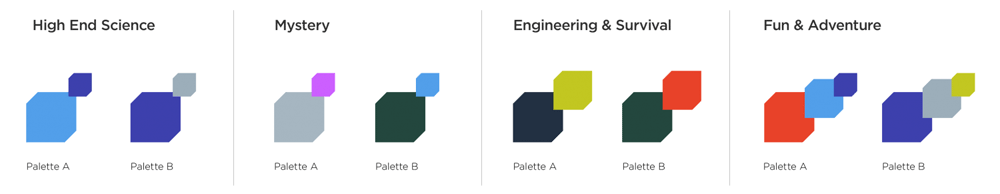
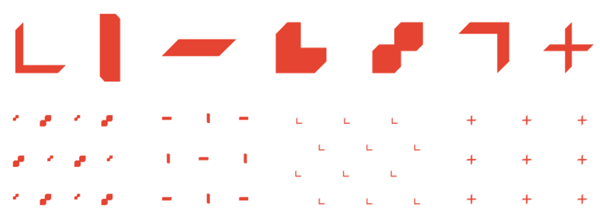
We’ve designed a set of science-inspired graphic elements and patterns based on the shape of the new logo. The patterns are used subtly over footage or solid backgrounds as an added layer of texture. They’re used as compositional details creating a rich graphic world where every shape relates back to the form of the logo.
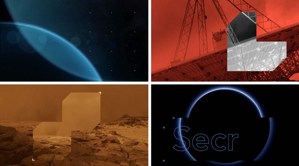
The visual language gets a slight boost from corner-y graphic elements but is not necessarily inspiring. The main typography — Avenir, I think — doesn’t help in making things any more interesting, looking out of place amidst all the science-y imagery. It almost looks like a college textbook cover.
In motion things get a tiny bit better (mostly because you can add motion to watching paint dry and it will be better), especially with the frosted effect when the logo takes on the imagery below it but distorts it ever so slightly. All the growing and repositioning cube effects feel obvious and expected. Like the logo, they are not bad but they are also not great. The one cool effect might be at the very end of the video, with the logo rotating into visibility, but that’s about it. Overall, with “science” as the backdrop for an identity — an identity that benefits from motion — this falls way short of the potential coolness it could achieve; if this were C-SPAN, it would be perfect but for a science channel it hardly blows my mind.
Thanks to Max L for the tip.

 Новости Союза дизайнеров
Все о дизайне в Санкт-Петербурге.
Новости Союза дизайнеров
Все о дизайне в Санкт-Петербурге.