Обзор лучших ресурсов по разработке бренда, разработке упаковки
contact us | ok@ohmycode.ru
contact us | ok@ohmycode.ru
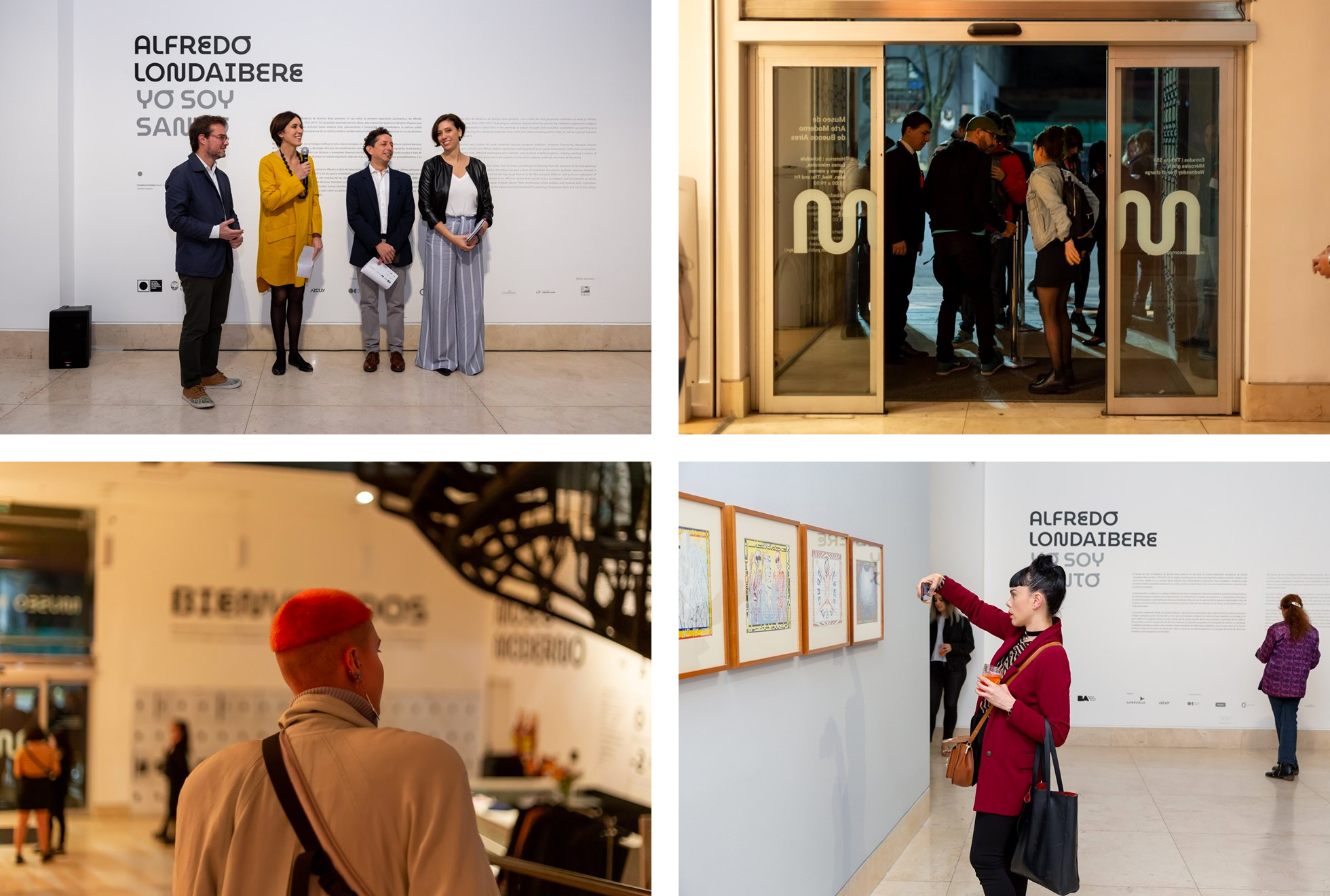
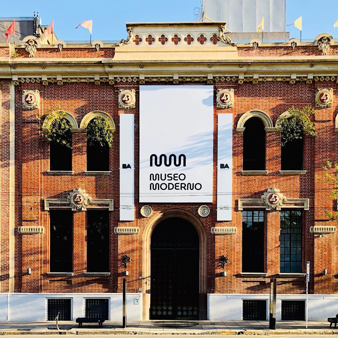
Established in 1956, the Museo de Arte Moderno de Buenos Aires is, as its name implies in Spanish, a museum of modern art in Argentina’s capital city of Buenos Aires. Colloquially known as “El Moderno” (The Modern), the museum is a public institution run by the Ministry of Culture of Buenos Aires’ government and from the outset it was meant to present the most avant garde work with its permanent collection now including over 7,000 works of modern and contemporary art from Argentina and overseas from the twentieth and twenty-first centuries. This week, a year after a major renovation, the museum has introduced a new identity designed by local firm Estudio Gorricho with local type foundry Omnibus-Type.
The name of the Museum was always the same, and it will continue to be the Museum of Modern Art of Buenos Aires, but we observe that throughout its history there were many acronyms and ways of referring to it, so we were presented with the opportunity to order and define how we wanted to be named and, above all, to consolidate the image in front of those who already knew us - and present it to those who have not yet - as a true reference of modern art and contemporary Argentine. From now on we invite our entire audience as a MODERN MUSEUM and present the new logo that, like a sounding board, seeks to expand the Museum from its core -the collection- outwards: starting with the exhibition halls, and reaching the neighborhood from San Telmo, the City of Buenos Aires and the whole world.
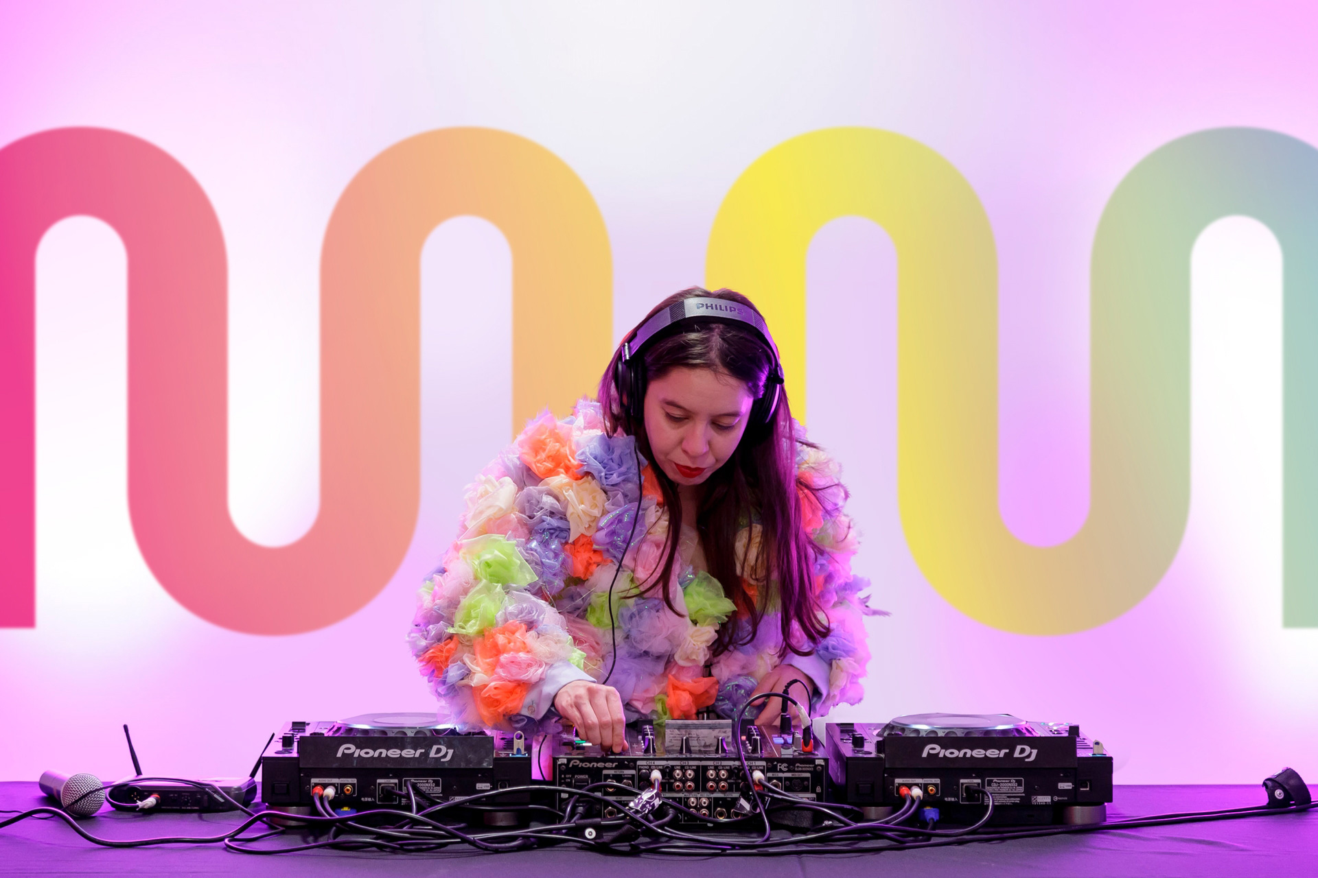
The old logo was fine, looking modern in a minimalist way with a big dot inside a square and lots of text, with the name in Gotham, in another square. Nothing overly exciting but properly done. Going with a shorter name in the logo — the museum is still officially called Museo de Arte Moderno de Buenos Aires (or MAMBA for short) — has given them flexibility to do something more interesting and adopting a double “m” monogram has yielded a much more playful expression while its hard geometry maintains a degree of gravitas. I find the monogram visually interesting and amusing even if I feel like we’ve seen double “m”s like these in the past (although I can’t pinpoint where). The monogram, at least at the beginning, depends on the wordmark where the two stacked initials evidently explain where the monogram comes from. A year from now, the monogram will be able to live on its own without any problem. The wordmark is part of the brand typeface but, on its own in the logo, it looks quite good and establishes the playfully geometric aesthetic for the rest of the identity — I wonder if they should have deviated from the typeface and made the wordmark monospace as it’s so close to the five stacked letters almost aligning.
The first idea that crossed this project was the development of a typography of the Museum that gave it a unique voice. The fact that modern design and contemporary design were also part of the Museum’s heritage - which keeps its own collection - gave even more sense to the creation of its own typography and of national origin.
The first printed document of the Museum of which it is registered uses a version of Futura, geometric, without serif. The premise for this design was to recover that original voice of the Museum but update it and bring it closer to the current profile of the institution. What happened to that typography in these almost 70 years of life of the Museum? How did it transform? In the search for its singular character, the criterion to rethink the typography was the Museum’s own collection: thus, the geometric deconstructions of works by Emilio Pettoruti or Tomás Maldonado; explorations of gestural, subversive typographies of works by León Ferrari or Mirtha Dermisache; and the alterations of time and form of Gregorio Vardanega were finding their translation into typographical gestures.
The result was a geometric typography of intermediate weight, specially designed for titration, inspired by artistic movements of the first half of the twentieth century and crossed by the imprint of the Museum’s collection. It presents alternative characters of some letters and signs that provide special singularity. Called MuseoModerno, it is a free and free license, which allows those who wish to download it and use it for free in teaching situations or in professional work.
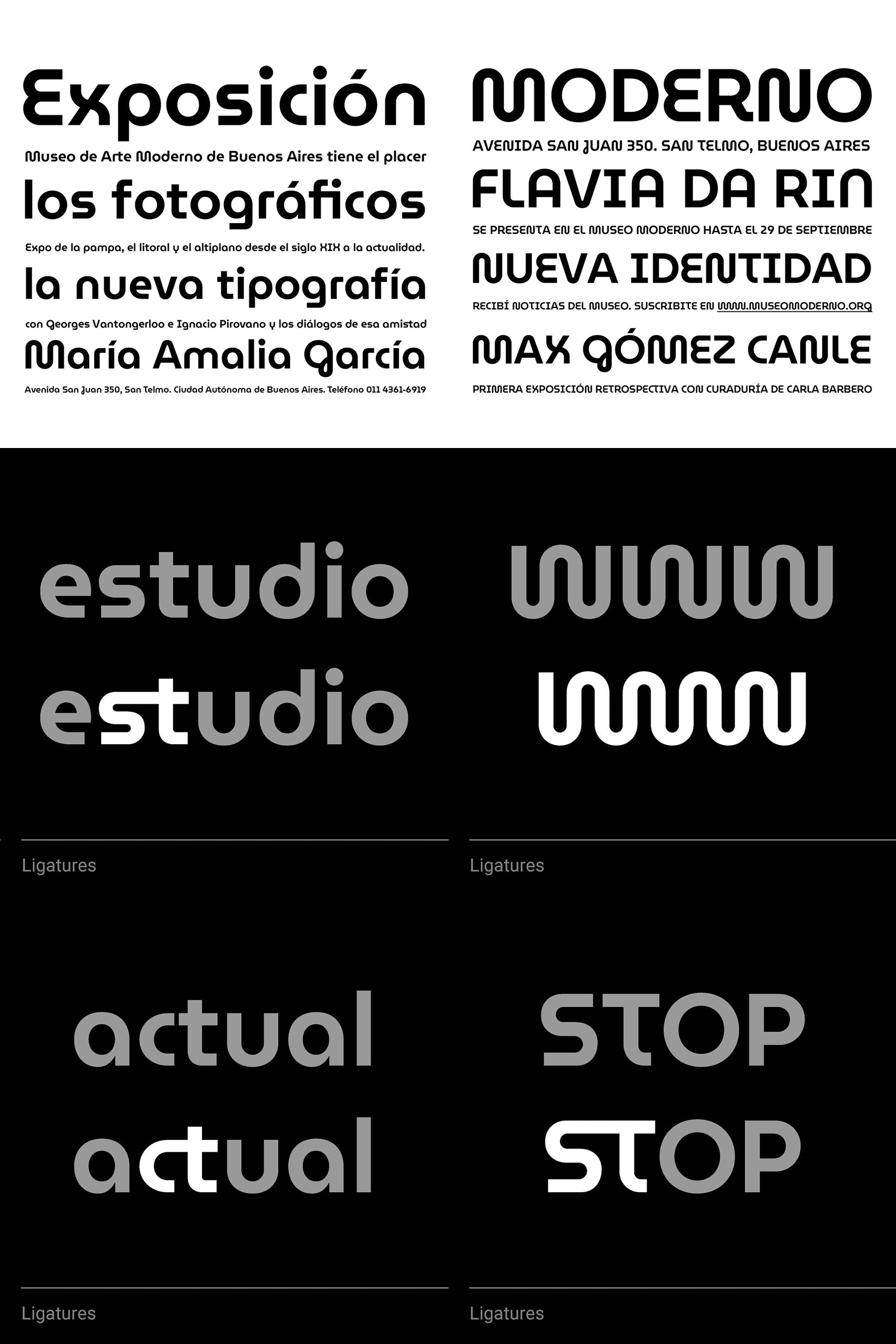
The custom typeface has a great Bauhaus/Paul Renner vibe that provides fun, new twists on some familiar typefaces like Futura and its original drafts or, gasp, ITC Bauhaus. The typeface has a lot of great alternates and ligatures and looks its best in uppercase, with the lowercase getting a little awkward. As a bonus, the font is free to use by anyone so if you ever dreamed of looking like a modern art museum in Argentina now is your chance.
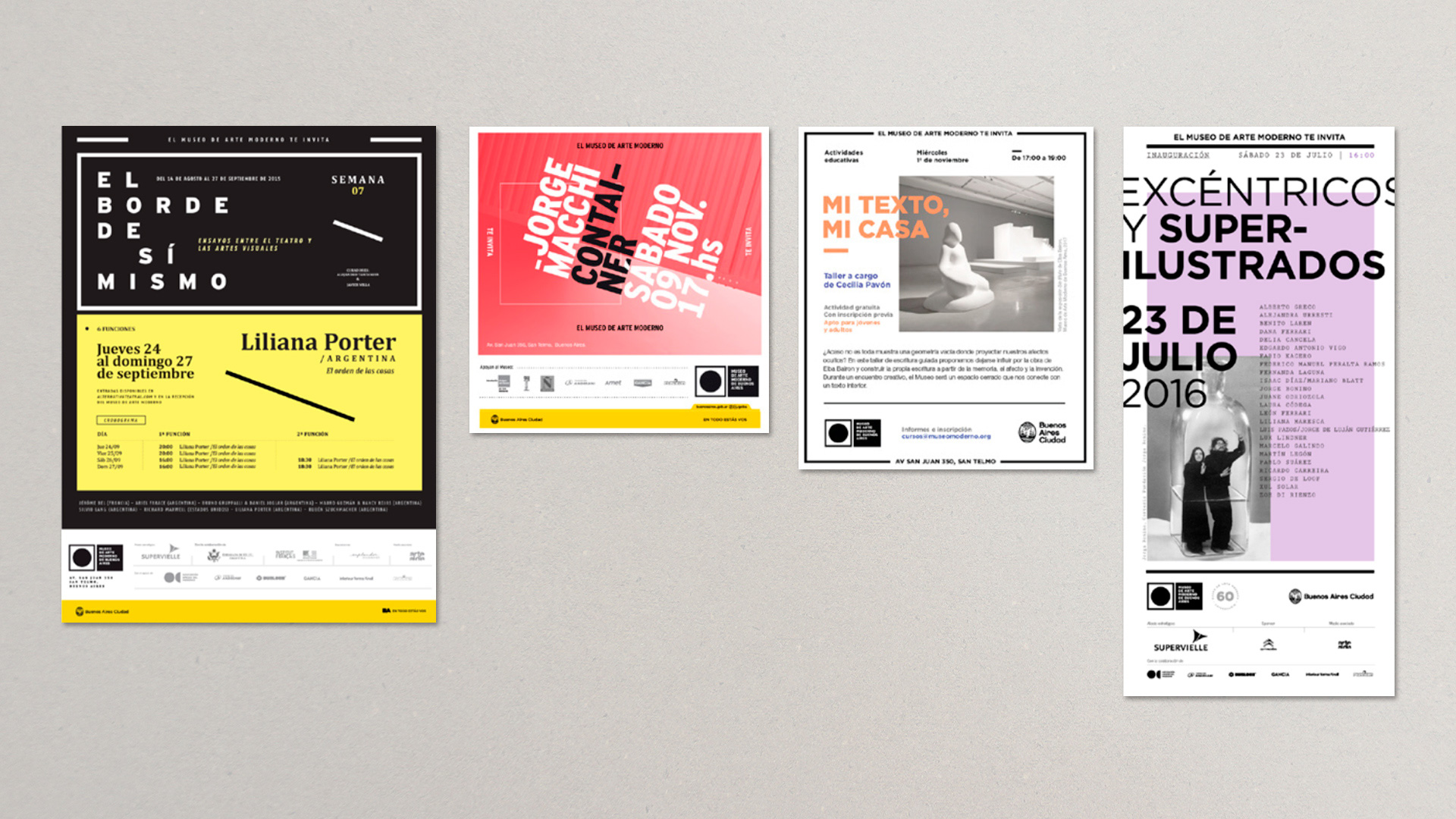
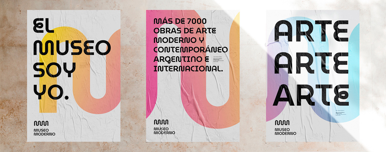
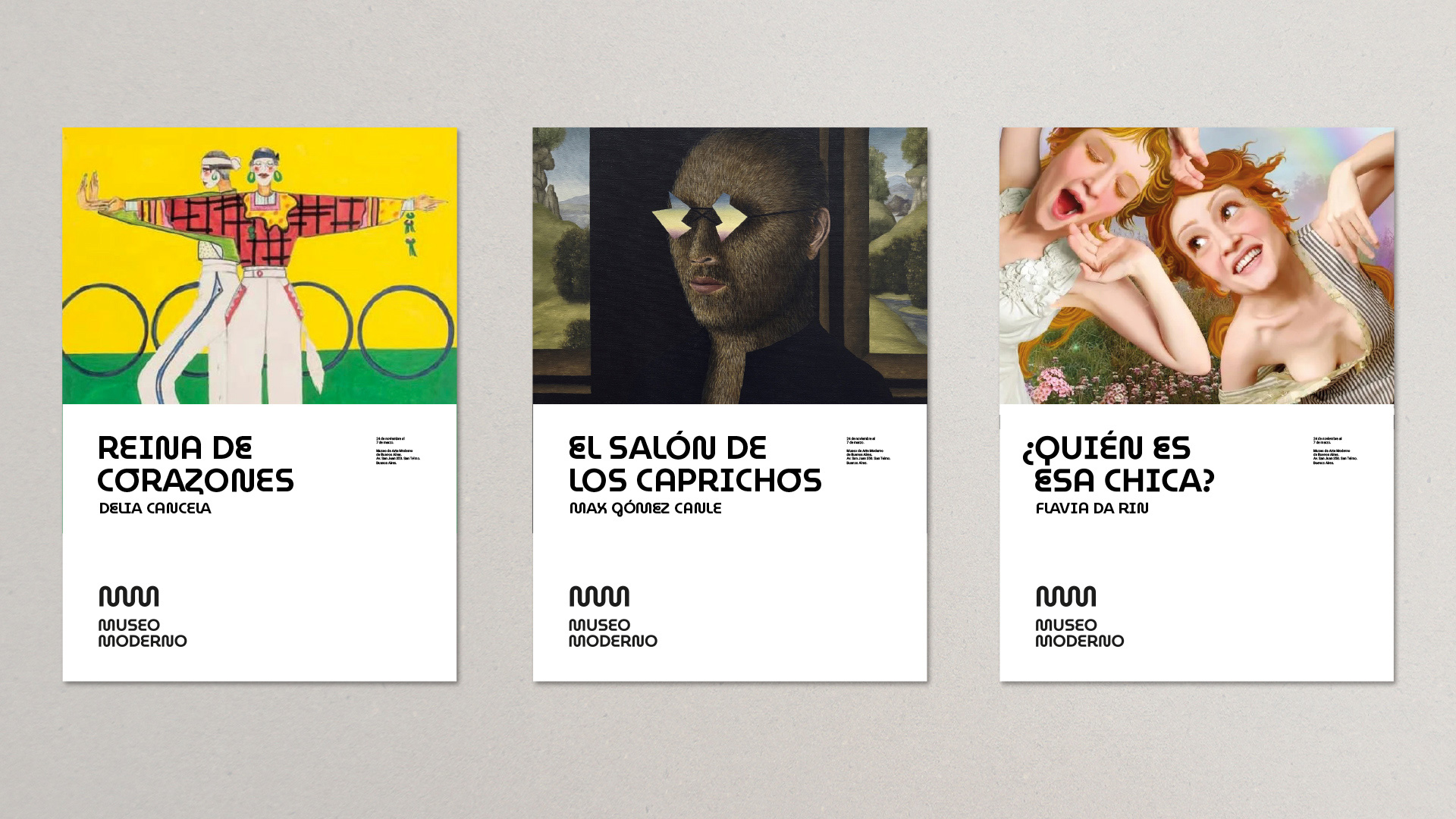
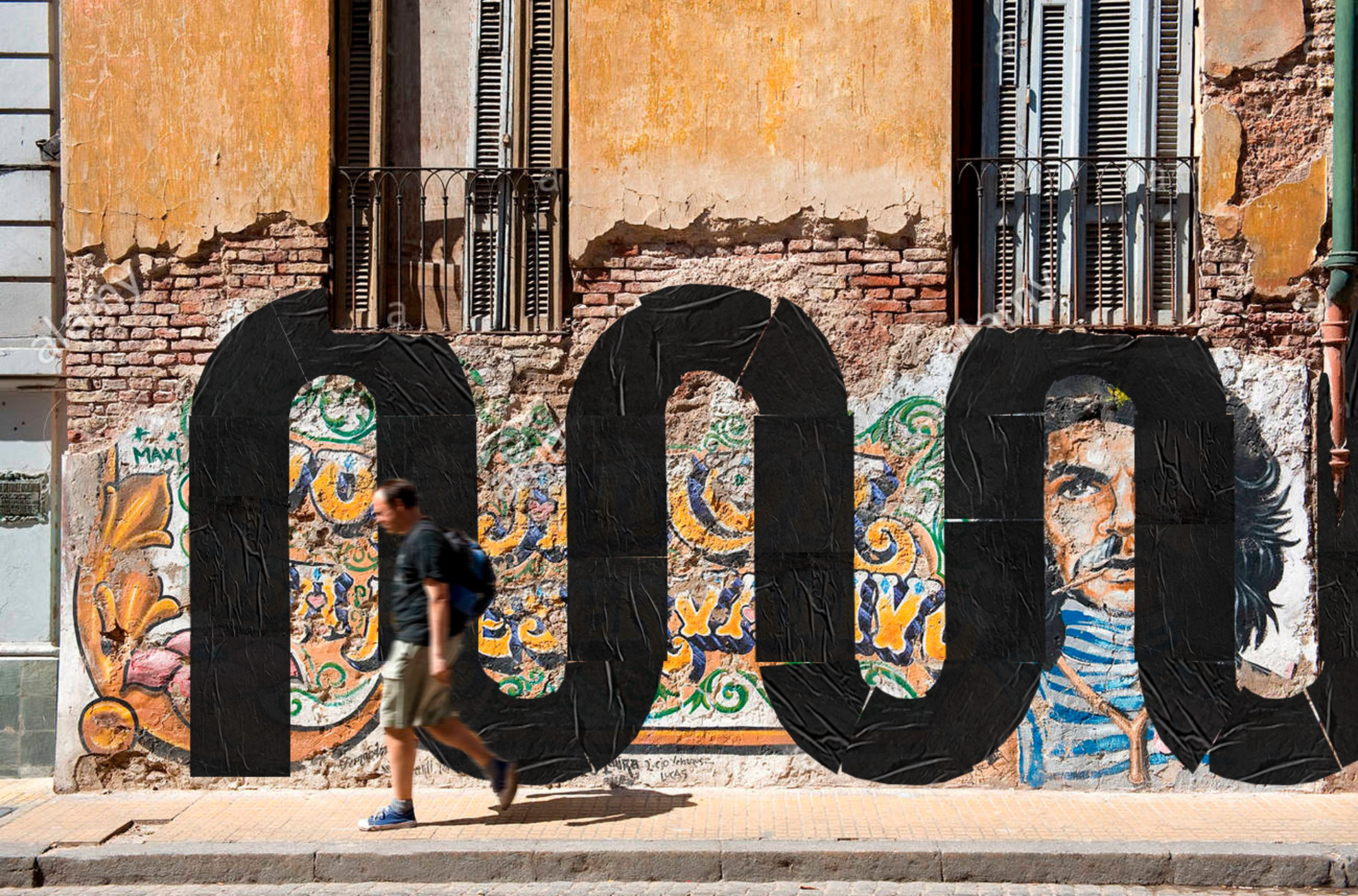
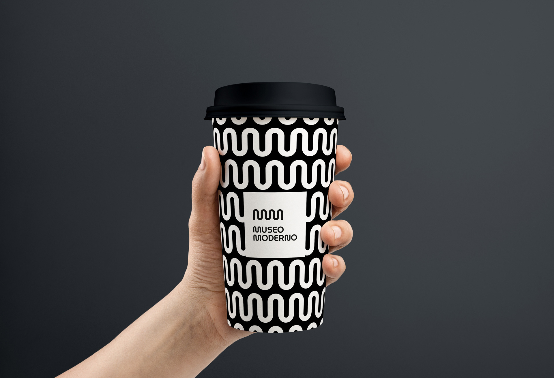
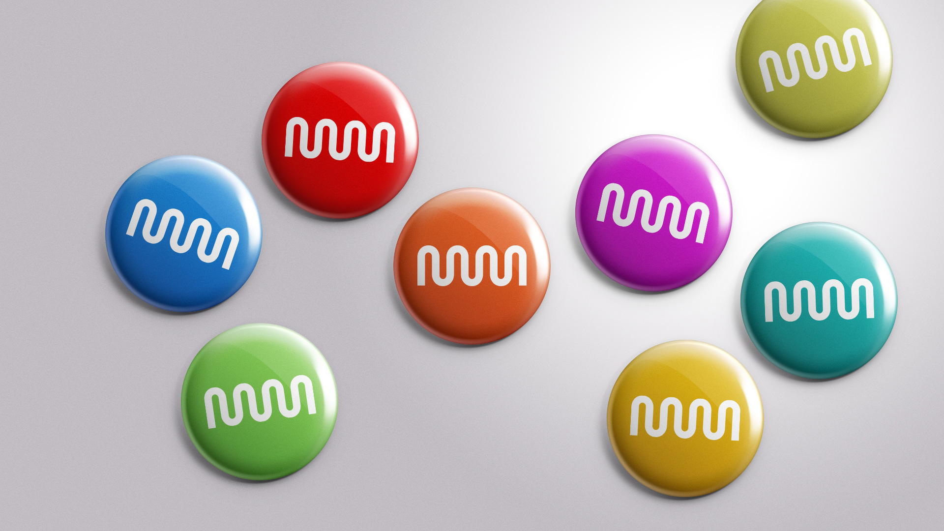
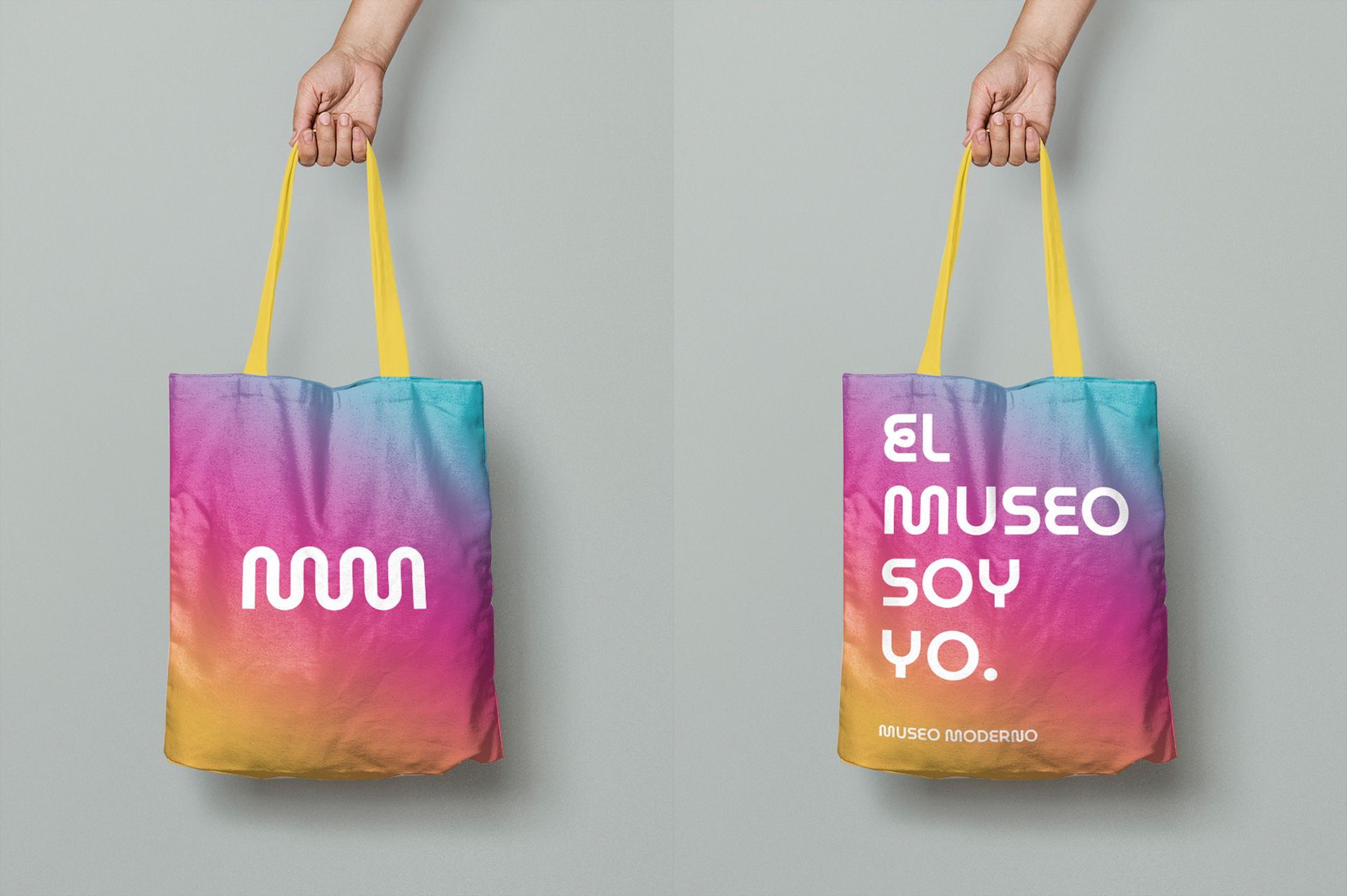
The old identity, like the logo, was fine, with lots of Gotham and a good use of thick strokes that referenced the stroke in the logo. Perhaps a little dry at times, but good. The new identity revolves 100% around the custom typeface and, no surprise, it instantly works to create a consistent voice. Unfortunately, the applications are all over the place, without a clear direction in the use of color or the deployment of the font. Anything goes apparently. There are a number of cool things in here, like the repeating pattern on the cup or the fake wild postings that make up the monogram but then there are gratuitous Instagram-logo gradients and random colors, which are not wrong… they just don’t add up to a cohesive identity.
This is the kind of identity that would benefit from a strong in-house design team to take some of these initial random ideas and shape them into something consistent because, overall, this has a lot of great potential that adds some excitement to the museum.
Thanks to Eduardo Chang for the tip.
 each year since publication began in 2006

 Новости Союза дизайнеров
Все о дизайне в Санкт-Петербурге.
Новости Союза дизайнеров
Все о дизайне в Санкт-Петербурге.