Обзор лучших ресурсов по разработке бренда, разработке упаковки
contact us | ok@ohmycode.ru
contact us | ok@ohmycode.ru
Established in 2013, Left Field Brewery is a microbrewery in Toronto, Canada, born from a passion for both craft beer and baseball, founded by a husband and wife team who left their daytime jobs (accounting and marketing, respectively) to start it. Initially brewing without a tap room, Left Field distributed their beer to 80 or so pubs in the area but with the opening of their facility in 2015, they were able to brew, can, and distribute on site where, aside from a few regular beers, they produce a new one almost every week. Last year, Left Field introduced a new identity, designed by Indianapolis, IN-based CODO.
A brand refresh (as opposed to a wholesale rebrand) is half science and half intuition. On the one hand, we catalogue what’s working well, so that we have a clear idea of what we’ll need to preserve. In the case of Left Field, the baseball, script, and general vibe were on target. Truth be told, many of the decisions we made through this refresh were in service of more practical, mundane considerations: How do we get more contrast out of this logo? How do we sidestep the use of a stock script font for something with more character and punch? And finally, how do we tweak the can labels so that they stand out more effectively amongst the impressive craft beer stock of the LCBO?
[Discussions with the owners] helped inform, for example, the decision to place the “Left Field” logotype on a straight baseline as opposed to the previously angled-upward text. This change made the logo easier to use in a variety of formats and layouts. We also developed a custom script mark, scrutinizing various capital F’s and L’s until the word mark felt just right. To support the new logo (and give Left Field more visual assets to work with) we developed a system of fun, baseball (and beer!) related iconography to be used on merch and other supporting promo pieces.
The old logo was more or less fine with an execution that wasn’t great or terrible and has clearly served them well over the years. The new logo is a super tight evolution that takes the best of the old logo and makes it much better. The custom script is beautifully executed and fills up the baseball graphic much better — I love how the “t” meets the “F”. “BREWERY” is also very successfully nestled under the name and filling in the space between it and the baseball thread, which is, naturally, a rendition of hops/barley. The only thing I question is the use of red in “BREWERY”… it somehow looks off. Other than that, a great evolution.
Semi-random in some cases but, overall, they are all cool and squarely within the theme.
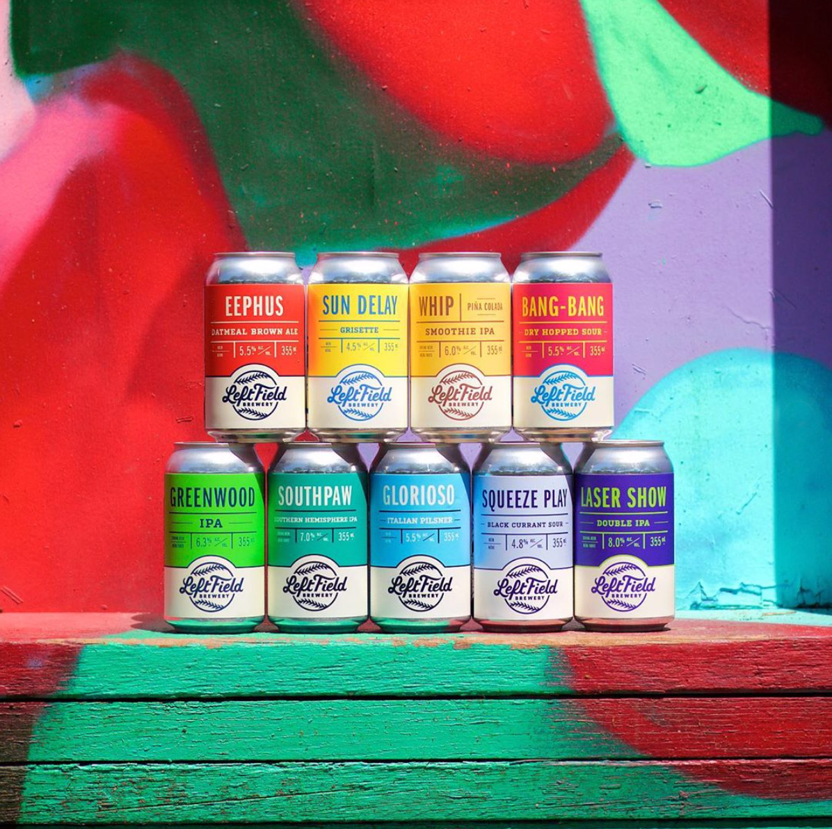
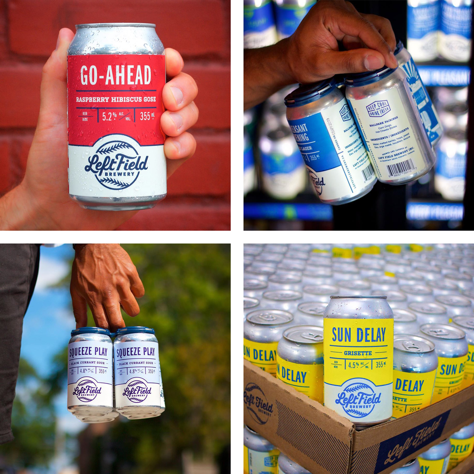
With revised branding in place, we shifted gears to packaging. Much as with the logo design process, we set out to update the existing cans with a sense of continuity from old to new. We leaned on Left Field as much as we could through this process: they had done the majority of their creative work in-house up until this point. This meant that they had an above-average understanding of what would play in the market. The resulting front and right side of the can labels are clear, consistent layouts, reminiscent of a ballpark scoreboard. We placed in the leftmost panel of the label a piece of art that tells a deeper story about each beer. An important parameter throughout the logo and package design process was the ability for Left Field to take over in-house and create new assets using the established framework of the refresh.
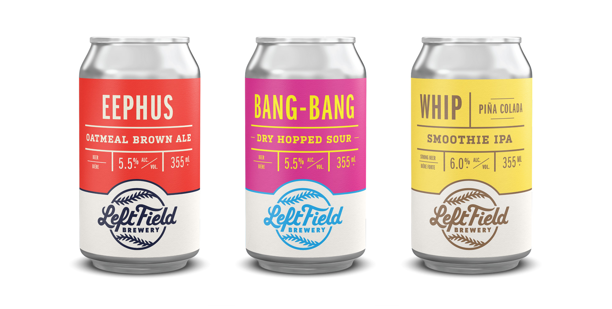
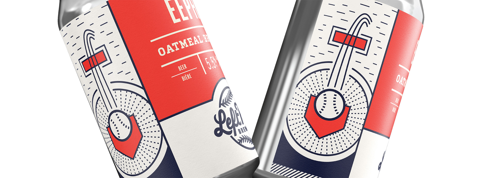
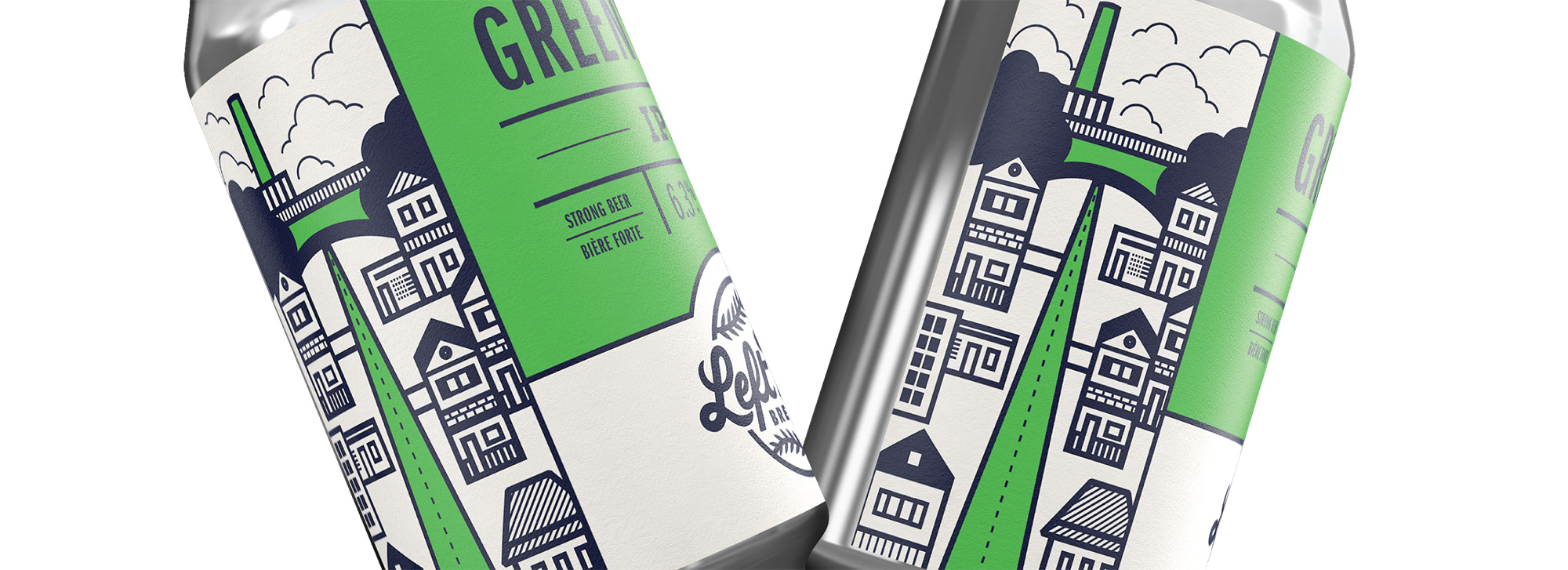
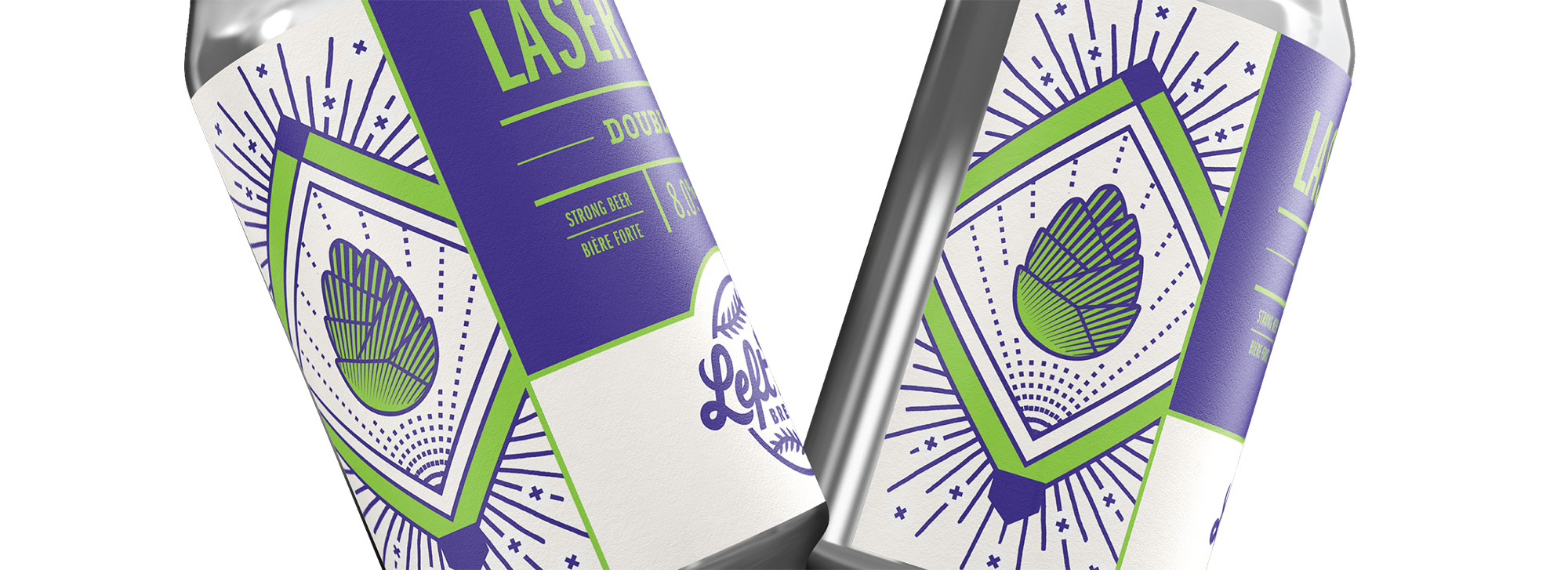
The old cans were also mostly fine but not great by any means, giving a little too much attention to the spiky font. The new cans have a much more balanced hierarchy system that better unifies the wacky, baseball-themed names with the beer information. The logo at the bottom, in a white field separated by a thick stroke, unifies all the cans and provides a consistent “footer” for all the myriad color combos (which can sometimes be a little questionable but overall good). The illustrations on the sides of the renders are a cool idea but probably unsustainable for weekly new beers.
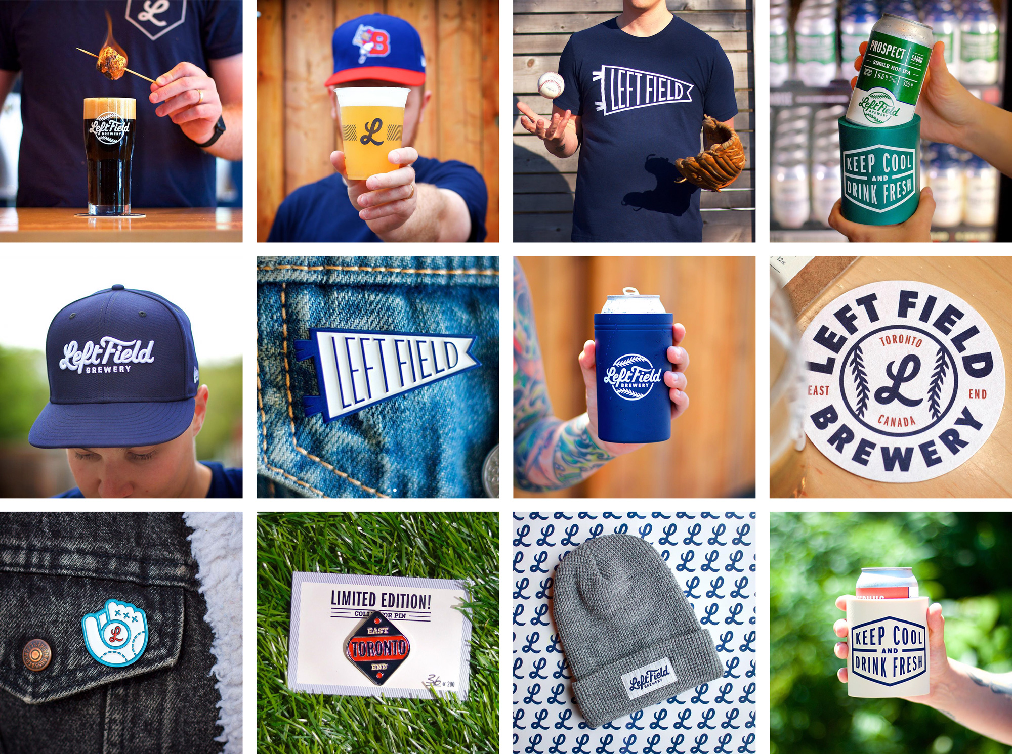
Left Field has really embraced the identity and assets, producing tons of swag and merch that all looks really great and is almost a no-brainer purchase for the beer-baseball fan, which is a kind of bulletproof target audience. Overall, while there isn’t anything surprisingly innovative or unexpected in this identity, it’s a perfect manifestation of the spirit of the brewery and it certainly helps them stand out as “That baseball beer” in an increasingly competitive industry.
 each year since publication began in 2006

 Новости Союза дизайнеров
Все о дизайне в Санкт-Петербурге.
Новости Союза дизайнеров
Все о дизайне в Санкт-Петербурге.