Обзор лучших ресурсов по разработке бренда, разработке упаковки
contact us | ok@ohmycode.ru
contact us | ok@ohmycode.ru
Launched in 1986, Sabra offers a range of “fresh dips” that include hummus, tzatziki, guacamole, and salsas. Its flagship product, the hummus range (available in 12 different flavors), has become one of the most popular in the U.S., garnering 60% market share. Sabra has gone through a number of owners and is currently a U.S./Canadian joint venture between Strauss Group and PepsiCo who distribute the same product outside of North America under the name Obela. This week, Sabra introduced a new logo and packaging designed by New York, NY-based Beardwood&Co..
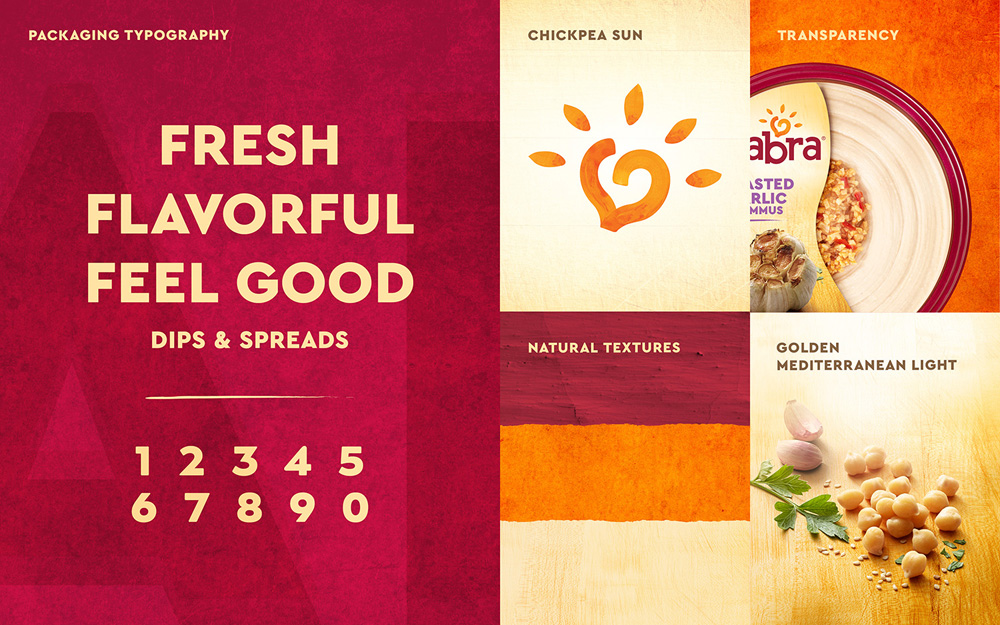
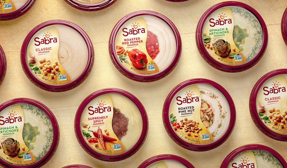
The new Sabra Chickpea Sun symbol takes ownership of the chickpea ingredient that is at the heart of hummus. It is surrounded by 5 sesame seed rays that represent Sabra’s five core values: Openness, Trust, Passion, Caring, and Daring. A custom Sabra wordmark keeps the playful “musicality” of the previous version while adding a bolder impression.
Sabra — Roasted Pine Nut edition — is my go-to hummus of choice and even though I have bought dozens of it I had never paid close attention to its logo, which is probably for the better as it’s not great. While it had a fun-looking energy and perhaps it signaled mediterranean-y right away, it wasn’t particularly attractive, well executed, or cohesive, with the wordmark, sun, and swoosh each having a different style. The new logo does a better job in unifying the elements (while dropping the swoosh) and introduces a new chickpea sun that is charming and nicely executed with its sesame seed rays. The wordmark, however, is neither charming nor nicely executed. It feels stiff, unbalanced, and as if each letter came from a different type family. The “misalignment” on purpose of the baseline is weird because only the “S” and “b” dip below it and the other three letters are awkwardly anchored. I wish they had tried to capture the softness and flowiness of the chickpea icon into the letters.
The Chickpea Sun logo unifies the brands and symbolizes the warmth of the Mediterranean, bringing people together to connect over food. Sabra is a healthy plant-based food that’s fun, delicious and perfect for sharing. New packaging creates strong differentiation from the rest of the category with a vertical label that features tasty ingredients and the view through to the product.
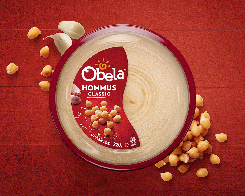
The old Obela logo was pretty terrible, with its giant “e” and super weird slabs. The new one has the same problems as Sabra’s and for some reason maintained the “b” and “e” touching, which is the only pair of letters in the two logos that touch. The baseline shifts are a little better in this one but not that much more engaging. The chickpea sun is in the same position in relationship to the “b” as in Sabra’s where it works well being nestled but in this one it should have been centered between the “b” and “l”. But, hey, at least they now look like they are a pair.
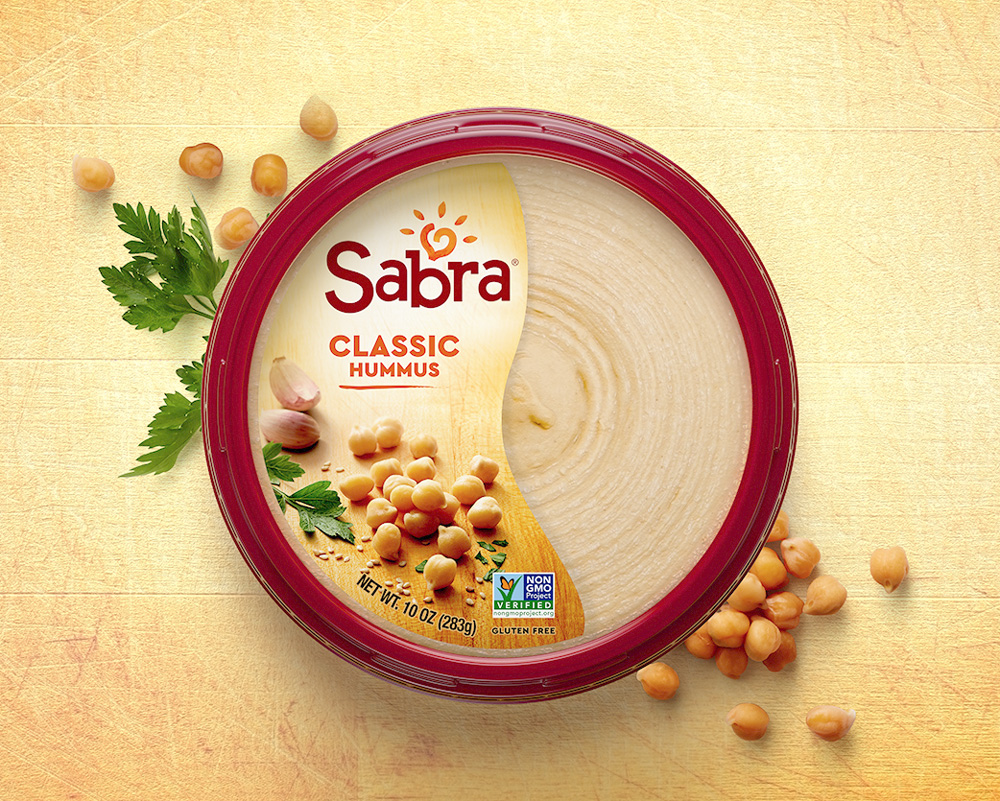
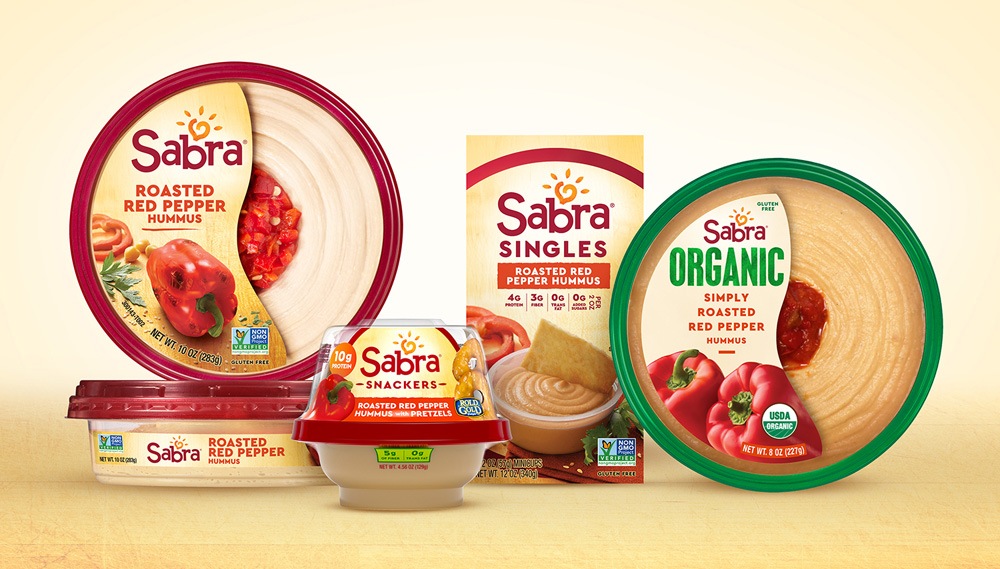
With its iconic red rim unchanged, Sabra’s top label has been reoriented from horizontal to vertical. These vertical labels guide the eye naturally to the new logo, then color-coded flavor, ingredients and finally to the transparent view of the product (a packaging innovation Sabra first introduced in the early 2000s).
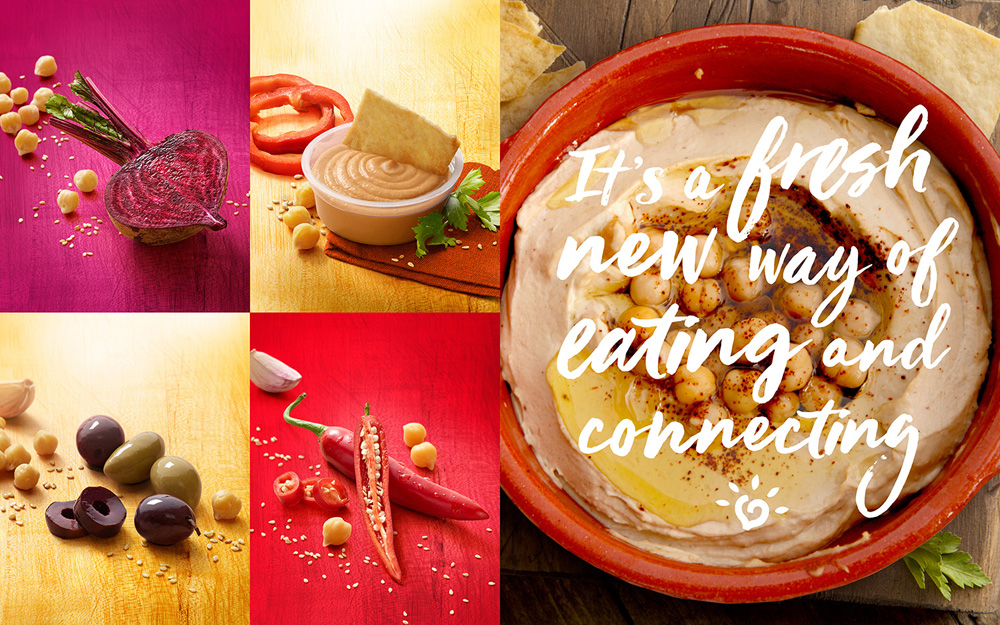
Our distinctive photographic approach elevates Mediterranean inspiration with sunlit ingredients on a wooden cutting board, shining a light on the fresh ingredients that deliver great flavor, naturally.
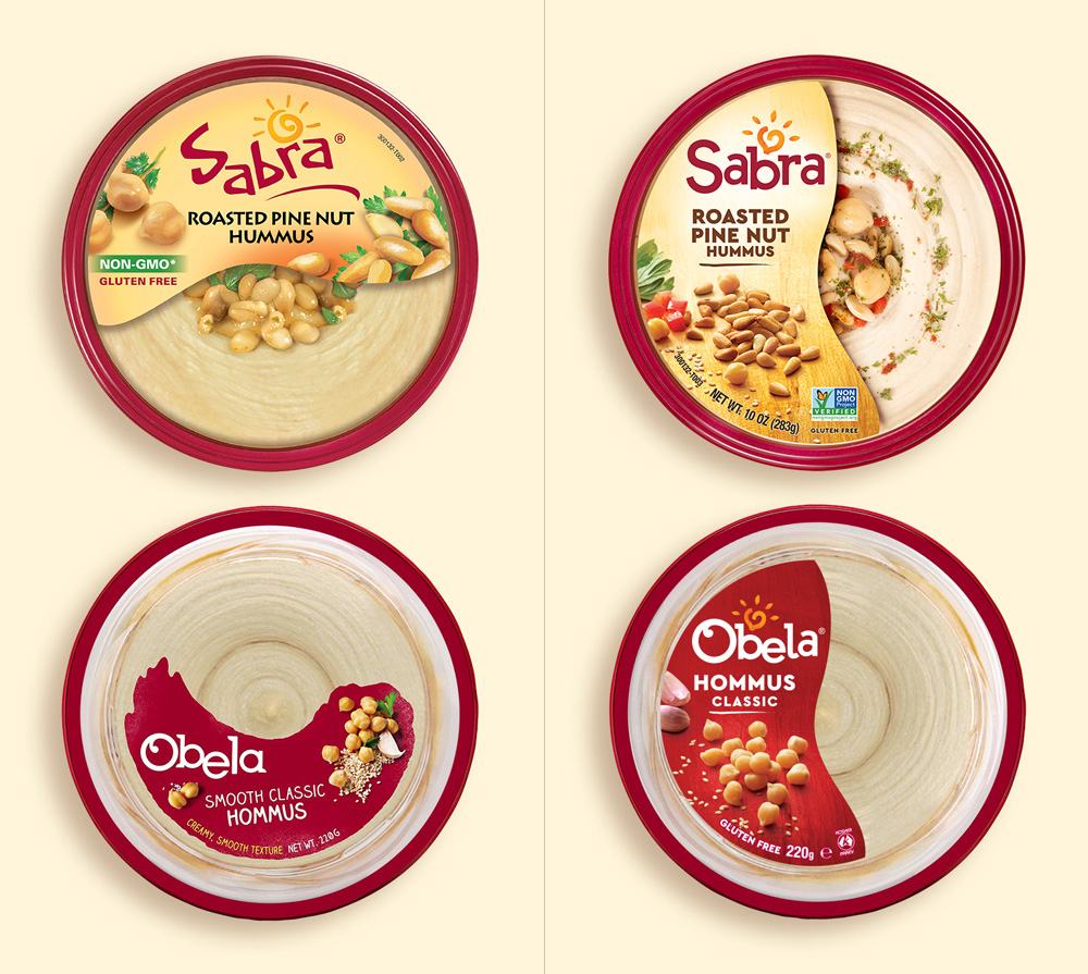
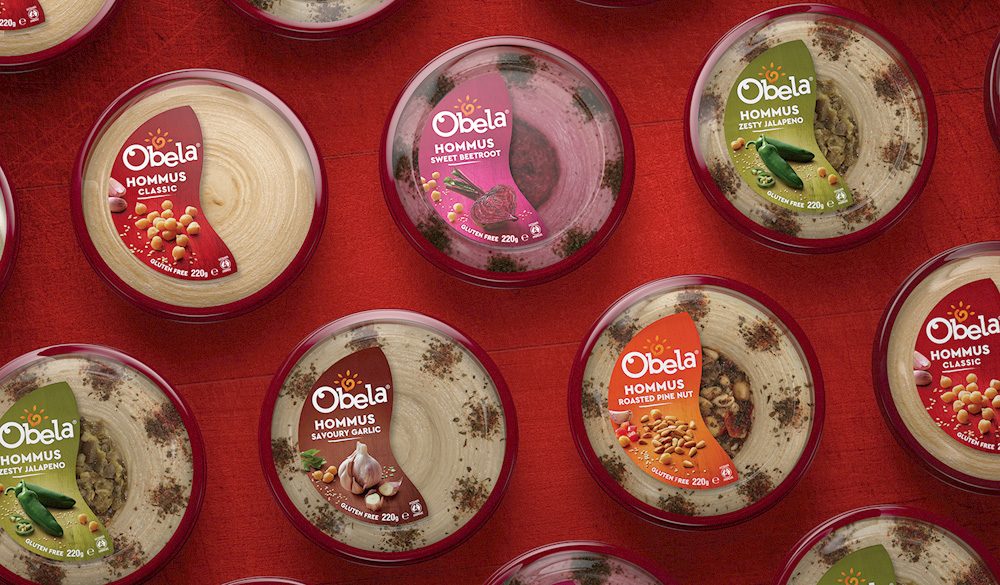
The old packaging was not great (or even good) by any stretch of the imagination. Just your average consumer product with subpar ingredient photos. Its red rim and transparent top are what make it quickly and easily recognizable on shelves. The new packaging is a slight improvement, with more attractive ingredient photography, clearer hierarchy, and easier distinction between flavors. Also, it’s always a good day when a Greek-ish brand stops using Lithos. The new Obela packaging is slightly more interesting because of the color coding that allows the label to stand out from the color of the hummus — whereas in Sabra’s it’s all too much of the same hue.
The new Obela packaging uses the same iconic red rim, vertical label and photography style as Sabra. What’s different is that Obela keeps colored backgrounds for each flavor since that color-coded approach is recognized by customers in the countries where Obela already exists.
Overall, the general presentation is an improvement in that it looks less like a start-up product and more like an established brand. If the wordmarks had been better resolved this would have had me double-dipping.

 Новости Союза дизайнеров
Все о дизайне в Санкт-Петербурге.
Новости Союза дизайнеров
Все о дизайне в Санкт-Петербурге.