Обзор лучших ресурсов по разработке бренда, разработке упаковки
contact us | ok@ohmycode.ru
contact us | ok@ohmycode.ru
Established in 1944 (originally as Guildford Aerodrome), Perth Airport is a domestic and international airport serving Perth, the capital and largest city of Western Australia, and is the fourth busiest airport in the country. After being ranked the worst airport in 2012 by the Australian Competition and Consumer Commission, it was ranked the best in 2018 by the same organization after a major renovation project. Perth Airport serves nearly 14 million passengers a year through 18 international and 12 domestic and regional airlines that travel to more than 110 destinations around Australia and overseas. Last year Perth Airport introduced a new identity designed by Fitzroy, Australia-based PUSH Collective.
The new brandmark leverages the State’s emblem, a black swan, with renewed simplicity and optimism, while making a nostalgic nod to the airport’s early days, when travelers used to feed black swans located near the terminal.
The old logo was par for the course when it comes to airport logos by including some kind of swooshy element, an airplane shape, and being forgettable. The new logo features an attractive icon that at first glance I thought it was a star of some sort and took me a minute to realize it was a bird — once I read the text above that it’s meant to be a black swan, the state’s emblem, it clicked. I think the icon could have done without the internal gradients but other than that, it’s a solid mark that uses a relevant element (the black swan) that, in its rendering in hard and straight lines, evokes airplanes and avoids looking like a nature documentary. The animation is a little clunky but I guess it helps get the point across. The wordmark is good and simple with a little bit of personality.
Perth is the capital city of Western Australia, a vast state with extraordinarily diverse natural wonders, and an indigenous culture which dates back tens of thousands of years.
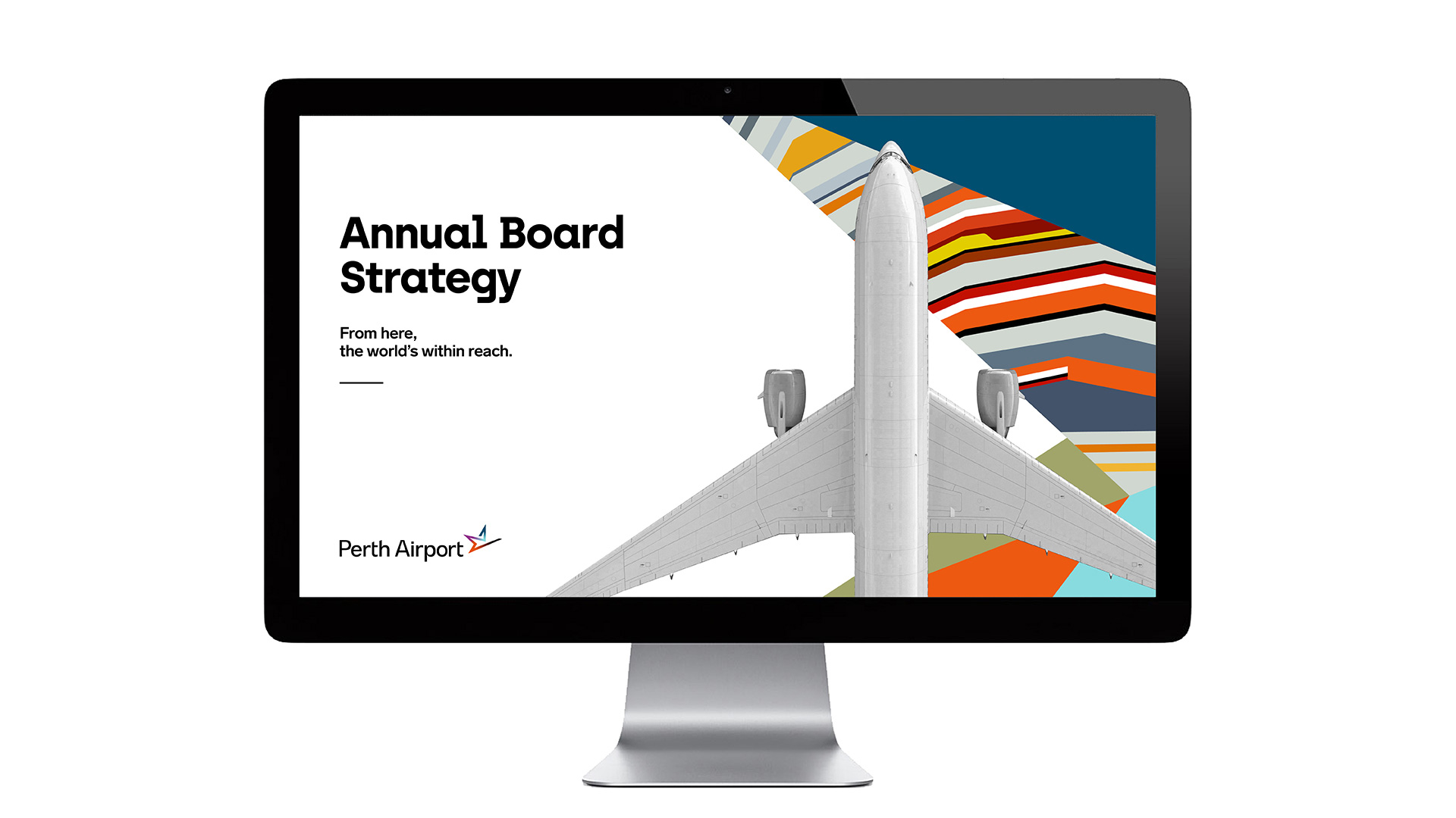
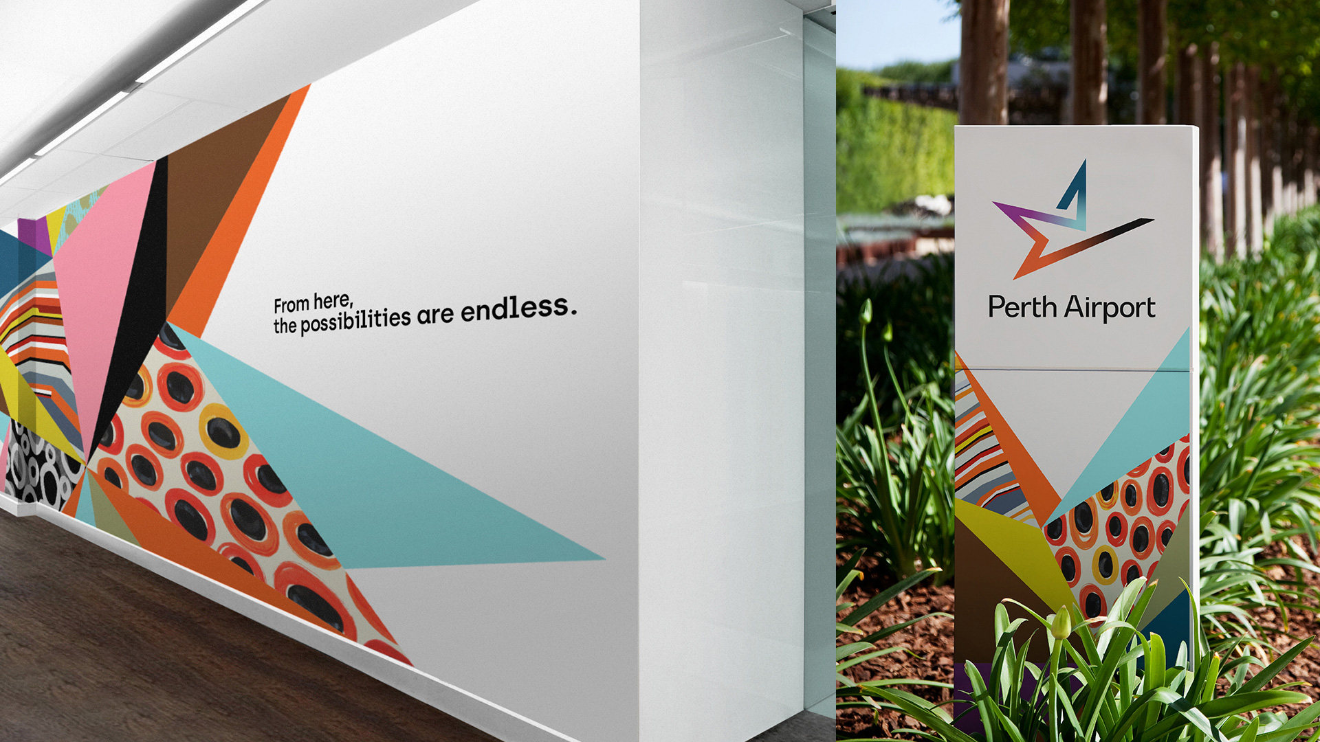
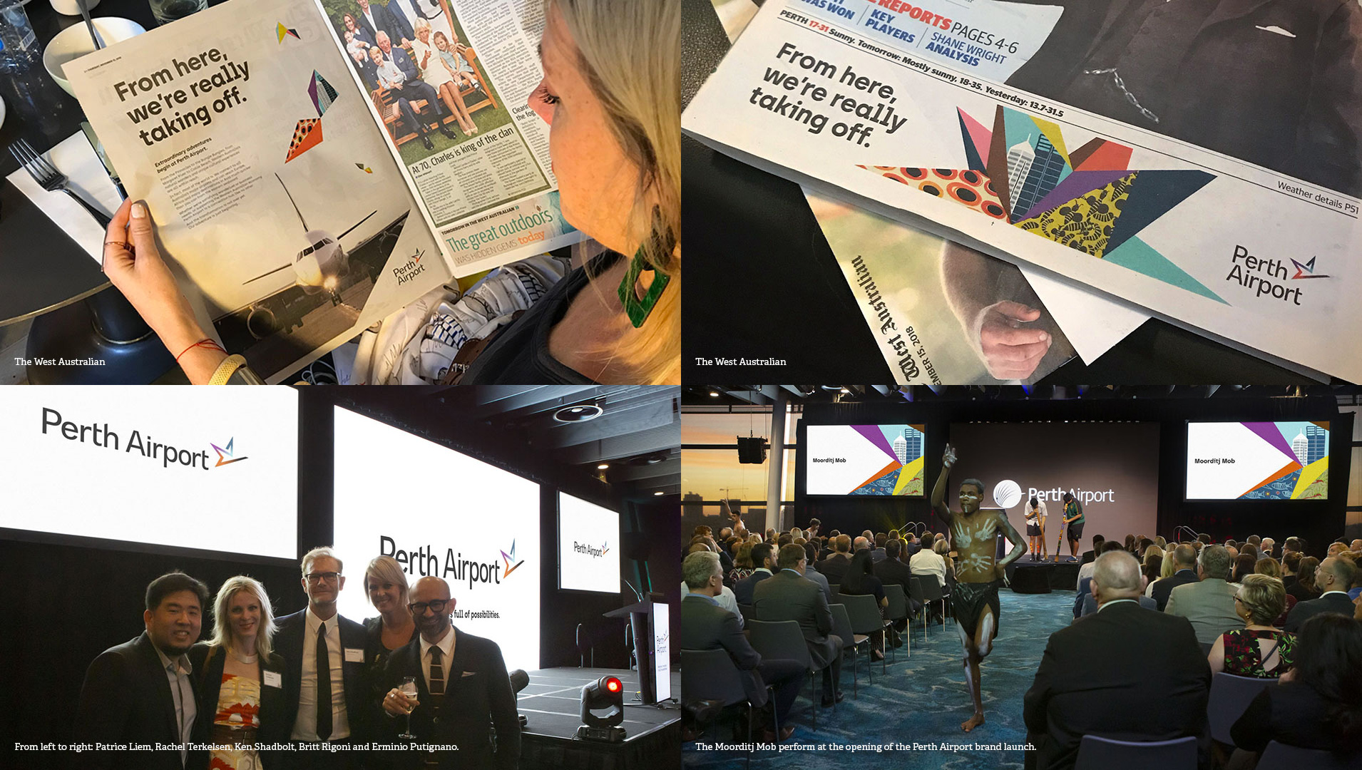
PUSH developed a new strategy centred around the brand idea ‘Nexus of Possibilities’, which provides the platform for the airport to showcase the best of Western Australia.
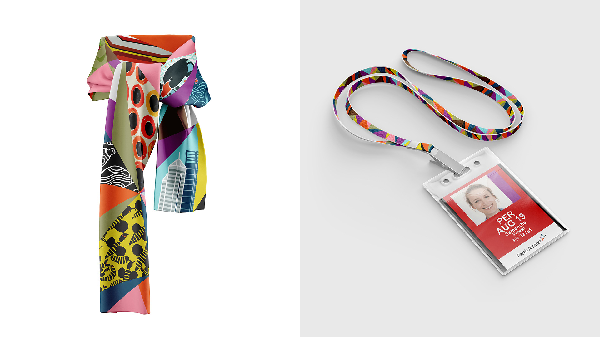
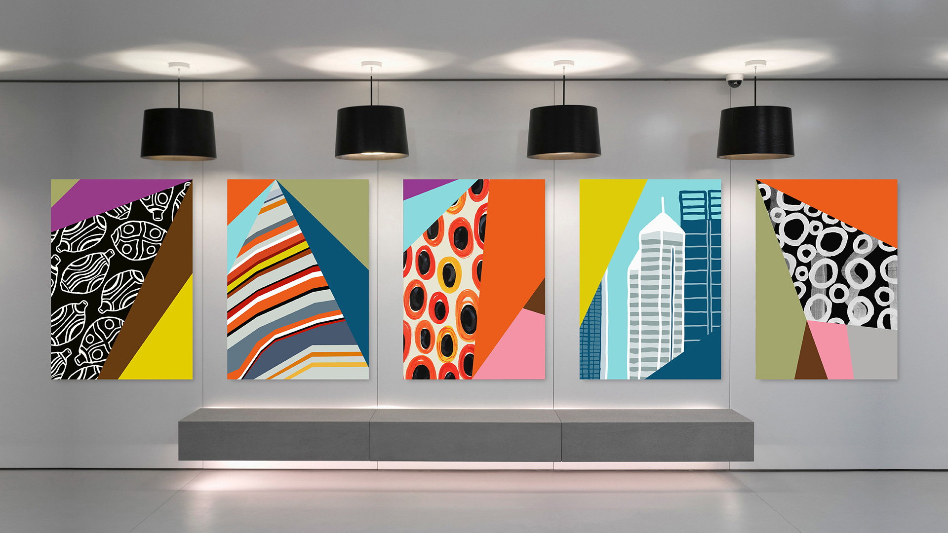
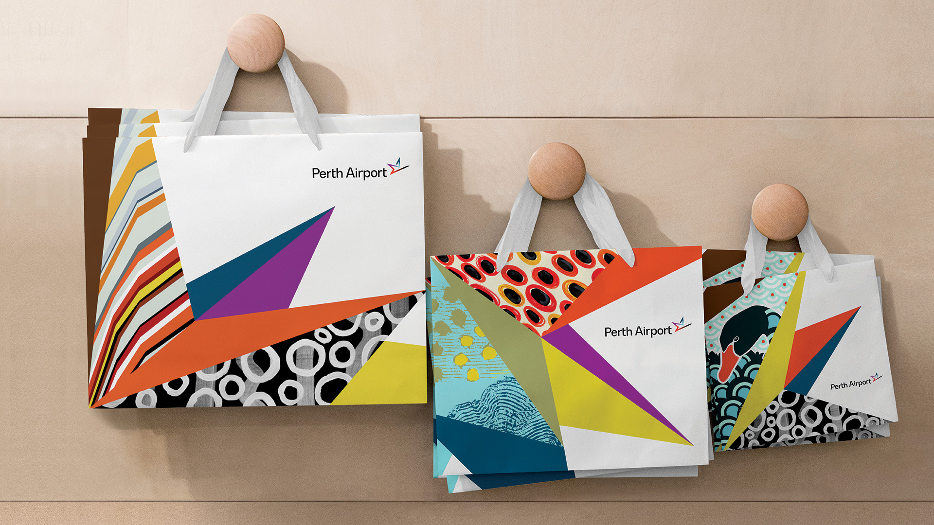
This idea inspired the signature graphic element of the identity - a 3-dimensional compass - that metaphorically points to the possibilities accessible via the airport hub. This signature graphic features colours and commissioned artwork that convey the rich Western Australia experience.
PUSH collaborated with a diverse range of artists, including indigenous artists, representing regions from across the State to express their personal perspectives on themes of flora, fauna, land, sea, sky and vibrant urban landscapes.
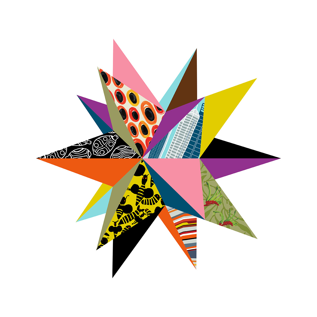
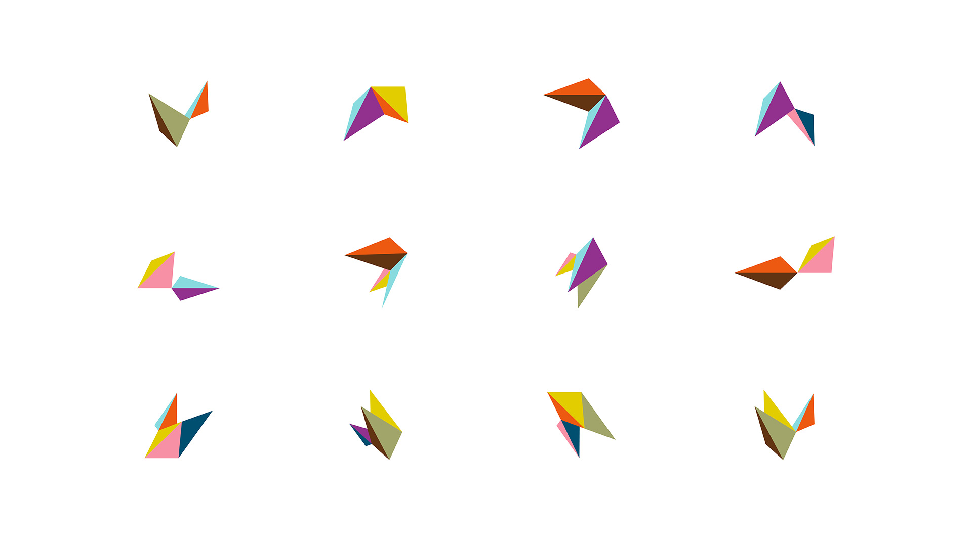
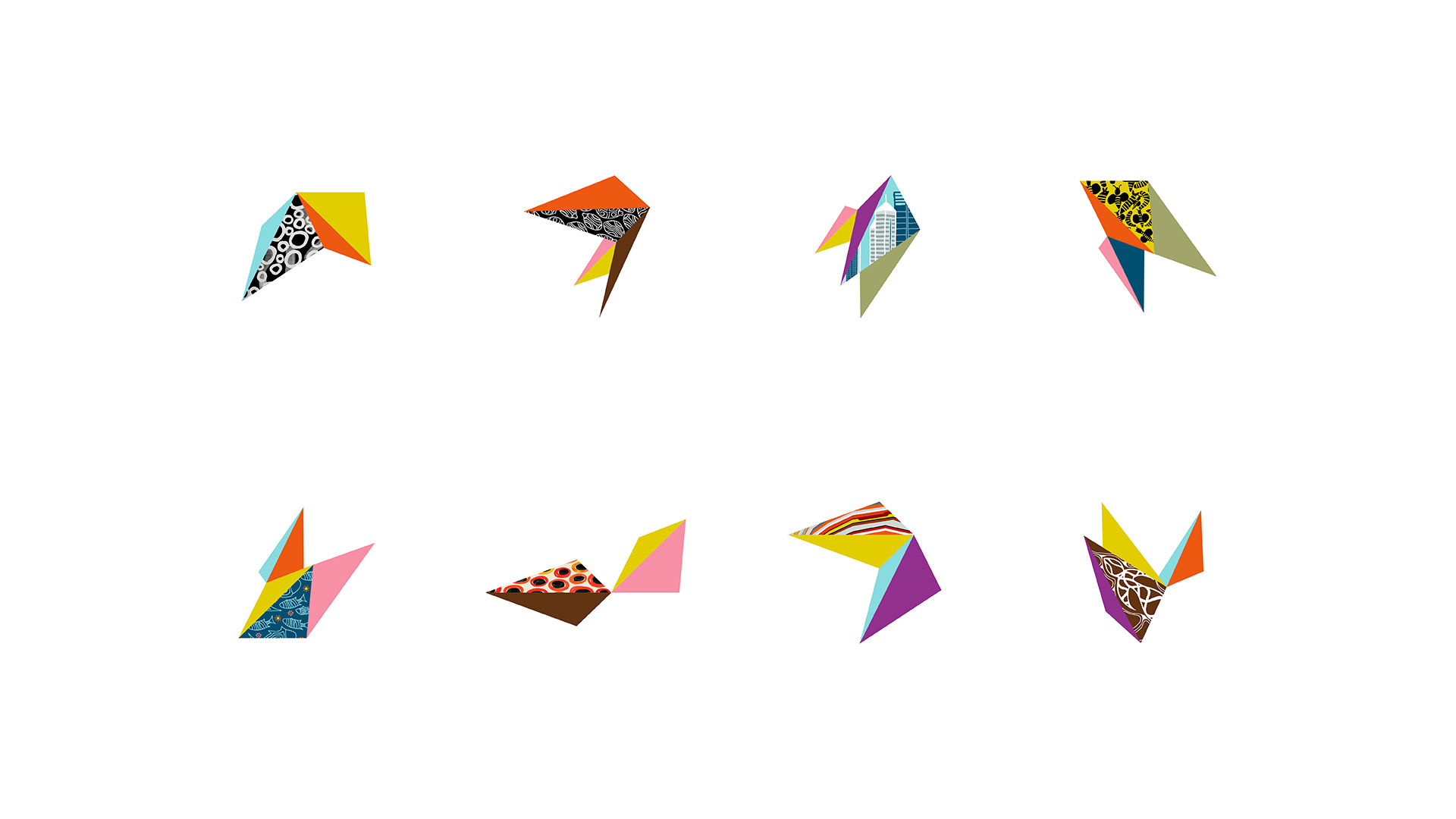
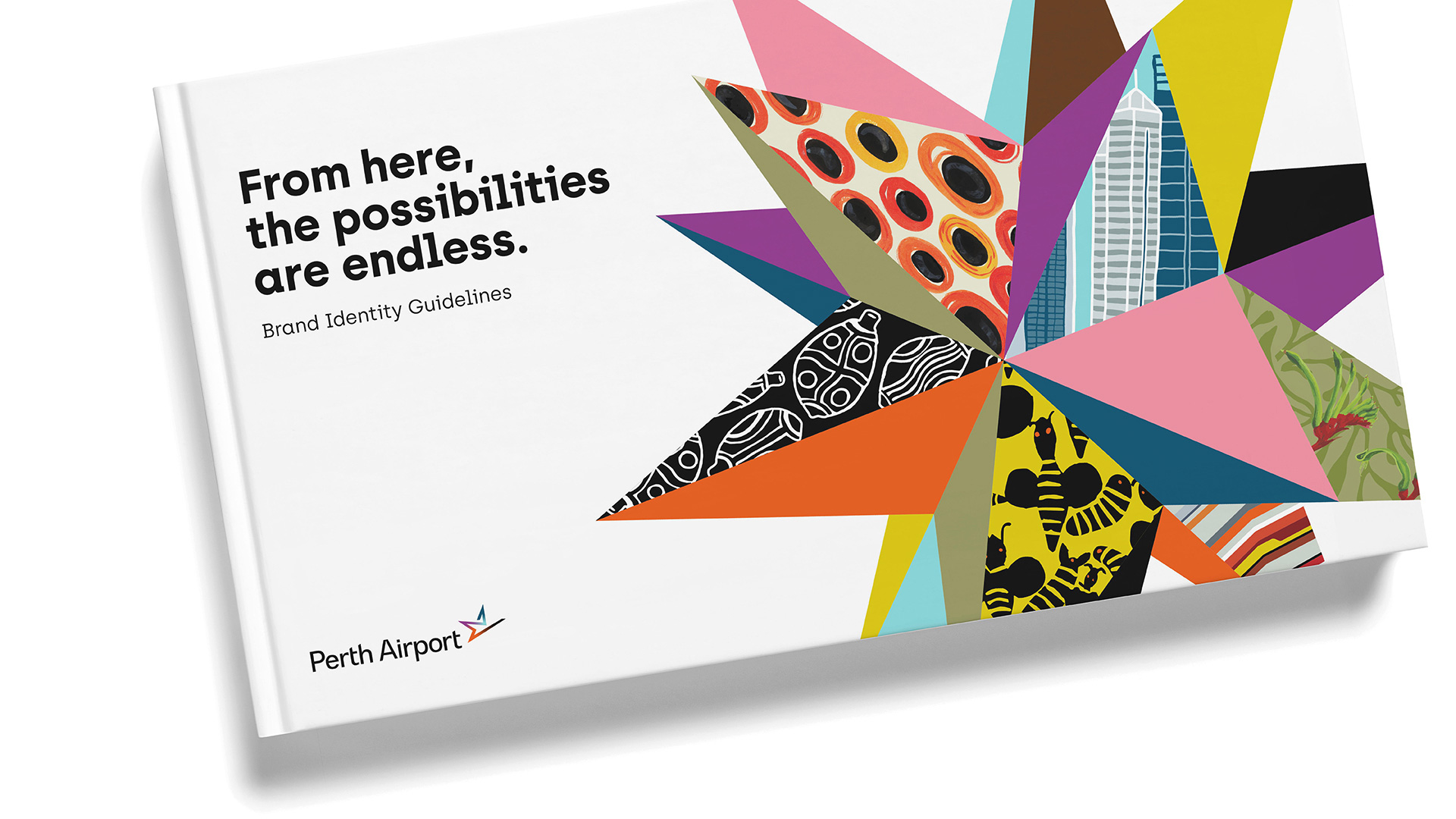
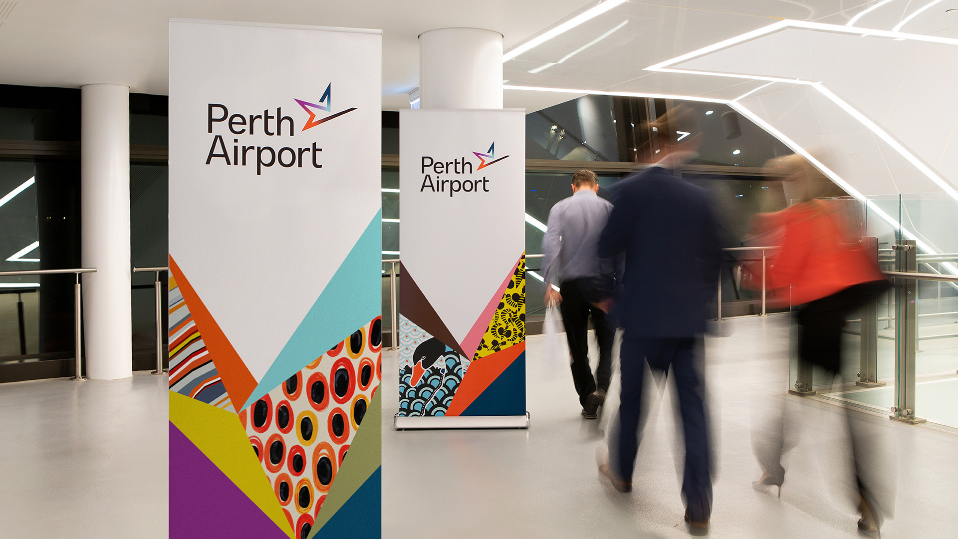
The logo becomes a secondary element with the introduction of a colorful, dynamic “compass” that is fragmented with color blocks and illustrations that reflect the many facets of Perth. It’s a solid concept and a fun graphic that adds a lot of life to the identity. The angles of the compass could be traced as a relation to the angles of the icon in the logo, which is the only thing that makes the two elements work together. When combined is when I think the icon would be much better in a single color as the gradients in the tiny logo can’t compete with the color onslaught of the compass. But back to the compass… one nice thing about it is that 2 or 3 years down the line it can be refilled with new illustrations and color combinations, possibly extending its shelf life.
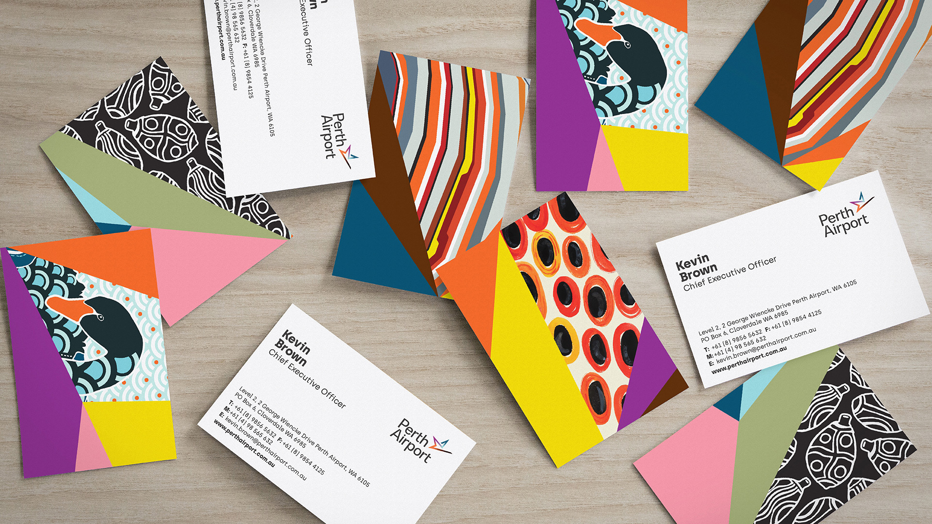
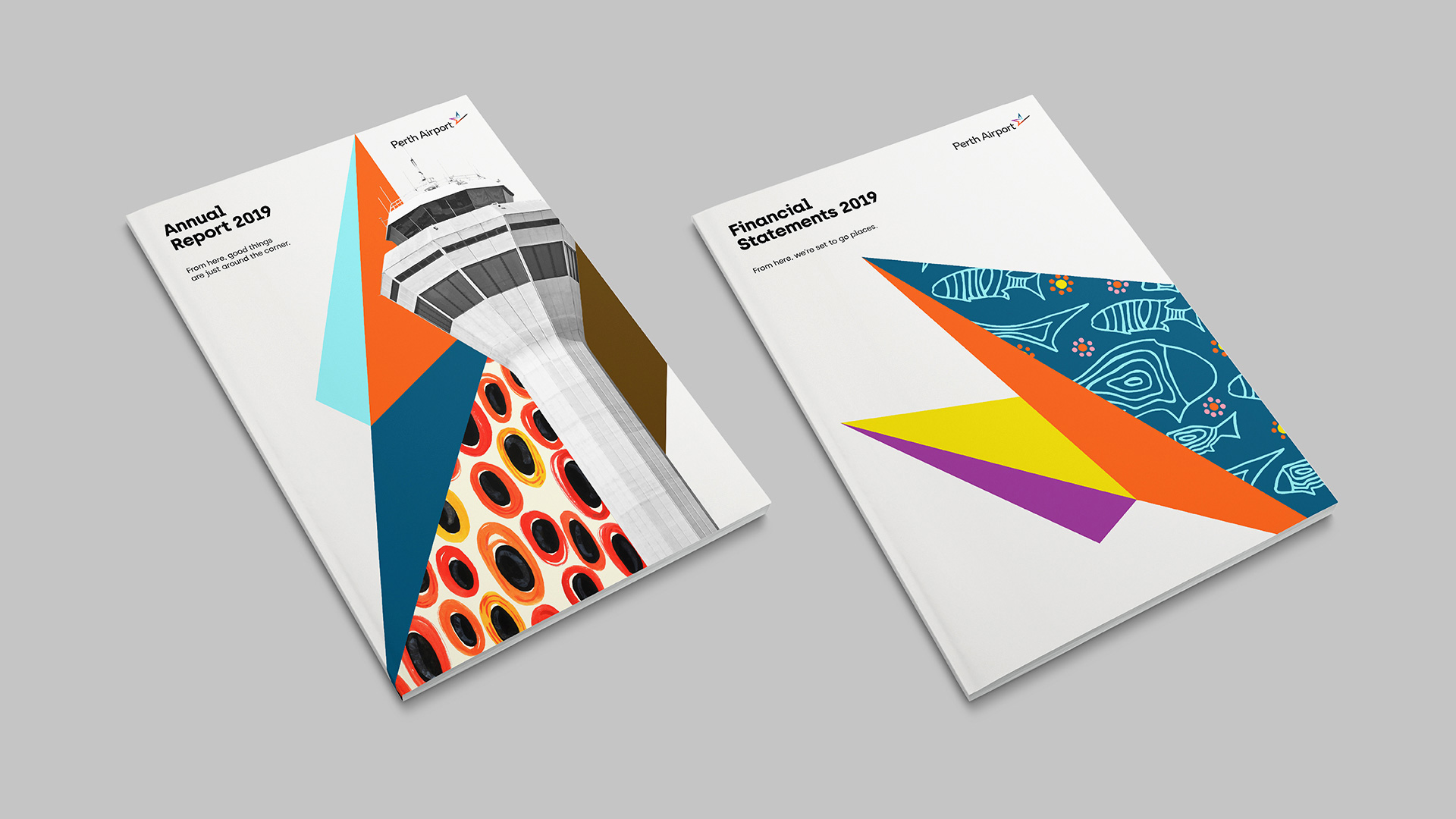
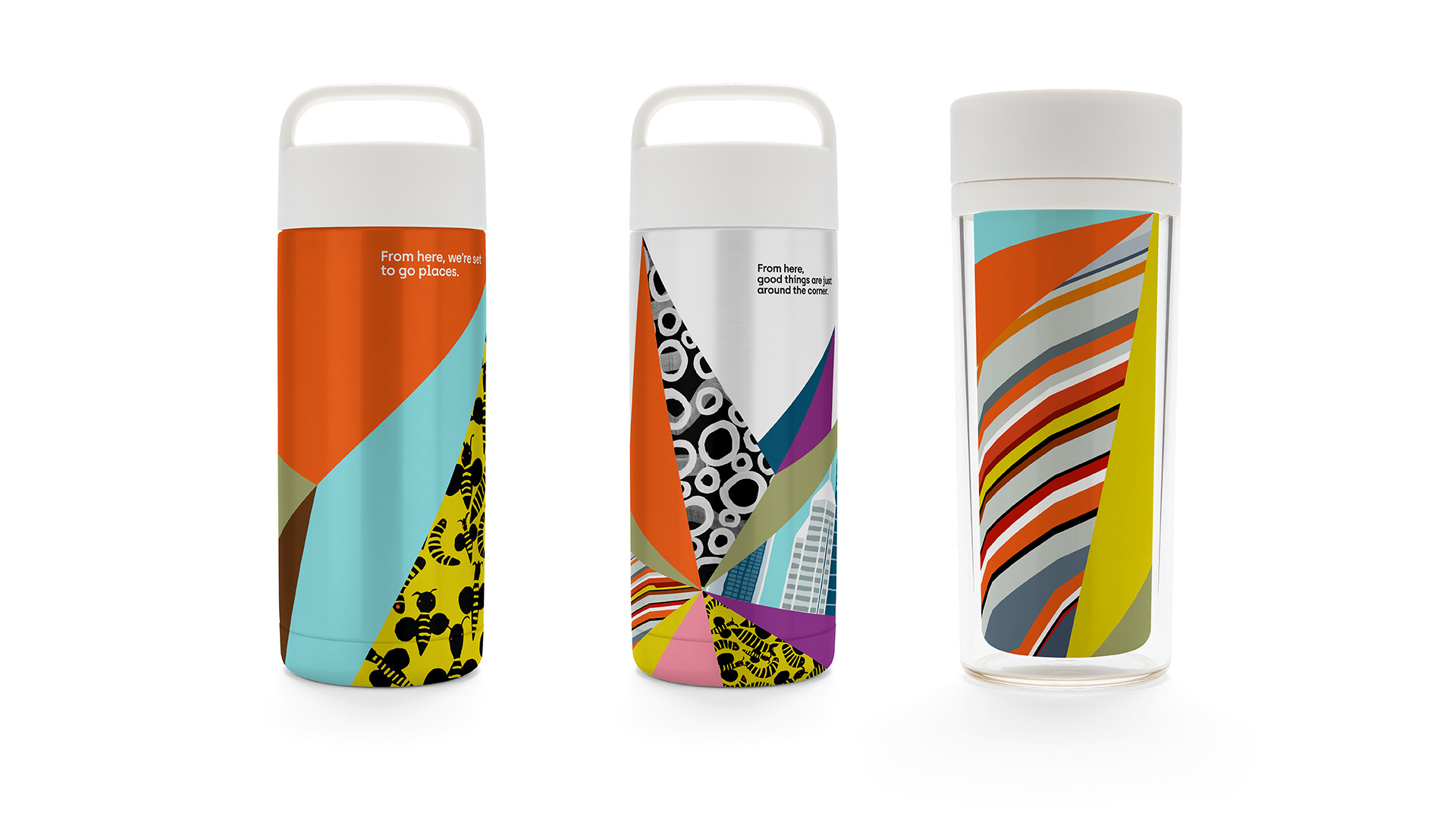
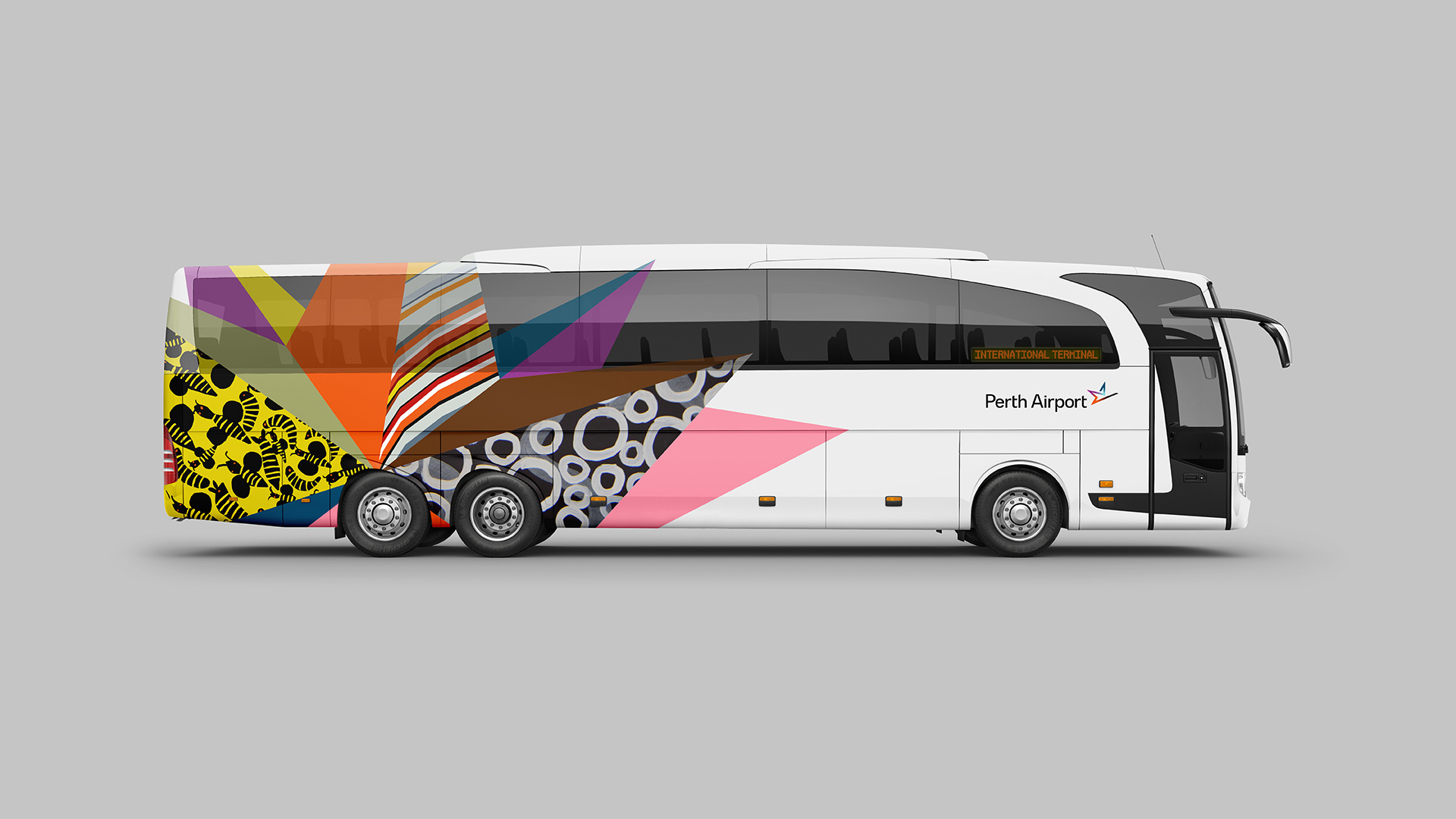
The applications are good, with either crops or individual fragments of the compass used big on stark white backgrounds that create richly contrasting layouts — perhaps, at times, too contrasting. I’m not sure about the bold font choice, Archia by atipo, as it clashes with the font in the wordmark and has strong features like the flat “g” that demand more attention than needed. But, to most of the 14 million passengers, I doubt flat-bottomed “g”s will be a problem.
Overall, I really like the concept behind the identity and how it manifested in the compass but the best aspect of this is the attention and thought given to an airport identity, which usually play second fiddle to the airlines and their branding. Something like this makes airport experiences just a tiny bit more bearable.

 Новости Союза дизайнеров
Все о дизайне в Санкт-Петербурге.
Новости Союза дизайнеров
Все о дизайне в Санкт-Петербурге.