Обзор лучших ресурсов по разработке бренда, разработке упаковки
contact us | ok@ohmycode.ru
contact us | ok@ohmycode.ru
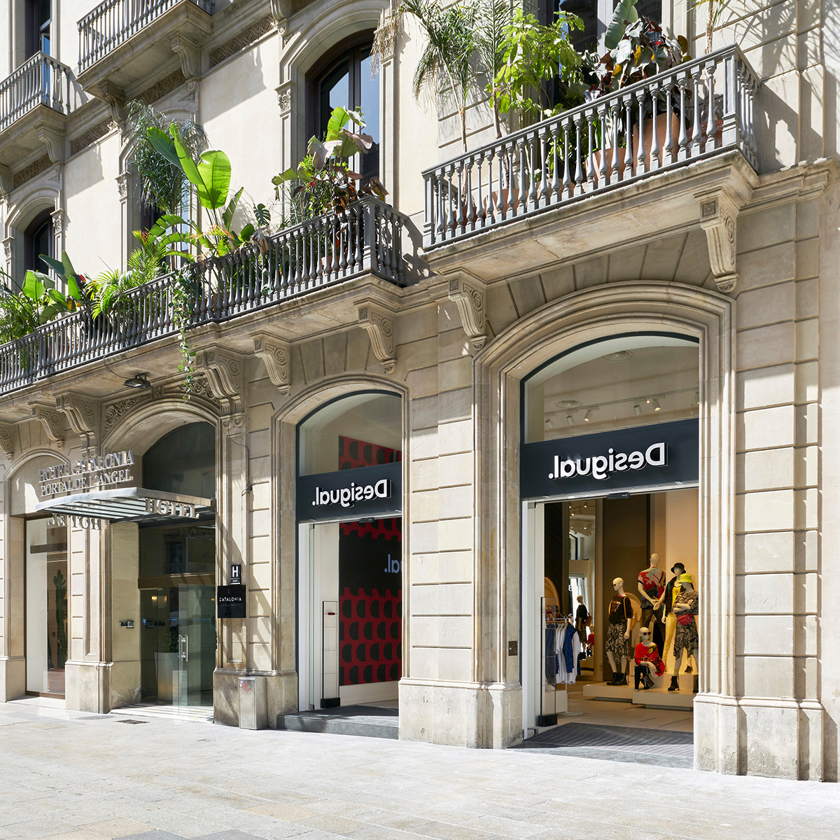
Established in 1984 in Barcelona, Spain, Desigual is an international fashion brand for a youthful audience. Known for its patchwork and bold graphics, the brand designs, sells, and distributes across eight product categories (women, men, shoes, accessories, sports, living, kids, and beauty) online and in over 100 countries with more than 500 stores (some of them within department stores or other authorized retailers). Headquartered in Ibiza, it employs 4,500+ people — 800+ alone in their corporate office. Last month, Desigual introduced a new identity designed in-house.
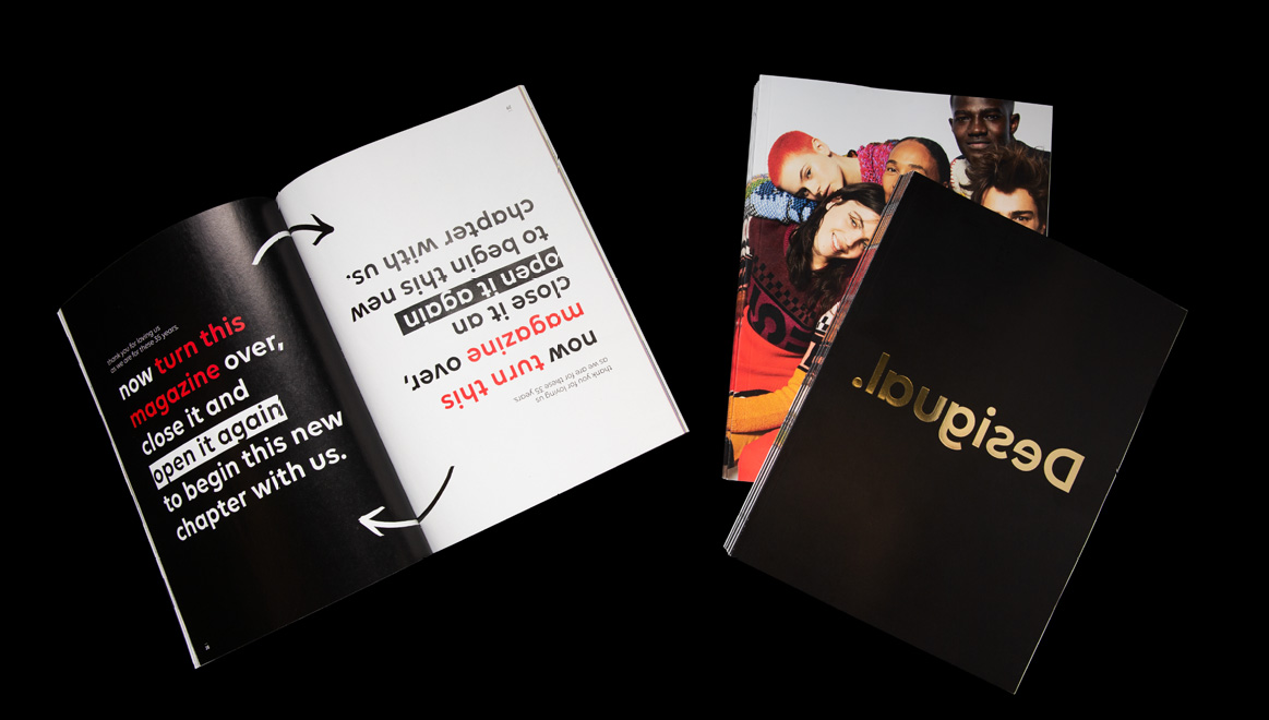
Following the Transformation Plan that we began in 2015, today, the 13th of June 2019, in an unprecedented exercise of logic, we turned our logo around to pay tribute to who we are and to truly honour our name.
So, in addition to becoming the first brand in the world to permanently reverse its logo, we are also making our intentions very clear: being more ourselves than ever. A tribute to the rebellious, disruptive and fresh spirit that inspired filmmaker Isabel Coixet to give us the name Desigual in 1984 because we were “not doing the same” thing as everyone else. An (inverted) move that brings us closer, once again, to fulfilling our dream: living in a world where everyone can be themselves by using their innate creativity as a tool.

The old logo, with a flipped “s” had a more subtle approach to portraying the name — which would loosely translate to English in a sort of portmanteaux as “unsame” (not being the same) — and it did so in tightly letterspaced Helvetica because Europe and fashion. The new logo flips the whole word and adds a period at the end (or is it the beginning?) to emphasize the “rebellious” move. I don’t think this is as monumental as Desigual thinks it is. I mean, yes, it’s different but it’s so readable and easy to interpret that there is almost no element of surprise. What was good about the old logo was that one of eight letters was wrong and it created a quick short circuit that you had to do a double-take to realize it was the flipped “s” that caused it, whereas this new one just gives it all away from the get-go. I do think there is something valiant and look-at-me-!-ish about it but it’s not an industry-shifting change. Typographically it’s not that interesting either… like, it doesn’t look good or cool or radical, it’s just type flipped. The monogram doesn’t get much better as it’s just a flipped “D” inside a very tight stroke.
The campaign, designed by Desigual’s Creative Studio in collaboration with Dutch agency We are Pi, starts today, the 13th of June. It begins with street marketing in major European cities, where people will find signs that seem impossible to read at first but conceal a hidden message.
“It’s a nod to the selfie generation. Curious people who want to view life in a different way and love to try new things.”
For the brand, this also means heading into unchartered territory:
“It’s the first time in 35 years that we’ve run an outdoor campaign that doesn’t feature the product.”
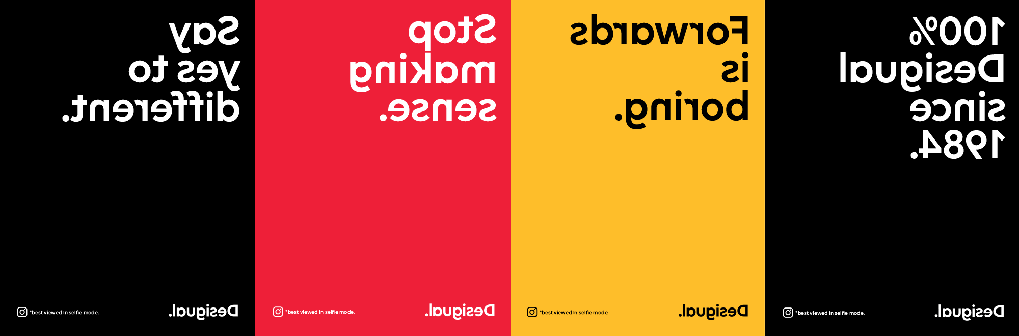
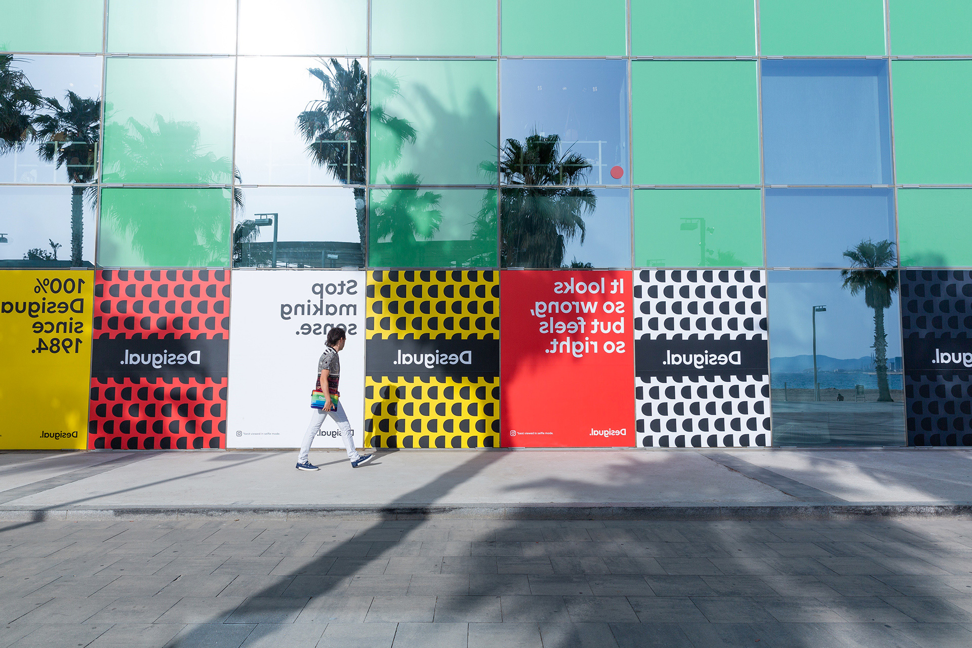
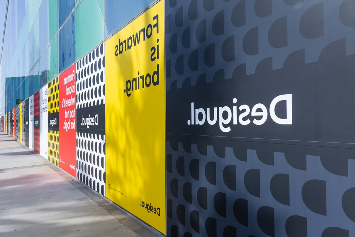
The campaign could have been interesting and it almost is but the messages are kind of weak… meaning, there is no call to action, no emotive manifesto, no aspirational goals, it’s random sentences about things being slightly wrong. The execution also makes this look like a brand of fancy notebooks. I think it’s the black bands going across the patterns or the primary colors but I definitely do not think “fashion” when I see those.
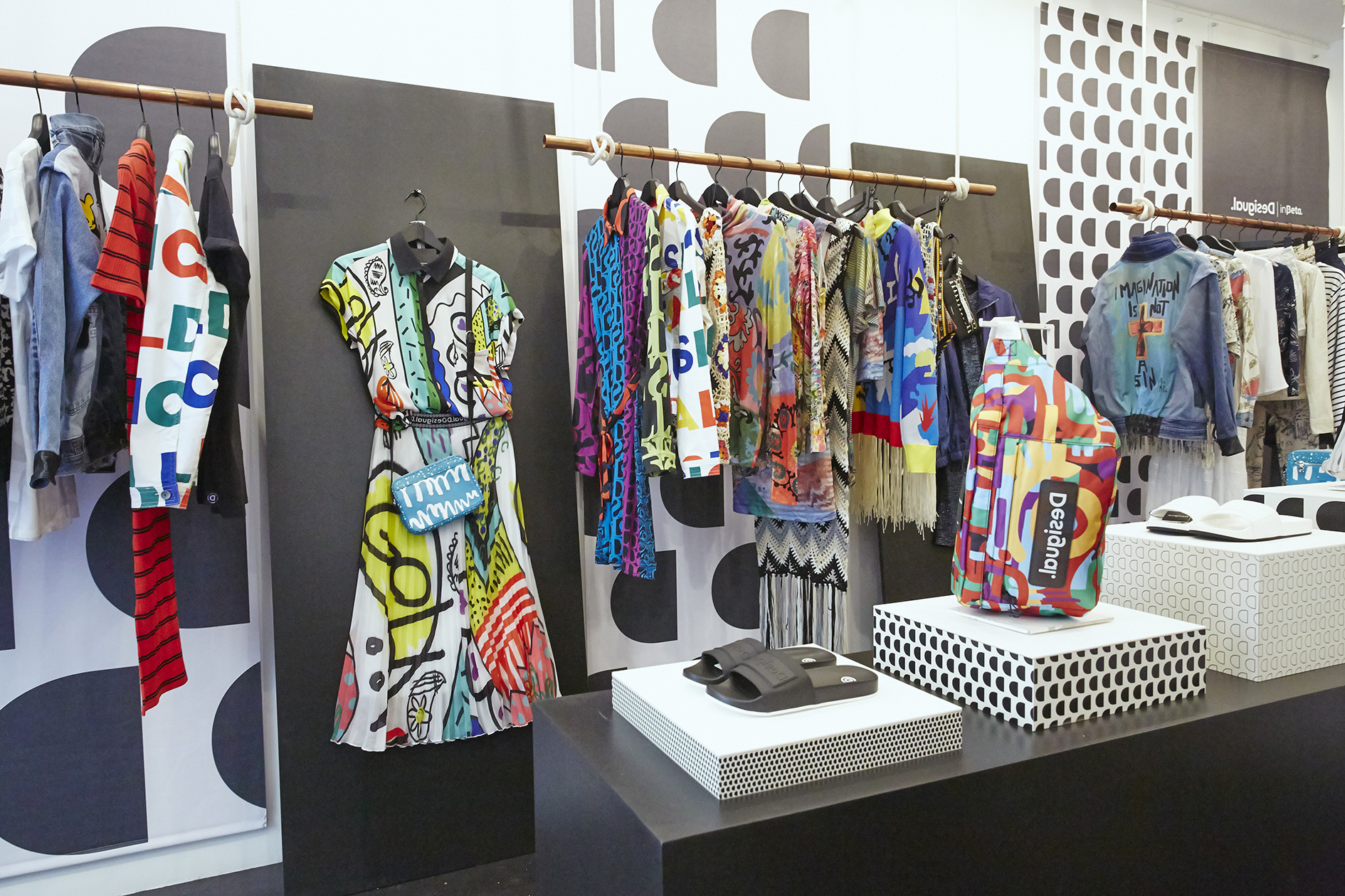
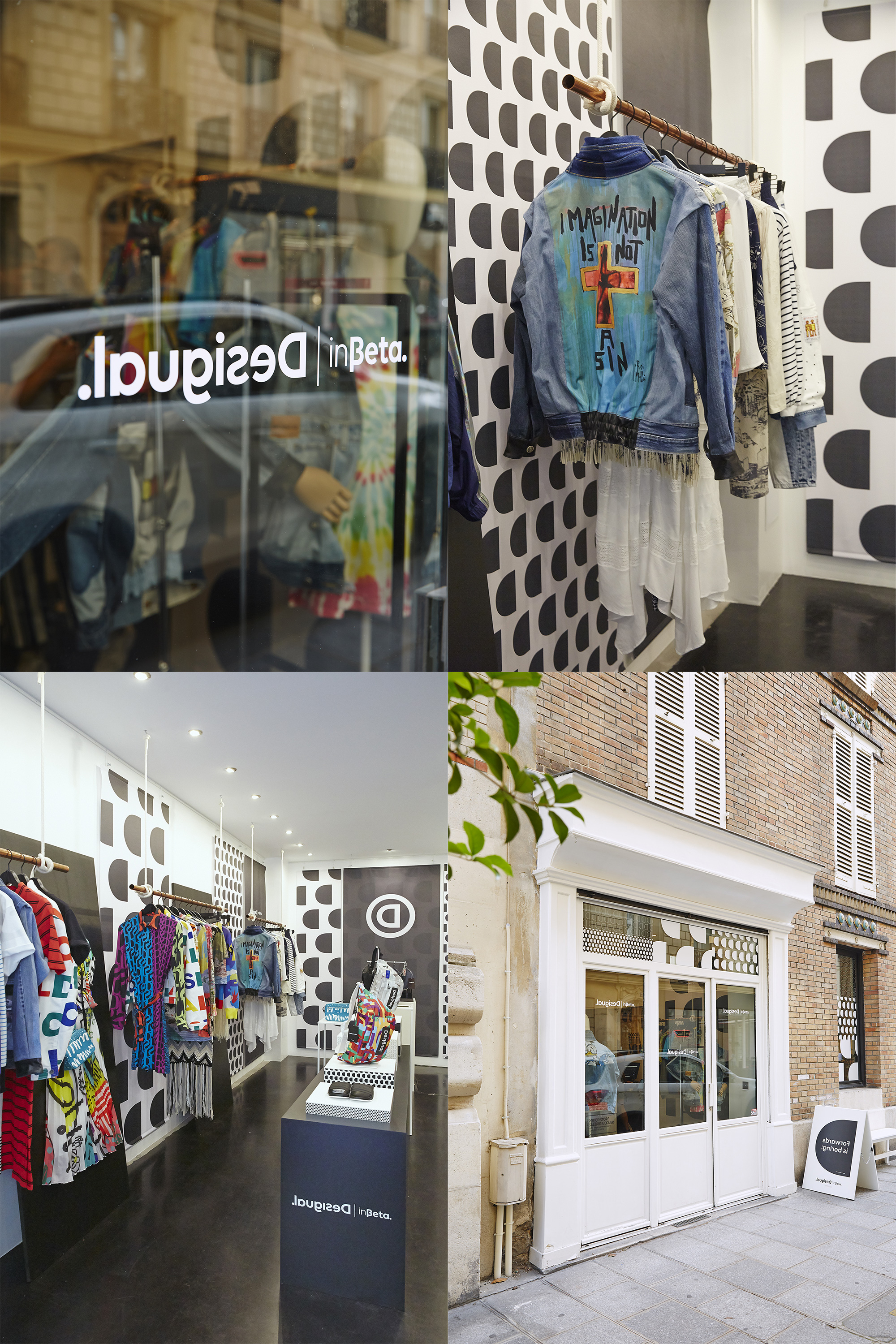
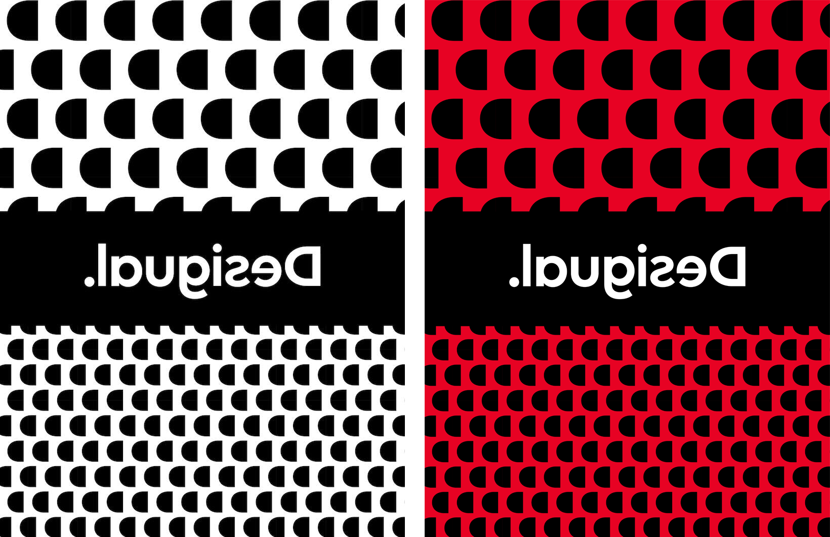
The “inBeta” store starts to get at something more interesting, bold, and exciting, with the mixing of different sized patterns in black and white as a backdrop to the colorful products.
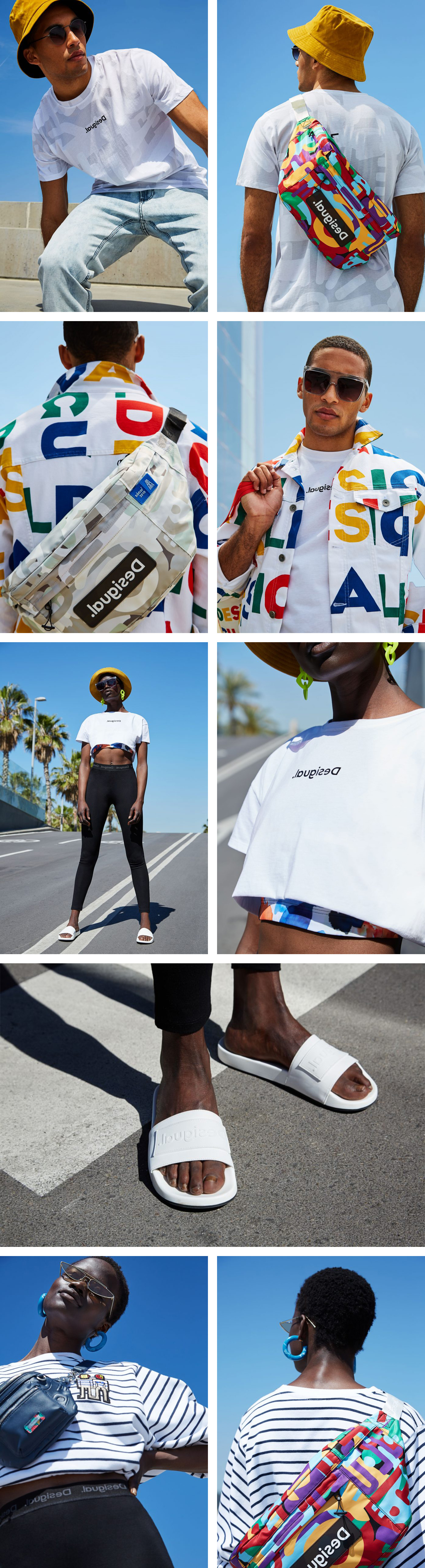
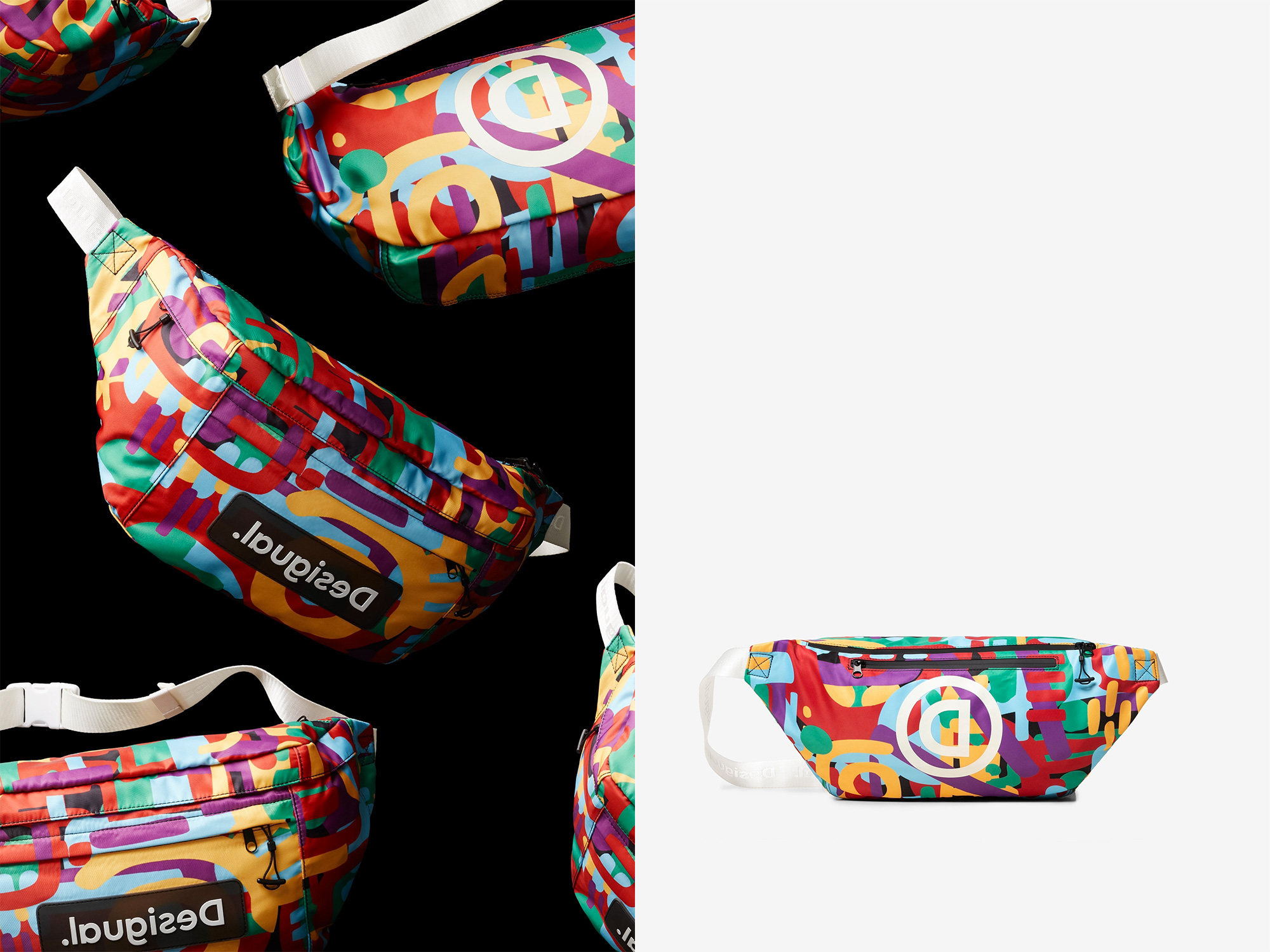
This set of images also begins to move the brand into something more rebellious but I think it has to do more with anything that’s not the logo — especially that giant fanny pack.
I don’t know… maybe I’m being too hard on this and letting my lack of enthusiasm of a flipped logo dampen their effort to stand out in the marketplace through a gesture that, indeed, not many other fashion houses would be willing to do.
Thanks to Alessandro Bertoni for the tip.

 Новости Союза дизайнеров
Все о дизайне в Санкт-Петербурге.
Новости Союза дизайнеров
Все о дизайне в Санкт-Петербурге.