Обзор лучших ресурсов по разработке бренда, разработке упаковки
contact us | ok@ohmycode.ru
contact us | ok@ohmycode.ru
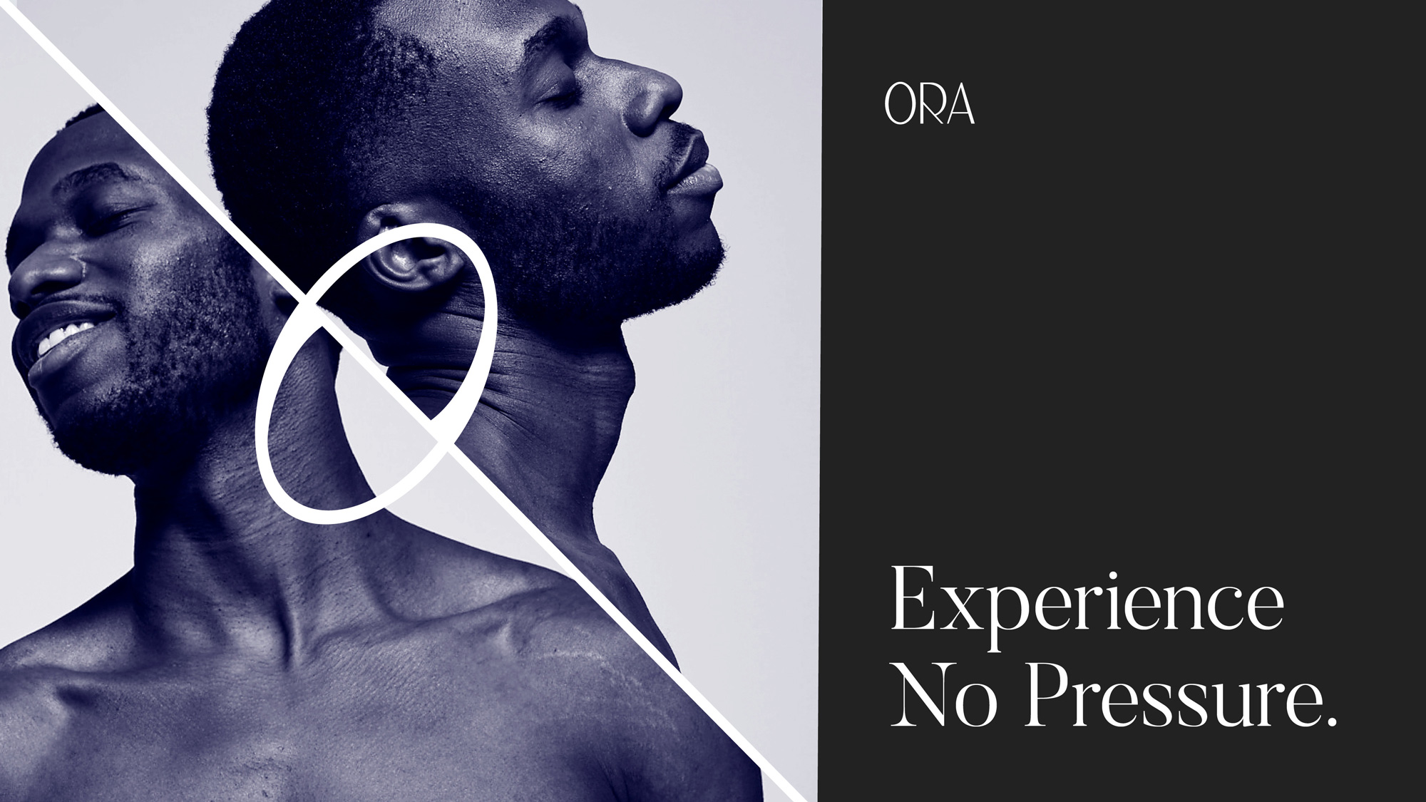
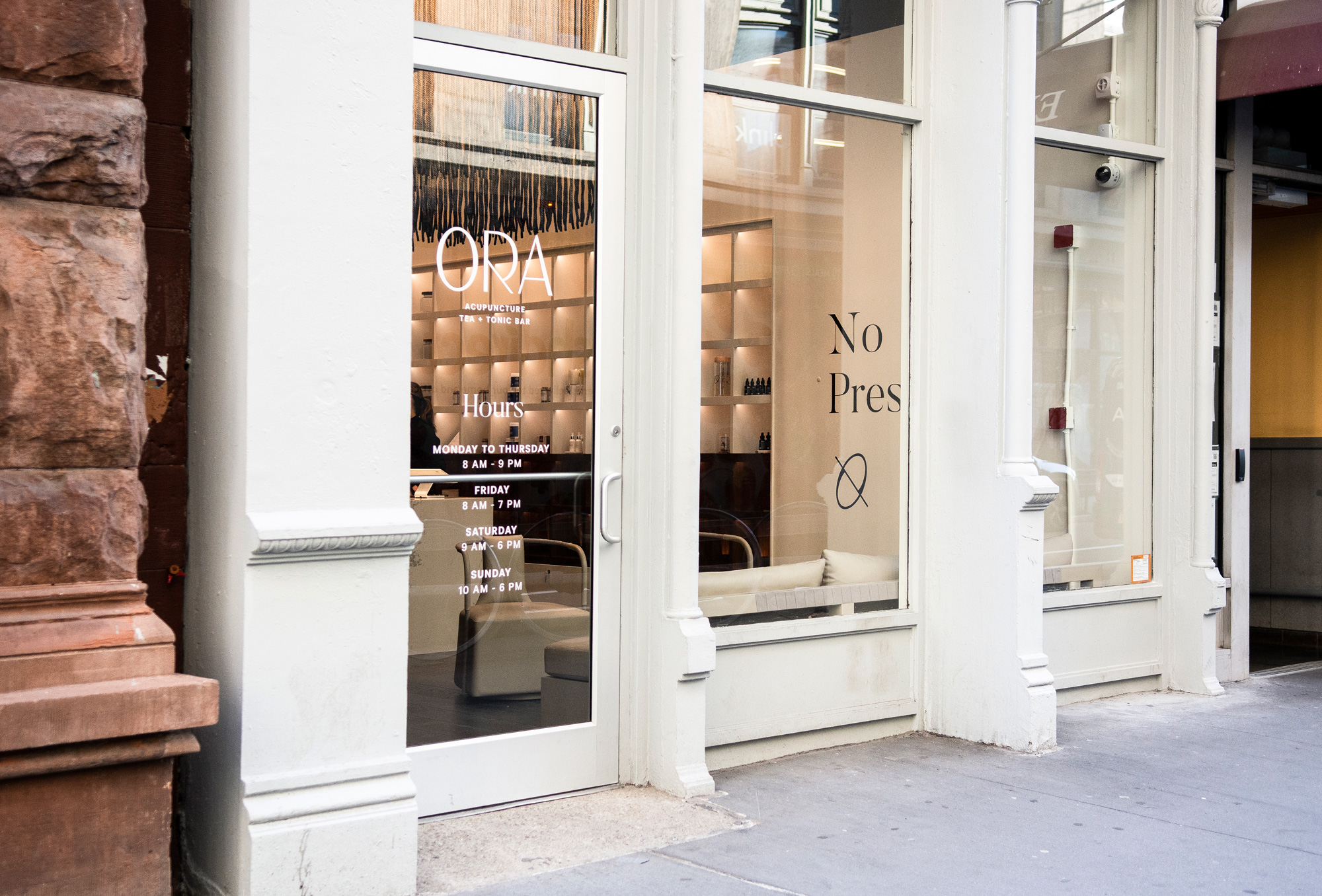
Opened in early 2020, ORA is an acupuncture and wellness space in New York, NY, that brings “the traditional techniques of ancient Chinese medicine into a convenient and modern experience”. The idea for ORA, positioned as a high-end luxury service and experience, was conceived by Kimberly Ross — who, before this, had established, as a teen, an online network of baby sitters with Type 1 diabetes (she was diagnosed at age 11) to work with kids with Type 1 diabetes and was later acquired by Beyond Type 1 — during her time at Harvard Business School to earn an MBA in combination with experiencing first-hand positive benefits from acupuncture. With a retail location designed by Rockwell Group, ORA introduced a new identity designed by New York-based The Working Assembly.
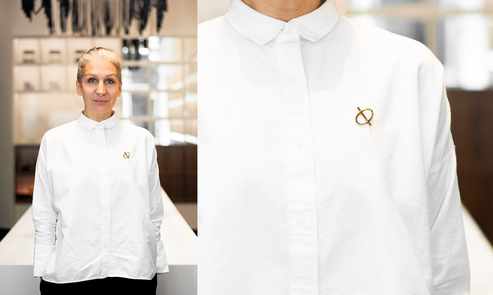
The icon contains an abstract of the Yin and Yang, representing the idea of two wholes coming together. [In application] one half of the imagery represents enjoyment, while the other is zen and calm — Two qualities that treatments of acupuncture hope to achieve.
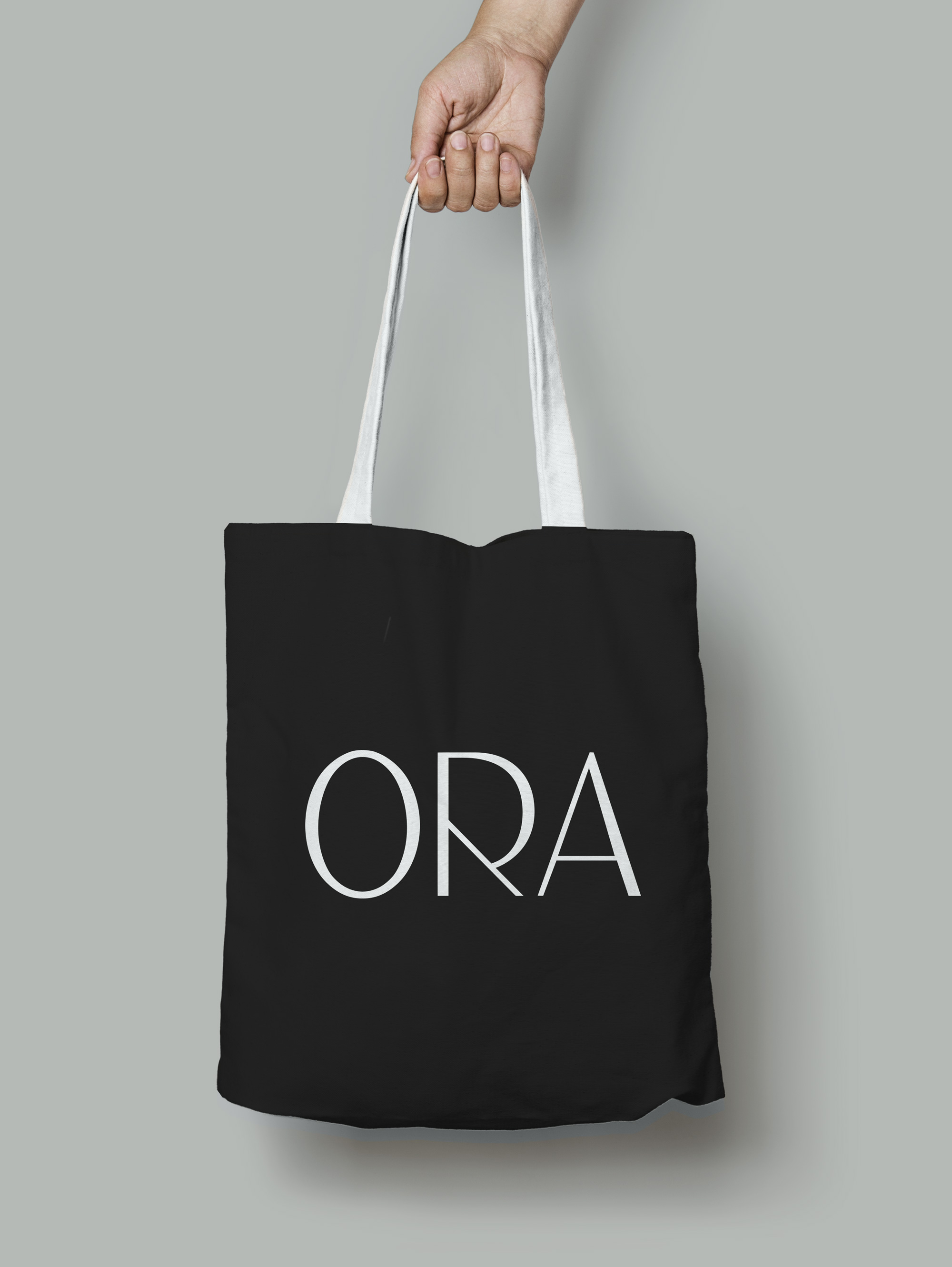
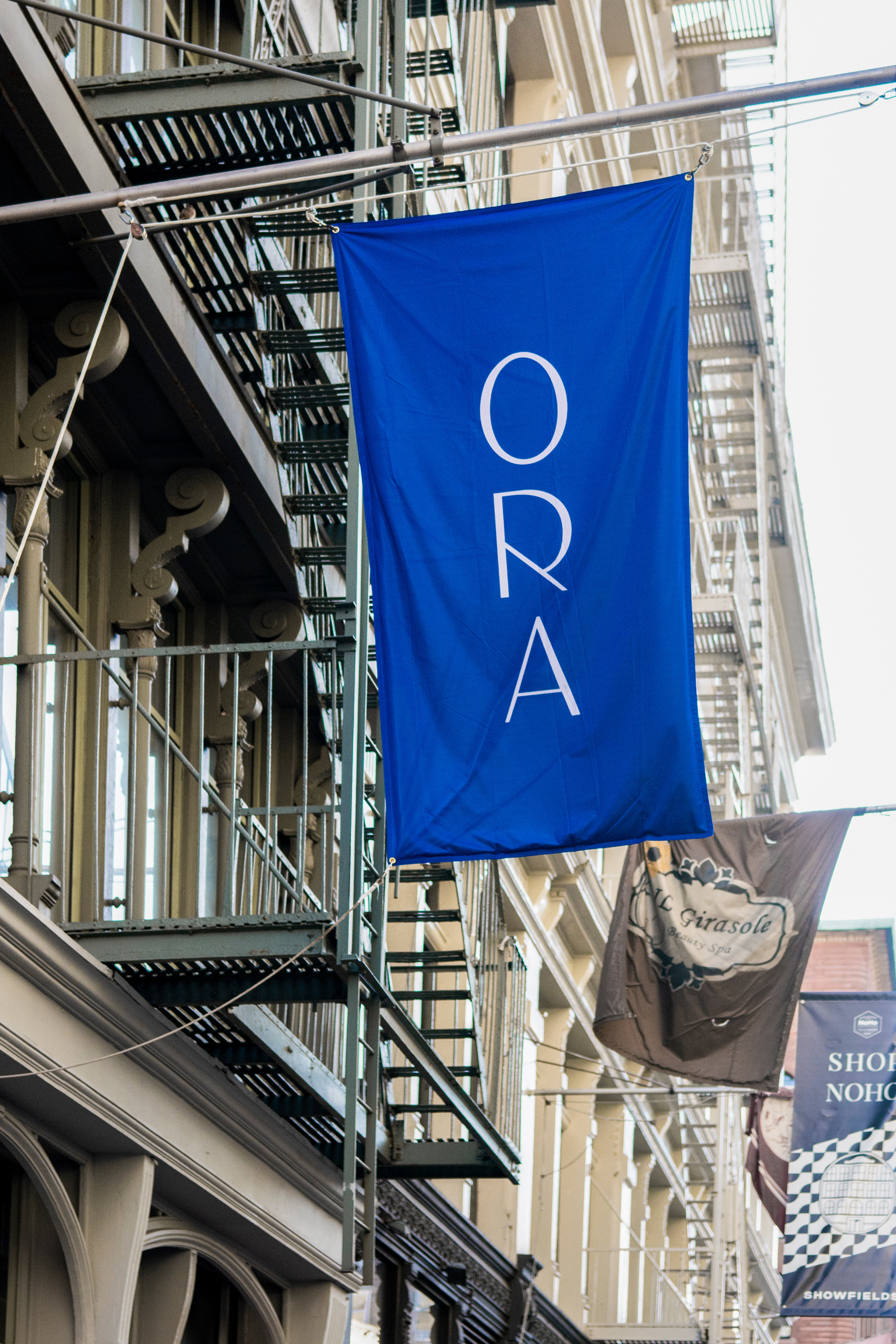
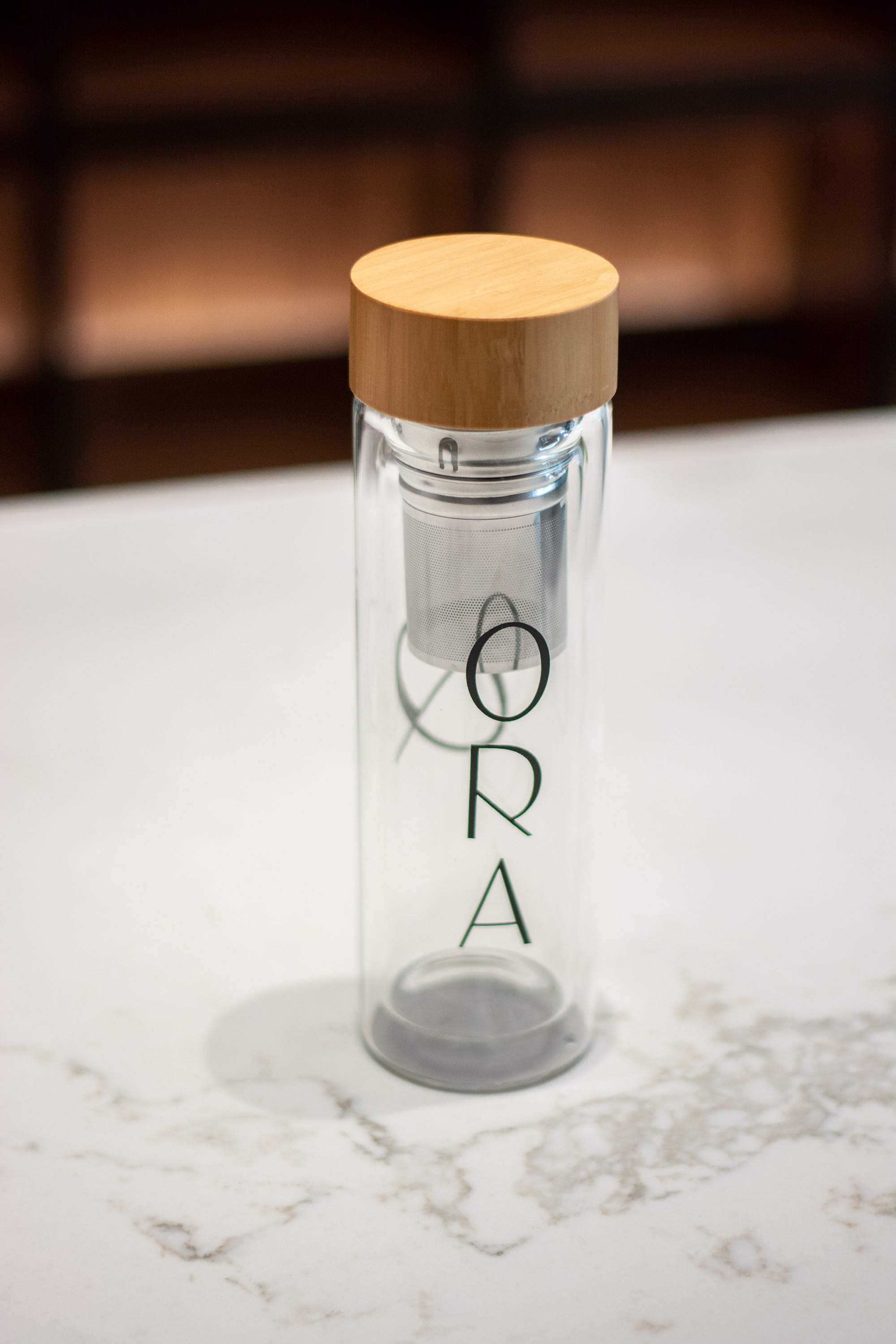
The identity employs a combination of an icon and a wordmark used separately (as opposed to bringing the two into a lock-up) and both elements are quite nice. The icon above has a nice italic slant and while I don’t quite see an abstract Yin Yang I do get a nice sentiment of balance and almost like a re-channeling of energy with the 45-degree line acting as the redirecting mechanism, like an acupuncture needle. The wordmark repeats the same angle in the “R” and, with the two companion letters, is executed in a high-contrast sans serif style that yields an elegant and unique combination.
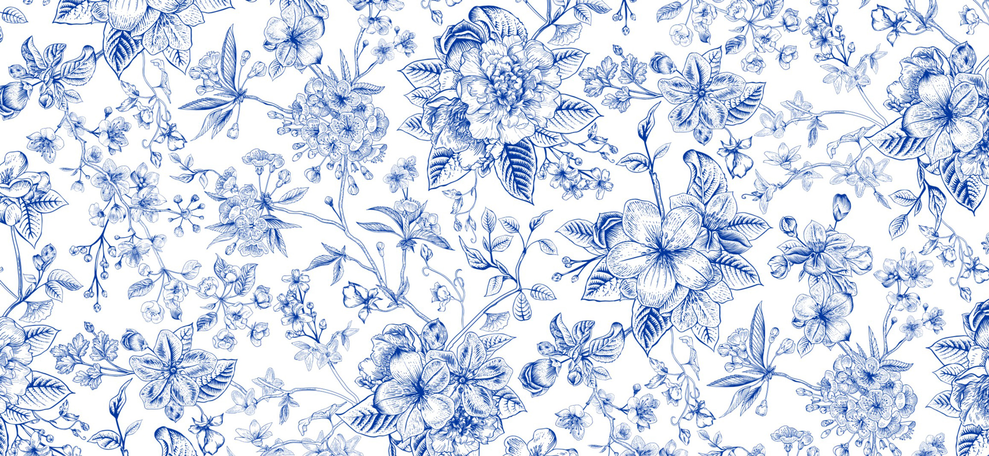
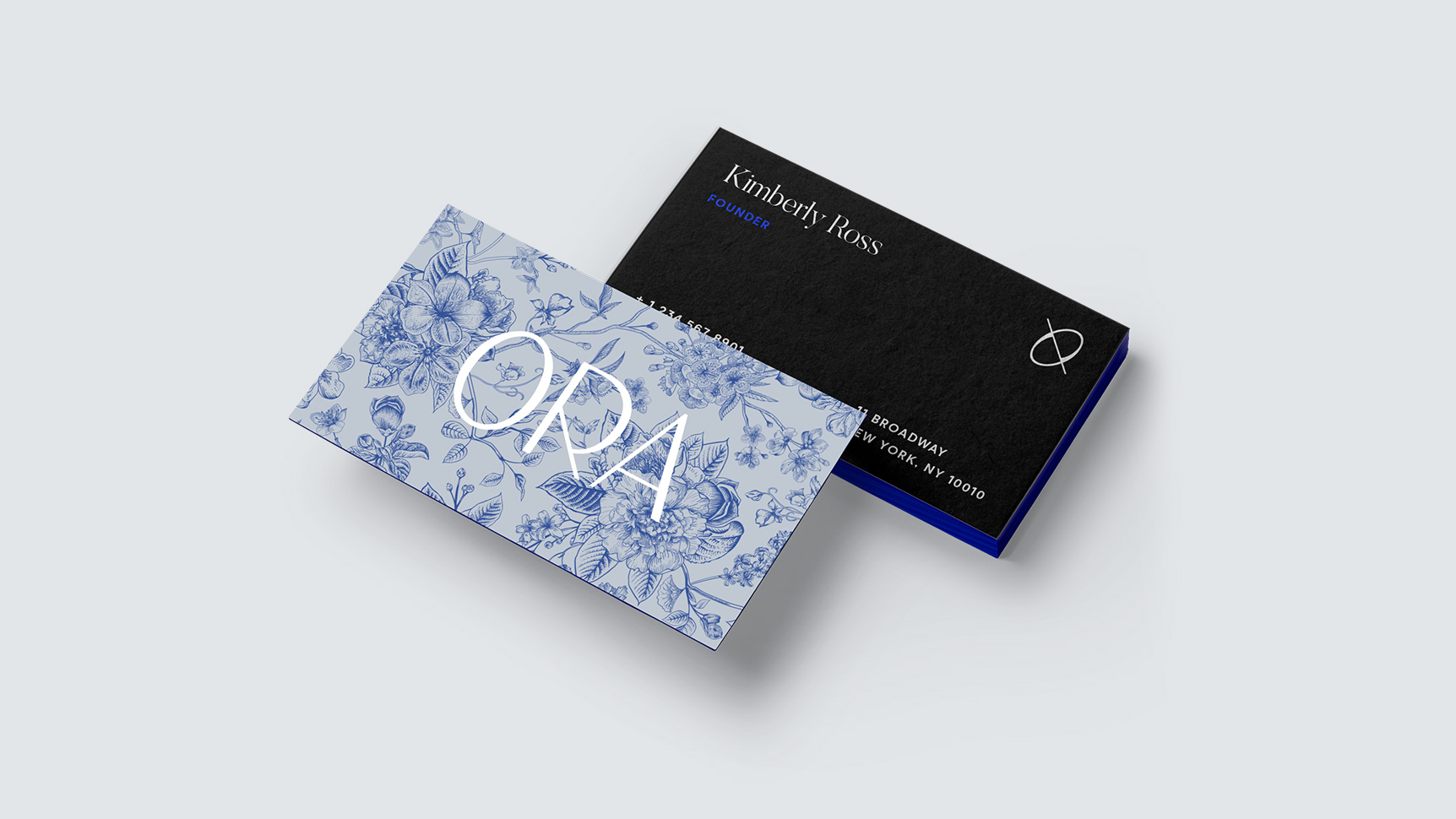
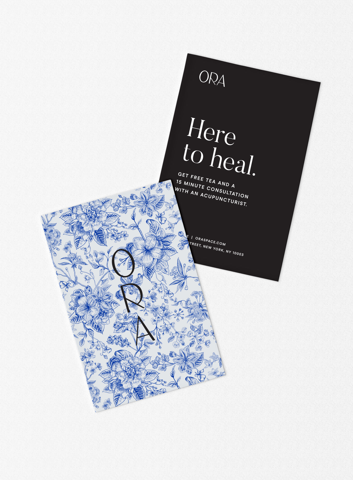
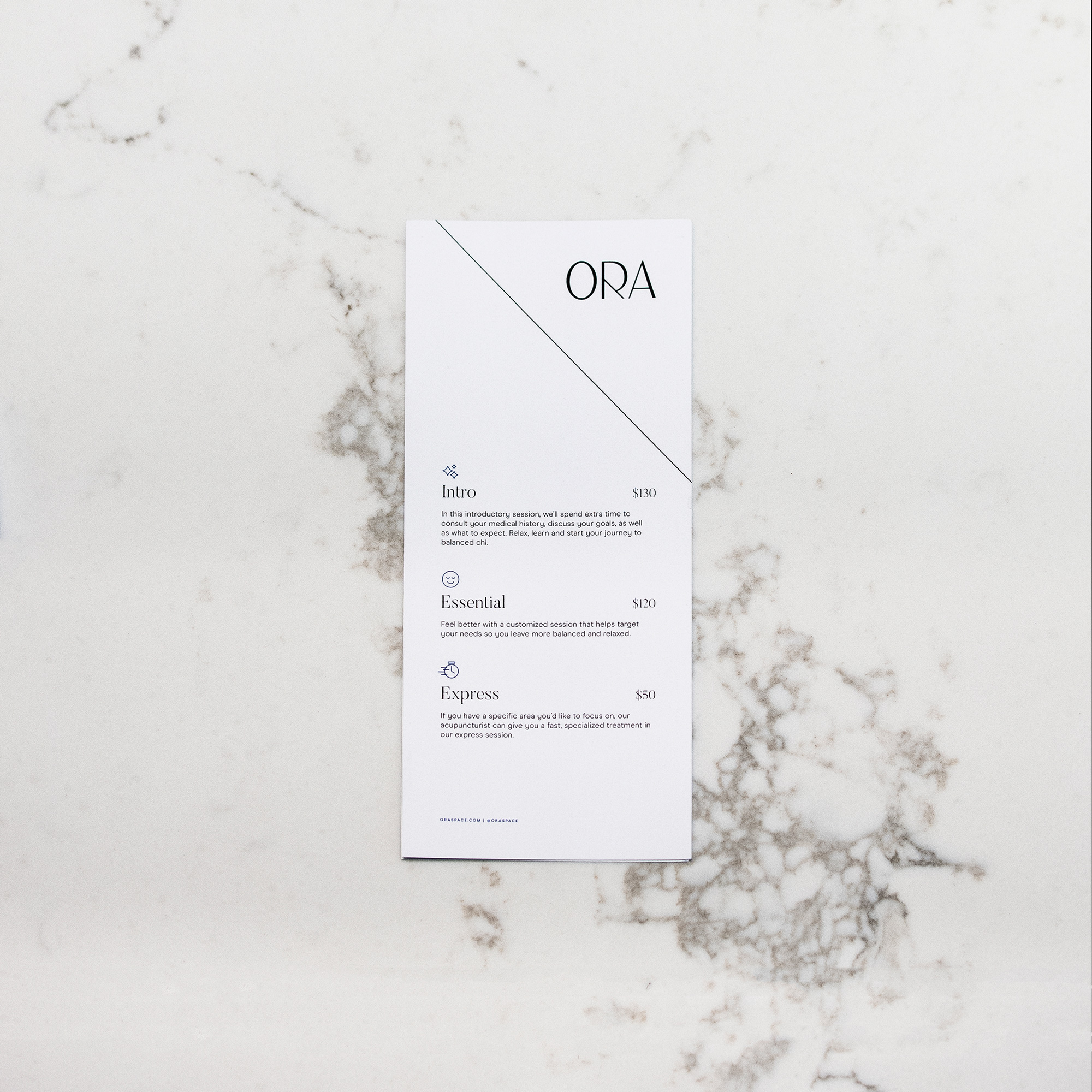
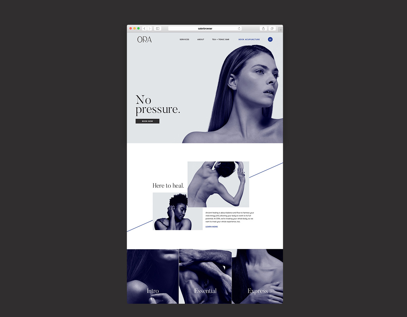
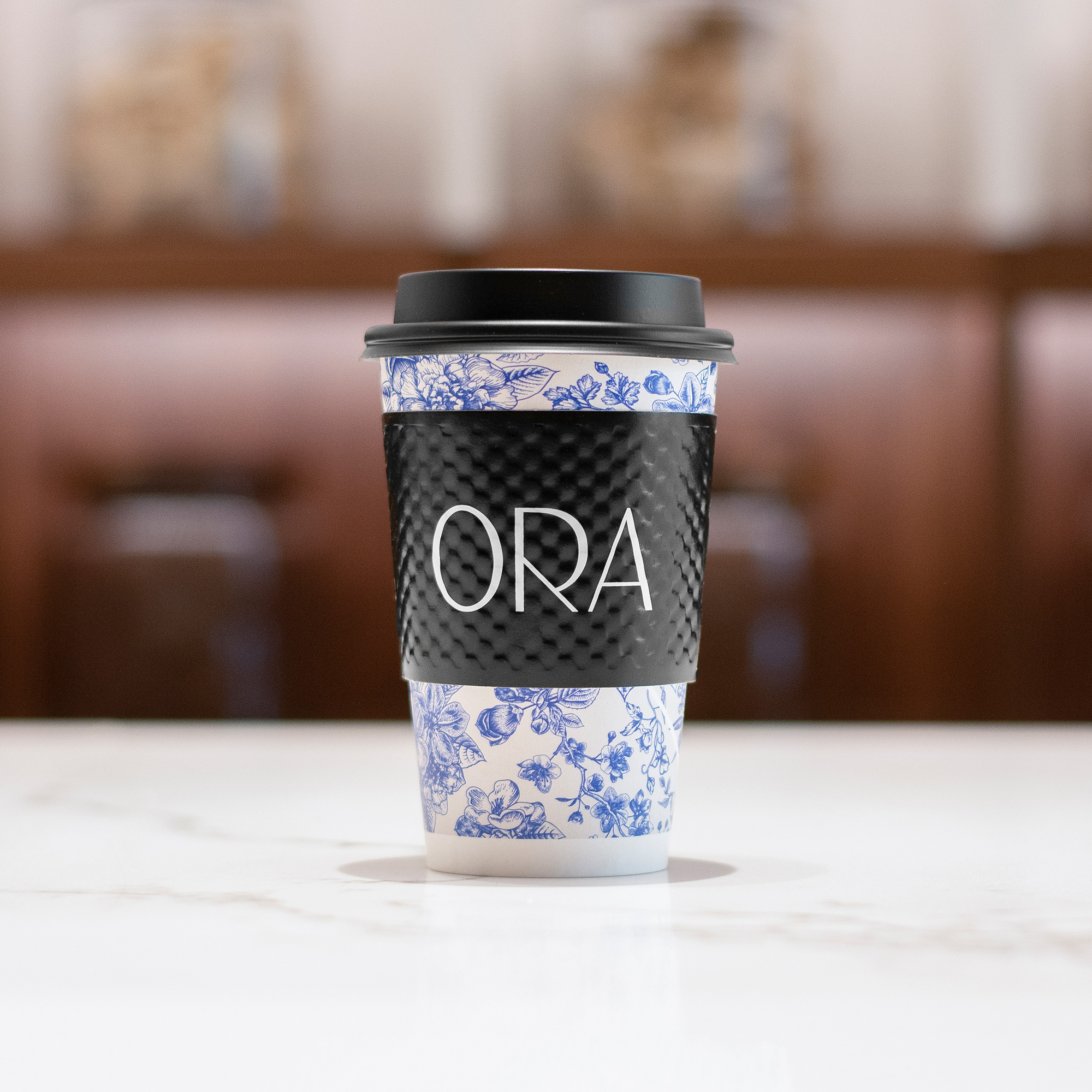
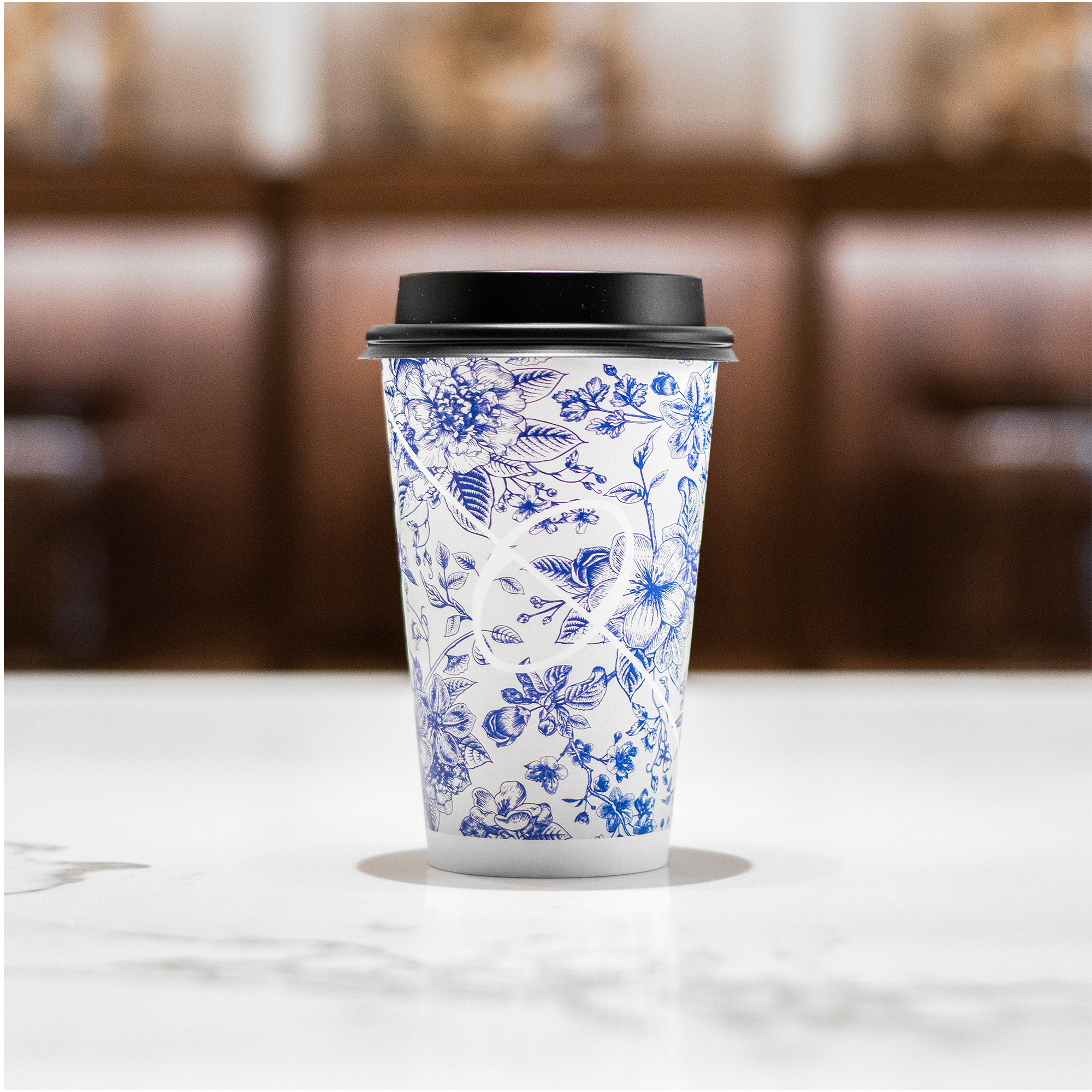
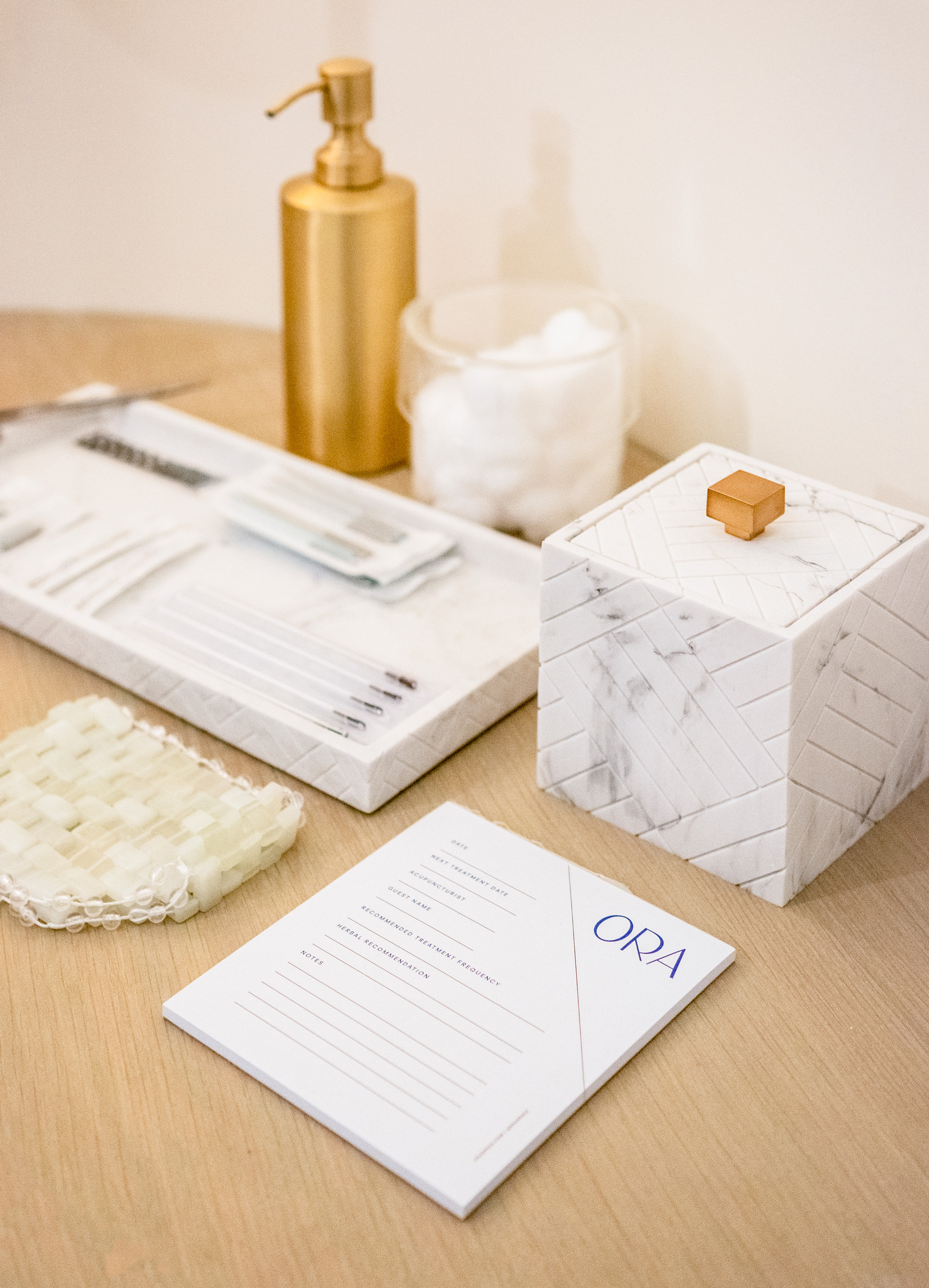
The applications introduce a floral pattern in a blue monotone approach reminiscent of blue and white porcelain that alludes to the Chinese techniques used in the practice as well as the high-end, luxury vibe. With black, white, and blue as the color palette and a classic combination of a display serif, Butler, and a sans serif, Modern Era, the applications are fairly straightforward but very effective in establishing a sense of luxury.
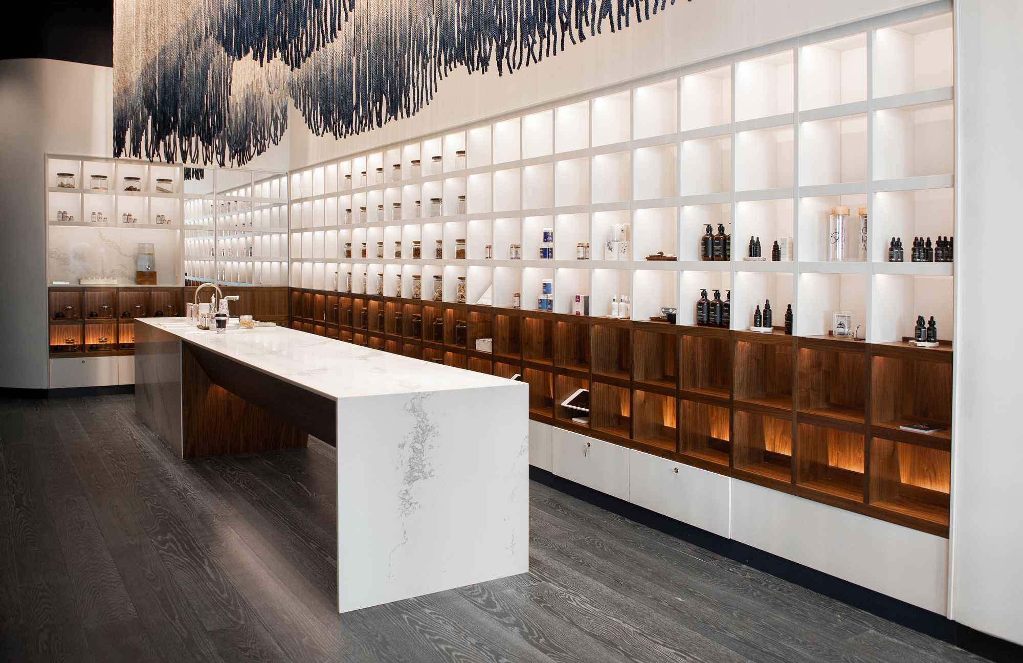
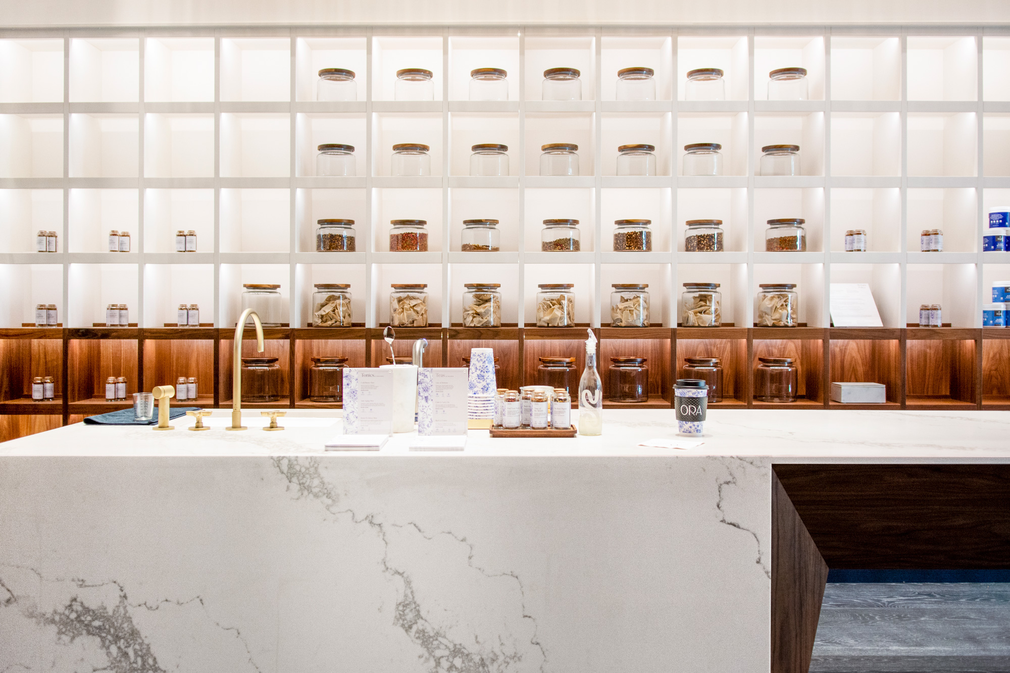
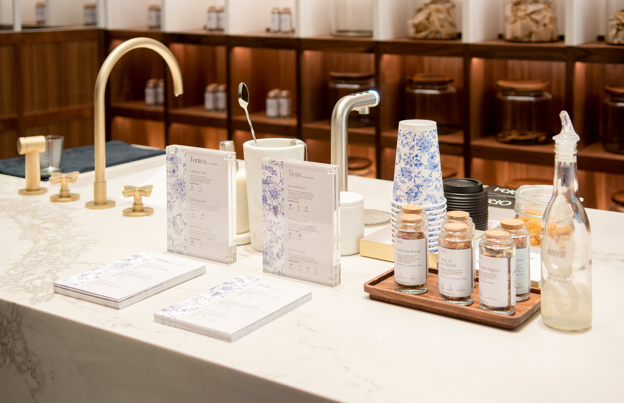
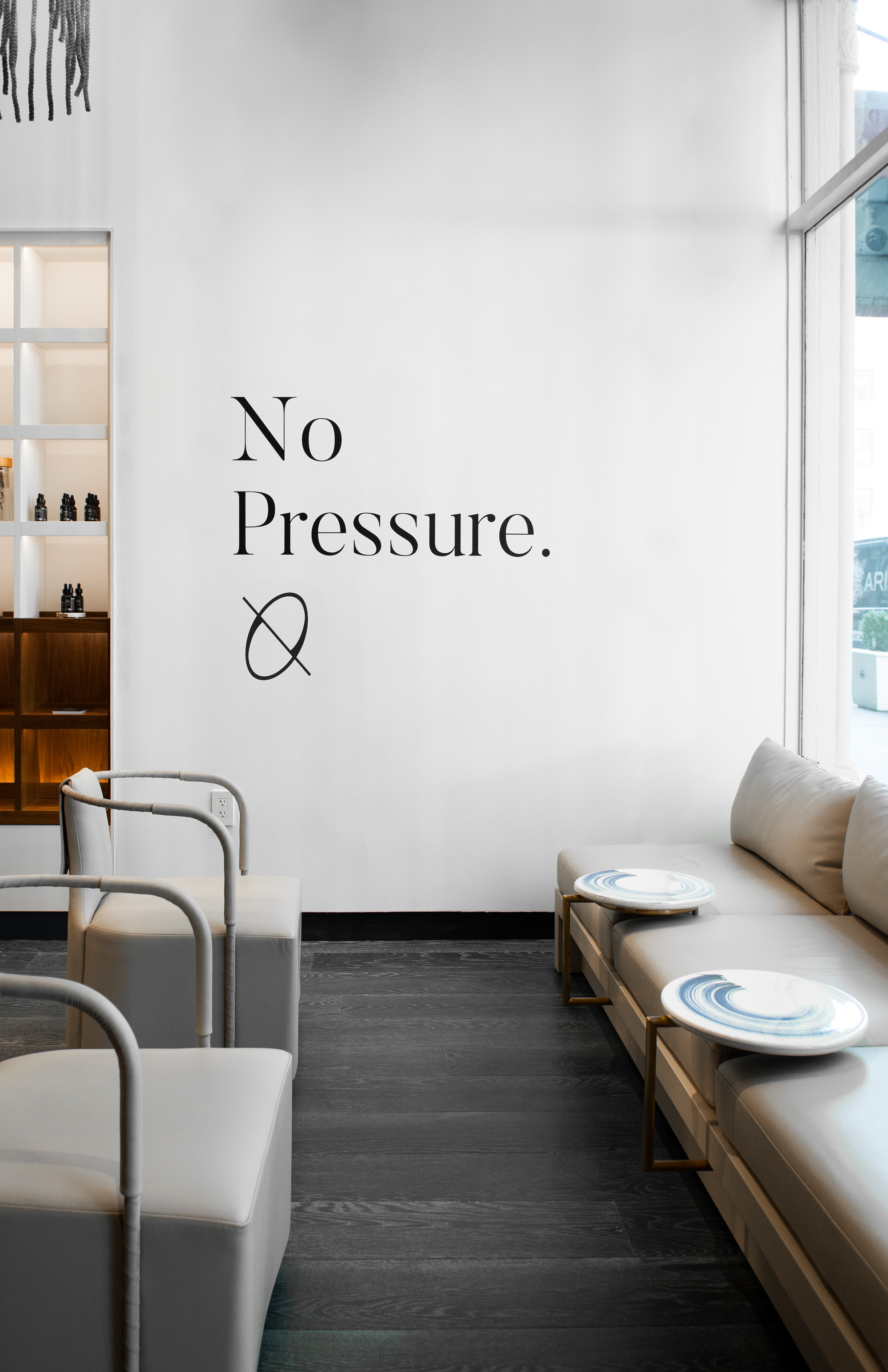
Things literally come together in the impressive marble counter where the applications and the additional tea and tincture products all live in harmony, with the blue floral patterns providing a great burst of color and texture to contrast all the whites and browns of the environment. Overall, the identity fits the service and physical space perfectly and although we can’t all afford a $120 acupuncture sesh at the moment, we can channel some of that zen into our day today.
 each year since publication began in 2006

 Новости Союза дизайнеров
Все о дизайне в Санкт-Петербурге.
Новости Союза дизайнеров
Все о дизайне в Санкт-Петербурге.