Обзор лучших ресурсов по разработке бренда, разработке упаковки
contact us | ok@ohmycode.ru
contact us | ok@ohmycode.ru
Established in 1981 as a franchise from the then-American company, The Athlete’s Foot is the largest retailer of athletic footwear in Australia with 138 stores and an online store. In 2009, the company purchased a 249-year-long brand license so that it could pretty much do whatever it wanted without ties to the original licensor (now Bern, Switzerland-based Intersport International Corporation that franchises the brand in 27 countries with over 483 stores). Over the years, though, it seems the brand had become stale despite its knowledgeable staff that attracted “practical parents and people with problem feet” instead of the cool athletic, fitness-minded type. Late last year, The Athlete’s Foot introduced a new identity and retail presence designed by Sydney, Australia-based Re.
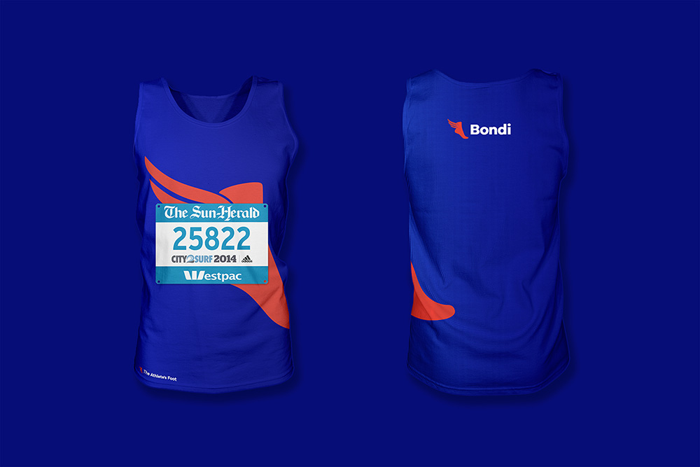
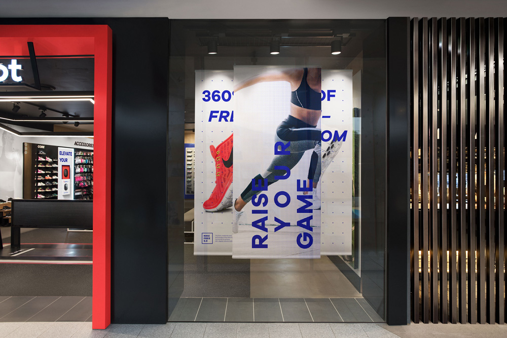
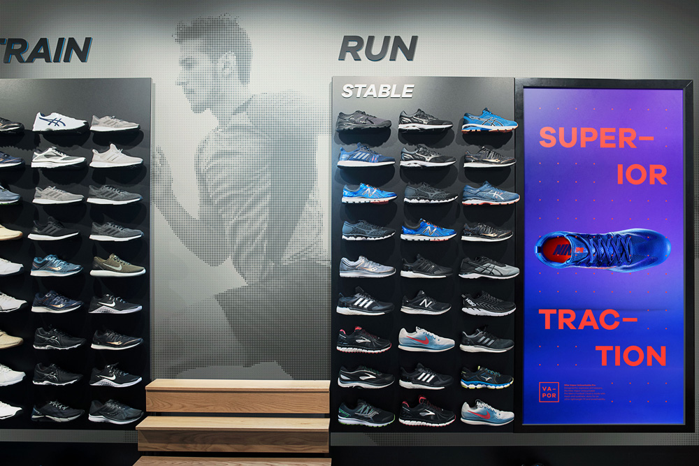
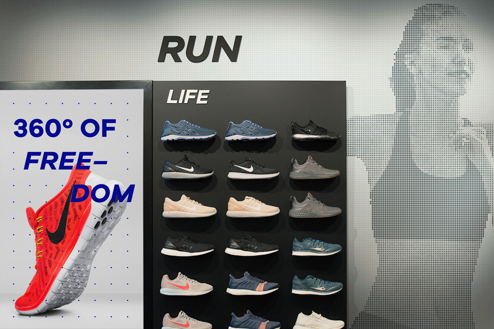
When it comes to performance, the smallest thing can make the biggest difference. So instead of shying away from the technical details, we put them front and centre.
Precision and data became our visual and verbal language. The brand system was underpinned by two grids that could scan, annotate and highlight information, allowing us to showcase The Athlete’s Foot’s in-depth knowledge of product and fit.
The end result wasn’t an athleisure brand. It was a brand for the everyday athlete who believes every breath, every flex, every last second counts.
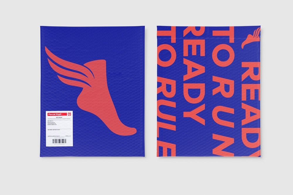
The old logo, which I believe was a version we saw in the U.S. at some point too, was mostly fine with the main awkward thing being how they handled the “The”, scaled smaller and tucked on the other side of the foot. The new logo is mostly fine too with a cleaner evolution of the same elements. The foot icon has its wings better integrated instead of feeling glued on and the angle of the foot feels more athletic. The wordmark is fine… I do question if the apostrophe should be more apostrophic (which, amazingly, is an actual word!) instead of almost looking like a foot mark (which, now that I write that out, would make conceptual sense!). But it’s the stuff around the logo that makes this project stand out…
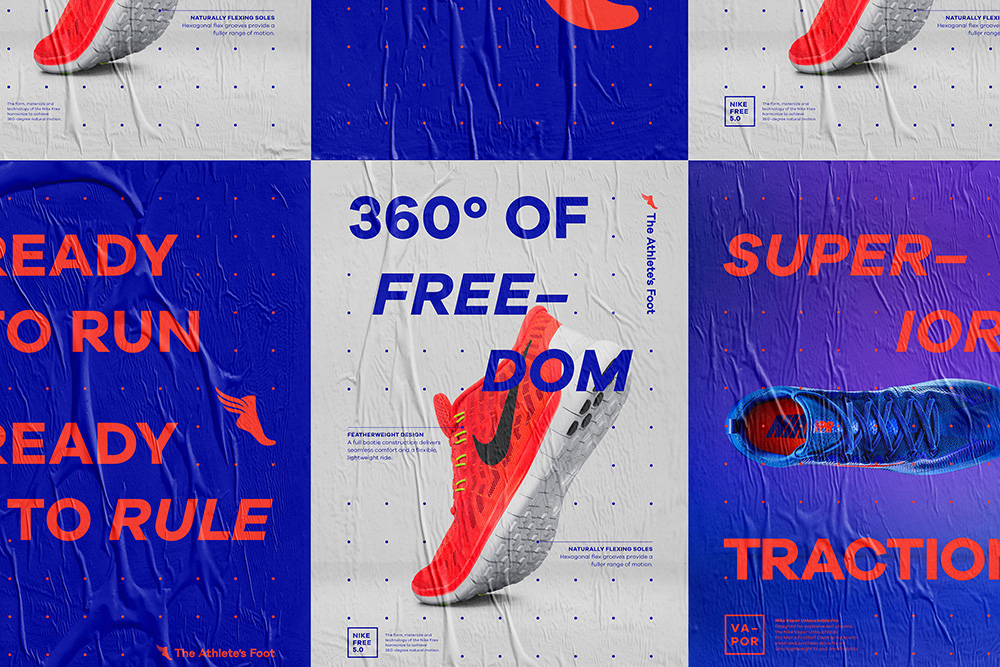
The identity builds on the idea that The Athlete’s Foot knows a lot about shoes and they focus on the details that make each shoe work through a visible dot grid and lines that shoot out from each node, giving it a kind of Matrix-y aesthetic. The that-blue, orange, and white color palette gives everything an electric feel that literally makes the identity vibrate. At the gut level, I dig it; it looks fun and exciting and the typography looks great.
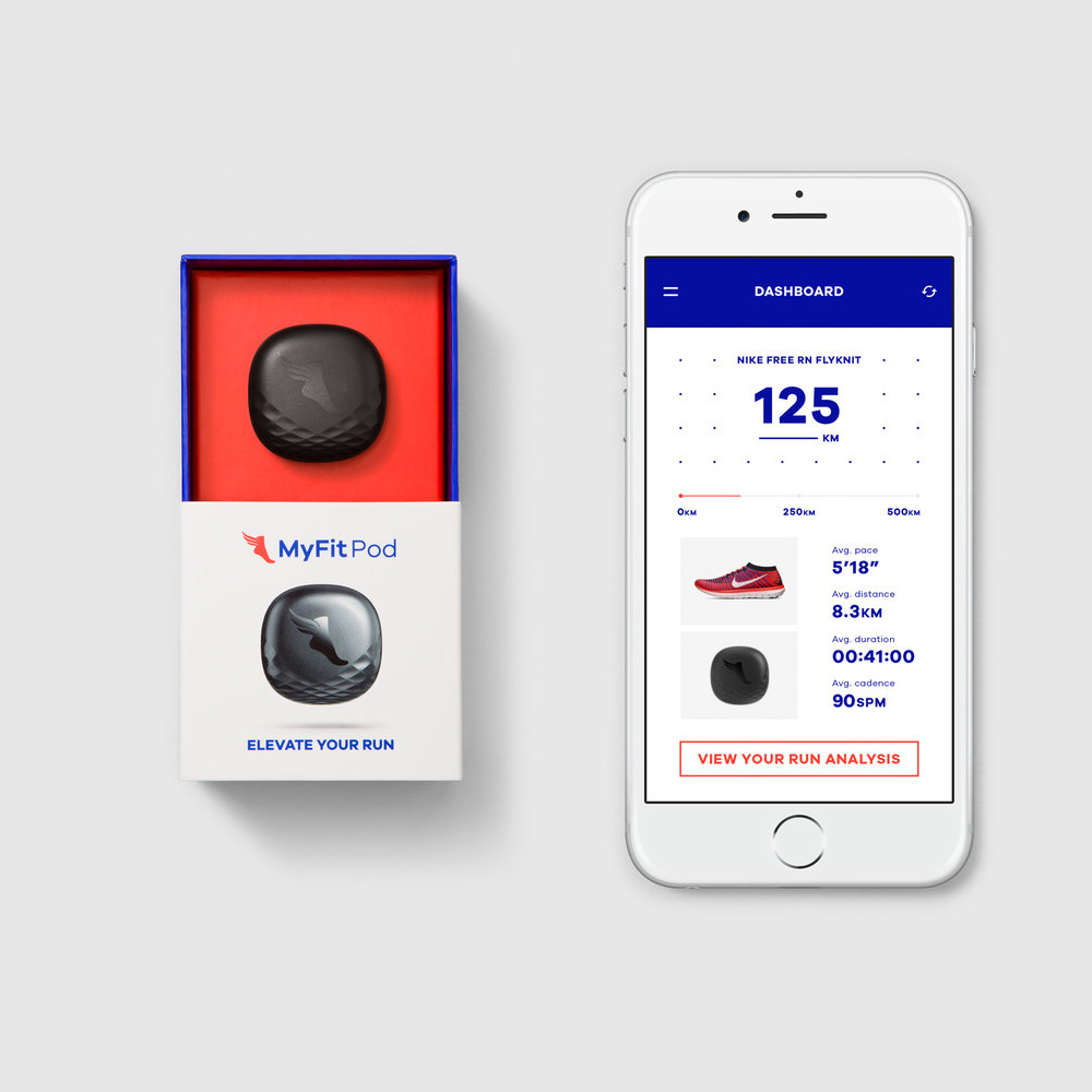
As part of the launch of MyFit we helped bring a new product to market - the MyFit Pod, a piece of wearable tech and partner app that makes any shoe smart. Our role was to design the app’s UX and the overall look and feel, as well as the MyFit Pod’s packaging, visual merchandising and collateral.
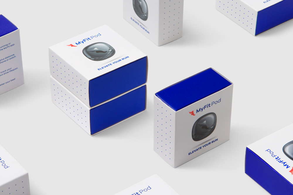
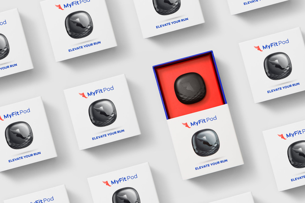
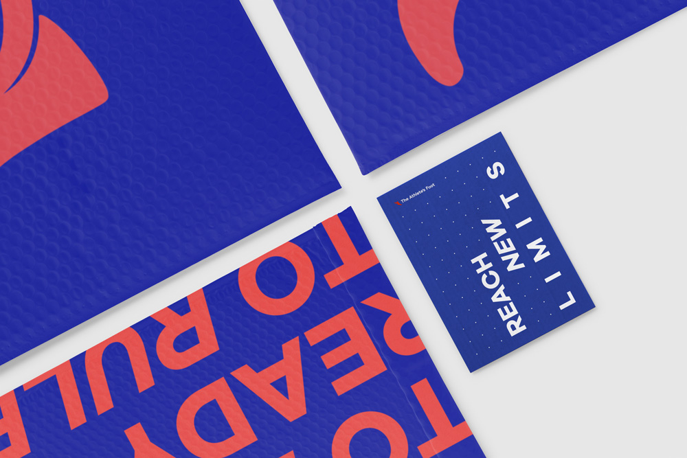
Pretty nice little package. I like how the color palette can look elegant when the balance is shifted to white being the main color and using the orange and blue as accents. The blue dot grid on white, though, doesn’t look as cool as it does orange on blue.
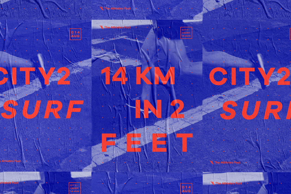
To truly become a performance brand, we had to live and breathe performance through every part of the experience. And with 138 stores nationwide, one of the most important touchpoints was undoubtedly retail. We brought the brand to life across every step of the customer journey from category naming, to store materials, to merchandising and more.
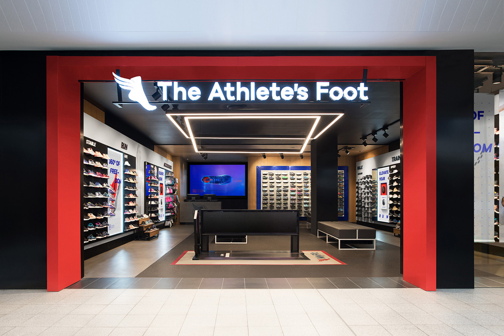
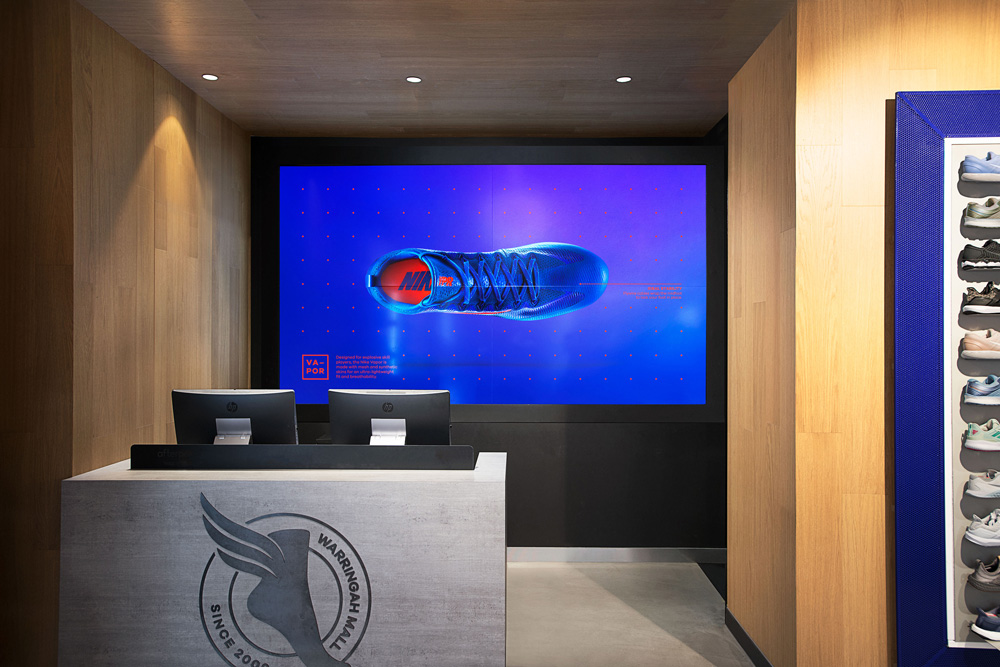
The new retail graphics are good, although judging from the photos of this particular store, the exterior still looks the same as any The Athlete’s Foot in any mall, but I guess that’s more the problem of stores in malls than of the identity itself and the identity does work hard to make the best of the few spaces it has to work on to establish the new visual language. Overall, this does achieve a techie/athletic look and possibly starts to overcome that The Athlete’s Foot (in Australia and at least in the U.S.) isn’t the most exciting retail brand.

 Новости Союза дизайнеров
Все о дизайне в Санкт-Петербурге.
Новости Союза дизайнеров
Все о дизайне в Санкт-Петербурге.