Обзор лучших ресурсов по разработке бренда, разработке упаковки
contact us | ok@ohmycode.ru
contact us | ok@ohmycode.ru
Established in 2013, OnePlus is a global mobile technology company best known for designing, manufacturing, and retailing their own smartphone, which has now gone through nine iterations. Based in Shenzhen, Guangdong, China, OnePlus has operations across Asia, employing over 1,000 people from 21 countries to make their products available in more than 50 countries — in 2018 it lead India’s premium smartphone segment with a 40% market share. Their phones operate through two Android-based operating systems, HydrogenOS for China and OxygenOS for the rest of the markets, which have been heavily informed by community feedback over the years. This year, OnePlus is introducing a new identity designed, I believe, in-house.
We know that our community loves our logo, so our objective was clear: retain the overall design while solving some of the issues we identified that would make our logo more accessible to more people.
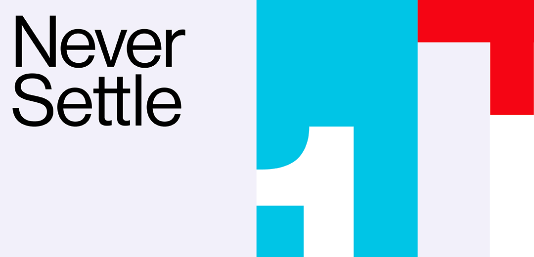
The changes you see here have two purposes - Create a clearer association between the logo and the brand while improving legibility and visibility. To achieve this, we increased the logo’s thickness, gave the number 1 some curve so it’s more immediately recognizable and slightly increased the plus sign to make it a more relevant part of the logo in homage to our community, which we view as an extension of the OnePlus family. We also removed the solid box behind the word “OnePlus” and made the weight of the entire logo consistent to improve the overall balance.
While the changes are relatively minimal — the core composition of the logo remains the same — I think they are highly beneficial in making the logo feel more premium. The new 1+ in a box feels less mechanical and much more balanced and better spaced in the box. The alignment of the “1” with the cut of the top line brings me all kinds of joy. Removing the wordmark from the heavy red box does wonders to the logo as the two elements aren’t competing with each other anymore and it now gives more importance to the 1+. Getting rid of the difference in weights in the wordmark is also a great choice, removing unnecessary visual noise. As a unit, the logo is very nicely balanced and evenly weighed for a solid improvement.
The 1980s MTV variation approach lives on with OnePlus and while certainly not novel, all of the examples so far are visually cool. I emphasize “visually” because, from my limited experience of this brand, I do not know if these represent the brand properly: are they too playful? Too colorful? Too trying-to-be-cool? I really don’t know. I get the impression that OnePlus users are a loyal, dedicated, and passionate group so if you are a OnePlus user, I would love to hear how these fit in the brand. Based on the visual language below, I sense a bit of a disconnect as they are trying to do that cool, undesigned, design thing that’s popular, so this feels like another brand altogether.
The second change that you might notice is our updated Never Settle. Keeping our signature tagline, we changed its style by updating the font, spacing between the letters and swapped the upper case for mixed case.
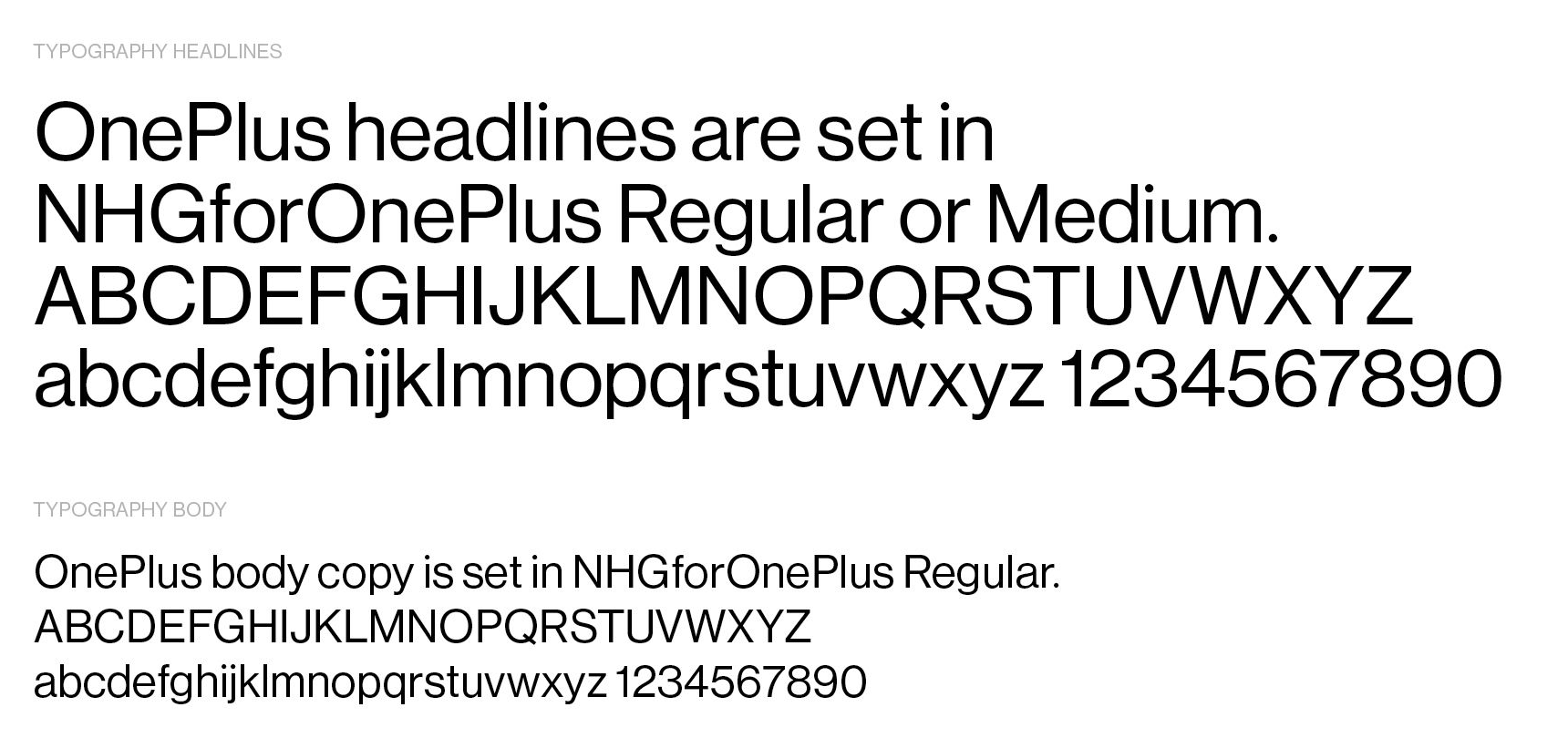
This leads us to our third change: a new typeface. Departing from OnePlus Slate, we wanted a highly functional, but versatile typeface - legible for long texts, but also perfect for our logo or headlines. We “test read” a wide range of different typefaces to make sure the letters formed words with the least effort for the user, to assure the best reading experience.
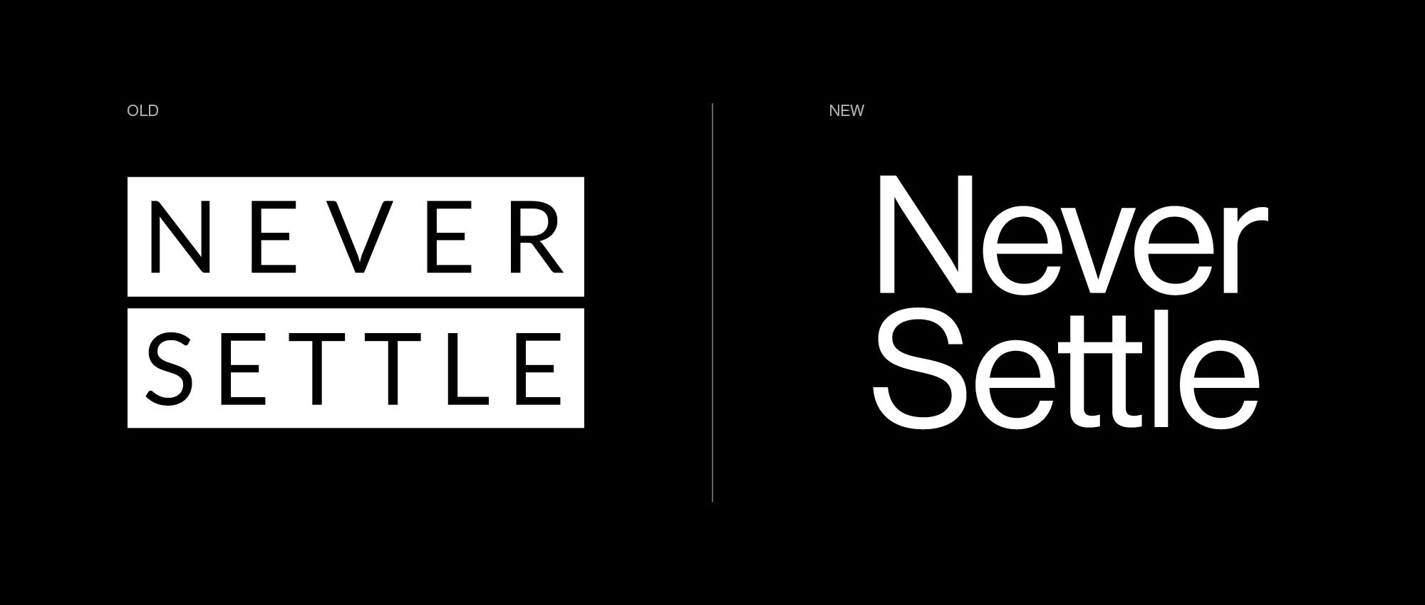
Like the logo, the tagline benefits hugely from being released from the boxes, allowing it to do more things and be more… conversational. Meaning that the old one looked like another logo, whereas this can be embedded more naturally into the identity and read as text as opposed to like a brand asset.
Combining all these elements, we also worked on achieving a more consistent, unique and recognizable brand image. We took our first steps with a bolder look and feel for the OnePlus 7T Series launch, collected invaluable feedback and iterated on what turned out to be a very well-received approach. The result is a better use of our brand colors that conveys a bold yet premium finish, while keeping things fresh and vibrant with new accent colors.
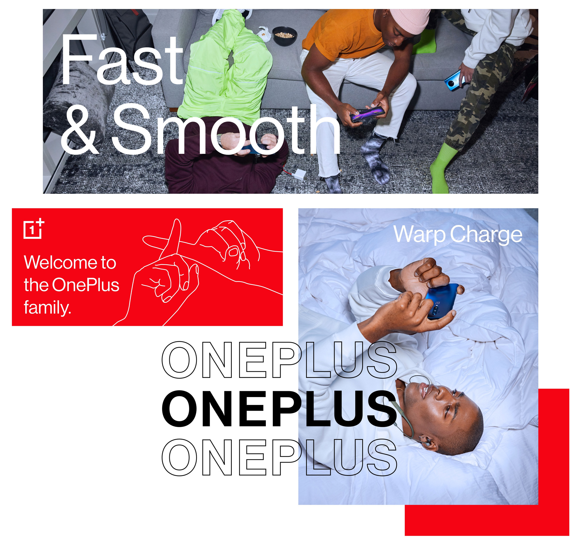
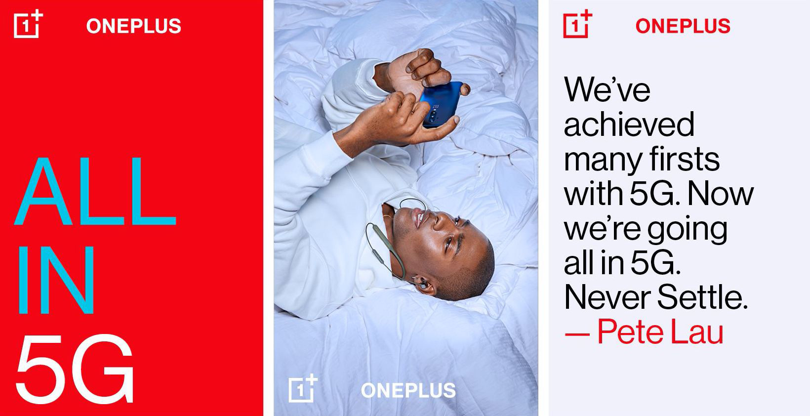
The limited applications available point to the trendy aesthetic of deadpan sans serif typography and raw photography. It’s not bad. But it’s also not exactly original. Perhaps, to its credit, it IS differentiating in the smartphone category, since iPhones, Galaxys, Pixels, et al don’t present themselves this way, so my (and probably your) argument that this looks like a dozen other things out there isn’t as relevant. And nothing like a good motion piece to sway you into the positive…
Overall, this definitely feels like an improvement and I think the logo evolution can play a big role in elevating the status of the product as it now feels much more confident and established. In terms of the identity and visual/verbal language there is a sense as well of confidence but also of being more of an extroverted brand where I feel like it used to be more of an introverted brand, quietly growing its market share while Apple, Samsung, Google, et al made a lot more noise. In terms of pluses, I would go with B+ on this one.
Thanks to The Tomatoes for the tip.
 each year since publication began in 2006

 Новости Союза дизайнеров
Все о дизайне в Санкт-Петербурге.
Новости Союза дизайнеров
Все о дизайне в Санкт-Петербурге.