Обзор лучших ресурсов по разработке бренда, разработке упаковки
contact us | ok@ohmycode.ru
contact us | ok@ohmycode.ru
Established in 2015, Lord Hobo Brewing is a craft brewery based in Woburn, MA, led by Daniel Lanigan, long-time owner of beer bar Lord Hobo in Cambridge, MA, and Alewife bars in Baltimore, MD, and Queens, NY. Lord Hobo Brewing specializes in IPAs, producing more than 30,000 barrels in 2017, and offers five different varieties — including its flagship beer, Boom Sauce — available in their tap room or across ten states. The identity and packaging for the brewery was designed by New York, NY-based Ben Whitla.
This post breaks hard with my timeframe limits of when an identity was designed as this is three years old but given that it’s not a huge brand I thought timeliness wasn’t critical. I also appreciated Ben’s description of the project that has been developing over all these years. Lastly, the project is hops of fun so it’s hard to be upset by its inclusion.
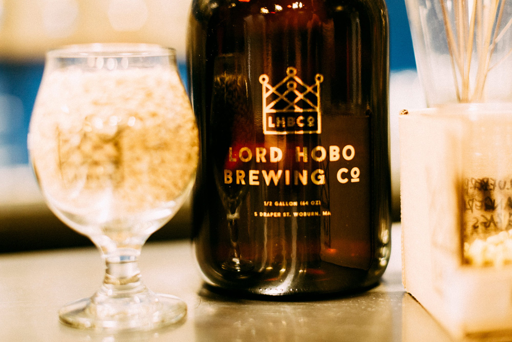
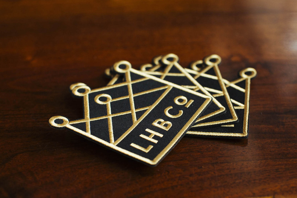
There were some things about the brand that seemed inevitable. There was almost no choice — from day one I knew it would be black, gray, gold and white. We never even looked at any alternates. We also knew the logo would be some kind of crown, to pay homage to the Lord Hobo bar and pay forward the concept of a lord.
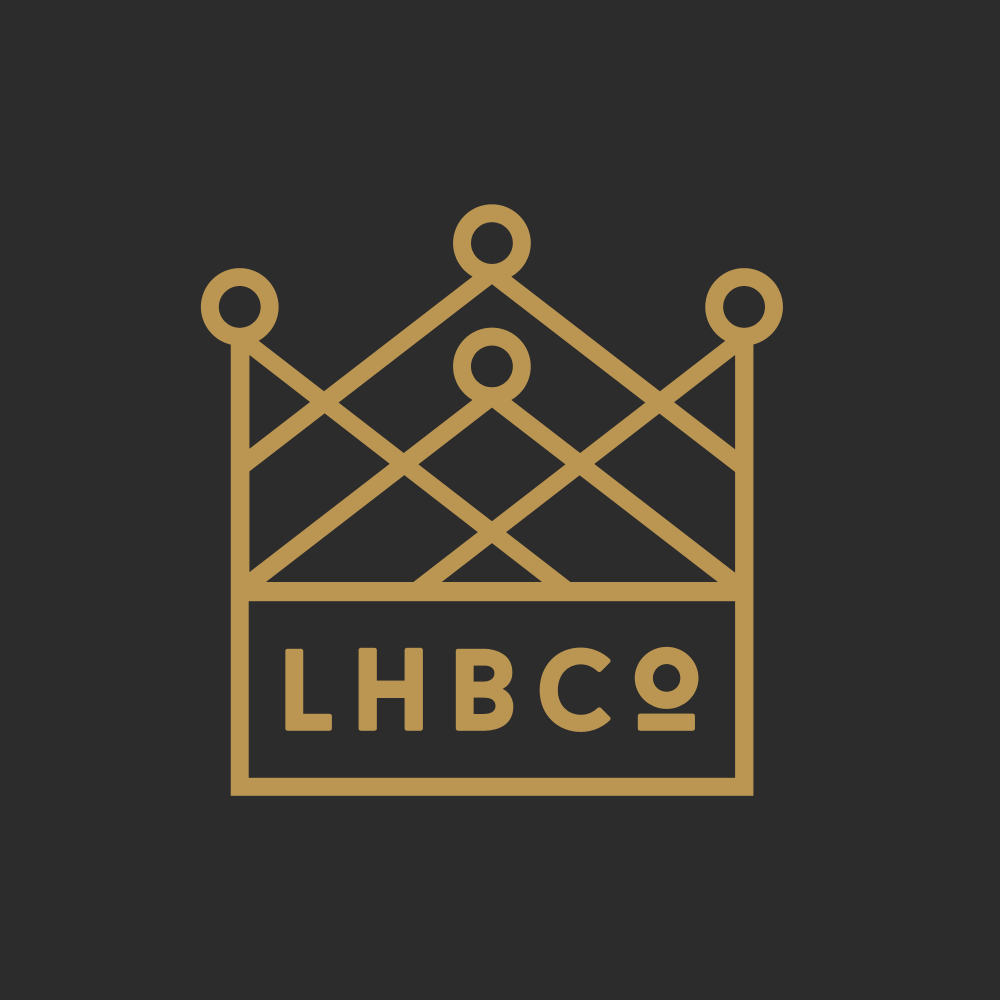
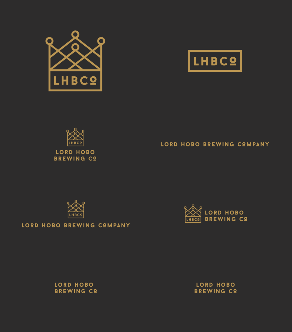
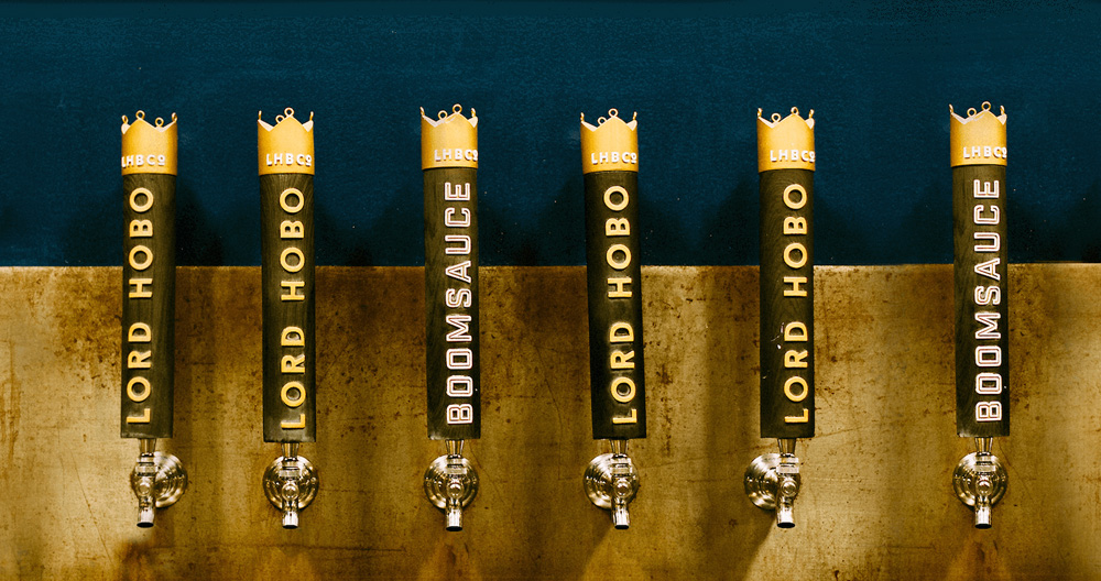
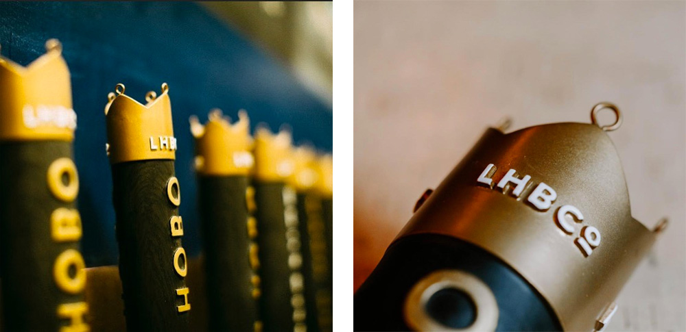
At first glance, this could easily be dismissed as yet another hipster brewery brand but there is a great degree of refinement at work here that elevates it beyond the trend. The crown logo is very nicely executed, yielding a nice texture when seen small but also holding up really well when blown up big. The small “LHBCo” in the crown is pleasantly rendered in the same thickness as the icon with its only drawback being the underscore of the “o” getting fuzzy when shrunk. The different lock-up variations are all efficient in different ways and they add up to a good palette of logos to use in various places.
Let’s get the this right out there: an old school rule of packaging is you never make it black. Or dark, dark, dark grey. Why? It shows dust. If your product sits on shelf for more than a week, it will look like it’s been there for a month. But, I had a feeling these products wouldn’t be sitting on shelf very long. So I said fuck it, it feels right — let’s roll with it. The first beer off the line is the now-iconic Boom Sauce, so we started there.
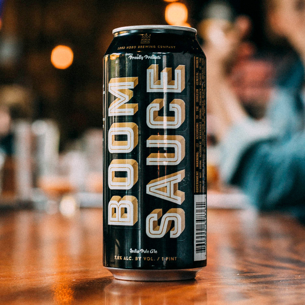
Since we knew that color was locked, we had to plan ahead and differentiate beers in another way. I had a feeling it would be typography (also, that’s sort of my thing, so, you know, do what you enjoy, live laugh kern).
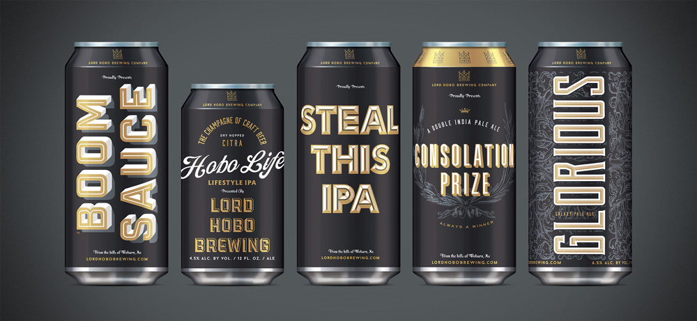
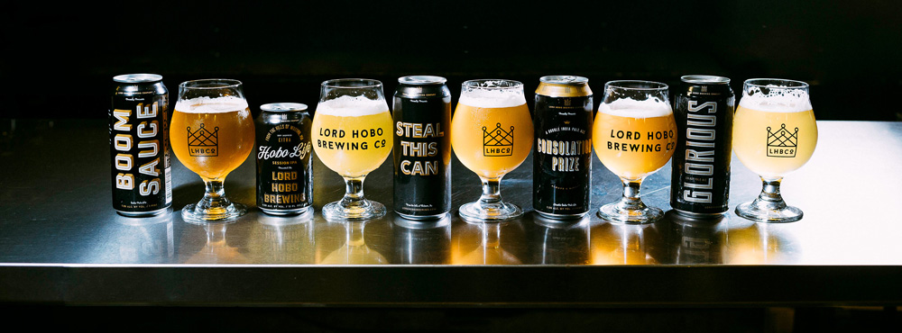
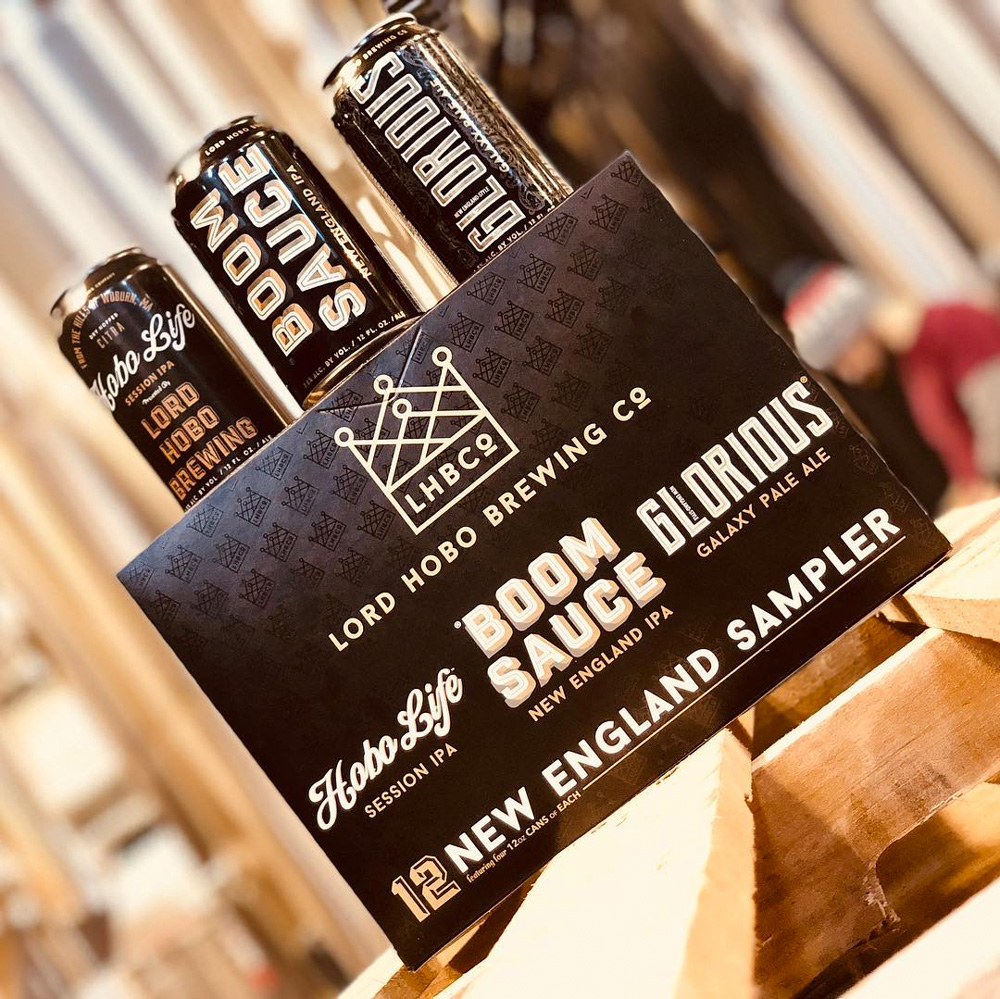
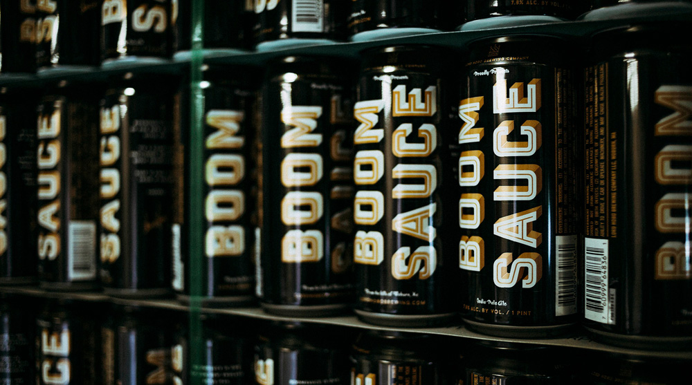
The beer cans are very energetic, bold, and striking. The black-white-and-gold color palette is great, certainly making them stand out and helping unify the wildly different typographic treatments, all pleasing in their own way. The combination of the name, the black backgrounds, and the gold crown and accents do give this a royal feel, one where beer is king. In the image directly above, I love how all the different ingredients of the brand and the individual beers come together, showcasing the flexibility of the identity.
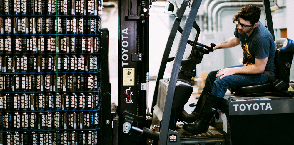
The branding and design guidelines I set out were instrumental in building this beer brand into the behemoth they are becoming today. They grew nearly 415% in 2016 alone, and are already sold in over 12 states. Then we blew it out: Tap handles, growlers, tshirts, damn box trucks, keg collars, cases, a van.
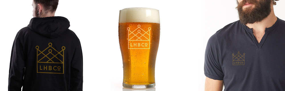
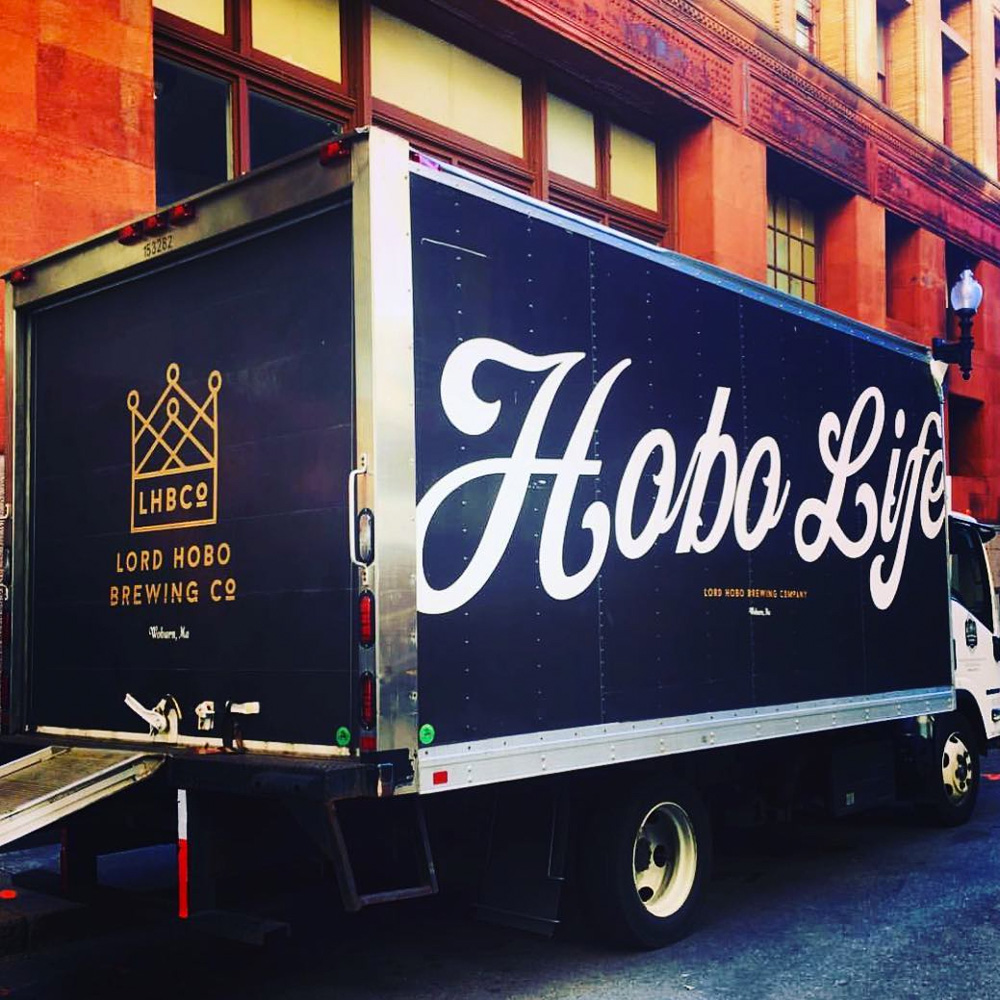
The rest of the applications make great use of the logo and its variations and sticking to the color palette makes everything feel satisfyingly cohesive. One of the things that I find most impressive about the identity is how much the brewery has embraced it as part of its brand… which sounds like a dumb thing to say, since that’s what identities are meant to do but some identities are secondary to the actual business whereas here, if you go through their website or their Instagram account, there are images everywhere of the identity in action not just shown to highlight their products but instead they come across as being an integral part of the overall DNA of the company — heck, even their dog is on brand with the gold and black color combo.

 Новости Союза дизайнеров
Все о дизайне в Санкт-Петербурге.
Новости Союза дизайнеров
Все о дизайне в Санкт-Петербурге.