Обзор лучших ресурсов по разработке бренда, разработке упаковки
contact us | ok@ohmycode.ru
contact us | ok@ohmycode.ru
Launched in 1996 — think about that for a second: that’s when, to get online, you needed a modem that made screeching noises — Slate is a general-interest online magazine offering analysis and commentary about politics, news, business, technology, and culture. It has also published podcasts since the beginning of that medium and now hosts more than fifteen different ones. Slate is published by The Slate Group, a Graham Holdings Company (formerly The Washington Post Company). Earlier this month, Slate introduced a new identity and online presence designed in collaboration between New York, NY-based Gretel and Slate’s in-house design group.
The bulk of the content of this post comes from Gretel but Slate’s Design Director, Jason Santa Maria, has a great piece on the backstory of the redesign.
It was clear on first appraisal that Slate had fallen into disrepair over the years. It lacked a cohesive visual voice and was in dire need of a redesign. After speaking to a cross section of people we uncovered a very strong sense of self that nobody could pin down but was described internally as ‘Slateyness’. We knew our job was to express ‘Slateyness’ visually in a way that lived up to the tone and quality of the journalism. […]
Slate’s process is messy and nonlinear. We knew Slate’s personality was far from clean cut. It’s irreverent, quirky, jarring so a polished representation of the brand just wouldn’t do justice to the personality. It had to fly in the face of convention and be counter to the plethora of buttoned up news publications that saturate the internet. It had to feel off-kilter.
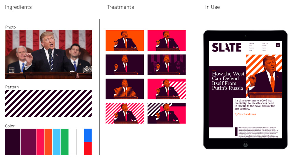
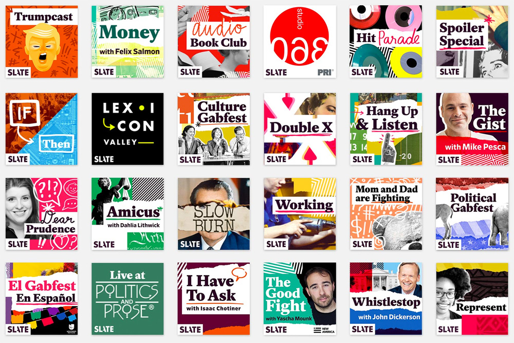
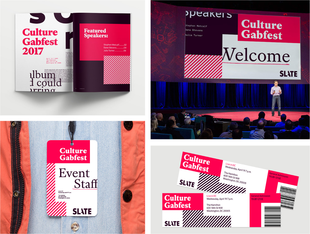
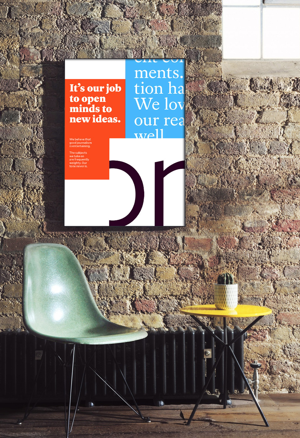
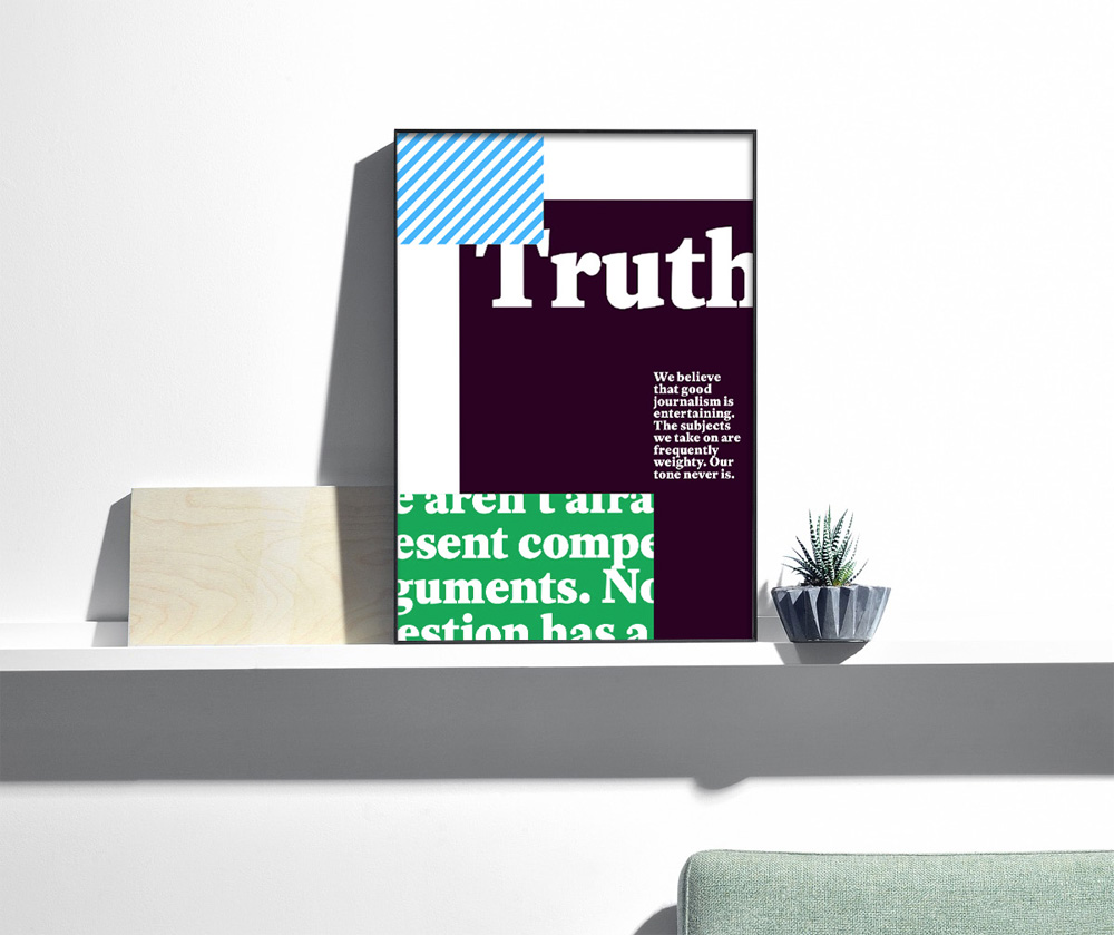
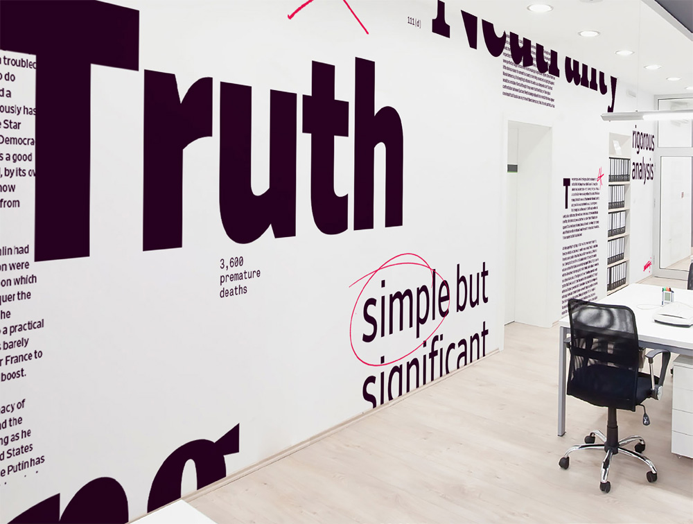
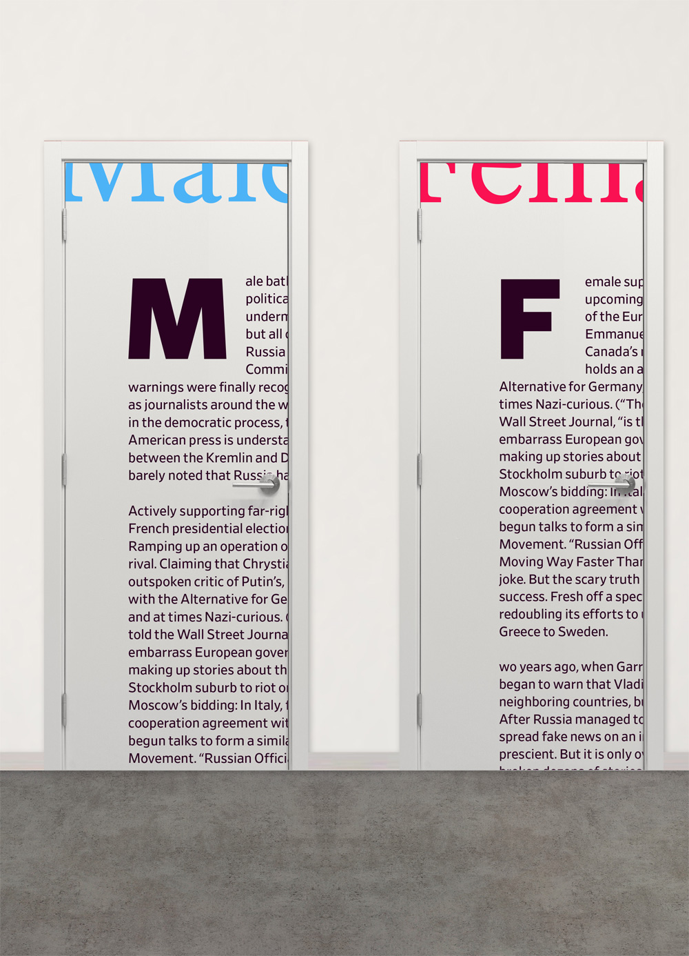
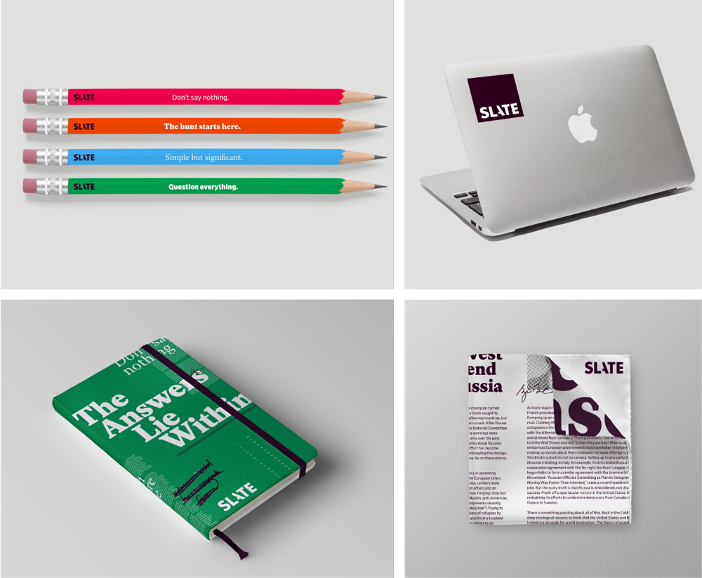
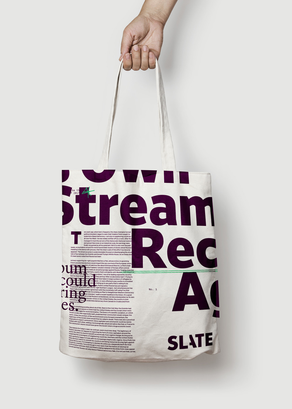
Our visual research led us to layers of noise, microfiche, zoom-ins, and handwritten scribbles. We devised a technique of layered ‘slates’ that would bring structure to article layouts and reveal the story for the viewer as they scroll the page. This idea of layering and revealing was echoed in the logo. To inject the wit and whimsy that’s so true to the voice, we created a photo-illustration style that could take the place of stock photography and instantly bring ‘slateyness’ to any article.
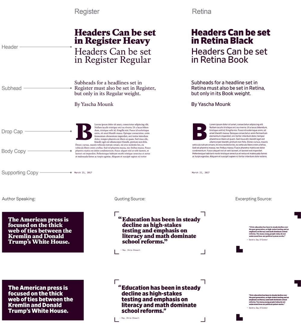
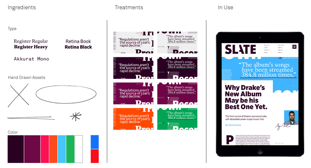
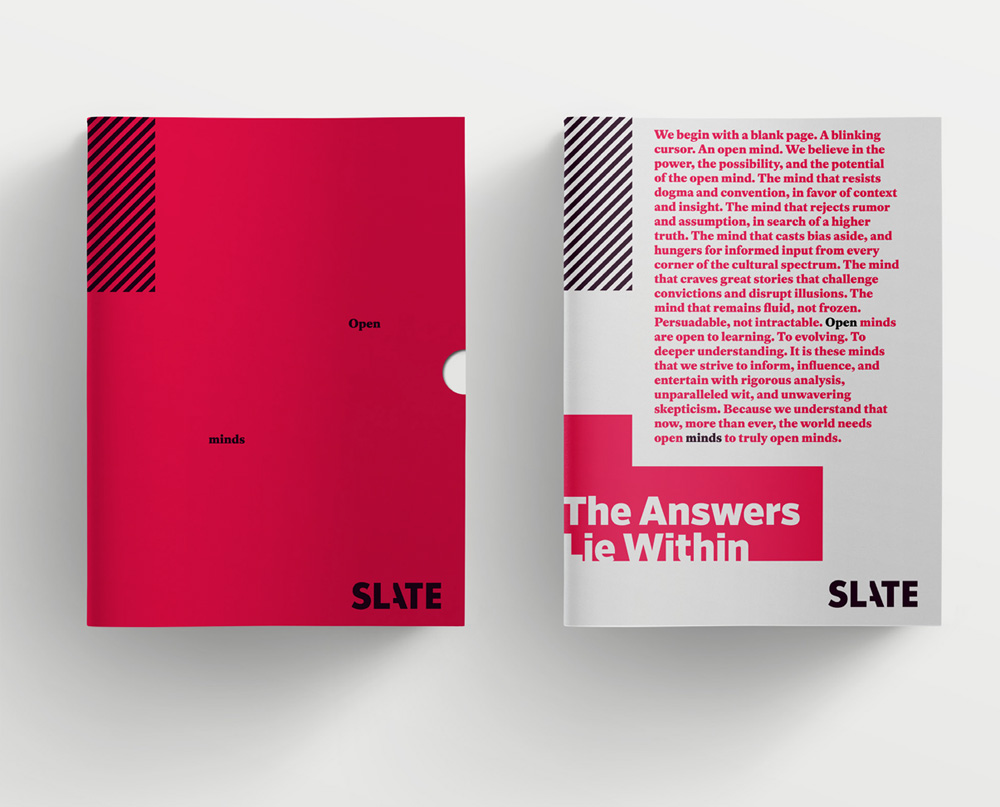
We introduced new typographic styles that sought to represent different textures of news and piles of press clippings with fonts that could be both illustrative and functional assets. We did this by paring a Serif (Register) and a Sans-serif (Retina). The only thing we kept from the old Slate was the tone-of-voice and the maroon color, albeit with a slight tweak to make it a little more punchy. We also gave them a wider palette as an aid to navigating sections.
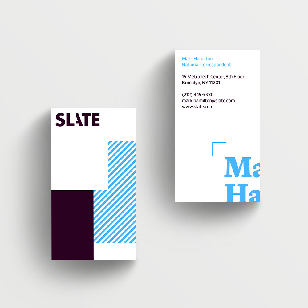
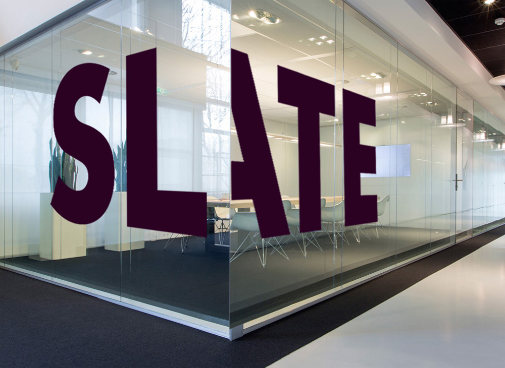
The old logo’s most recognizable trait was its maroon color, which is what visually helped identify you had landed on slate.com. The angled cut of the “t” could probably be considered a recognizable trait but there wasn’t much else particularly memorable about it. The new logo transforms into a bold, uppercase wordmark with the distinguishing mark of a cut-off “A”. The quote above mentions that it’s about “layering and revealing”, a visual strategy applied to the identity and website that works in those instances because there are enough elements to play with and really create a sense of pieces of slate put one on top of another but in the logo that idea gets fairly lost. This doesn’t mean the logo is bad — visually, it’s pretty great, well balanced, and surprising how well the “A” reads — but it feels like there is a message being conveyed that’s hard to decipher. Like, what am I supposed to read into this missing piece of the “A”? Intrigue? That there are two sides to every story and this is only one? Maybe that’s it. Again, I like what I’m looking at but because what I’m looking at has such a distinctive feature it bothers me that I don’t get what it stands for right away.
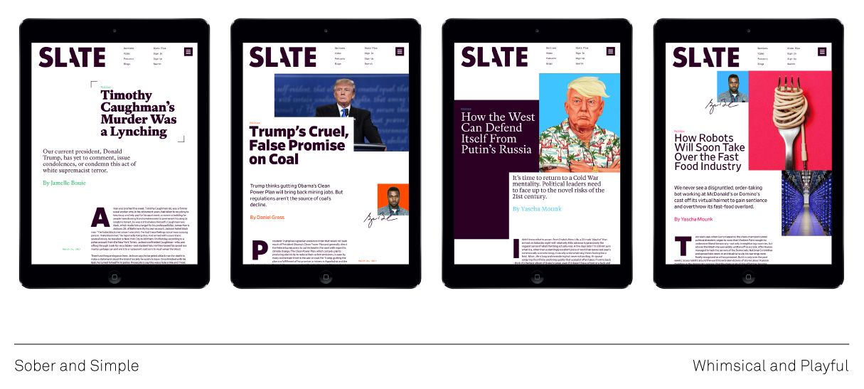
Online, the idea of layering slates with different kinds of content comes alive through a great combination of typographic, image, and layout treatments that add variety to the large amount of content published while infusing it all with a cohesive aesthetic.
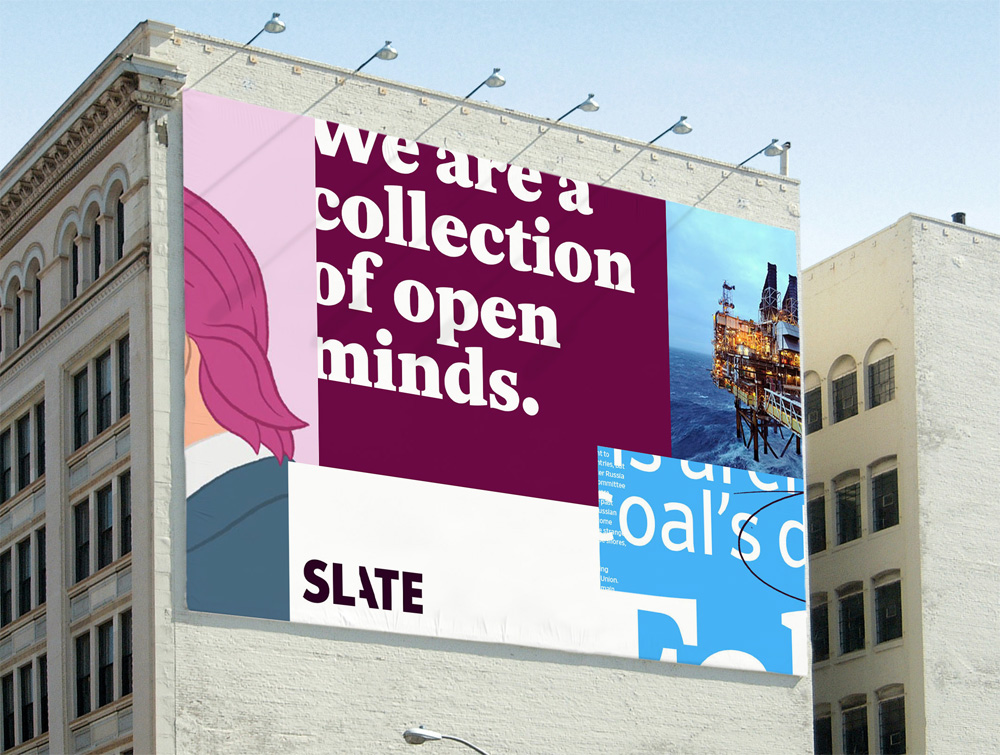
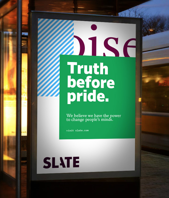
The ads in particular help convey the visual strategy quite well with tight crops of different image and typographic textures, punctuated by the logo.
Overall, what this identity does really well is establish a unified but diversified tone of voice for Slate that can turn the volume up or down on different knobs while maintaining the same overall attitude.

 Новости Союза дизайнеров
Все о дизайне в Санкт-Петербурге.
Новости Союза дизайнеров
Все о дизайне в Санкт-Петербурге.