Обзор лучших ресурсов по разработке бренда, разработке упаковки
contact us | ok@ohmycode.ru
contact us | ok@ohmycode.ru
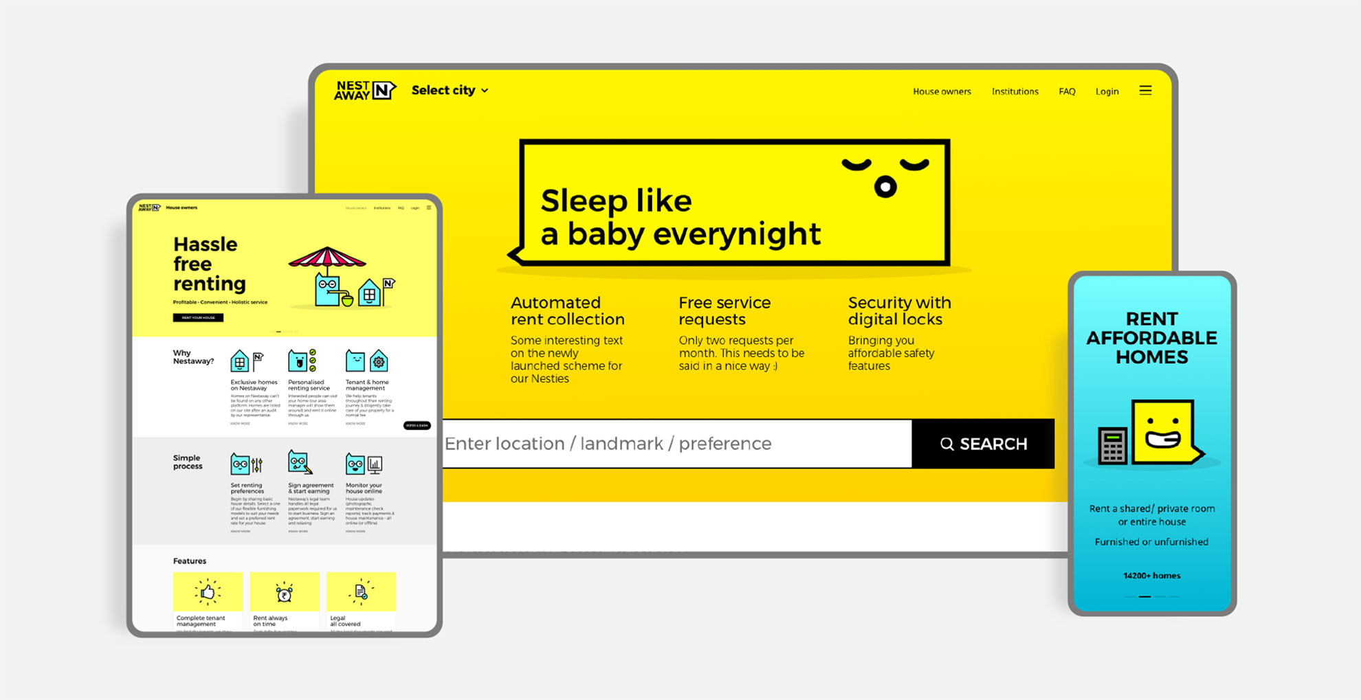
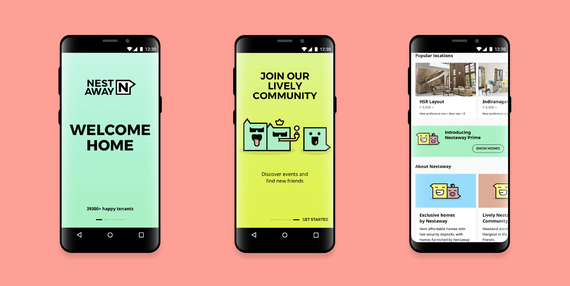
Established in 2015, Nestaway is a “Managed Home Rental Network” in India that provides both an online platform to find rentals as well as being the property manager for those rentals. Unlike most rental property companies, Nestaway’s goals are more noble than usual: helping young people who are not always taken seriously, immigrants who are often seen with suspicion, and single men and women who are considered unreliable find a place to live without hassle and discrimination. Nestaway manages over 30,000 homes across 13 cities in India and has built a social component around its platform for more than 72,000 “Nesties”, who get together for bike rides, nights out on the town, or to play sports. Earlier this year, Nestaway introduced a new identity designed by Gurgaon, India-based Lopez Design.
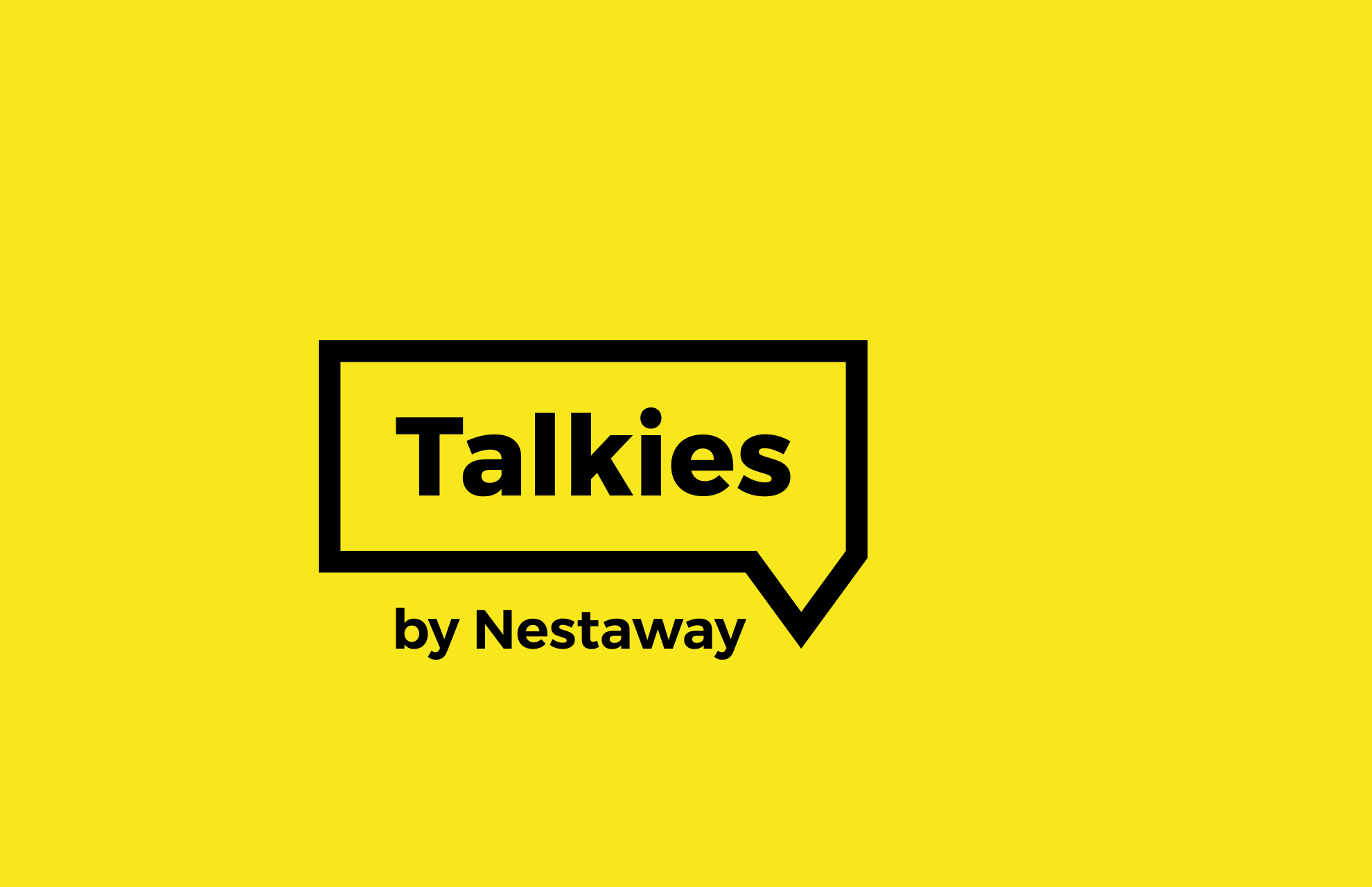
We visualized the logo as a ‘Voice Box’, as a platform for expressing ourselves in a manner resonating with the voice of our young audiences.
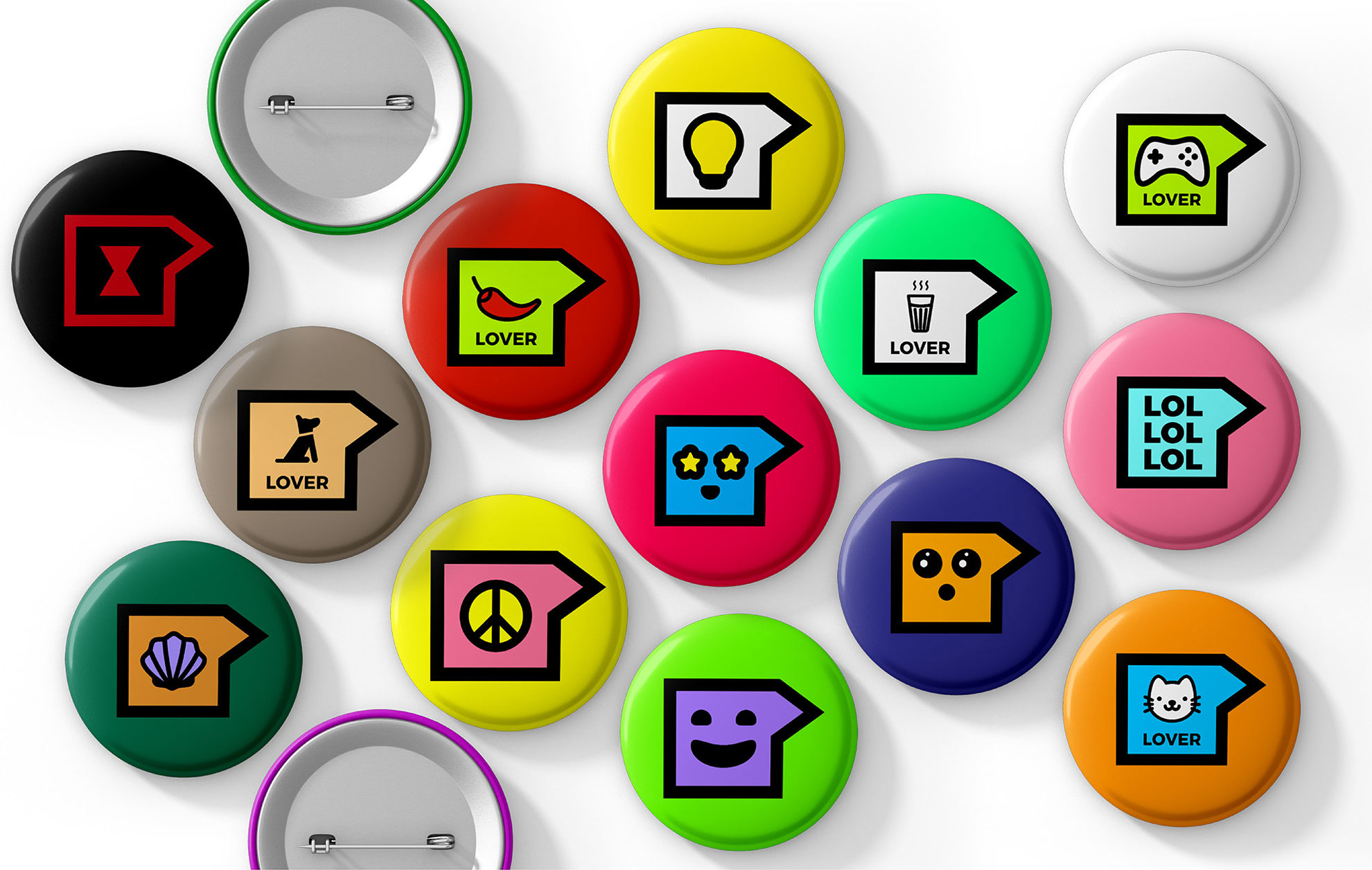
Taking off from a secure square shape, the logo represents ‘a space you can call a home’. The arrow which emerges nudges you to do many things by making you constantly take the next step.
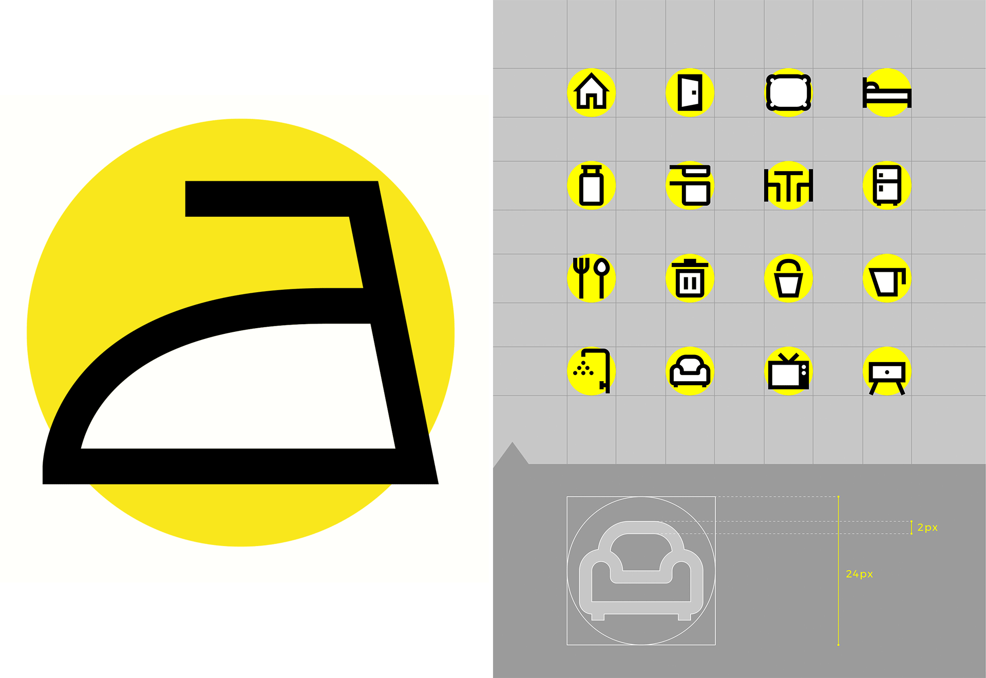
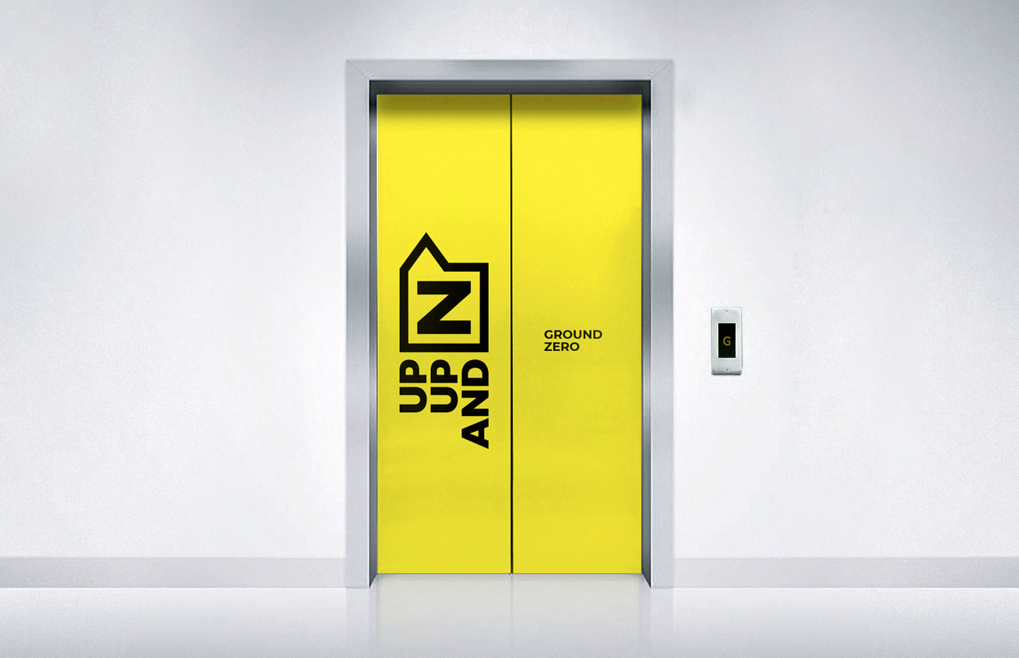
The flexible identity becomes the face of all communication, it can stretch in different directions to hold the message in any form, making the brand easily and instantly recognisable in all communication.
The old logo was pretty bad, with a jarring and poorly mixed combination of sans serifs and colors. The bird was possibly a good idea to support the “nest” name and it had a decent shape, but its placement on top of the “t” made it look like a weather vane and accentuated a cross shape. The new logo is more direct, bold, and youthful. On its own it’s not exactly great — the wordmark is a little clunky and it’s hard to figure out exactly what the arrowed box means — but it serves as the seed for the rest of the identity, which gets more interesting and fun as it expands into a visual language.
Nestaway is an Indian firm entrenched in the new consciousness of a fast-evolving India. We designed them to be nimble and ambidextrous, ensuring ease of use and flexibility. Our brand language for Nestaway responded to this need to be open, inclusive and flexible, providing many options.
The ‘Voice Box’ container evolved as a powerful conversational platform. In its implementation it is language in itself; highly flexible and impactful to get the maximum impact. This makes it memorable and easy to fit into various kinds of communications. It is bold, simple and compact in size, yet very flexible.
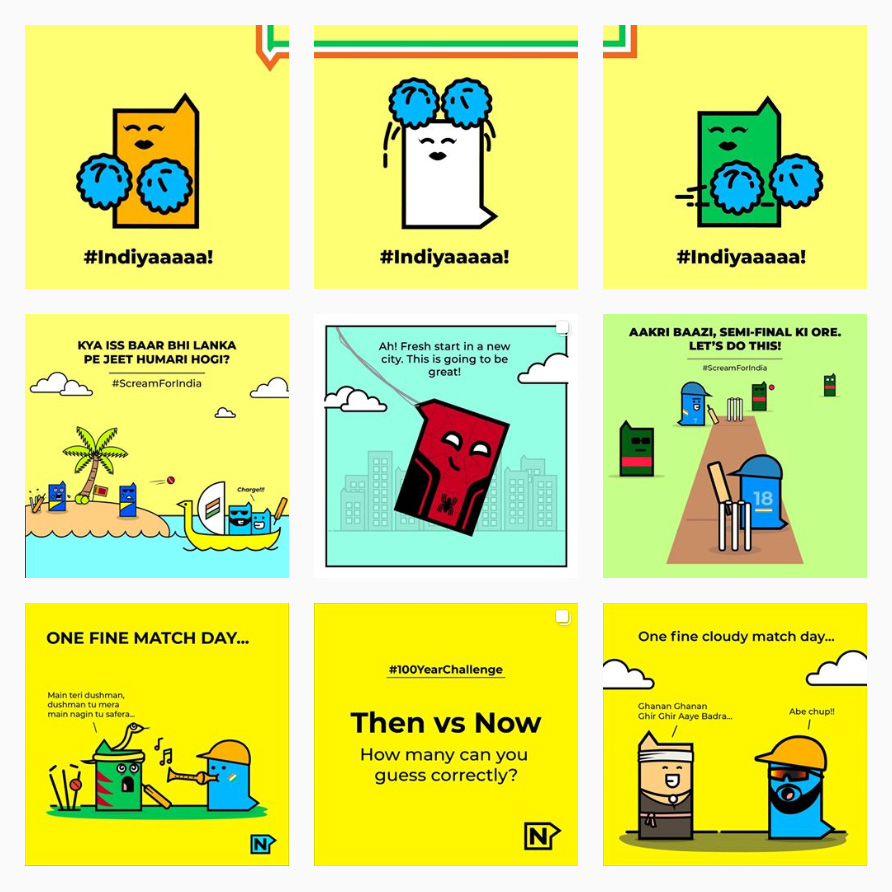
My absolute favorite element of the identity is the activation of the arrowed box as characters that can be stretched, squeezed, and stacked with their silly faces always anchored to the corner. They have a great free-flowing irreverence and lack of graphic self-consciousness — meaning, they are not trendy or cool or necessarily perfectly executed — that create a very authentic and original brand element. Clicking through the website reveals multiple great uses of the Voice Box characters illustrating content in fun ways.
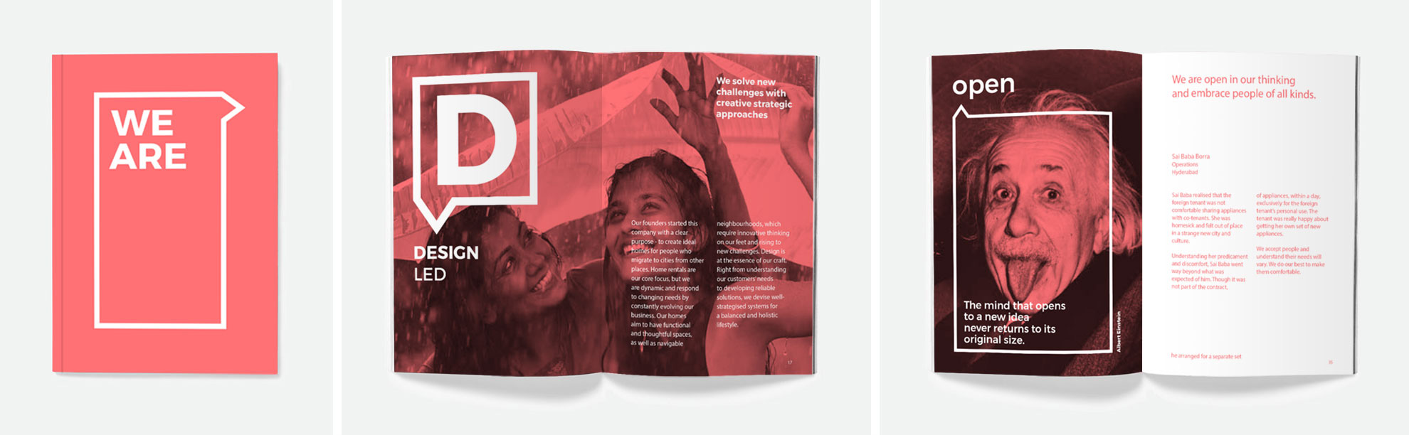
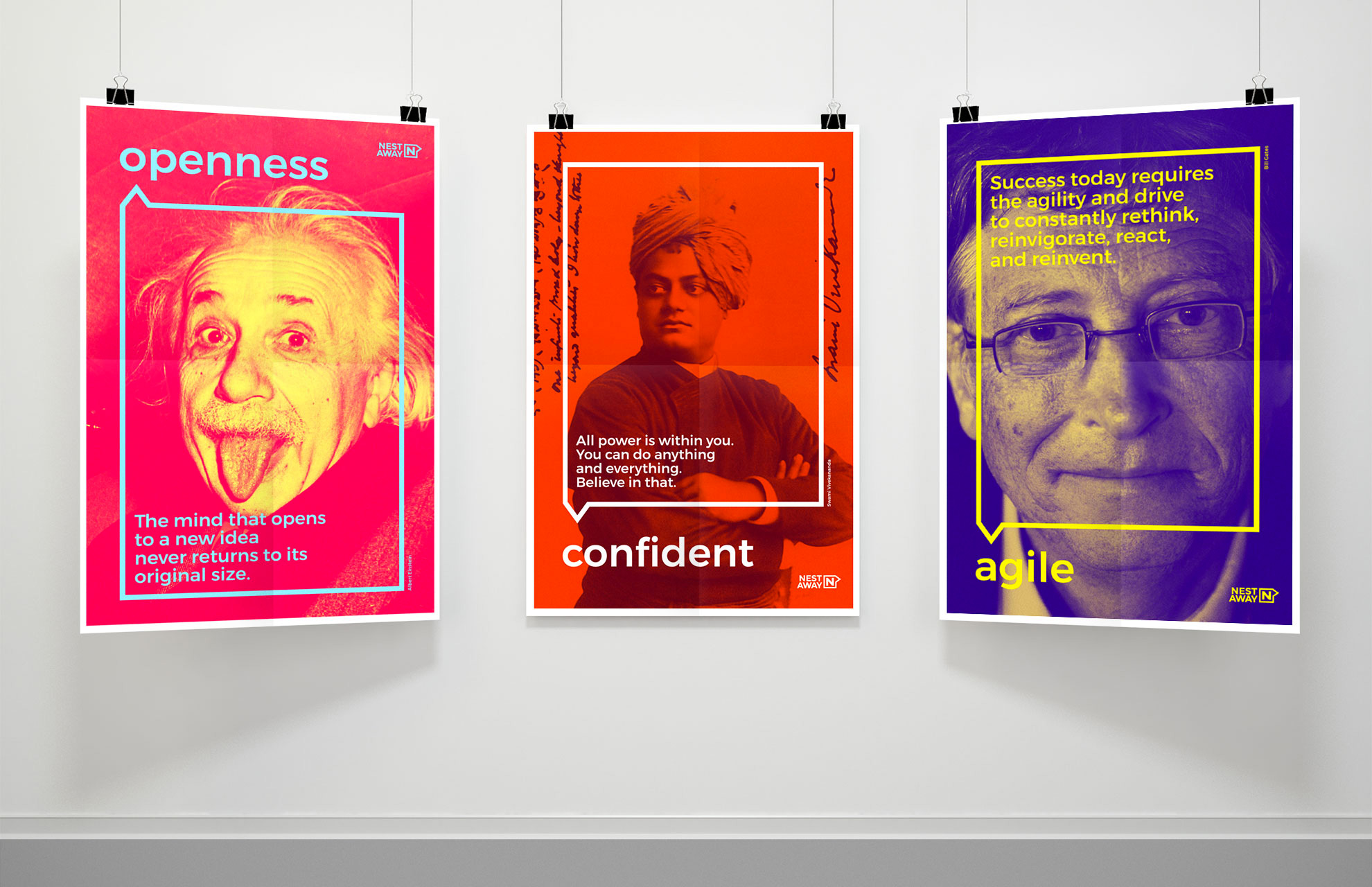
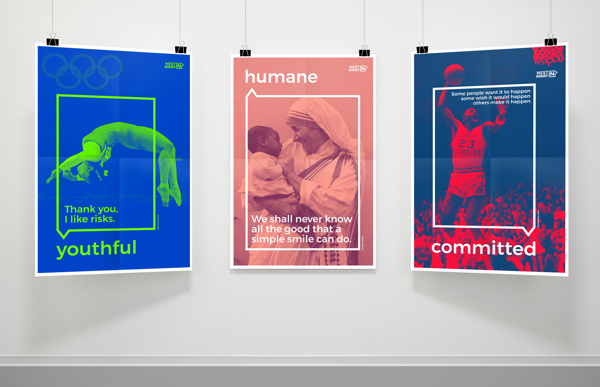
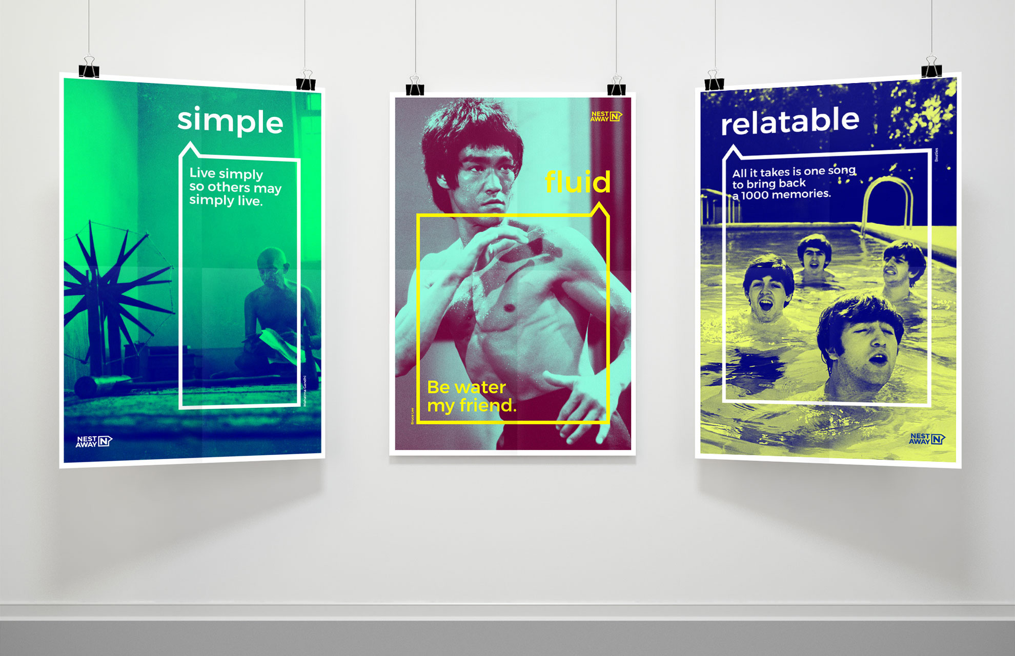
It’s not all fun and games, although I wish it were, with the identity taking on slightly more serious tones with the box becoming a holding shape for messaging. Speech bubbles are nothing new as logos or as graphic devices for identities but I like how they have applied it here by allowing the directional device to be on any side but always the same, small size in relation to the bigger frame. All around, the typography could be a lot better and the move into duotones starts to feel generic, but it’s a decent starting place.
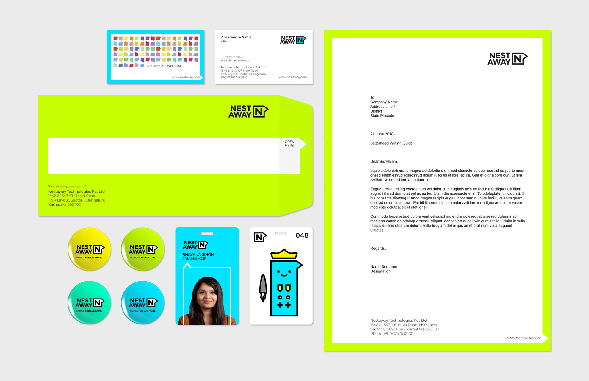
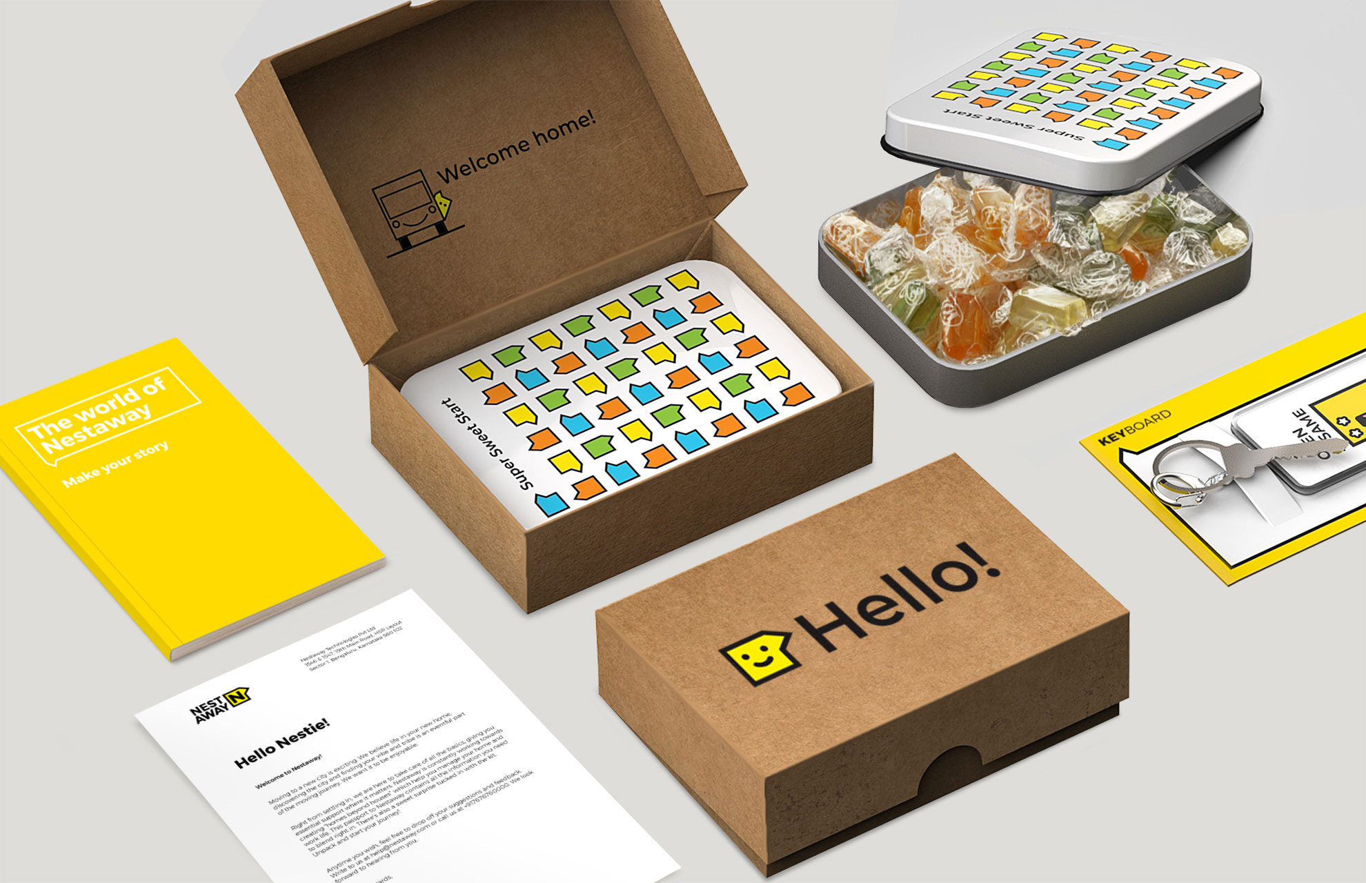
The branding brought these aspects of ‘feeling familiar’ by creating varied touchpoints from fridge magnets, neighbourhood tours, Nestaway -certified vendors and city maps.
We introduced comic characters who are simple, relatable models that resonate with spirit of the youth at Nestaway. Cartoons can be used to portray stereotypes, bringing in a dash of humour without being offensive, which is how Nestaway would like to be seen.
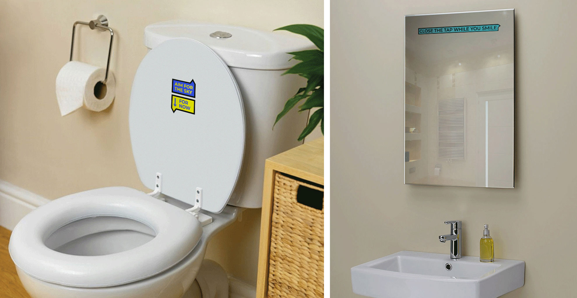
Most of the applications could use some refinement and perhaps even some restraint in color use — it can get overly vibrant in some cases — but, overall, there is a clear sense of friendliness and approachability to the brand that is fun and different from most rental companies.
 each year since publication began in 2006

 Новости Союза дизайнеров
Все о дизайне в Санкт-Петербурге.
Новости Союза дизайнеров
Все о дизайне в Санкт-Петербурге.