Обзор лучших ресурсов по разработке бренда, разработке упаковки
contact us | ok@ohmycode.ru
contact us | ok@ohmycode.ru
Launched in the Czech Republic in 2006, DIGI is a direct to home satellite television service that is also available in Romania (where it’s headquartered) and Hungary. Originally airing mostly sports — and by sports I mean football and by football I mean the sport that if I call soccer people in the comments get upset with me — in the Czech Republic, 2010 saw an increase in programming, infrastructure, and offerings (mainly internet connection) when Czech investment group Lama Energy Group joined them. Today, DIGI — in the Czech Republic only — is changing its name to Telly and has introduced a new identity designed by Prague, Czech Republic-based Studio Najbrt, who also did the naming.
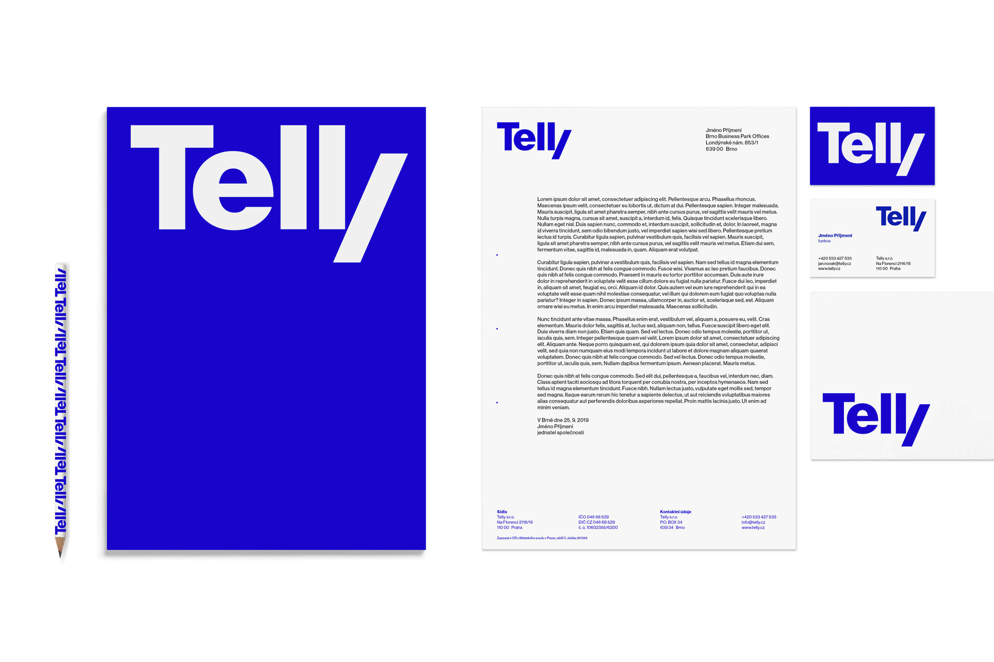
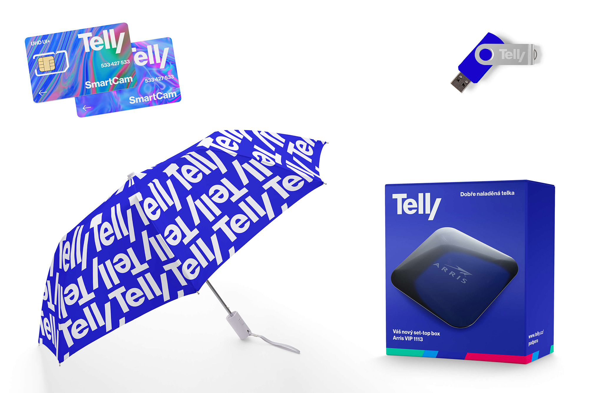
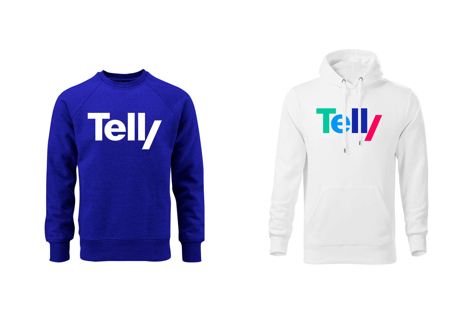
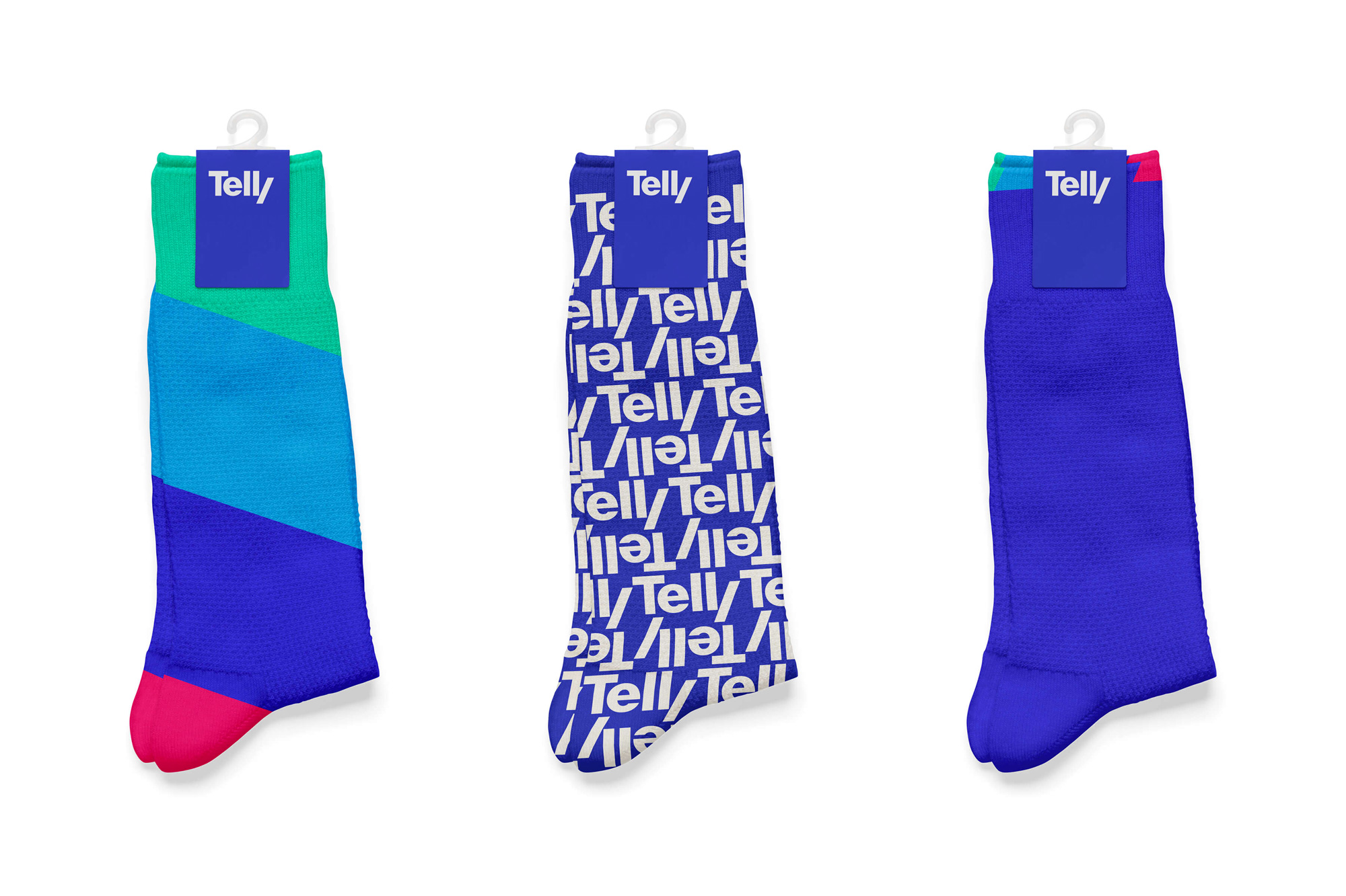
We came up with the friendly name and sharpened its look a little with a simple diagonal. First, we cut the Y in the logo and then in a visual style we added an easily applicable “wipe”, an unmistakable film and video editing technique. The color scheme begins with the blue of the glowing screen and continues with the complementary RGB spectrum in shifted shades. The logo, as well as the additional typeface Neue Haas Grotesk Display, to which its morphology remotely refers, in their modernity and readability easily withstand a wide range of uses and the tooth of time.
The old name (which will still exist for DIGI in Hungary and Romania) was/is fine but perhaps it’s a little cold and detached of emotion, sounding more like a business-to-business name than a business-to-consumer one, which the new name corrects with the endearing “telly”. If this were a UK brand, I imagine it would be an issue to adopt it as a name given that it’s such a commonly used word but I imagine, also, that in the Czech Republic it’s more ownable. You would be correct in thinking “Aren’t there other Telly brands around the world?” because there are, but it was available in the Czech Republic in the category, so Telly it is, and I like it.
The old logo (which will also still exist for DIGI in Hungary and Romania) was/is more or less fine. The wide letterforms helped make the short name have more presence and the “G” was sort of interesting but perhaps the whole thing needed/needs a new interpretation in capable hands. The new logo starts out with business as usual in a bold, unassuming sans serif but then adds a lovely twist with a clever take on the “y” building off of the “l”, yielding a distinctive, compact wordmark and establishing the angle as a recurring, recognizable motif in the identity. The tight letter-spacing is great, with the “e” nestling under the “T” and allowing for that “y” to be more easily read. I really like the multi-color version above and kind of wish that were the main usage, but I get that it becomes a little harder to read.
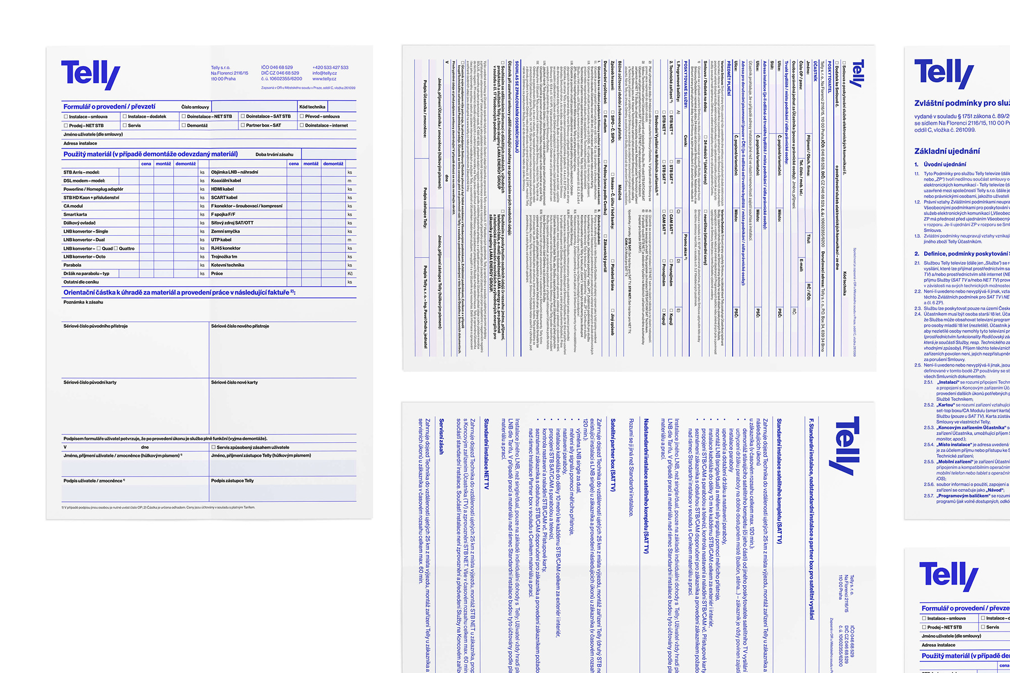
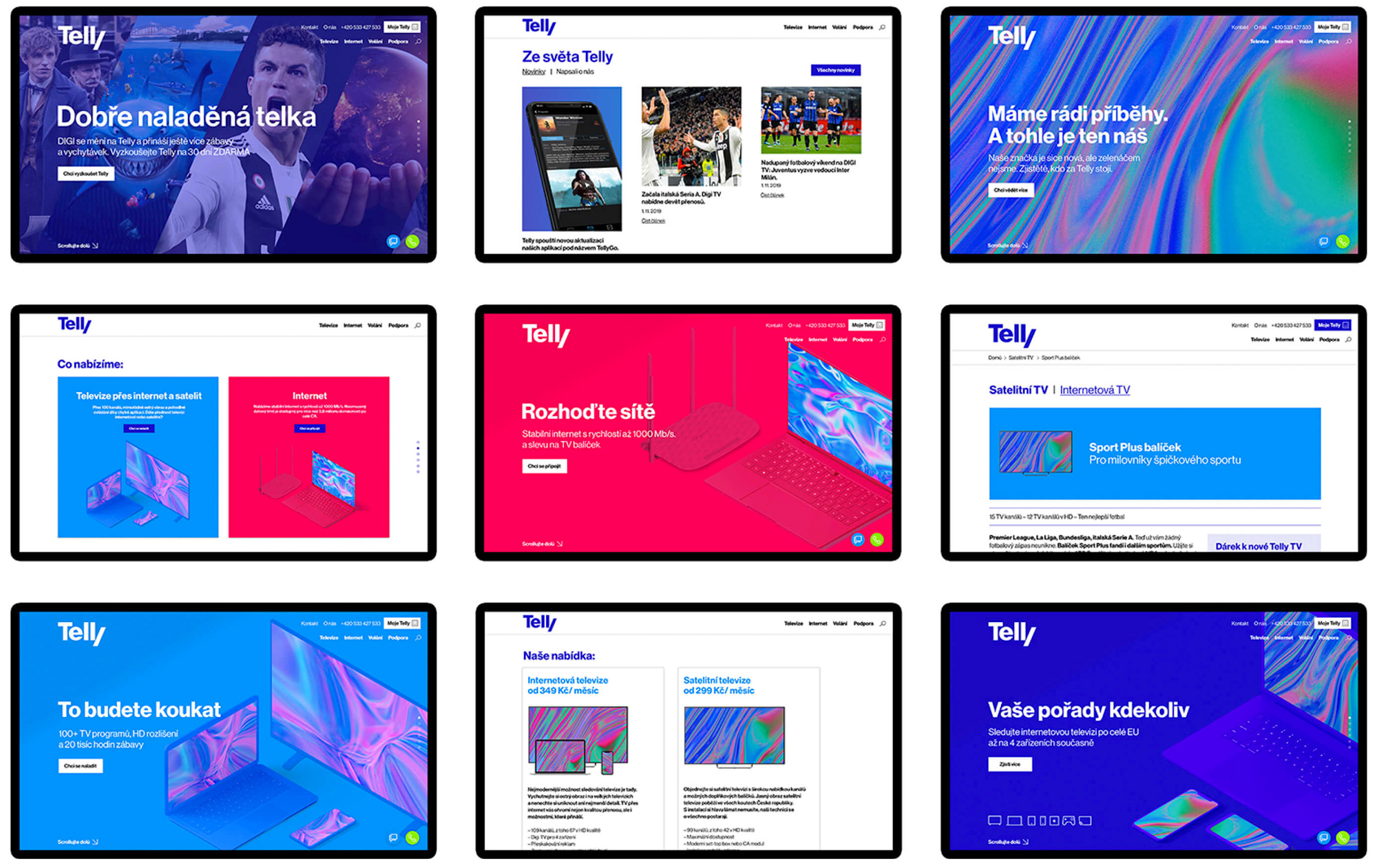
Big fan of the institutional materials with the tight grids and no-nonsense layouts. Feels very Unimark-ish.
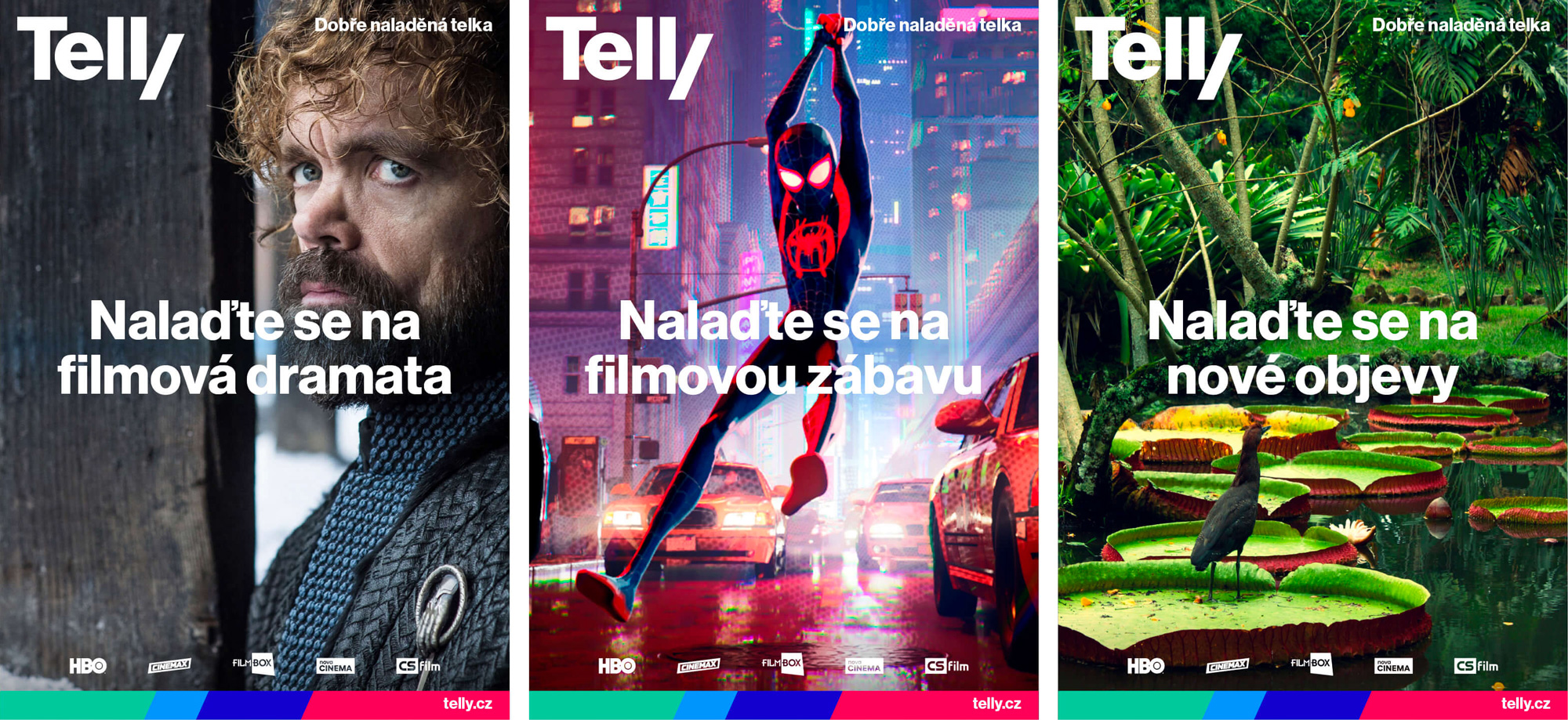
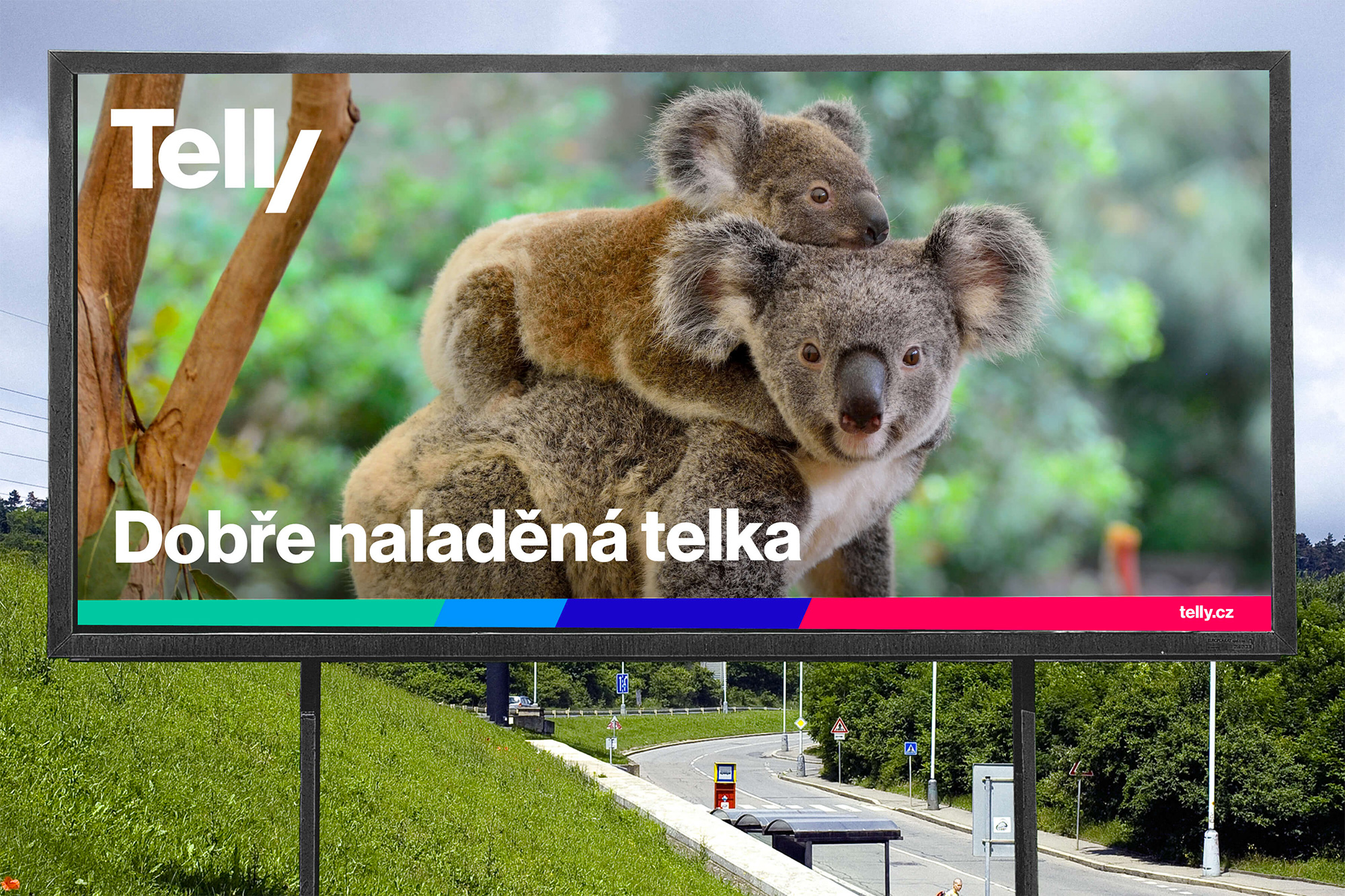
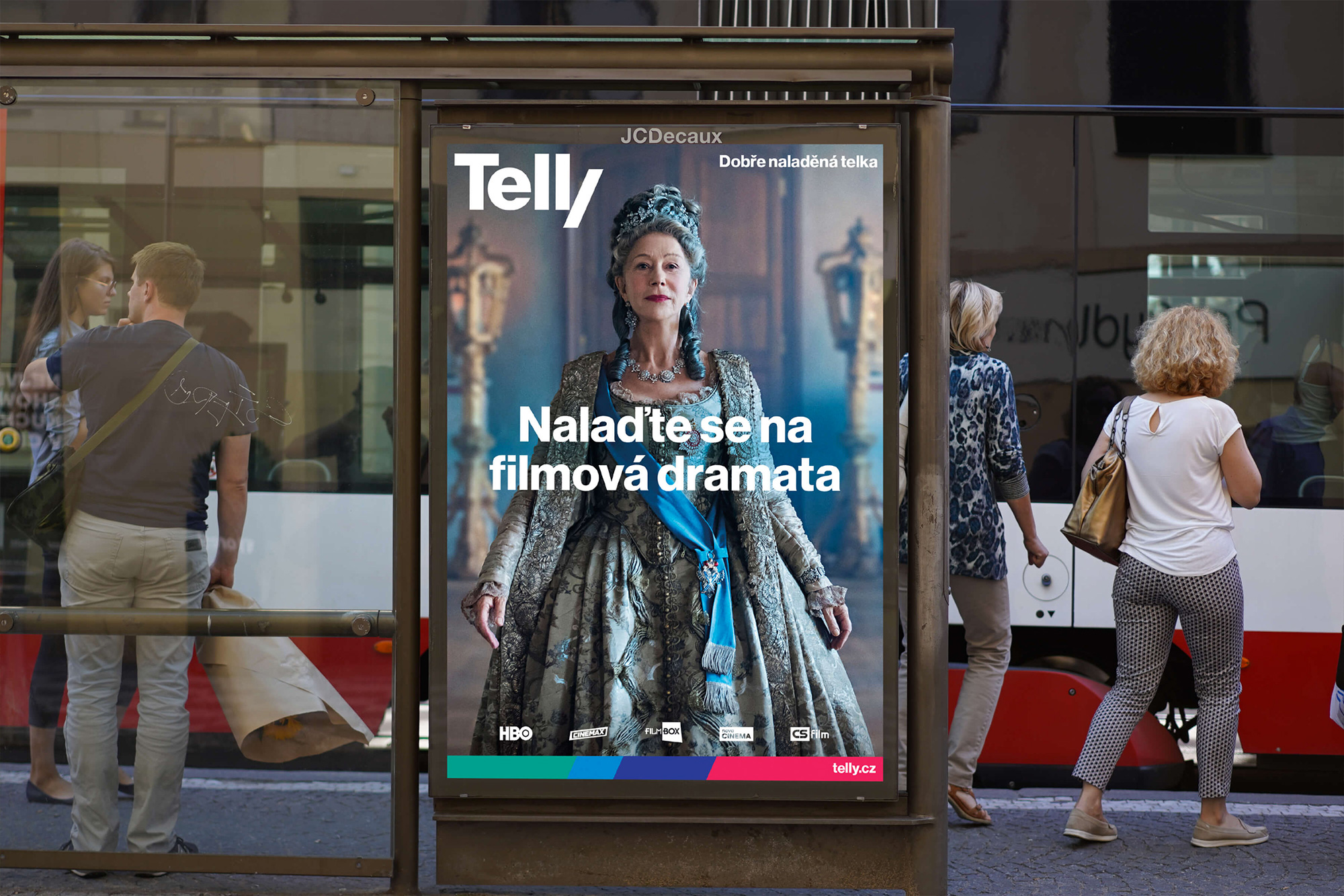
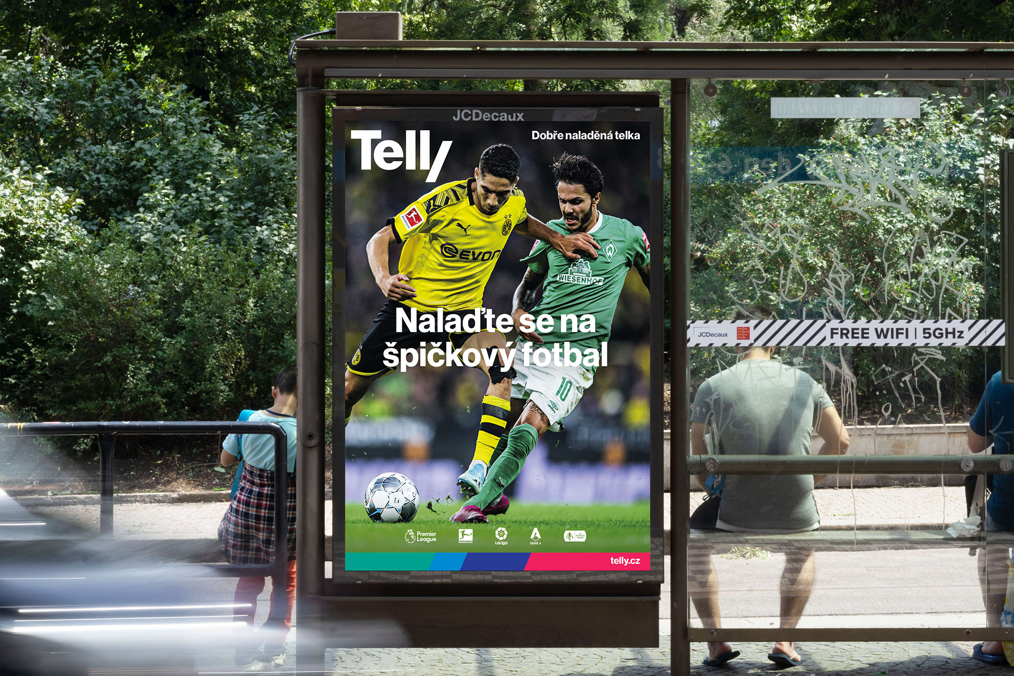
The consumer applications are very straightforward with a big logo in the top left corner plus a programming still plus a headline plus a footer strip in the brand’s colors and signature angle. It’s not groundbreaking and it’s not that interesting, to be honest, but it’s effective. Perhaps as the brand evolves, their visual language can get a little more sophisticated, perhaps introducing a Photoshop-y treatment to the programming imagery so it feels less generic. The logo is so bold and has so much presence, though, that it almost gets the job done on its own.
There is a slightly groovy element that starts to appear below (and can be seen here on their website) of a psychedelic-ish pattern in the RGB colors that’s kind of interesting. It may be a little too weird for driving the advertising but there is something cool going on there.
Overall, this is a solid renaming/redesign that establishes a new brand that looks and sounds like it’s been there for decades. It feels like a confident, dependable brand where you can enjoy all the soccer you want.
 each year since publication began in 2006

 Новости Союза дизайнеров
Все о дизайне в Санкт-Петербурге.
Новости Союза дизайнеров
Все о дизайне в Санкт-Петербурге.