Обзор лучших ресурсов по разработке бренда, разработке упаковки
contact us | ok@ohmycode.ru
contact us | ok@ohmycode.ru
Established in 2003, BOO is the premier streetwear and skate brand in Vietnam. Founded by twin brothers, Viet Anh and Viet Hung, who grew up in the Czech Republic and moved to Vietnam when they turned 20, the company started with them selling other brands’ merchandise from their home before opening their first retail store and eventually developing their own apparel starting in 2009. According to this article, the company is named in honor of cows — “boo” is “moo” in Czech (although I couldn’t confirm the translation through Google so any bovine Czech enthusiasts reading are welcome to confirm). Today, BOO has over 50 retail stores across the country and enjoys growing influence in the Vietnam fashion scene. Earlier this year, BOO introduced a new identity designed by Ho Chi Minh City, Vietnam-based Rice.
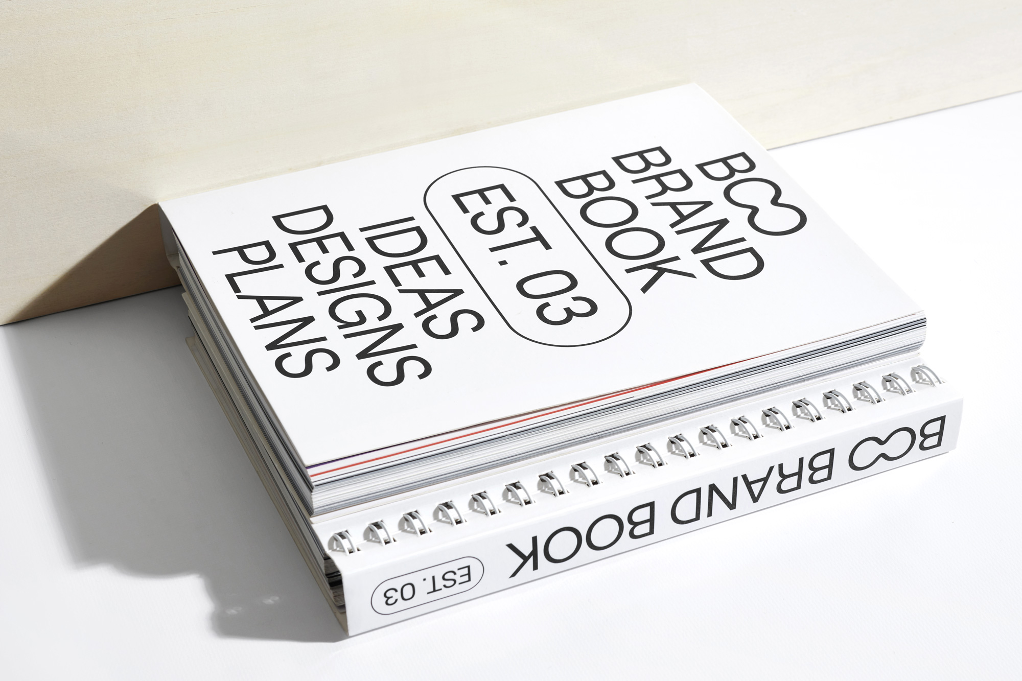
For BOO, Rice created a comprehensive and heavy-lifting new identity system designed to focus and streamline the brand. Reducing brand assets in order to make them work harder, reorganizing hierarchies to clarify offerings and initiatives, and introducing systems for design and communication, Rice aimed to help BOO stay relevant for the new generation on Vietnamese streetwear lovers.
Rice commissioned Displaay type foundry to create an exclusive, Vietnamese version of Roobert Regular with custom discretionary ligatures for BOO. The BOO word-mark is type-able and can be displayed within any line of copy and was designed with a variety of lock-up’s in mind. Branded stamps were designed with each shape mimicking an encapsulated stamp of approval.
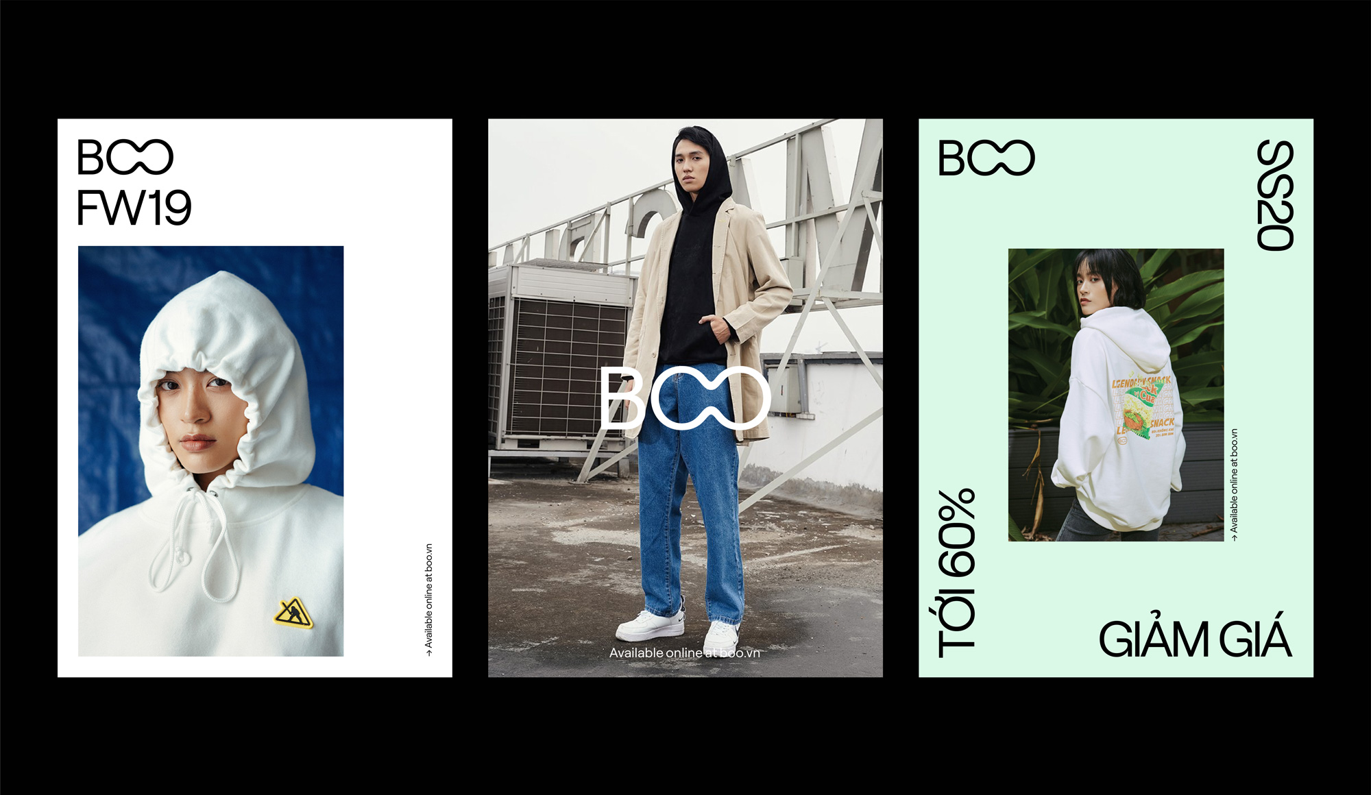
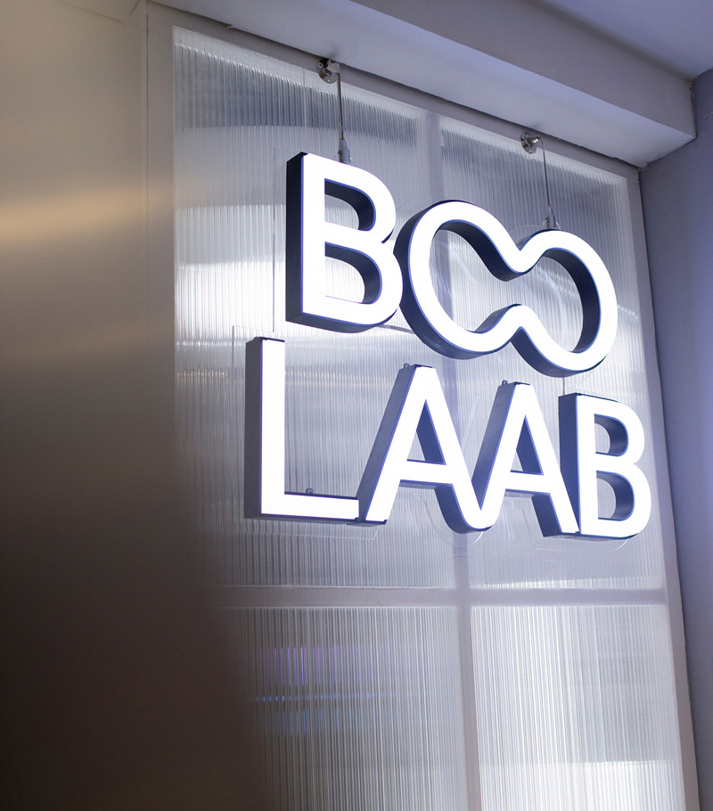
The old logo was not good by traditional logo standards — it was very difficult to read as “BOO”, more like “B8”, and the laurel wreaths had nothing to do with anything visually or conceptually — but when it comes to streetwear and skate wear my impression is that such concerns don’t matter and if the audience embraces it then it’s cool AF and that seems to be the case here. Nonetheless, it wasn’t a good logo. Meanwhile, the new logo is pretty awesome, with a super funky “OO” ligature that is unexpected and rule-defying, giving it a challenger-brand personality with a mature, confident approach. The logo is simple, minimal, and catchy in an odd yet satisfying way. Complemented by a heavy dose of a customized version of Displaay’s Roobert Regular and thin stroke holding shapes, the logo system does verge into the deadpan trend territory but it’s so nicely done that it’s hard to be mad at it in any way.
While I wish there was a slight visual twist somewhere, somehow, beyond the Brutalist approach — which, in this case, is kept on the light side — the design system is effective mostly because now it seems like such an acceptable visual language for fashion brands. Perhaps it’s a novel approach in Vietnam that isn’t as pervasive as in Europe or the U.S…. or a design blog.
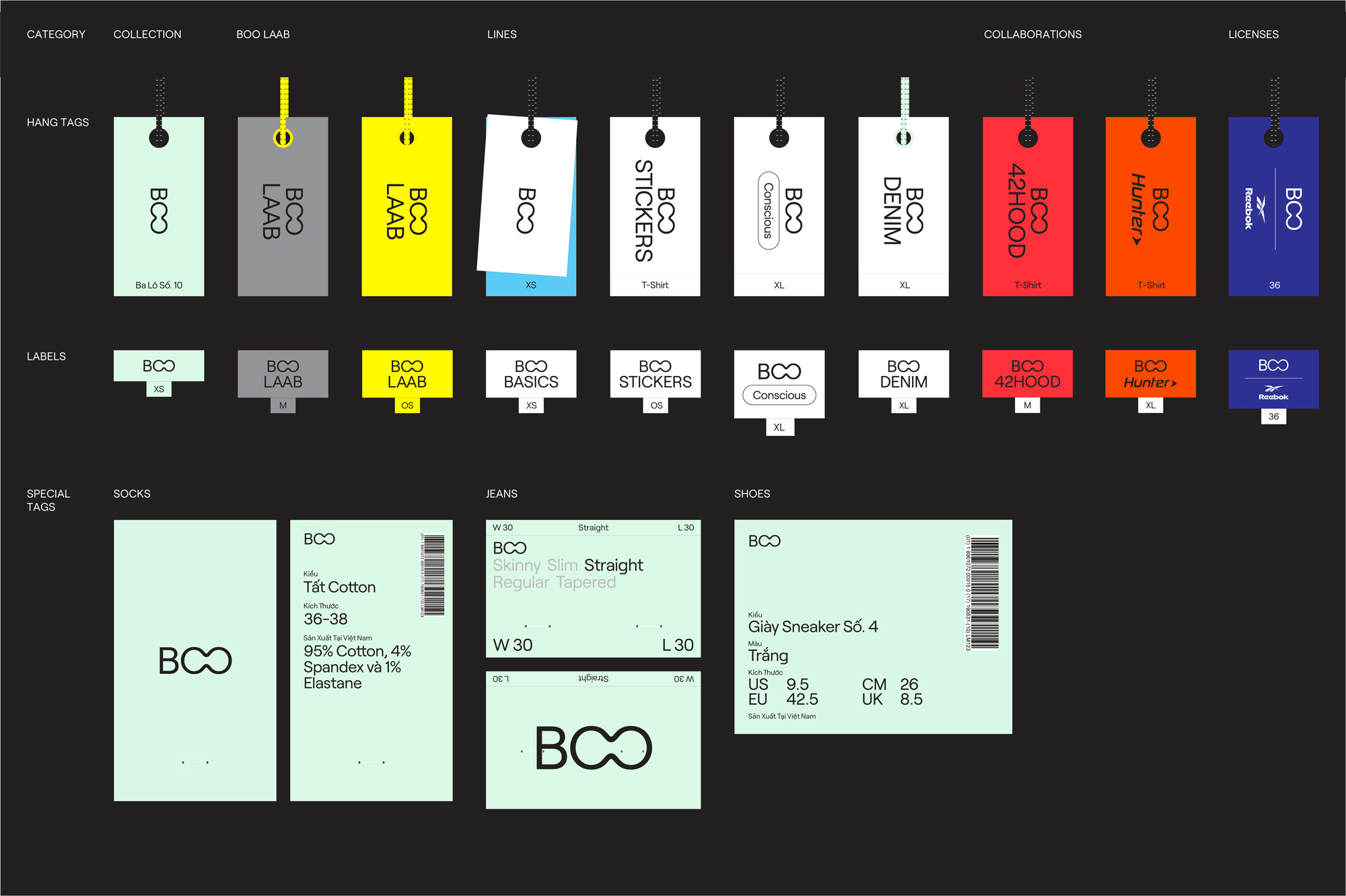
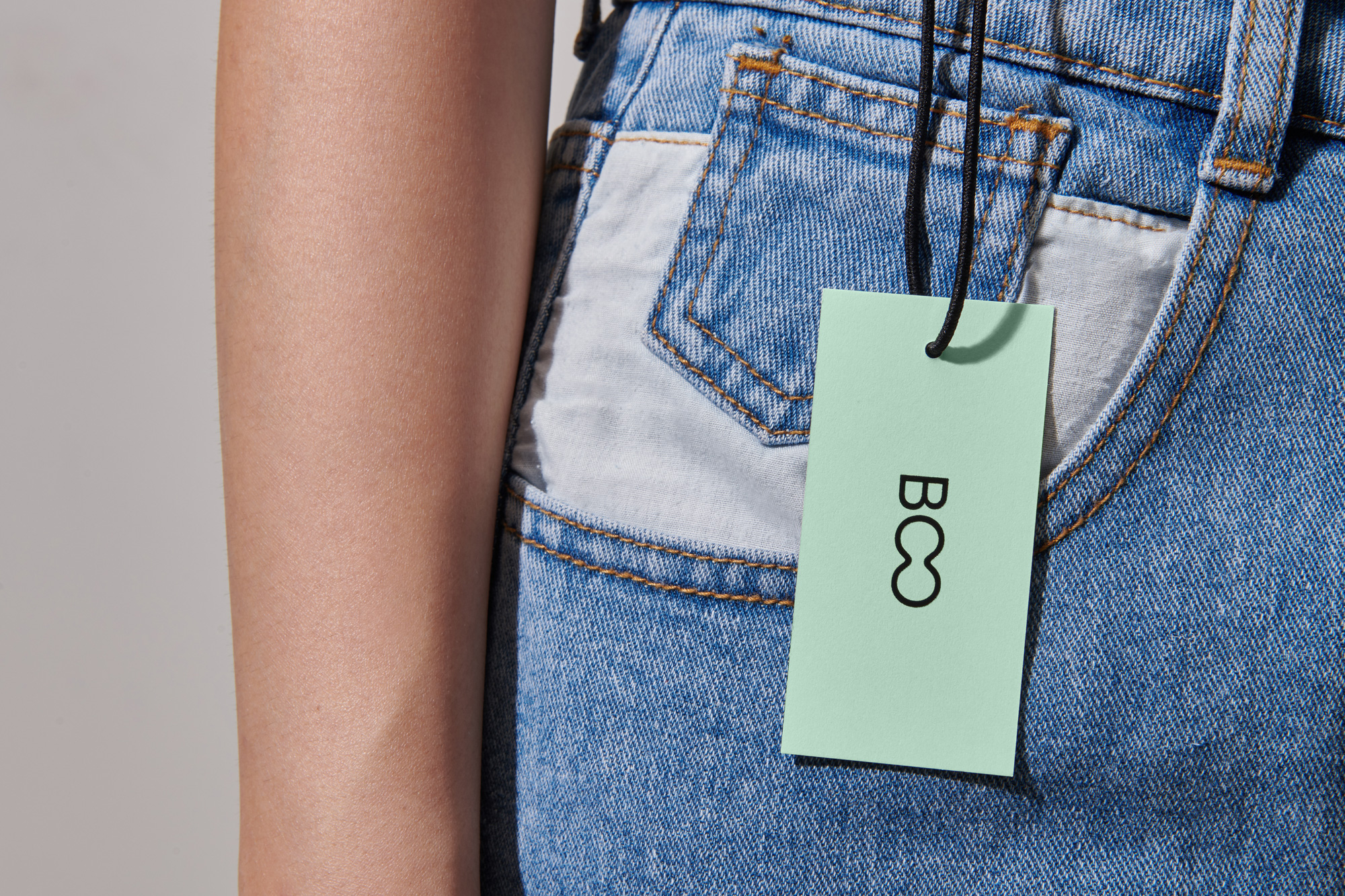
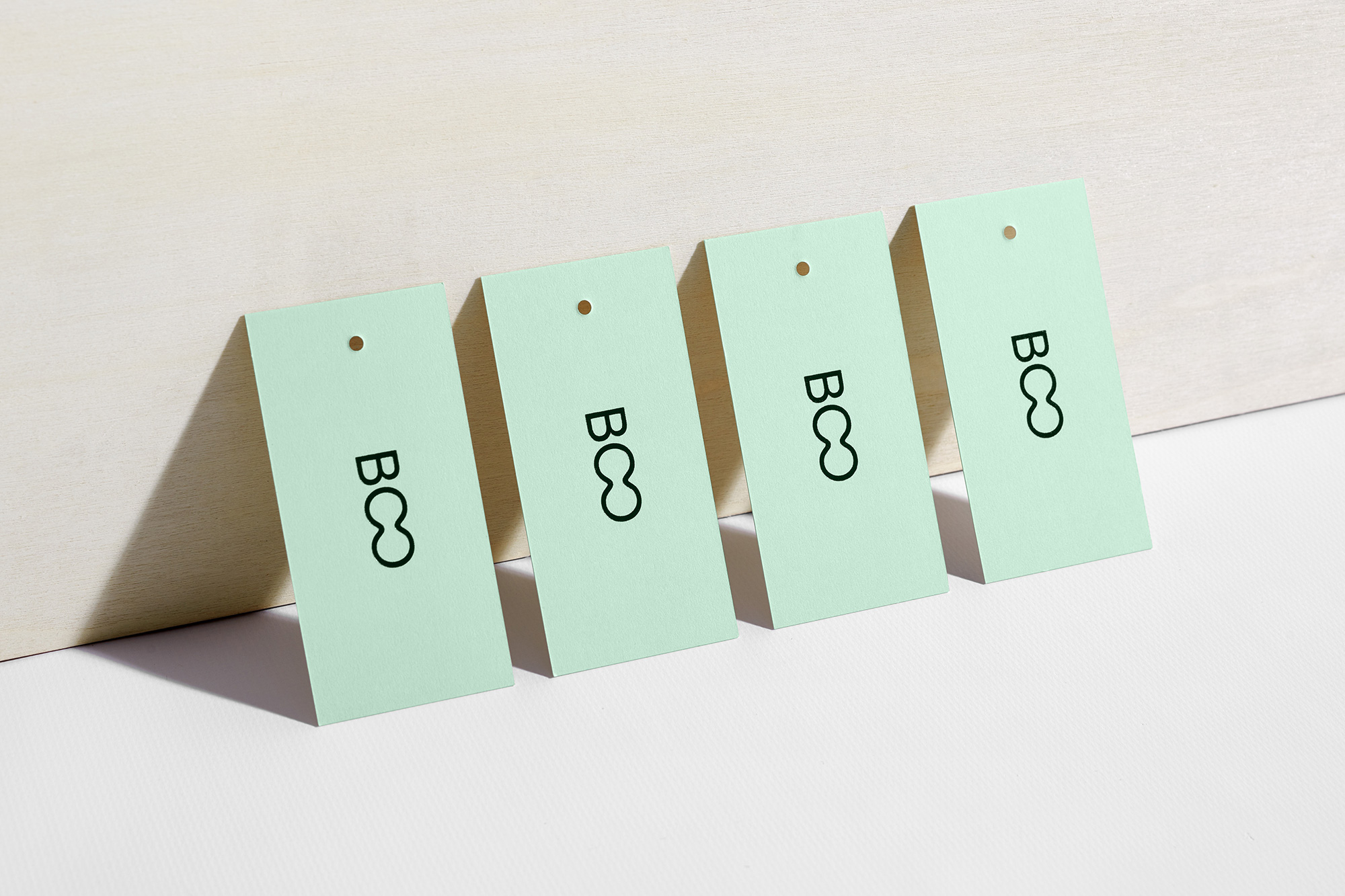
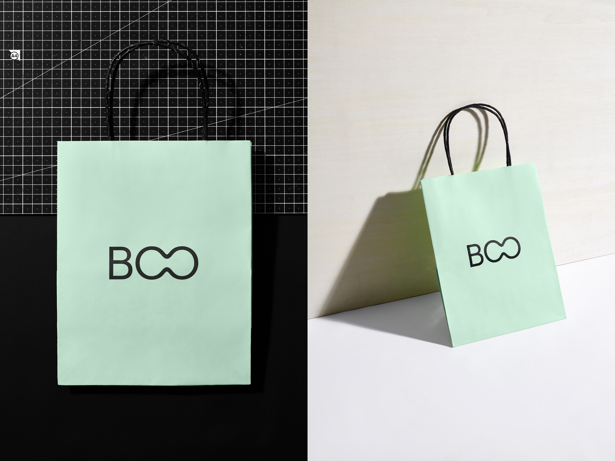
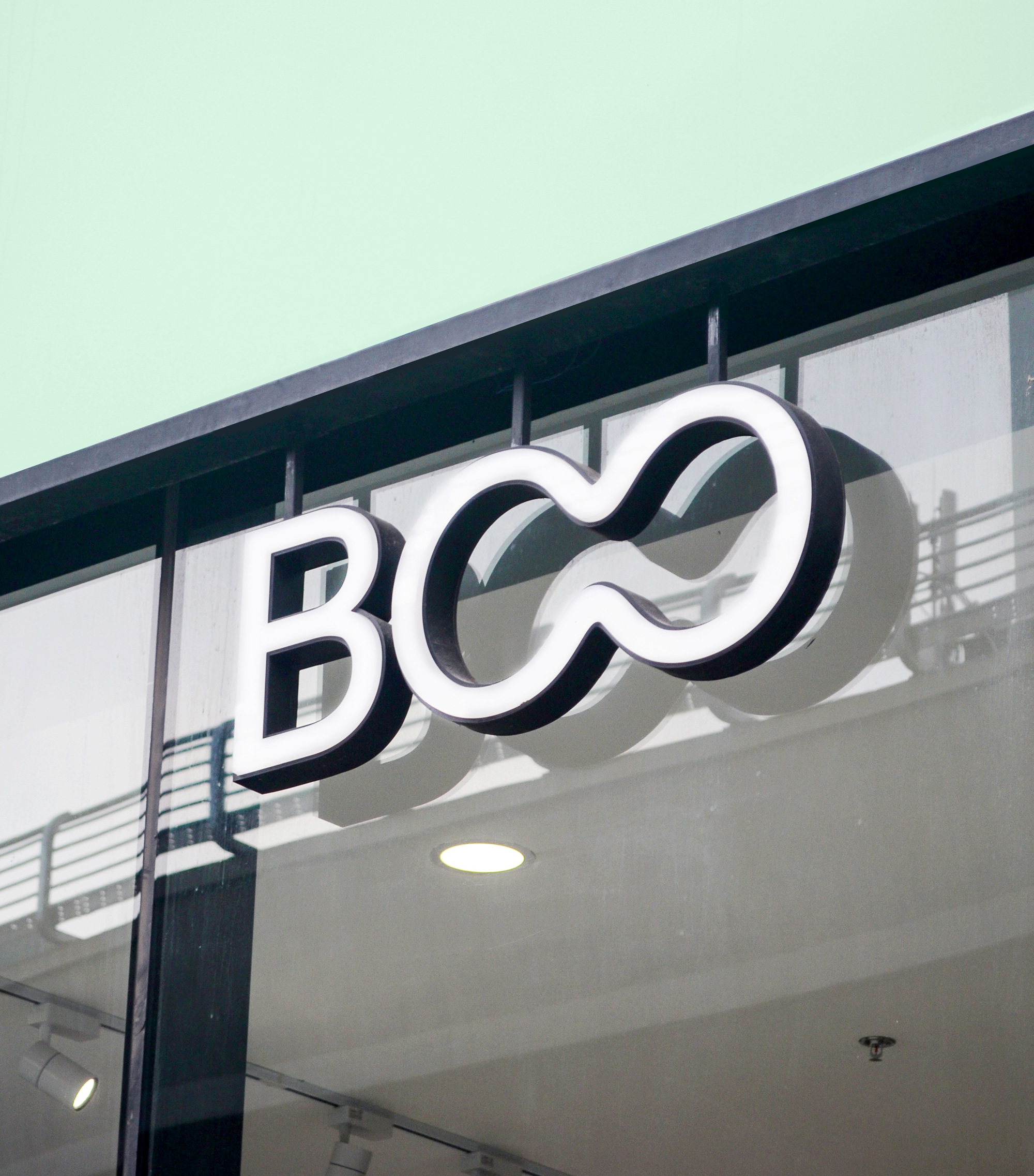
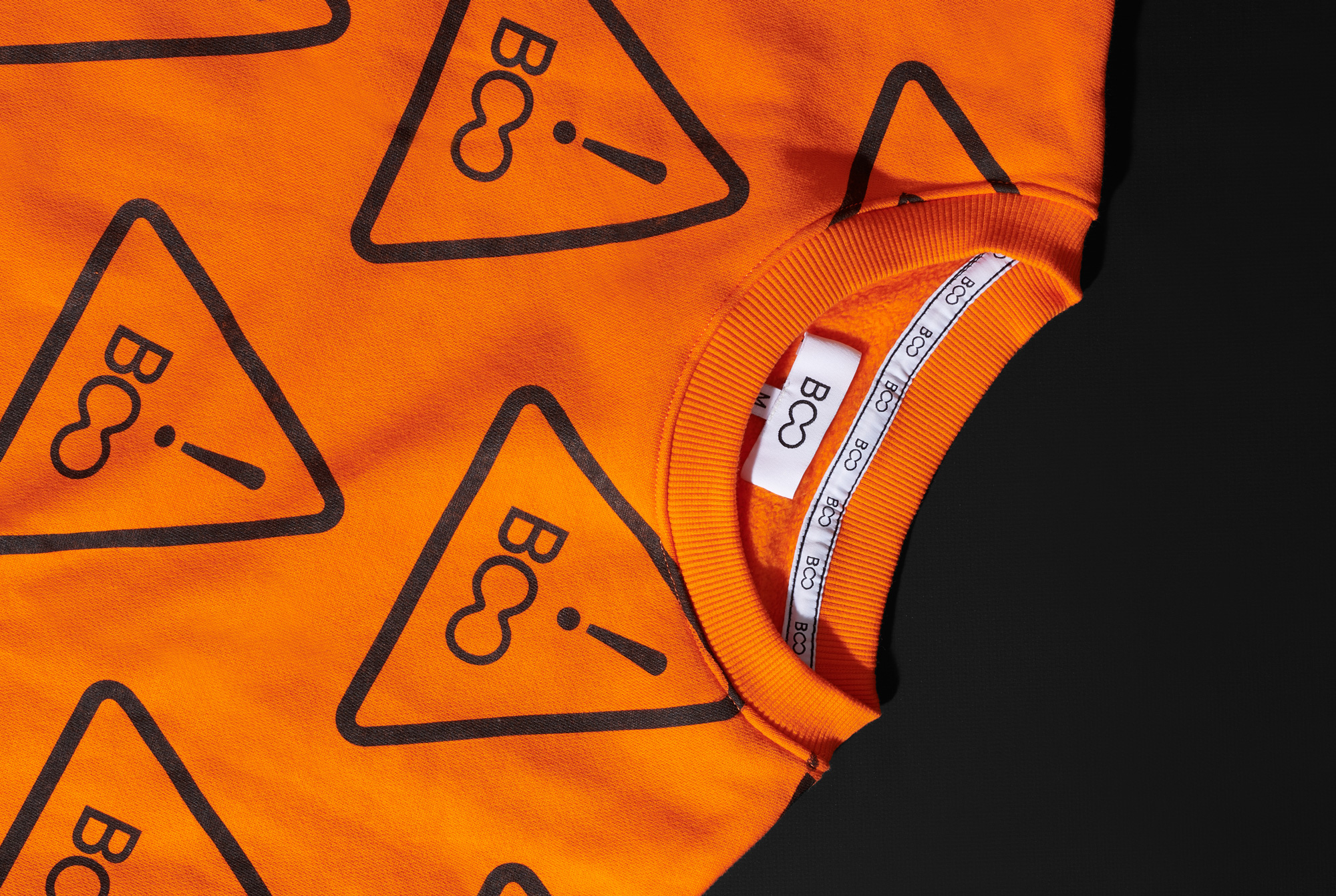
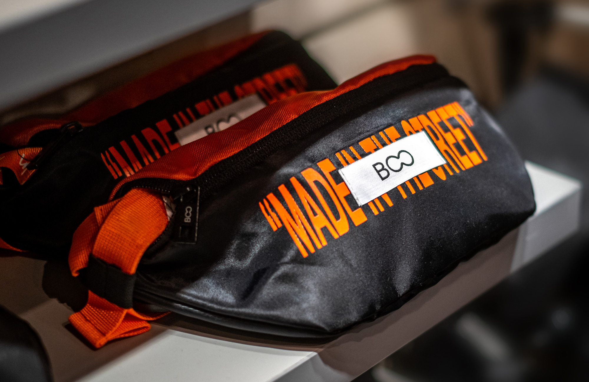
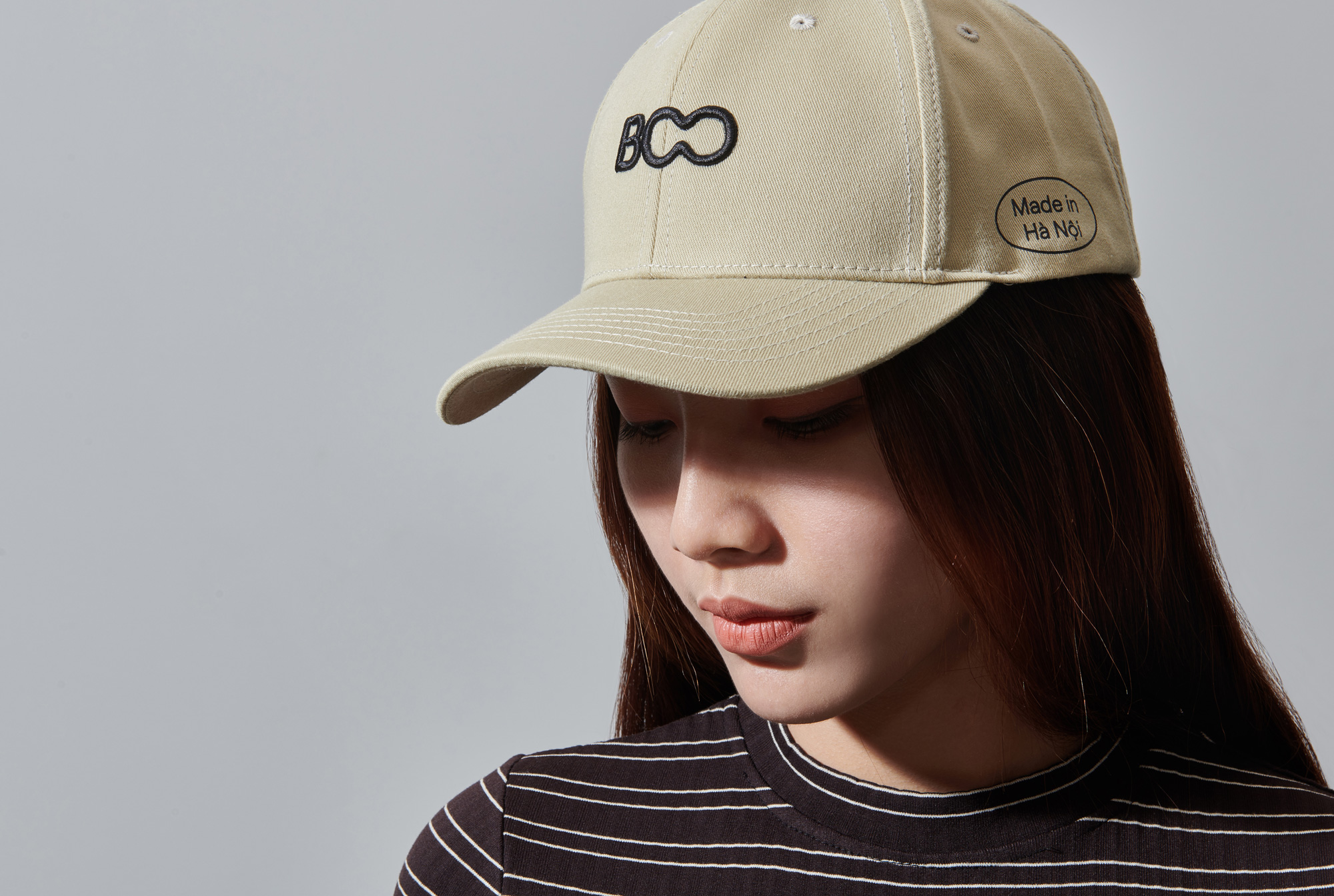
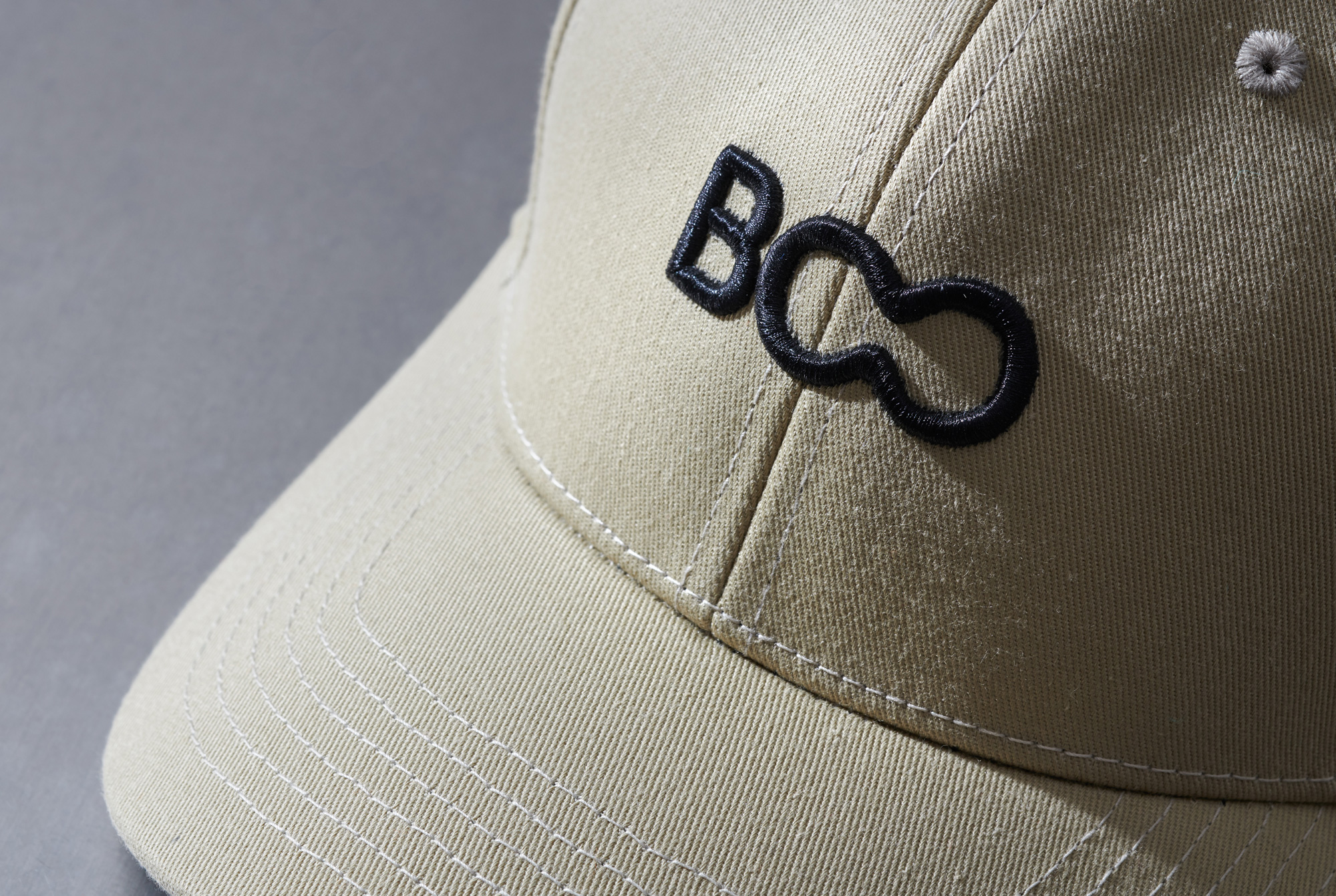
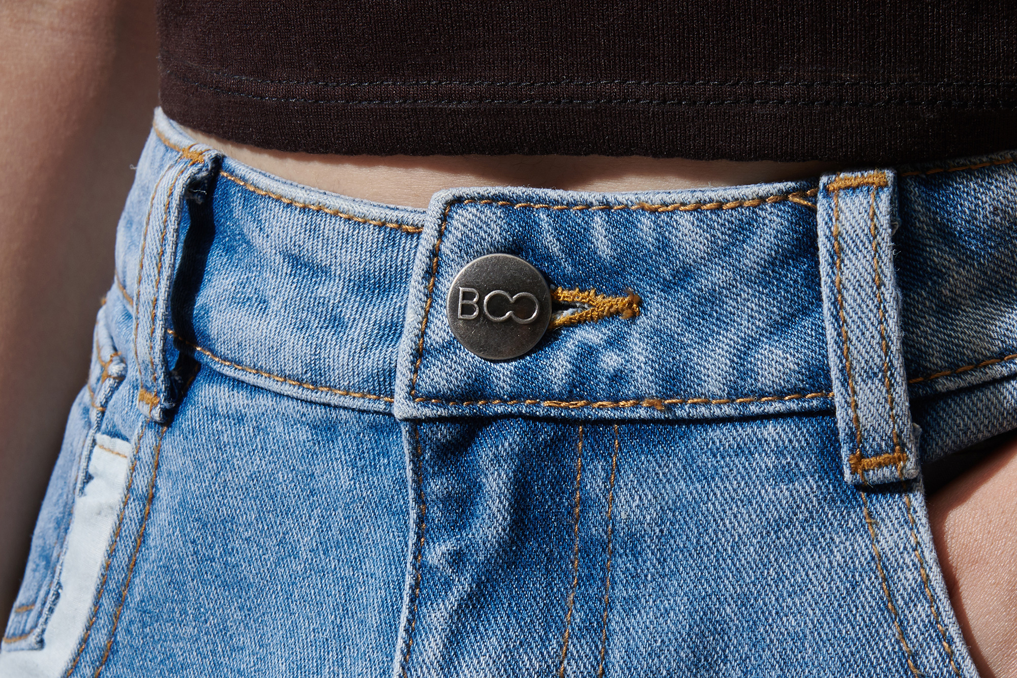
The strength of the logo is demonstrated in how easily it can brand everything on its own, from hang tags to caps to buttons, and being such a small device, it can remain readable even in the smallest of real estate.
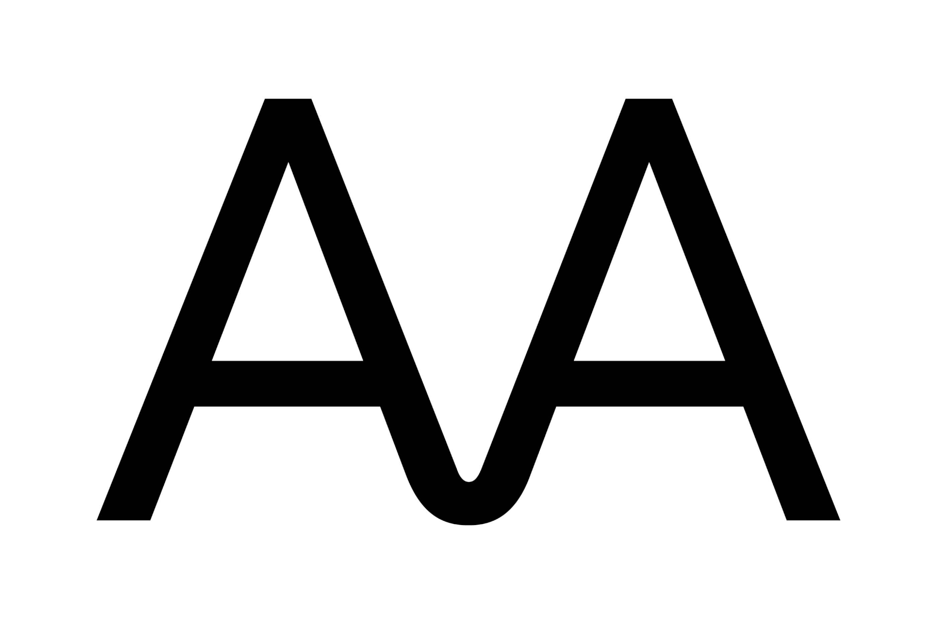
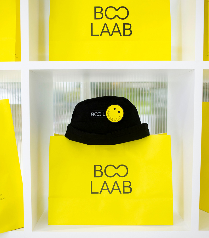
Rice created a sub-brand for BOO called BOO LAAB. BOO LAAB is a place for BOO to experiment with new approaches to product making and push themselves into unexpected territories. The BOO LAAB product can be found at BOO stores but also at their own stand alone retail outlets. The BOO LAAB word-mark is constructed using a special AA ligature which mirrors the OO in BOO. Times New Roman is adds some spice to the typographic mix.
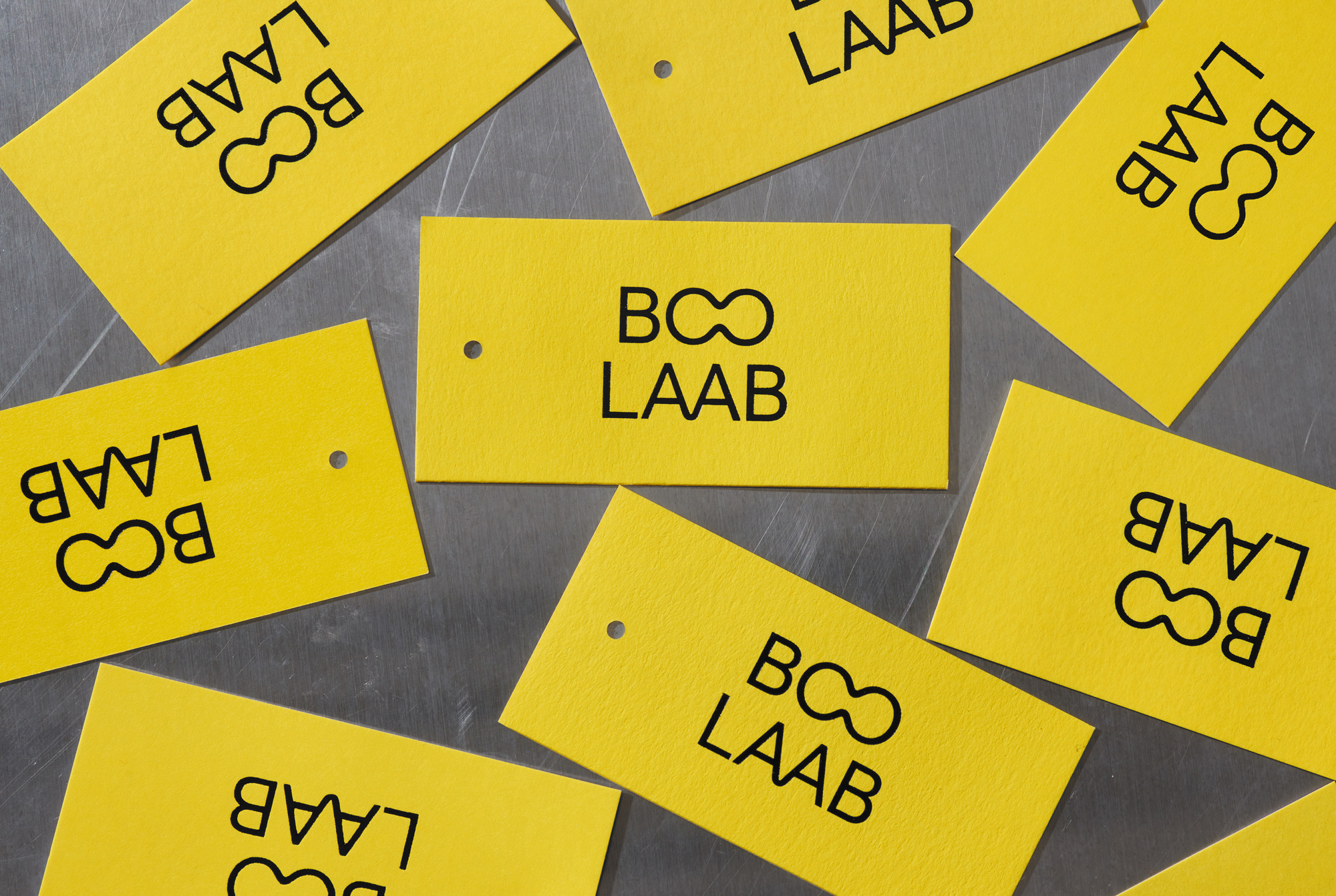
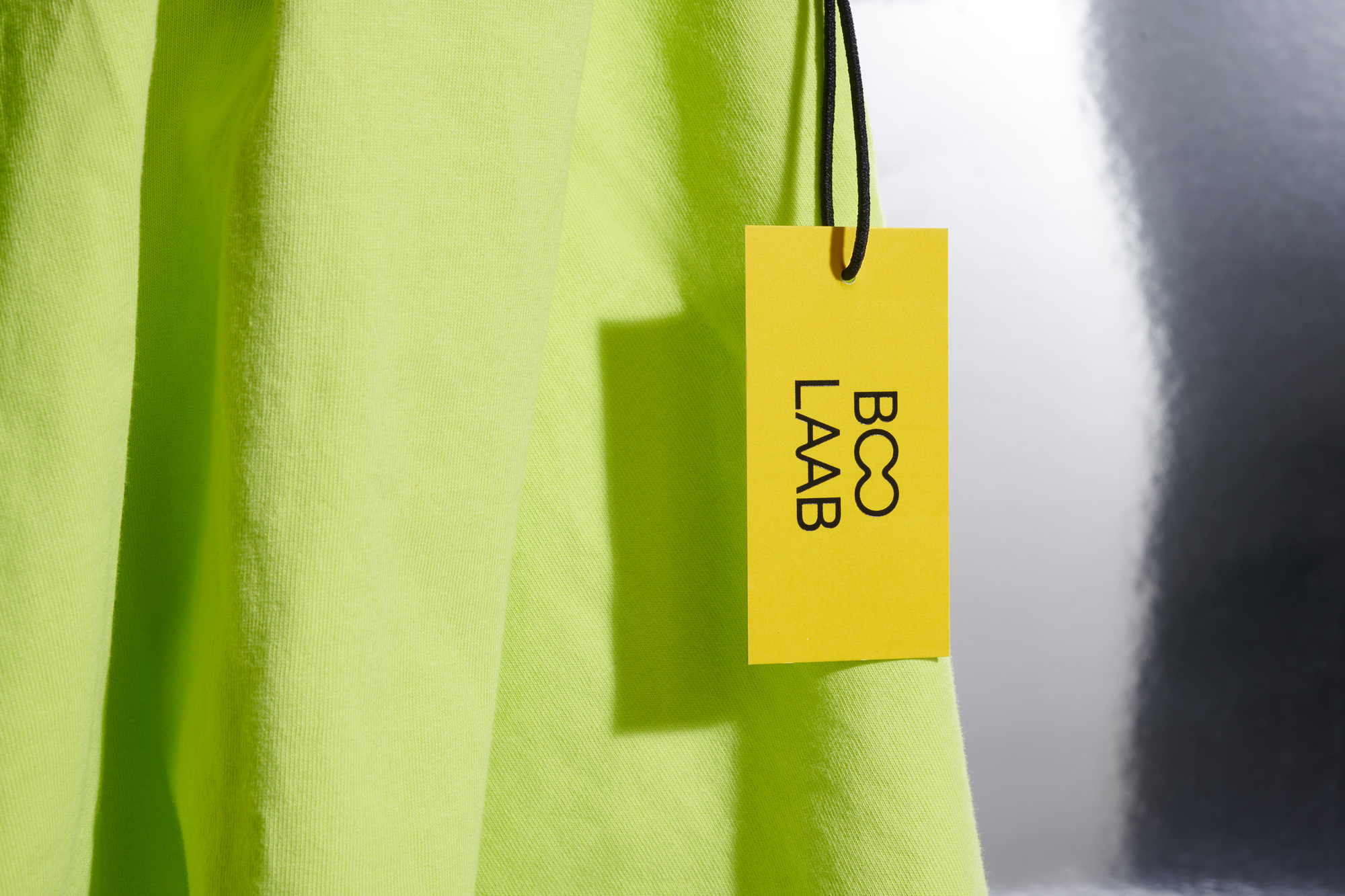
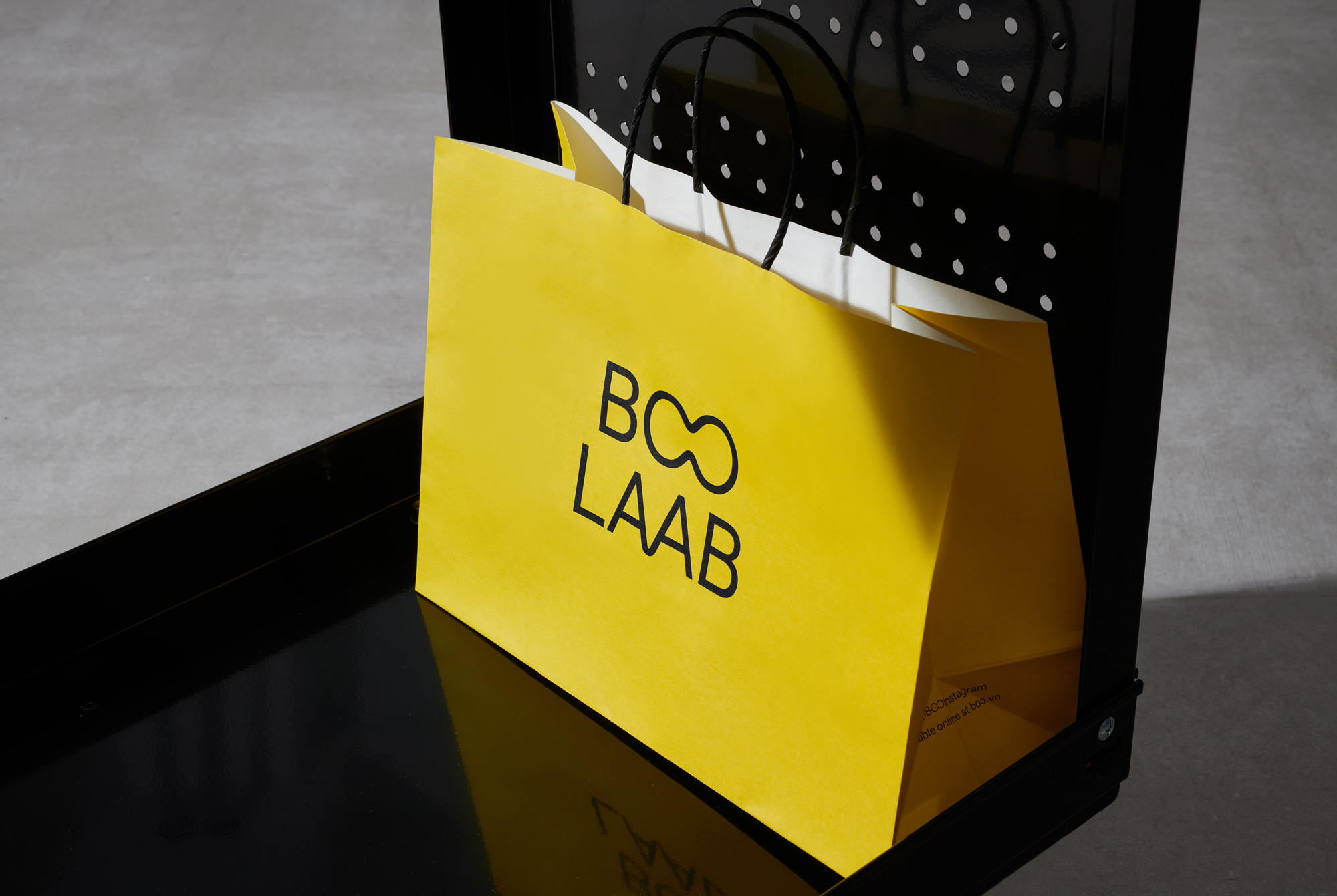
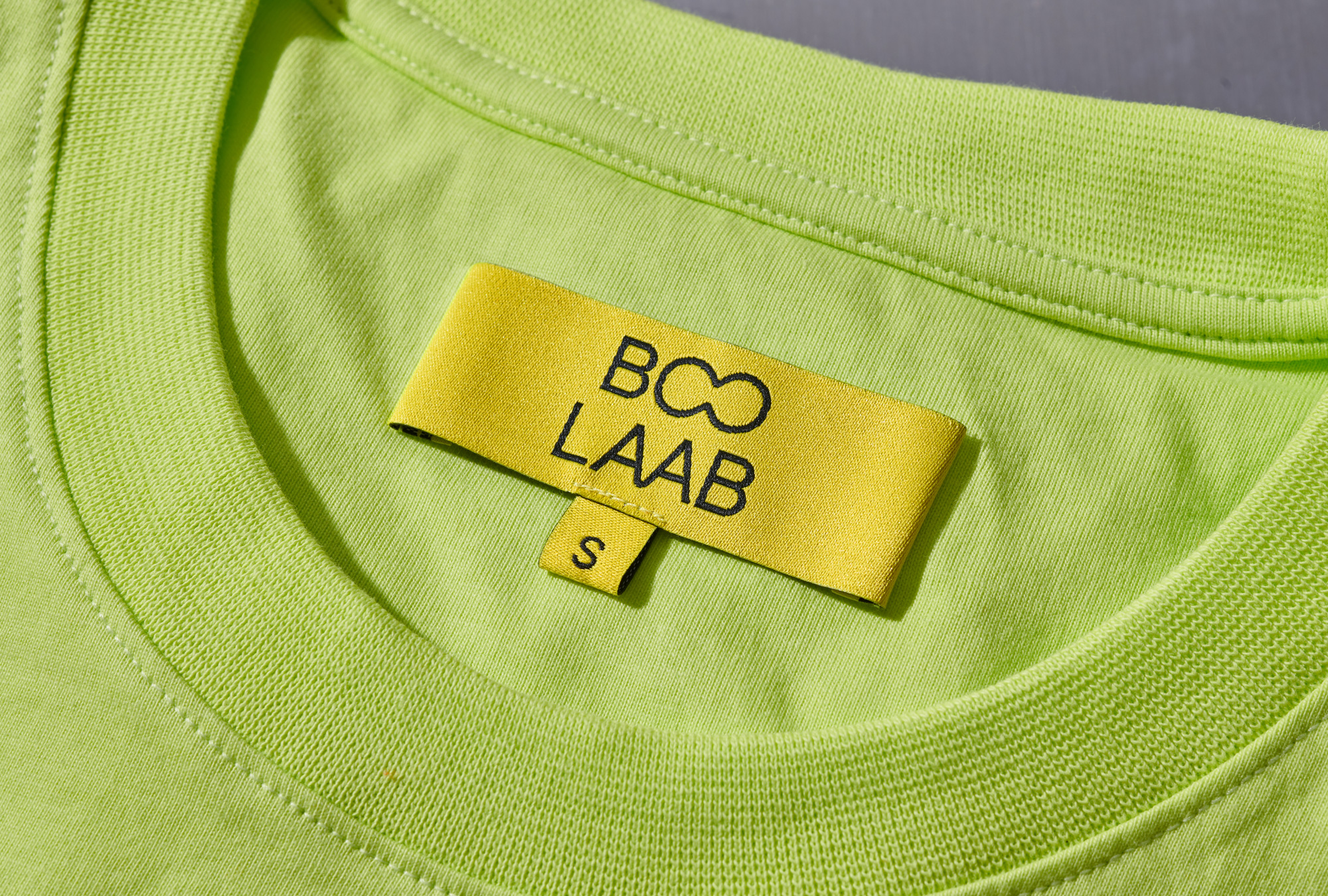
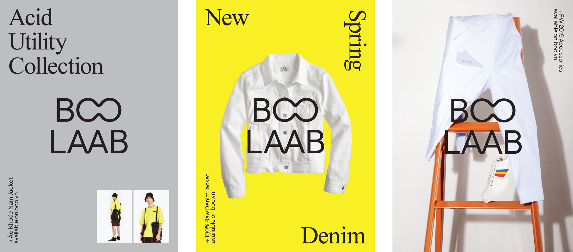
The BOO LAAB sub-brand follows the same parameters but in yellow instead of mint green and with the addition of Times New Roman as an extra dose of graphic irreverence (which, eh, it was an interesting idea a decade or more ago but not so much anymore). I wish the “AA” ligature were more exaggerated to match the “OO” as it can almost pass unperceived.
Overall, despite some expected fashion and identity tropes, this is really well done and gives the brand a sense of maturity without losing the rebellious attitude.
 each year since publication began in 2006

 Новости Союза дизайнеров
Все о дизайне в Санкт-Петербурге.
Новости Союза дизайнеров
Все о дизайне в Санкт-Петербурге.