Обзор лучших ресурсов по разработке бренда, разработке упаковки
contact us | ok@ohmycode.ru
contact us | ok@ohmycode.ru
Established in 1995 and based in Barcelona, Universitat Oberta de Catalunya (UOC for short, Open University of Catalonia in English) is one of the world’s first, fully online universities. With more than 3,000 teaching staff and over 6,000 active classrooms, UOC serves nearly 50,000 students and has graduated 63,870 students over the years. UOC offers bachelor’s and master’s degrees as well as postgraduate and specialist courses in a very wide range of fields of study. As part of a recent strategy change at the university, the organization has introduced a new identity designed by Mucho.
A brand microsite with some more information and display of the identity can be found here.
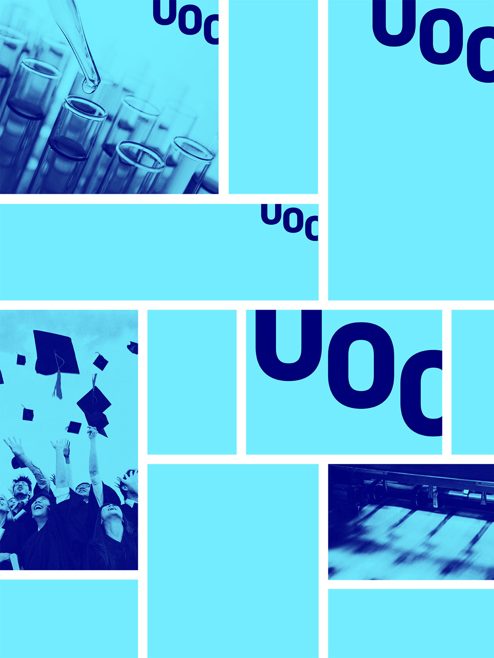
We took advantage of the fortuitous opportunity that the letters U and C by could both be formed by cutting the letter O. This diagonally shaped composition allows for dynamic composition and is reminiscent of heraldry, so often used by universities. This new brand proposes stepping out of established conventions, setting new boundaries and acting in a flexible but ordered fashion. To complement the brand, we created an in-house serif and sans serif font family, a digitally native RGB color palette, a photography style, new visual resources and a pictographic system to match the logo.
The old logo was not terribly offensive in that all the typography was decent but the dot in a square is a real head-scratcher. Is it a student at a desk seen from above? A student entering the tiniest dorm room seen from above? A dot in a square with no meaning? Who knows. But it’s the kind of logo that makes you question the authenticity and validity of an online university. The new logo on the other hand is so boss, you get an education simply by looking at it and deciphering what it’s doing: The same shape of the “O” is repeated as the “U” and “C” and achieved to read as those letters by their cropping. It’s not only visually genius, it’s extremely brave in being adopted by an institution. This is the kind of readability-challenging concept that would get killed by anyone wanting to keep their job at the university for fear of choosing something that someone might not be able to figure out with a little effort. It’s a great acronym logo with a lovely rhythm to it. The serif wordmark spelling out the full name adds a touch of academic-ness to it that also makes the whole logo look more refined, confident, and authoritative than many brick-and-mortar universities.
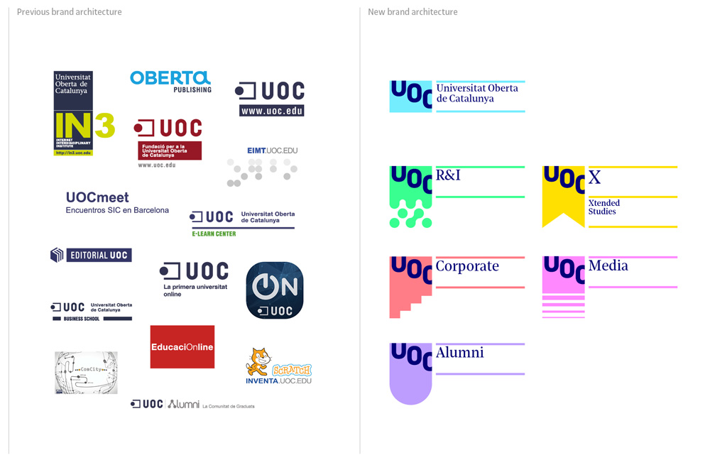
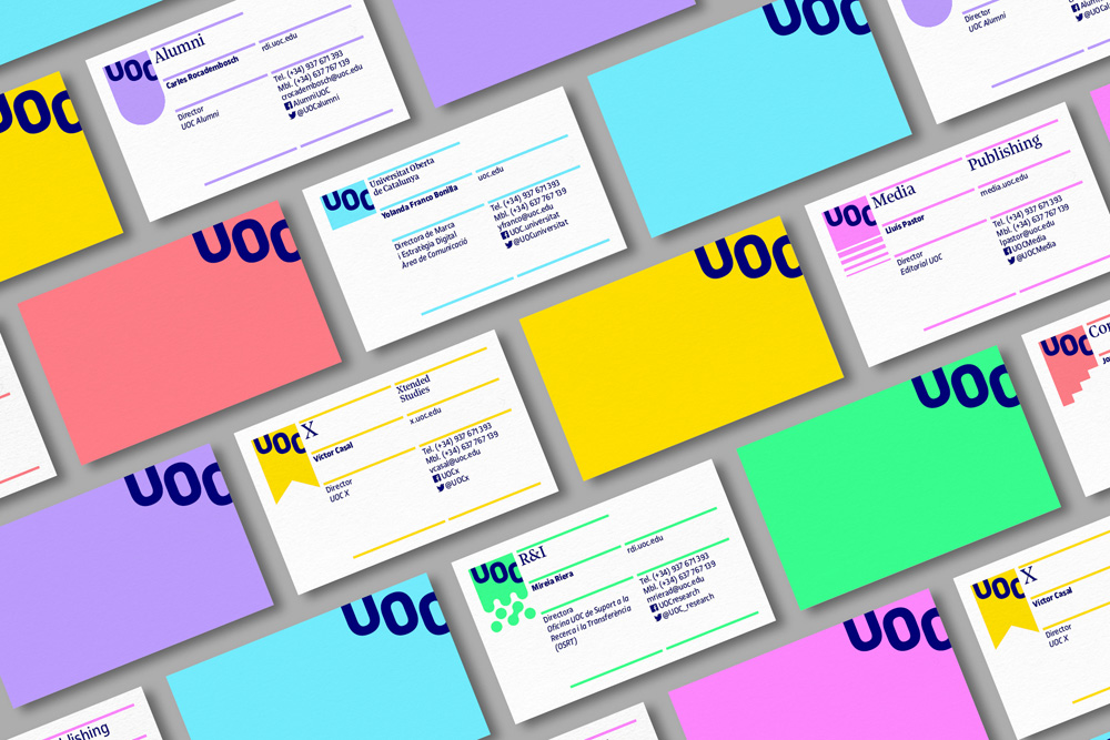
UOC also counts with a lot of sub-brands that represent various other benefits and services offered by the university and the old free-for-all mess has been cleaned up with crisp riffs on the main logo and a funky color palette that works quite well for a digital-first university.
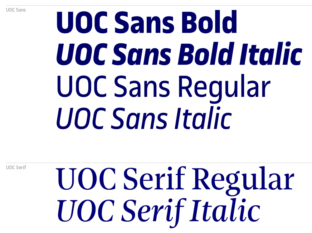
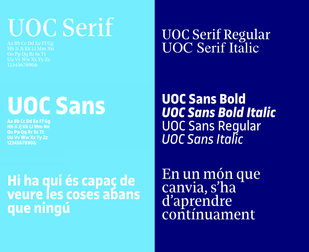
The identity features two custom type families with UOC Sans Bold being the primary expression and it’s a wonderful mix of 1970s chunkiness with a strong contemporary construction. It’s like a corporate condensed version of Antique Olive. The serif is a great complement and they work perfect together in application.
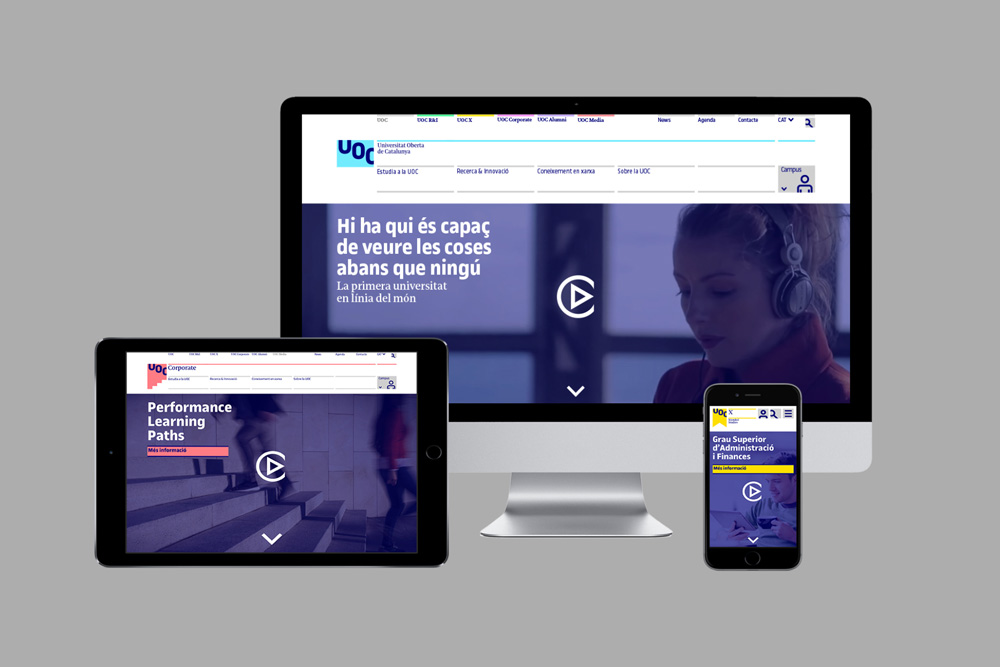
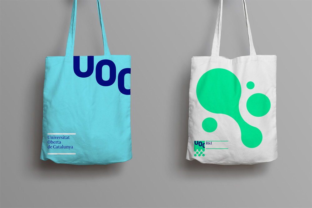
In application there are a lot of rules (lines) adhering to a grid — and if you’ve navigated through any of our sites, you’ve seen a lot of rules adhering to grids, so I’m a big fan — with the short and long lines of typography creating tension in the layouts. While this identity lives mostly online, putting the UOC logo in a corner is not a big problem but IRL that poor logo is going to suffer from the usual margin of error in printing and trimming. And that tote, as pretty as it is, would need to be expensively custom-made as no tote vendor prints to the edge. Realities aside, this is a beautiful, smart, and solid identity anchored by a fantastic logo.

 Новости Союза дизайнеров
Все о дизайне в Санкт-Петербурге.
Новости Союза дизайнеров
Все о дизайне в Санкт-Петербурге.