Обзор лучших ресурсов по разработке бренда, разработке упаковки
contact us | ok@ohmycode.ru
contact us | ok@ohmycode.ru
Established in 1994, Banregio is a regional bank in Mexico, serving central and northern Mexico. Based in San Pedro Garza García, near Monterrey, Banregio operates 133 branches in 44 cities with approximately 250 ATMs and its main customers are small and medium-sized companies. Late last year, Banregio introduced a new identity designed by local firm Brands&People.
We wanted to bring their image up to date with everything else we were doing — to renew the energy and aesthetics of the brand without taking away from their history. We had two main goals: express Banregio’s vision for the future and, at the same time, intensify the internal culture and sense of belonging from within.
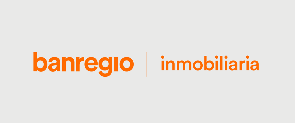
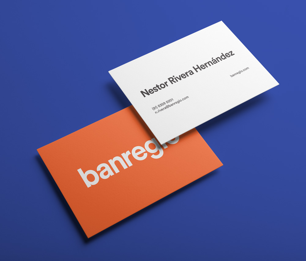
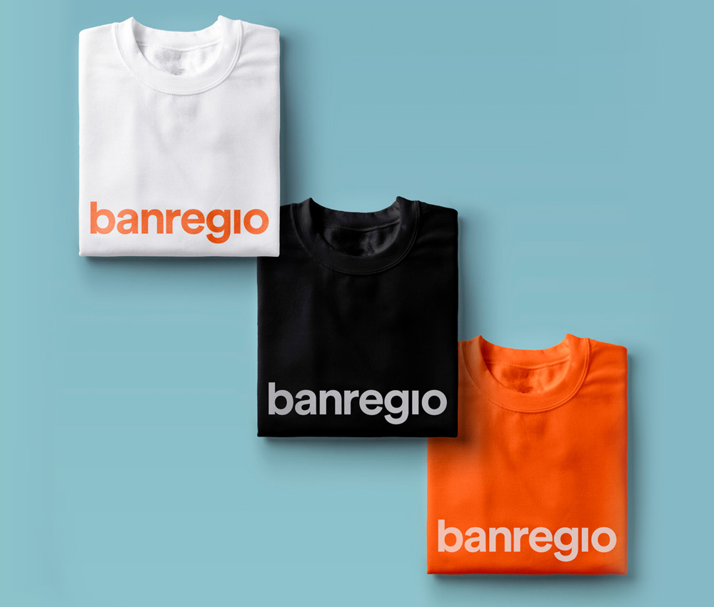
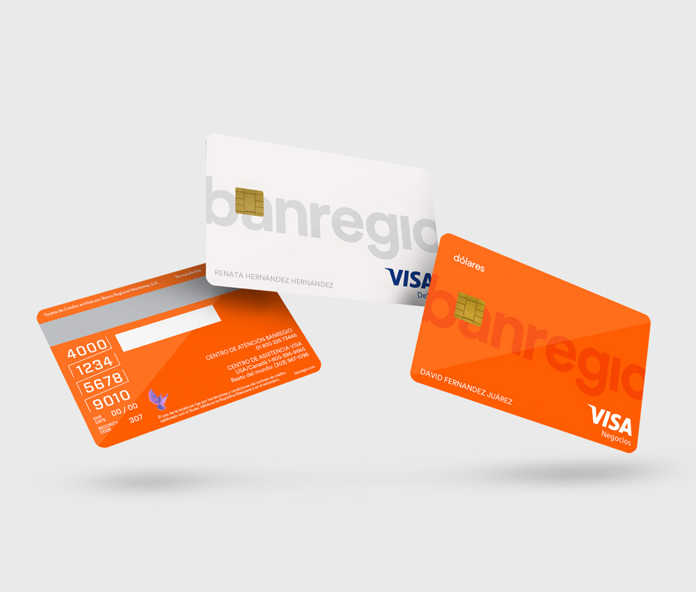
First, we took the brand from its traditional all-caps to lowercase, using a rounded and straight-forward typeface for a modern, relatable aesthetic. Then, instead of dotting the i, we broke it apart from the name and transformed it into a set of familiar visuals that convey different brand sentiments to elevate the personality and dynamism of the identity to a whole new level.
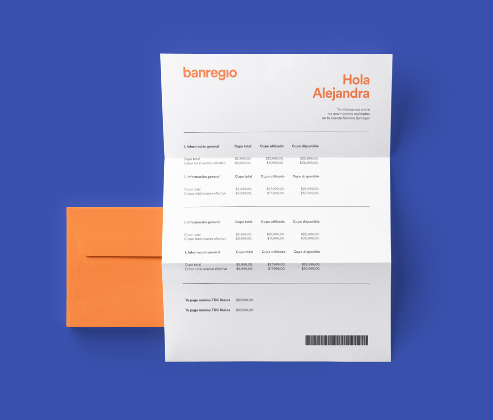
Finally, to tie it all together, we chose the orange tone to stand in contrast to the traditional institutional banking palette and to embody Banregio’s energy and innovation. With this new brand color, we created an orange wave that reached inside the bank branches and throughout the city, fully embracing our evolution and inviting everyone to be a part of it.
These changes created a highly relatable identity that captured Banregio’s evolution and at the same time highlighted the bank’s customer-centric approach, helping them express who they aspire to be: “the best bank for our clients.”
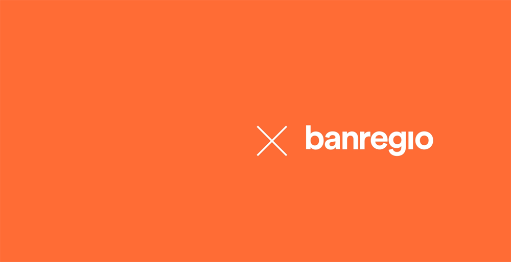
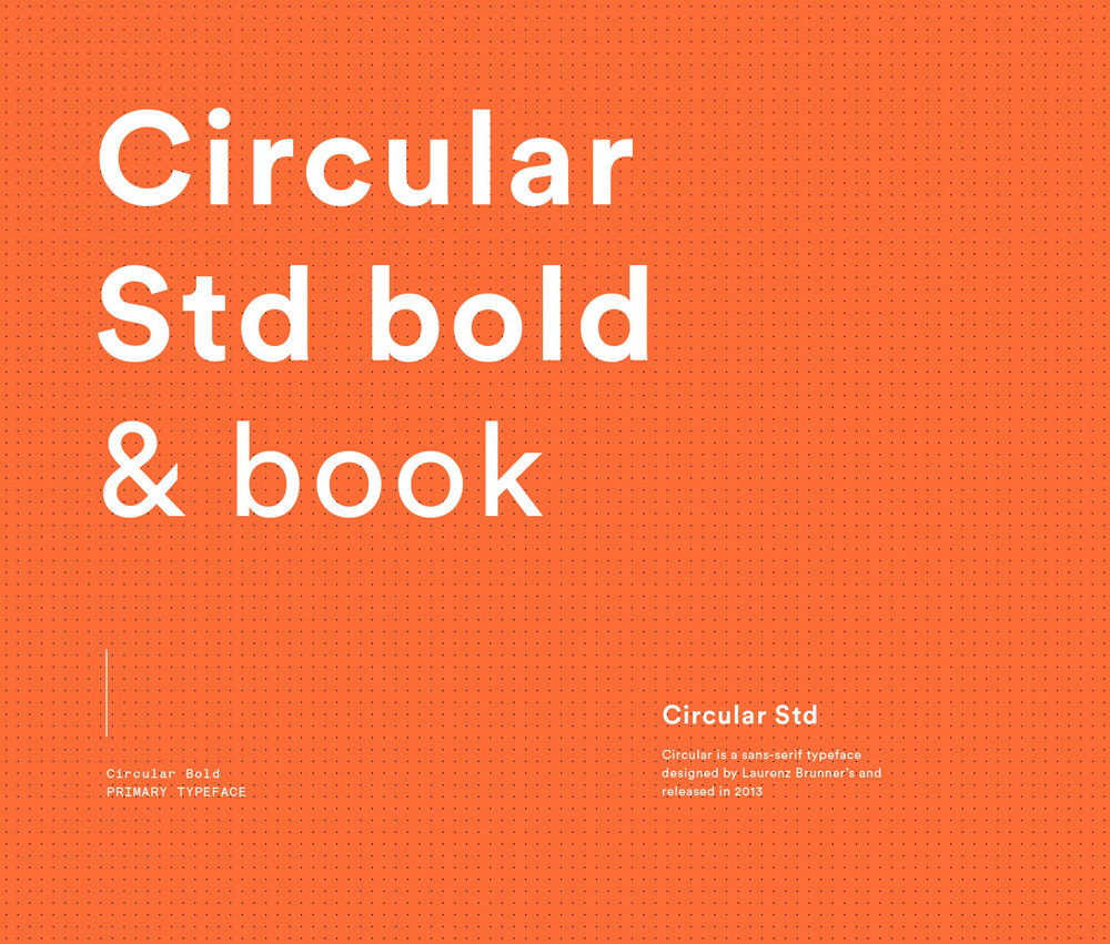
The old logo had some potential but ultimately it was bad, with an oversized “R” that didn’t match the rest of the letters and some seriously tight letter-spacing that wasn’t well resolved across the logo. What the logo did have was that it felt like a bank, perhaps a crappy bank but it had a certain authority to it. Something the new logo loses in favor of being friendly and contemporary. The new logo is typeset in Lineto’s Circular — a couple of years behind the trend — and, in its most creative gesture, drops the tittle of the “i” because… because I guess it’s a thing you do. The logo is set all in lowercase because… because that’s another thing you do. My point is, perhaps not too subtly, there is nothing original or interesting going on here but — BUT — a bank has never presented itself like this in Mexico, much less in Northern Mexico (which is a little more… rugged) so while it’s something that to us feels like something we’ve seen a dozen times before it’s definitely a disruptive approach for that market. Not that that excuses it for being bland or that we have to judge it on a curve but it does change the context.
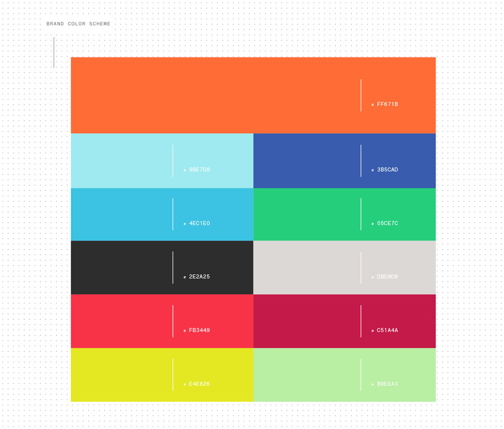
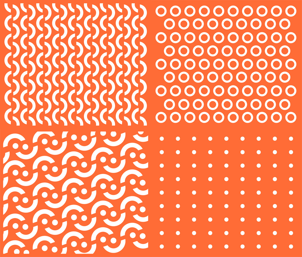
From the color palette and the patterns, you start to get a sense that this is a bit of a free-for-all. Yes, orange is the key color and it’s used consistently but why present a color palette that is, literally, the most random and least cohesive set of colors possible? The patterns have no recurring structure or consistent rhythm and they make no appearance anywhere again.
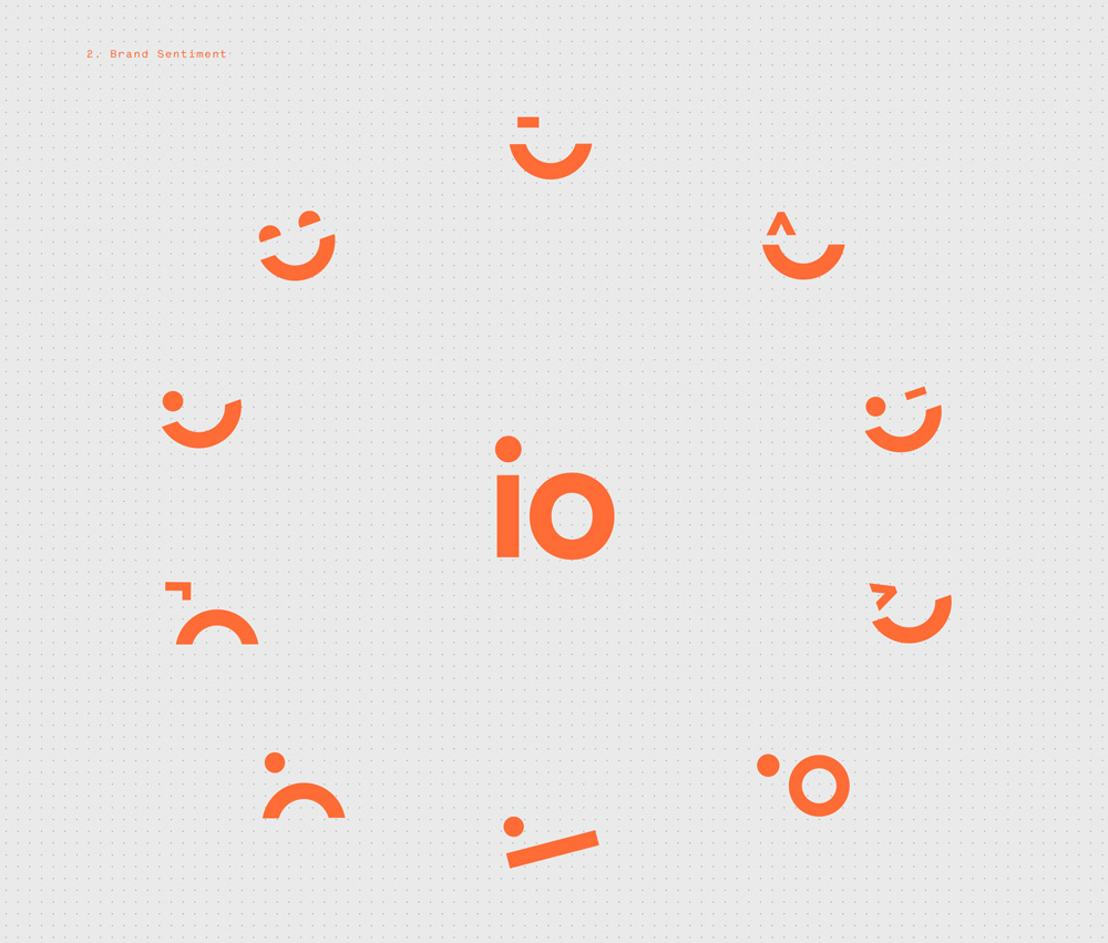
Then there is this face that comes from the “io” of the name, which now suddenly and conveniently has sprouted a tittle again, and tries to be extra cute. As a side note… it might seem like there are a lot of images in this post but this was after heavily editing the selection available at the project page which has all kinds of things going in all kinds of visual directions — there are even pictures of oranges (the fruit) because orange color, right? — so I tried to narrow it all down to something more digestible. My feeling is that the design firm tried to cram as many trends and graphic mannerisms as possible into a single project instead of editing their approach.
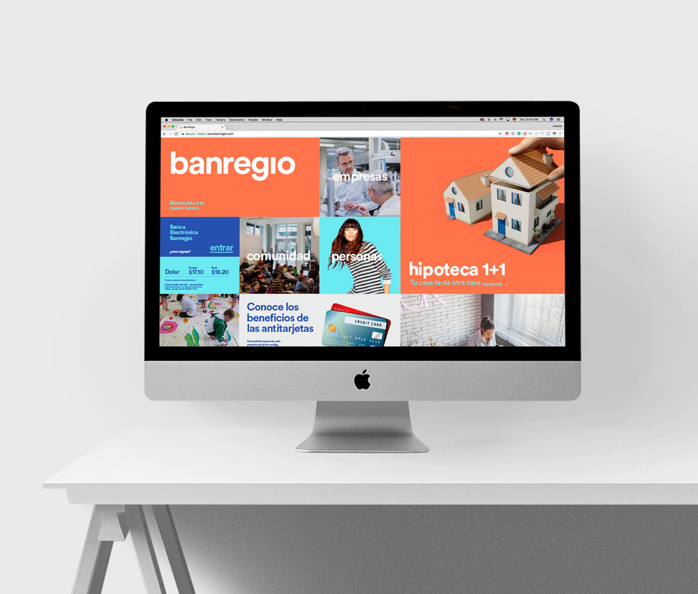
The applications are straightforward and, to a degree, they do work and make the bank feel fresher. It’s also hard to deny that Circular is a really nice font so it works even when designers inflict pain on it.
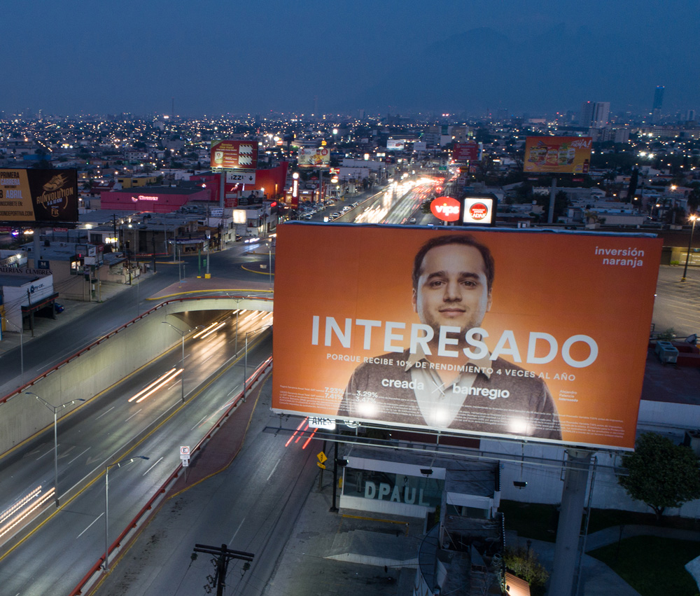
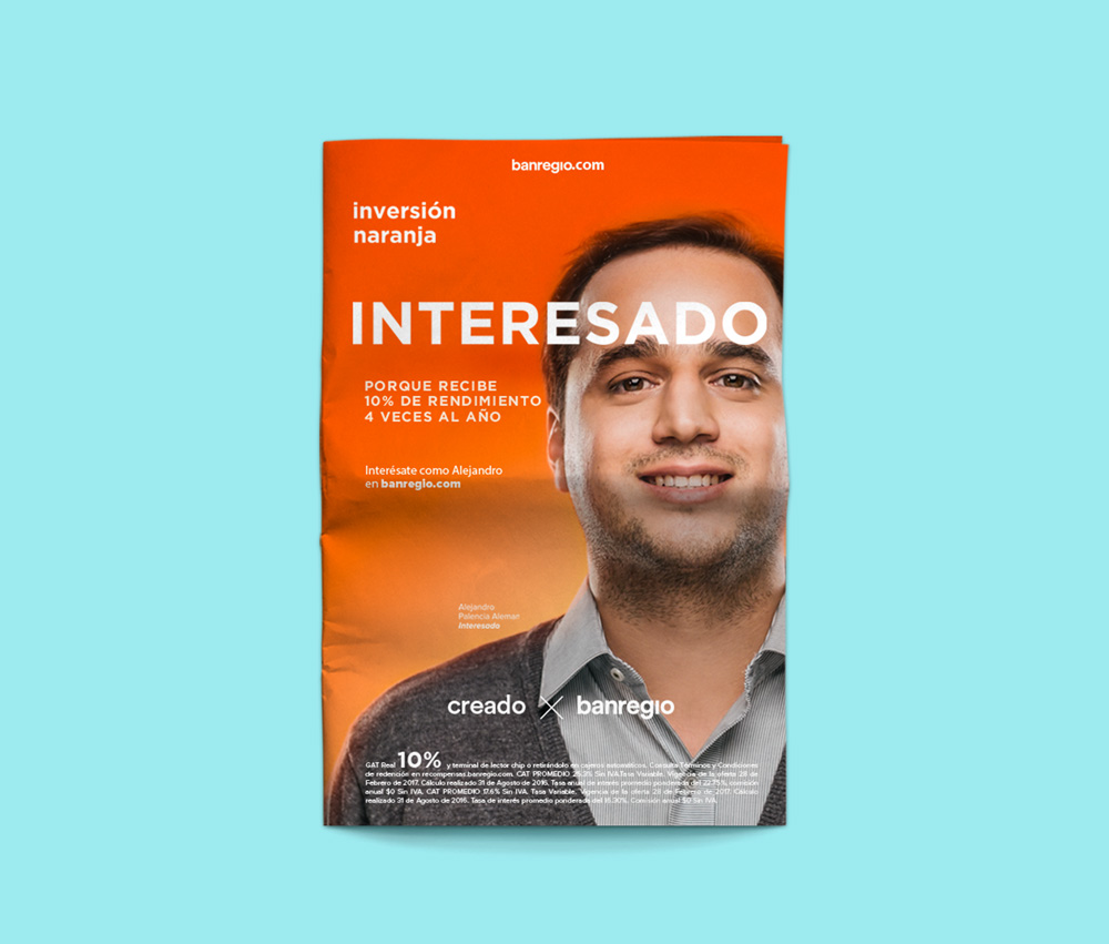
The “Interested” campaign is sort of okay in concept and the gradient orange background is kind of attractive but the typography is literally and metaphorically all over the place with all uppercase, all lowercase, centered, left-aligned, right-aligned, and no discernible grid anywhere.
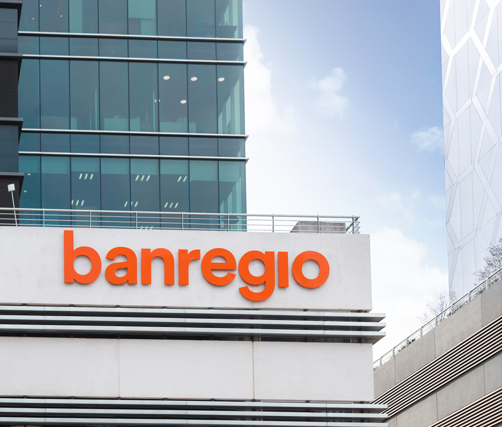
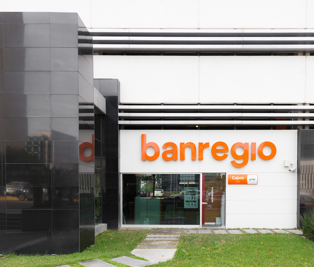
The one shining moment of the brand is the large deployment of the logo on the branches. That middle image above is kind of great, with the logo being five times the size of the door. But that’s about it in terms of praise. Overall, yes, this redesign does what it set out to do — modernize the bank, make it more accessible, etc. — and on the surface it looks fine but there is a big lack of refinement, attention to detail, and cohesiveness that’s kind of sad given that the bank took a big step in adopting such a drastic change.
Thanks to Oscar López for the tip.

 Новости Союза дизайнеров
Все о дизайне в Санкт-Петербурге.
Новости Союза дизайнеров
Все о дизайне в Санкт-Петербурге.