Обзор лучших ресурсов по разработке бренда, разработке упаковки
contact us | ok@ohmycode.ru
contact us | ok@ohmycode.ru
Established in 1996 by members of Québec’s agri-food industry, Aliments du Québec (Foods of Québec) is a non-profit organization whose mission is to promote both raw and prepared products originating from Québec. The organization’s literal seal of approval is given to products that not only are grown there but for which all processing and packaging is also done locally, guaranteeing the origin of the products. The organization counts with 1,200 member companies that, combined, have over 22,000 products certified and available in the marketplace. In the end the goal is to encourage consumers to buy local and to provide a network for companies to promote and distribute their products. Recently, Aliments du Québec introduced a new identity designed by lg2.
A certification all Quebecers are familiar with, Aliments du Québec was using an outdated logo that easily got lost on packaging that was often cluttered with information. It needed more than just a new logo; in order to unify and communicate the human stories behind Quebec food products, it needed an entire new identity, brand and communication platform.
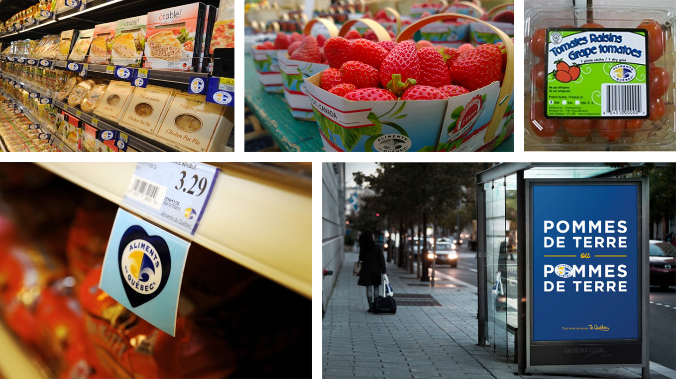
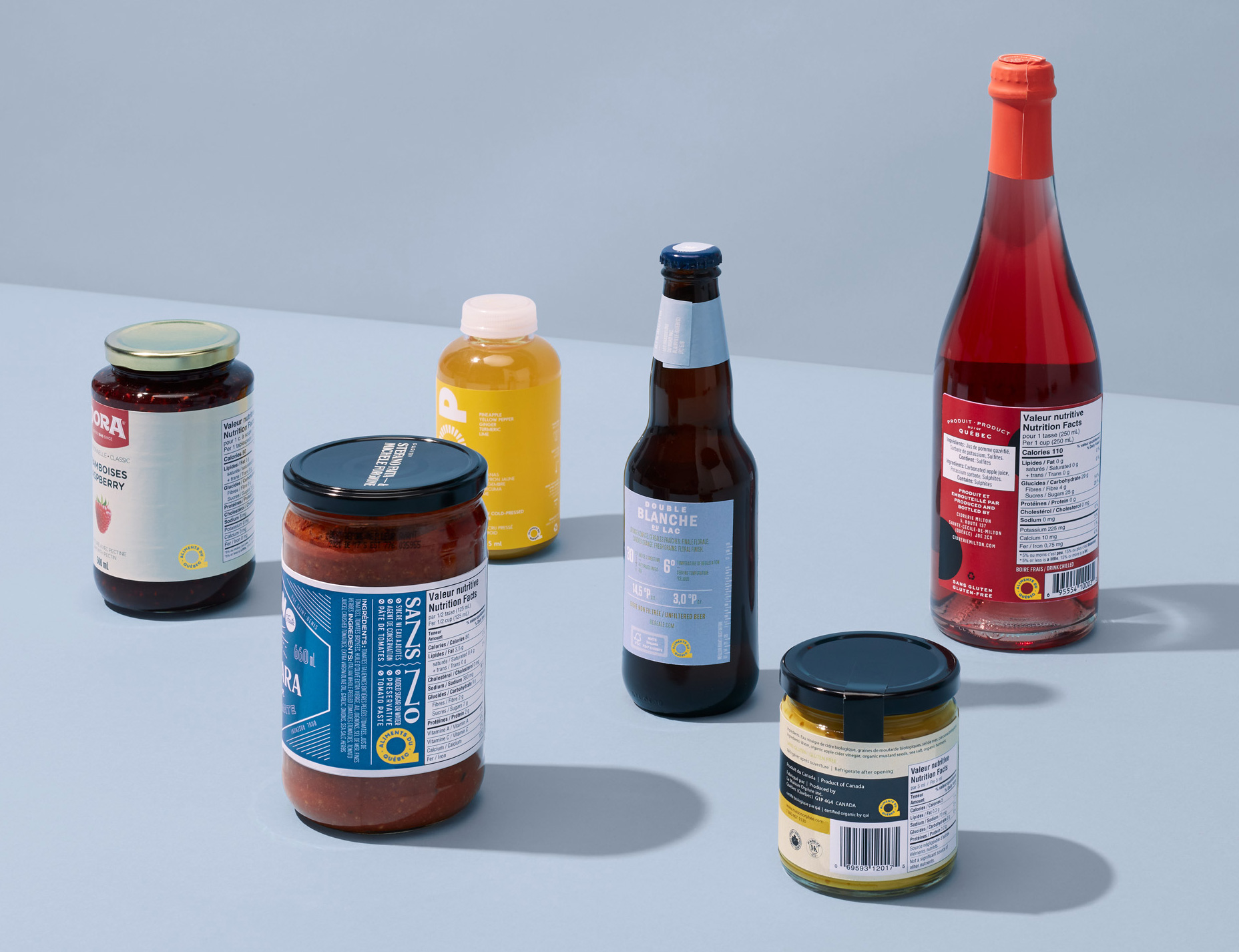
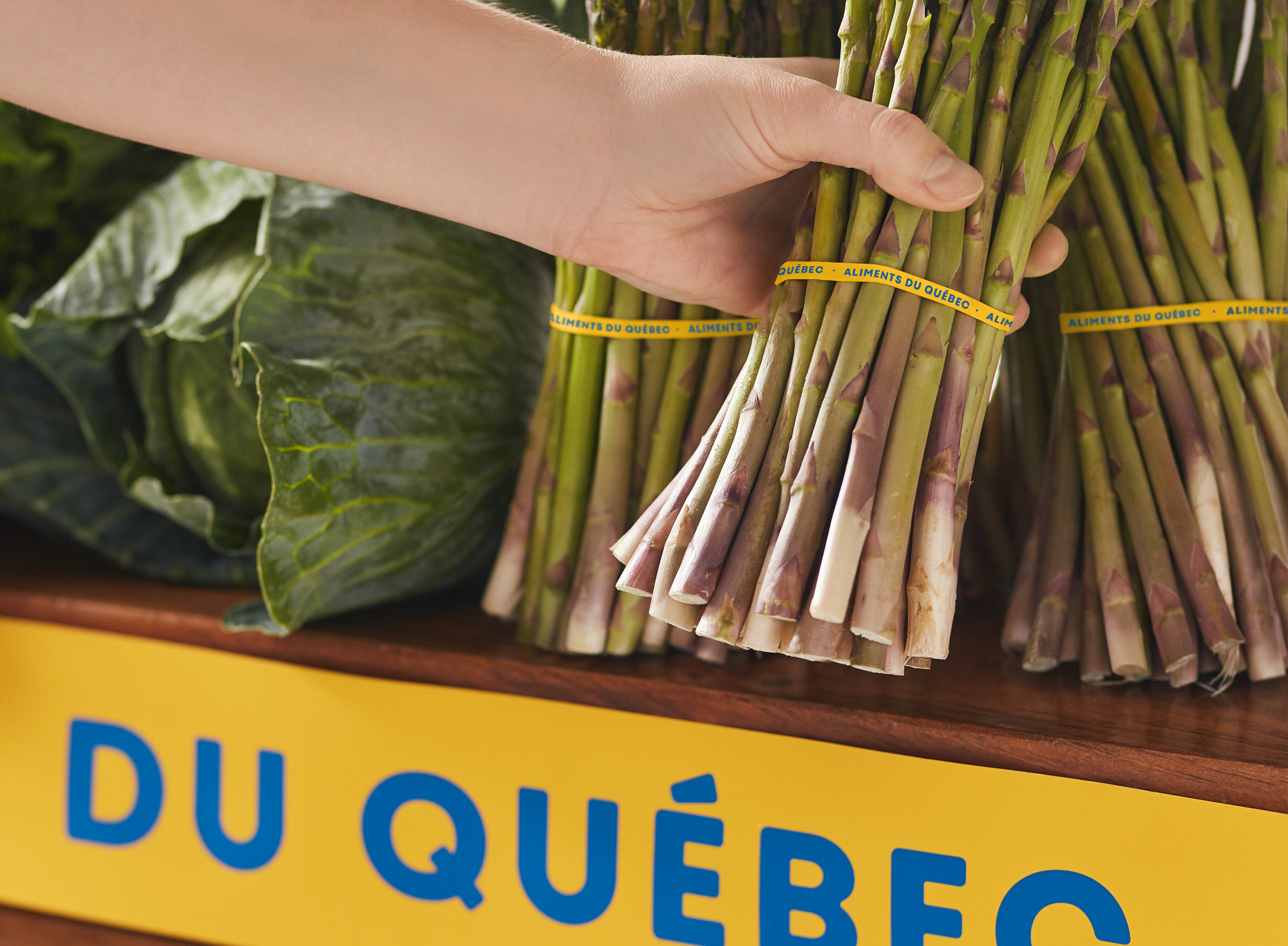
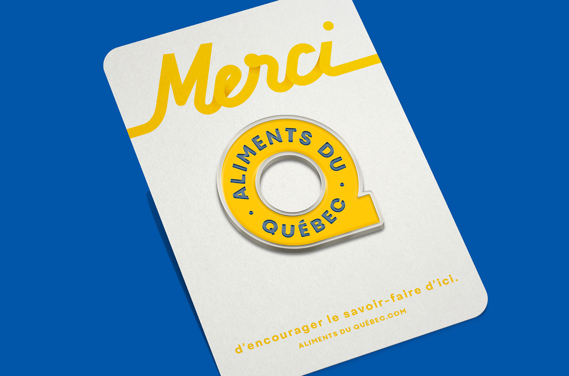
The new identity retains several elements of the former logo while also establishing a clear break. The yellow and the blue remain, but the logo’s oval form has taken the round shape of the letter Q, making the most of the available space on packaging. The use of the logo, which often appears in minimum size on cluttered packaging, meant we had to simplify its shape as much as possible.
Moreover, printing constraints required us to design a logo that worked equally well in black and white and reversed versions. Lastly, the similarity between the various certifications makes Quebec consumers’ lives easier, who now have a single visual clue to help them recognize and buy local products.
The old logo wasn’t particularly attractive but in its garishness it was effective in establishing a recognizable oval shape and graphic to put on products. The fleurs-de-lis — an element from Québec’s flag — was certainly relevant but visually overwrought in the logo with far too many things going on inside and around it. As much as Copperplate is one of the best typefaces to put on a curve, it didn’t quite fill the space and it looked like it was about to all crumble down. The new logo is a very drastic departure considering it drops everything that made the old one recognizable but, in exchange, it’s a much more contemporary seal to put on today’s products and looks less governmental. A “Q” might not be as iconic or Québec-esque as a fleurs-de-lis but it creates a unique contour that does stand out when placed on produce or products (as seen below). The type on a path is nicely done and the selected typeface has a charming ruggedness to it. The system of seals works well too but if the ones that say “Aliments Préparés” get used small they will certainly suffer from readability.
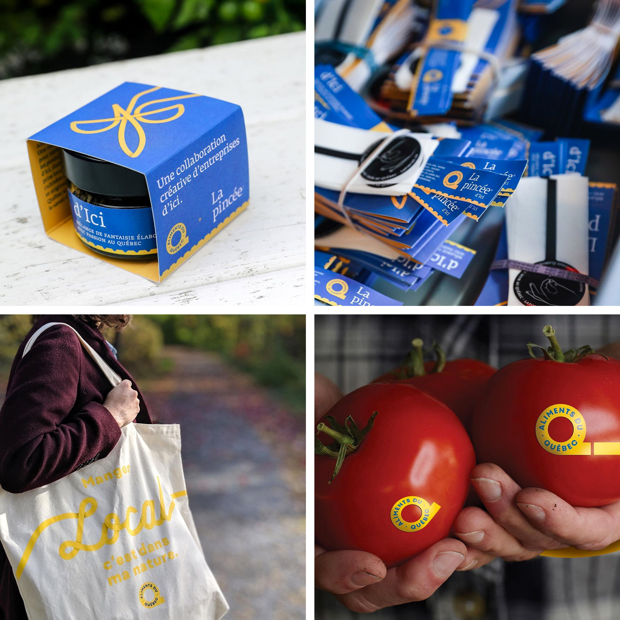
The applications are not that great… they are not as sophisticated as is the usual by lg2. From the ribbons to the spaced-out headlines to the cheesy script font, it all feels as if it came from a large food producer trying to be friendly and less corporate. It all seems like it’s lacking a connection to the people that make these products.
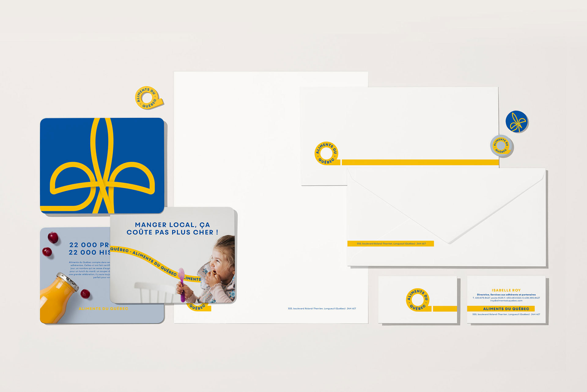
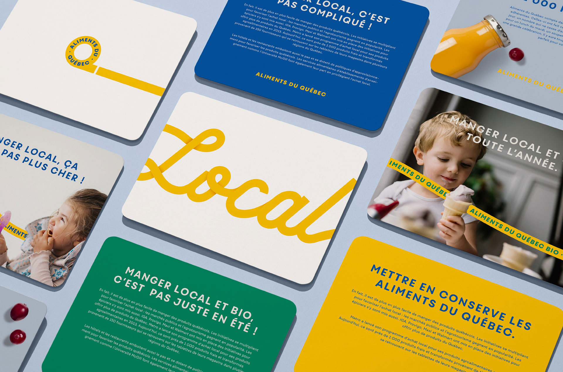
Given the strong notoriety of the former Aliments du Québec logo, a launch campaign was orchestrated to accompany the deployment of the new identity and to ensure the public was aware of the brand’s transition. The different campaign pieces strongly emphasize the new brand platform and remind consumers that Aliments du Québec is there to help make choosing easier.
It was critical that the new logo be present everywhere, in all executions. Plus, the mechanism of the ribbon that unfurls to tell a story from consumers’ lives or those of the artisans working in the agri-food industry highlights the process and local savoir-faire, from the land right to the plate.
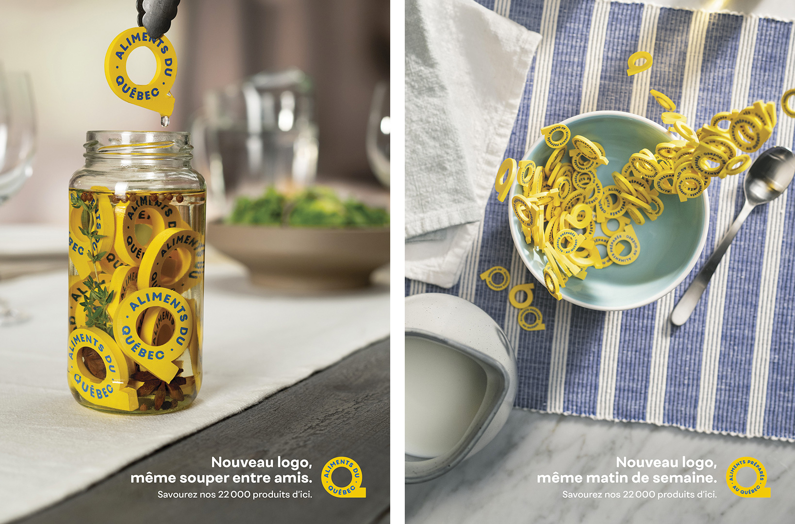
On the flip side there is this great campaign to introduce the new logo, with 3D versions of it being treated as food, done very convincingly in an entertaining way. It’s this sort of cleverness and attention to detail that was missing from the applications.
Overall, even though it will take a few months if not a year or more for consumers to get used to this logo — and they will — I do think this is a great improvement that establishes a more engaging, useful, and attractive seal of approval.
 each year since publication began in 2006

 Новости Союза дизайнеров
Все о дизайне в Санкт-Петербурге.
Новости Союза дизайнеров
Все о дизайне в Санкт-Петербурге.