Обзор лучших ресурсов по разработке бренда, разработке упаковки
contact us | ok@ohmycode.ru
contact us | ok@ohmycode.ru
In June of 2018 I posted about the new logo and identity for Oslo Kommune (Oslo Municipality), who announced that, in 2019, would introduce a new administrative and city-wide identity. Well, 2019 is here and the identity has been developed into a more comprehensive system that maintains a lot of the original ideas while introducing new ones designed by the Oslo office of Creuna.
The City of Oslo had a clear need to appear clearer and more uniform. The municipality operates many types of businesses and communicates with many different target groups. There are over 250 municipal logos in use. Therefore, it is unclear to many what the municipality does. The solution is a new visual identity in which the City of Oslo communicates as one holistic player. The result meets the requirements of universal design so that it can be used by everyone. The solution also includes a goal of simplification and efficiency improvement. It is estimated that today’s fragmentation costs the municipality NOK 40 million a year. The identity will gradually be implemented over the next few years.
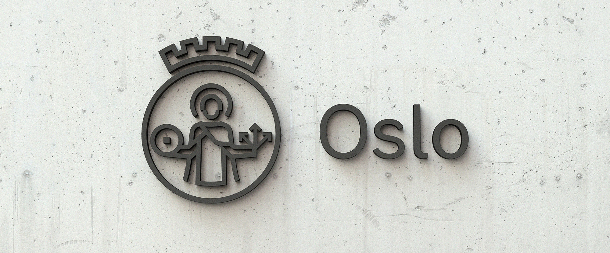
With the solution, all businesses in the Oslo municipality have been gathered under one common identity with one common logo. This makes it easier for citizens to understand everything the municipality does and contributes to. The Oslo logo shows St. Halvard in the symbol and Oslo in writing. It is based on Oslo’s coat of arms. The production of St. Halvard is simplified and modernized, but carries the story. Oslo’s coat of arms will continue to be used in a solemn and traditional context, and by artistic and historical renditions.
I liked the logo when they introduced it and I still like it now. They made some small adjustments to it, it seems, like making the crown a tad narrower and, to my delight, addressed the one complaint I had about it originally, which was the outer ring and crown stroke were thicker than the rest. I called it, y’all.
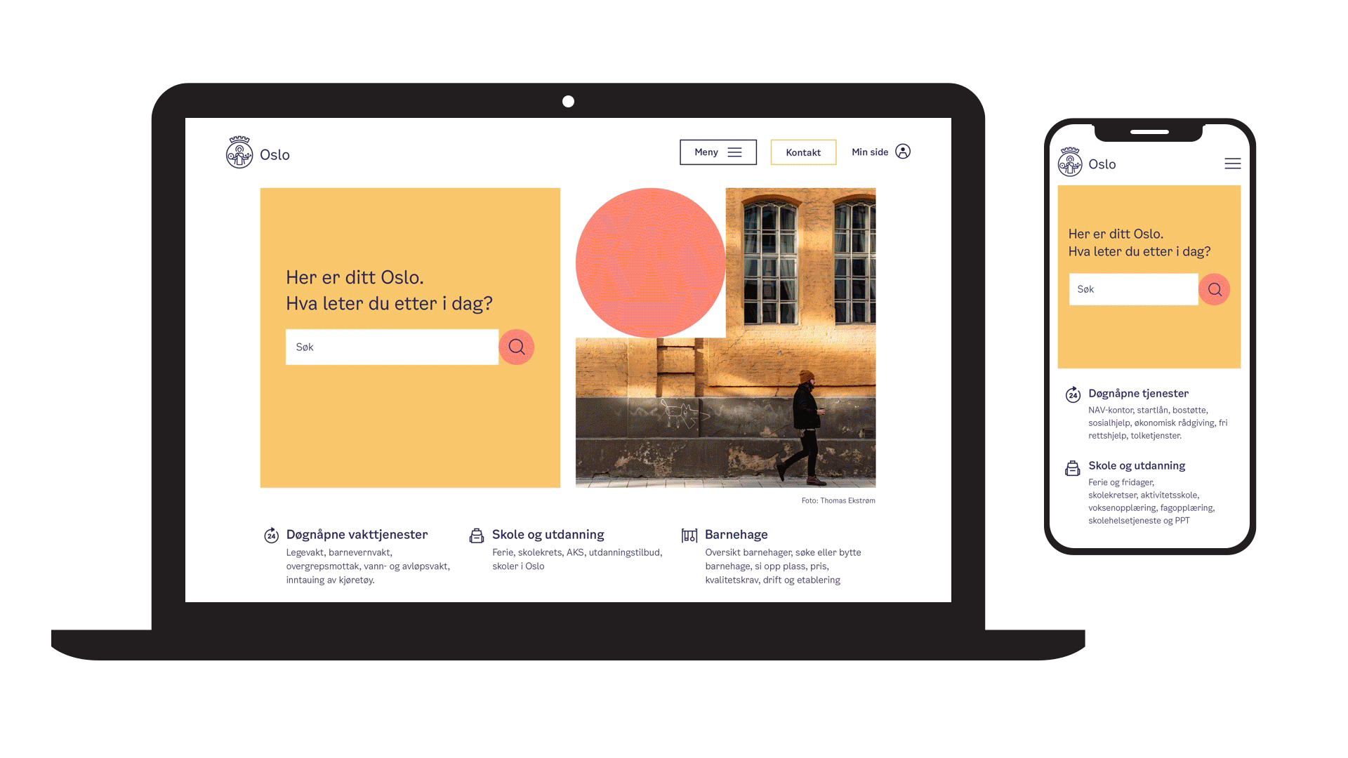
Most of what you need to see about the new identity is in the video above and it’s damn convincing. From the logo to the color palette to the abstract “OSLO” shapes, it leaves little doubt that everything is where and how it needs to be. The subtle motion added to the otherwise super basic circle and square shapes adds a fantastic dimension to the identity that’s already strong enough in static applications, based on a breadth of identity elements.
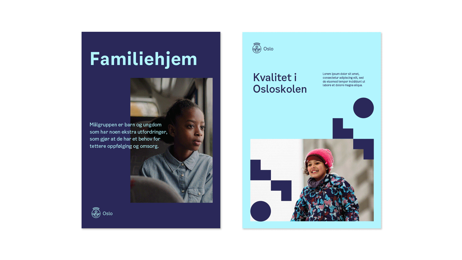
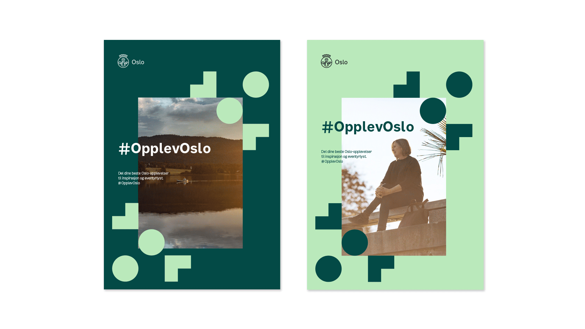
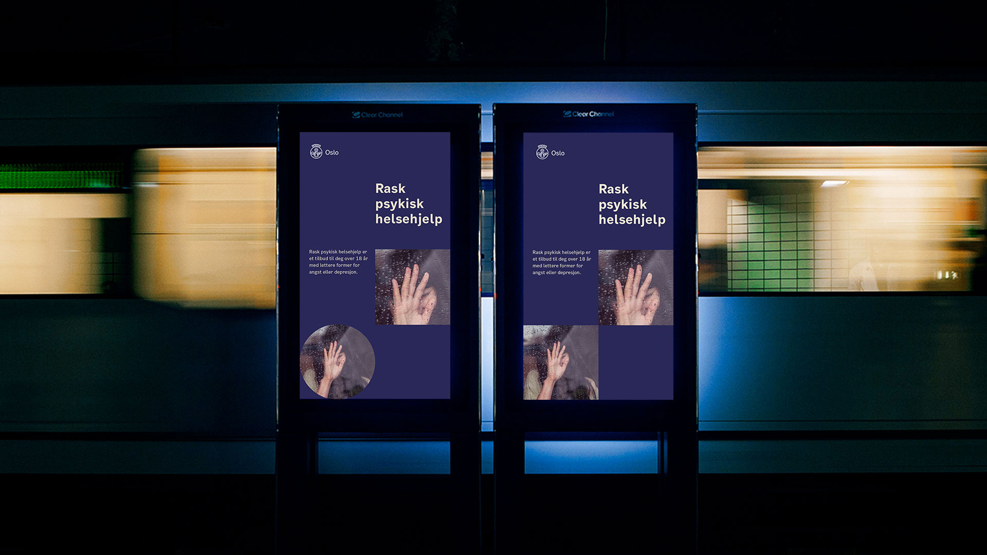
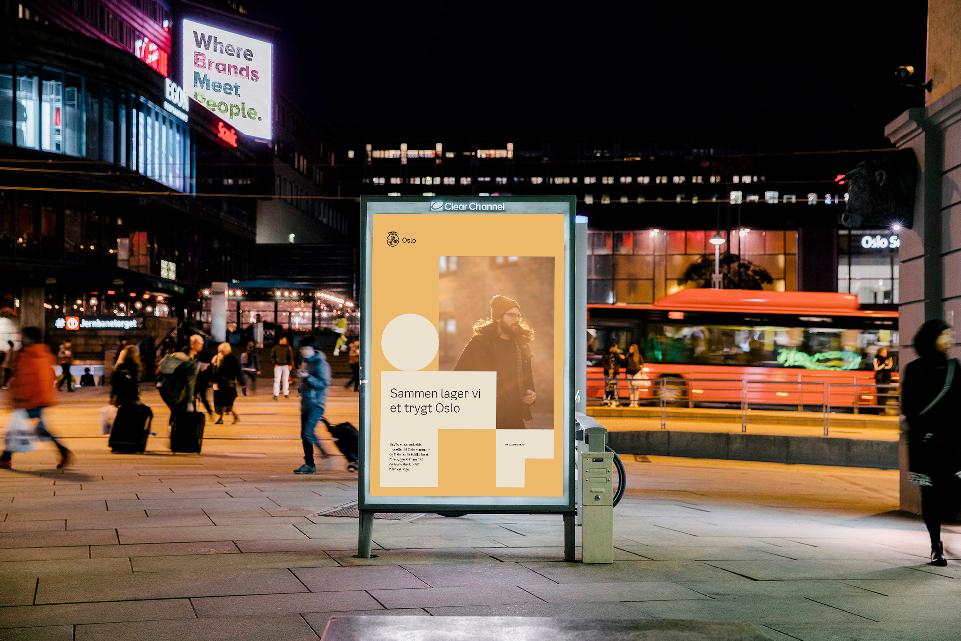
The colors of the identity are taken from the cityscape in Oslo. Blue from the trams and the fjord, green from the field and the green lungs. The warm and neutral colors are inspired by the facades of the city’s buildings.

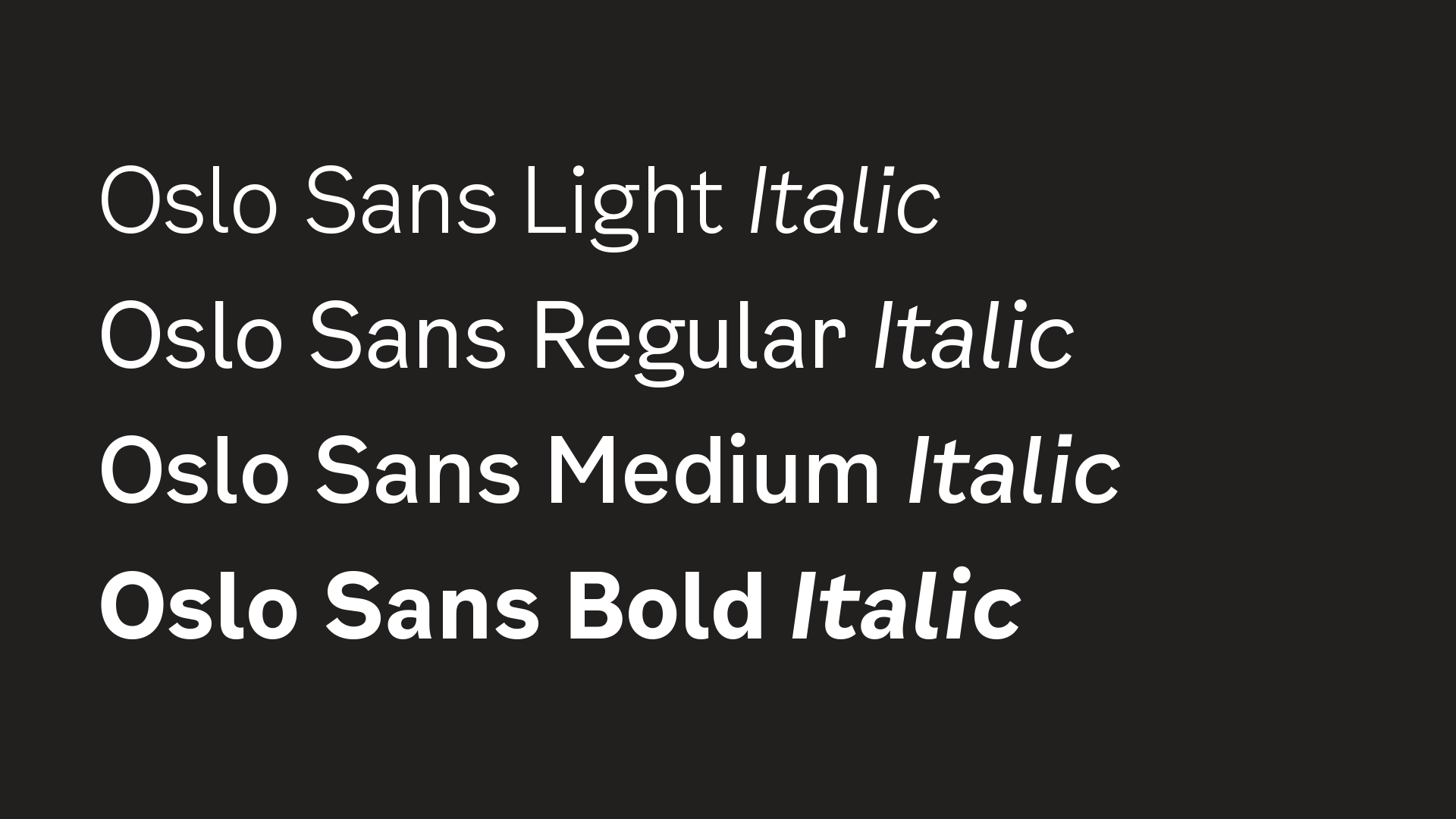
Oslo municipality has developed a separate font which is a central part of the identity. It is inspired by street signs in Oslo. The font is designed for good readability and to provide a functional and timeless expression.
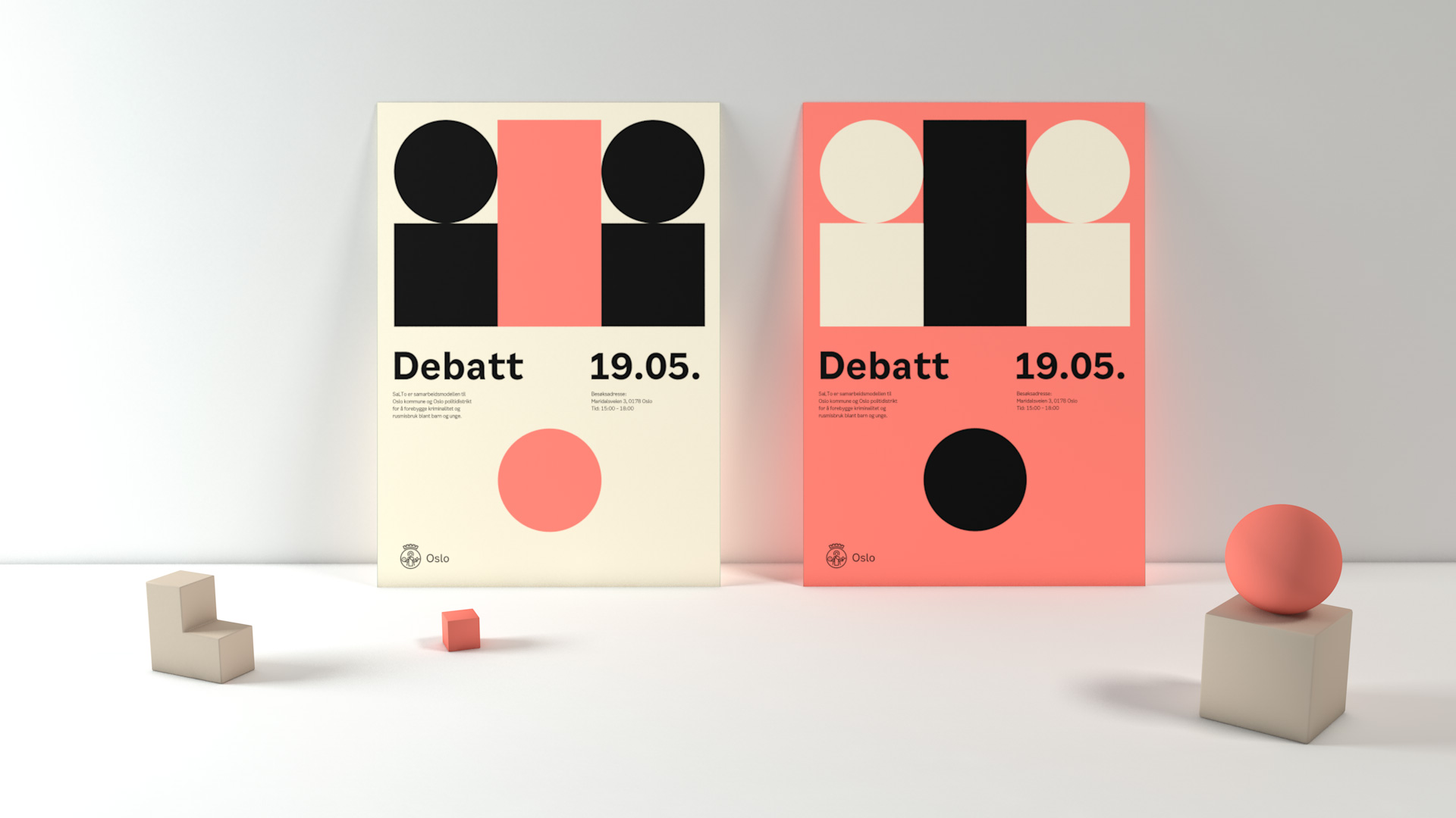
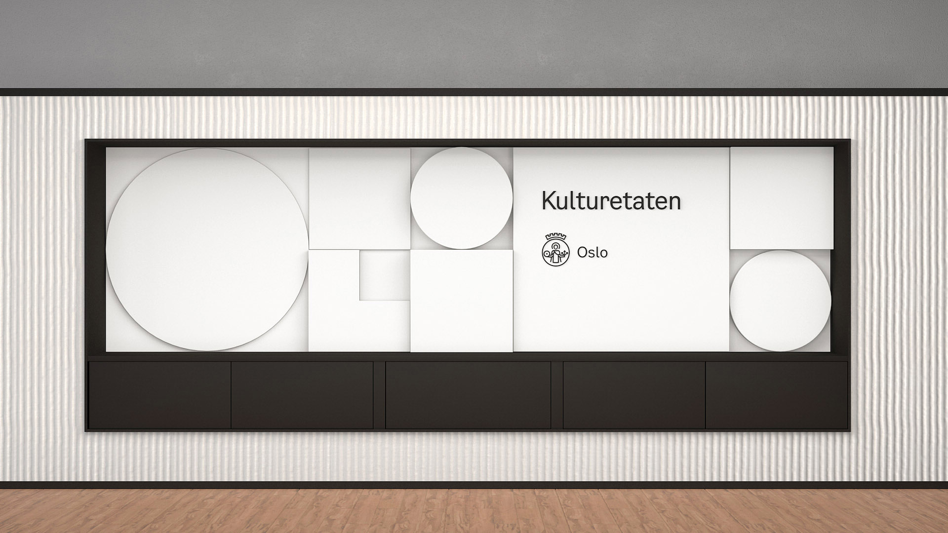
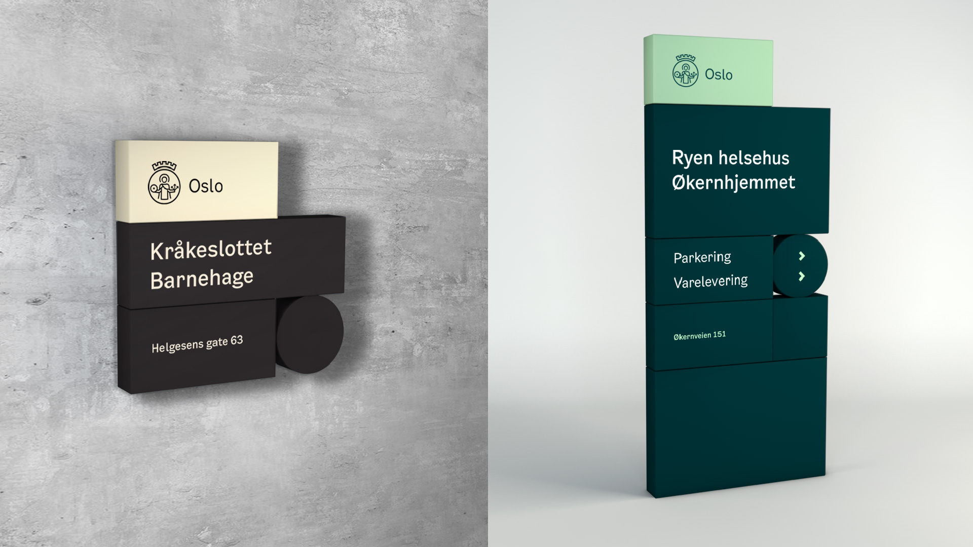
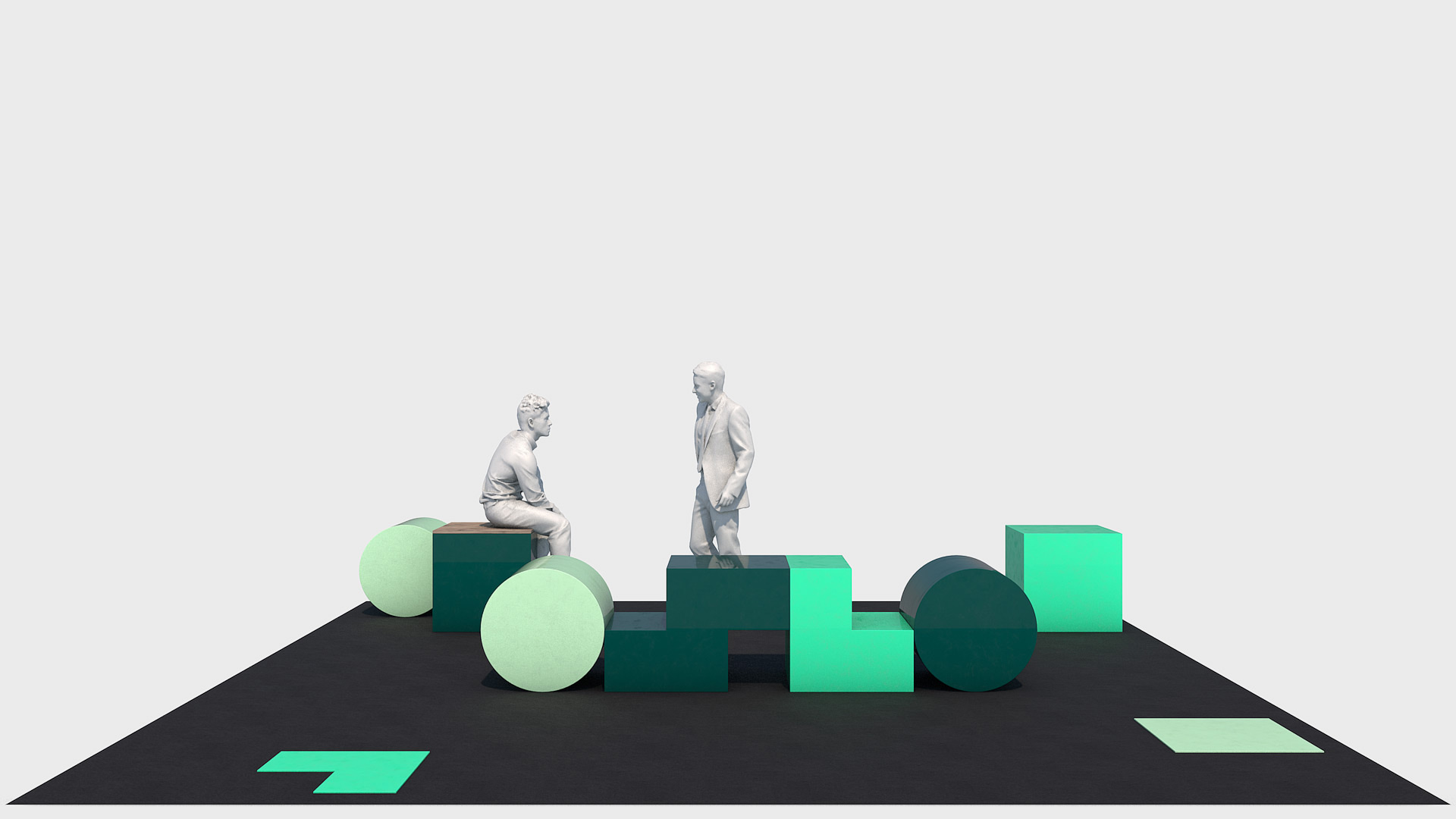
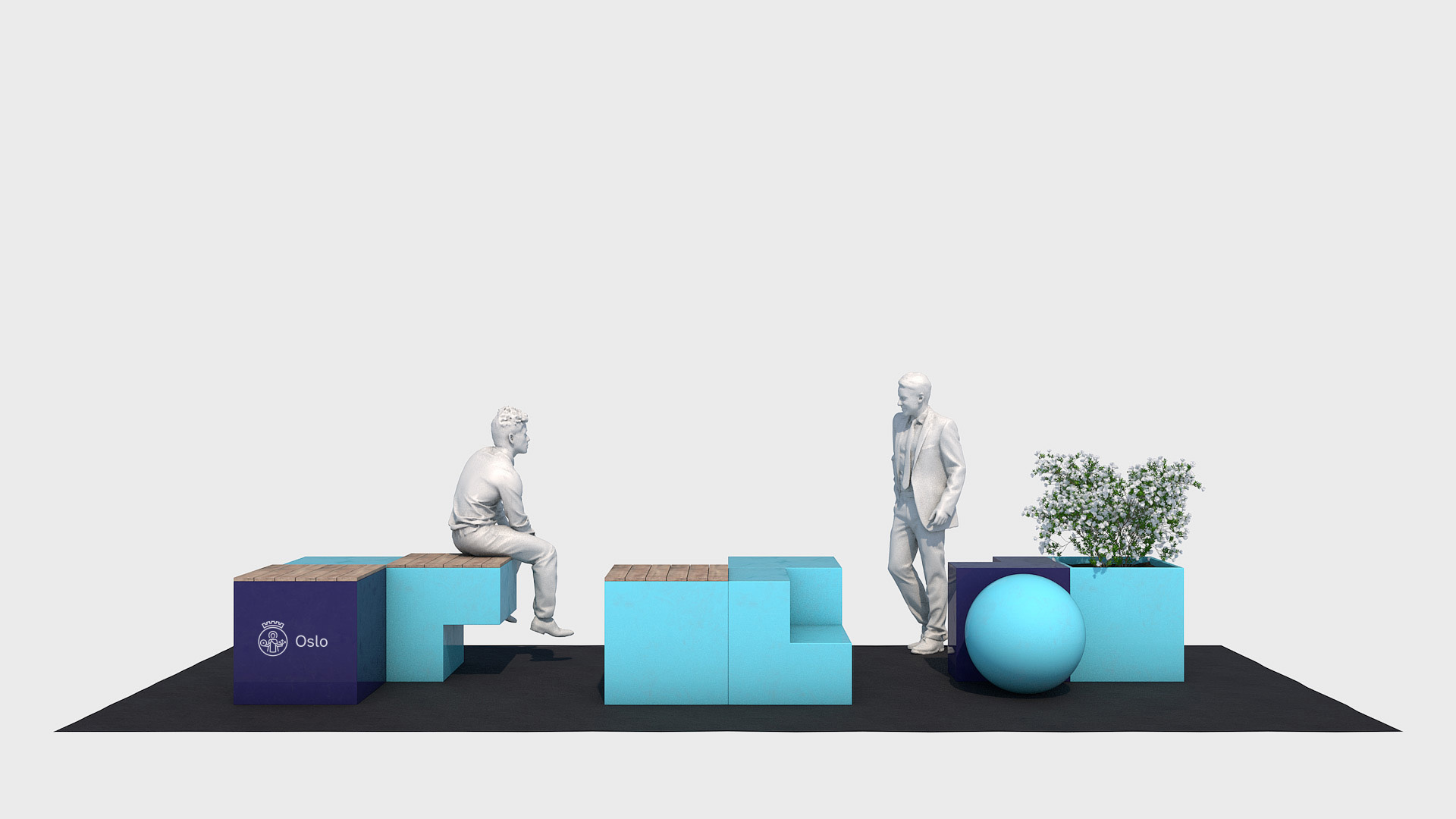
The Oslo forms are taken directly from the Oslo logo. The three basic forms are also an abstract reference to the cityscape. The three basic forms: the square, the circle and the angle can be assembled in different ways. They are the foundation of a new and flexible design system, and can also form compositions of Oslo as a word picture.
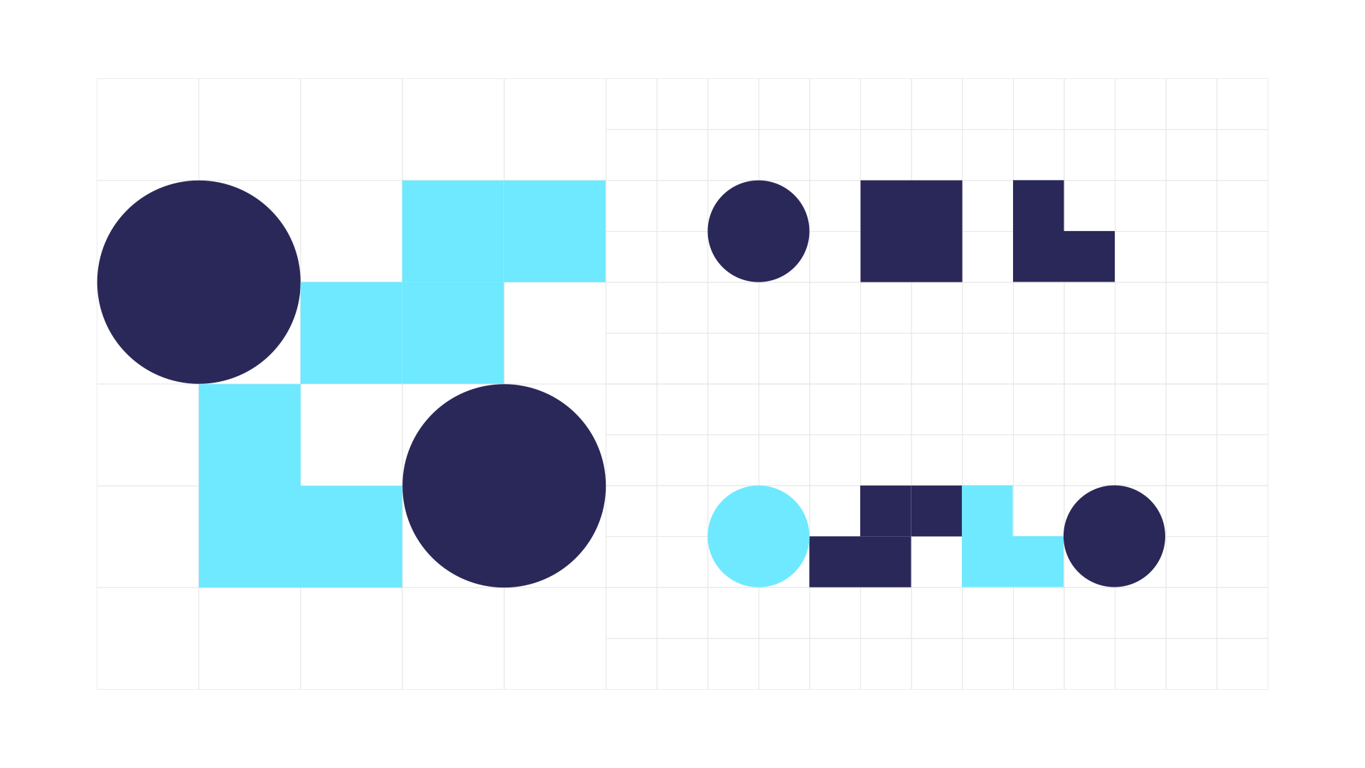
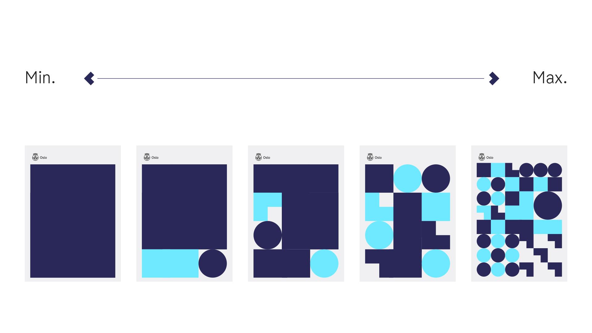
The layouts have a great variety to them while being very consistent. Having a layout generator both makes it easy for all departments to use and ensures on-brand-ed-ness at every turn. I like the versions when the shapes are bigger and look less like decoration, but don’t mind the other end of spectrum at all.
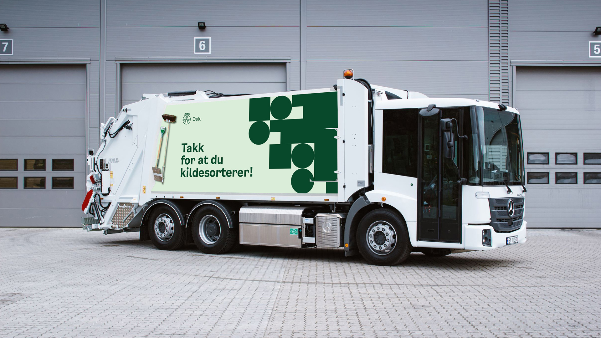
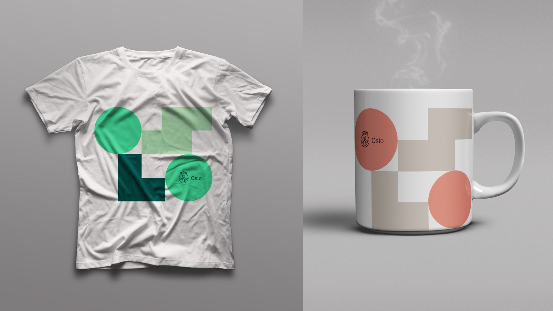
One new detail in the identity is when pairing the logo with the abstract “OSLO”, the logo now sits inside a circle instead of the square and it looks so much more slick this way, as seen in the swag above. The shape patterns can maybe get a little on the extreme side as seen in the garbage one image above truck or blue wall below, so I definitely like the more restrained versions better, like the white wall or wayfinding applications.

Overall, this is a really great identity with a lot of moving parts (sometimes literally) that manages to look both fun and organized, giving Oslo — which is already a kick-ass city — a lively and effective system to support and present all the great work of its many departments.

 Новости Союза дизайнеров
Все о дизайне в Санкт-Петербурге.
Новости Союза дизайнеров
Все о дизайне в Санкт-Петербурге.