Обзор лучших ресурсов по разработке бренда, разработке упаковки
contact us | ok@ohmycode.ru
contact us | ok@ohmycode.ru
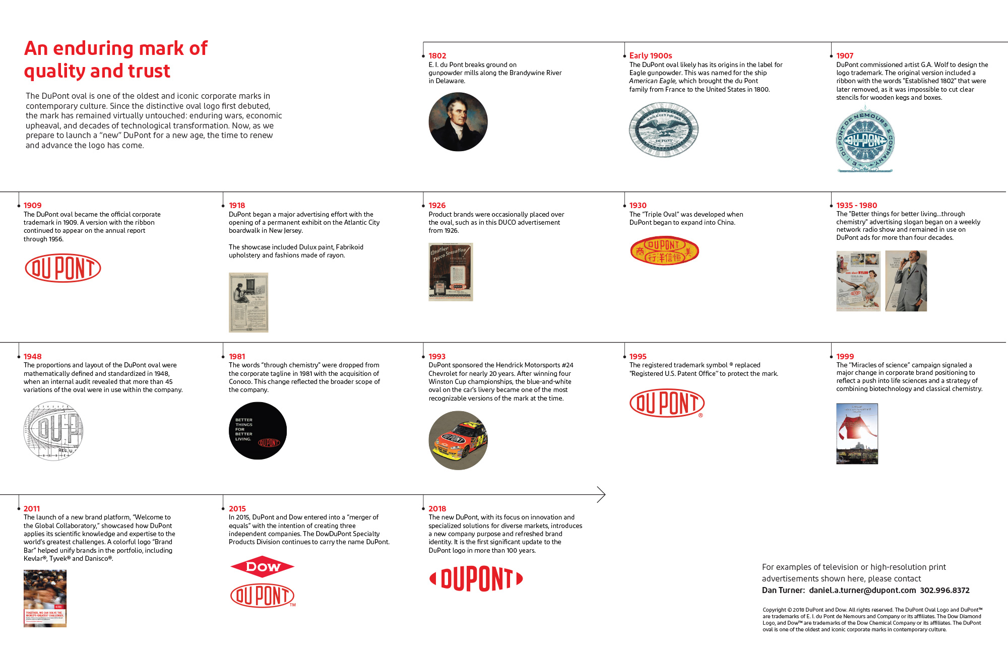
Established in 1802 (originally as a gunpowder mill and its full name being E. I. du Pont de Nemours and Company), DuPont grew to be one of the world’s largest chemical companies and developed many of today’s technologies and materials like Teflon, Nylon, Neoprene, Tyvek, and Lycra — all brand names that we’ve come to use as general descriptors for product categories (like calling all facial tissues Kleenex). In 2017, DuPont merged with Dow Chemical Company to create DowDuPont with the outward intention of, 18 months down the line, separating into three independent, publicly traded companies: Corteva Agriscience, focusing on agriculture; Dow, focusing on materials science; and DuPont, focusing on specialty products. Why they had to merge and spin-off to remain the same two companies is above my pay grade but what’s important to know is that DuPont became DowDuPont Specialty Products Division became DuPont and will keep keeping on doing DuPont things. Yesterday, DuPont or DowDuPont or whoever, introduced a new identity designed by Lippincott.
“Our new branding is one of many steps we are taking in DuPont’s transformation and amplifies what we do; help our customers solve complex problems, and turn their best ideas into real-world products and solutions,” said Barbara Pandos, chief communications officer, Specialty Products Division of DowDuPont. “It preserves the legacy shape of the iconic DuPont Oval, which for more than a century has provided a seal of quality, performance and trust, but it will no longer be constrained by an elliptical border - signaling a collaborative and open flow of ideas and innovation.”
Given how quickly logos change today it’s easy to forget that some companies have had the same logo for an insane amount of time and it’s baffling to think that DuPont has had the same logo for 100 years, which makes the case for updating it extremely difficult. Given the corporate changes for DuPont and its need to signal a new era it’s not entirely surprising that they would want to do that through a logo change (along with all the corporate and messaging restructuring). There is no “win” here because all we can do is judge it against a logo that has been around for ONE HUNDRED YEARS and even though it’s a logo we don’t interact with on a regular basis — like that of, say, Coca-Cola which has been around even longer — the DuPont oval is highly recognizable and anything, no matter how good it is, that replaces it simply can not withstand that comparison.
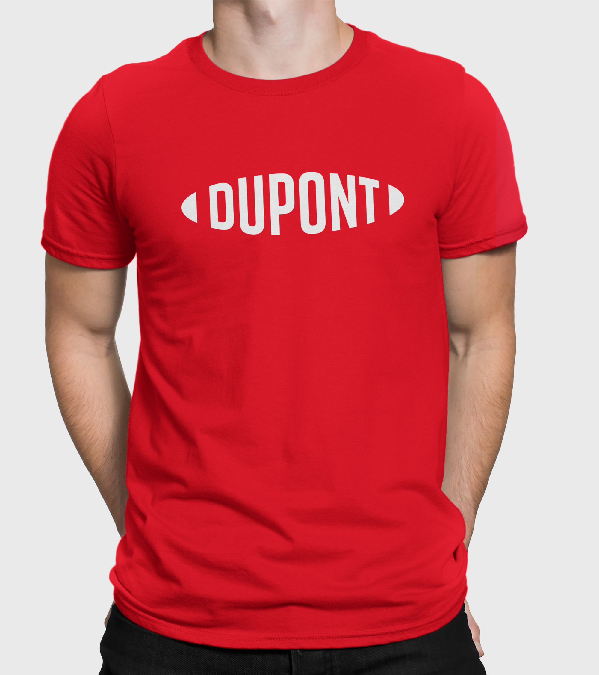
Having said that, Lippincott’s update is a valiant effort and has resulted is what is possibly one of the most correct and appropriate evolutions. It keeps the distinct oval shape and funky typography stretching horizontally to fill the shape. There are positive and negative things going on but, in general, this is a strong evolution. Removing the stroke yields a much more elongated oval which is a little odd when it comes to logos, especially today when most logos somehow try to be square to fit in social media avatars. Seeing a football (of the American kind) or a baguette in the shape of the logo is not out of the question but it’s a difficult task to not have people see unintended things in logos. One thing that could have possibly helped assuage the wideness (and that I don’t understand why it wasn’t done) would be to tighten the spacing in the little shapes at the edges so that that would match the spacing in the rest of the letters but I’m guessing this was attempted and, one way or another, it was shut down. The new boldness of the wordmark is great and more in line with contemporary logos. The curvature of the letters has been very well done and I think the overall presence and functionality of the logo has improved.
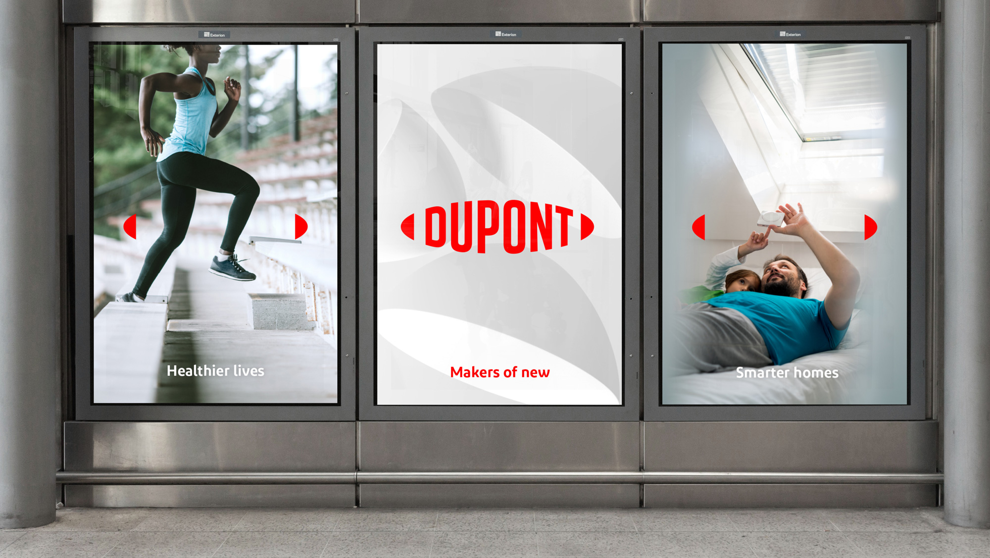
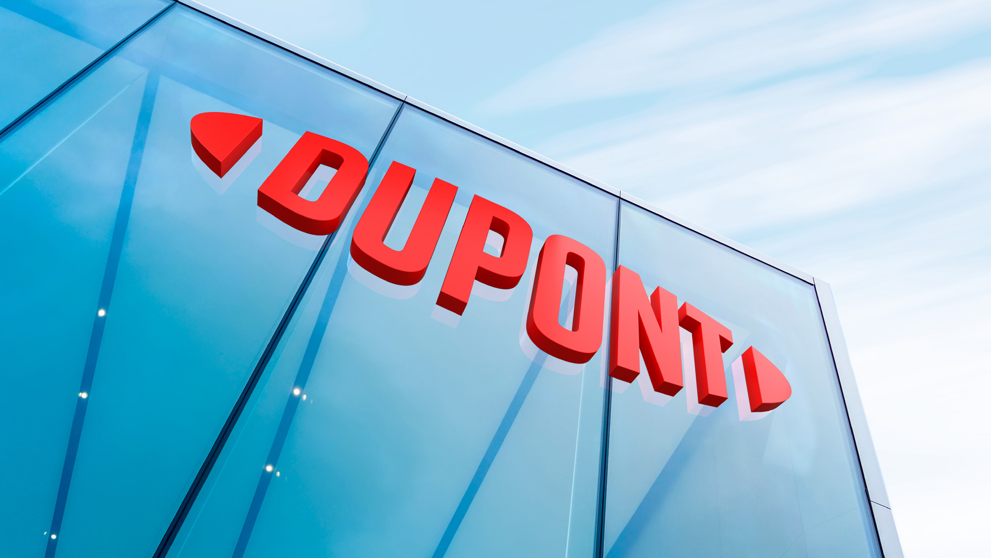
The two little pieces at the start and end of the logo take on a bigger role in the applications. One approach is by transforming them into giant 3D shapes that look a little avant garde and abstract in a way that makes such a corporate behemoth look cooler than you might expect. The other approach is to use the tips as a subtle framing device as seen in the ads. This has the potential to become a highly recognizable maneuver. I can imagine seeing series of ads like this at airports and being the kind of approach that is instantly recognizable. But only time will tell.
The identity uses NOT a custom sans but a font off the shelf! It’s almost unheard of these days, especially for a company of a significant size to license a font family. I am the smallest fan of the “spurless” sans category but Diodrum, as has been applied for DuPont, is spot on and the first time I actually enjoy its use.
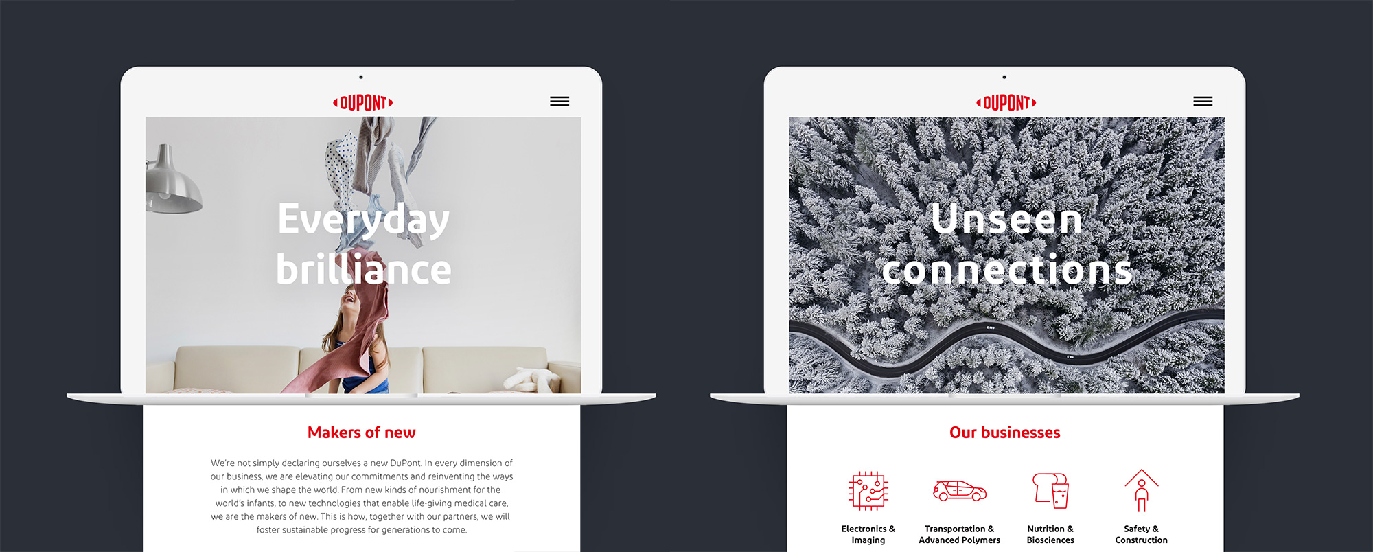
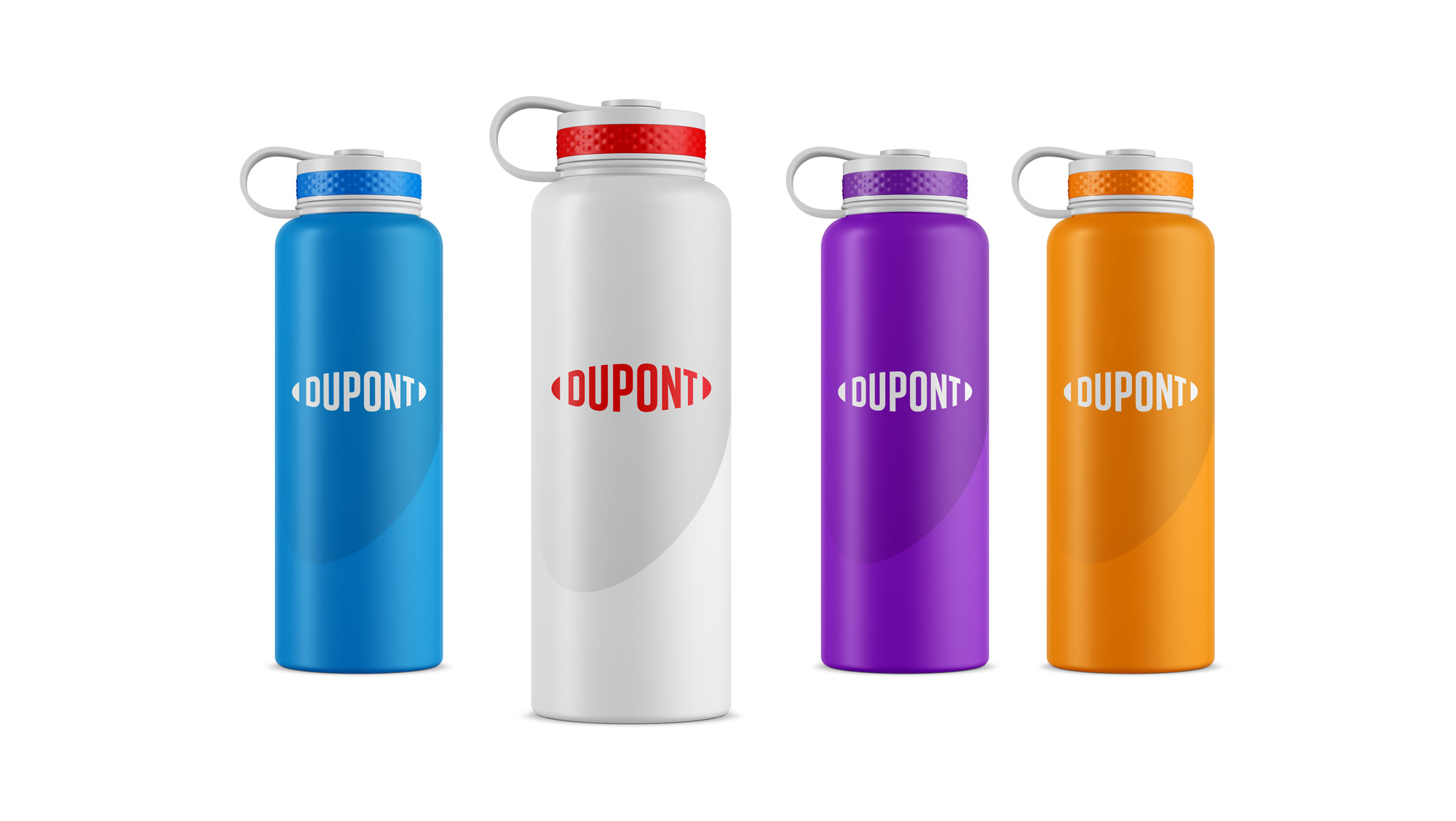
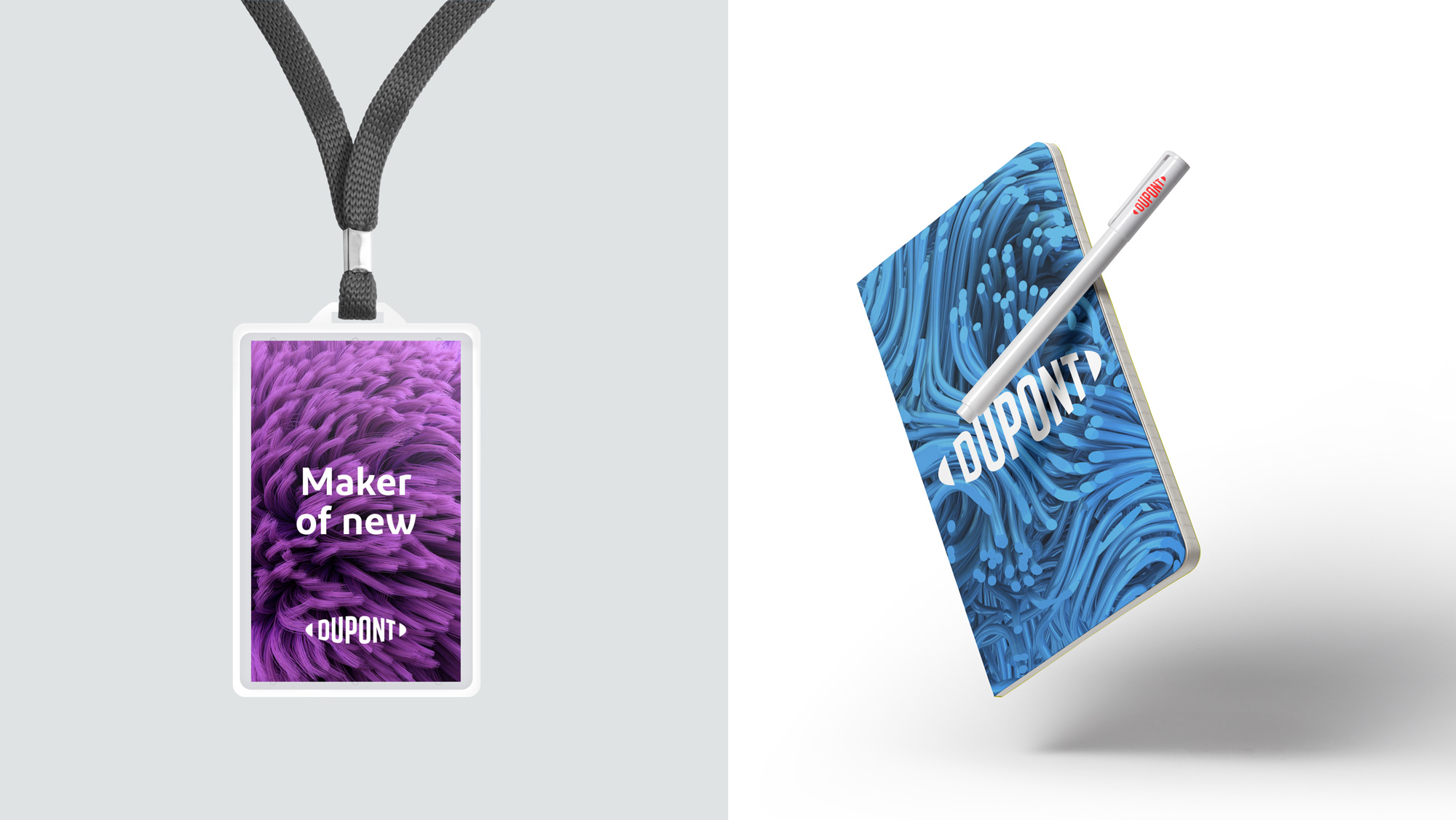
Lots of other bland renders abound. Not ideal to judge applications based on this and they are not the most flattering for the logo but here they are.
Overall, I do think this is a strong, positive change and since this is not a consumer product — even though it’s a very well known corporate brand — there is not sufficient sane reasons for people to rebel against or complain about. The people that interact with DuPont will keep interacting with it because it’s business, it’s not a consumer decision affected by shelf presence and visual allegiances built over time with a product. As designers we might mourn the death of a classic logo but as proponents of change we also need to embrace it.

 Новости Союза дизайнеров
Все о дизайне в Санкт-Петербурге.
Новости Союза дизайнеров
Все о дизайне в Санкт-Петербурге.