Обзор лучших ресурсов по разработке бренда, разработке упаковки
contact us | ok@ohmycode.ru
contact us | ok@ohmycode.ru
(Est. 1974) “New York-based Town Sports International Holdings, Inc. is one of the leading owners and operators of fitness clubs in the Northeast and mid-Atlantic regions of the United States and, through its subsidiaries, operated 149 fitness clubs as of June 30, 2016, comprising 102 New York Sports Clubs, 27 Boston Sports Clubs, 12 Washington Sports Clubs (one of which is partly-owned), five Philadelphia Sports Clubs, and three clubs located in Switzerland. These clubs collectively served approximately 551,000 members as of June 30, 2016. In addition, the Company also owned two BFX Studio locations and had one partly-owned club that operated under a different brand name in Washington, D.C. as of June 30, 2016.”
Kettle (New York, NY)
Kettle project page
Town Sports International press release
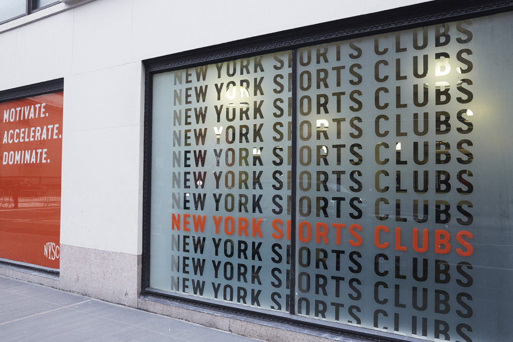
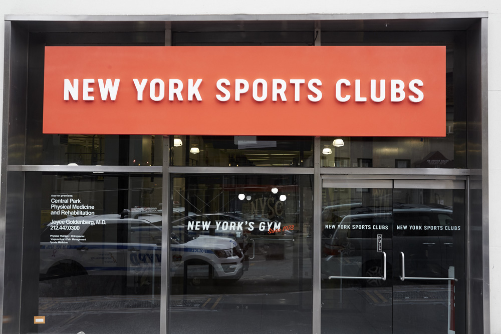
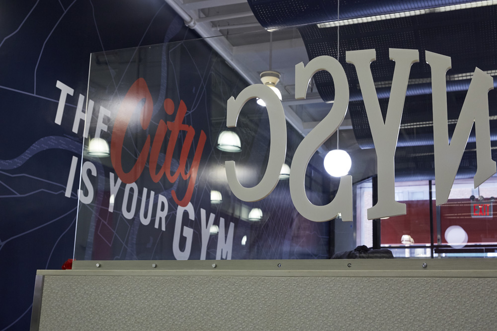
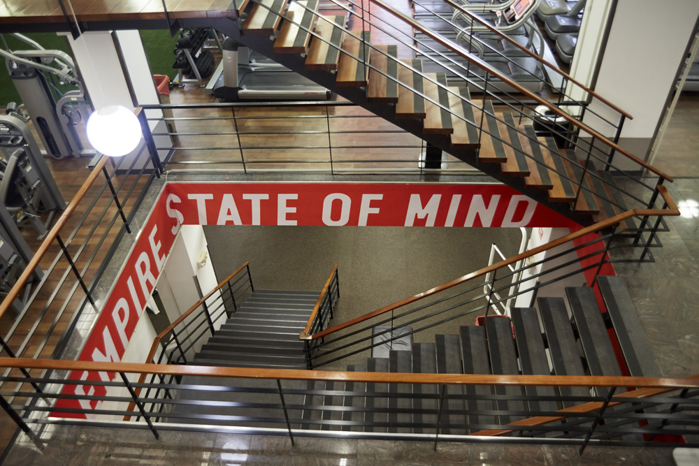
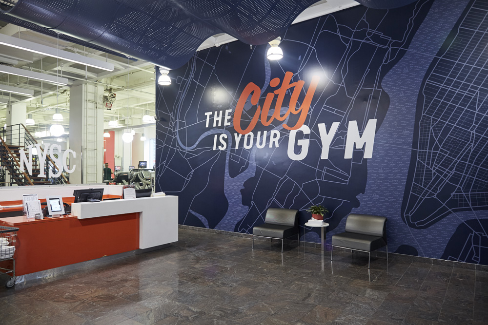
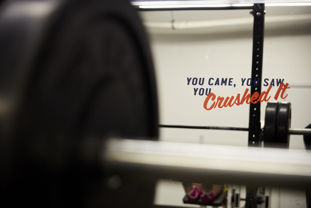
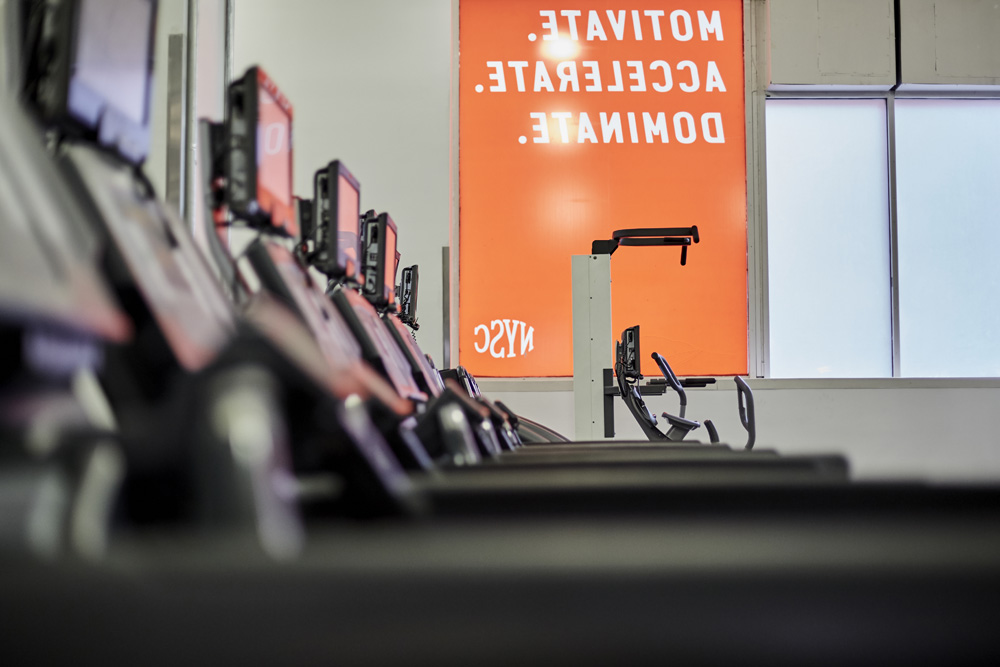
From the logo to font and color choices, every aspect of NYSC’s new brand is designed to balance a sense of the contemporary and the accessible. We warmed NYSC’s signature red and added a complimentary blue-gray to create a friendly, cosmopolitan palette. Lettering with a combination of hard edges and soft corners conveys modernity and approachability. Even the icons we crafted tap into the same mixture of sharp and soft lines. The result is not a departure from NYSC’s past but an evolution that captures its core principals, today.
I'm not much of a gym person so it takes little to dissuade me from one and, in my time in New York, the NYSC locations that I saw (from the outside) never looked very inviting. Part of it was the harsh red and blue combo in the logo paired with the formal serif that made it look more like some kind of city bureaucratic program than a gym. Still, for the thousands of members, the iconic logo must have a lot of equity and is why the same fish-eye effect has been kept in the evolution. I don't know that the new logos are an improvement typographically, they are just another serif version forcefully fitting inside an oval — neither old or new are easier or harder to read. Without the oval, though, the new logos do look odder as at least the old ones explained why the letterforms were so whack. The visual language inside the gym looks much more improved and energetic, mixing and matching a condensed italic sans serif and a script typeface that gives it a determined yet relaxed and friendly vibe. Overall, the change takes the old-school, hard-city-life aesthetic of the old logo and identity to a more welcoming one.

 Новости Союза дизайнеров
Все о дизайне в Санкт-Петербурге.
Новости Союза дизайнеров
Все о дизайне в Санкт-Петербурге.