Обзор лучших ресурсов по разработке бренда, разработке упаковки
contact us | ok@ohmycode.ru
contact us | ok@ohmycode.ru
Established in 1906, Hochschule Konstanz für Technik, Wirtschaft und Gestaltung (Konstanz University of Applied Sciences for Technology, Business and Design in English or HTWG for short) is a small applied sciences university in the town of Konstanz in the south of Germany. It offers Bachelor and Master degrees across Architecture and Design; Business, Cultural and Legal Studies; Civil Engineering; Computer Science; Electrical Engineering and Information Technology; and Mechanical Engineering. Late last year, HTWG introduced a new identity designed by Berlin-based think moto.
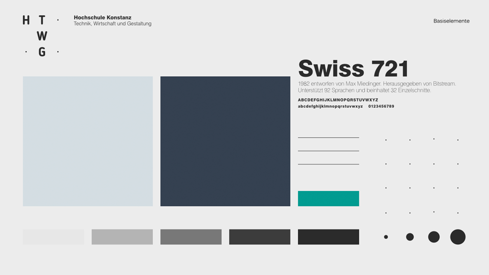
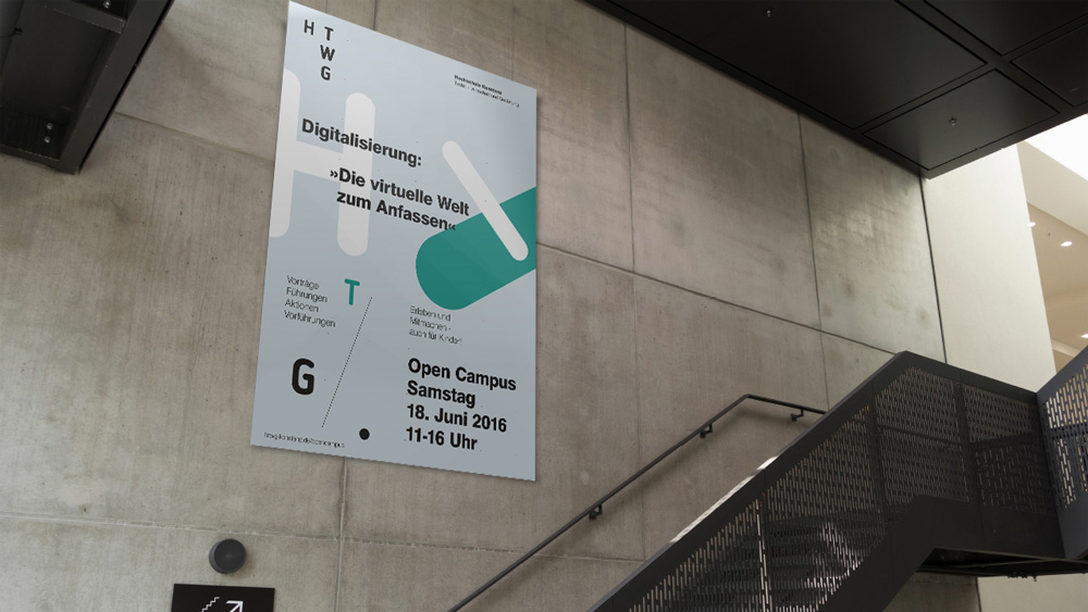
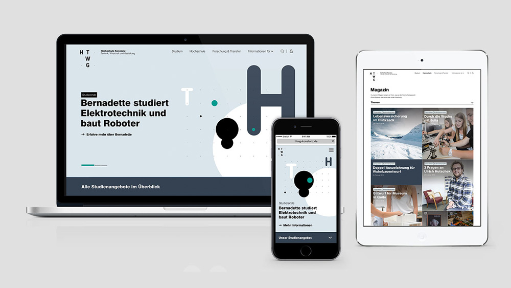
The basic idea of the new design is the topics “center” and “networking”. With its new appearance, the HTWG presents itself as a location with international networking, optimal career prospects, excellent infrastructure in an attractive location. This basic idea is visualized by a visible grid system, in which individual points can be marked or connected.
The old logo was quite daring with a relatively hard to read HTWG acronym set in some massive letters that do deserve some commendation for being different. The full name in the almost default-looking sans serif and the baby blue color wasn’t the right combination unfortunately. The new logo is much clearer, cleaner and retains the weird-ish vibe of the old one with a relatively uncommon stacking of its acronym. Set on a 3-by-3 grid — that is very loosely and questionably based on the concept of the location of the university in context of the world — the “H” for Hochschule stands on its own while the “TWG” (that makes this Hochschule different than other Hochschules) stand together. I’m surprised they left out the “K” for Konstanz not just in the new logo but in the old as well. It makes for a decent, somewhat interesting logo. The grid comes in handy for each department, with its relevant initials appearing on the right column. The full name (and the rest of the typography) is set in the dry but crowd-pleasing Swiss 721.
The new logo of the HTWG radiates seriousness, the further design elements allow for a high variability, which highlights the joy of innovation and sparkling creativity. In typography, design elements, use of color and the world of images, the design allows for both the dynamic aspects of the university vision as well as vision and future orientation, as well as fixed, stationary facets of the vision, such as proximity to life and credibility.
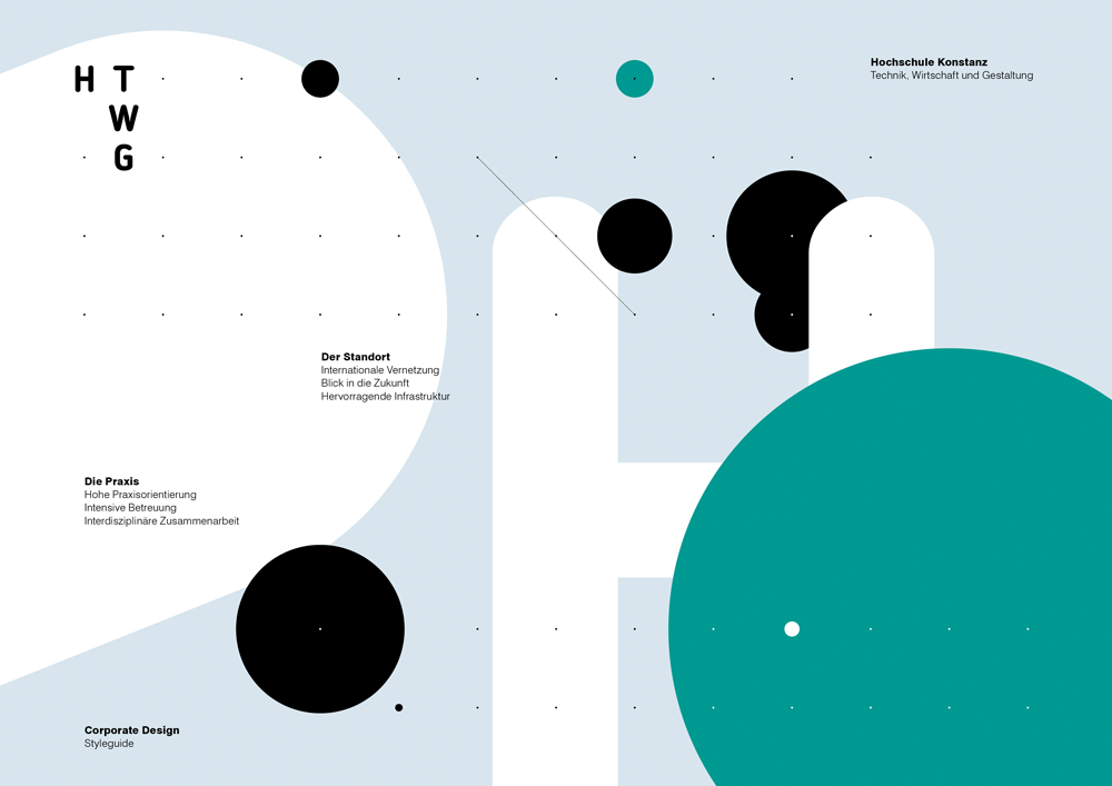
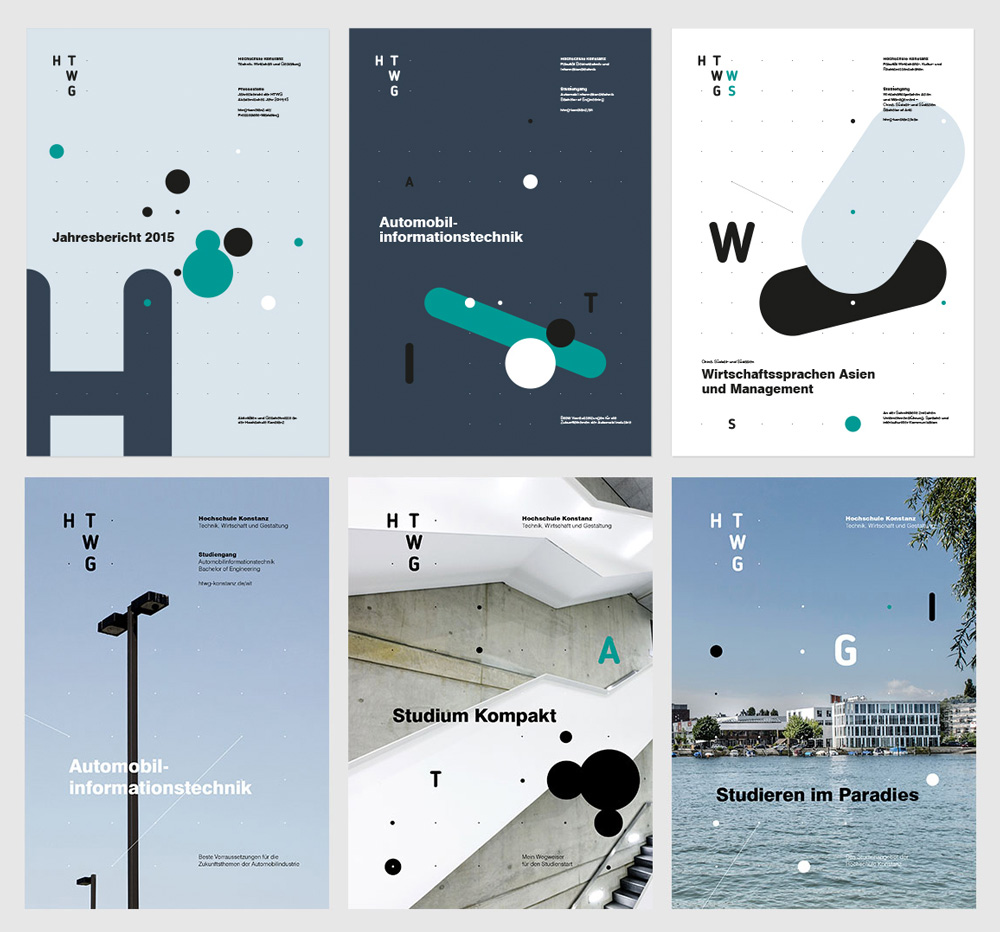
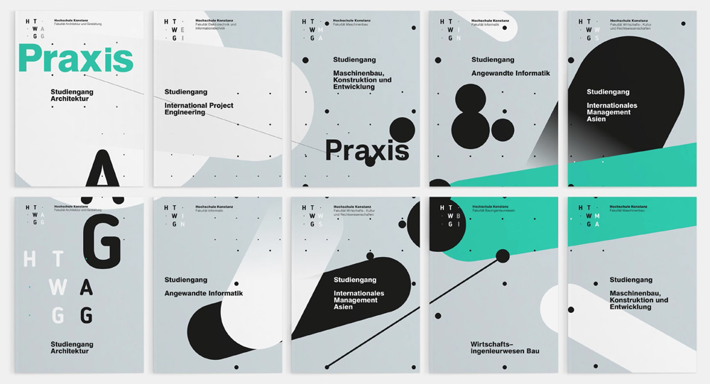
In application, the dot grid plays a big role as it serves to connect the typography to a mix of scaling circles and expanding, thickening, diagonal strokes. Although there is the concept of “networking” mentioned — what university isn’t networking? — in the quote and the applications do build on that concept I would gladly accept that the application’s concept were “because it looks cool and applied-science-y” because that’s what it really does well. Like, you are not going to HTWG to be the next Shakespeare. The layouts are generally interesting and both flat colors and photos look great in the background with all the flotsam and jetsam over them.
Overall, not knowing much about this university, this identity helps give it a personality that’s about precision but with a looseness that speaks to the possibilities of each student making their own connections. Sorry, don’t mean to get too philosophical on their behalf. Point being: it works. To end on a somewhat separate note, Hochschules are turning out to be some of the most interesting clients, willing to do some weird design stuff. Business goals for 2018: get one Hochschule and one brewery client.
Thanks to Sebastian Kirmse for the tip.

 Новости Союза дизайнеров
Все о дизайне в Санкт-Петербурге.
Новости Союза дизайнеров
Все о дизайне в Санкт-Петербурге.