Обзор лучших ресурсов по разработке бренда, разработке упаковки
contact us | ok@ohmycode.ru
contact us | ok@ohmycode.ru
Launched at the end of 2019, Sloy is a new “augmented reality short video” mobile app (in a similar vein to Tik Tok) created by Yandex, a large Russian tech company (that runs Yandex Search, the leading search engine in the country). Aimed at a 12- to 25-year-old demographic, the app has its slew of video editing tools, filters, masks, special effects, and music tracks that are all the rage now. Available only in iOS and in the Russian market for now, part of what makes Sloy unique is its focus on fashion and clothing where the app will auto-recognize pieces of apparel and call them out in the videos as tags, allowing users to surf videos by, say, all the people wearing vans sneakers. The logo and identity for Sloy was designed by Yandex’s in-house design team.
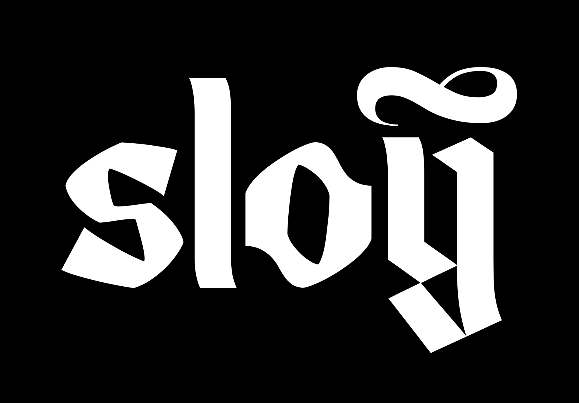
The word Sloy is Slavic for ‘layer’. As in “I’ve put on so many layers not freeze to death”, as well as “make-up layer” or “a layer of context”. Not to dive into the conceptuality of the term, let’s just say it has meanings.
We use CSTM Xprmntl font for the logo. It’s variable and has three styles: Gothic, Old Cyrillic and Experimental. We use a mix of all three of them for our most emotional communications and main messages. The font is in development, as is everything.
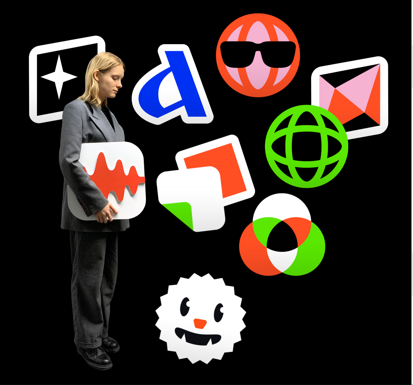
Born as a camera button, it evolved into Sloy’s app icon and our main communication tool. When we use it as a communication tool, the light and the gradient of the Portal are essential elements of brand visual representation, whereas the shape is as flexible as the environment we apply it to.
As I was preparing the images for this post I came to the realization that, pretty much, I have no idea what’s going on here and I considered not posting it but I thought it would be valuable as an exercise in understanding today’s youth and stepping out of our collective comfort zones of what an identity can be. So, the new logo… there are two completely different elements to it that have no relationship to each other visually or conceptually but, as you will come to understand by the end of this post, it doesn’t really matter. The icon is a green gradient orb that looks like an eye looking at you and collecting your data every time you stare into your phone’s soul. It’s cool to look at as a piece of digital art and I do like the premise that it’s the same graphic that serves as the app’s camera button. The wordmark is a very weird blackletter, typeset in the very weird CSTM Xprtmntl 03 — I don’t like it but I also cannot look away. I’m not sure what the tilde-slash-infinity-symbol thing over the “y” is but there it is. So that’s the logo.
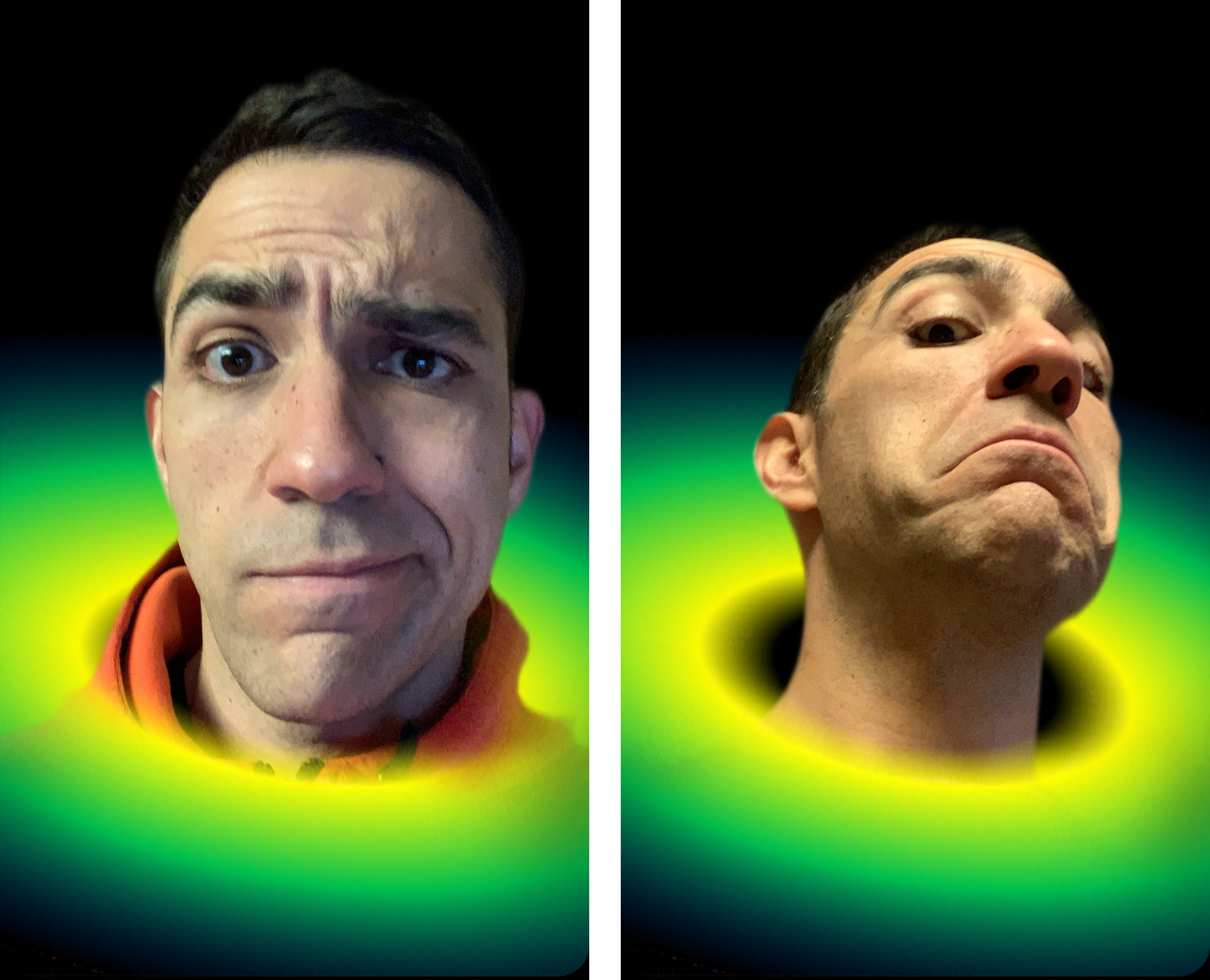
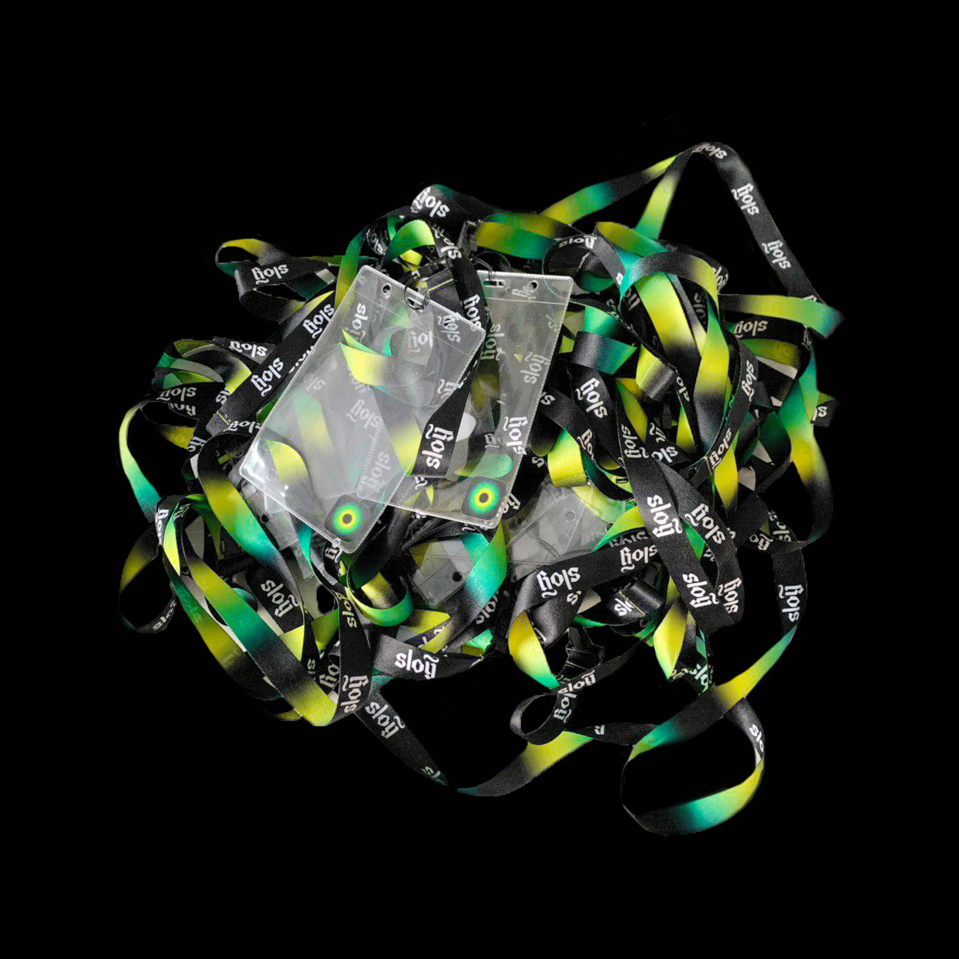
The green orb icon then expands to be the app’s main identity element, able to literally expand in any shape or direction without many limitations. One literal flex is that the icon can serve as an Instagram mask where the icon becomes a “portal”, a kind of green-black hole from which one can emanate as demonstrated by yours truly. The lanyards below are what most resembles an application and I have to say that it looks kind of hot… I would really love to see how this visual language can be tamed down into actual things.
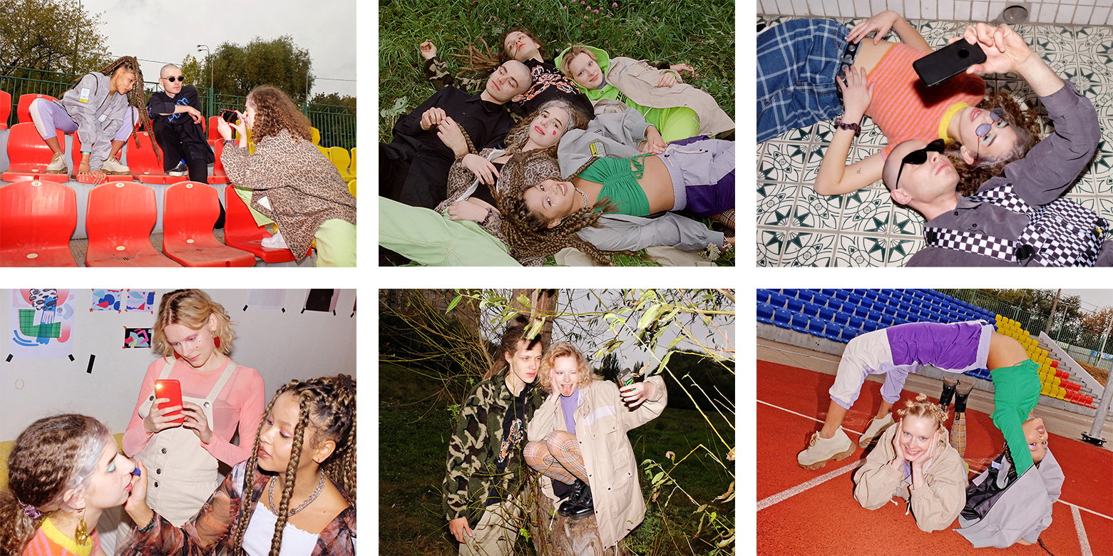
The brand photography is sort of what you would expect from a fashion-focused mobile app targeted to 12- to 25-year-olds, which translates into us old people going “WTF are they wearing?”. You do you, youth.
The aesthetics play an important role in how product works and how people communicate with it. Hence, we make our interface somewhat extra, more emotive.
There are three screens where the most interaction happens: camera, profile and feed. We chose to flex the interface and replace basic icons with custom stickers to add an emotional layer to the product.
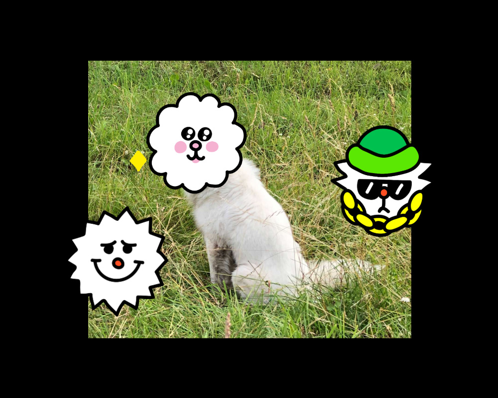
Tyler — our mascot, AR icon in the app, a sticker pack and an actual dog — lives both within and beyond the interface.
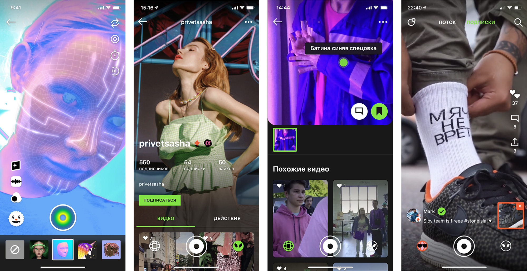
In terms of the app itself, it looks kind of chaotic and the addition of stickers to replace UI elements only exacerbates its crazyness which further signals this is not the app for our demographic — I find the Weather app to be all the excitement I can handle on my phone. Overall, this “identity” is kind of perfect for the market and the audience with zero fucks given at every turn and a truly unique, convention-breaking visual language that adds to the self-expression appeal of the app.
 each year since publication began in 2006

 Новости Союза дизайнеров
Все о дизайне в Санкт-Петербурге.
Новости Союза дизайнеров
Все о дизайне в Санкт-Петербурге.