contact us | ok@ohmycode.ru
contact us | ok@ohmycode.ru

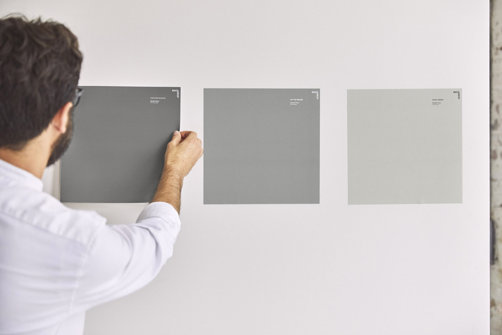
Established in 2018, Backdrop is a new direct-to-consumer paint brand — meaning you don’t have to go to a giant hardware store to get it but can instead order directly — that provides a reimagined painting experience. Instead of tiny swatches, you can order 12-by-12-inch stickers to neatly place on your wall to assess the color. Instead of hundreds of colors, there is only 50. Instead of a round can, it’s a funky rectangular box. And instead of a bottomless pit of money for a corporation, every sale benefits the International Rescue Committee. Launched at the end of last year, Backdrop introduced its new identity designed by New York, NY- and San Francisco, CA-based Aruliden.
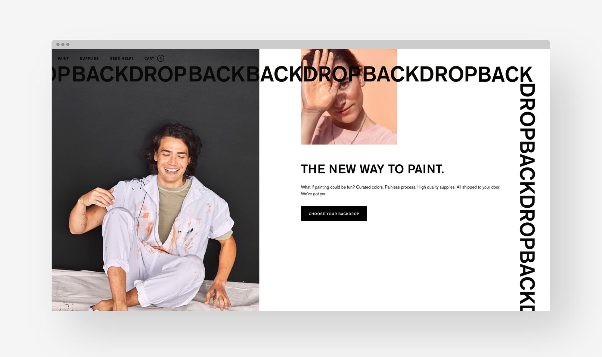
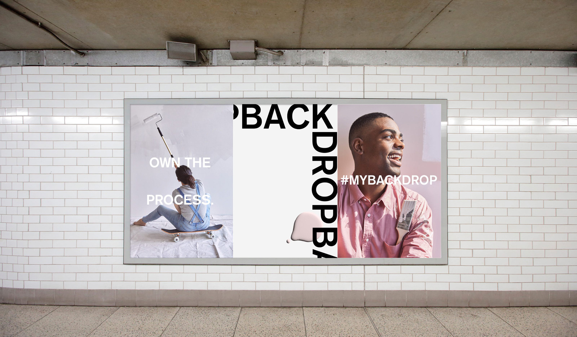
Backdrop set out to be transparent, easy-to-use and empowering, so we designed a visual identity to match. From logo to typography to photography style, every aspect of how Backdrop shows up in the world was carefully curated and designed to get the job done.
As a direct-to-consumer brand, Backdrop’s out-of-box experience needed to be picture-perfect, and visual coordination across the brand’s entire ecosystem had to be just right. Our graphic and industrial designers worked side-by-side to apply the new identity to Backdrop’s painting tools and packaging, and ensure the brand’s IRL experiences measured up to its digital expression.
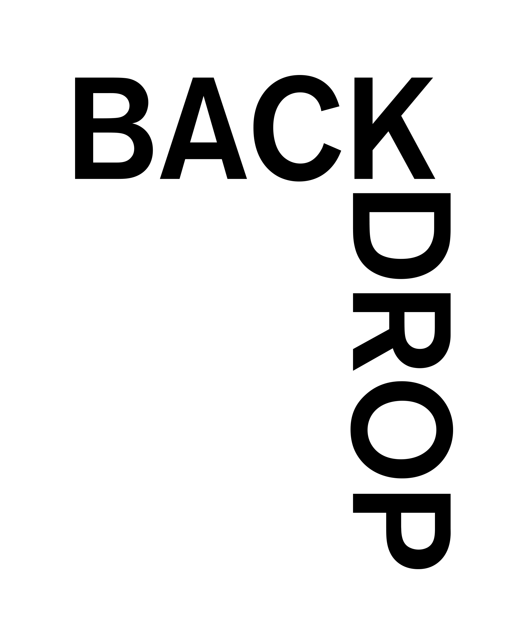
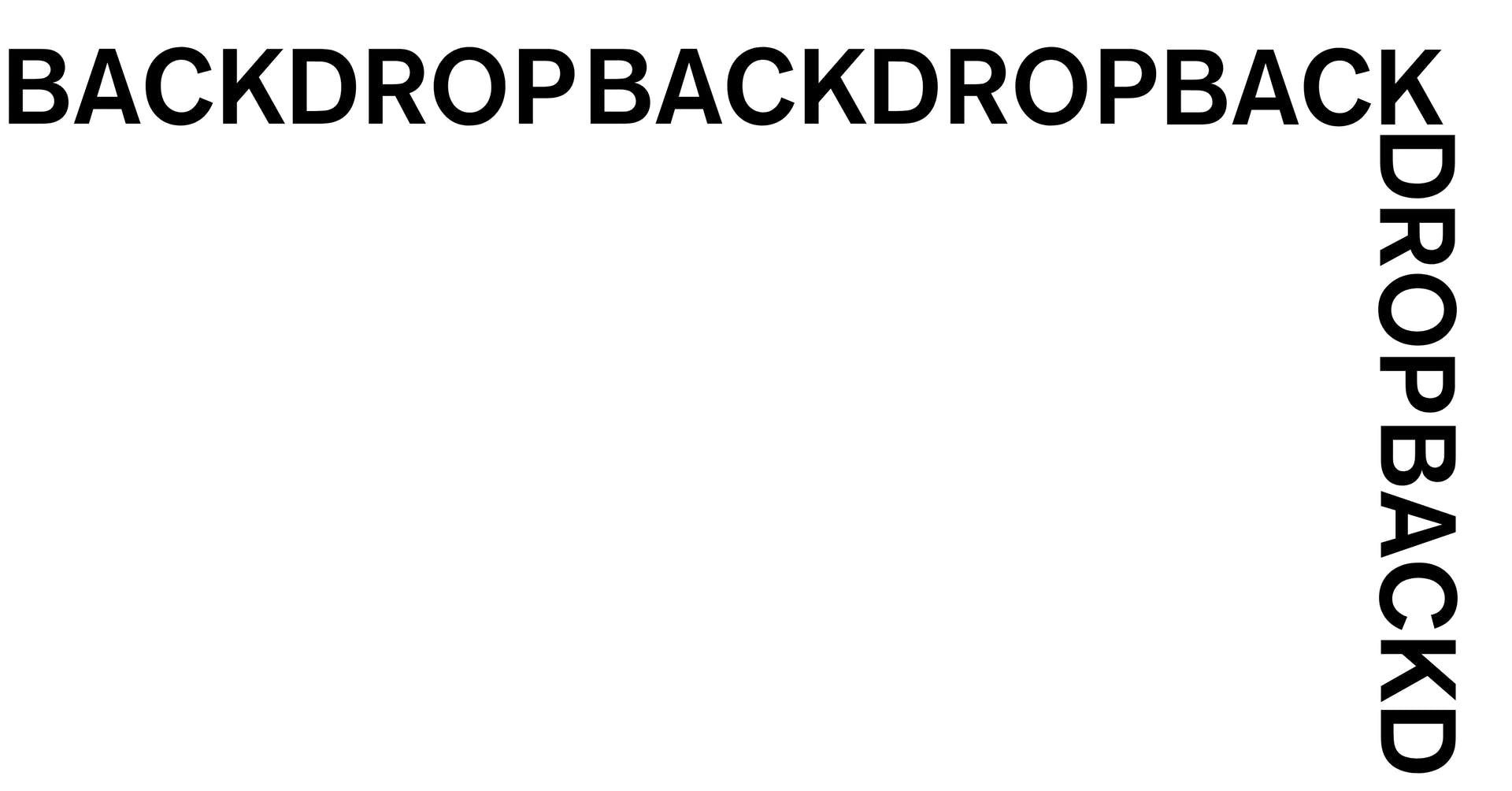
The logo seems about right for the product and design-minded approach of the brand. It’s not inherently exciting but it has an industrious feel that plays well with the packaging. I assume the turning-the-corner approach is a visual metaphor for the meeting of two walls, which adds a little extra dimension to the otherwise barebones wordmark. One tiny detail that bothers me — and at first I thought it was another SVG logo issue but all applications have it — is that the bottom of the turned “D” doesn’t perfectly align with the left of the “K” and I don’t know why that would be. The treatment of the logo as a repeating border is alright.
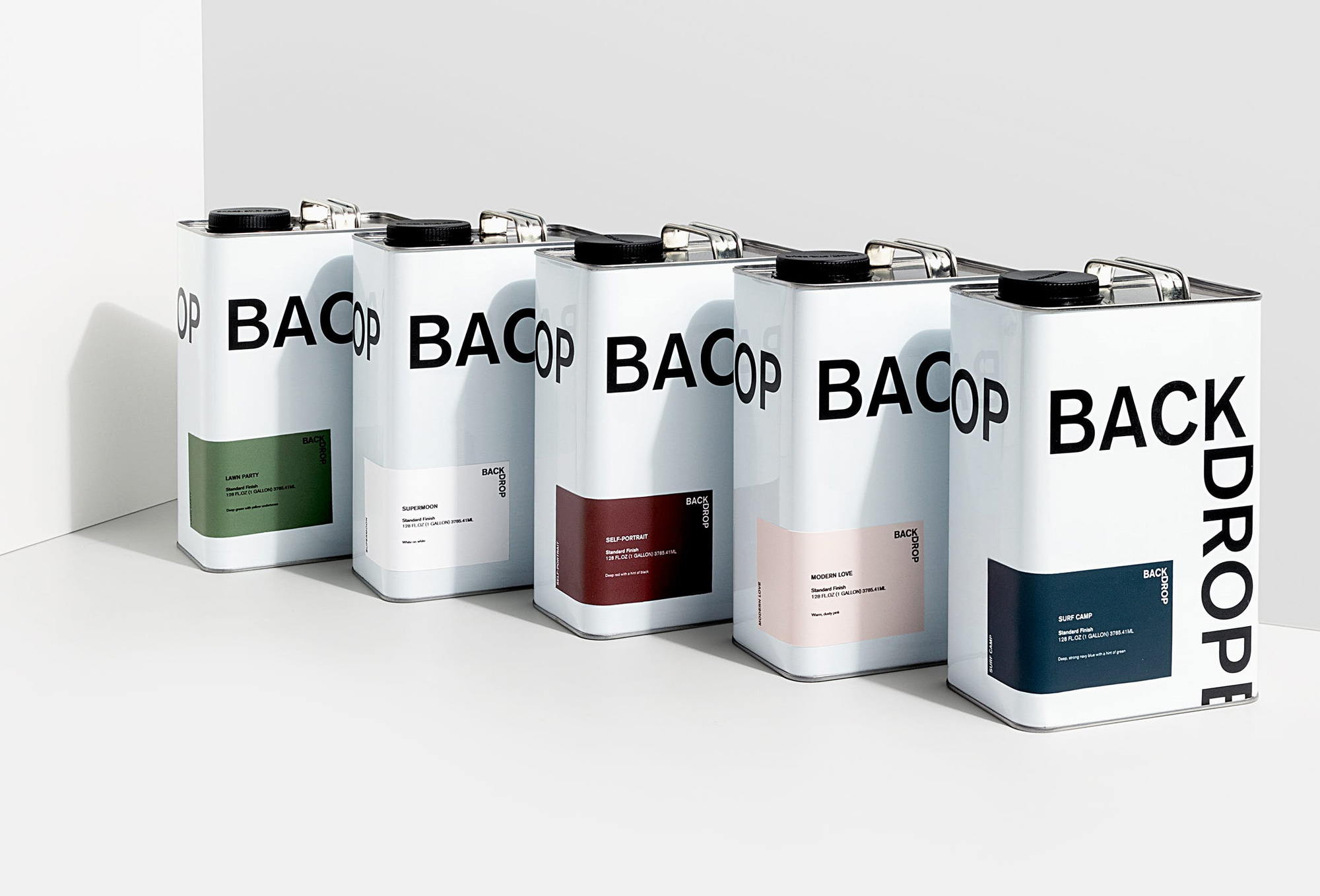
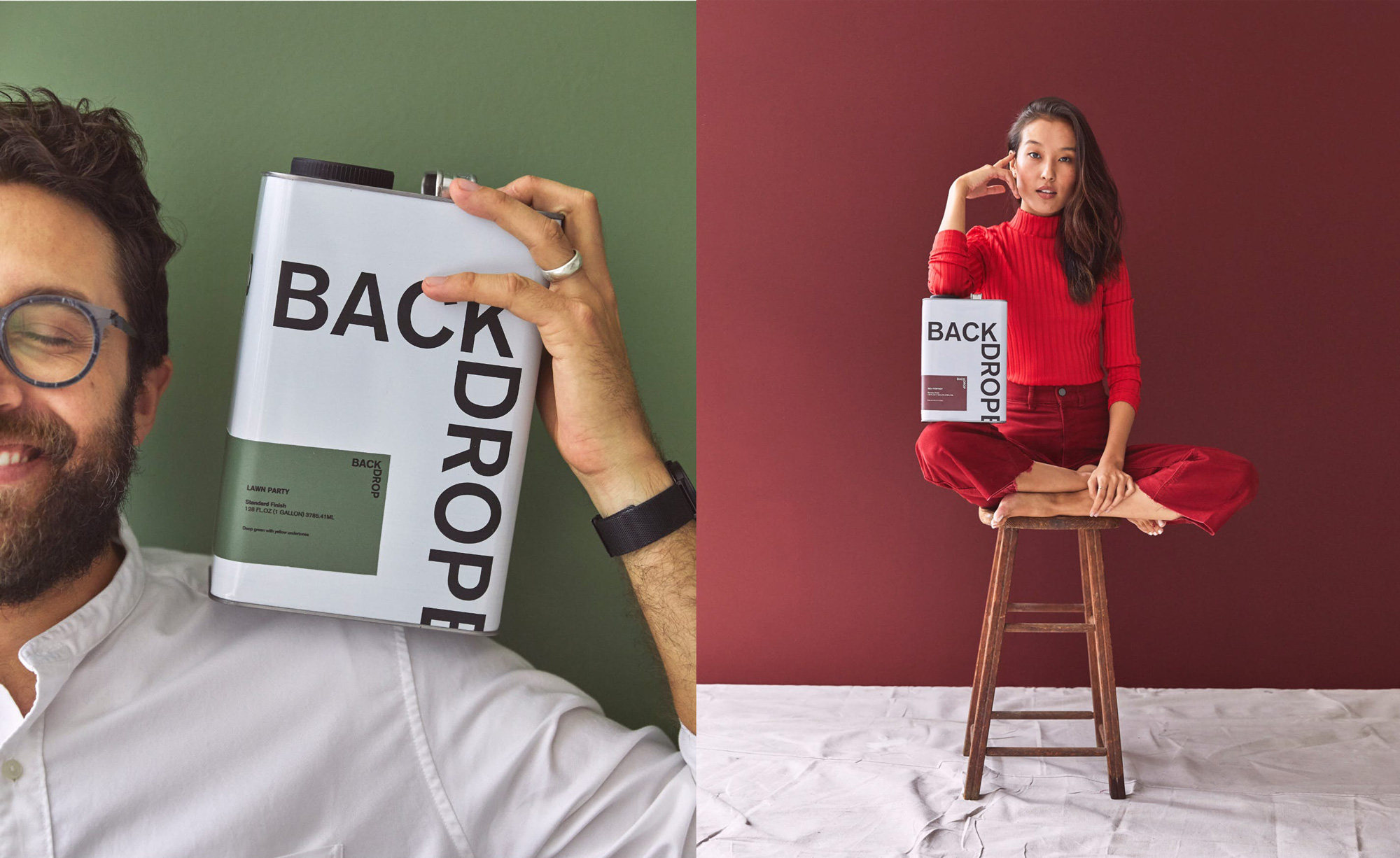
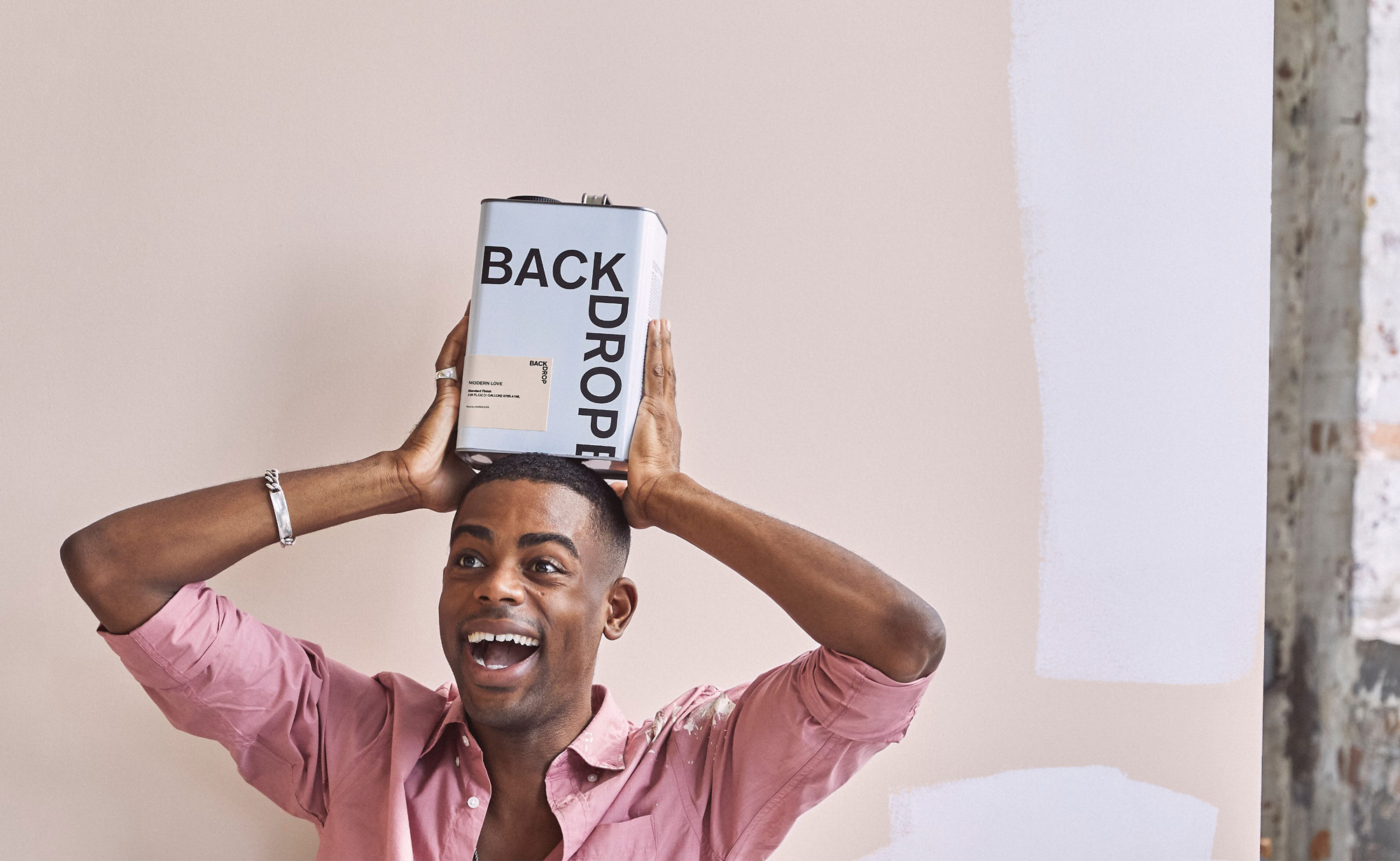
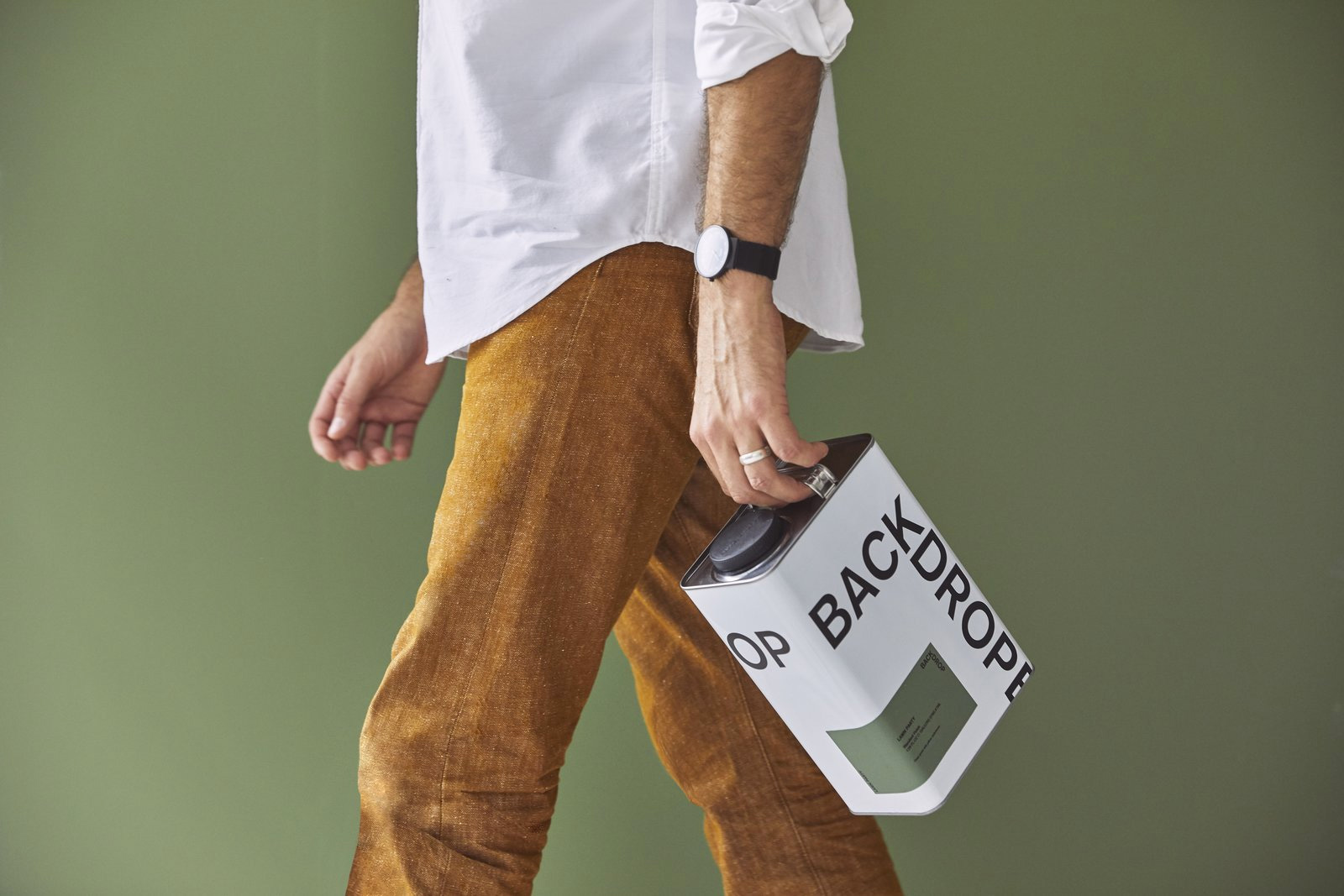
The highlight of the project is the can, which has a really great aesthetic and is perfect for Instagram — it makes painting look like a cool lifestyle choice not like the hell-on-earth experience it most often is. (That’s awesome if you love painting walls; I hate it.) It has a vintage, military-esque shape that has been nicely softened with the generous use of white space. The wrapping of the color sticker looks great and the large logo works perfectly with the shape of the can. I also like the implied continuation of the border treatment with the small sliver of “B” going into the bottom of the can. Not sure what’s going on on the backside, though, with the “OP” looping around on the side.
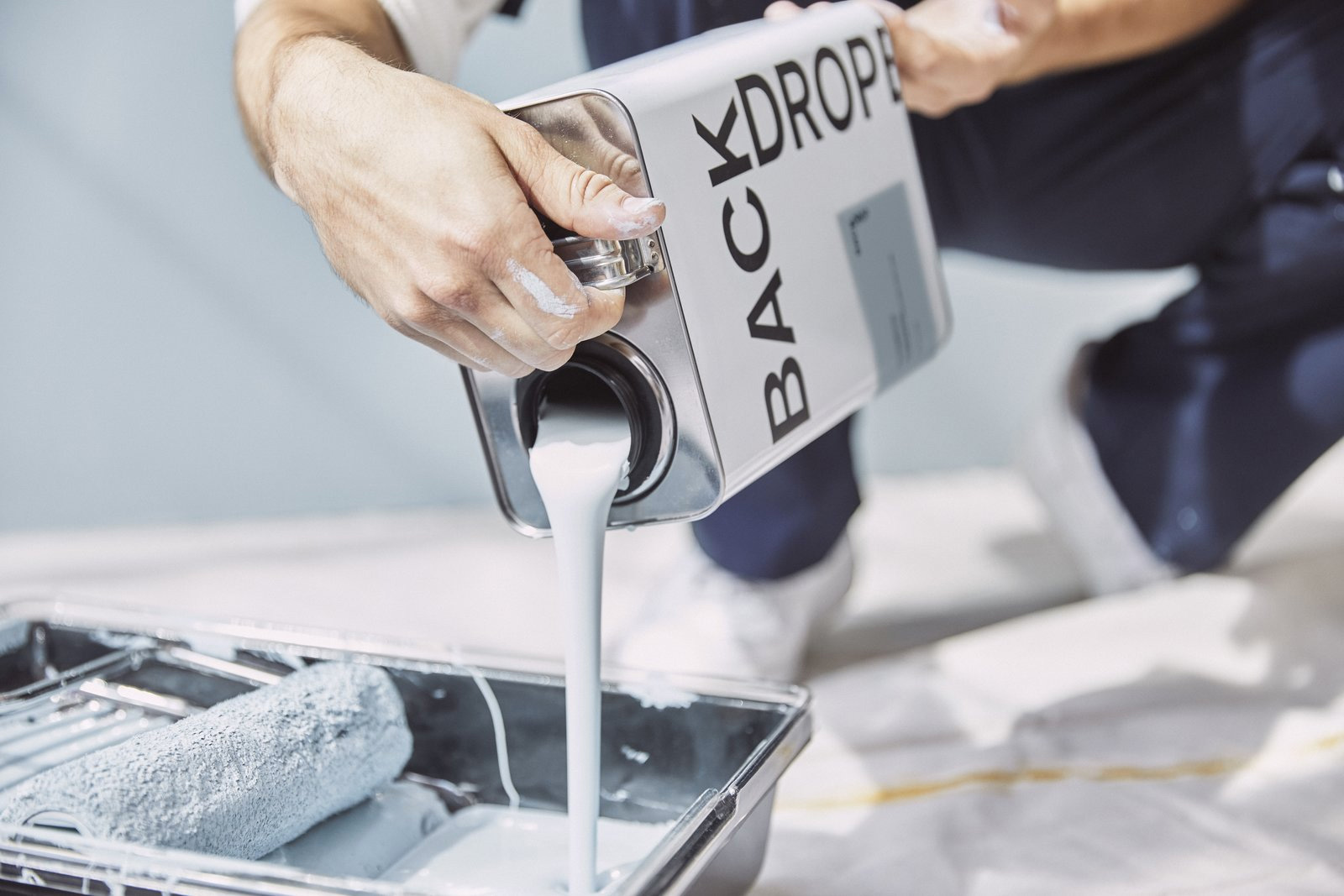
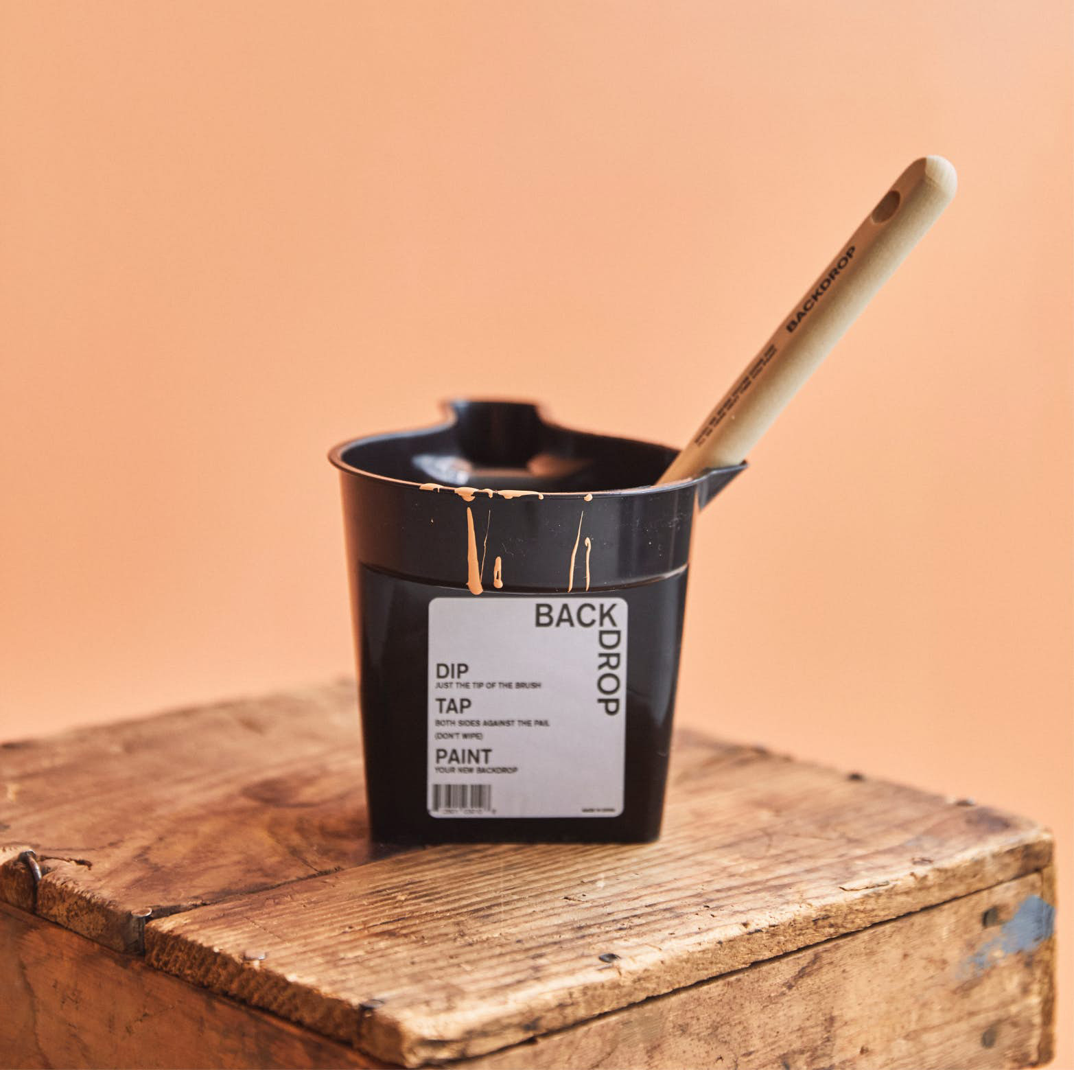
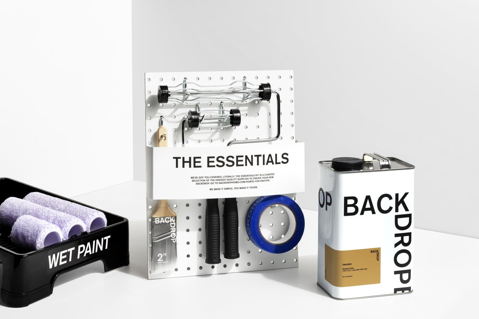
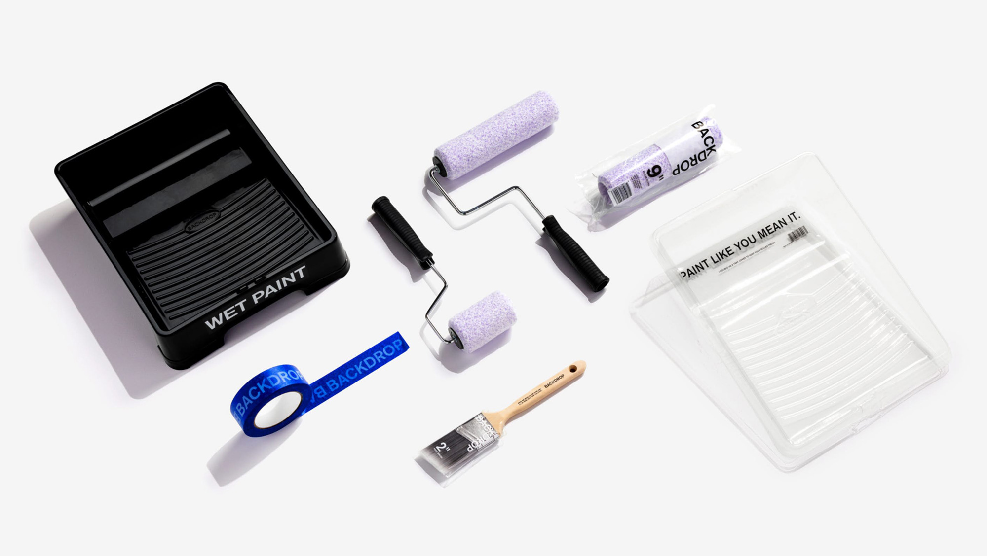
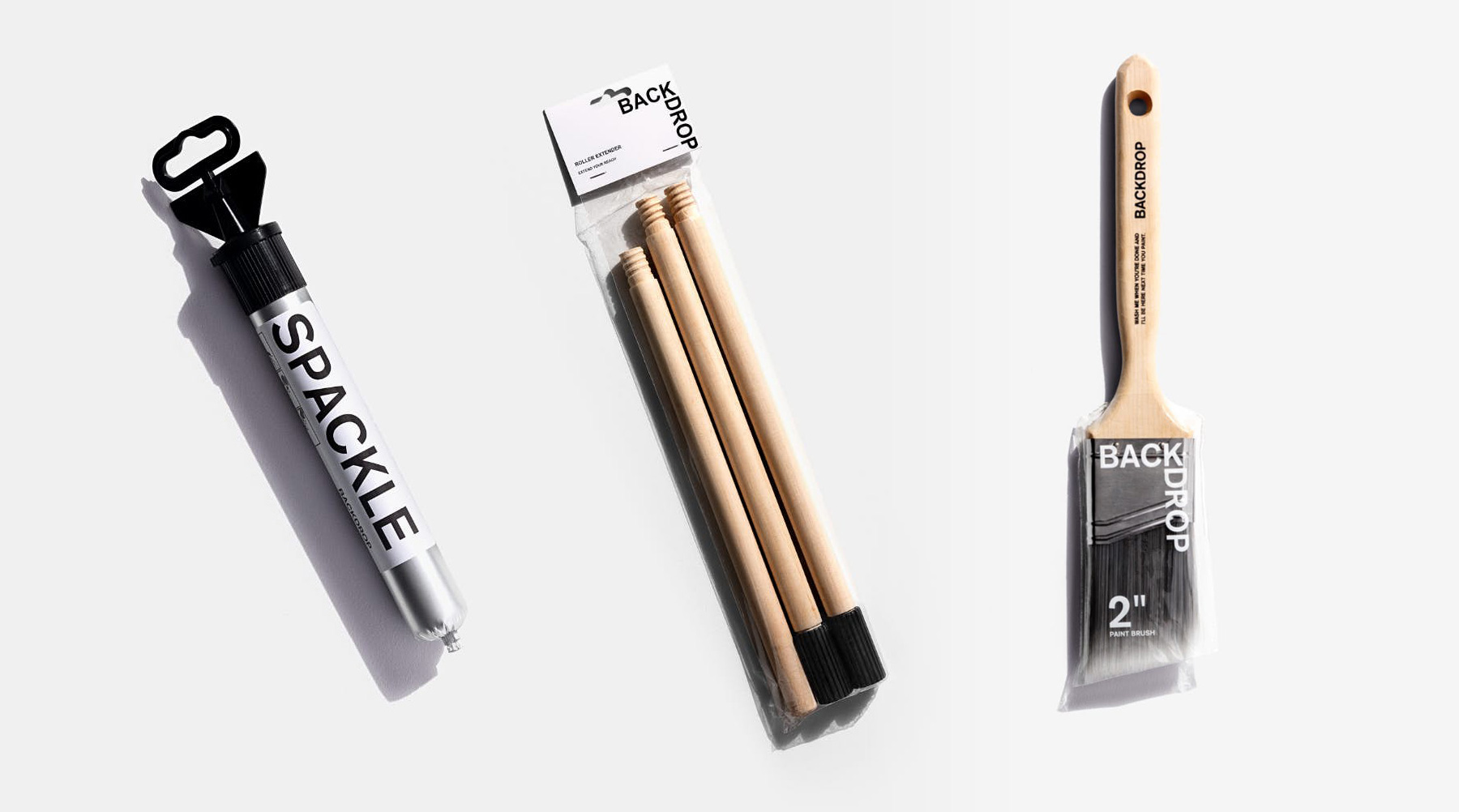
All the other range of products follow suit in their spareness and rely on Akzidenz Grotesk to get the job done. Everything looks pretty good if perhaps a little inconsistent but I think that has more to do with the wildly different objects needed for the job.
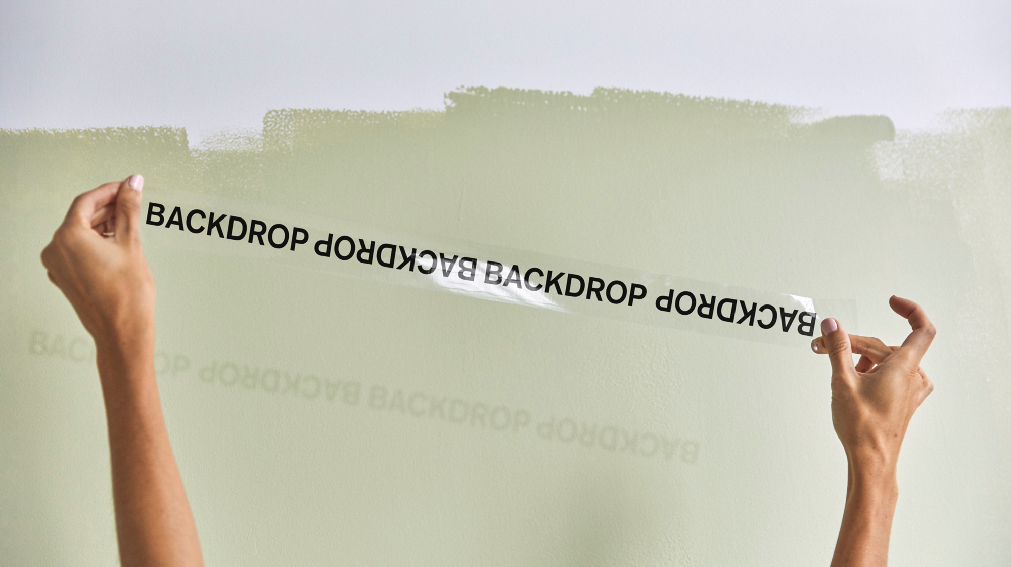
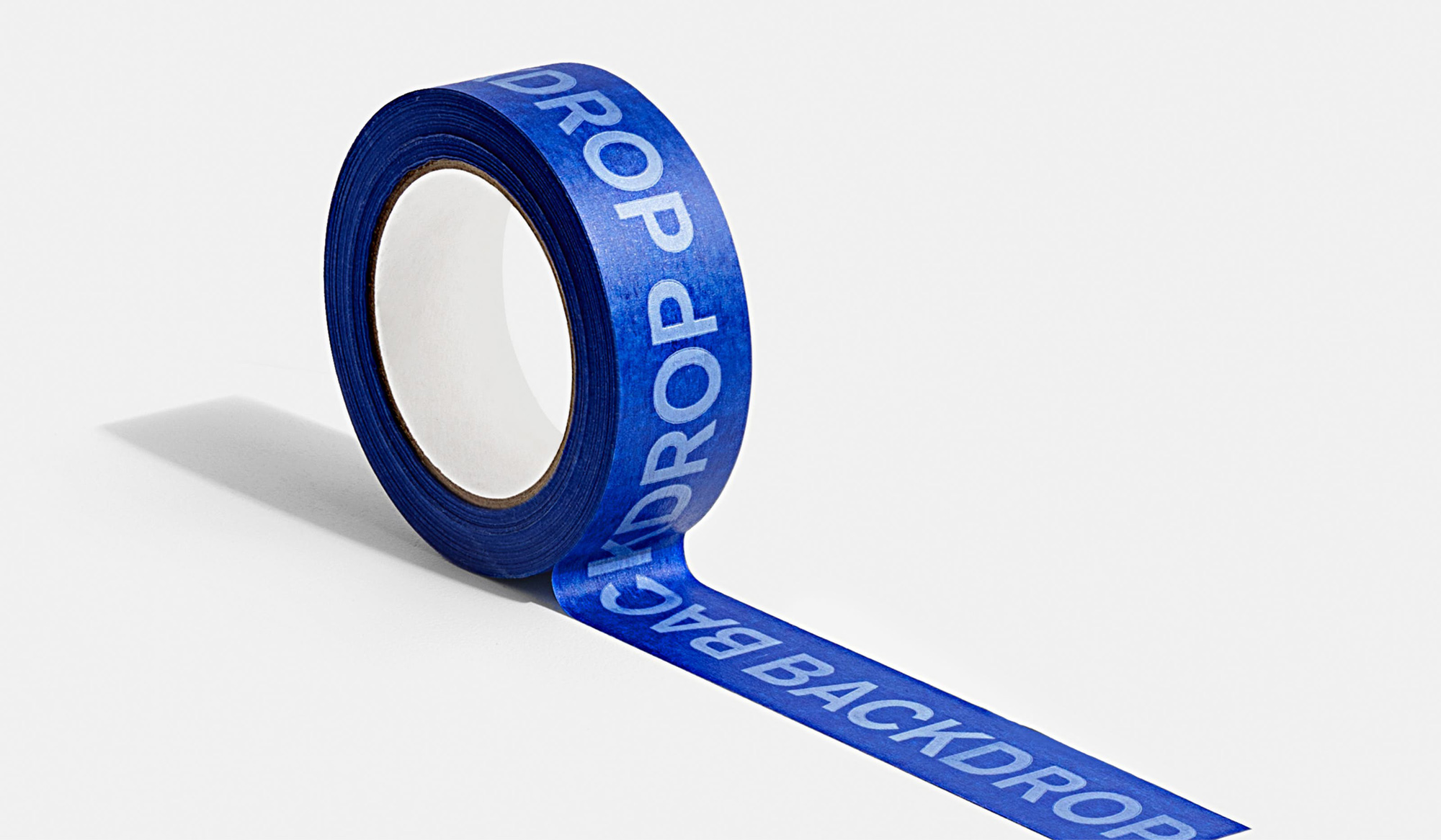
Overall, this does achieve the goal of making the painting experience — from color selection to tool purchasing to paint pouring — feel more enjoyable. It also adapts the decades-old process to today’s never-set-foot-in-a-store-again lifestyle by making the process easier and the product more enticing, giving customers the confidence that their walls will turn out a-ok.

 Новости Союза дизайнеров
Все о дизайне в Санкт-Петербурге.