Обзор лучших ресурсов по разработке бренда, разработке упаковки
contact us | ok@ohmycode.ru
contact us | ok@ohmycode.ru
Established in 1908, DeSerres is an art supply store for artists, hobbyists, designers, art enthusiasts, children, and students. Family-owned for three generations, DeSerres has 34 stores across Canada. Aside from well-known brands like Staedtler, Fabriano, and Winsor & Newton, the company also offers its own brand of products across various categories, from frames to paints to brushes. Yesterday, DeSerres introduced a new identity designed by lg2.
“DeSerres has shaped the retail industry by constantly redefining itself. This latest change reflects our desire to always be innovative,” explained Marc DeSerres, president of DeSerres. “With this change, we are investing in a transformation that better meets the tastes and aspirations of our clientele. Ask any creative person and they will tell you that the process is often more fruitful than the actual result.”
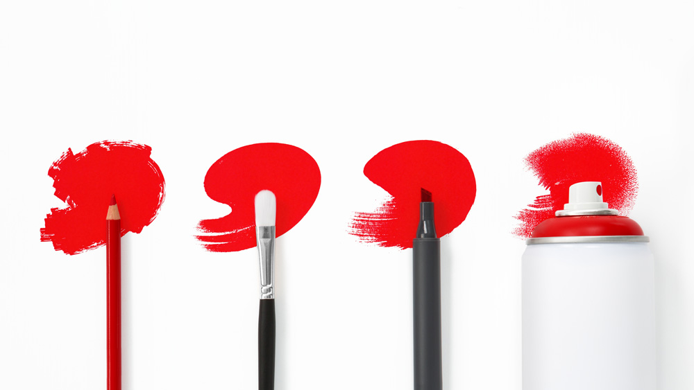
It’s in this same spirit that the new brand platform pays tribute to the process and materials that nourish creativity. “Every detail was designed to illustrate the importance of bringing creativity to people’s lives, from the logo, which embodies the creative act, to the choice of products in-store that are selected to spark inspiration and creativity,” mentioned Pénélope Fournier, Partner and General Manager of lg2’s Montreal office.
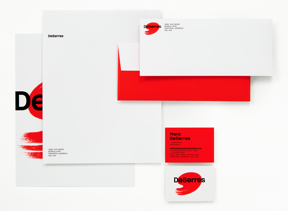
The old logo suffered from some unfortunate plastic-ification in 2008 when the full name of the founder was dropped. The cheesy highlight and shadow added to the palette made it look like a toy and the typography was far from interesting. The new logo keeps the palette but renders it in a very nicely executed brush stroke that more evocatively conveys the sense of making/doing/creating. It keeps the equity of the old one but improves it in every way. The new wordmark lands more bluntly on the palette icon making it feel more contemporary and less constrained.
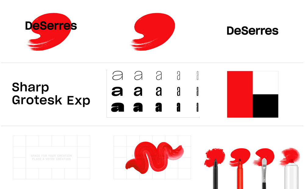
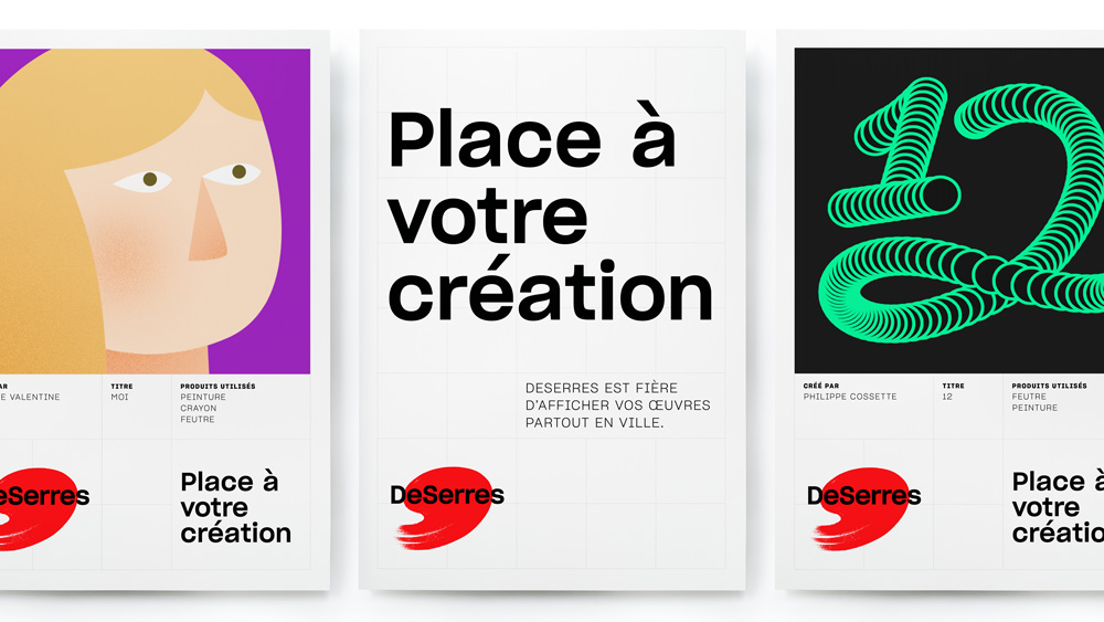
The key element of the applications is the subtle grid in the background that makes the applications look like templates that can be interpreted as blank canvases for the customers. The combination of large type with the smaller, light, all-uppercase descriptions (as seen in the posters) is quite nice and gives the identity a sort of technical-drawing aesthetic. I wish we could see some more of the packaging samples (in the video at the end) as those look nice too, like if Geigy Pharmaceuticals did art supplies.
Overall, this is a great redesign that stays close to its predecessor but at the same time is a strong departure from it in terms of quality and expressiveness.

 Новости Союза дизайнеров
Все о дизайне в Санкт-Петербурге.
Новости Союза дизайнеров
Все о дизайне в Санкт-Петербурге.