Обзор лучших ресурсов по разработке бренда, разработке упаковки
contact us | ok@ohmycode.ru
contact us | ok@ohmycode.ru
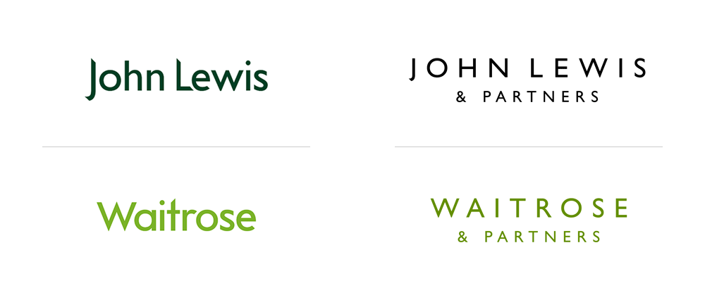
Established in 1929, the John Lewis Partnership is the parent company of department store chain John Lewis and grocery store chain Waitrose whose combined 85,000 employees have an ownership stake in the company and are known as “Partners”. This week, both retailers added “& Partners” to their name to celebrate this unique (at this scale) business model. John Lewis & Partners was first established in 1864 and has 50 stores across the UK; Waitrose & Partners was first established in 1904, purchased by John Lewis Partnership in 1937, and now has 350-plus shops in England, Scotland, Wales and the Channel Islands. The new identities for both retailers were designed by London, UK-based Pentagram partner Harry Pearce.
The brand identities are informed by a shared design system, developed by Pentagram to bring coherence, clarity and flexibility to the three organisations, and their full suite of products and services. Crucially, the brand identities work in harmony with the Partnership’s vast offering of products and services; bold and pronounced in some contexts, quiet and subtle in others.
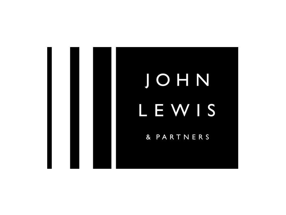
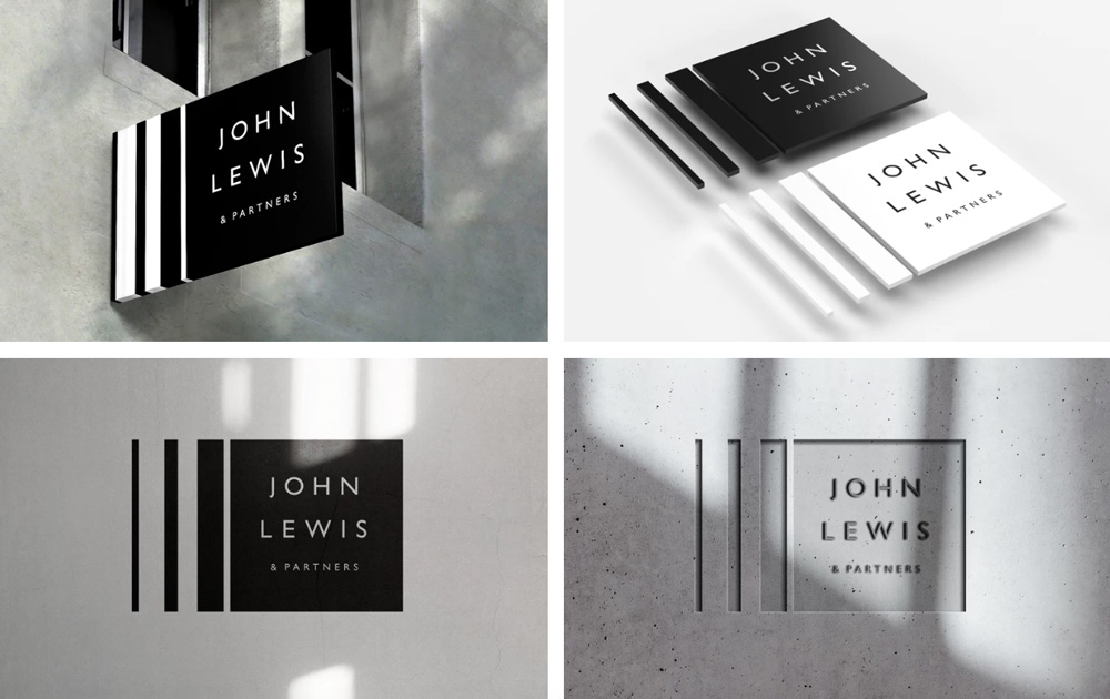
Retaining the Gill font that has become synonymous with John Lewis, Pentagram created more of a ‘mark’ by stacking the wordmark. The three wordmarks have been redrawn to thrive at various scales, from mobile phones, to billboards and retail installations.
Not being from the UK, I obviously have no emotional attachment to either of these two brands but, from reading about the change, I do get it they are a significant part of the UK retail landscape. I bring this up so that I can say that the old logos were fine but nothing in particular about them seemed worth holding unto for the rest of eternity. They were not particularly elegant or even pleasant wordmarks, with those sharp angles on their ascenders. The new logos, on the other hand, are very elegant and very pleasant. There is nothing amazing or even interesting about them — Gill Sans for a UK brand is almost as obvious as a maple leaf for a Canadian brand — but they are simple, classic, and look as they should have looked for the last fifty years. At least in their standalone, type-only versions.
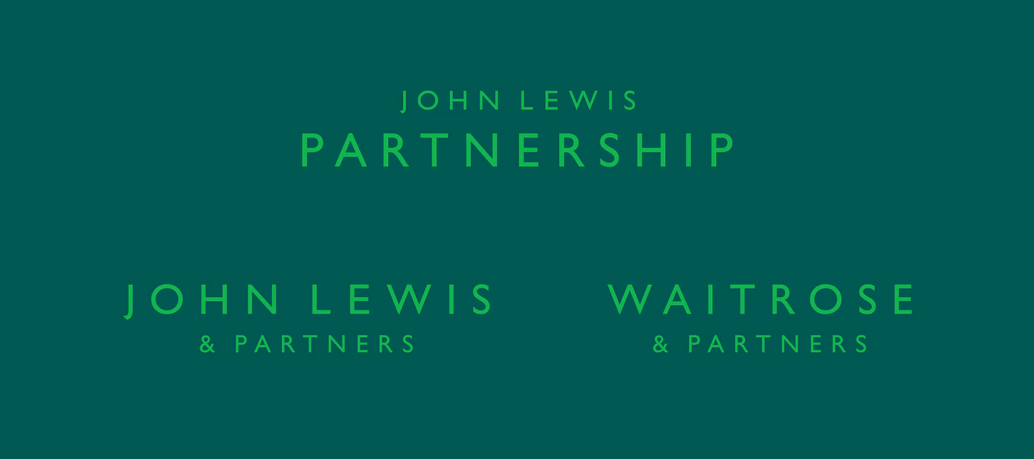
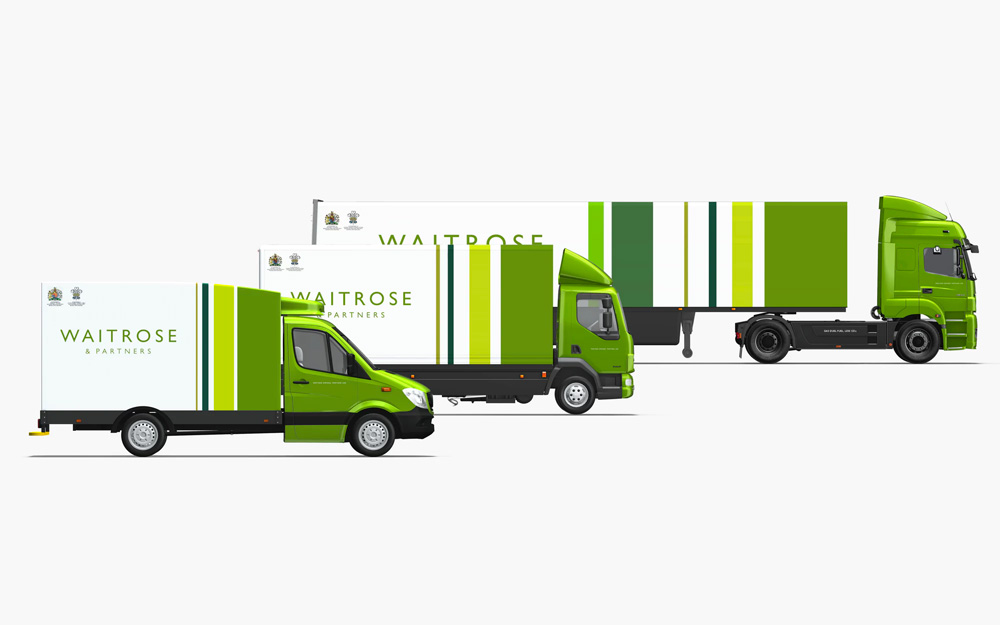
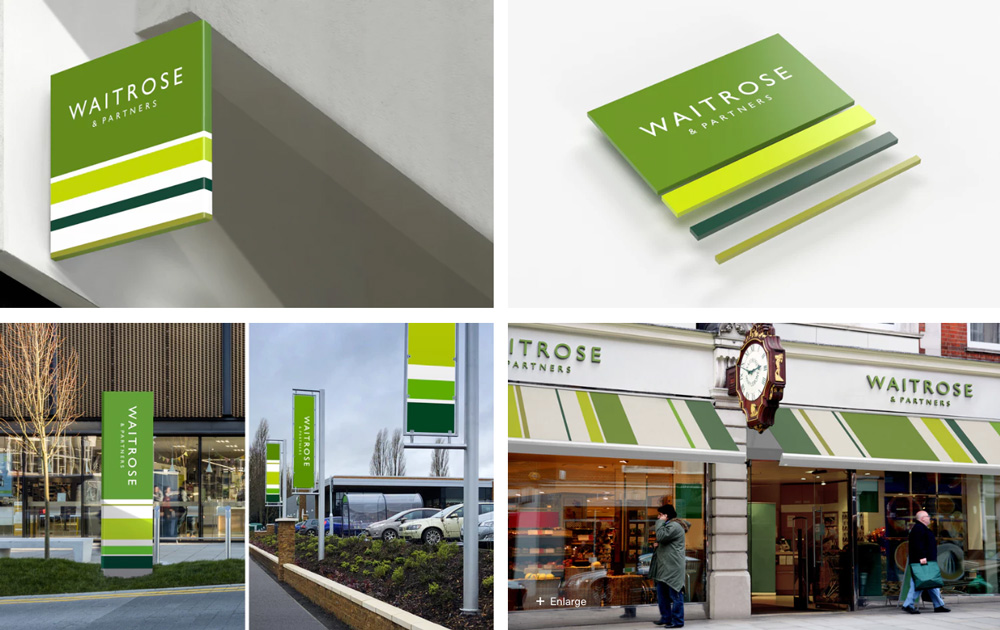
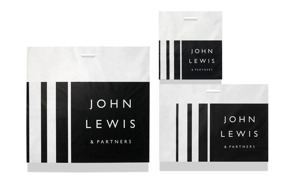
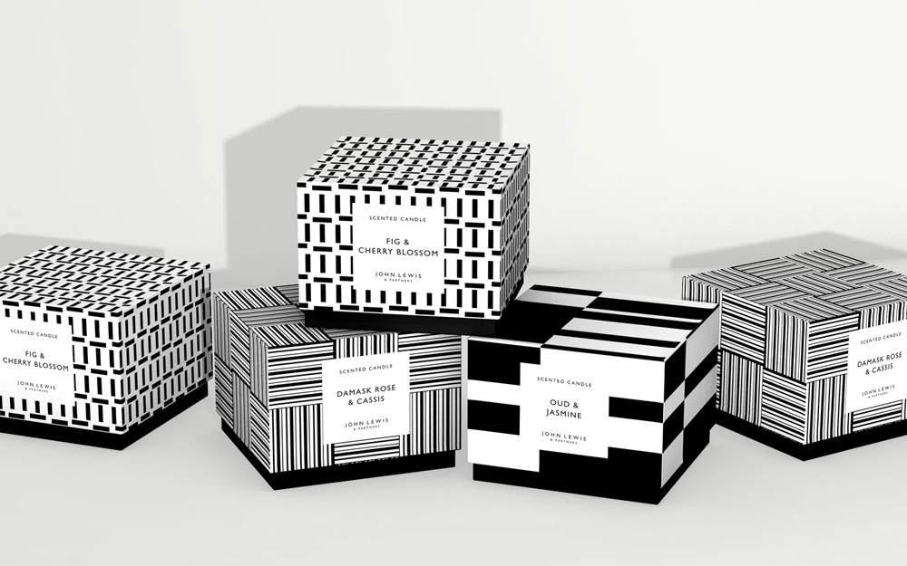
The new ‘Brandlines’ logotype is inspired by a Peter Hatch pattern created for the John Lewis Partnership in the 1960s. It is based on precise proportional relationships derived from the original pattern. Applied across both the John Lewis Partnership parent brand and the trading brand identities of John Lewis and Waitrose, differing variants of the logo can be used depending on the requirements of the application; responding to a wide range of products, communications and customer experiences while maintaining recognition and building a cohesive customer experience.
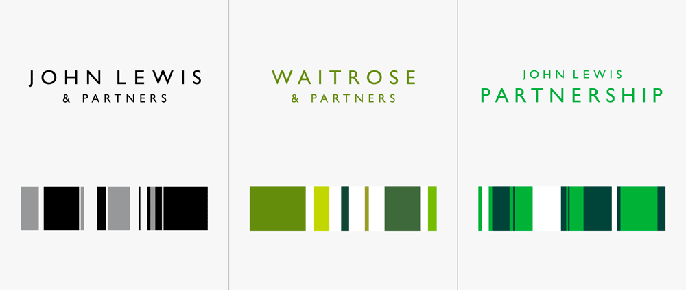
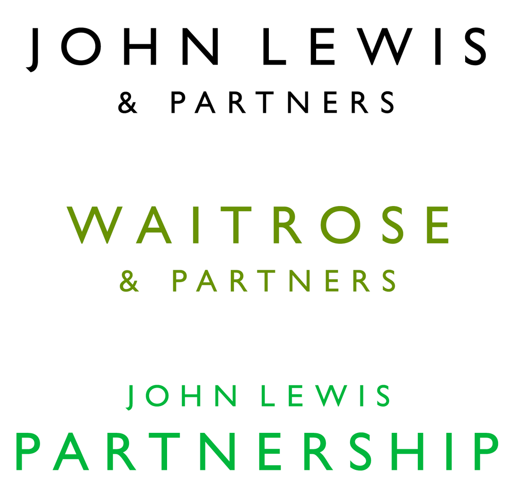
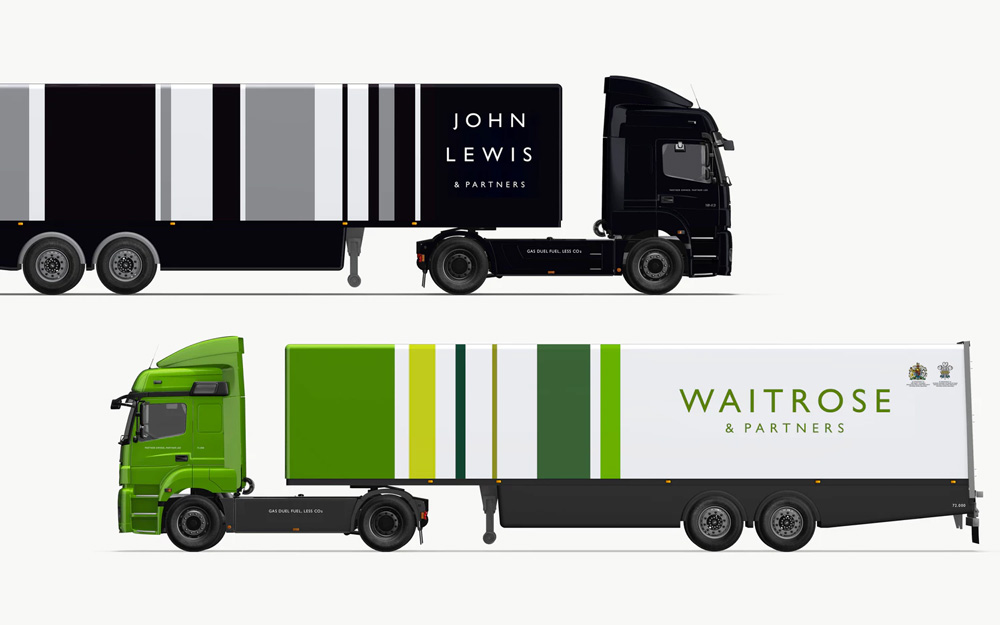
The “Brandlines” treatment for John Lewis & Partners, which seems to be the main usage, is a big turn-off for me. I appreciate how it came from a vintage pattern from the brand’s history but they really sucked the life out of that 45-degree pattern when it was turned into vertical bars and imprisoned the wordmark into the square. Whereas Waitrose’s logo roams free without a box and bars and feels much more upscale and contemporary. In general, the bars and patterns are not very exciting and have a dated feel to them. There are some instances where they do look interesting — the trucks are quite nice, looking like a giant gift box — but for the most part I think they get in the way of what’s otherwise a pretty nice typographic language.
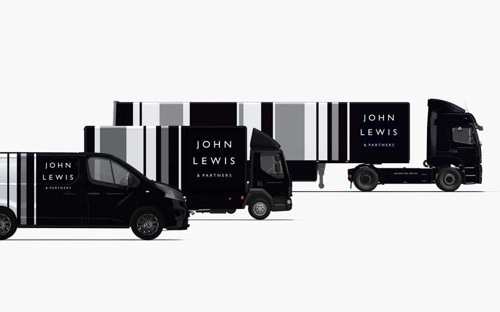
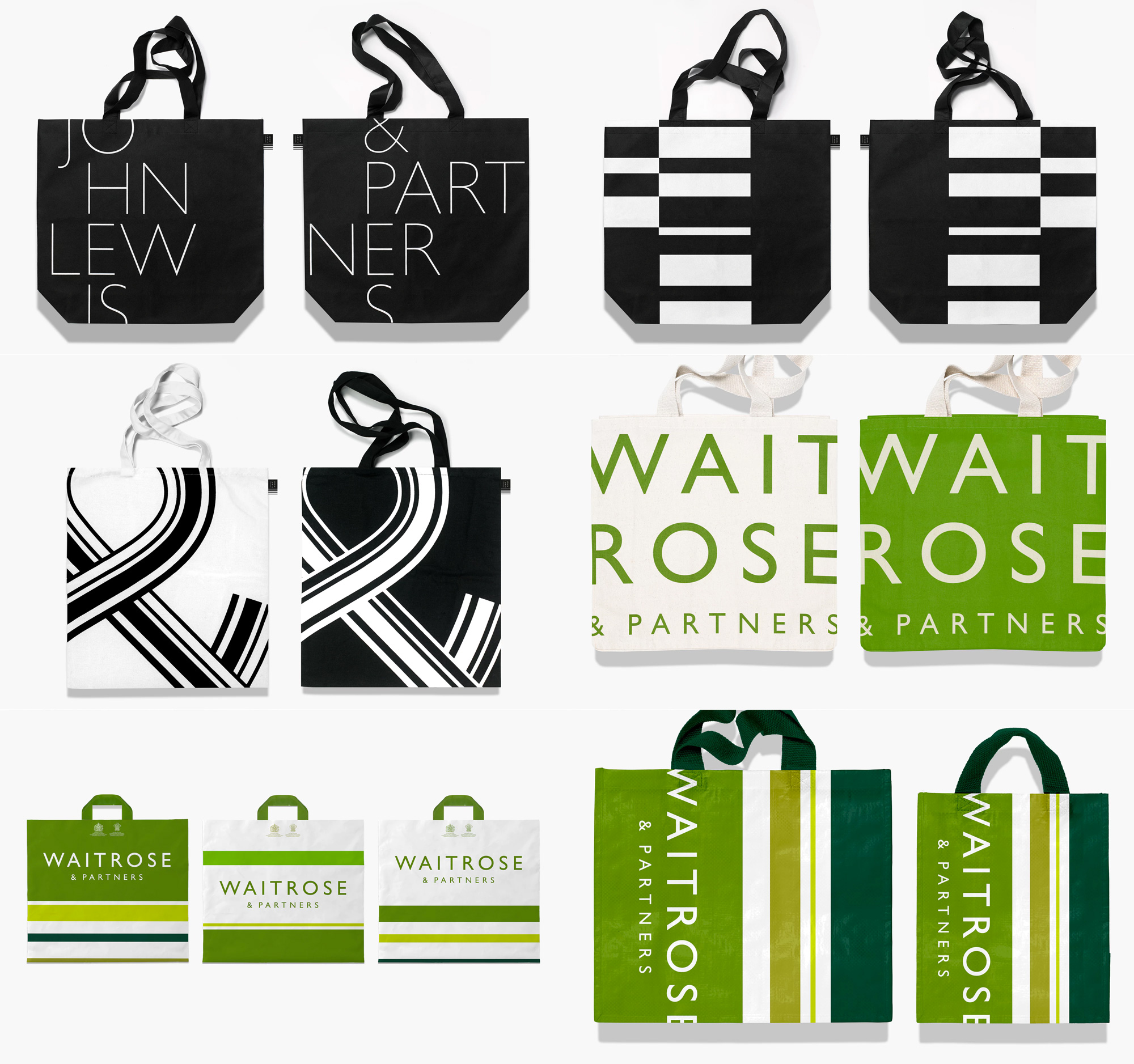
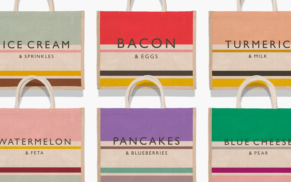
All the applications are fine and look functional, no question about that. As mentioned with the livery there are some really cool moments like the colorful Waitrose bags with the different food combinations. Those make a better and more interesting use of the bar patterns. There are a few more applications on Pentagram’s project page that, for brevity, are not included here but worth taking a look. The John Lewis tags and labels (sans lines!) are quite nice.
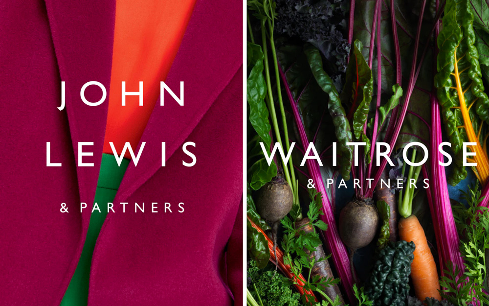
Typography is another key part of the Partnership’s new brand identity. Pentagram has developed a typographically confident style that will be used in tandem with the patterns to create impactful campaigns. A hand drawn headline font, ‘brandlines alphabet’, is taken from an old version of Gill and incorporates Hatches’ pattern lines.
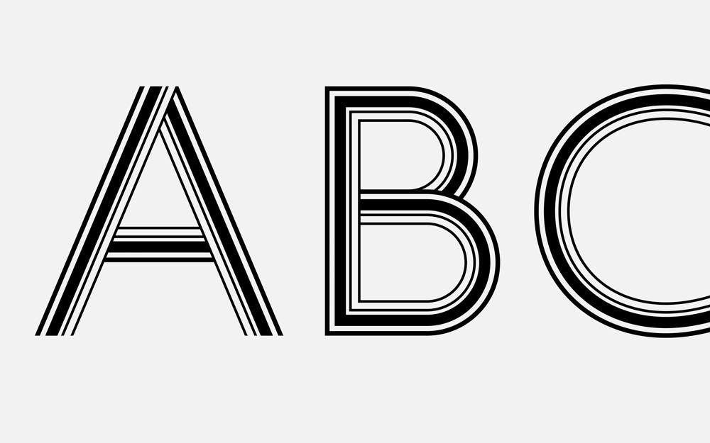
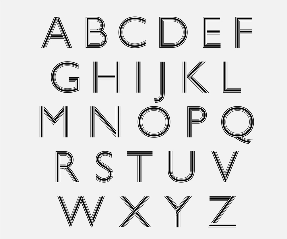
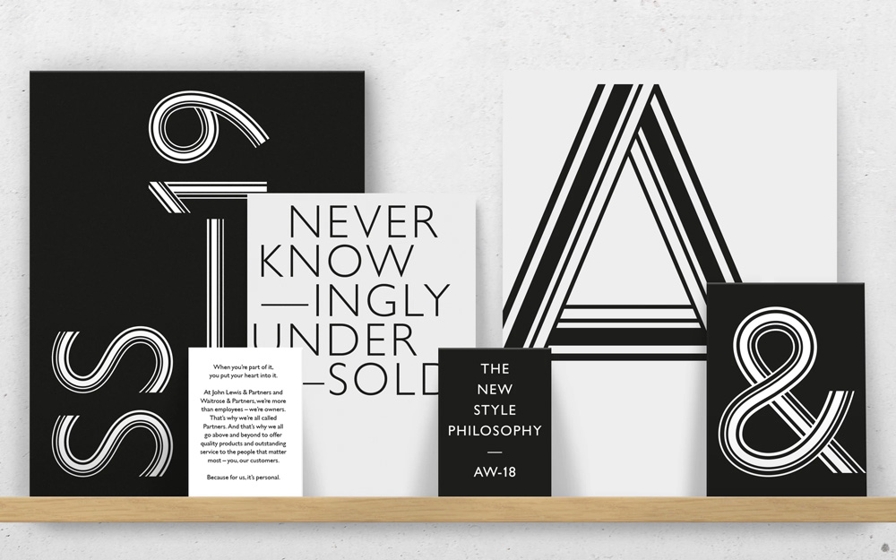
The headline font is great and I would have loved to see that expanded as part of the core visual language (e.g., crops of giant “S”s instead of the heavy bar patterns would have been slick) as it feels more unique and ownable. The packaging also has a great energy to it that doesn’t appear in other places. I understand not everything can be all-out all the time but more of that energy and contrast is more engaging.
The launch of the new identity is being supported by the first ever joint John Lewis & Partners and Waitrose & Partners national marketing campaign; the single biggest ever campaign for both brands outside of Christmas. It includes a new TV and cinema advert, which features children putting their heart into performing a school play to the sound of Queen’s Bohemian Rhapsody song and ends with the line ‘For us, it’s personal’.
Stealing the thunder of the name change and logo update, though, is this wonderful spot — the first combined ad for the two retail brands — that shows an ambitious kid production of Bohemian Rhapsody. It’s just grin-inducing.
Overall, I may not be the biggest fan of the heavy-handed bars and lines but this is a solid and ambitious update and it’s pretty amazing to see two distinct retail operations come seamlessly together through a shared identity that allows each to have a little bit of their own personality but definitely come across as being part of the same family.

 Новости Союза дизайнеров
Все о дизайне в Санкт-Петербурге.
Новости Союза дизайнеров
Все о дизайне в Санкт-Петербурге.