Обзор лучших ресурсов по разработке бренда, разработке упаковки
contact us | ok@ohmycode.ru
contact us | ok@ohmycode.ru
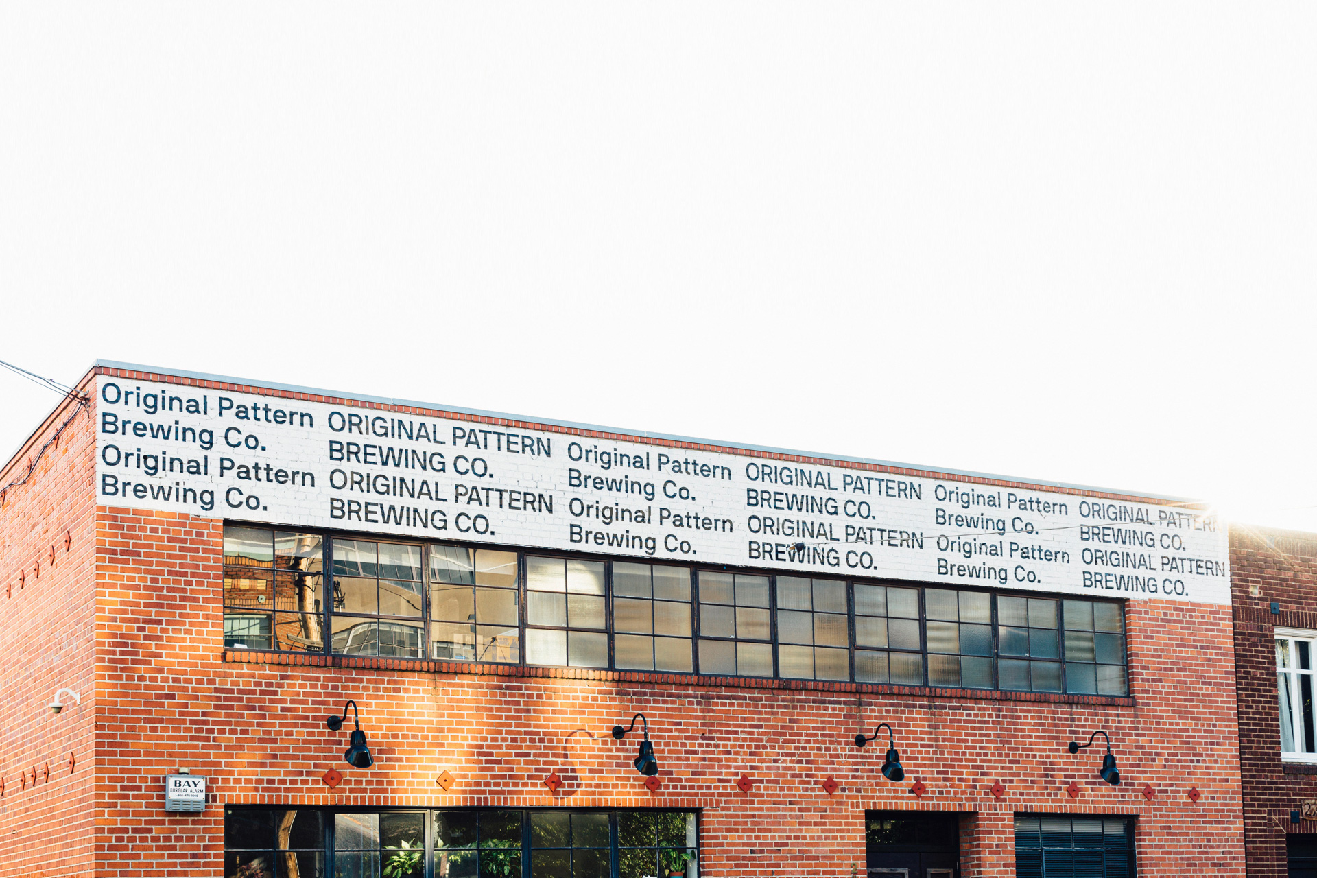
Established in 2018, Original Pattern Brewing Company is an employee-owned brewery and tasting room in Oakland, CA. Inside a 5,500-square-feet space, the brewery, instead of offering a core range of beers and a few seasonal novelties, is constantly creating and offering new beers that span the full gamut, from sours to saisons to, obviously, IPAs. The identity for Original Pattern Brewing Company was designed by San Francisco, CA-based Play.
Play partnered with Original Pattern Brewing Company to create something that could grow, evolve, and reflect the spirit of a company committed to constant flavor experimentation. The Original Pattern name was the genesis of the system, made of consistent elements that rearrange, rotate, expand and contract. Every new brew has a different typeface, color, and pattern based on its taste, the hops it uses, and, of course, its name.
(Project photography by Eric Louis Haines. Can Renders by Giant Void.)
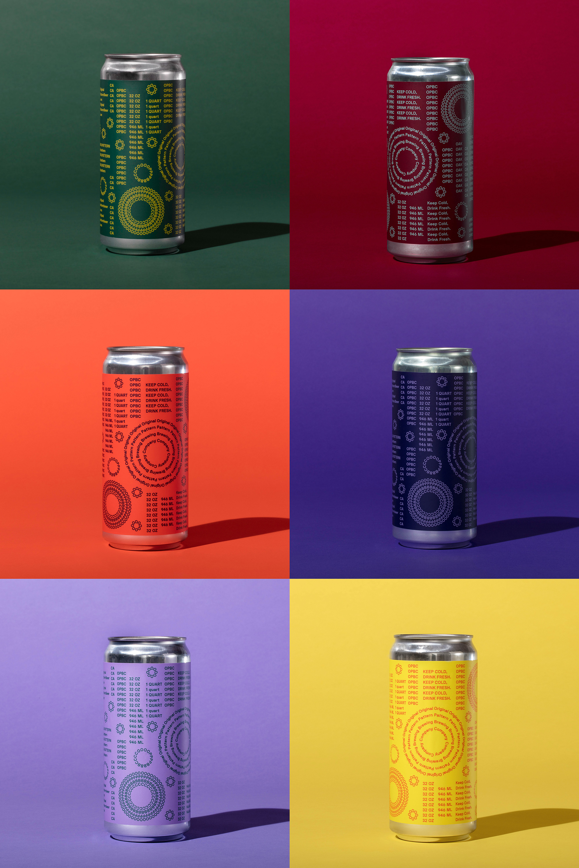
The primary logo — the bigger set of concentric-circle type — sets the tone for the rest of the identity: complex, energetic, different. This is the kind of logo most clients would avoid for being hard to read and hard to use but if there is anyone that can pull it off is a hip brewery. Typeset exclusively in NB International™ Pro, the logo features one word per concentric circle, literally drawing you into a rabbit hole of beer. It’s not exactly a pleasant logo but it’s — to use a common word in their beer names — hella cool. The logo can then reduce into a repeating acronym in concentric circles, then in a single circle, and finally into a string of “O”s, which is the only unconvincing version. What I like the most is how it maintains the same font size across all variations and also how they can all be used together to form a pattern.
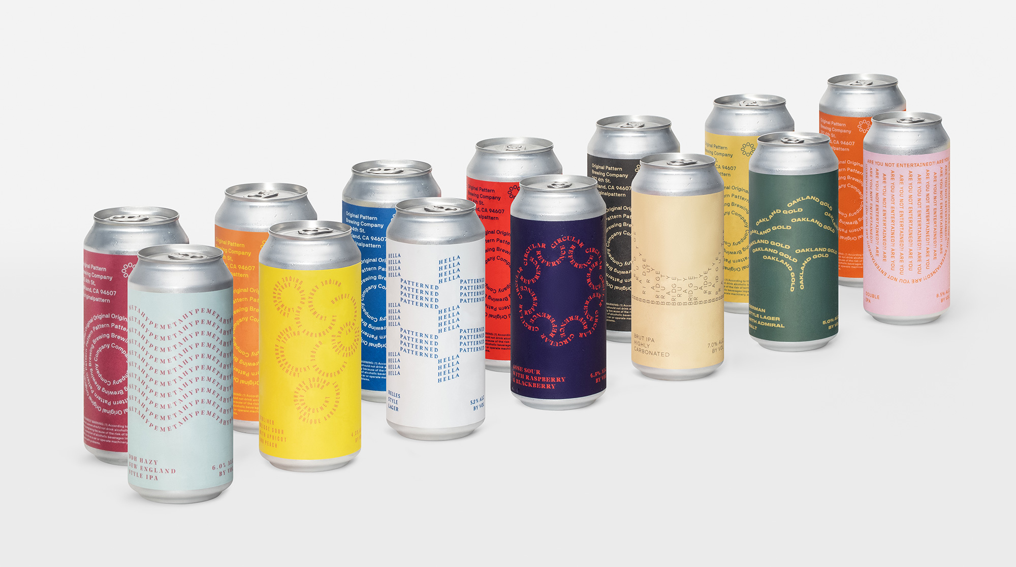
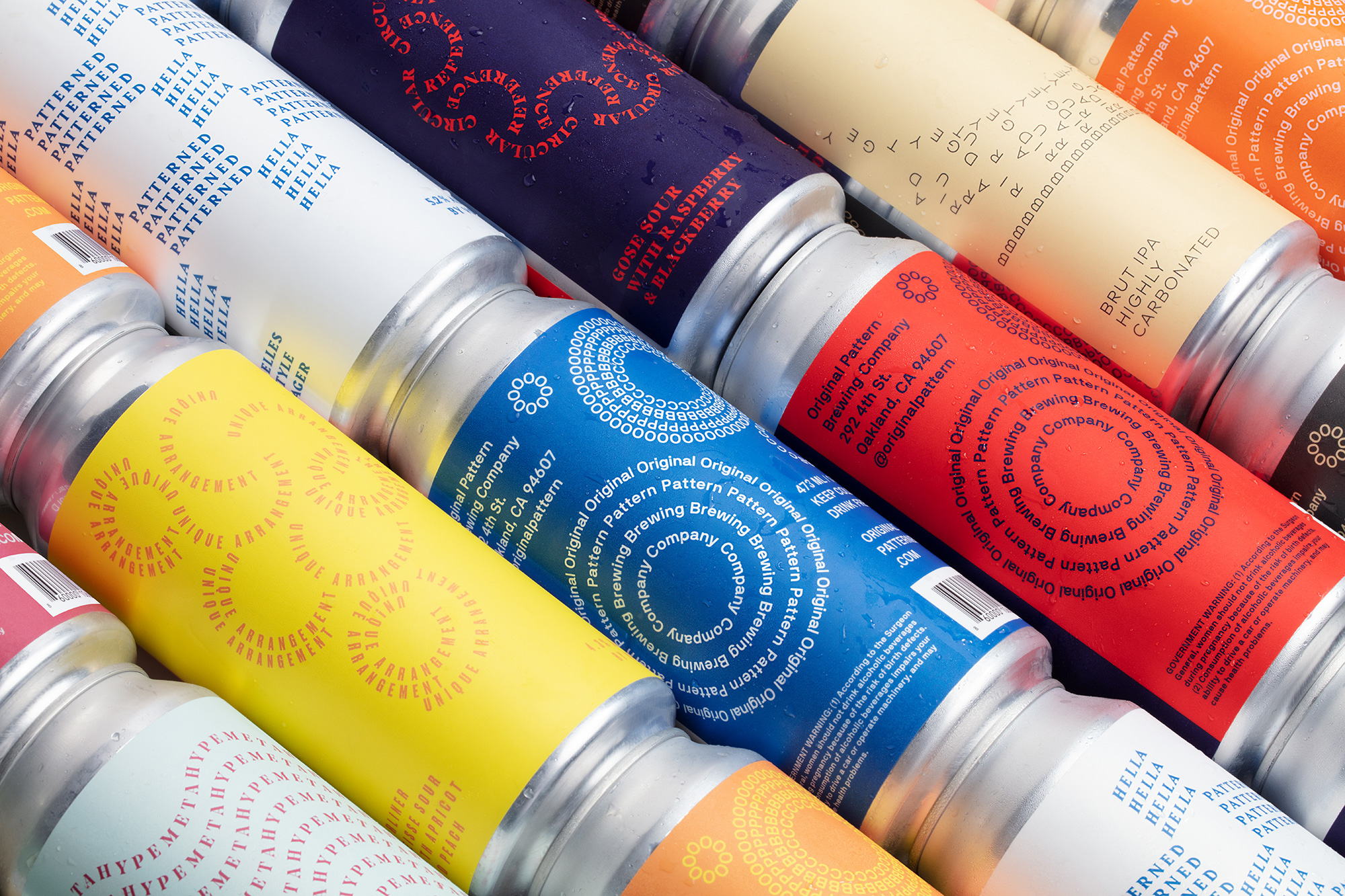
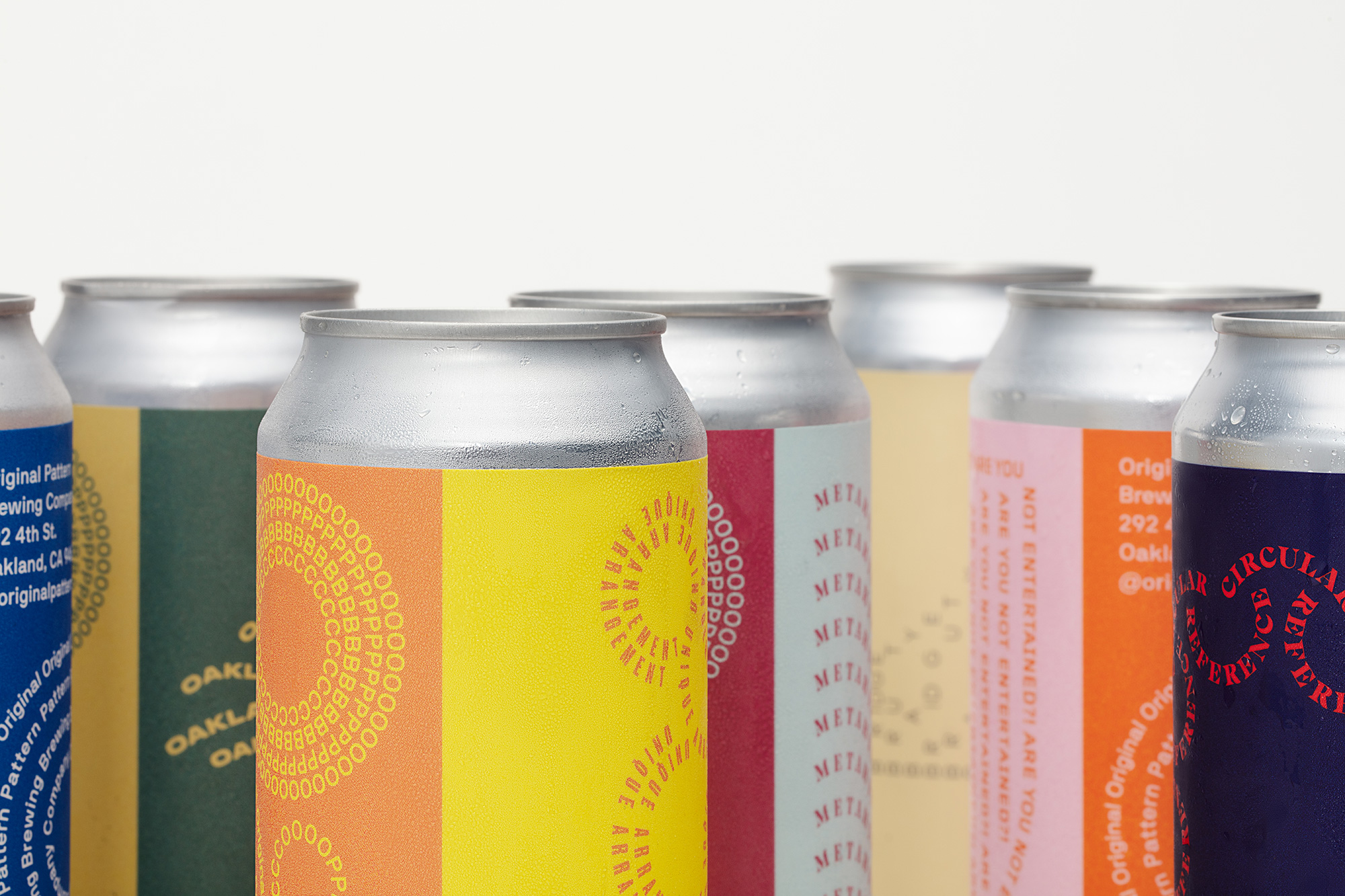
The cans are split into halves, with one side being the “brand” side and featuring the logos and other company information all in NB International, and the other side featuring typographic interpretations — using different fonts — of the beer names and styles. Some are literal and some are abstract, some are funny and some are serious, some are obvious and some are head-scratchers. The important and cool thing is the flexibility of the system to create an overarching identity that plays out well across all beers.
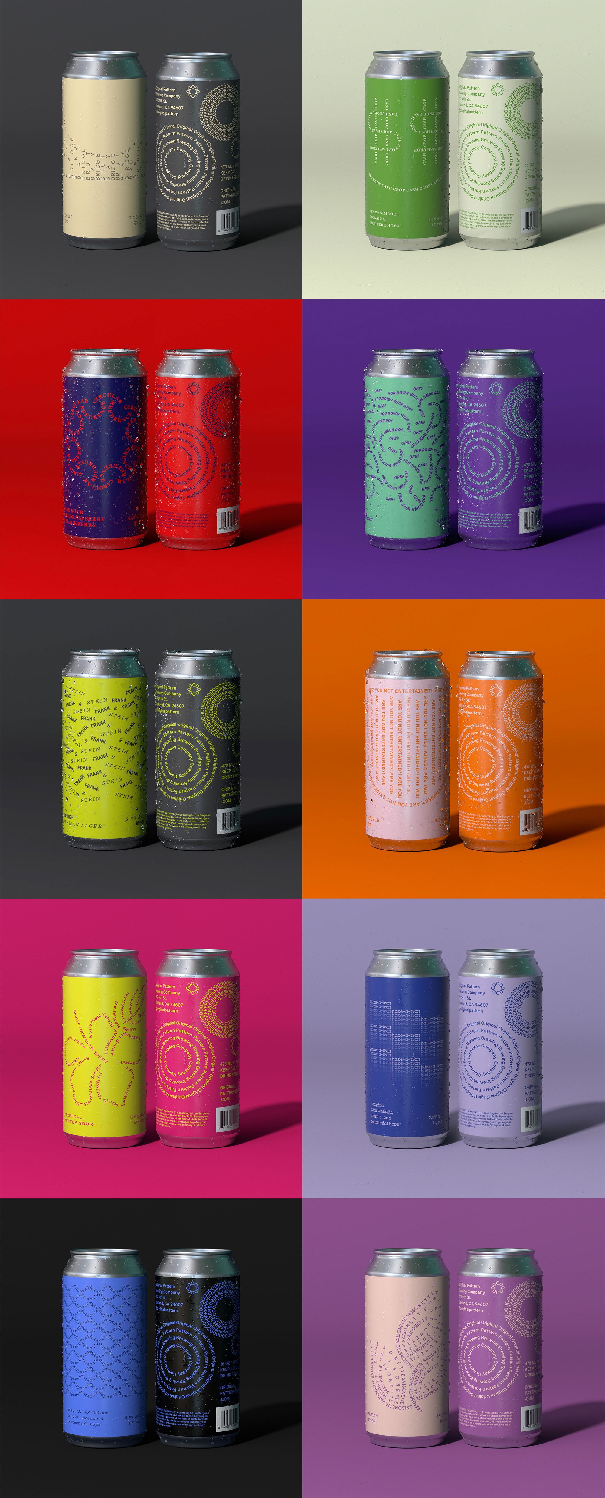
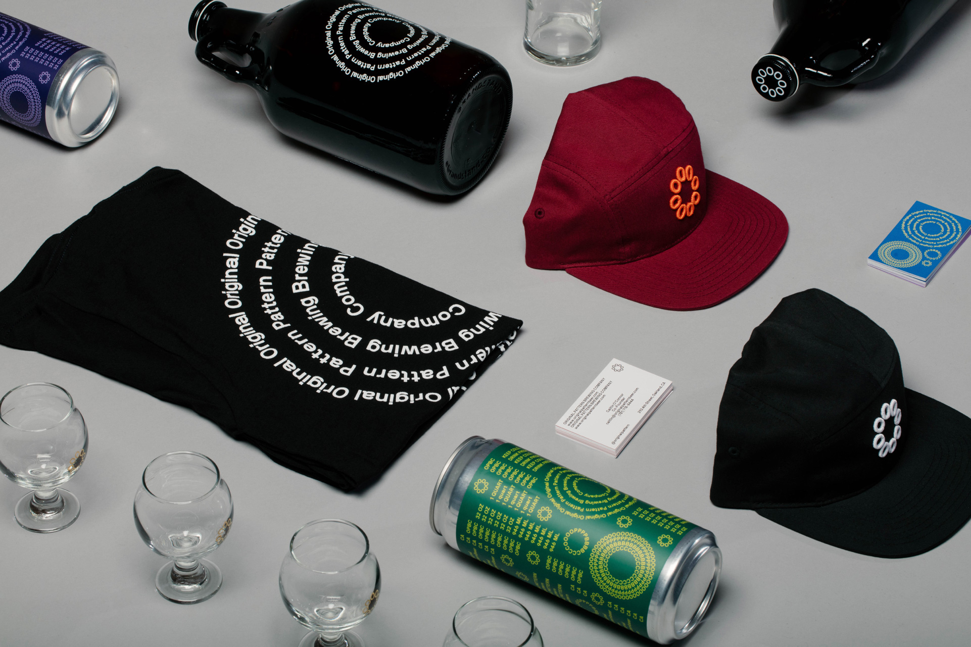
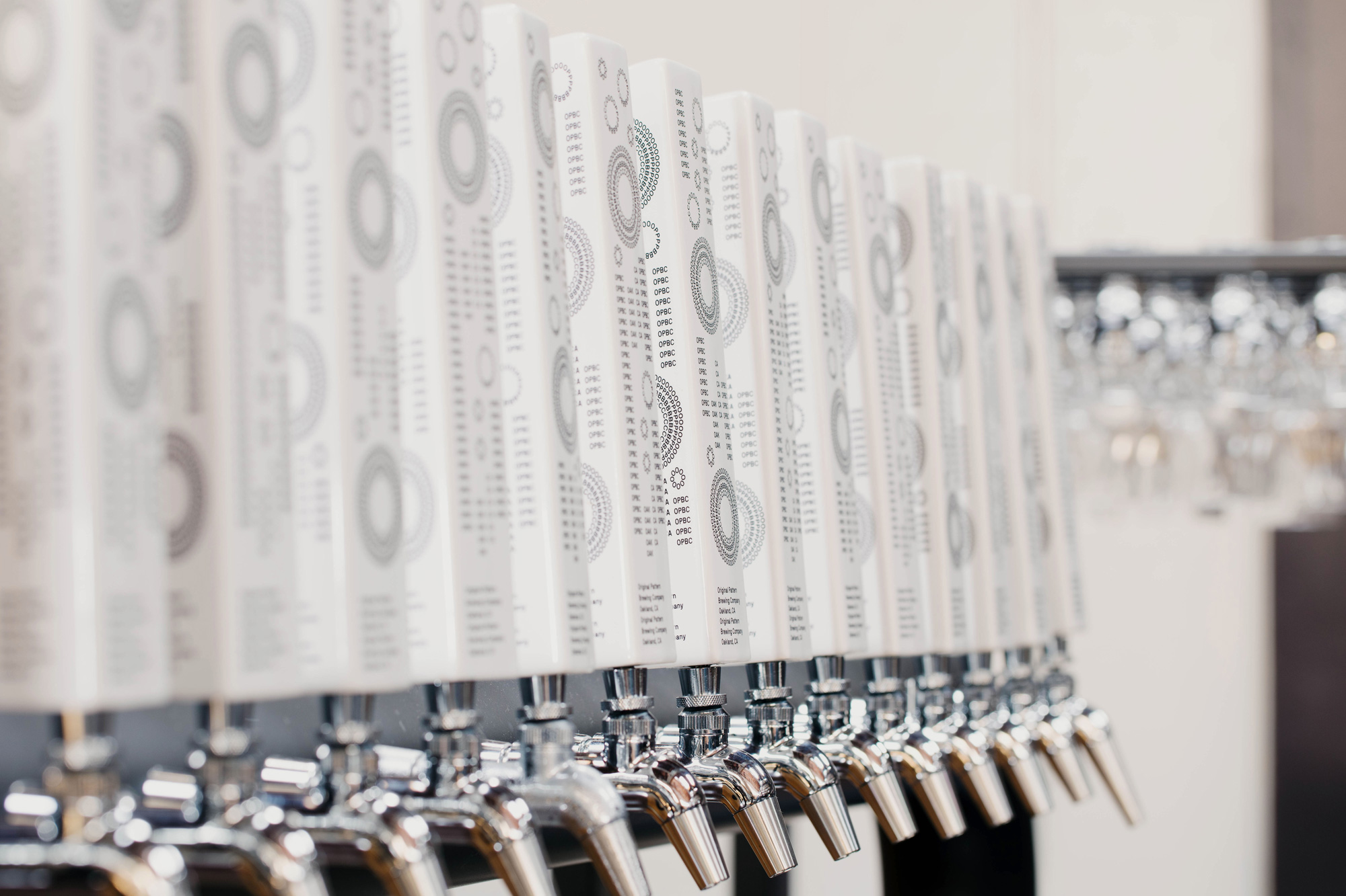
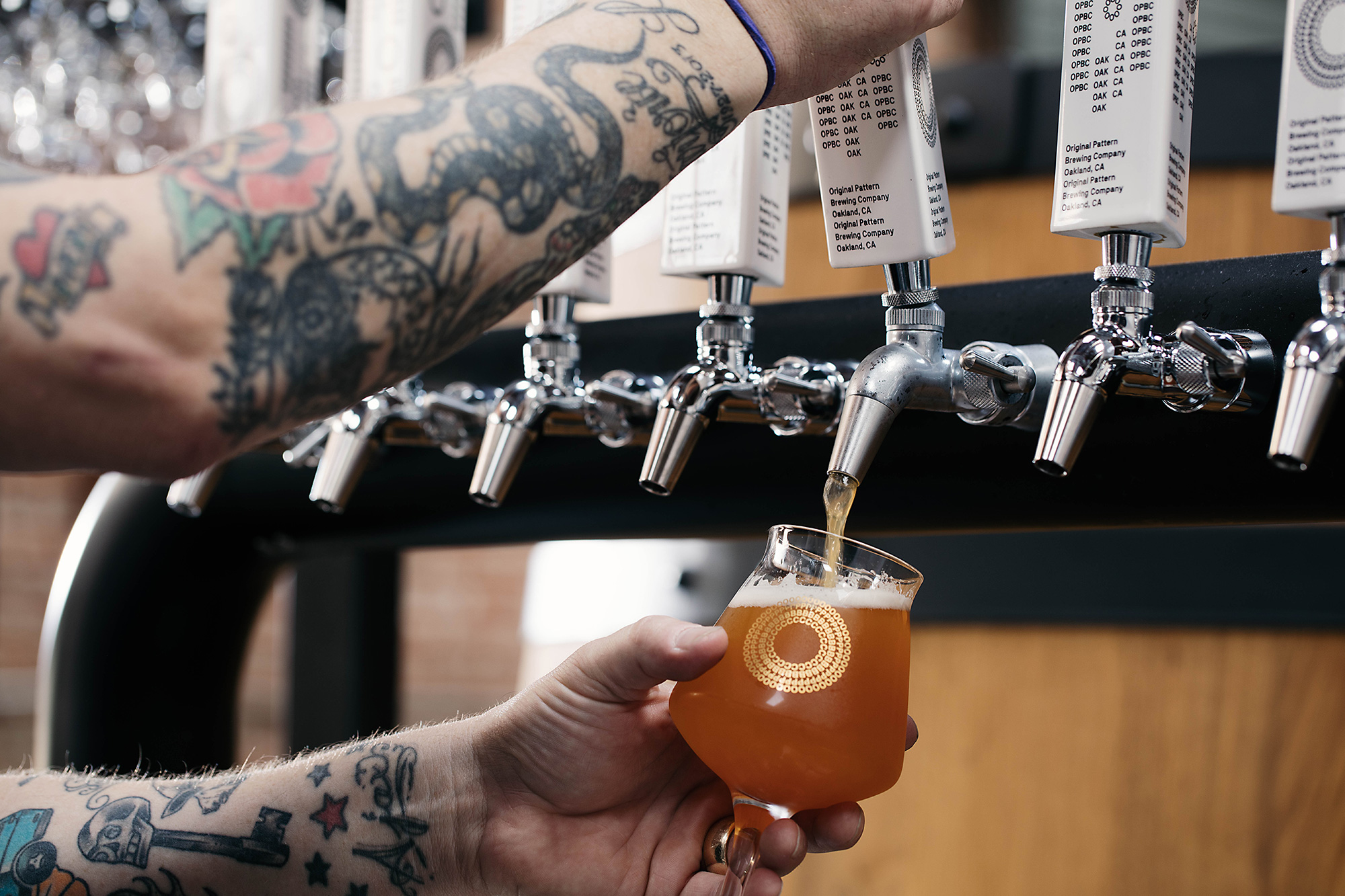
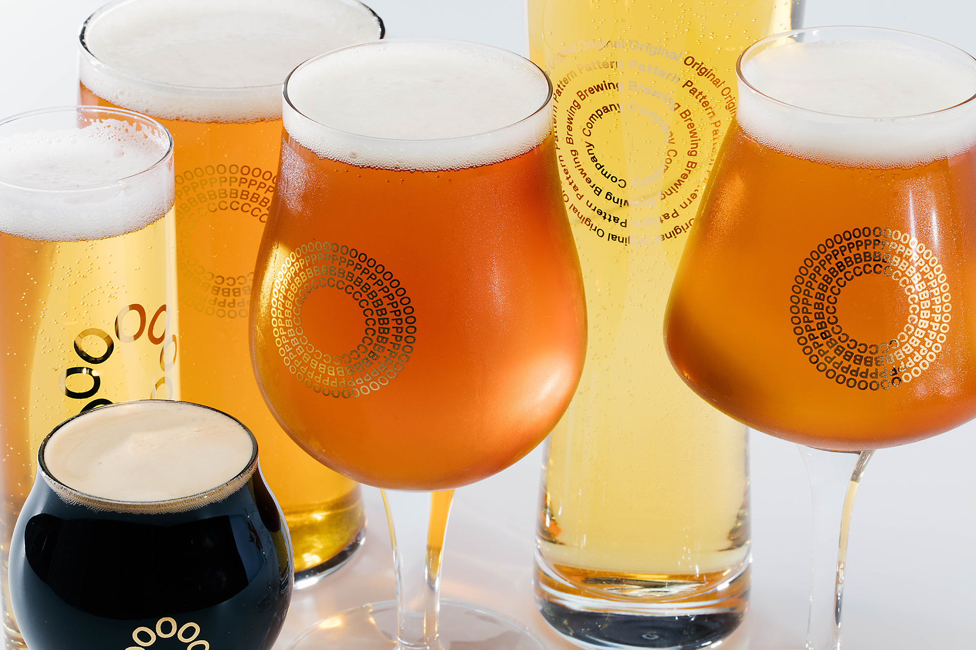
The rest of the identity uses the pattern and individual logos in a fun, freeform style and adds repeating words and sentence in a loose and playful way, creating an unexpectedly cohesive system across growlers, glassware, and some of the coolest tap handles out there.
Overall, put simply, this is great. We’ve seen breweries take design to the extreme and adopt odd and unexpected design systems, often gratuitously design-y, as is the case here as well, no doubt, but as a full-on design flex, this is as good as it gets.

 Новости Союза дизайнеров
Все о дизайне в Санкт-Петербурге.
Новости Союза дизайнеров
Все о дизайне в Санкт-Петербурге.