contact us | ok@ohmycode.ru
contact us | ok@ohmycode.ru
Launched this month (June 2018, in case you are reading this in the future), Paws is a new service available in the UK that delivers food for dogs packed in precise daily portions and re-delivered on schedule to keep the food fresh. As a bonus, for every purchase, Paws donates a meal to a shelter dog. Starting with dog food, the service will eventually include more pet types and other products. The identity for Paws has been designed by London, UK-based Koto.
Our visual and verbal identity pays tribute to all our fun, silly, individual, joyful pets - for a brand as unique as they are. Owning a pet will make you happier, fact. So all the elements of the Paws identity work together to communicate this positivity - the amazing moments we share with our pets. Warm colours combine with art direction that shows healthy breeds in dignified, natural poses.

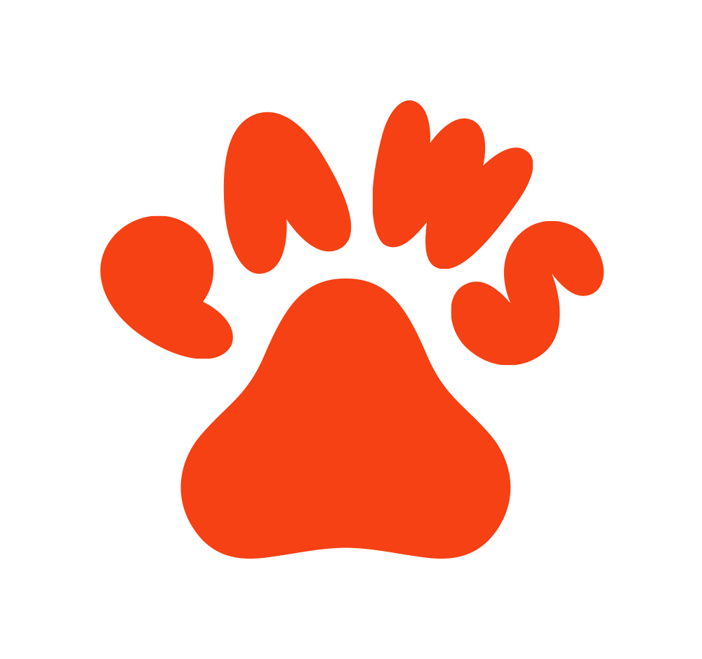
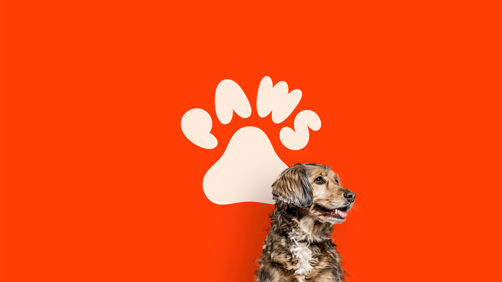
I thought we could start the week with a feel-good post, especially if your country team was on the losing end on any of this weekend’s World Cup matches — go Mexico! (sorry Germany). The logo for this new service comes in two variations, a horizontal version with cute, bubbly, chubby typography and a more square version where that same typography is arranged into a paw shape, which is the star of this identity. I am guessing that the paw version was the original proposal and that the horizontal version came second as a need for places where the name had to appear bigger. Without the paw version the horizontal version is just cute type but, when seen as a paw, the letters do look like the irresistible pads of dog paws.
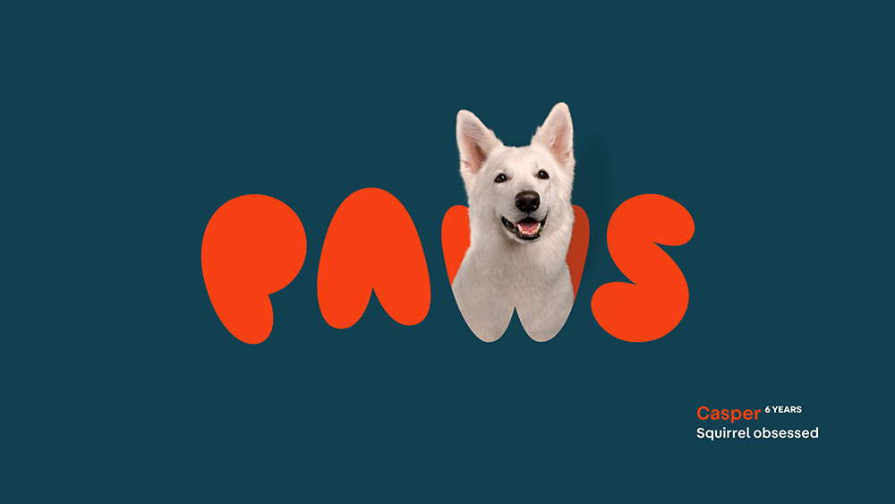
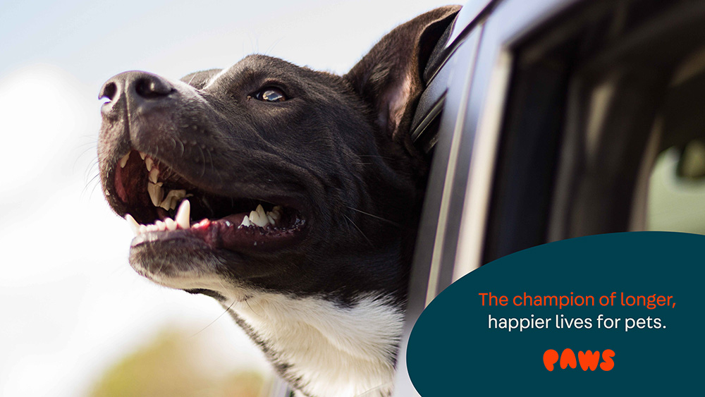
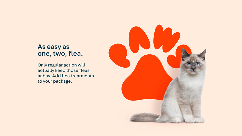
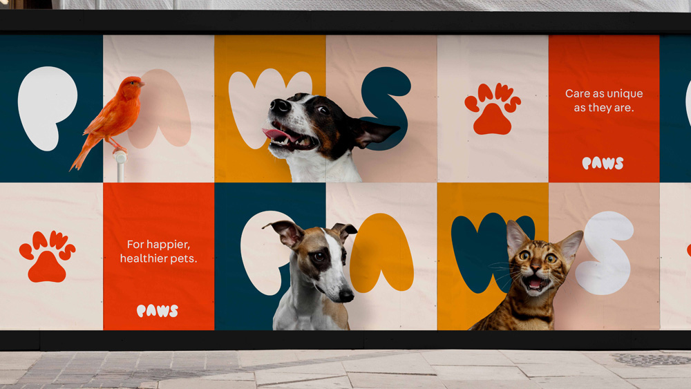
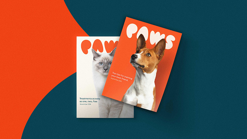
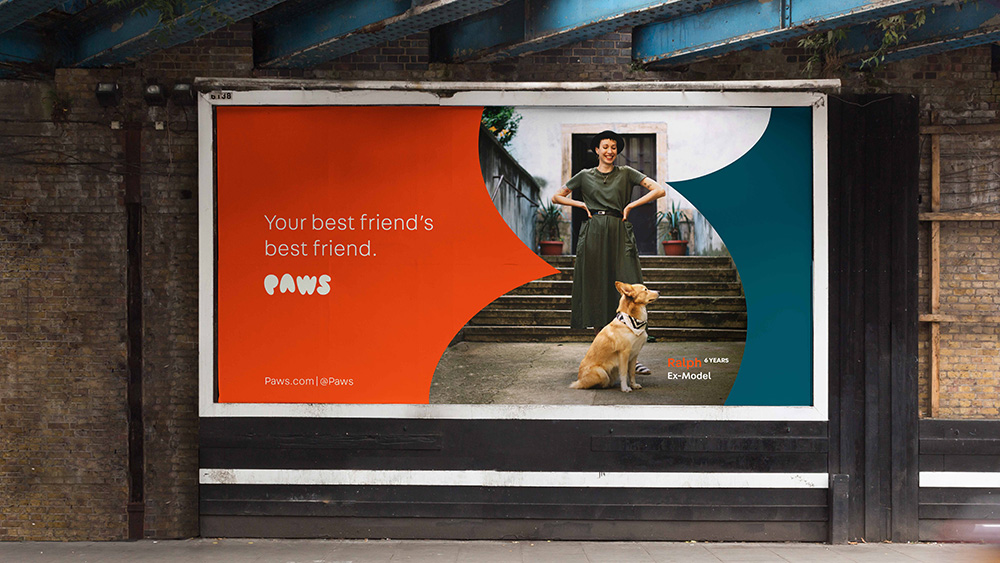
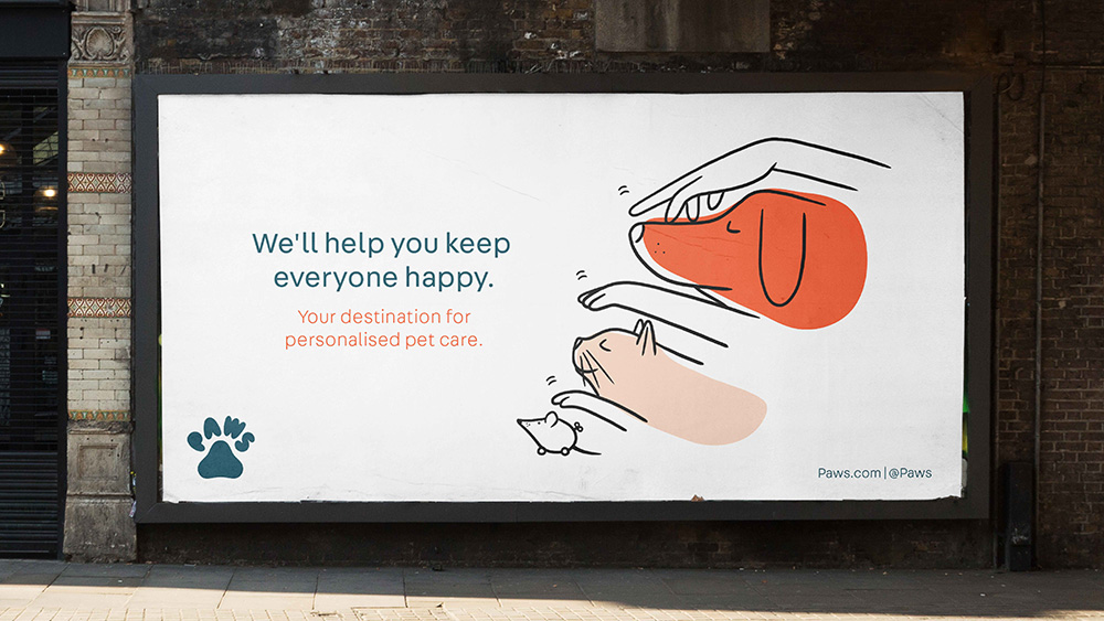
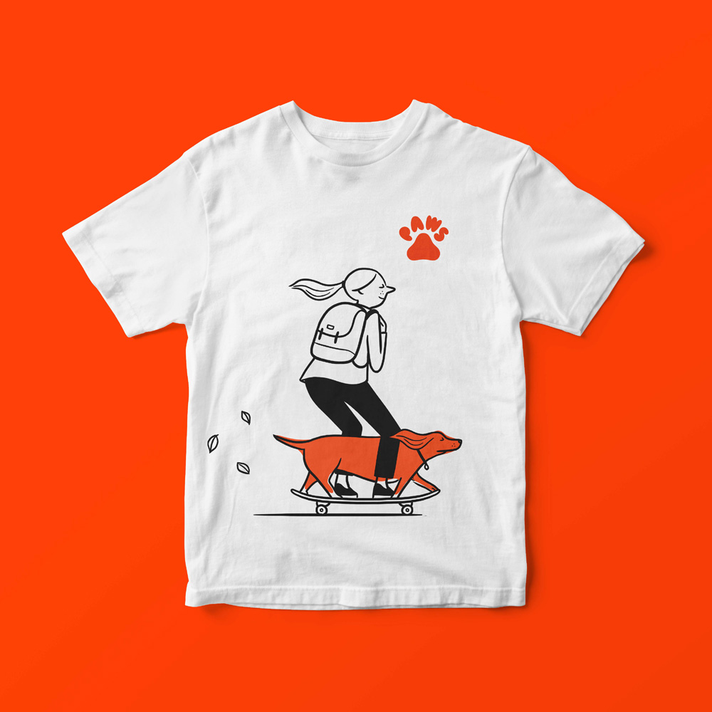
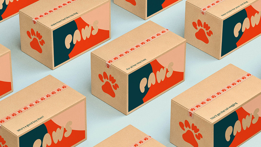
As the service starts out, most of the applications presented are renders that show the potential of the identity and the flexibility of the logo to be used in two variations and with pets in, over, and under them. The first billboard shown also has a cool treatment with the “S” blown up to help frame the content. The posters and ads are a little bare and it feels like the type/logo/photo compositions could still use more integration but, in general, anything with cute pets on them usually wins because pets are the best.
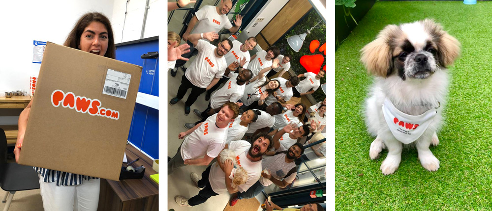
The image above with the actual launch materials shows the more humble beginnings of the brand that can’t yet afford 3-color screenprinted boxes with custom tape. The image isn’t shown with the intention to reveal that the renders aren’t real — spoiler: many of the renders (especially tote bag renders) we see on Brand New will never be real — but to show that even at its most basic applications, the logo works quite great and manages to convey a fun brand for our furry friends.

 Новости Союза дизайнеров
Все о дизайне в Санкт-Петербурге.