Обзор лучших ресурсов по разработке бренда, разработке упаковки
contact us | ok@ohmycode.ru
contact us | ok@ohmycode.ru
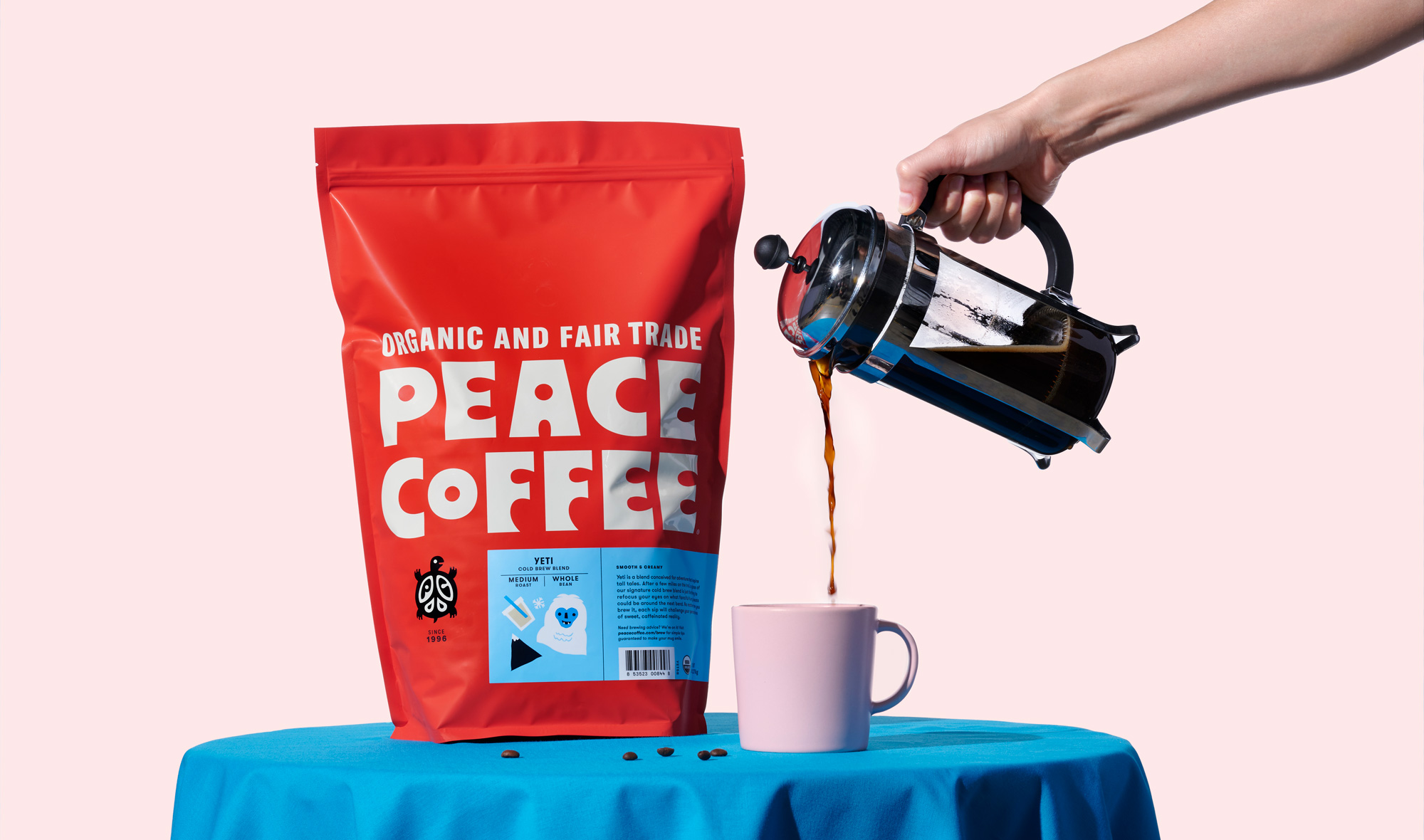
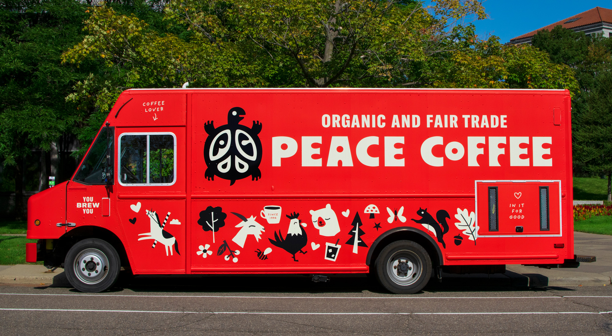
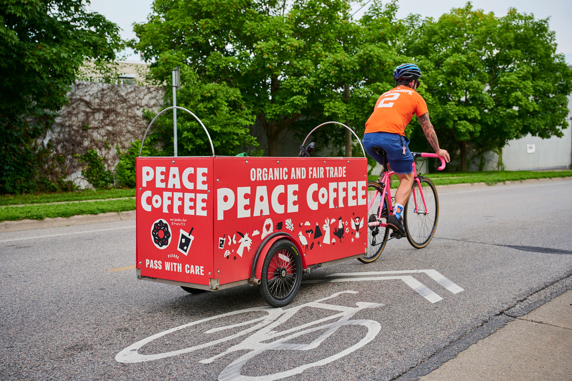
Established in 1996, Peace Coffee is a small-batch, fair-trade, organic coffee roaster based in Minneapolis, MN. Originally founded by the Institute for Agriculture and Trade Policy as a way to help coffee farmers in Mexico. They started by importing their beans to Minneapolis and later working with larger coffee cooperatives to bring coffee from Mexico, Guatemala, Nicaragua, Peru, Ethiopia, and Rwanda. Sold in retailers nationwide, Peace Coffee — an independent B Corp since 2018 — is largely present in the Midwest and specifically in Minneapolis where their roastery, roaming truck, and three brick and mortar coffee shops are located. Earlier this year, Peace Coffee introduced a new identity designed by Saint Paul, MN-based Werner Design Werks.
Our goal was to retain the essence of Peace Coffee, a self-described group of starry-eyed dreamers, who are truly in it for good. They take coffee seriously, but not themselves. You brew you, no coffee snobs here. After some exploration we all quickly agreed it was important to retain and build on the quirky personality of the brand and the people behind it. We got to work, and modernized the turtle and created whimsical, flavor-specific illustrations that live within a unified system that’s an easy-to-scan, easy-to-shop experience…with a little magic stirred in.
We chose to embrace our logo as a turtle from day one because of its slow and steady progress toward whatever goal it’s headed for. We stick with the turtle today because we know and believe turtles to be boundary crossers. Neither aquatic nor terrestrial, they are able to press on and adapt to changes that come their way over time, and like turtles, we have been able to overcome persistent challenges in our business.
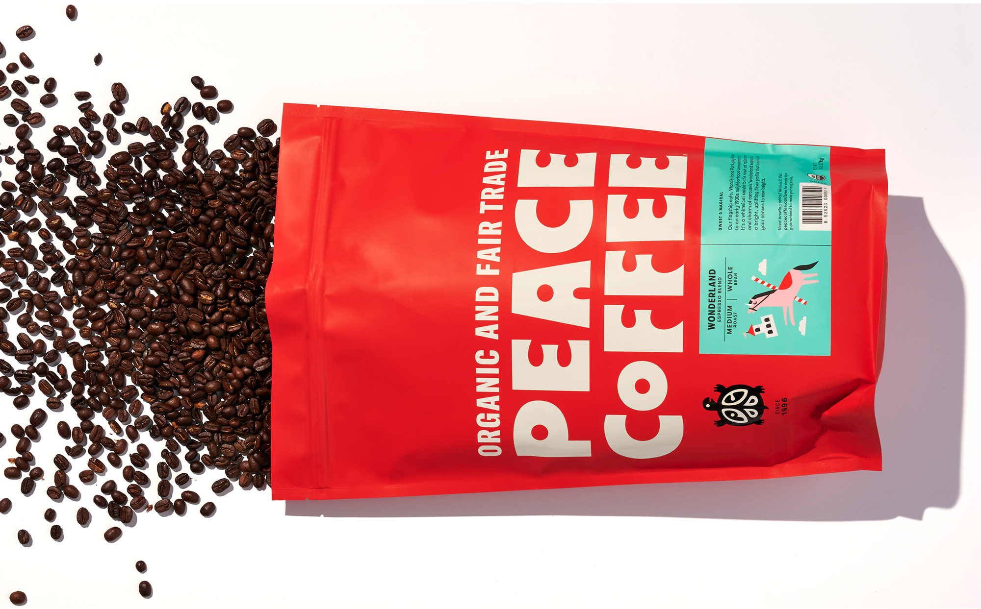
The old logo was fairly charming with a turtle decked in a kind of broad, Latin American-ish indigenous craft design aesthetic and some funky typography for the name. A little rough around the edges and not the best suited for expanding the brand. The new logo maintains the charming turtle but with more defined limbs and a smiling face that doesn’t make it look like it’s been flattened by a vehicle. The ornamentation on its shell has been updated with a “PC” monogram while keeping the crafty, decorative concept. The name can now live on its own in an extremely endearing and extra funky wordmark that looks like the baby of Hobo and Gill Sans, which is an aberration you would think I would hate, but I kind of love. My only complaint about it would be the “P”, which feels a little small/light in comparison to the rest of the characters that are more dense but, nonetheless, I am really enjoying this fun bit of typography.
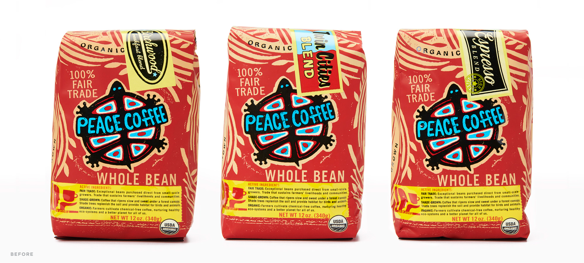
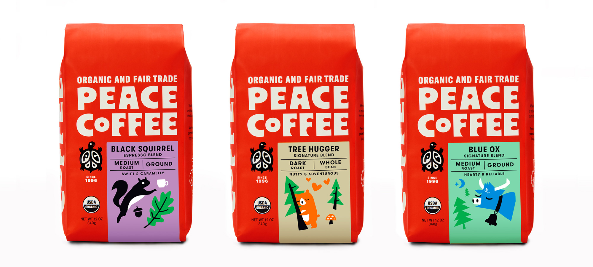
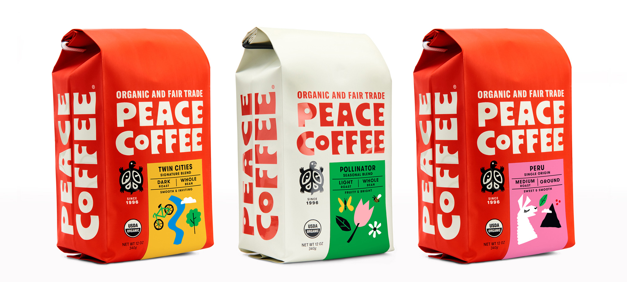
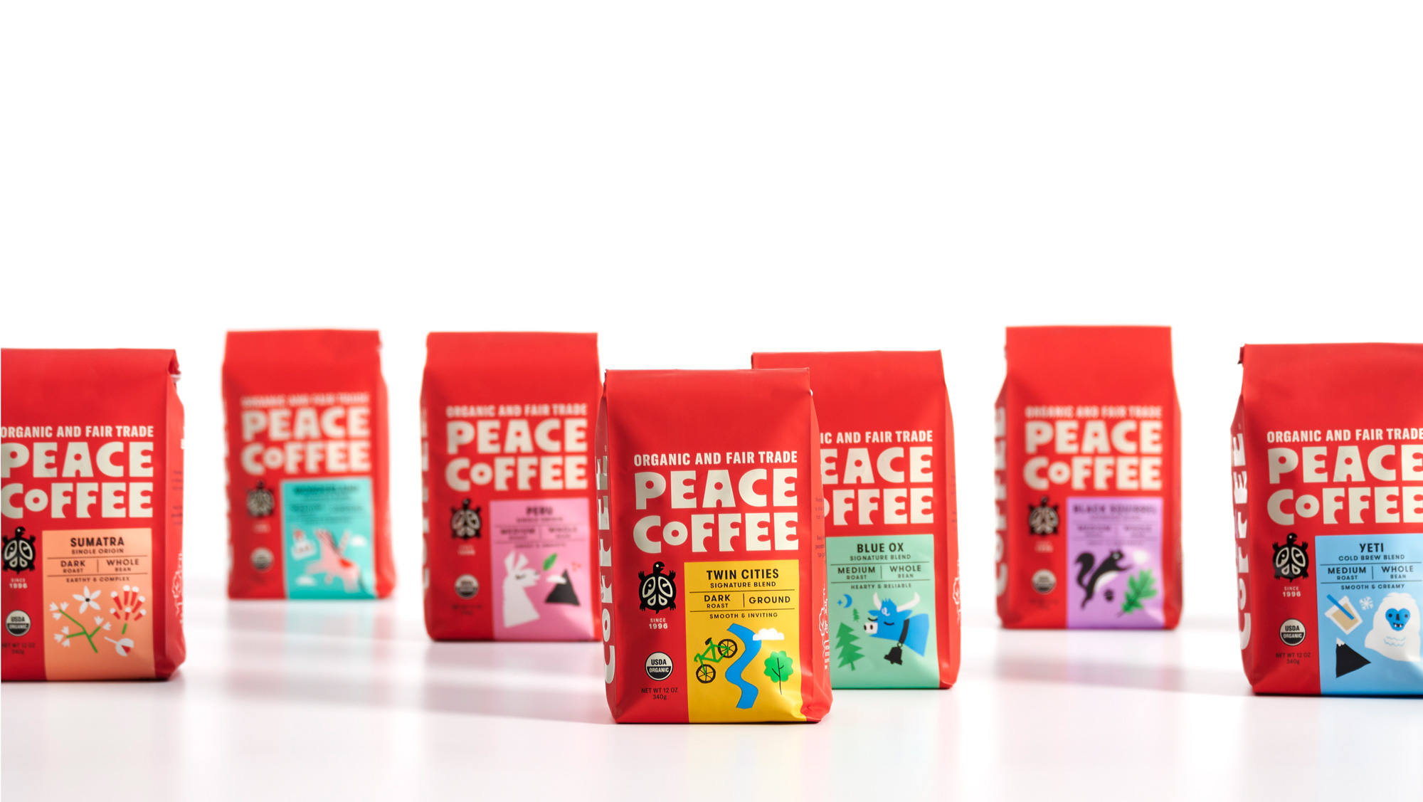
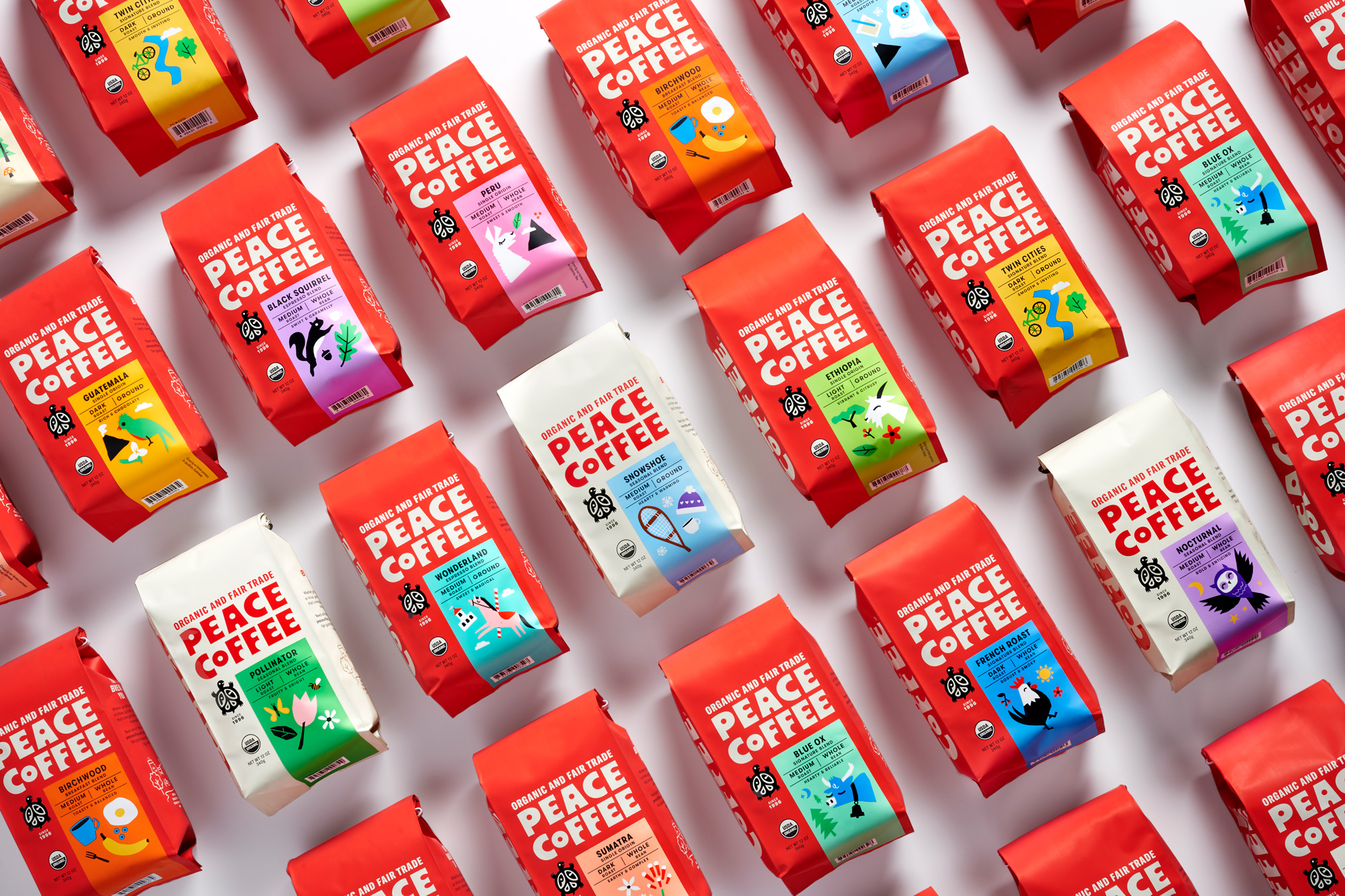
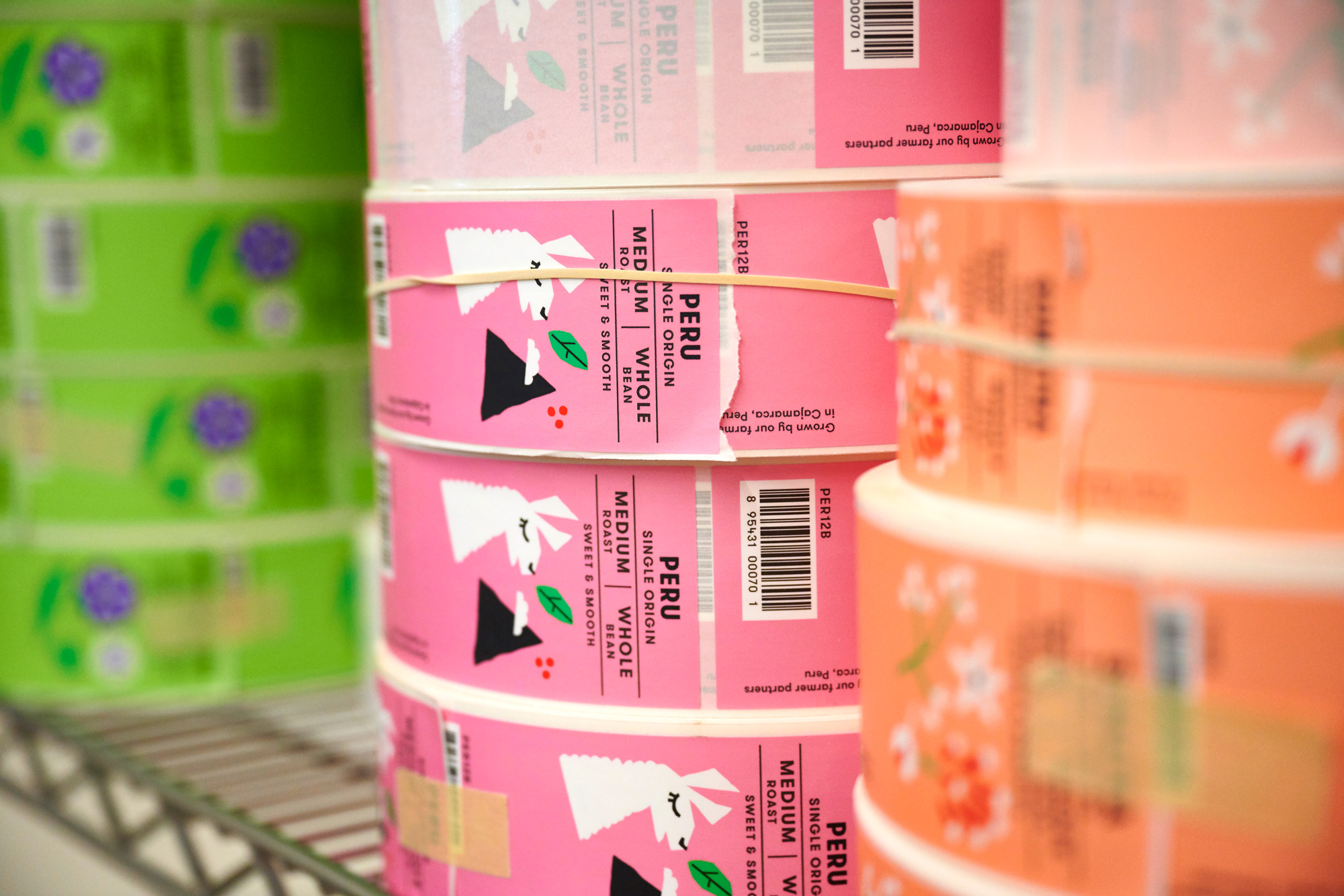
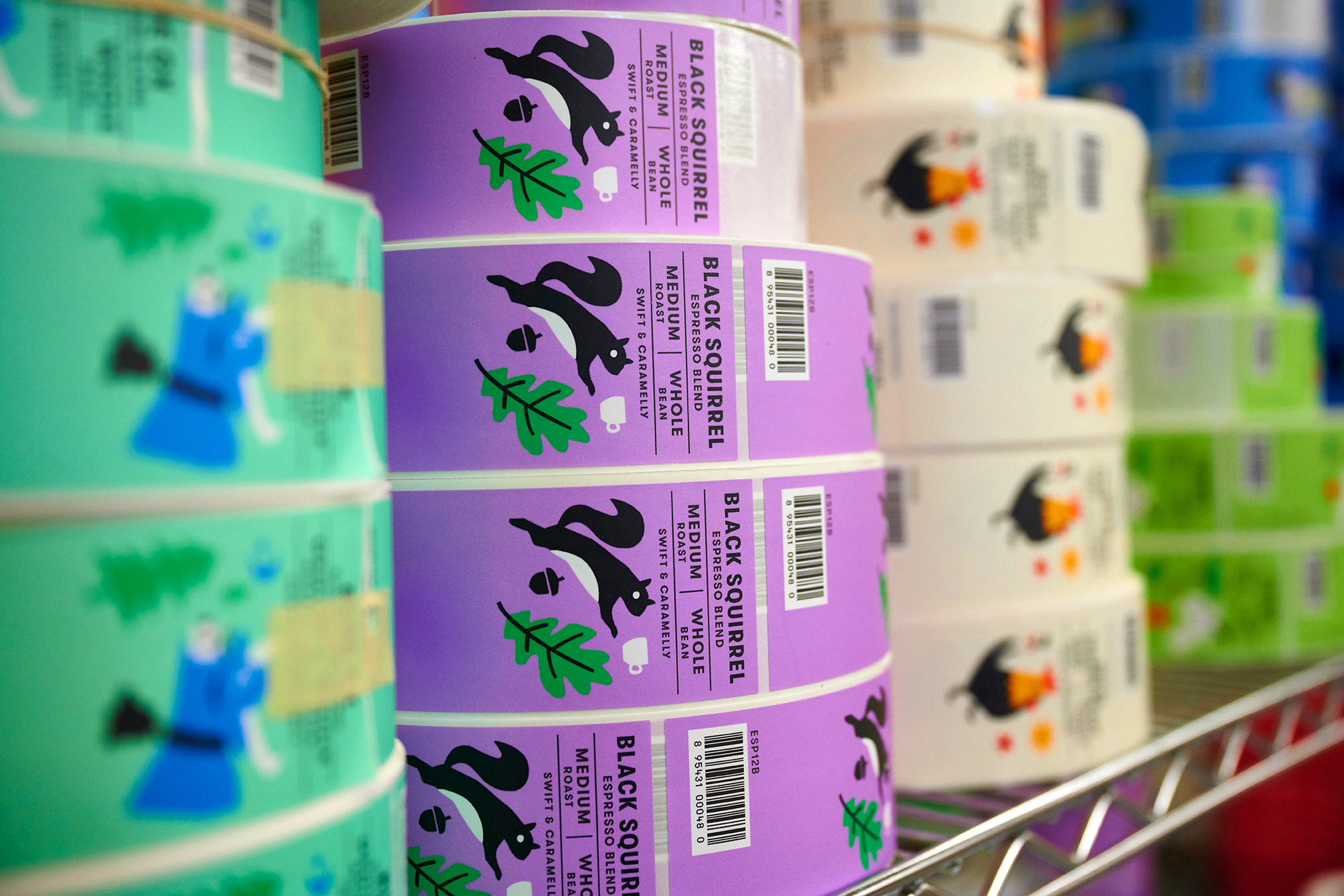
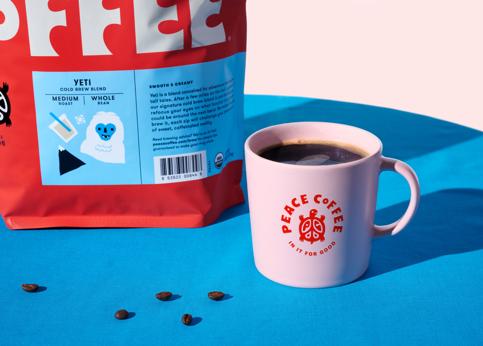
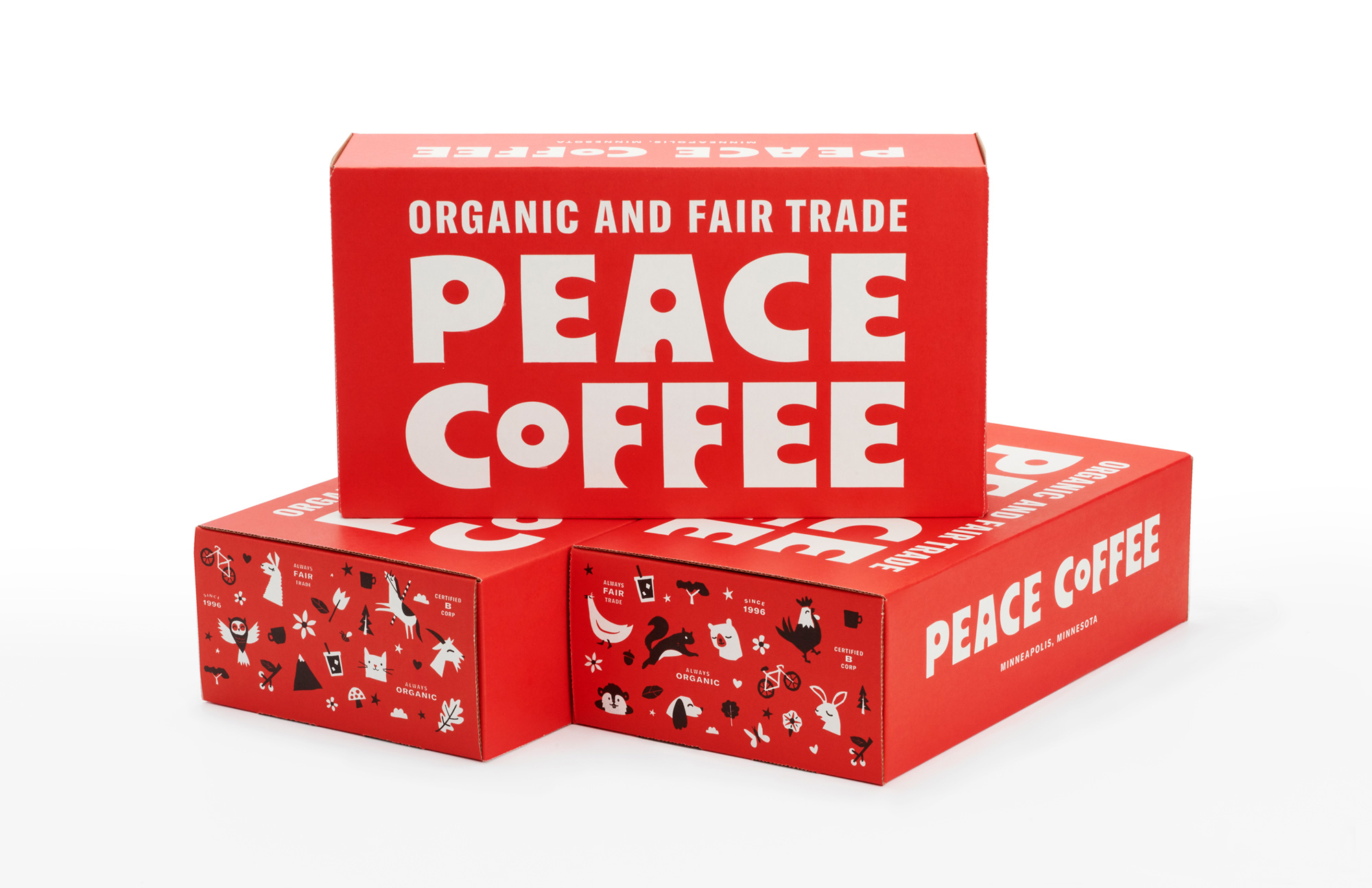
Like the old logo, the old packaging had its charm, with a heavily textured background, lots of things on top of things, and a very large turtle logo. It was a little too much though, with all the elements operating at the same (high) level of hierarchy, and the blue of the logo clashed with everything else. The new packaging takes away the hectic-ness and replaces it with a simple layout that remains fun and exciting thanks to the wordmark that is supported by a small turtle icon — which, at that scale, sort of acts as an environmentally-conscious seal of some kind (which is a good thing) — and a new range of illustrations for each of the coffee varieties. Set against easily differentiated background colors, charming squirrels, bears, ox-eses, llamas, and other flora and fauna add an extra dose of fun. To not be overly fawning only about it, I do feel like either the illustrations or the turtle icon could have been styled more equally to each other so that the two elements worked better together as they can feel like they are from two separate projects.
Overall, this is a feel-good redesign for a feel-good organization, maintaining the quirkiness of the original brand with a freshly brewed new aesthetic.
Thanks to Jonathan Kratzke for the tip.
 each year since publication began in 2006

 Новости Союза дизайнеров
Все о дизайне в Санкт-Петербурге.
Новости Союза дизайнеров
Все о дизайне в Санкт-Петербурге.