Обзор лучших ресурсов по разработке бренда, разработке упаковки
contact us | ok@ohmycode.ru
contact us | ok@ohmycode.ru
Located in San Francisco’s Potrero Point neighborhood, Pier 70 was a large industrial site during the two World Wars and was home to Union Iron Works, which opened the first west coast steel shipyard there in the 1880s, which was purchased by Bethlehem Steel in 1905 — in its peak during WWII, more than 18,000 people worked at Pier 70. As activity stopped in the 1980s, the city became the owner, and the area has been basically closed since then. In 2017, a $120-million, 15-year master plan was approved to develop the area into a 28-acre waterfront neighborhood that will have 9 acres of waterfront parks, playgrounds, and recreation; up to 2,000 new homes; between 1 and 1.75 million square feet of new office space; 90,000 square feet dedicated to arts non-profit space; 60,000 square feet for production and small manufacturing; and 115,000 square feet of retail and neighborhood amenities, set to open in phases with the first one in 2022. As the master plan is starting to become a reality, Pier 70 recently introduced an identity for the development designed by London, UK-based dn&co.
In a city going through fierce debates about the loss of identity, we created a brand that looked instead at the key ingredients that have always made San Francisco great: its creativity, its openness and its relationship to the Bay. The identity for this former shipyard signals a powerful renaissance of Pier 70s industrial roots with a bold and distinctive visual language that’s a love letter to San Francisco.
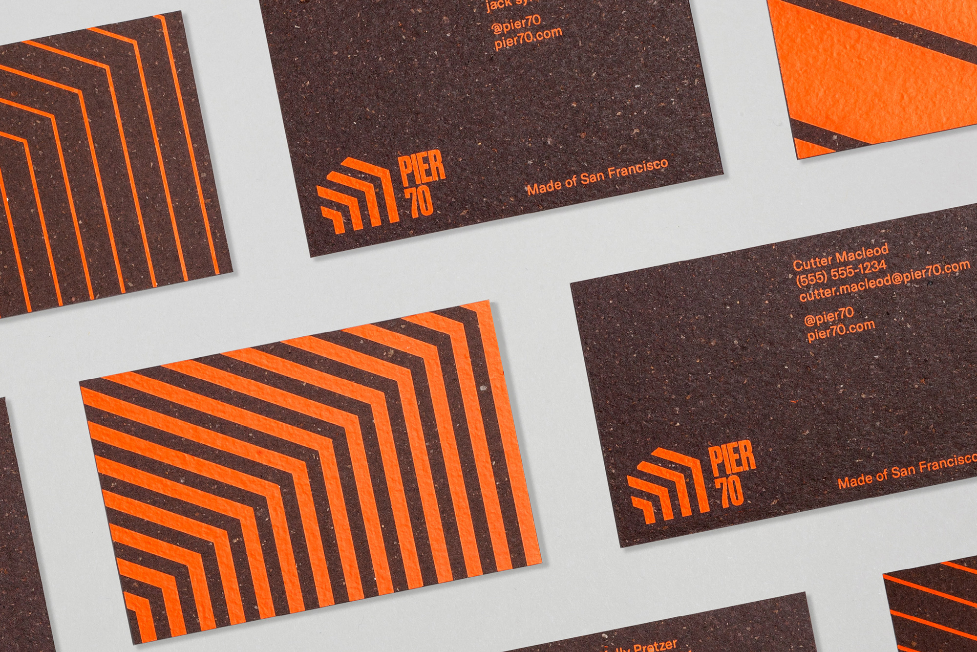
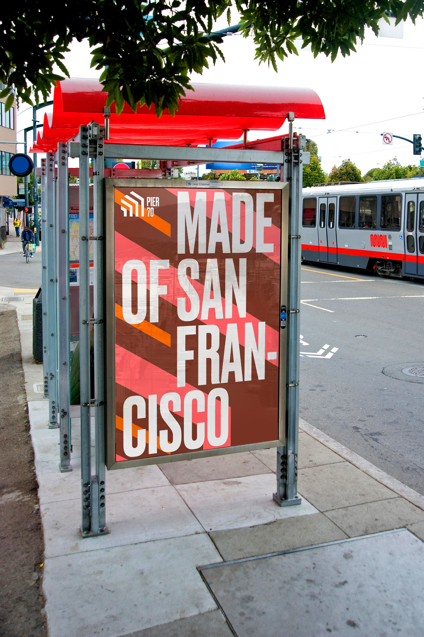
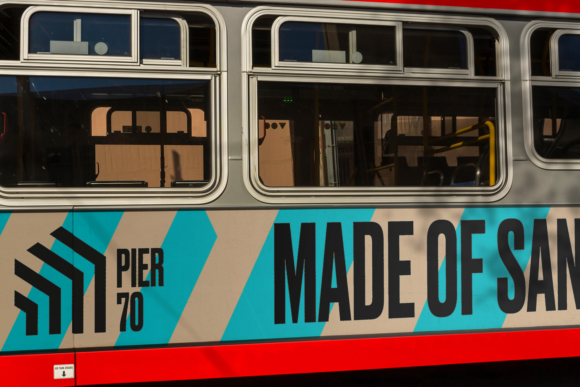
The revitalisation of Pier 70 sees the restoration of its most iconic buildings. This includes Building 15 and its incredible 50-foot-high steel frame, which has been turned into a gateway that you drive through into the new pier. This piece of repurposed architecture was the inspiration for Pier 70’s signature marque and graphic language.
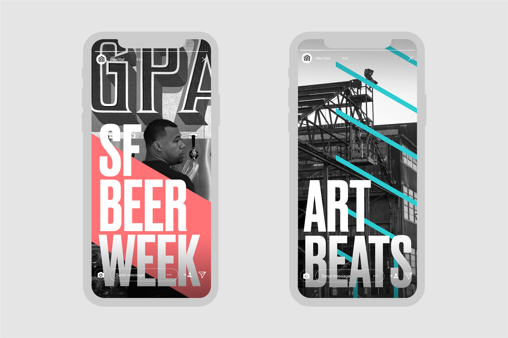
Bold, bright and refreshing for this post-industrial landscape, Pier 70’s powerful pattern language is expressed in colours that reference this unique city — rust orange, sea blue, steel-painted pink — and paired with a highly impactful typeface with echoes of the pier’s working past.
The old logo was decent in its literal depiction of what the pier was about — ships, construction, old buildings — and probably served the developer well as an identifier for the project but as a long-term solution to attract top-tier office and retail tenants as well as being an aspirational place to live, work, and recreate in, it wasn’t the most well-suited. The new logo has a strong, industrial personality that maybe leans too heavily into the office space/real estate aspect of the development and not enough on its potential as a community destination… meaning that the logo feels a little cold and too polished — it’s not exactly inviting. In terms of its execution, I like the abstraction of the steel frame into a chevron-esque icon and I will always support the choice of any of the condensed variations of Druk… just look at that “7”.
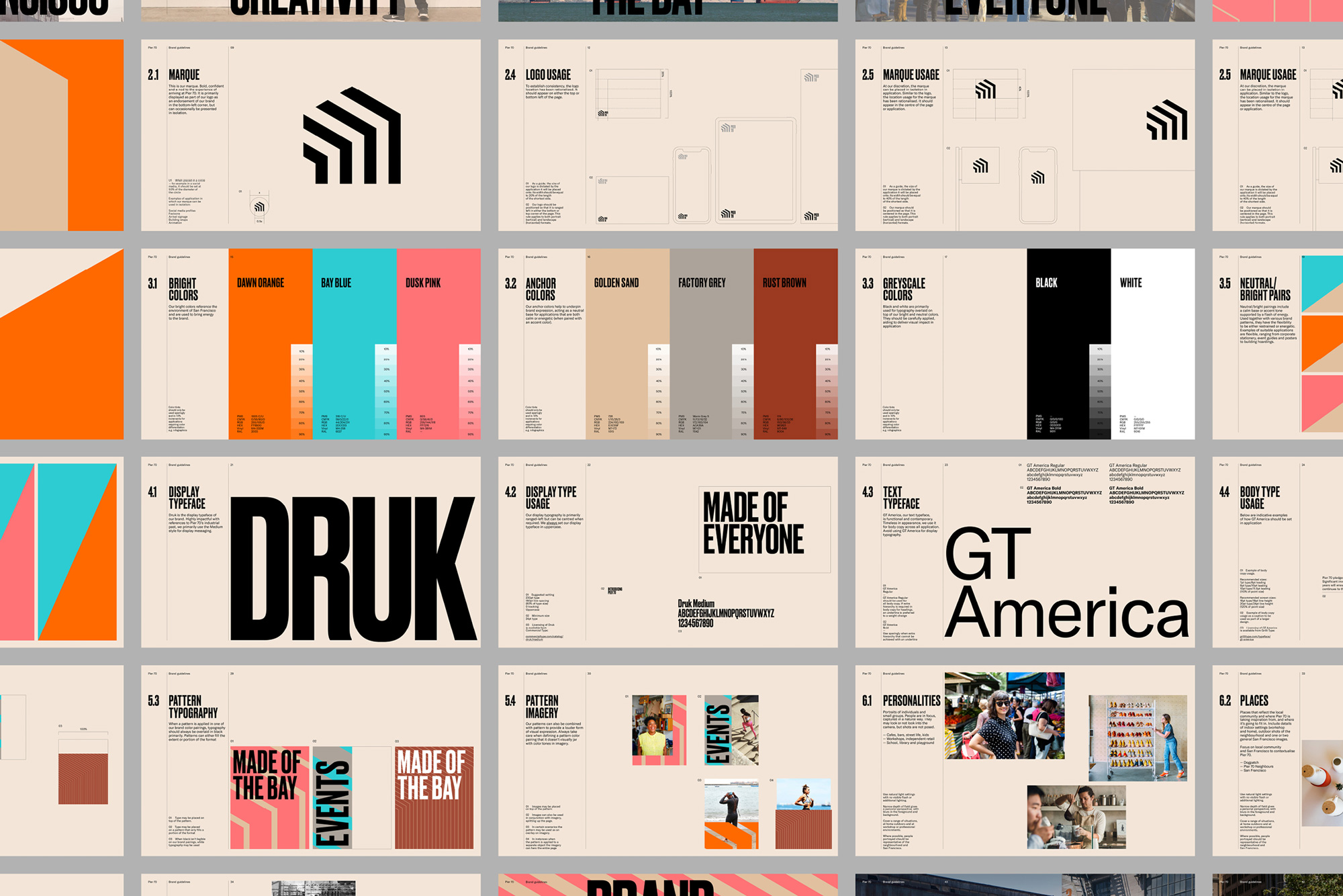
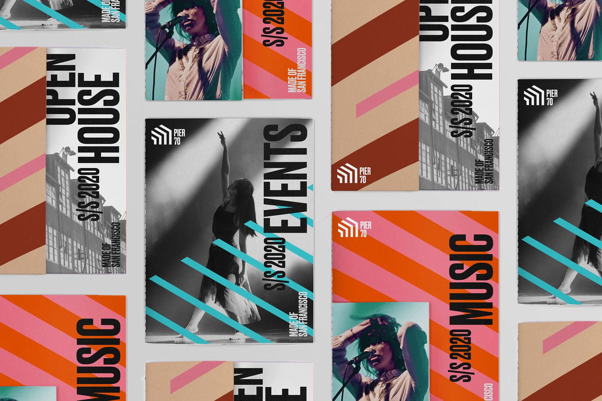
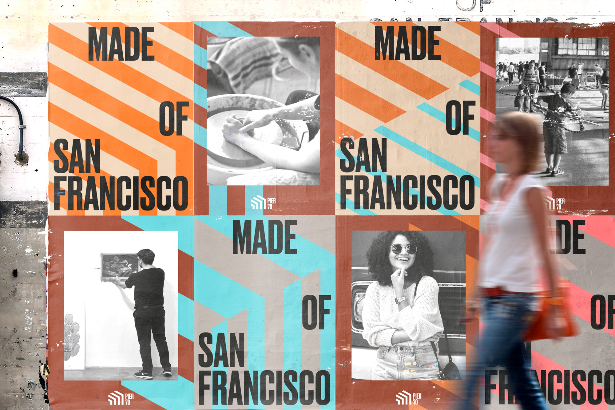
The identity doubles down on the angles established by the icon and builds on a library of hard-angle patterns that are softened through a nice color palette that adds some warmth to the otherwise cold elements. Used large and prominently, the patterns convey the future vibrancy of the neighborhood and do manage to make this feel San Francisco-y with an upscale festive/industrial aesthetic. I kind of wish some of the subtlety from the guideline layouts would transfer to the applications as a contrast to the bold-all-the-time graphics.
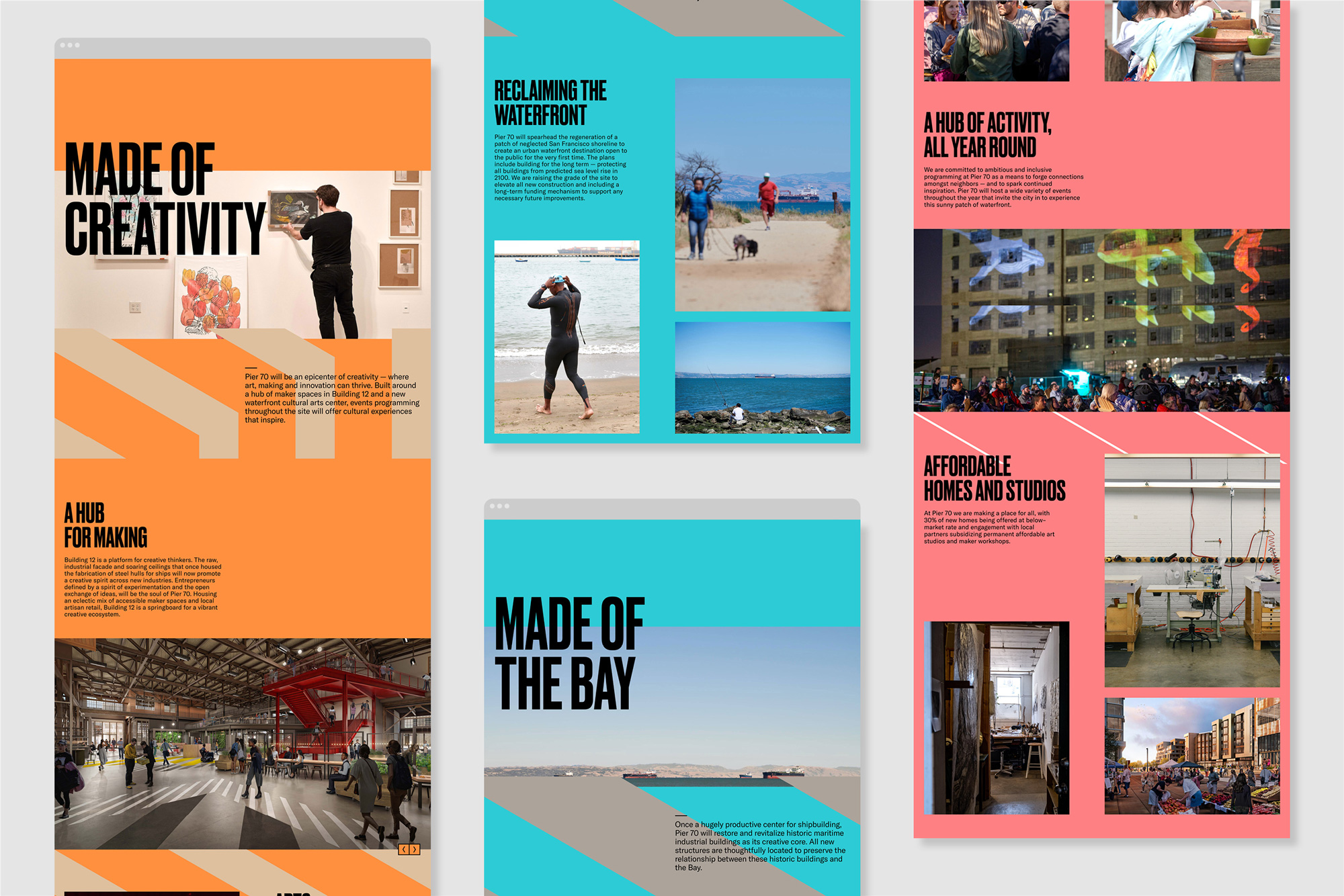
Overall, this feels just right for the master plan development, which means well with its open spaces and dedicated space to the arts and non-profits but that will ultimately rely on the affluence of corporate, retail, and real estate players to make this a viable commercial effort and I think that’s where the identity works best — making this look like the slick new frontier of San Francisco with just enough grit to make it feel raw and exciting.
 each year since publication began in 2006

 Новости Союза дизайнеров
Все о дизайне в Санкт-Петербурге.
Новости Союза дизайнеров
Все о дизайне в Санкт-Петербурге.