Обзор лучших ресурсов по разработке бренда, разработке упаковки
contact us | ok@ohmycode.ru
contact us | ok@ohmycode.ru
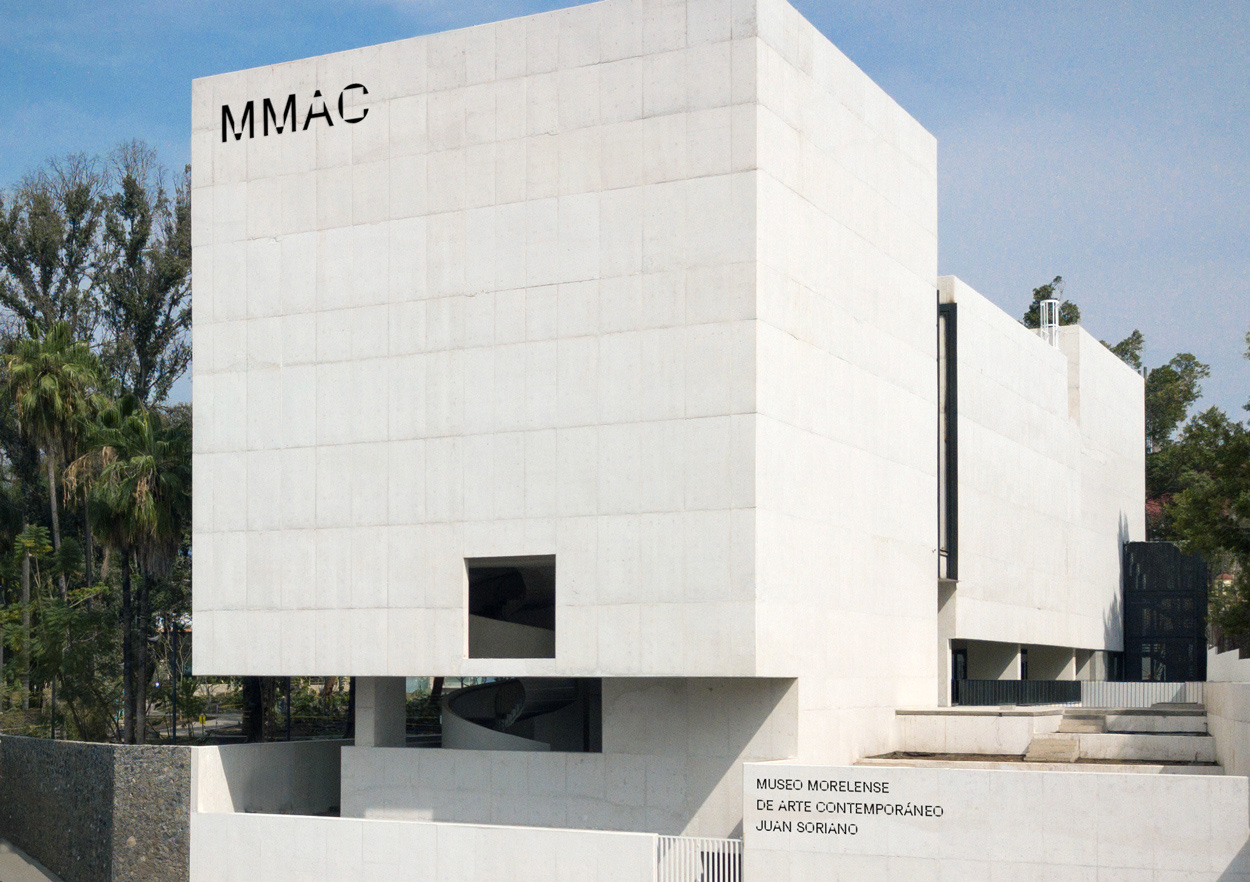
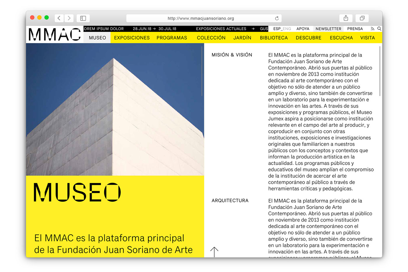
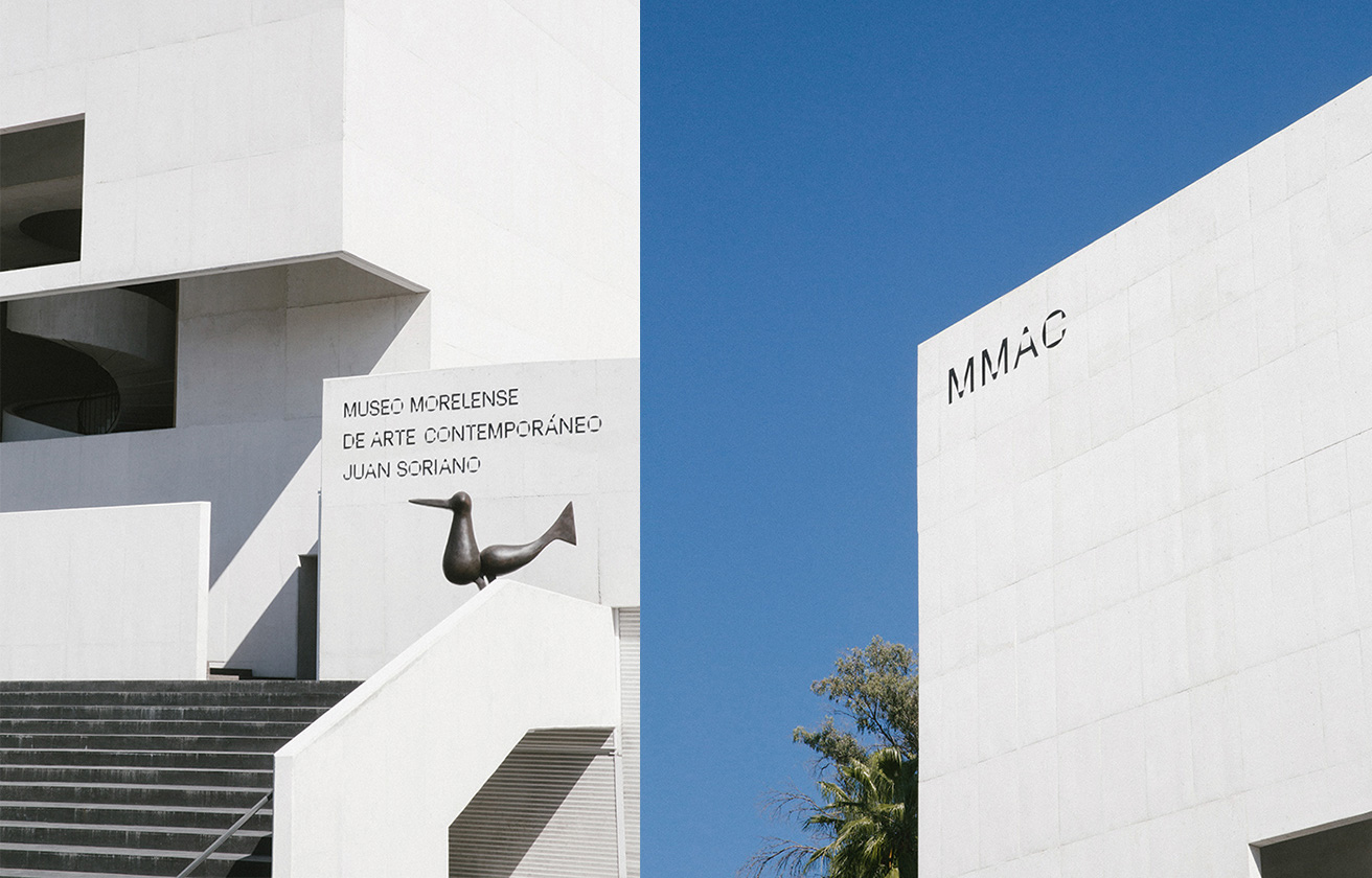
Opened in the Summer of 2018, the Museo Morelense de Arte Contemporáneo Juan Soriano (MMAC for short) is a new contemporary arts museum in the city of Cuernavaca — a popular weekend vacation town near Mexico City — in the state of Morelos, named after Juan Soriano, a Mexican artist who began exhibiting his paintings at the age of 16 in the mid 1930s and continued for many decades doing paintings, sculptures, and theater work. The museum’s permanent collection features over 1,200 pieces of his work and will feature local and international artists in its temporary exhibits along with a robust range of public programs. The building was designed by Mexico City-based JSa Arquitectura. The identity was designed by Mexico City-based Sociedad Anónima.
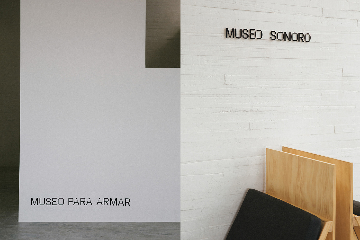
For the Morelense Museum of Contemporary Art Juan Soriano (MMAC), we designed a sans-serif typographic font with a display character, inspired by features of the museum’s architecture. The concrete reference is the windows and openings drawn on large-scale plans, gestures that were replicated in the typography by means of cuts and holes, alluding to the positive-negative space, interior-exterior, window, landscape.
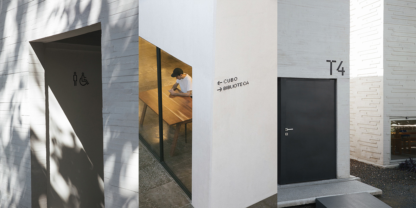
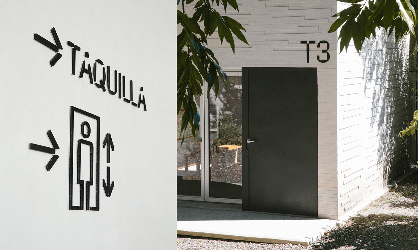
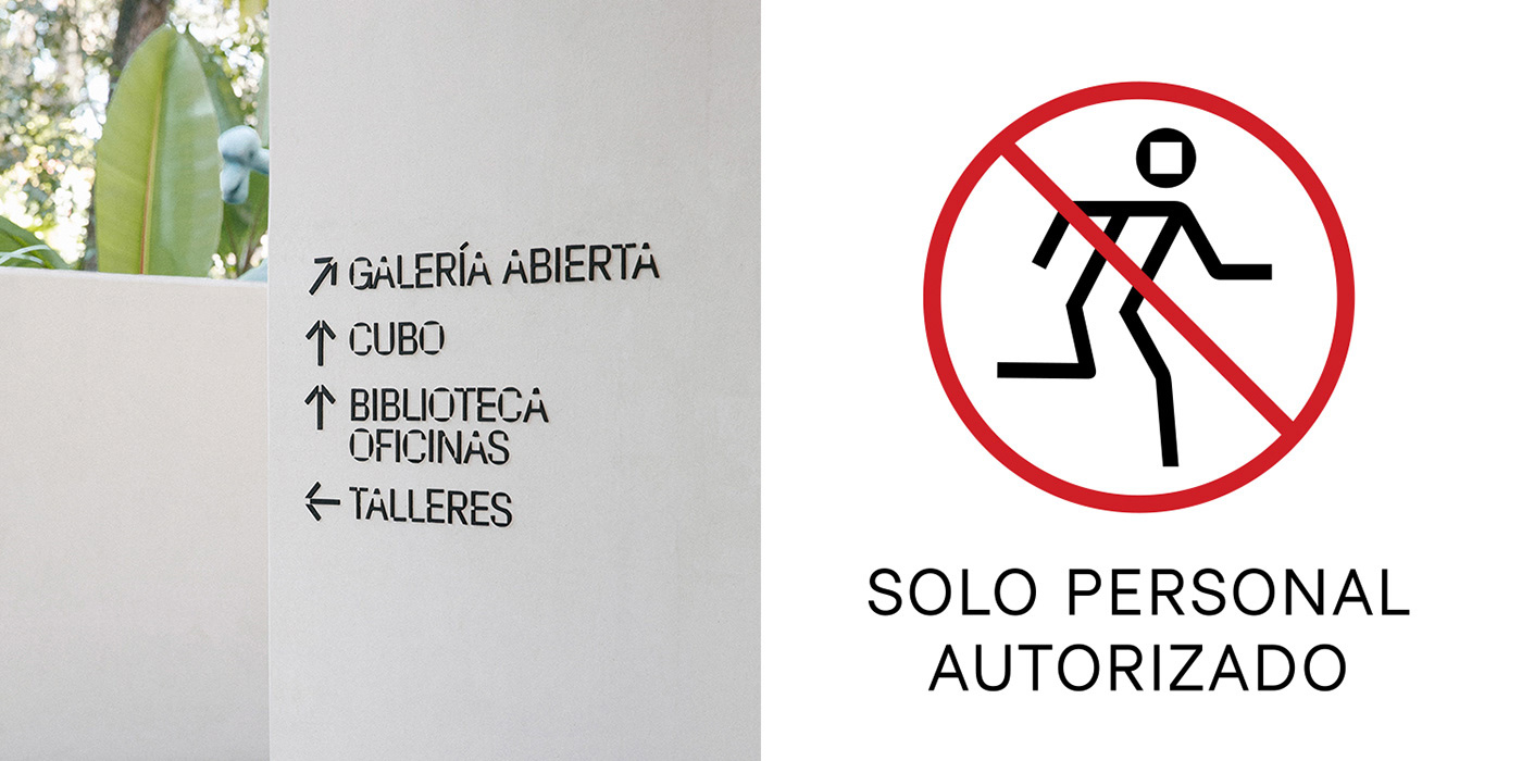
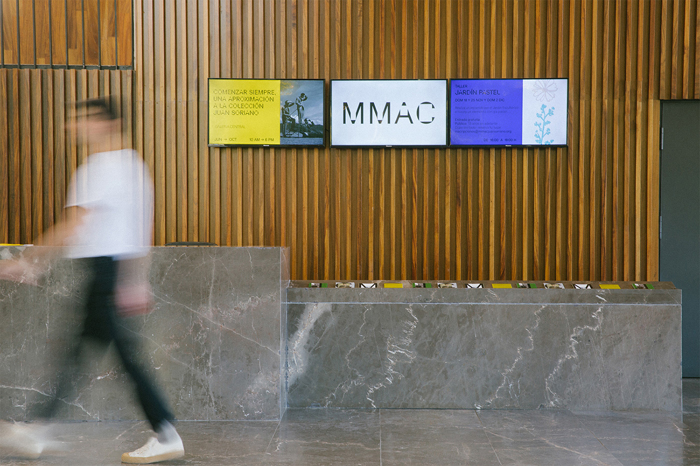
The graphic system of the MMAC is based on typography and is also complemented with the design of iconography of signaling, color codes and dynamic and expressive information grids.
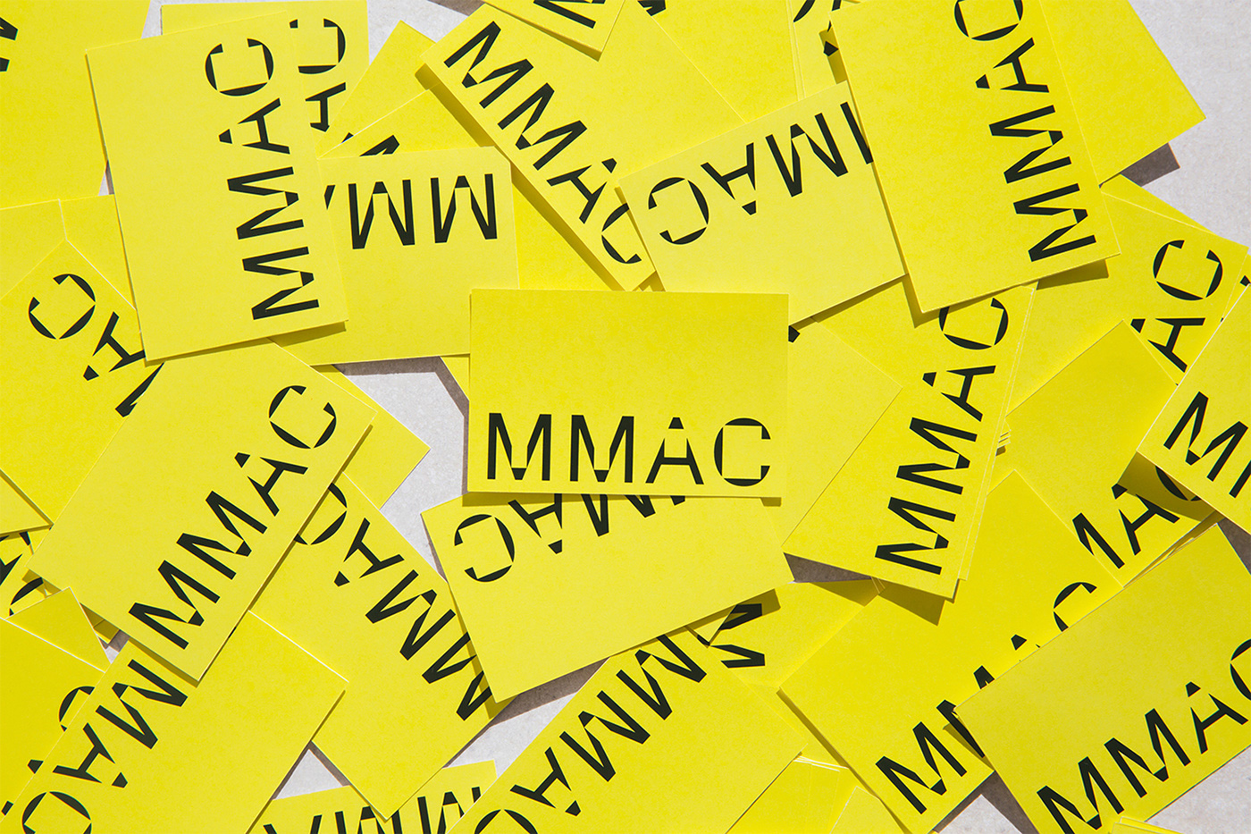
At first glance, without any explanation, the logo quickly gives off a contemporary arts museum vibe with a relatively uncomfortable logo. When seen in the context of the building, it’s easy to understand where the odd letter shapes come from, as the museum features large concrete walls and spaces with square and rectangular cuts that the letters emulate. The tiny window in the large facade being the most evident example. On its own, it’s a strange logo — which doesn’t make it bad, just an acquired taste — but when it’s supported by the matching visual identity, it’s a pretty convincing signature that captures the intended tension of the system and the space itself.
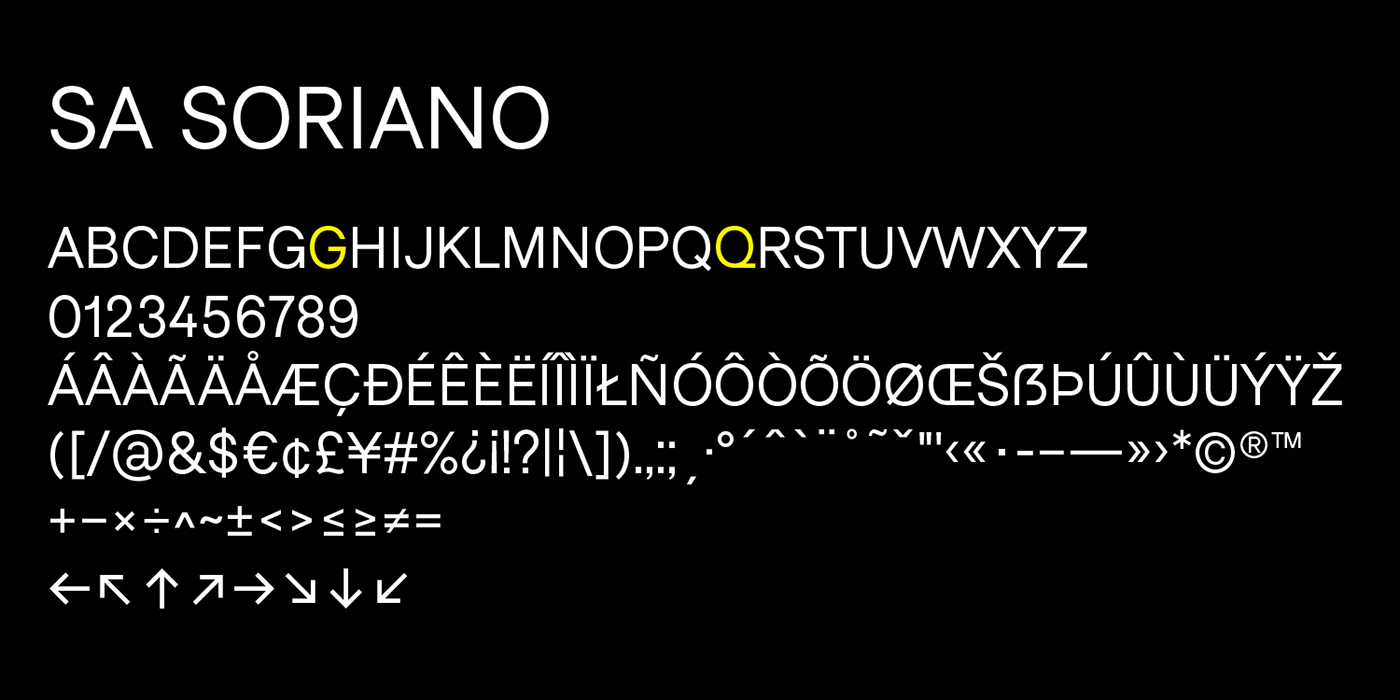
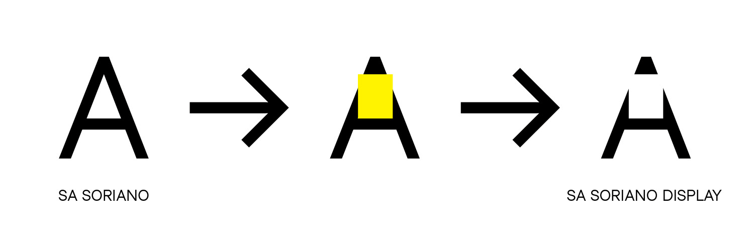
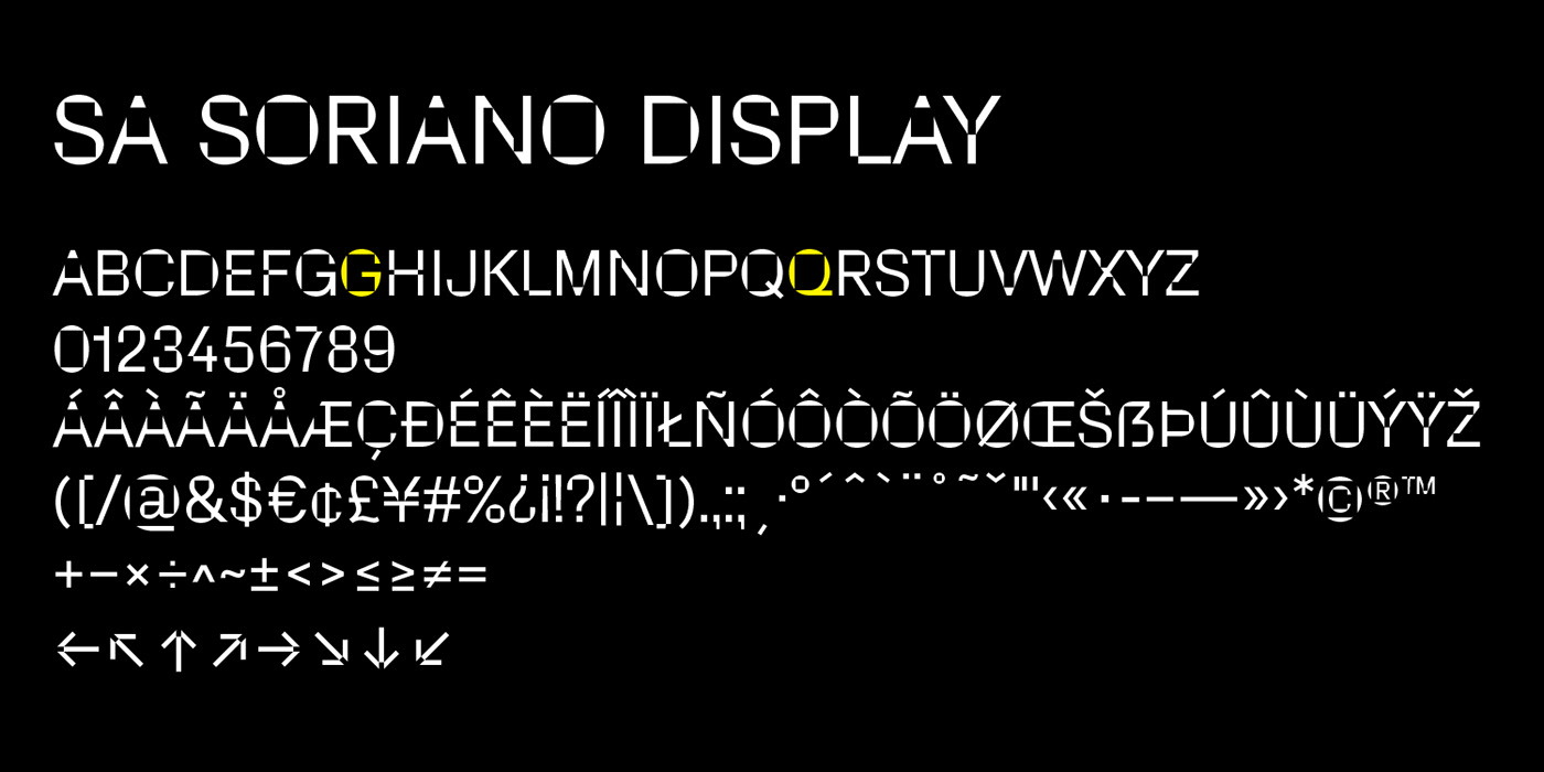
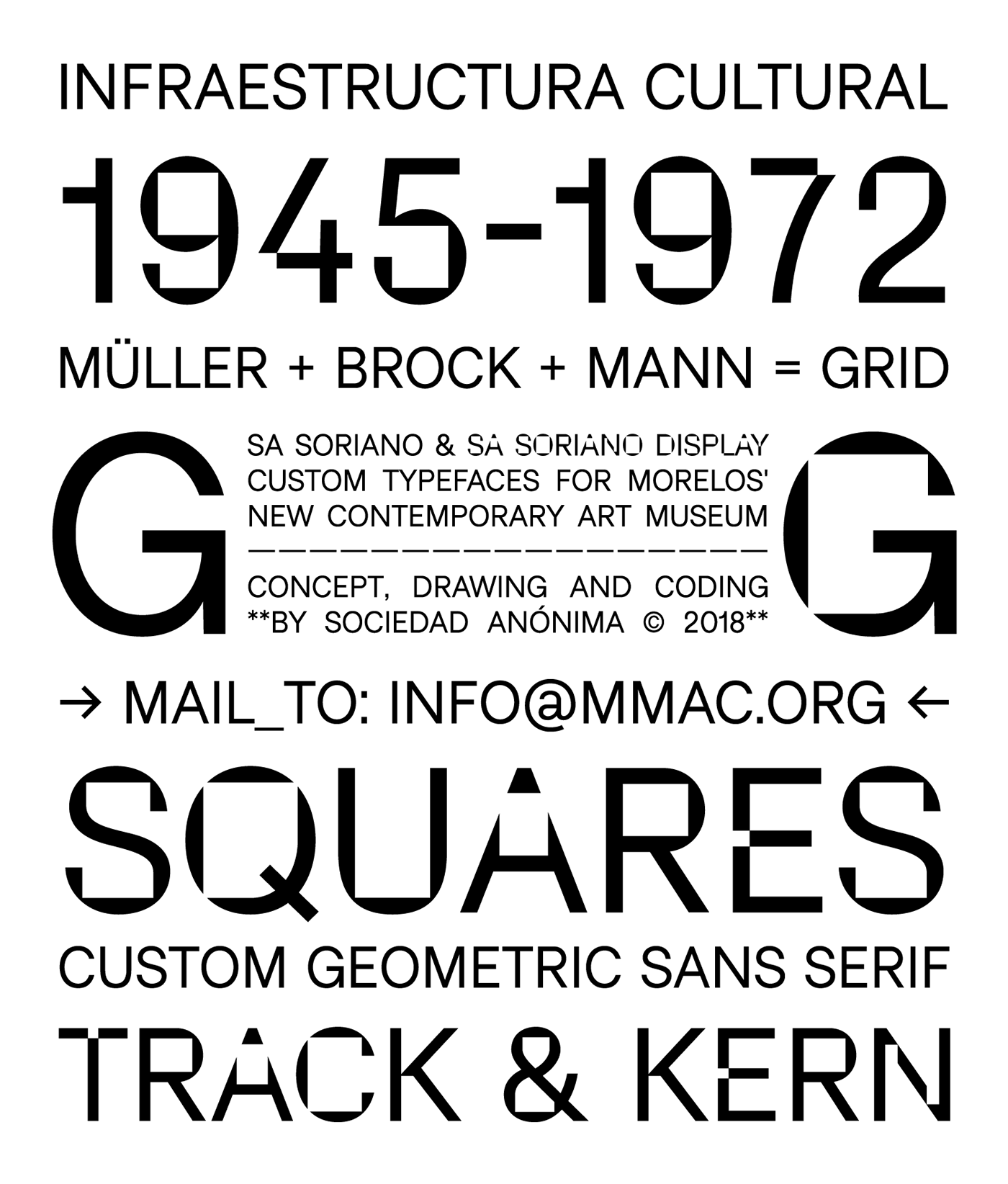
At the core of the identity is the custom sans serif family in two styles, normal and cuckoo… or, more technically, Text and Display. It’s interesting how the display version shouldn’t work but actually works great: The squared-off interiors are weird, the notches in letters like “E” and “F” are kind of dumb, and some letters just look odd (like the “1”) but all together and in use, it’s surprisingly effective, quite awesome, and very different from the current safe standards in identity design.
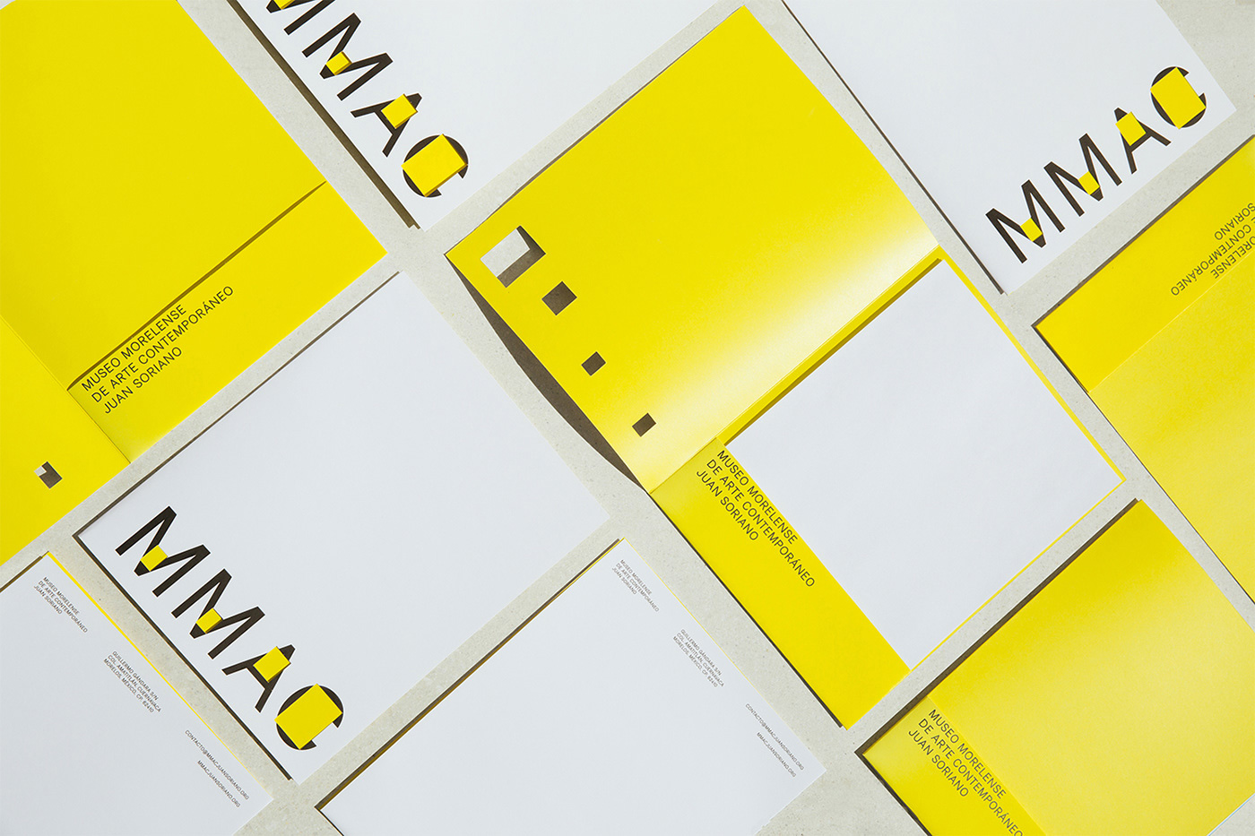
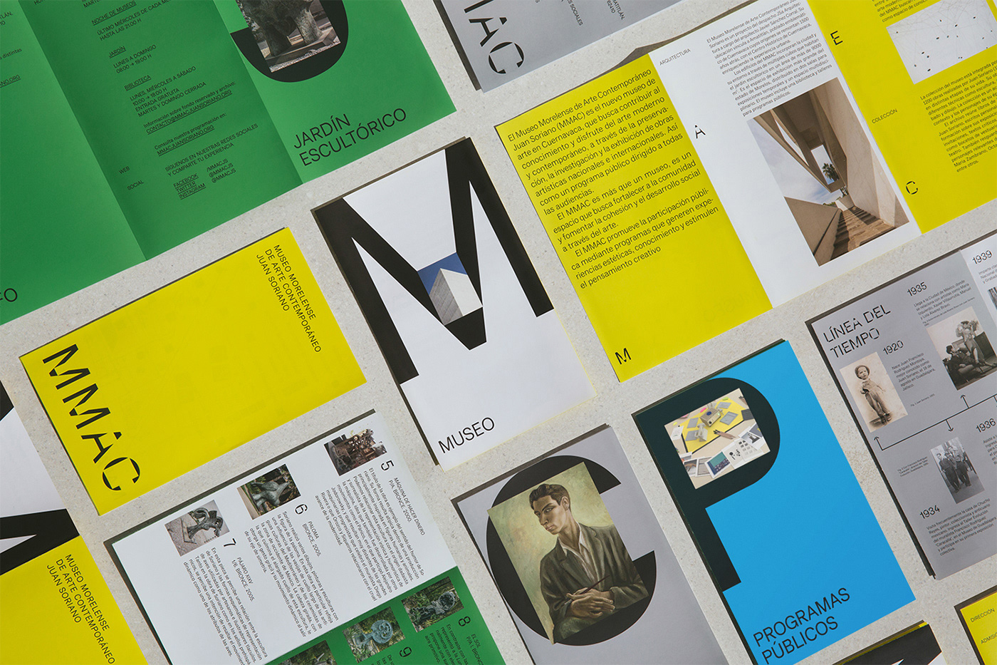
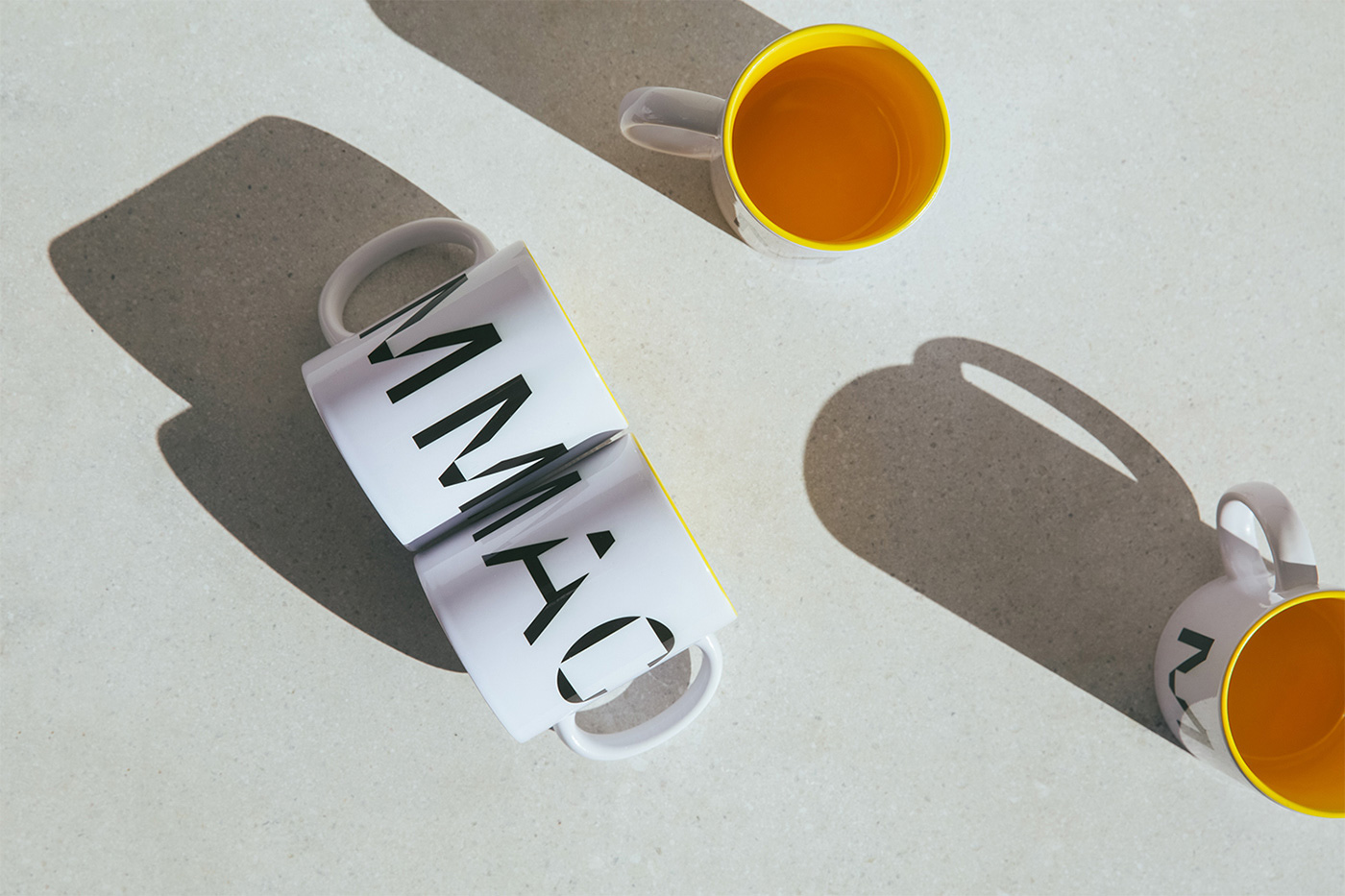
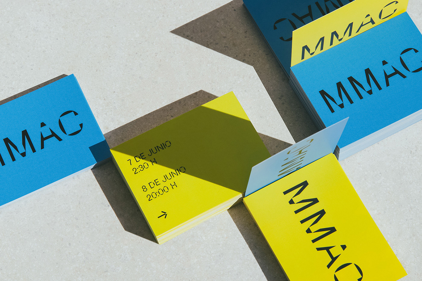
The print applications look solid, with the large use of the logo paired with the text version of the type family and a little bit of flair from the display version. The yellow accent in the applications is great and helps tie the pieces together.
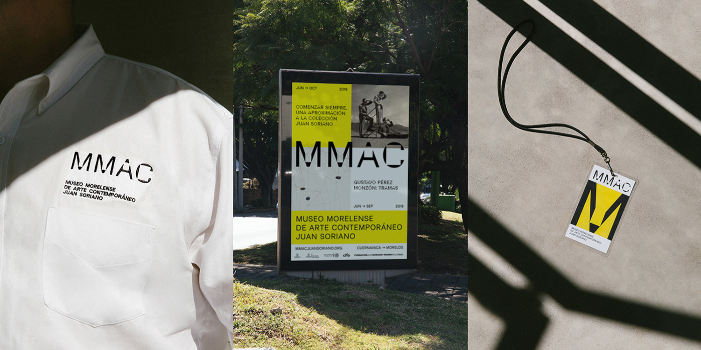
In signage, the display version takes over and it looks really bad-ass throughout the building. At times it almost looks like a disconcerting pixel font and creates a great texture (while remaining perfectly readable if, yes, not 100% straightforward).
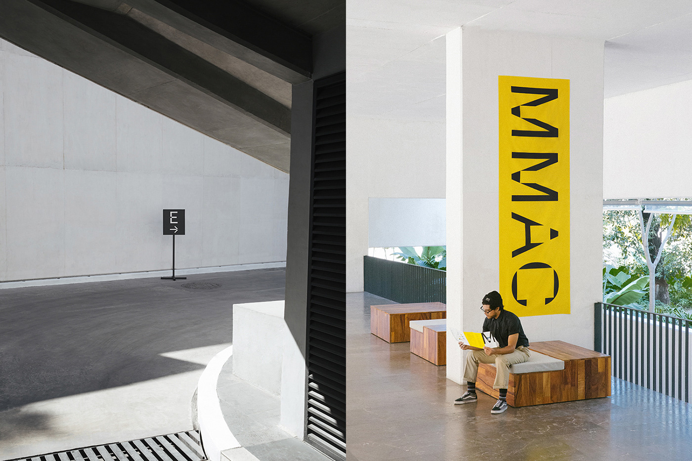
Overall, this is a great system that feels very appropriate to the museum in both its mission and its physical space while skirting expectations and trends with a unique visual voice.

 Новости Союза дизайнеров
Все о дизайне в Санкт-Петербурге.
Новости Союза дизайнеров
Все о дизайне в Санкт-Петербурге.