contact us | ok@ohmycode.ru
contact us | ok@ohmycode.ru
First sold in 1948 (as Nestle Quik), Nesquik began as a single chocolate powder product to mix into milk and now has grown to a wider line of products that include ready-to-drink bottled milk (in chocolate, strawberry, and vanilla flavors), syrups, cereal, and a few other extensions like candy bars around the world, where it’s available in more than 100 countries. Recently, Nesquik introduced a new logo and packaging designed by the Milan, Italy, office of Futurebrand.
The new logo hasn’t rolled out in all markets and has barely registered in the Italian and Portuguese sites.
[Futurebrand] evolved & modernised the global trademark to capture & convey a new warmth and approachability, using the white outline to communicate the product idea of milk complement, which is further reinforced by the droplet that forms the dot over the ‘I’.
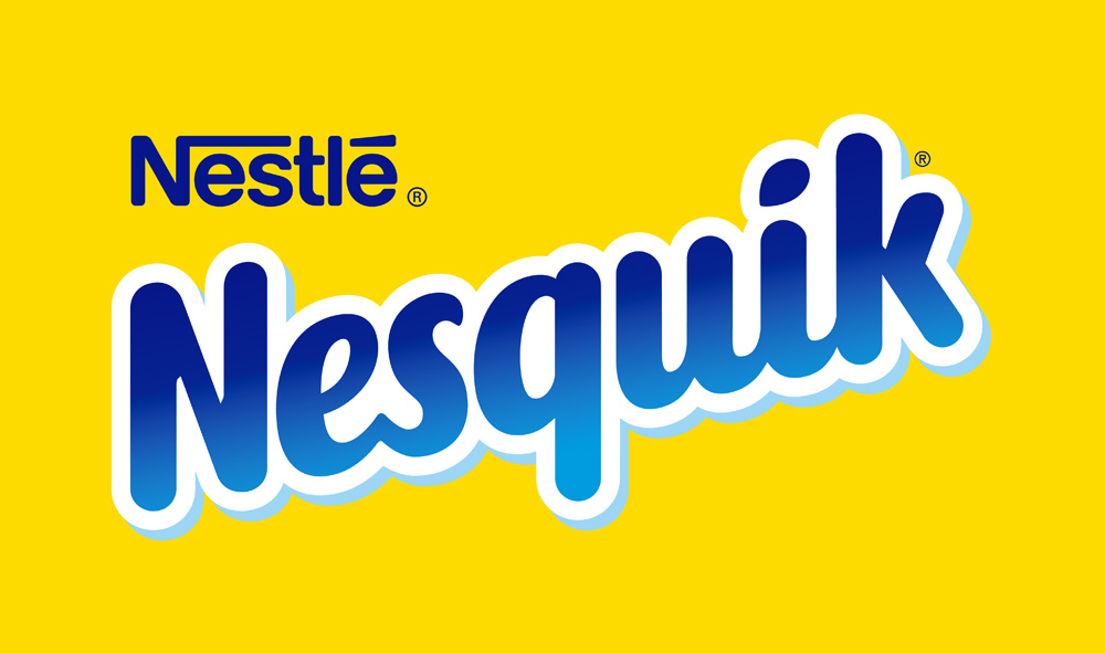
Both old and new logos are equally acceptable as solutions for a chocolate powder/drink product — the old one even looks like that of another chocolate product, Snickers — so it comes down to execution and perceived consumer friendliness. Compared to the new one, the old logo feels somewhat cold and perhaps even downright corporate. The new logo is much softer and friendlier and even nicer to look at. It’s a really nice custom lettering job where the italic structure allows the letterforms to be more condensed while also feel more airy. My only critique is that it now maybe looks too much like a facial tissue or toilet paper brand with the baseline of the wordmark looking like soft clouds. Still, the name obviously indicates this is not facial tissue or toilet paper and the yellow color is very much a trigger for Nesquick chocolate milk goodness.
In collaboration with McCann, FutureBrand also gave a contemporary new look to the iconic, much loved character QUICKY®.
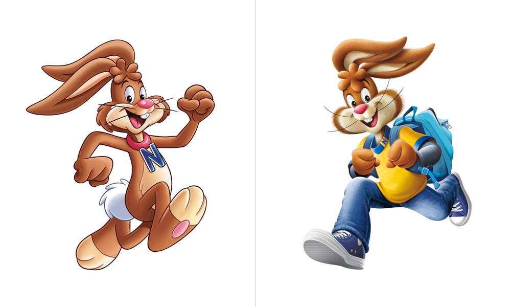
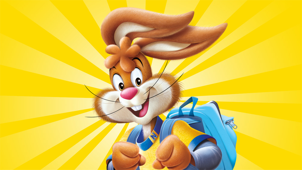
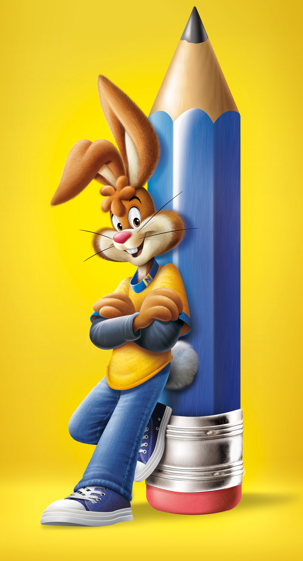
As far as consumer product mascots go, and maybe I’m alone in this, the Nesquik rabbit doesn’t rank high in recognizability or coolness factor. For example, we don’t buy Frosted Flakes but my kids know who Tony the Tiger is; we don’t buy Nesquik and if I showed them “Quicky” the rabbit, they would have no idea what it shilled for. If it were a little more well known I’m sure I would have noticed before that the rabbit has the weirdest clump of hair on its forehead, now even more accentuated in the new version. Like the logo, both versions are equally acceptable. The new one is more in tune with the Pixar-esque reality kids have gotten used to and he’s not naked anymore.
FutureBrand maintained the vibrant, distinctive NESQUIK® yellow as primary colour, while making it more natural through the rising sun - the perfect start to a happy, active day. “From the sun comes the path to empowering kids for the day ahead, through a great tasting, nutritionally balanced breakfast” explains Marshall Ward, Senior Vice President Europe at FutureBrand.
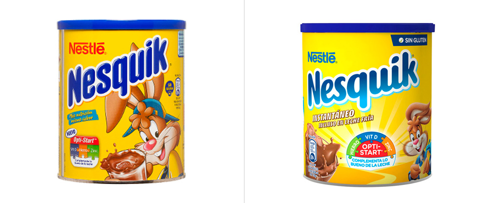
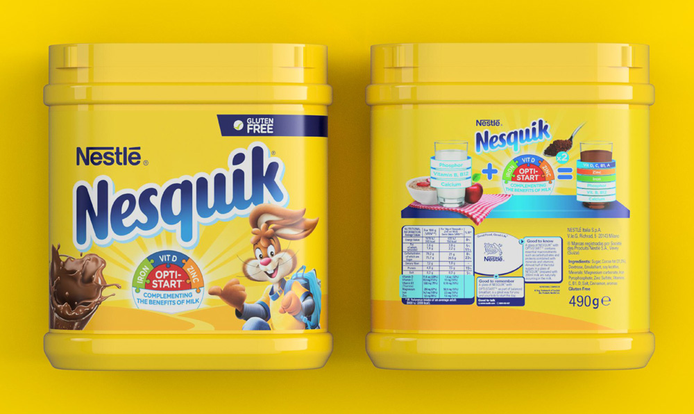
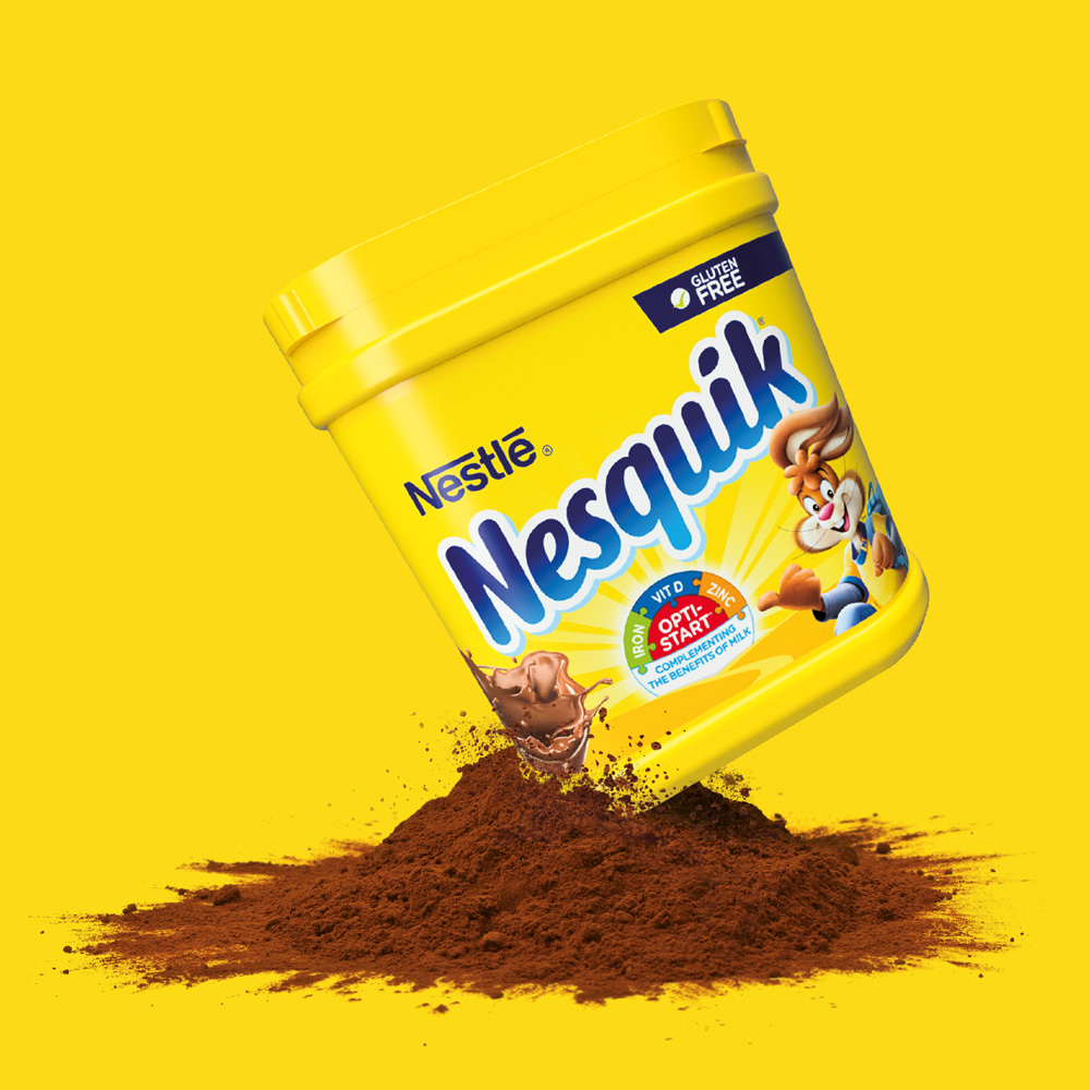
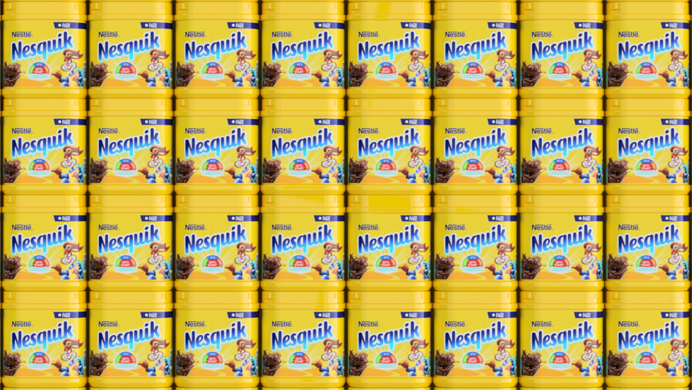
The new packaging is a simple styling update of the old, keeping the same elements — name, rabbit, product photo — but with the updated assets plus the introduction of a sunshine graphic exalting the relative nutritious values of the drink. In part, I admire that the new packaging doesn’t strive to be a minimalistic rendition with no pop-up windows and signs selling you the different benefits of the product but that it deals with all that stuff as painlessly as possible — the back of the packaging is cringe-y but not exponentially. Overall, not a necessary update in any way as chocolate powder kind of sells itself and the Nestle juggernaut can succeed simply by volume but, sure, it’s a visual improvement that gives the brand a kick in the rabbit butt to stay competitive and within the realm of more timely aesthetics.
Thanks to Brandemia for the tip.

 Новости Союза дизайнеров
Все о дизайне в Санкт-Петербурге.