Обзор лучших ресурсов по разработке бренда, разработке упаковки
contact us | ok@ohmycode.ru
contact us | ok@ohmycode.ru
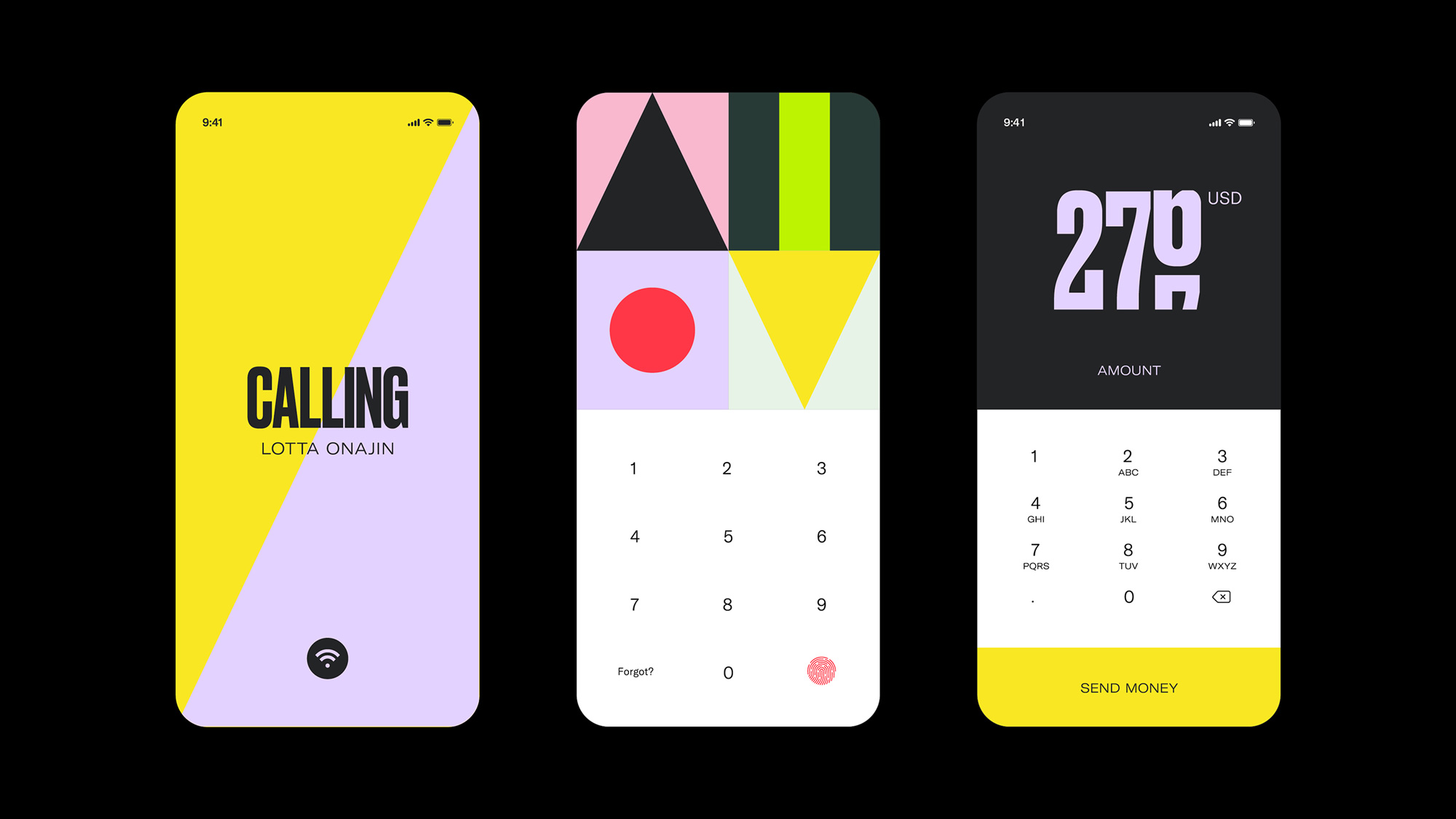
Established in 2019, Majority is a digital financial service dedicated to serving migrants worldwide by removing some of the barriers of traditional financial systems through a mobile app-based membership where users are able to open an FDIC-insured account, get a Visa debit card, process money transfers, and even make international calls. Its mission is to “give [people] the tools to thrive in a new country” and was built by a diverse team that had spent the last two decades serving global migrant communities within the fintech, payments, and telecom spaces. Founded in Stockholm, Sweden, Majority launched in the U.S. with headquarters in Houston, TX, and a partnership with Sutton Bank, Member FDIC, with the goal of expanding to other states in the U.S.. The identity for Majority has been designed by Stockholm-based Bold.
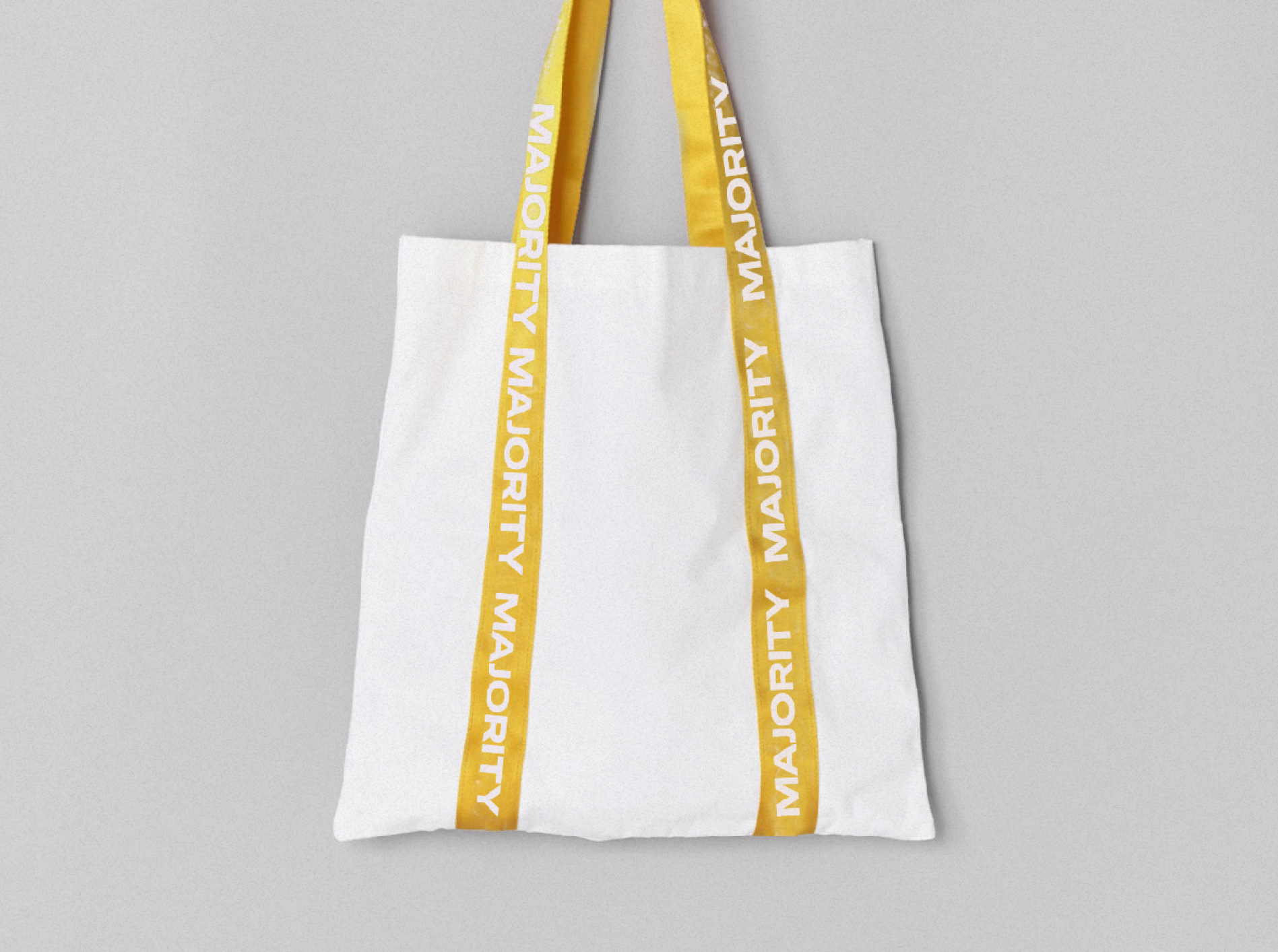
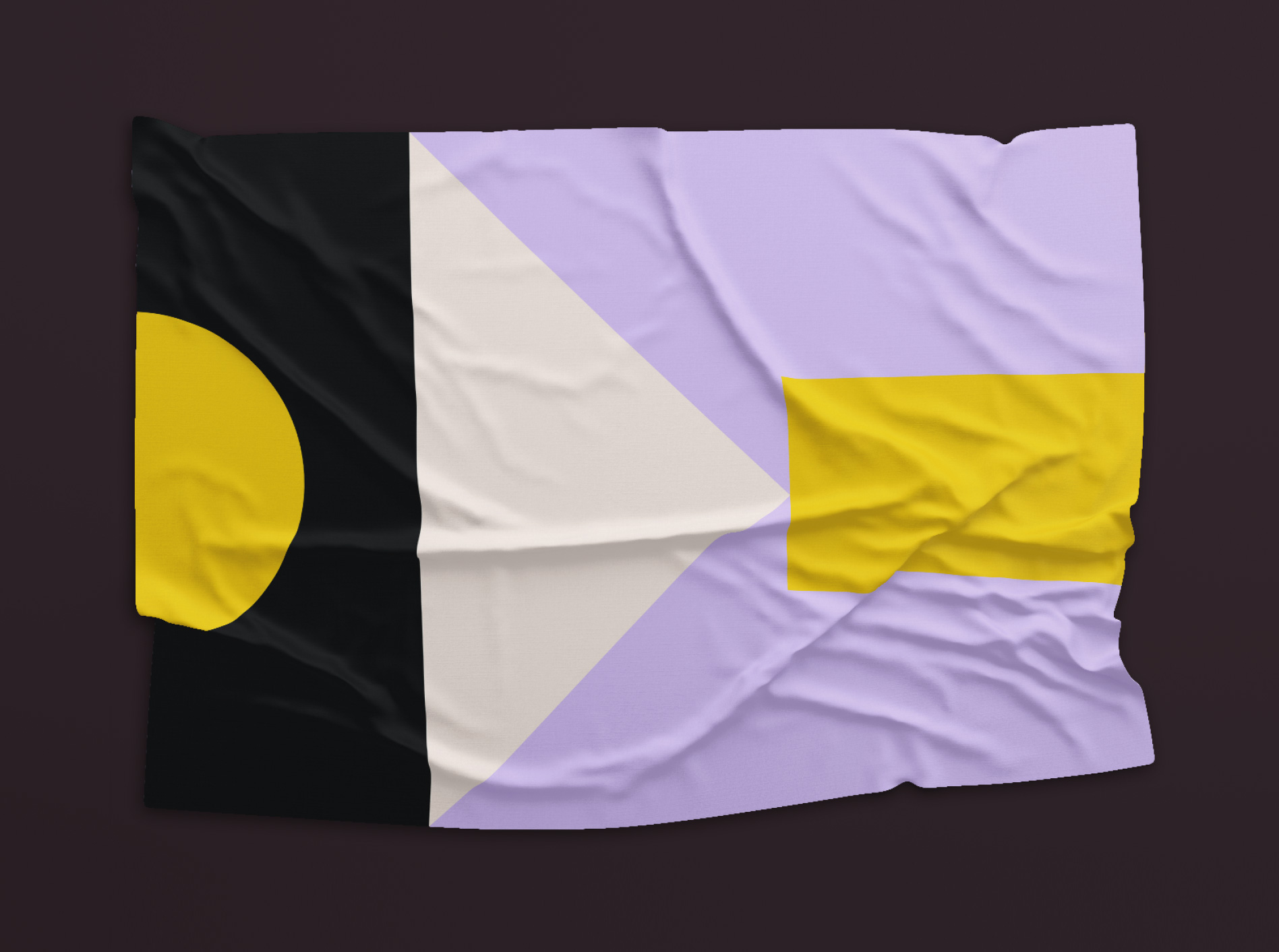
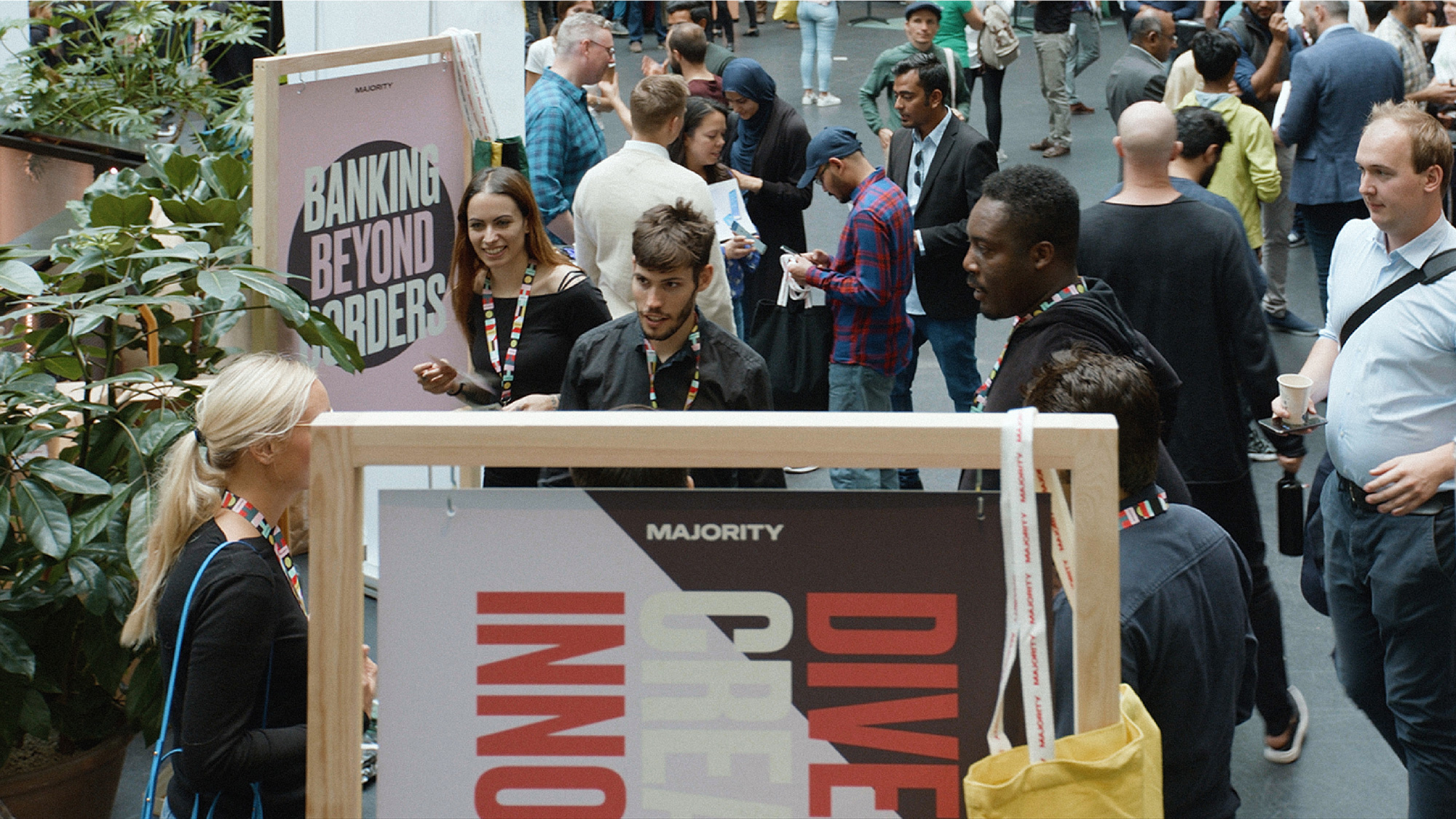
The brand and visual identity were built around Majority’s principle of inclusivity. We’ve translated the name Majority into a graphic device, called the Canvas. The canvas is a geometric grid, inspired by flag designs. It can be brought to life through use of colours, photography, animation and typography. It’s an endlessly diverse, unifying design system that ties together the whole brand experience; from an intuitive banking app, to modular retail spaces and to playful campaign materials.
There is not much to the new logo. A bold, uppercase sans serif with an extended structure. It could be an airline, it could be a gallery, it could be a fashion label, it could be a number of things but it happens to be an app-based banking account. Is it good? Not really. Is it bad? Not really. I think the goal of the logo is to simply establish some trust as a kind of neutral entity that, most importantly, doesn’t look like a traditional bank but that instead looks like something one might find in cooler retail establishments. For the record, visually and technically, the logo is absolutely fine — nice font, well spaced, etc. I also have the feeling that the “canvas” graphic below was pitched as the main logo but was a little too wild for a U.S.-based audience.
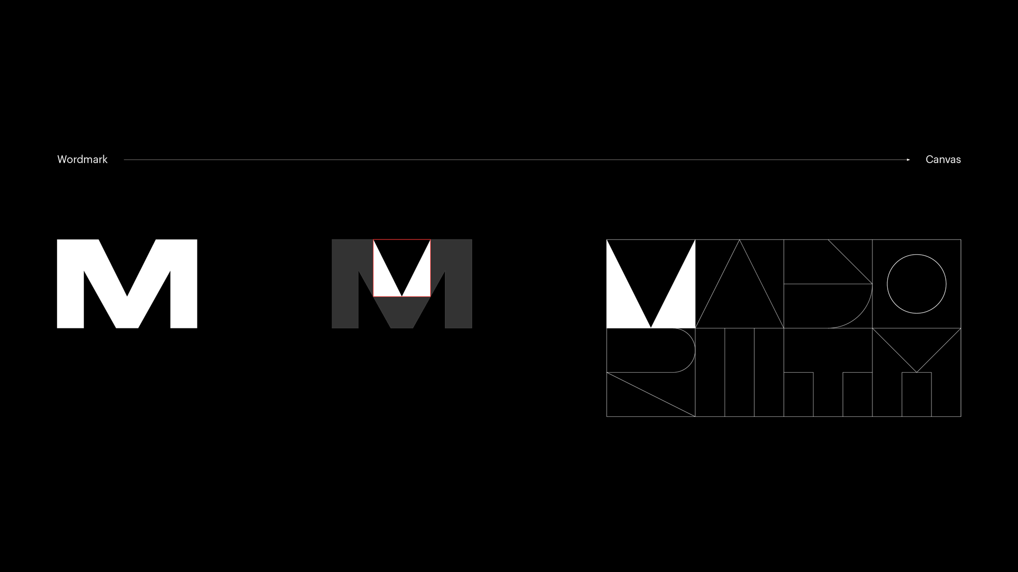
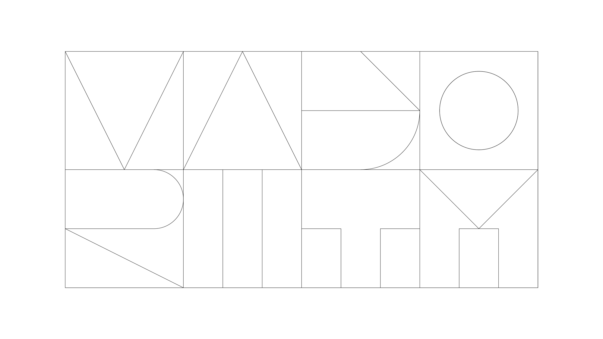
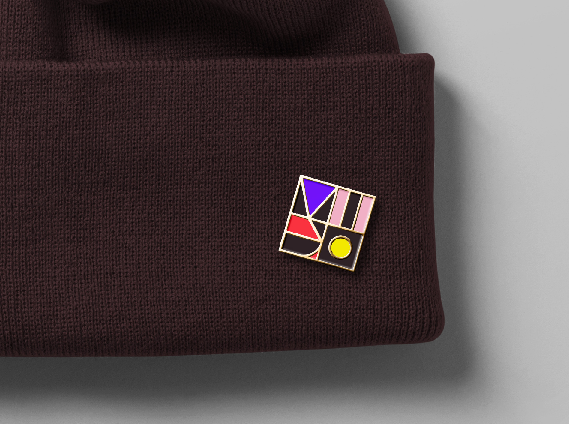
This is where things start to get interesting. I really like how the foundation for this “canvas” graphic came from a close-up of the “M”, which then led to heavy abstractions of each letter in the name, which then led to this cool tapestry of shapes that are used throughout the identity. At first glance its geometric gobbledygook, but the letters are quite readable with some effort (and if you know what it’s supposed to spell beforehand), so it has the benefit of looking cool on its own but it’s also not gratuitous shapes. And it animates like a boss.
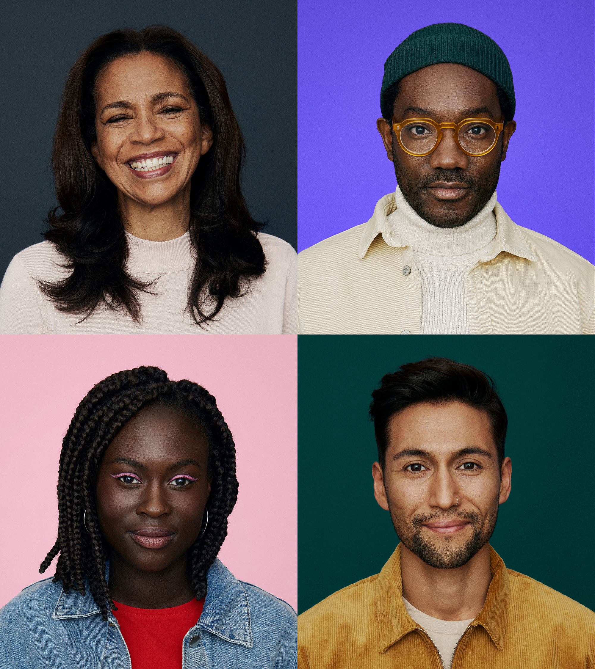
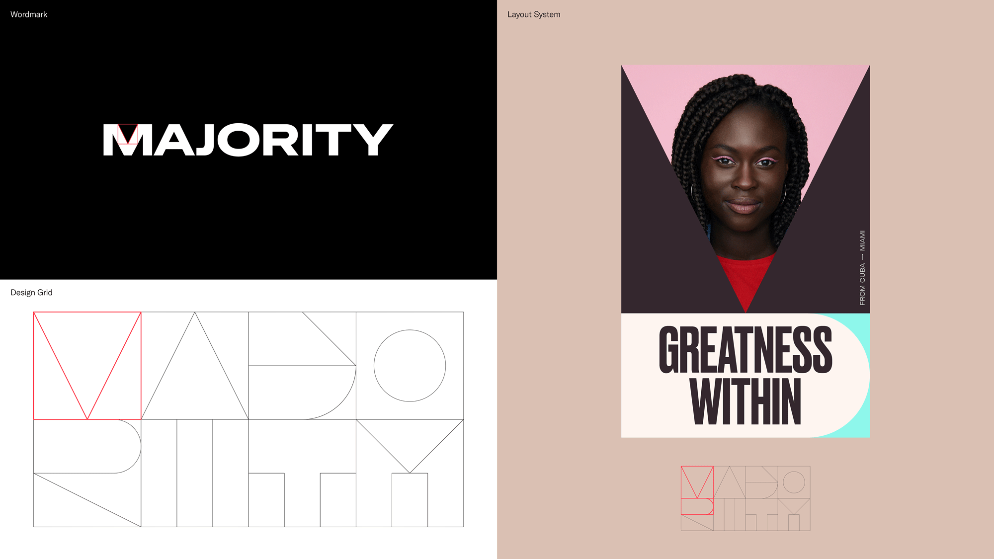
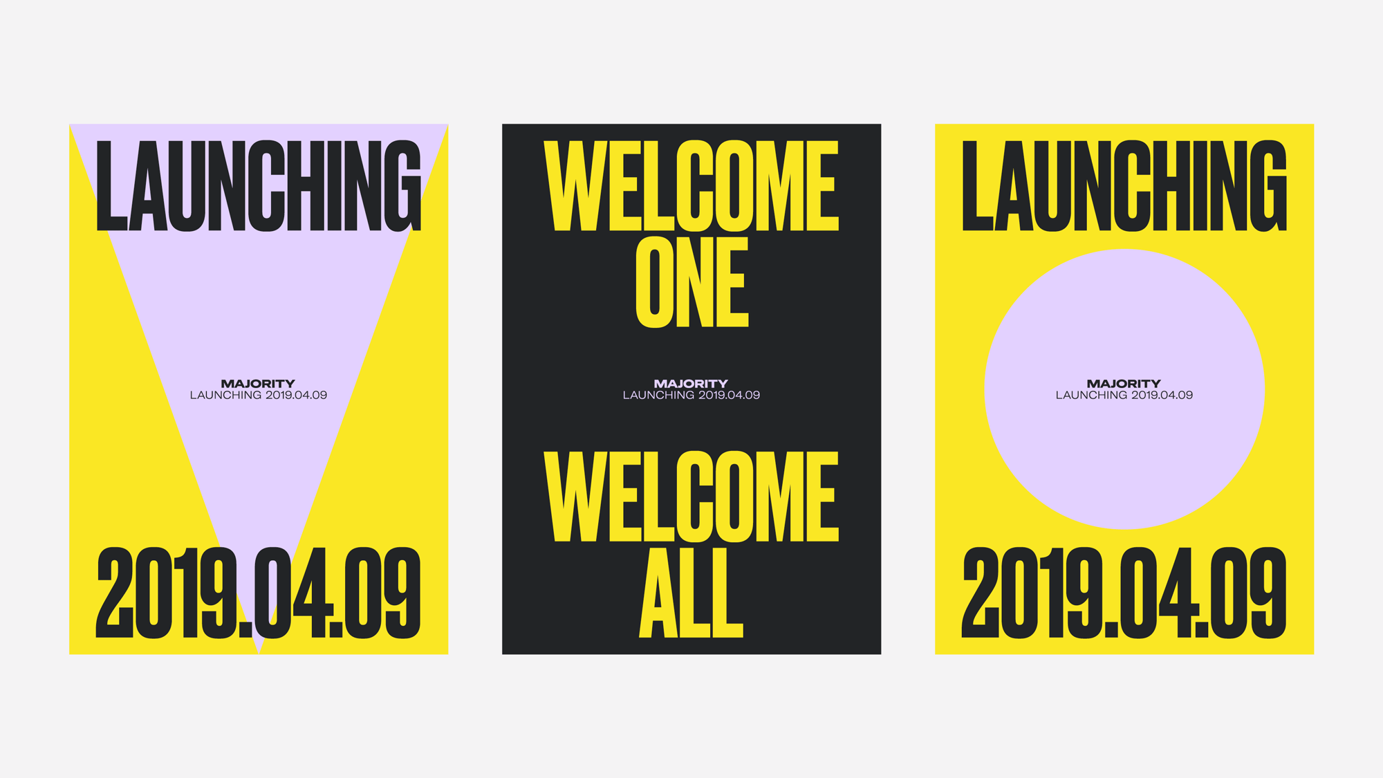
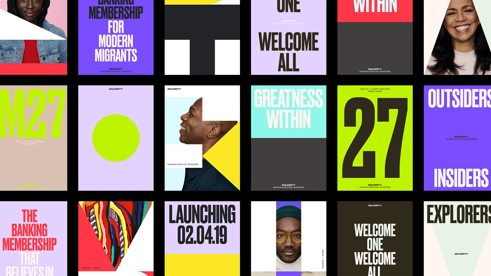
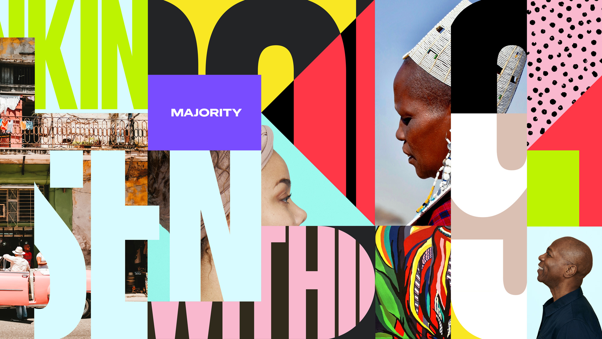
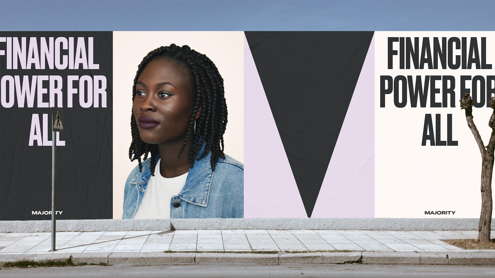
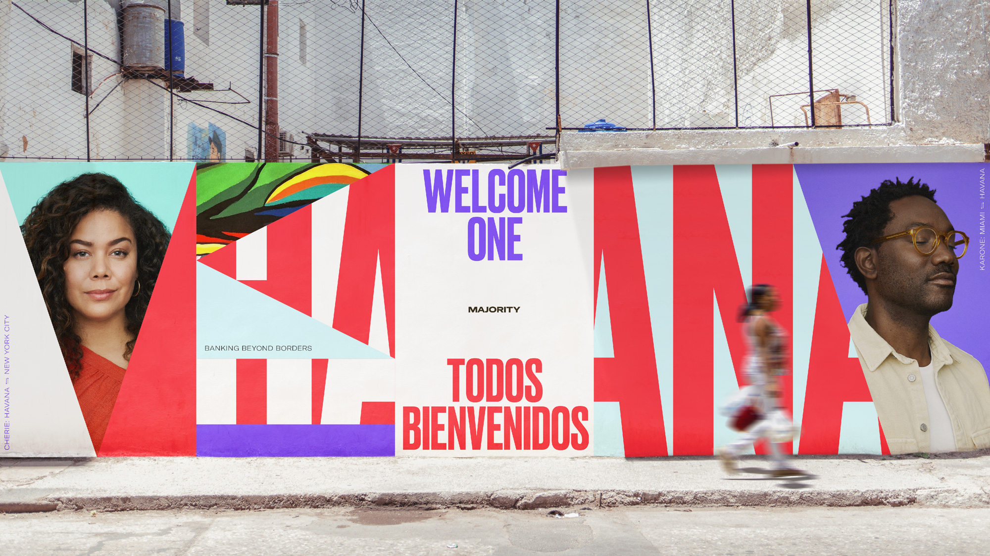
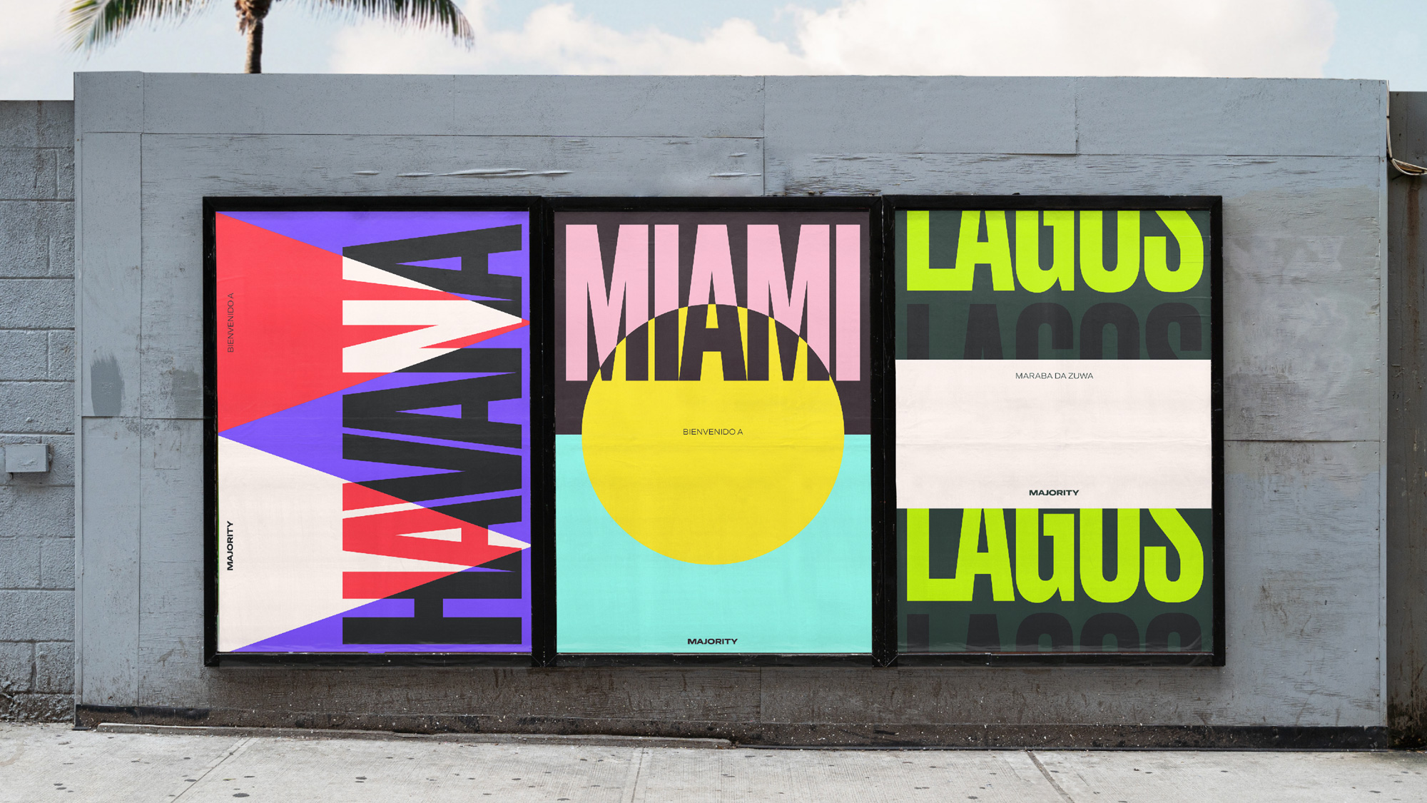
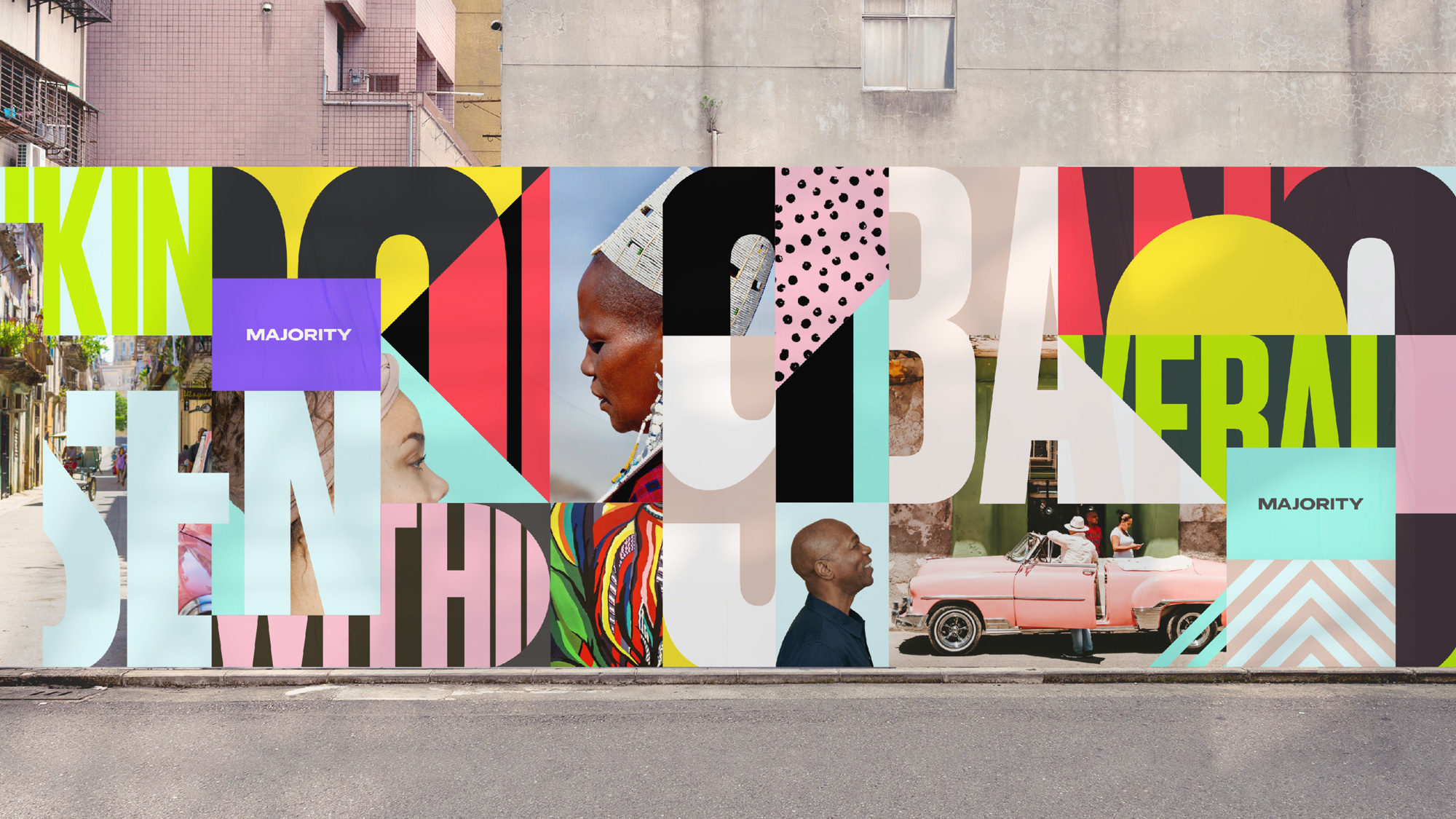
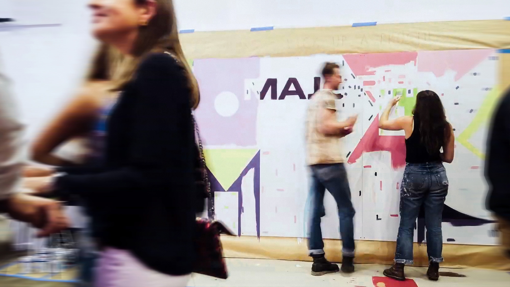
The identity comes together in explosive ways, with very energetic and bold applications that mix the canvas shapes with lots of color, great photography, and the introduction of a condensed sans serif that nicely contrasts the wide wordmark. To be honest, I’m not sure this says “We are a finance app” but, from an optimistic point of view, I think what it does is establish a culturally rich and diverse persona that feels more human, raw, and accepting that is much more appealing and engaging than a more buttoned-up, finance-y approach ever could. I do feel like somewhere in all of the above it should be a little more clear exactly what “Majority” is because it could easily be mistaken for a music festival. Still, it’s nice to see an identity in the finance realm go more over the top in its applications.
Overall, this is quite great. I do think it’s an identity that is able to create a more authentic connection with its target audience through a bolder, chaotic-within-reason, personable presence that traditional banks simply can’t pull off.
 each year since publication began in 2006

 Новости Союза дизайнеров
Все о дизайне в Санкт-Петербурге.
Новости Союза дизайнеров
Все о дизайне в Санкт-Петербурге.