Обзор лучших ресурсов по разработке бренда, разработке упаковки
contact us | ok@ohmycode.ru
contact us | ok@ohmycode.ru
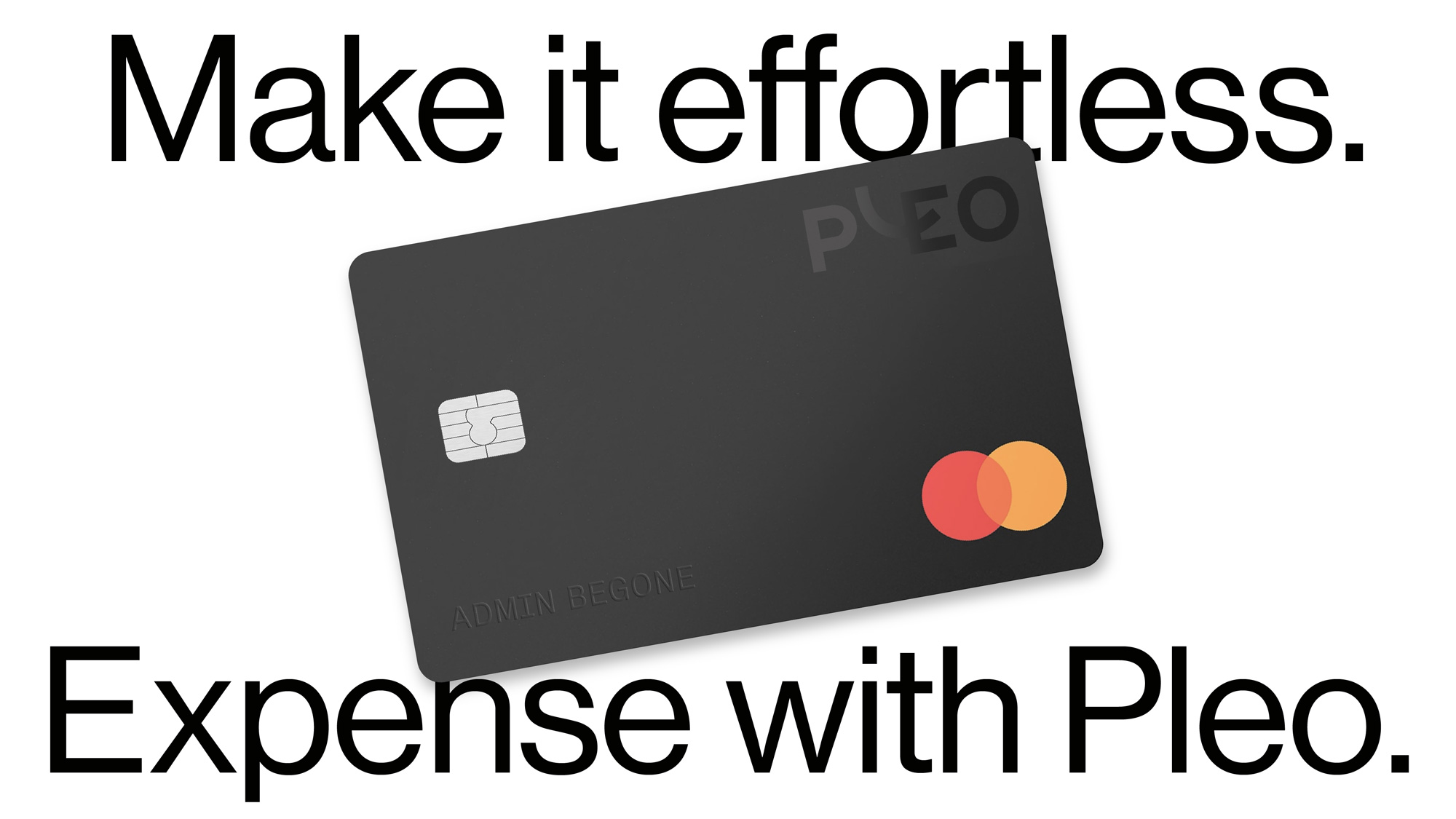
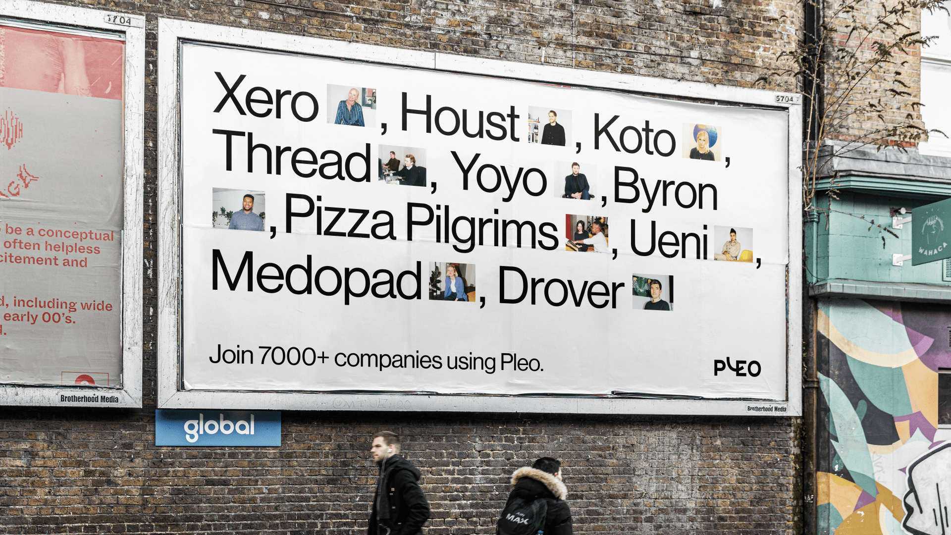
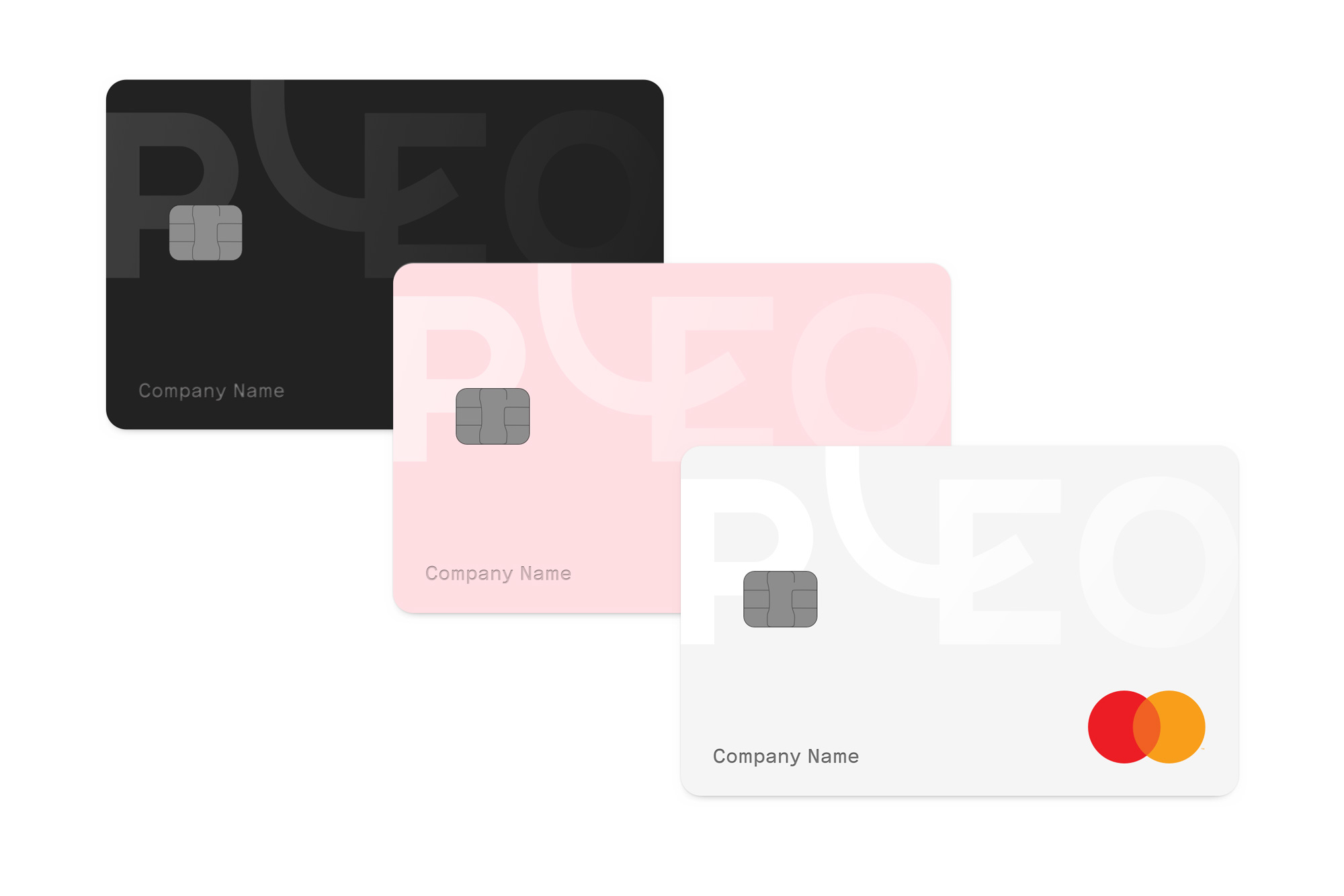
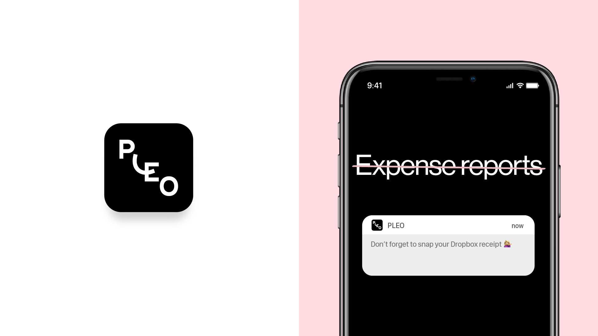
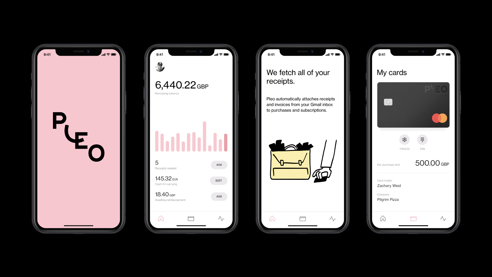
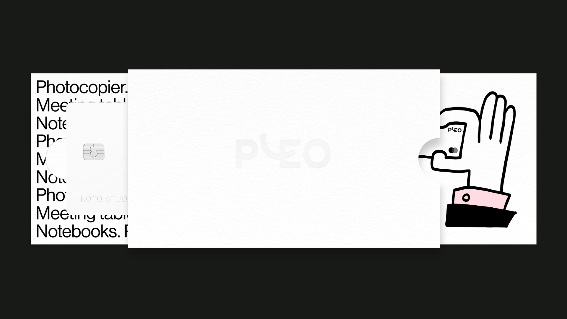
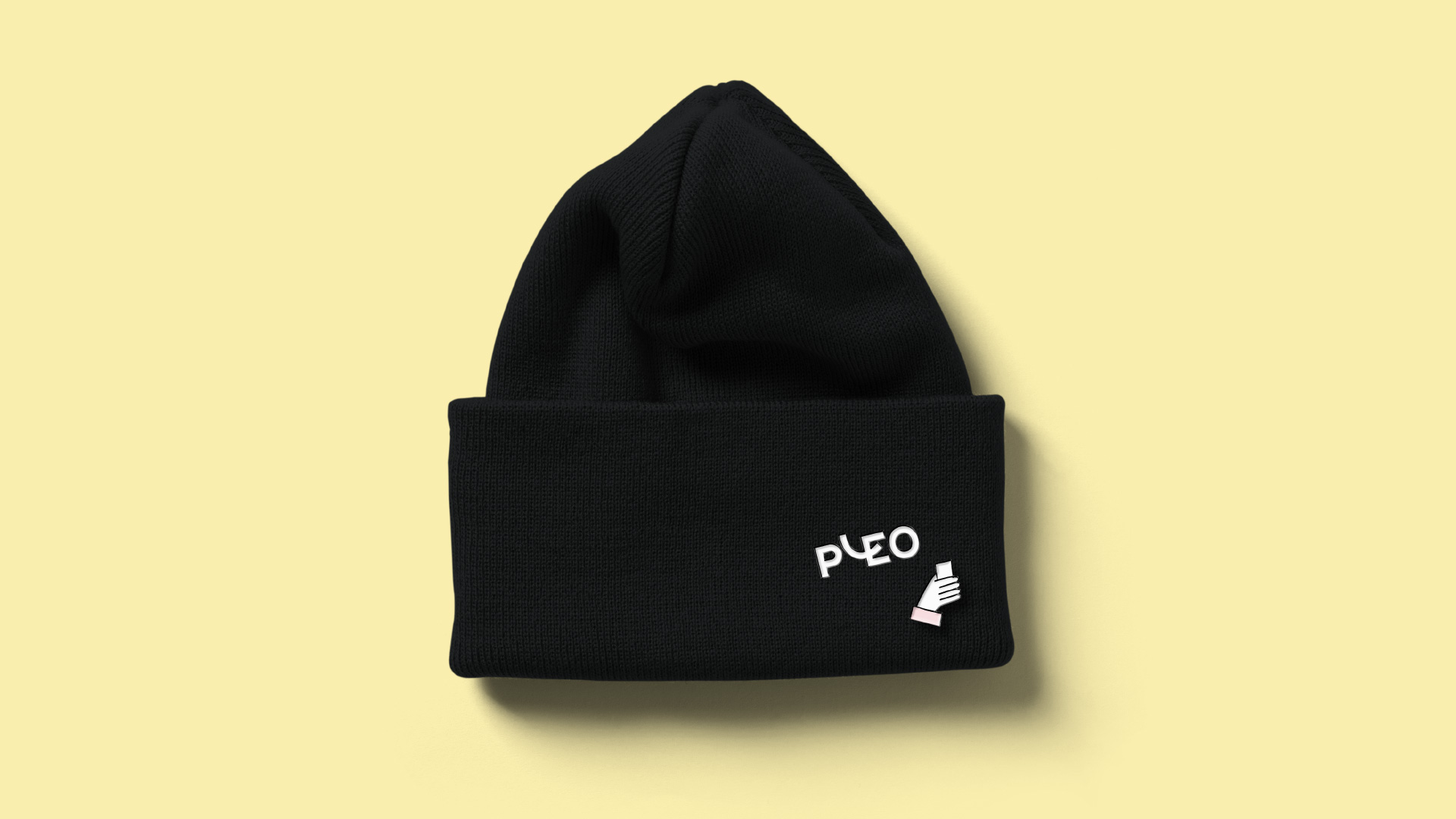
Established in 2015, Pleo is a financial services company that offers smart payment cards with a system optimized to manage a company’s employee expenses. Company managers can issue both virtual or traditional Prepaid Mastercard cards through Pleo and then its app (and desktop dashboard) tracks purchases by capturing the receipt and categorizing the expense so that there is no need for employees to fill out expense reports. Today, over 7,000 companies are using Pleo across six markets: the UK, Denmark, Sweden, German, Ireland, and Spain. Last week, Pleo introduced a new identity designed by Koto.
We want to be the go-to spending solution for forward-thinking teams everywhere. A logo that’s confident and warm plays a big part in forming first impressions of Pleo. We’ve even identified the easiest way to help everyone pronounce Pleo. We’re still bringing that beautiful, bold Nordic simplicity with our new design. But now we’re also reflecting more of the Pleo positivity and moxie with that cheeky little smiling L.
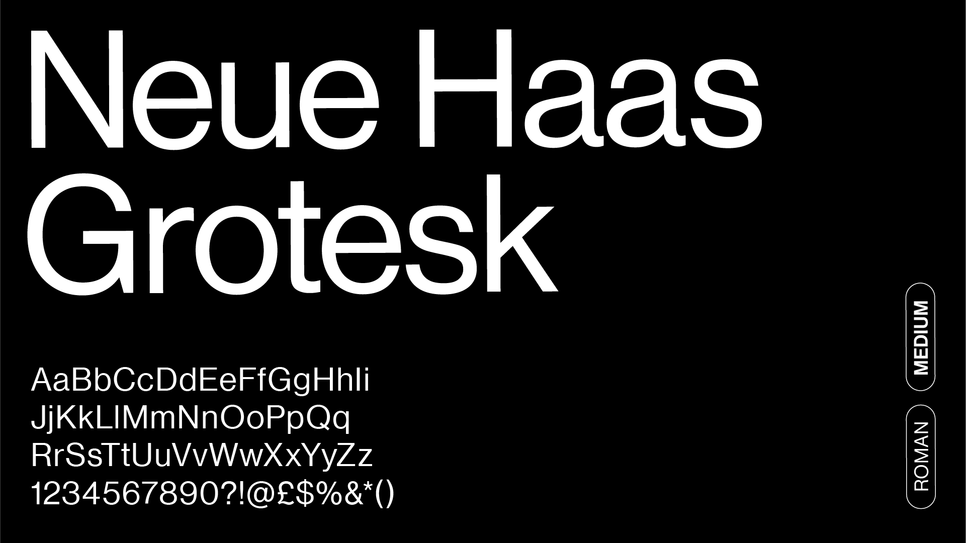
A new visual identity doesn’t stop there though. Our illustration style. The fonts you see when you land on our homepage. Which words should go where on our events stands.
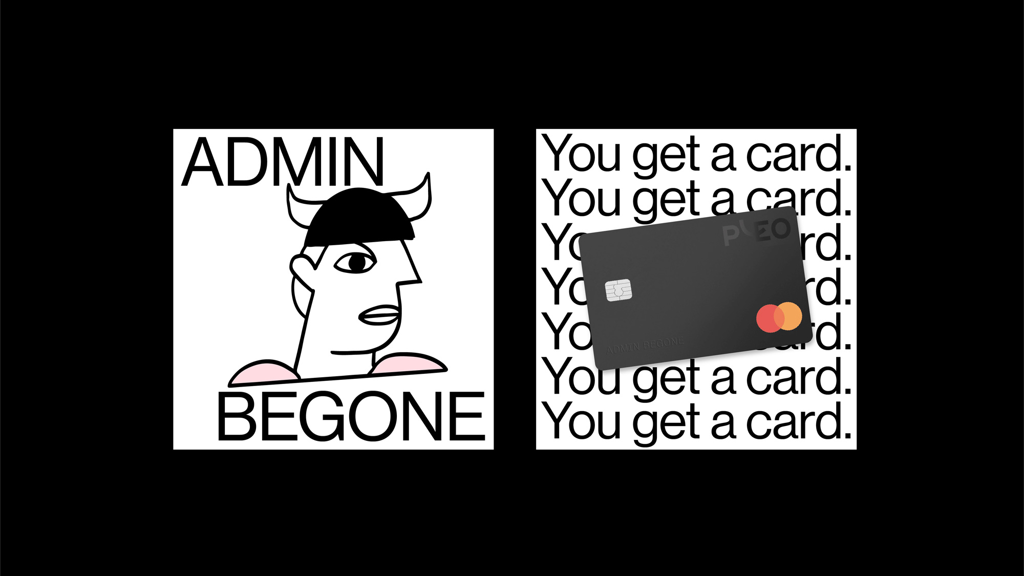
The old logo was not terrible but it wasn’t good or memorable in any way, with an execution that screams “Circles cut in Adobe Illustrator with sticks added!” which I know is not a thing that’s screamed but you get the point. The new logo has a lot more personality and is far more memorable with its funky “L” serving as both an “L” and the middle bar of the “E”. In theory, it’s supposed to be a smile too but it’s not as easy a read as other smile-based logos. I think I like the logo better when I don’t see a smile and just appreciate the looseness and playfulness of the “L”. The logo comes in two configurations: a staircase-like configuration and a horizontal one with the “L” going above the rest. I like both but, in a way, I’m not sure both should co-exist as they are relatively similar. I mean, I understand they are different but they are not super different and in application you almost can’t tell when one’s used or one’s not. Maybe it’s not a bad thing. Overall, I do like the logo as it takes the deadpan uppercase sans serif norm and twists it just enough to be much more interesting.

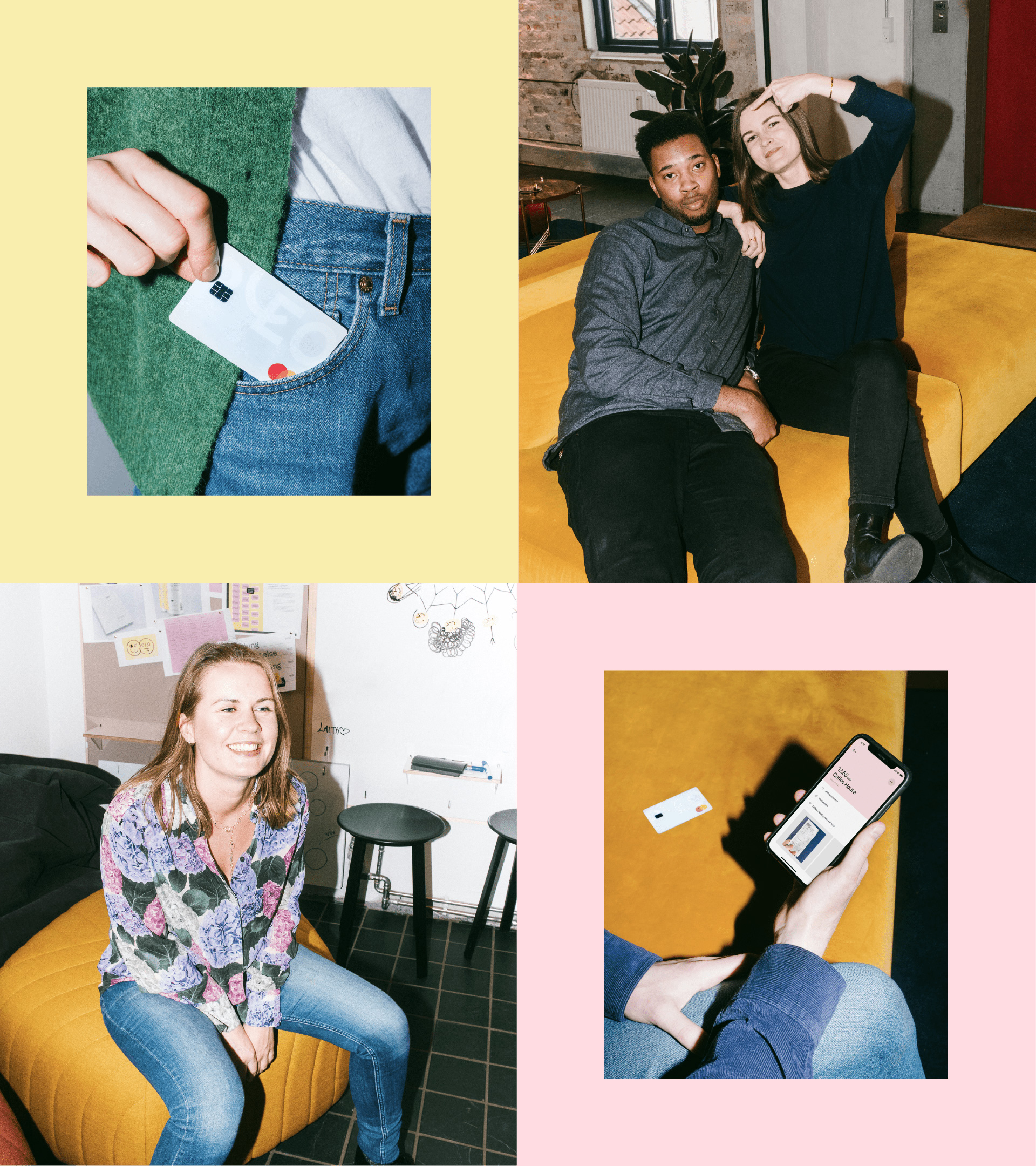
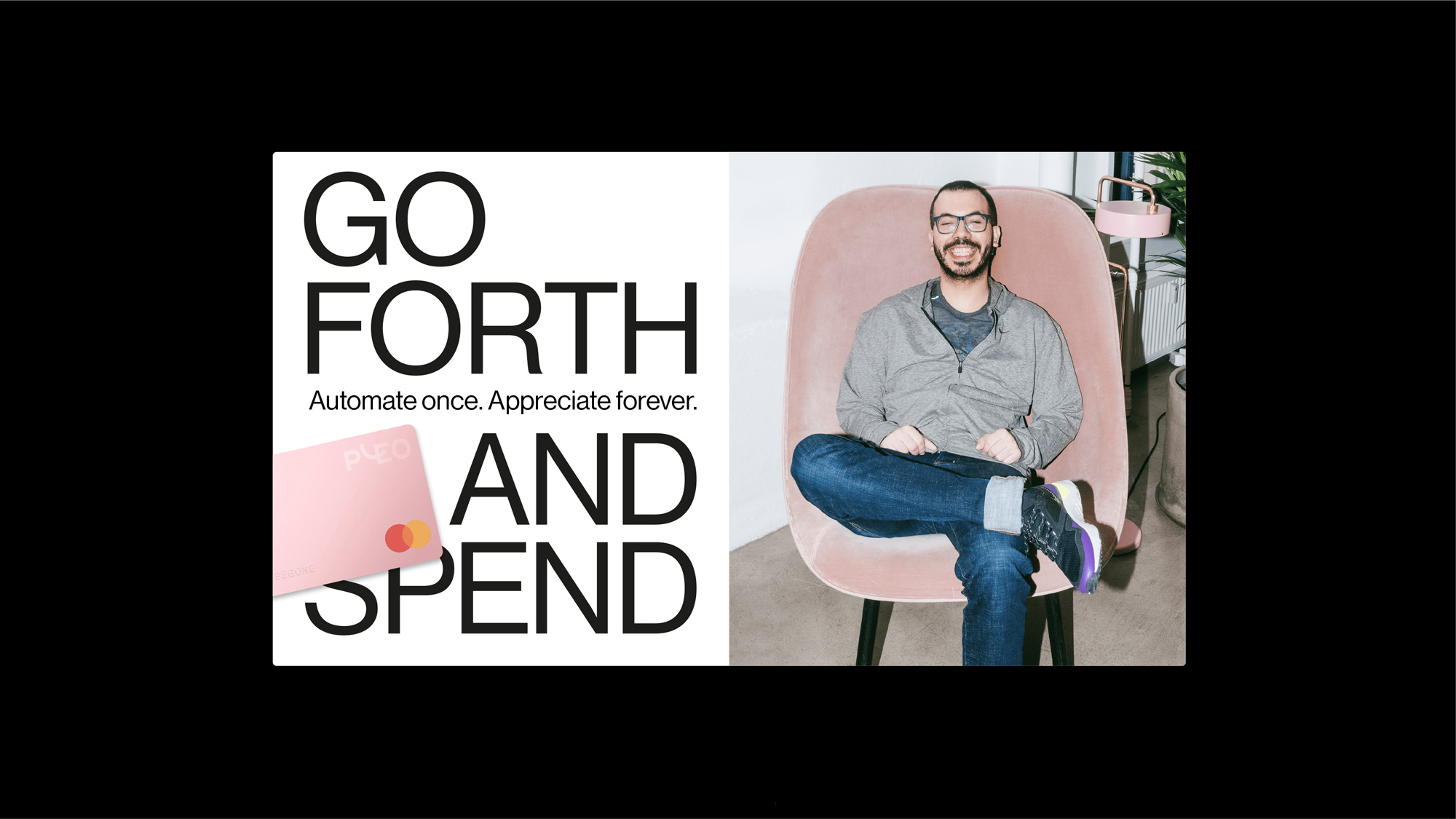
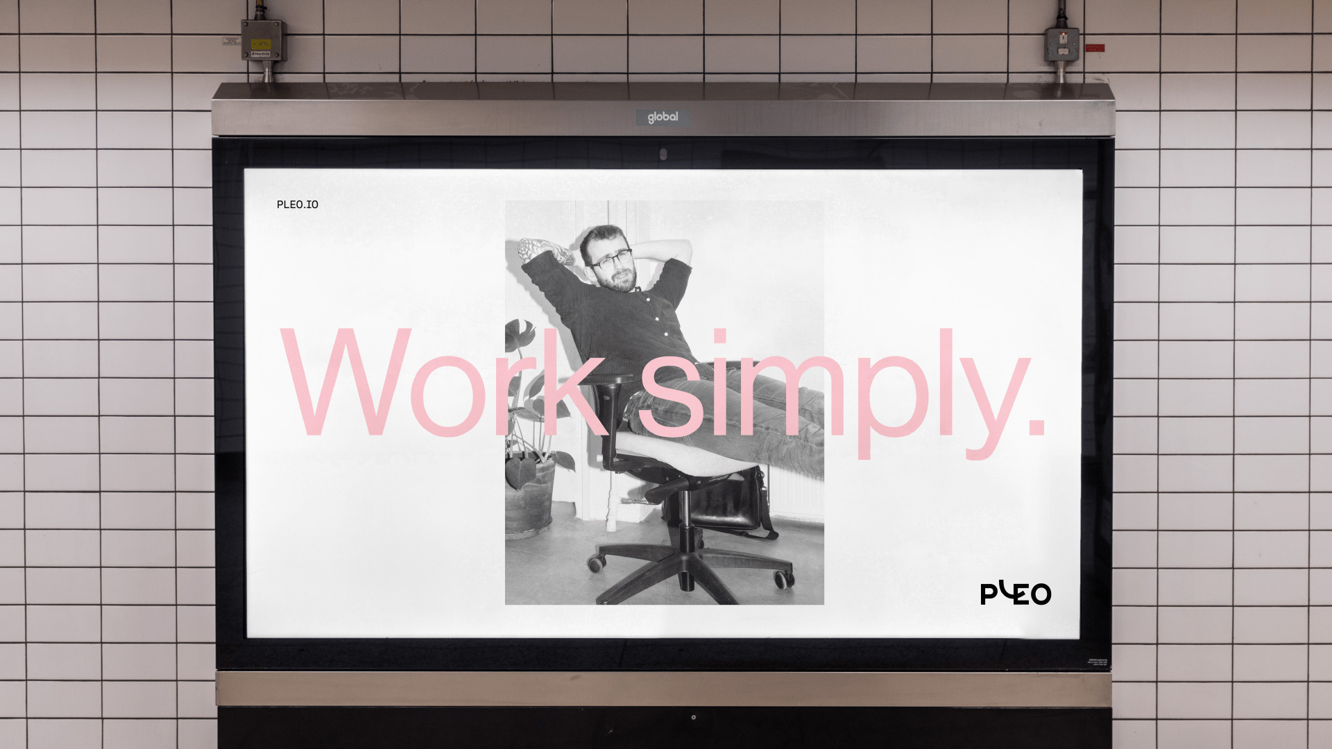
The applications take a slightly strange turn into too-cool-for-school territory, with flash-heavy photography that makes everyone look like they are at a frat party, a thin sans serif in big font sizes approach, and layouts that are designed to look un-designed. It looks cool but it feels somewhat misplaced as an identity for expense management. Maybe the goal is to make expense management look hip in which case, sure, bring out the kegs.
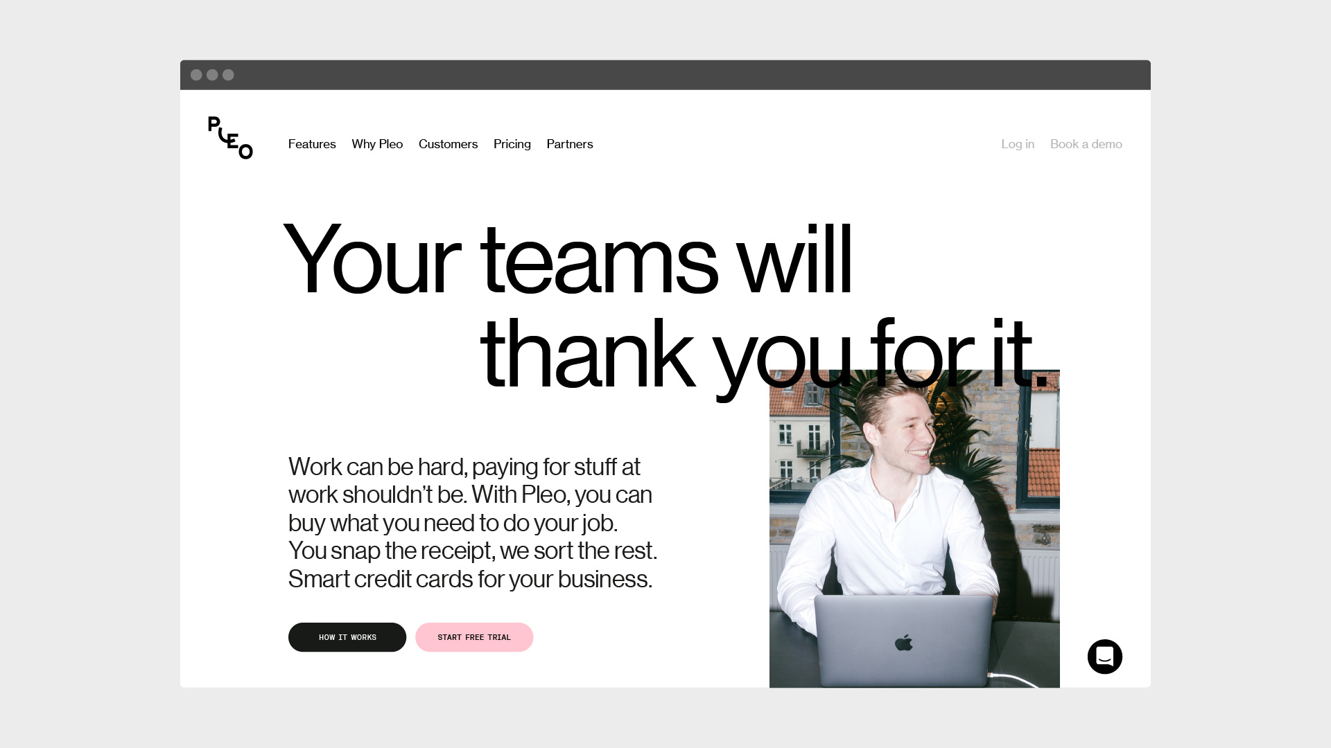
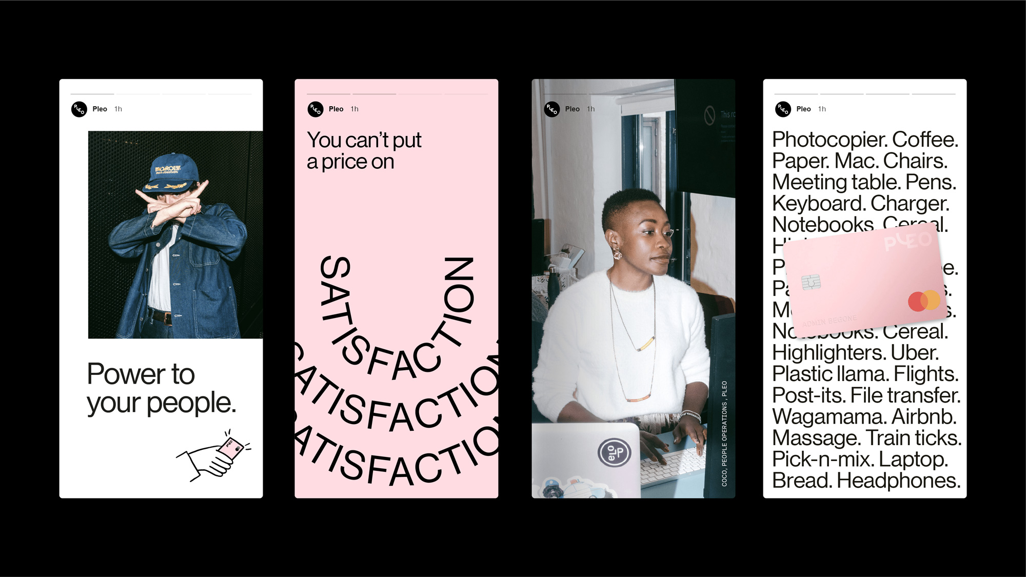

Overall, the identity definitely conveys the idea that Pleo is way cooler than expense reports and expense management the old-fashioned way or even through some other software. It positions Pleo almost more as a lifestyle brand than an accounting service and that will most likely be beneficial in the long run as the decision to adopt its service can start to be emotion-driven as much as it is logistics-driven.
 each year since publication began in 2006

 Новости Союза дизайнеров
Все о дизайне в Санкт-Петербурге.
Новости Союза дизайнеров
Все о дизайне в Санкт-Петербурге.