Обзор лучших ресурсов по разработке бренда, разработке упаковки
contact us | ok@ohmycode.ru
contact us | ok@ohmycode.ru
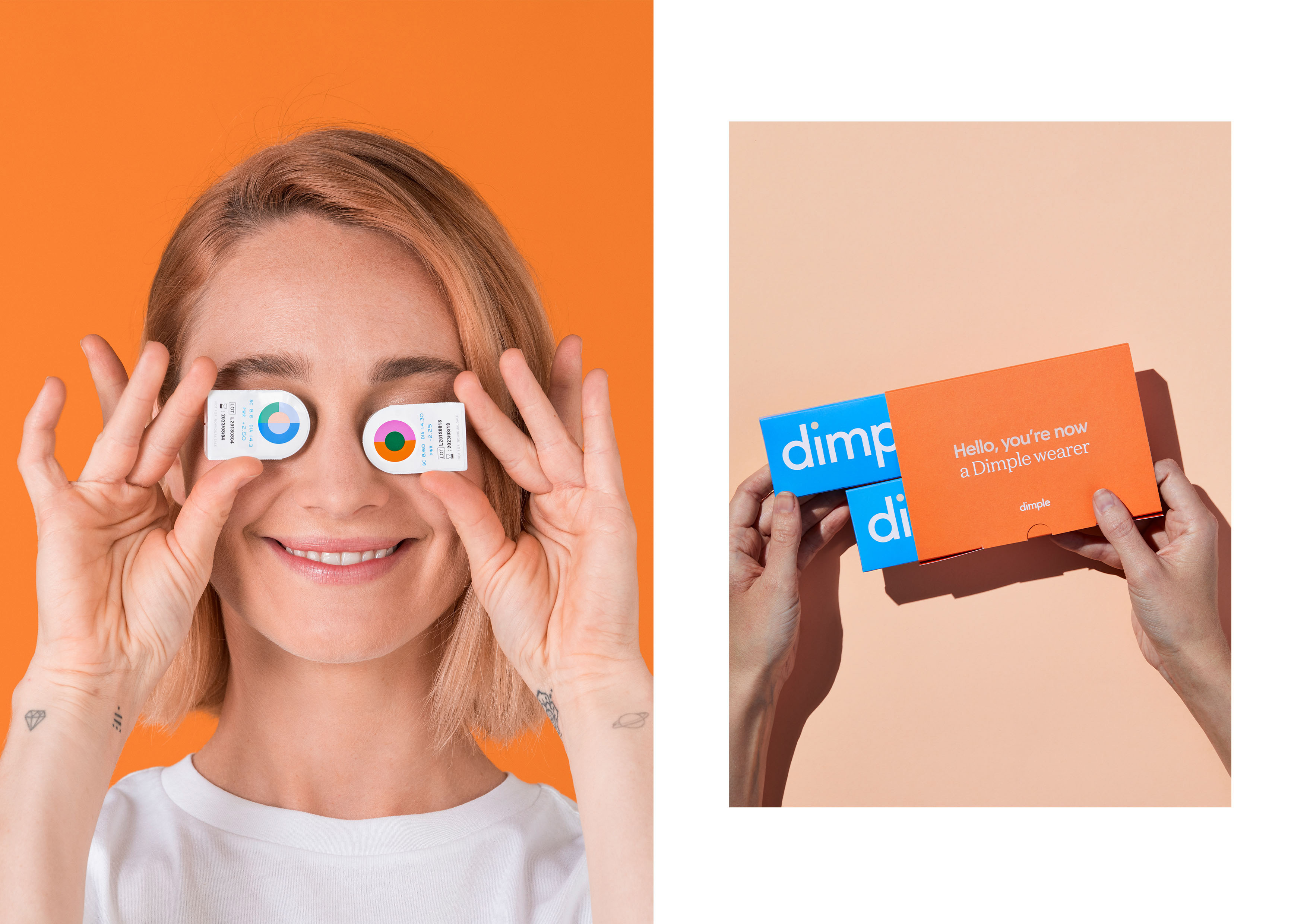
Established in 2018 and launched earlier this year, Dimple is a new daily disposable contact lens subscription service in Australia. Looking to stand apart from the four manufacturers that control 97% of the contact lens market in Australia, Dimple is a direct-to-consumer brand and focuses on the millennial market. As a bonus, $1 from every monthly order goes to Guide Dogs Australia. The identity and packaging for Dimple has been designed by Sydney, Australia-based Universal Favourite.
Although there isn’t much to the logo at a quick glance, there is actually a lot going on here with the subtle angles in various places, particularly the “l” and the “e”. They almost look like mistakes and I’m not sure how much they are needed but they certainly add a touch of quirkiness. Other than that, it’s a fairly innocuous sans serif with a colorful tittle. Update: The logo is typeset in Radim Pesko’s Fugue Regular.
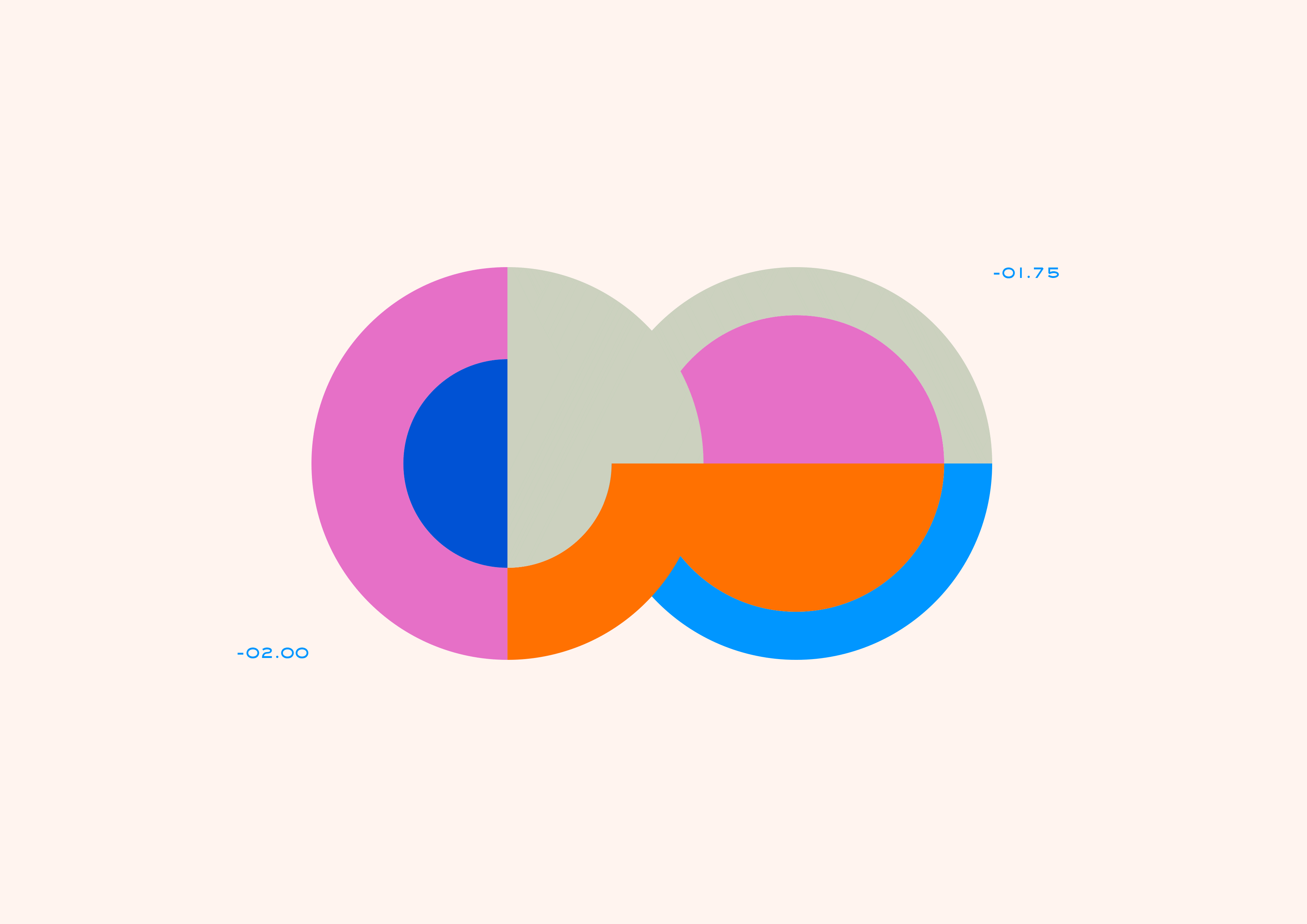
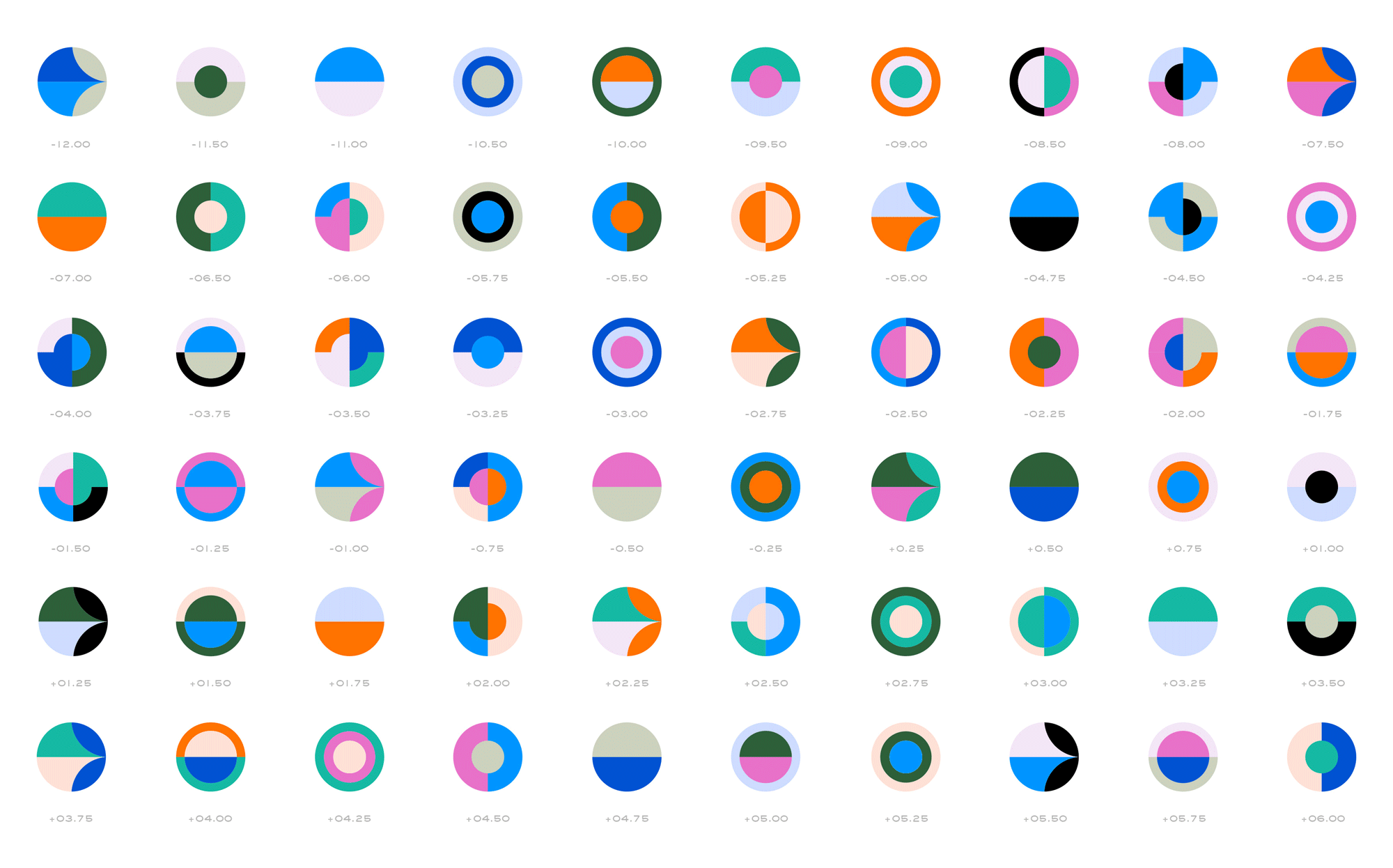
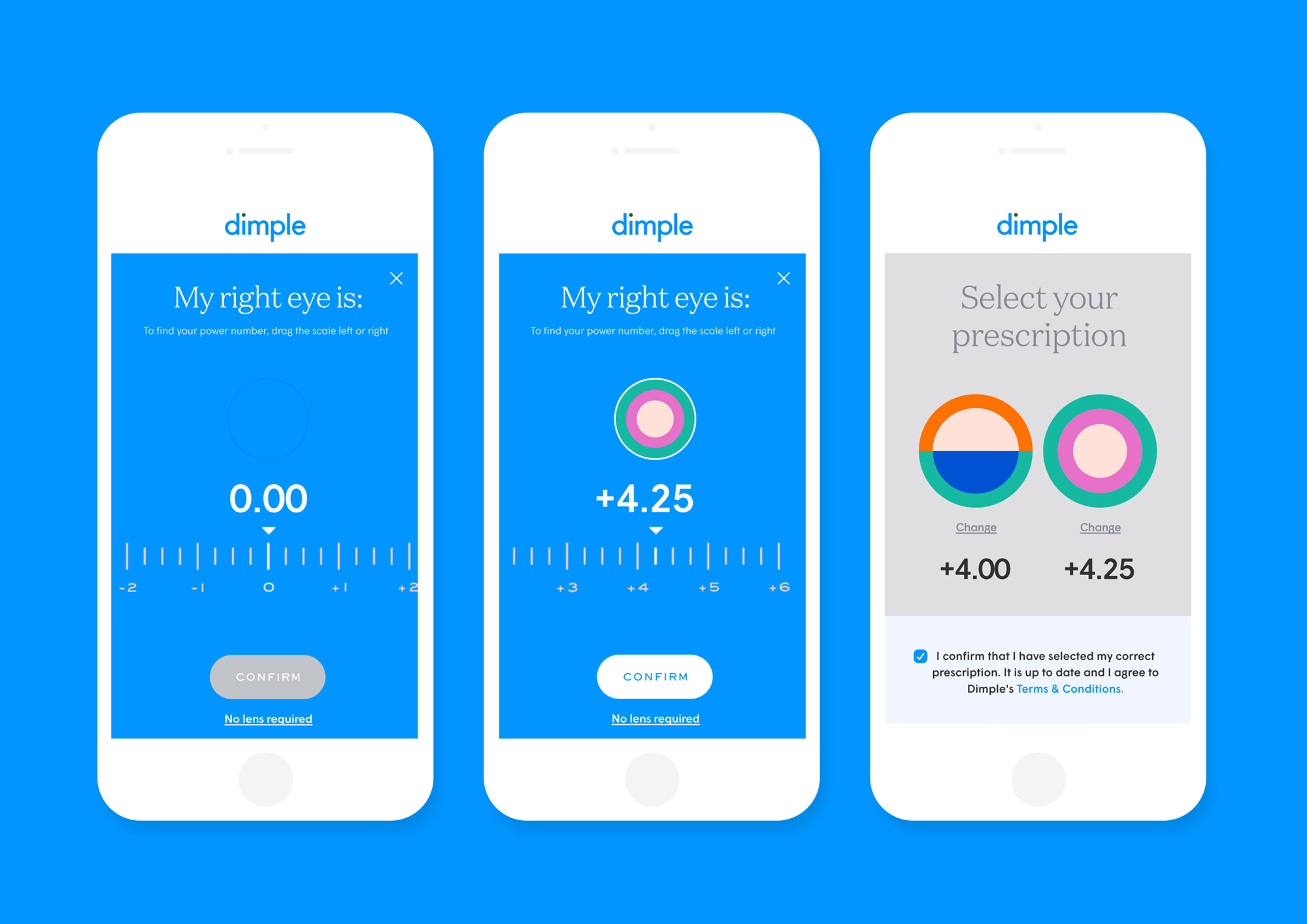
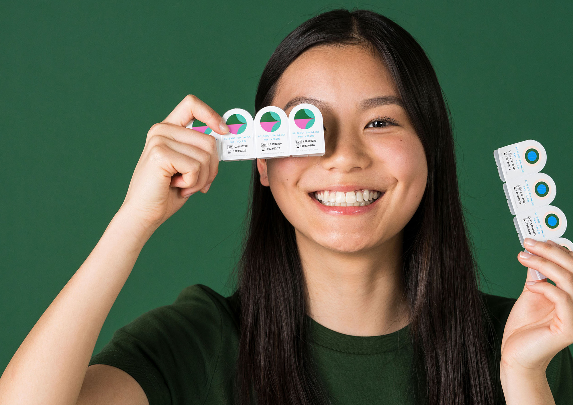
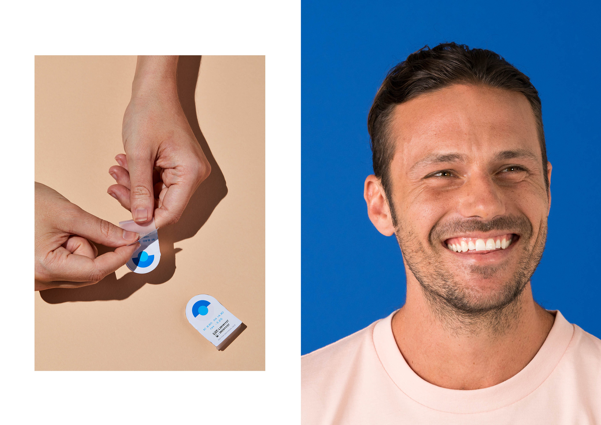
The identity we created comes from the fact that, for the most part, everyone’s left and right eye prescription is different. We created an illustrative suite of 60 colourful, complementary circles that correspond to each power number (from -12.00 to +6.00) and combine to show the vast number of combinations of individual prescriptions.
And the brand system doesn’t just look beautiful, but answers a huge flaw in existing contact lens blister packs. By creating these custom patterns (IDs) for each individual power number and displaying them boldly on each blister, it’s significantly easier for users to identify the pack that’s specific to each eye… especially when they don’t have their contacts in.
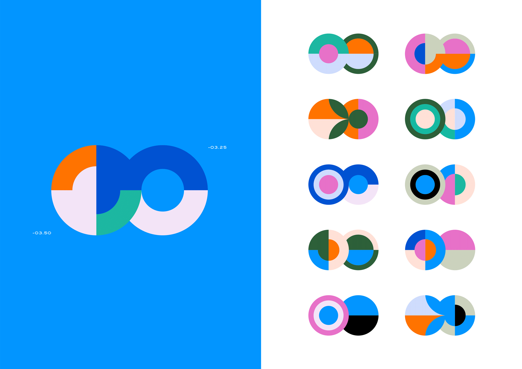
The real hero in this identity is the icon system that assigns a graphic representation for each prescription power increase. Although it might be tempting to try to derive meaning from each configuration or be sarcastic by saying “Of course, two half circles in lavender and orange mean +01.75” the system is about providing each consumer two distinct visuals for them to associate with their left and right eyes and I can empathize: Once outside their packaging, I have to write with a black marker “L” or “R” on the “blister” packs of my contacts because I can never remember which one is my fucked up eye that needs the -2.75 power. (It’s my left, btw.) Aside from being helpful, the combination of power IDs look great and it’s quite amazing that Dimple committed to printing them on the blisters, which I am sure was the path less traveled in the industry.
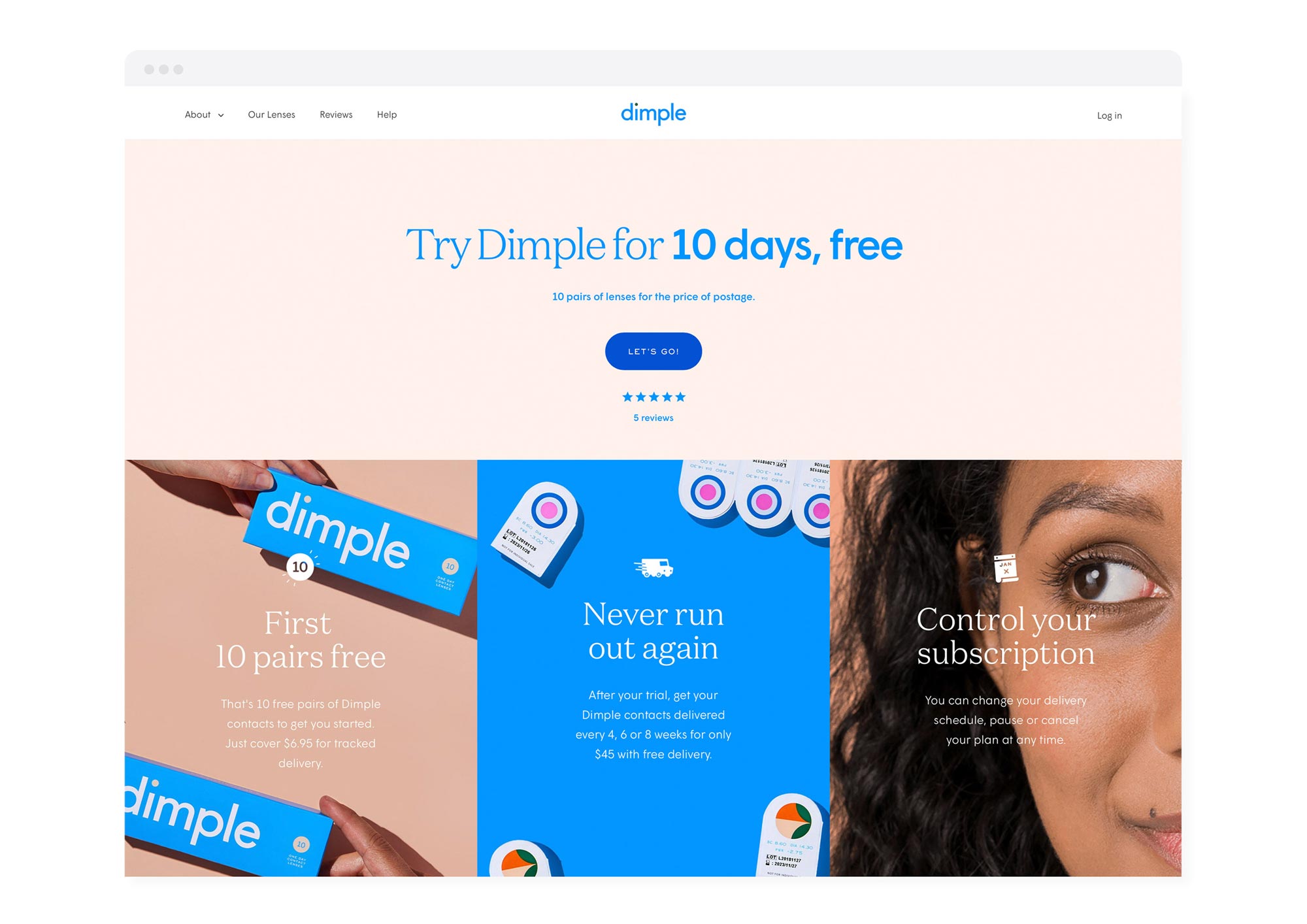
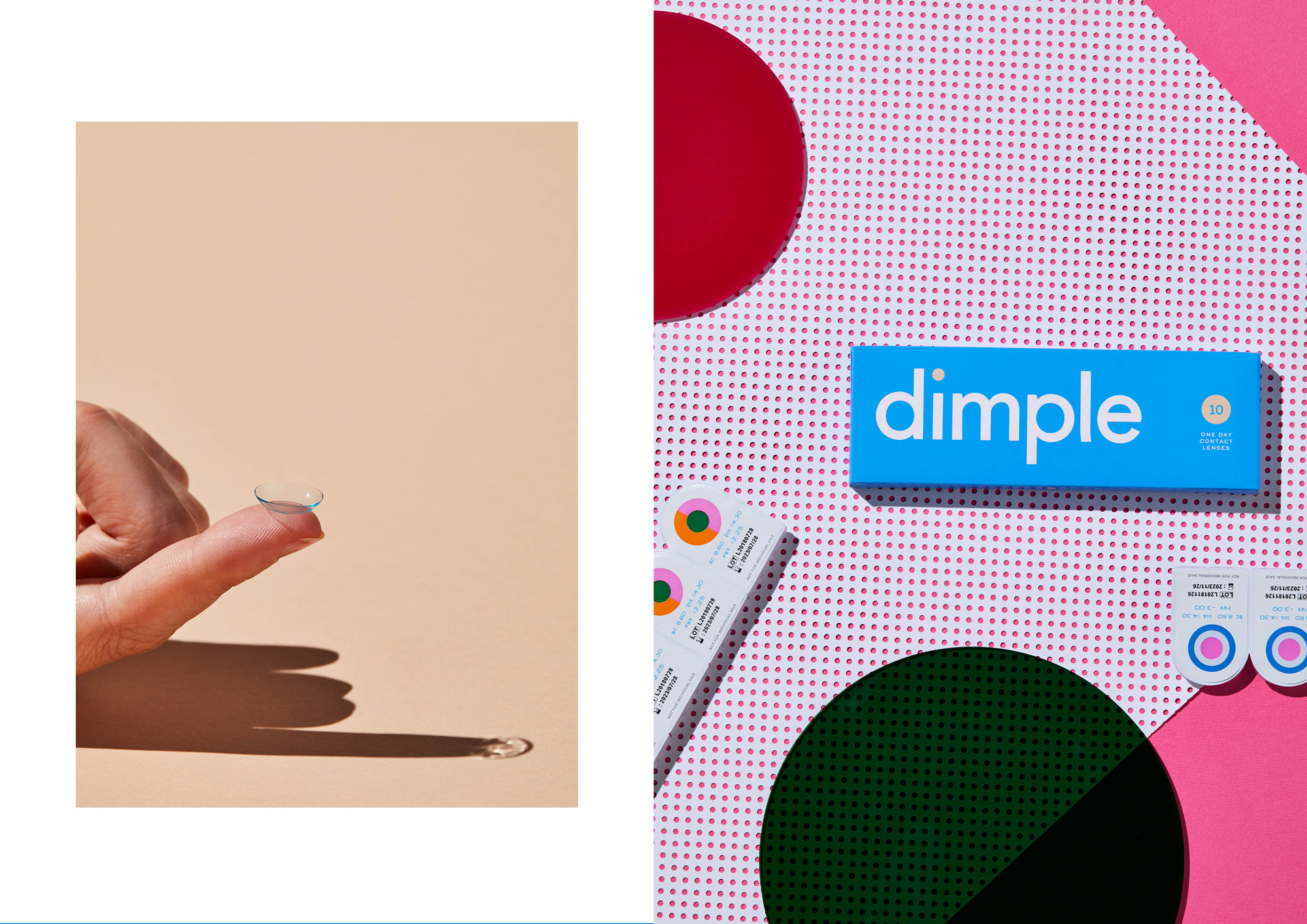
Packaging was a hugely important component to this task. As a direct-to-consumer company, we wanted the unboxing experience to be an utterly unexpected delight. From the blister packs coated in our custom pattern IDs to the boxes, mailers, sleeves and monthly information cards, we designed the entire packaging suite with our millennial market at the forefront of our minds.
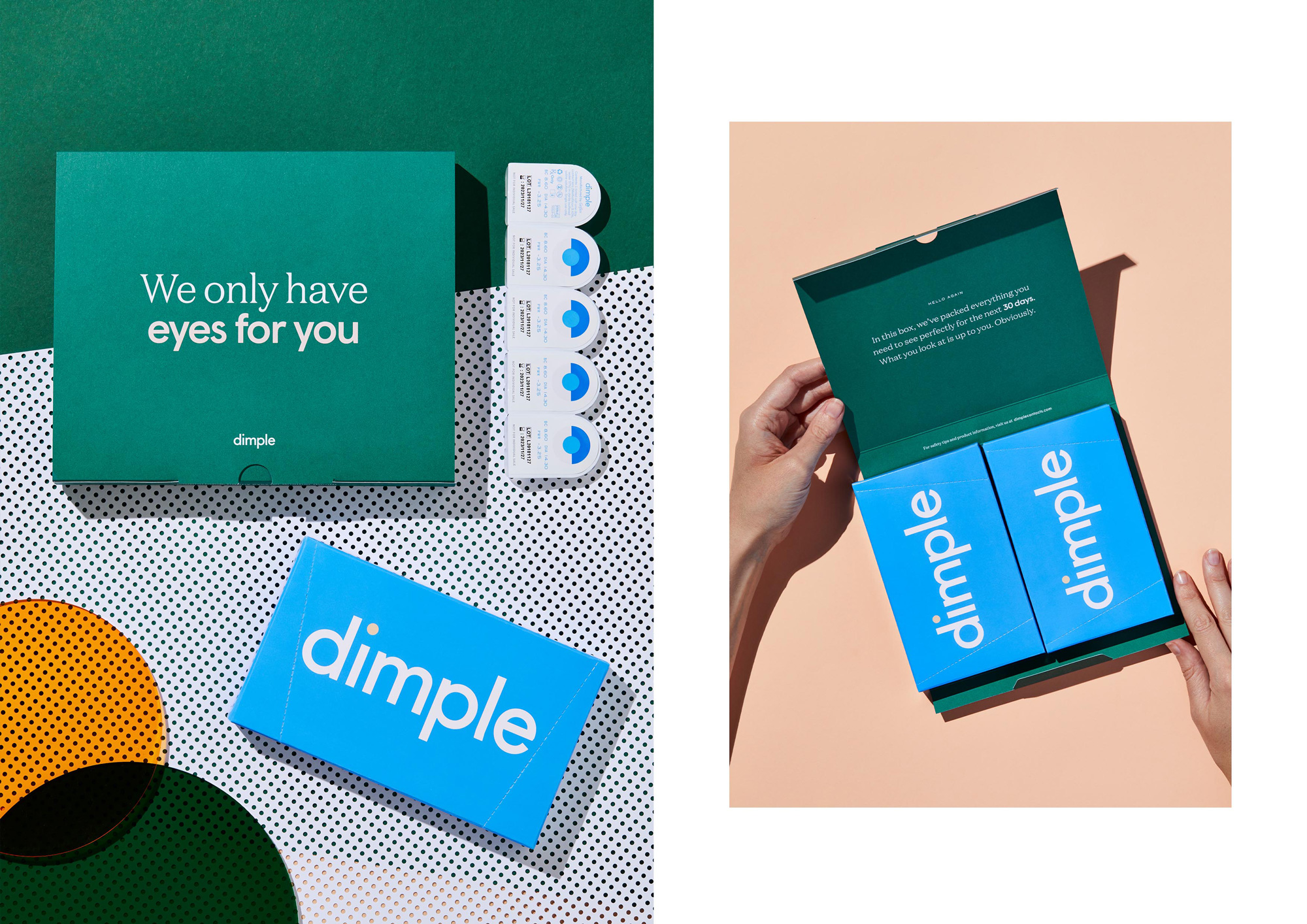
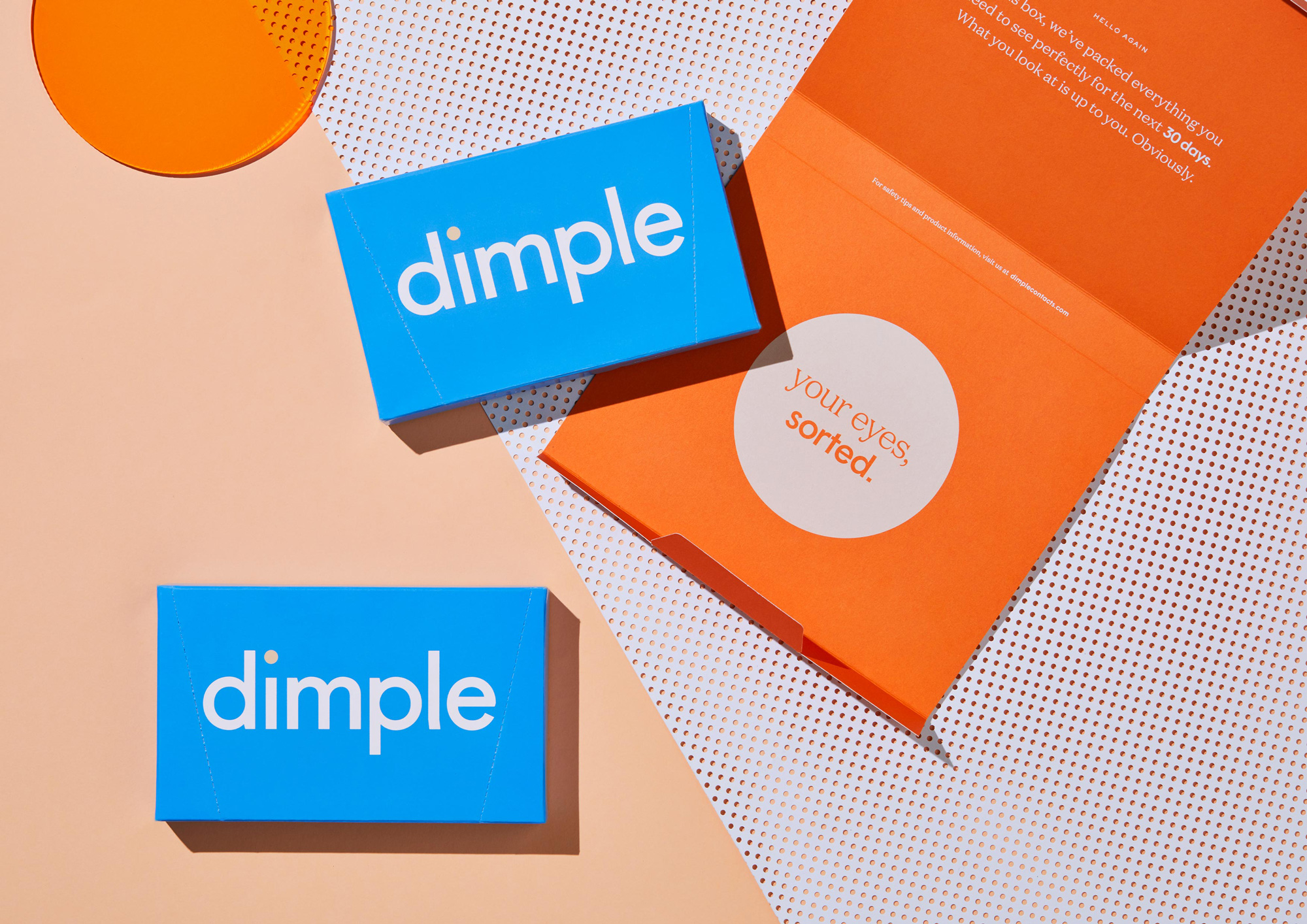
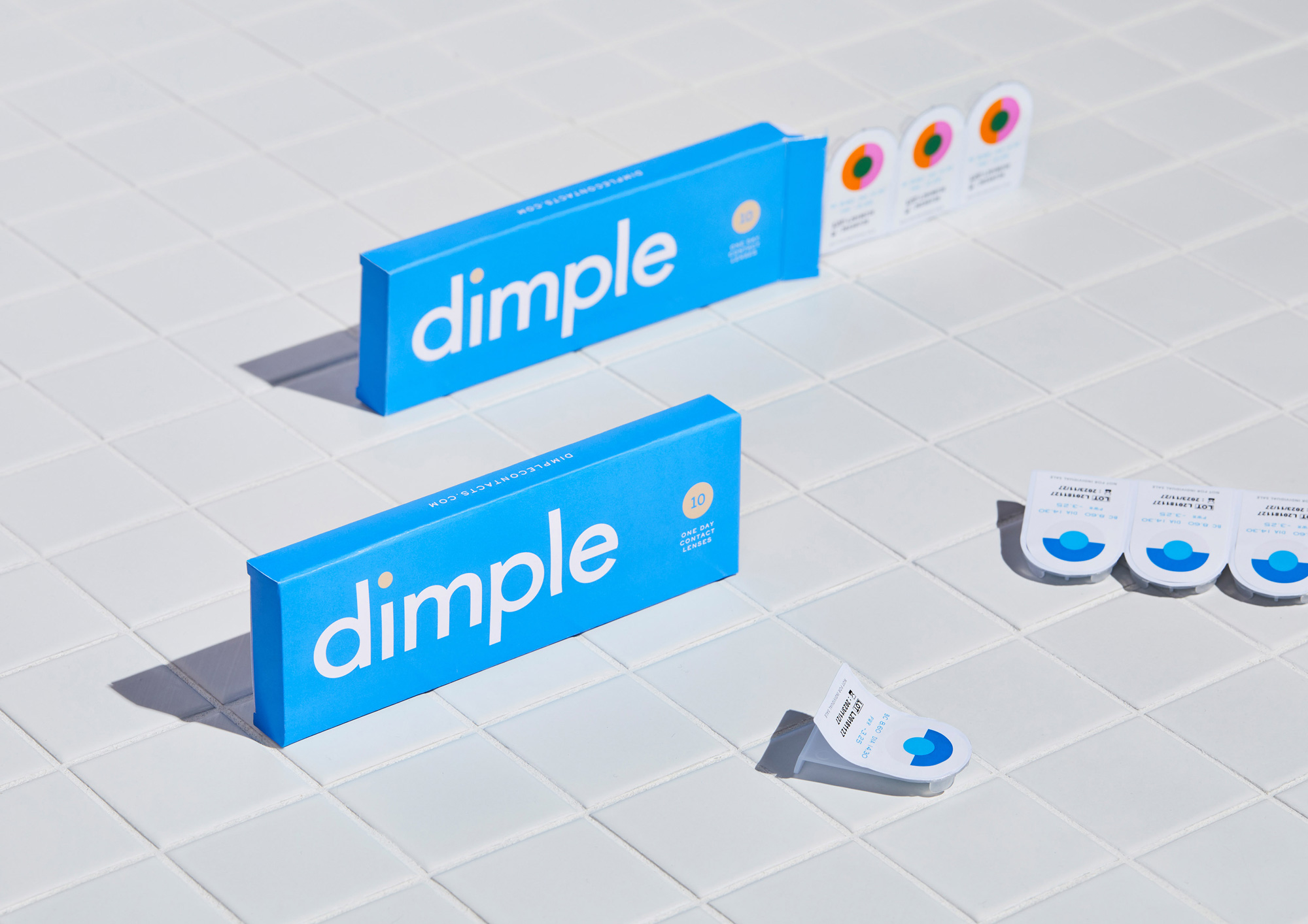

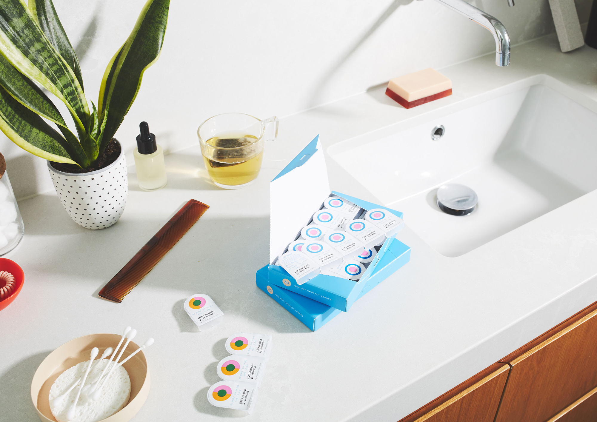
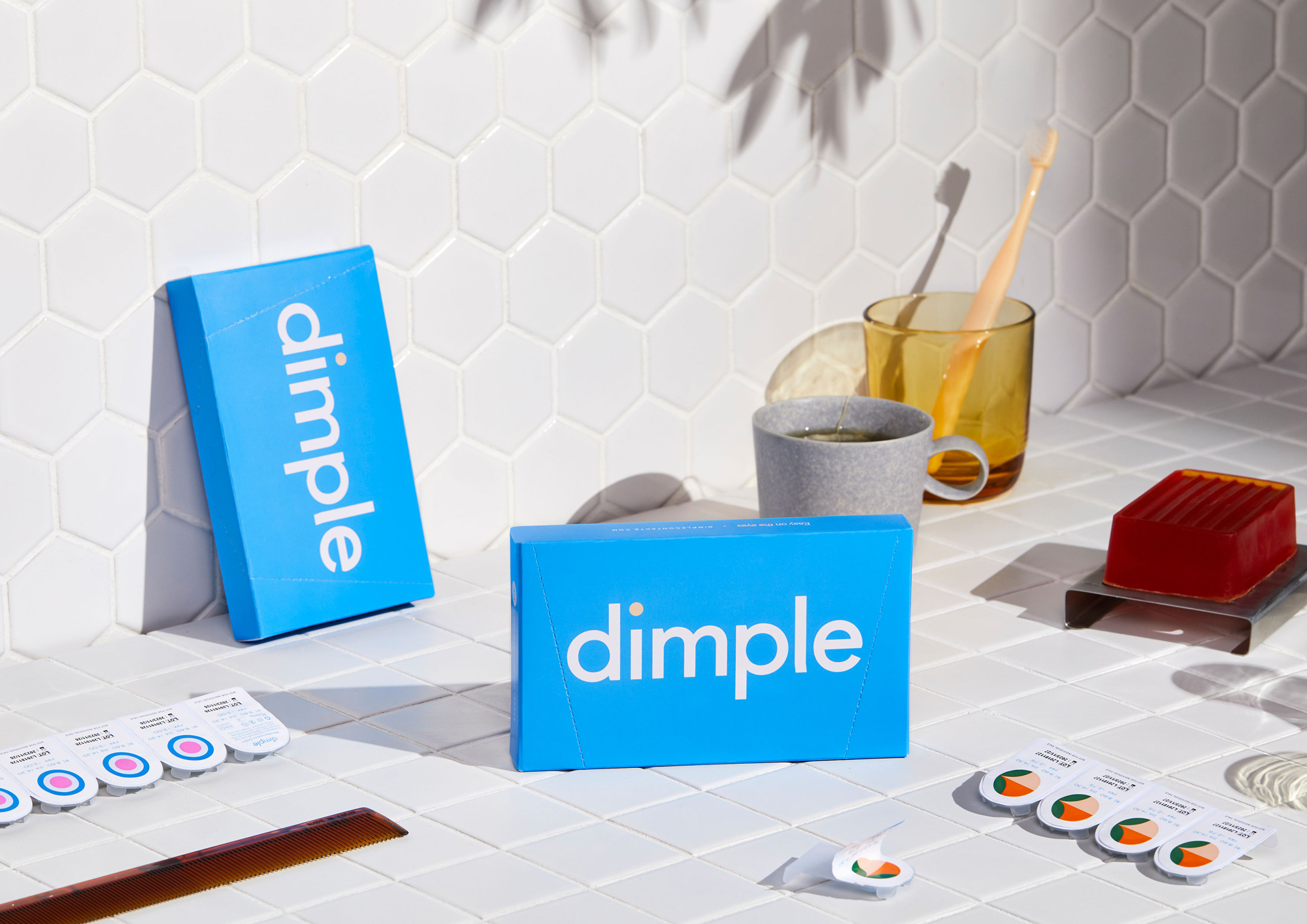
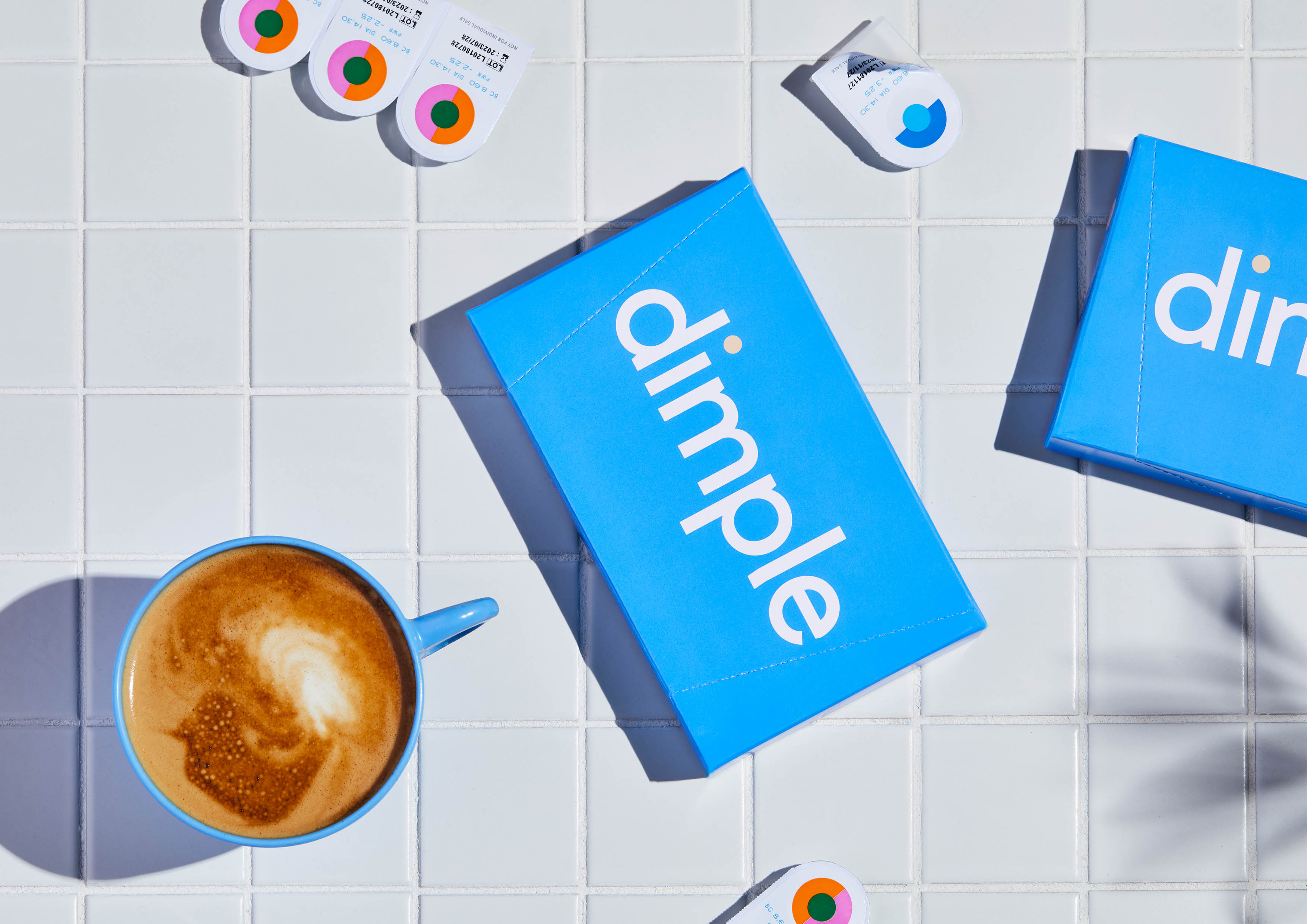
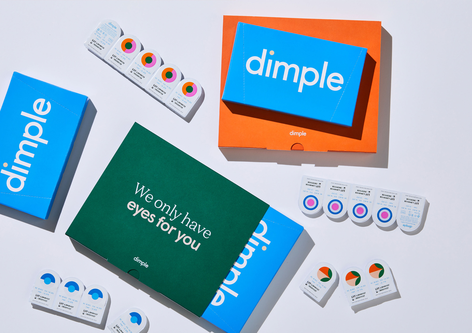
The packaging is quite nice, with a strong set of colors for each “layer” of packaging, starting with green on the outside, orange holding the two blue boxes, and culminating in bright white blister packs with the colorful ID accents. It’s a really nice set of gradual steps and the design is kept minimal and attractive. The only thing I question, on the packaging and website in general, is the combination of the light serif and medium weight sans serif… I sort of like it, but maybe it needed one more degree of separation, perhaps one bolder weight on the sans. Nonetheless, it’s a minor quibble in an otherwise nice identity.
The art direction we took for the launch centres on a vibrant community of contact lens wearers and packs a highly visual punch. Shot by Jonathan May, it celebrates the individual quirks of each member of the community and the freedom to have fun that contact lenses provide them.
By partnering with the Benito Martin and Jessica Johnson dream team for our product shoot and Lyndon Foss for our lifestyle shoot, we built a comprehensive and flexible suite of brand assets that could be used across web, communications, social and advertising in the year following the launch.
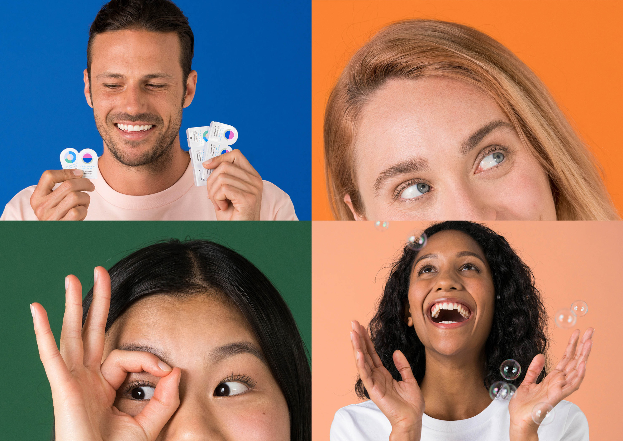
While the identity and packaging are simply strong, attractive designs that don’t overly pander to the millennial crowd, the lifestyle photography and promo video go a little more heavy to the deep end of that spectrum which, to an older crowd, like me, can be off-putting but, hey, you gotta play to your core audience. My only real question to millennials, after seeing the very final scene of the video, is are you really always dancing to everything? But I digress, overall, this is a strong entry into the market, with an identity and packaging that feel clinical enough to shove the product into your eyeball but fun enough to take a photo with it for your Insta fam.

 Новости Союза дизайнеров
Все о дизайне в Санкт-Петербурге.
Новости Союза дизайнеров
Все о дизайне в Санкт-Петербурге.