Обзор лучших ресурсов по разработке бренда, разработке упаковки
contact us | ok@ohmycode.ru
contact us | ok@ohmycode.ru
Established in 1965 by influential economist and philosopher, E. F. Schumacher, Practical Action is an international development organization that helps people in poverty find solutions to some of the world’s toughest problems. A registered charity in the UK, Practical Action works with communities in Africa, Asia, and Latin America to develop “ingenious, lasting, and locally owned solutions” for agriculture, water and waste management, climate resilience and clean energy. Whether it’s helping improve schools for children in remote areas of Peru or helping refugees in Kenya access finance, training, and technology, the organization implements ideas so that people in poverty can change their world. Recently, Practical Action introduced a new identity designed by London, UK-based NB.
The aim was to unite the people all around the world, from all walks of life, in all sorts of roles, with a unifying idea which would result in a more connected and confident organisation. They have a lot of important things to say, stories to tell and causes to campaign for so we wanted to encourage clarity and brevity which is sometimes tricky to realise in the charity sector.
Practical Action’s mission in a nutshell is Small Change, Big Difference. We used two fonts Druk and Geller as visual counterparts to create a succinct and sustainable messaging platform based on this idea of small to big.
We gave them the tools to write in a more structured yet natural way, then we worked hard to ensure the messages they write will translate across the globe in many different languages. If the identity looks typographic that’s because it’s all about helping to communicate and amplify their important messages.
we didn’t want to impose a visual identity, rather that it should form itself around the things we needed it to do. Our thinking and our designs evolved as we delved further into the project and got to know our client more intimately. The result, we believe, is confidence.
The old logo wasn’t particularly great but it wasn’t bad either. It had a well-meaning icon of two people working together and a rugged texture to perhaps allude to the remote areas they work in. The color combination wasn’t very pleasant and the lock-up between type and icon was a little disproportionate. To its credit, it did quickly communicate that, one way or another, this was about people, which would be the main drawback of the new logo where, just by looking at it, it would be impossible to figure out what it’s about. However, in its own practicality, it establishes a strong visual and verbal premise for how the whole identity communicates and it’s powerfully effective. Execution-wise, the logo pairs Geller Headline with Druk Condensed in a classic serif-sans-serif combo that emphasizes both each word as its own message — “Practical” and “Action” each trigger unique associations — and the two words together as the modus operandi of the organization. It’s not the most complicated of logos but the contrast, sizing, alignment, and spacing of the two words is very well done and, well, practical.
The shorthand version… I get what they were going for in creating that contrast of small and big to keep highlighting the organization’s belief of “the power of small to change the big picture” as well as to maintain the size relationship from the full logo but the result looks like two alphabet blocks that randomly came together. It’s definitely a hard logo to reduce to a square/circle and maybe others here do like it. Not a dealbreaker for me though when it comes to the rest of the identity.
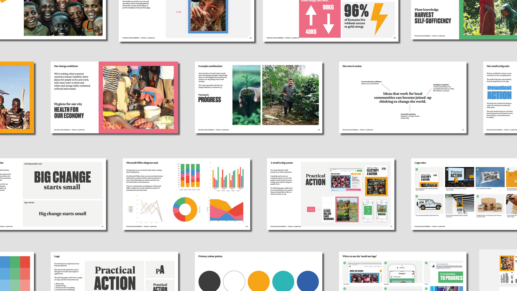
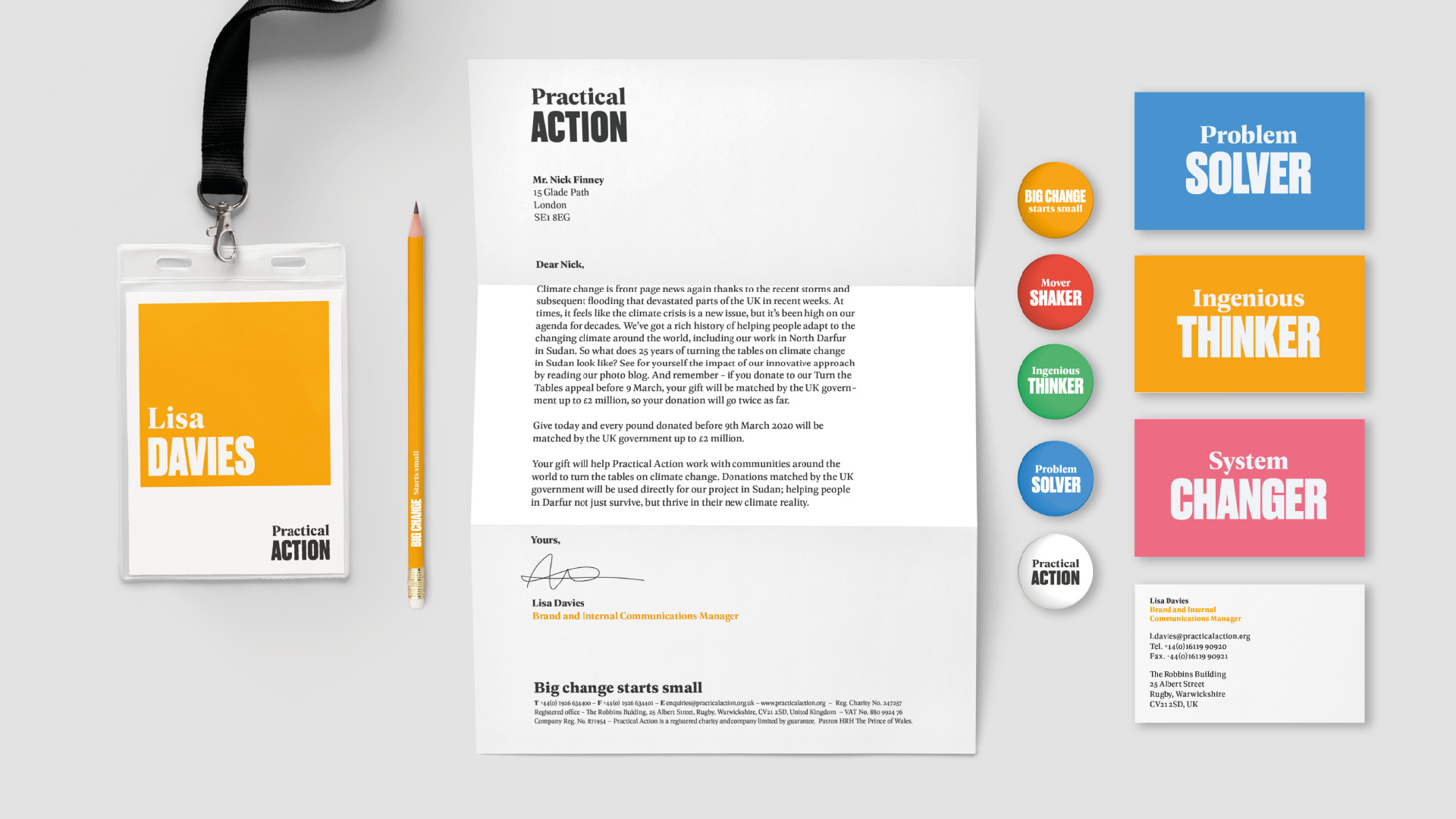
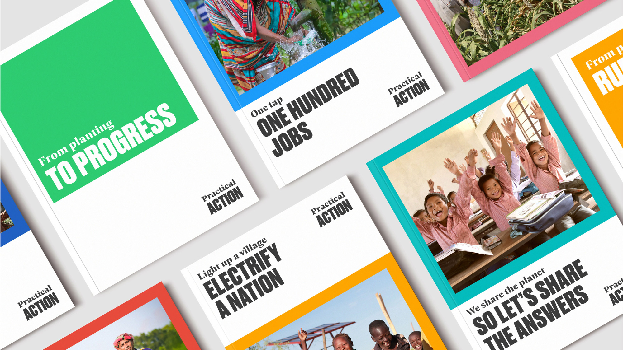

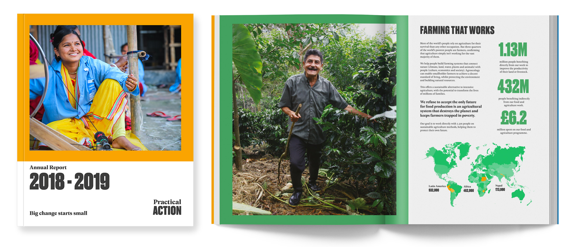
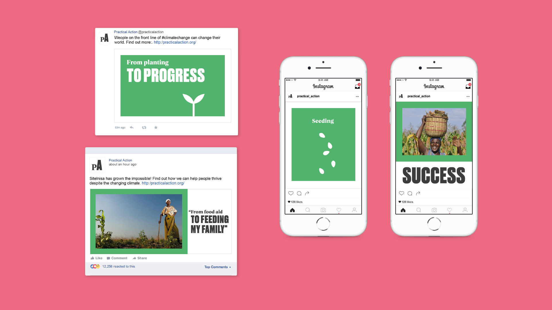
There aren’t many applications shown but the simple visual and verbal premise of the identity is amazingly effective, efficient, and evocative. The basic treatment of the logo — the classic serif-sans-serif combo — is repeated endlessly in powerful, one-two-punch headlines where the serif starts one part of the conversation and the sans serif ends it. The approach is particularly impressive in the video below, capturing so well what the organization does. Part of what I really like about it is how it blurs the line between logo and messaging, giving equal weight (and appearance) to both things so a phrase like “Ordinary People”, set in the same design, becomes as important as “Practical Action”. Design-wise, the applications are bold and colorful with a fairly straightforward layout system that easily accommodates photography from the field or just typography and everything looks, again, well, practical — nothing more, nothing less, just what’s needed.
Overall, this is a simple yet powerful identity that transfers responsibility to the messaging and copywriting to convey the organization’s mission and efforts and given how much Practical Action does — and how much of it is so good — it has an endless source of material to work from and a, well, practical identity to keep doing it well for years to come.
 each year since publication began in 2006

 Новости Союза дизайнеров
Все о дизайне в Санкт-Петербурге.
Новости Союза дизайнеров
Все о дизайне в Санкт-Петербурге.