Обзор лучших ресурсов по разработке бренда, разработке упаковки
contact us | ok@ohmycode.ru
contact us | ok@ohmycode.ru
First brewed in 1904, Carlsberg, a pilsner, is the flagship brand of Carlsberg Group (established in 1847 in Copenhagen, Denmark). Dubbed “Probably the best beer in the world” (as its tagline) since 1973, Carlsberg was created by Carl Jacobsen, son of Carlsberg Group’s founder J.C. Jacobsen and is now distributed in more than 150 markets. This month, Carlsberg introduced a new identity designed by Bristol, UK-based Taxi Studio in collaboration with Liverpool , UK-based Tom Lane.
We’ve collaborated with Carlsberg on a major global rebrand, unifying its diverse markets with a simple yet versatile identity system that champions the principles of great Danish design…
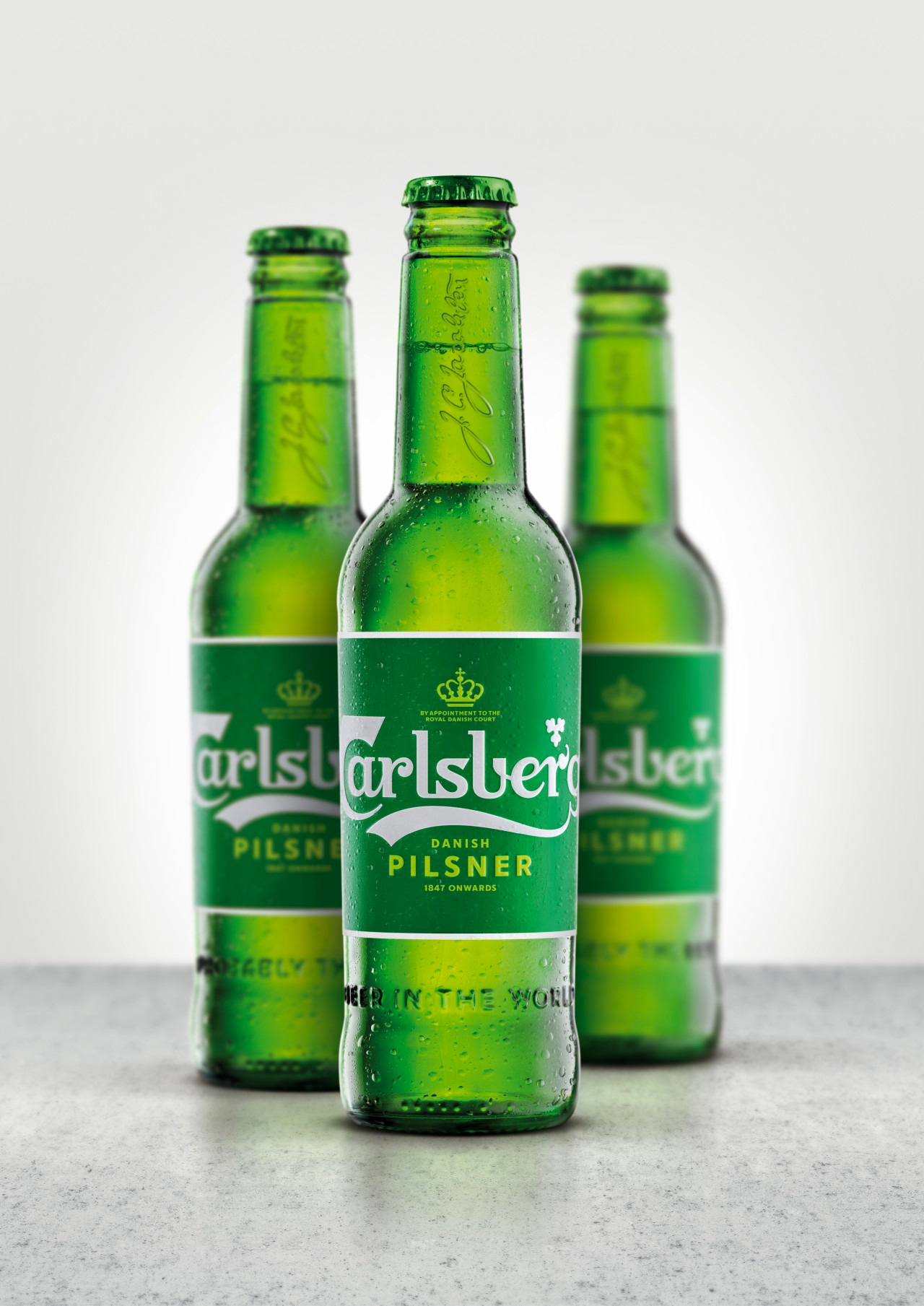
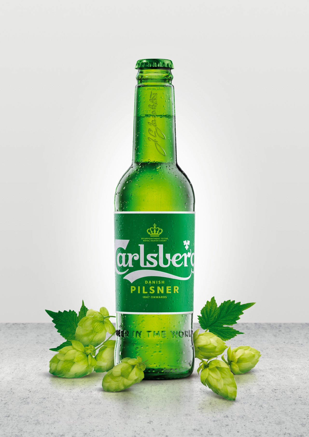
Following extensive research into the brand’s 171-year heritage, Carlsberg’s famous brand elements have been carefully re-crafted for the first time in several years, striking the perfect balance between form and function.
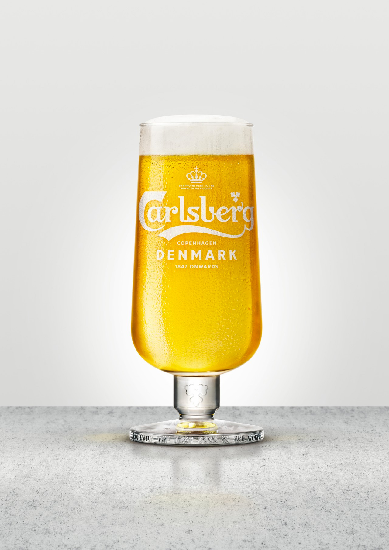
These assets combine to form a coherent master brand-led identity system that works across packaging, promotions and POS materials for all of Carlsberg’s global variants. The core elements include the logo, hop leaf, crown and brand typeface, as well as the signature of Carlsberg founder JC Jacobsen.
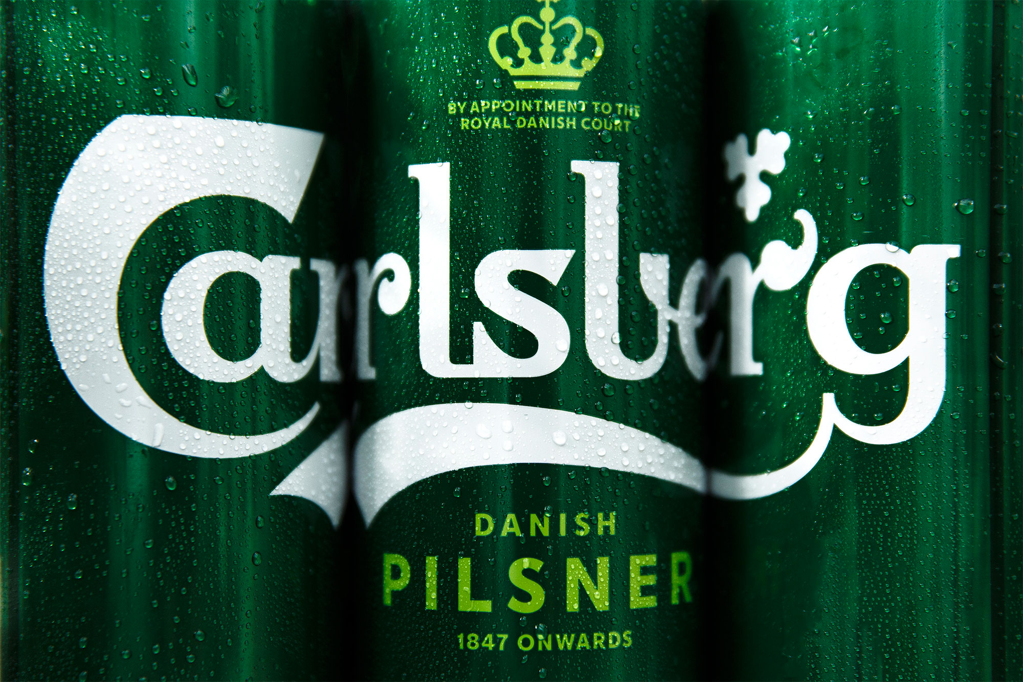
The Carlsberg logo has been basically the same since its inception, evolving with over 100 years of technology innovations and sometimes suffering with jumps in reproduction techniques, leading to what we all most recently know today, which is an extremely recognizable mark but one that, when looked at closely, isn’t the most finessed piece of lettering. The new logo maintains everything about the original but gives it a much needed trim, thinning the letters and accentuating some of its quirks, like the leafy “r” and totally whack “C” (which we’ve come to accept but does not take away from the fact that it is certifiably whack).
There are a few great evolutions in this logo, like the placement of the hop leaf that is now more naturally nestled above the notch of the “r” or the way the curve unifies the “ber” part, flowing nicely from one letter to the next. The only awkward moment is the connection in the “ls” pair which feels very strict and forced in comparison to the rest of the letters but it’s a small quibble in what’s otherwise a great evolution that will allow the logo to survive (and thrive) for another 100 years.
The hop leaf and signature evolutions are pretty nice too. Nothing overly exciting but certainly an improvement.
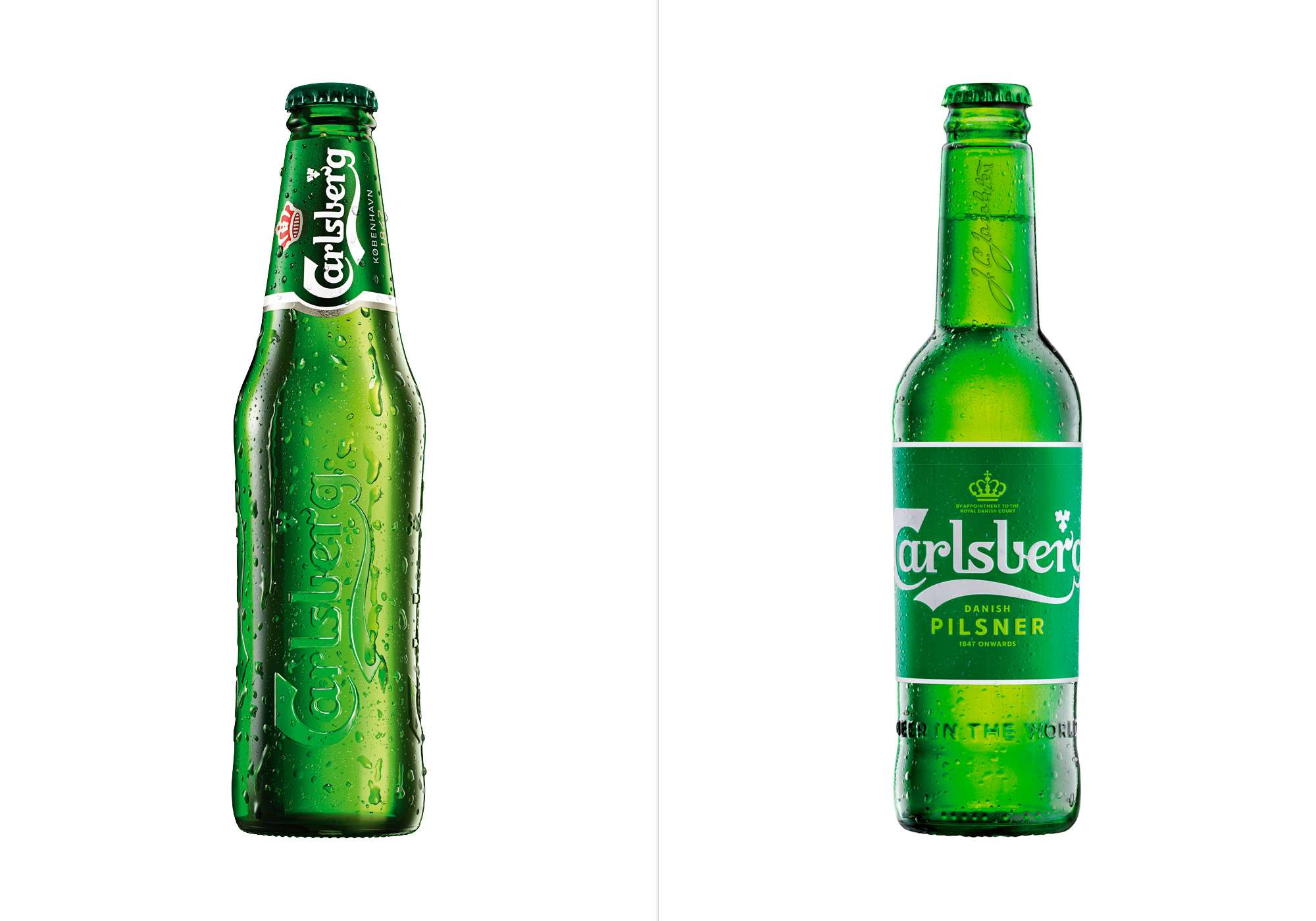
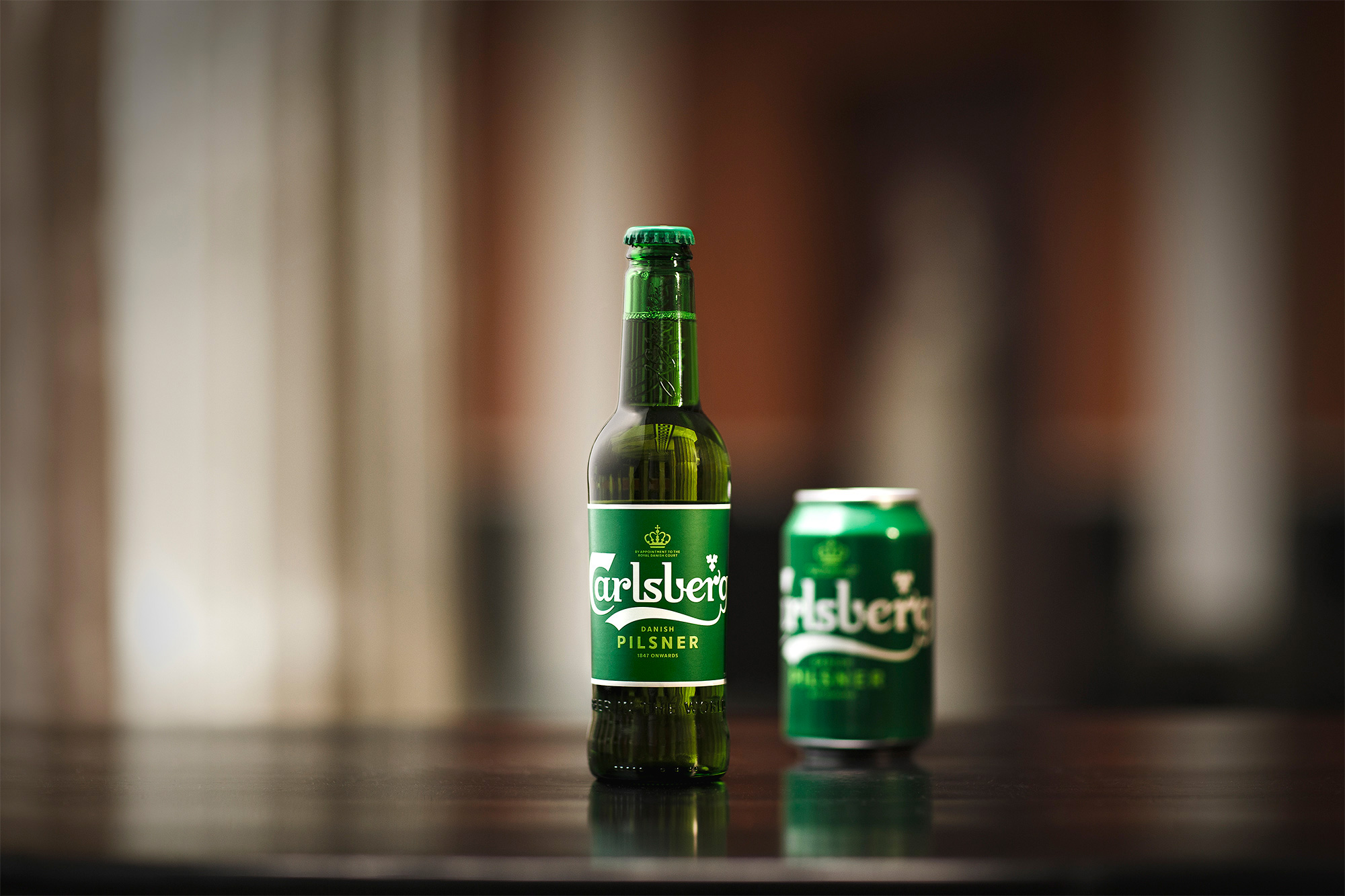
Locking down a “before” shot of the bottle was a little difficult as I think there are a number of bottle designs spread across different markets — this one came from the Denmark website, so I decided to use it. I won’t spend a lot of time talking about the old one as the bottle might be different to other people but this particular one was nice in its use of the physical bottle to reproduce the logo with a small label in the neck. The new bottle, while crisper-looking because of the logo, feels somewhat cheap with the new label. I don’t know if it’s the white stroke or simply the fact that it’s a generic paper label in contrast to some good, old-fashioned glasswork as in the previous bottle that makes this less premium or interesting. Again, the design looks nice but I think so much work went into the logo that that same attention to detail doesn’t quite come across here.
Carlsberg today announced a series of ground-breaking innovations including its new Snap Pack, which is set to reduce plastic waste globally by more than 1200 tonnes a year - the equivalent to 60 million plastic bags.
The Snap Pack replaces the plastic wrapping used around Carlsberg’s six packs with a pioneering technology that glues its cans together. A world first for the beer industry, it will reduce the amount of plastic used in traditional multi-packs by up to 76%.
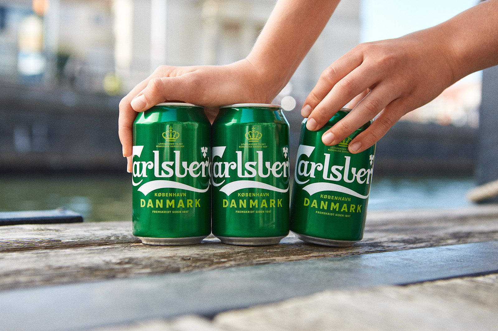
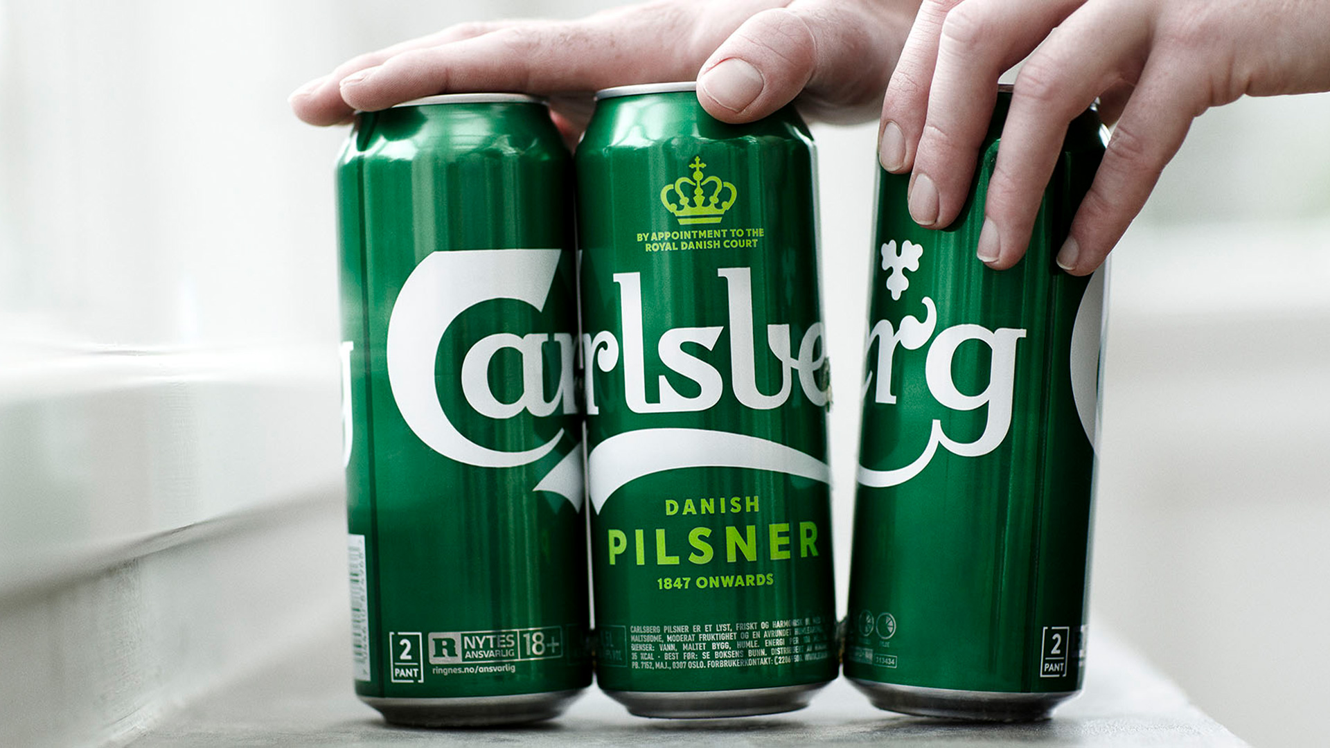
The cans look way cooler and better than the bottles. The size of the logo on them makes for a much more impactful and memorable product. And big props for the innovation on the glue to keep the six-pack together. I’m surprised they didn’t make a video of it. (I looked.) I bet it would be immensely satisfying to see the cans snap away from each other.
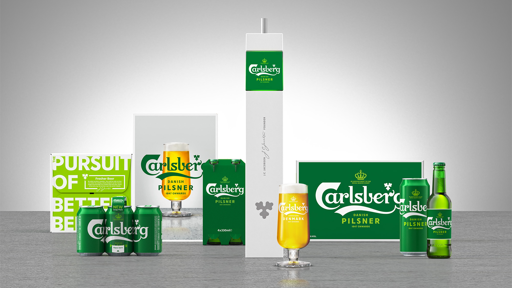
Overall, it’s a solid evolution that maintains the Carlsberg-ness inherent in the logo but positions the system as more flexible and accessible across all markets.
Thanks to W. Liebrecht Fick for the tip.

 Новости Союза дизайнеров
Все о дизайне в Санкт-Петербурге.
Новости Союза дизайнеров
Все о дизайне в Санкт-Петербурге.