Обзор лучших ресурсов по разработке бренда, разработке упаковки
contact us | ok@ohmycode.ru
contact us | ok@ohmycode.ru
Established in 1998, Saudi Telecom Company (stc) is a telecommunications company in Saudi Arabia providing cable, landline, mobile, internet services, and computer networks for residential and business customers. In official parlance, they offer a “variety of ICT solutions and digital services in several categories including telecommunication, IT, financial technology, digital media, cybersecurity, and other advanced digital solutions”. Last year, stc introduced a new identity designed by the Madrid, Spain, office of Interbrand.
In order to prepare the stc brand for the future while maintaining its authenticity, it was necessary to define a new, clear and meaningful vision.
For this reason, stc’s new purpose transcends the capabilities of a traditional telco operator and instead connects to people’s needs: “Creating and bringing greater dimension and richness to people’s personal and professional lives”. This is the ambition that will guide stc in internal and external processes, accompanying an evolution in their corporate culture that highlights drive, devotion and dynamism.
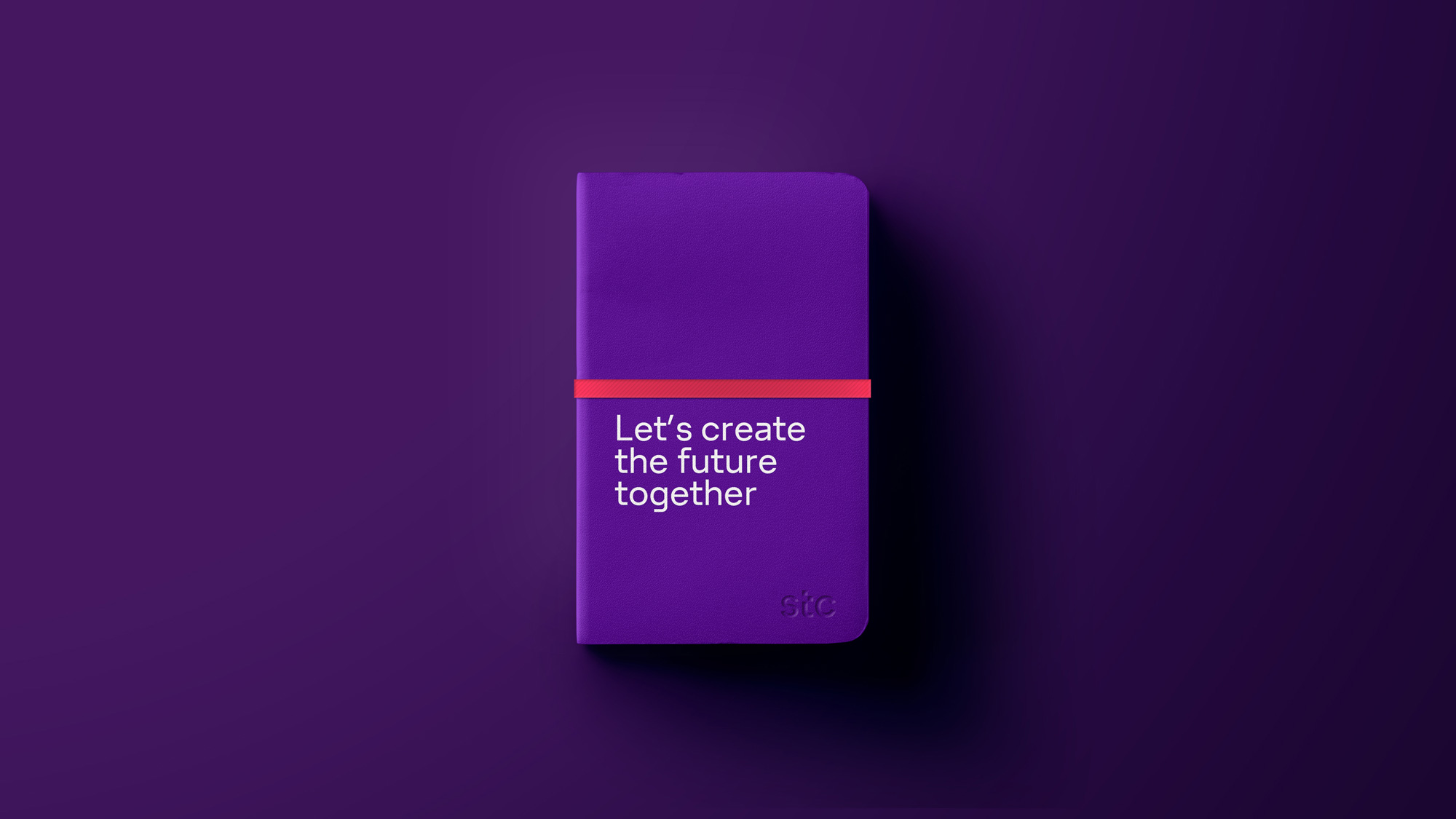
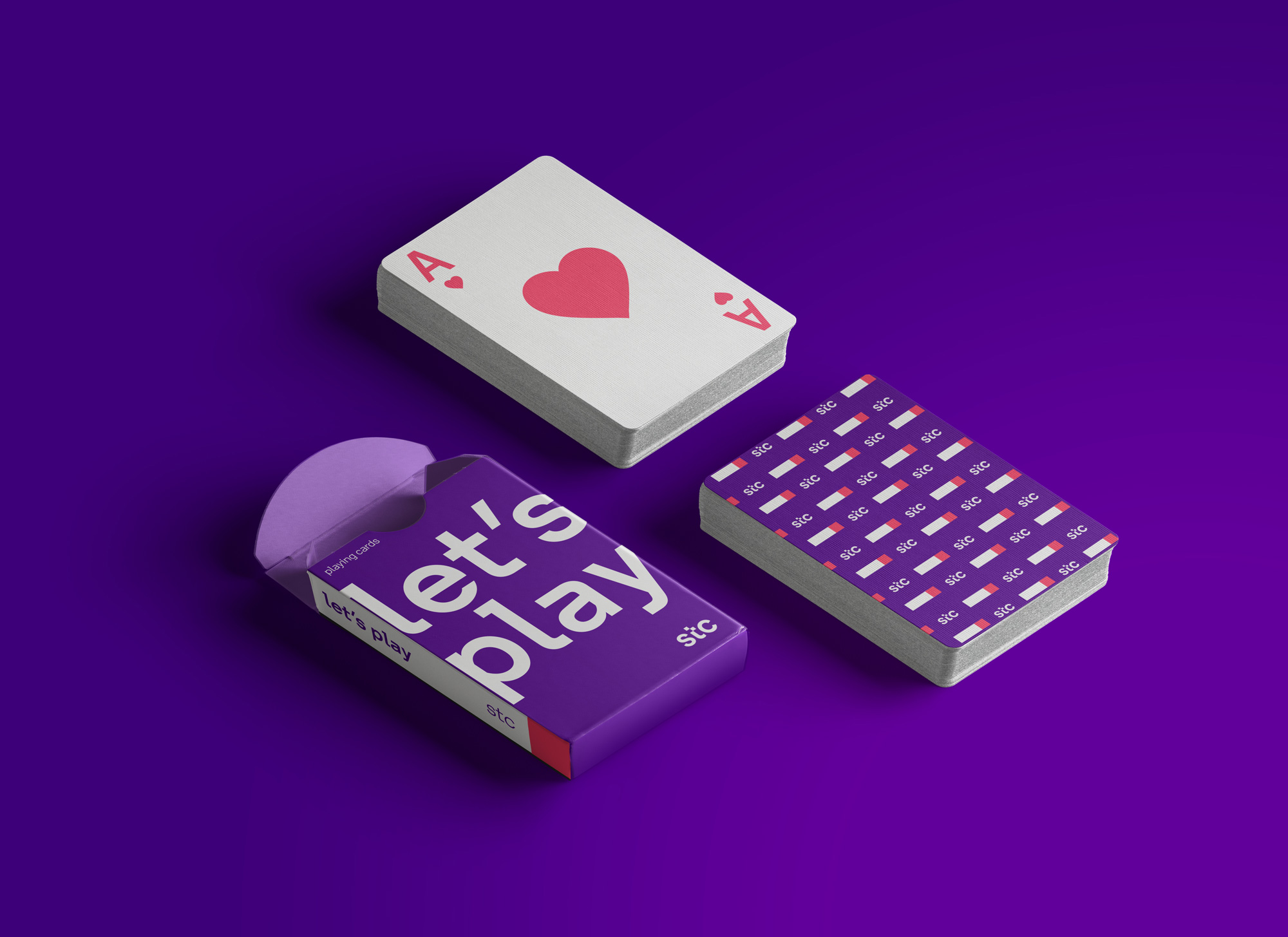
stc’s new soul is condensed under the claim “Everything’s going forward!” and is what inspired the renewal of the visual identity. The aim was to create a visual expression under a clear premise: enriching stc brand’s visual vocabulary through a simple design system that operates as a single team, telling a powerful story.
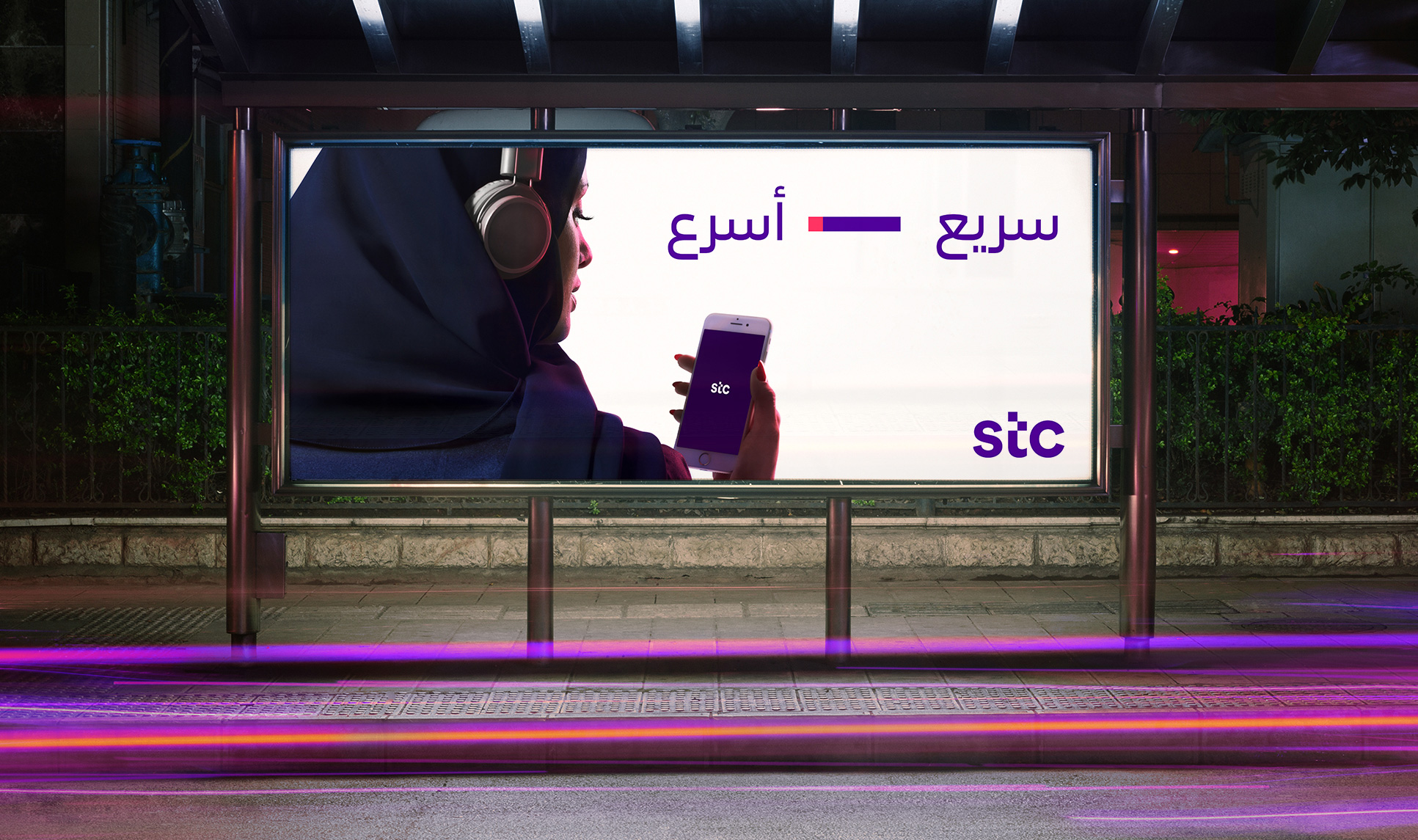
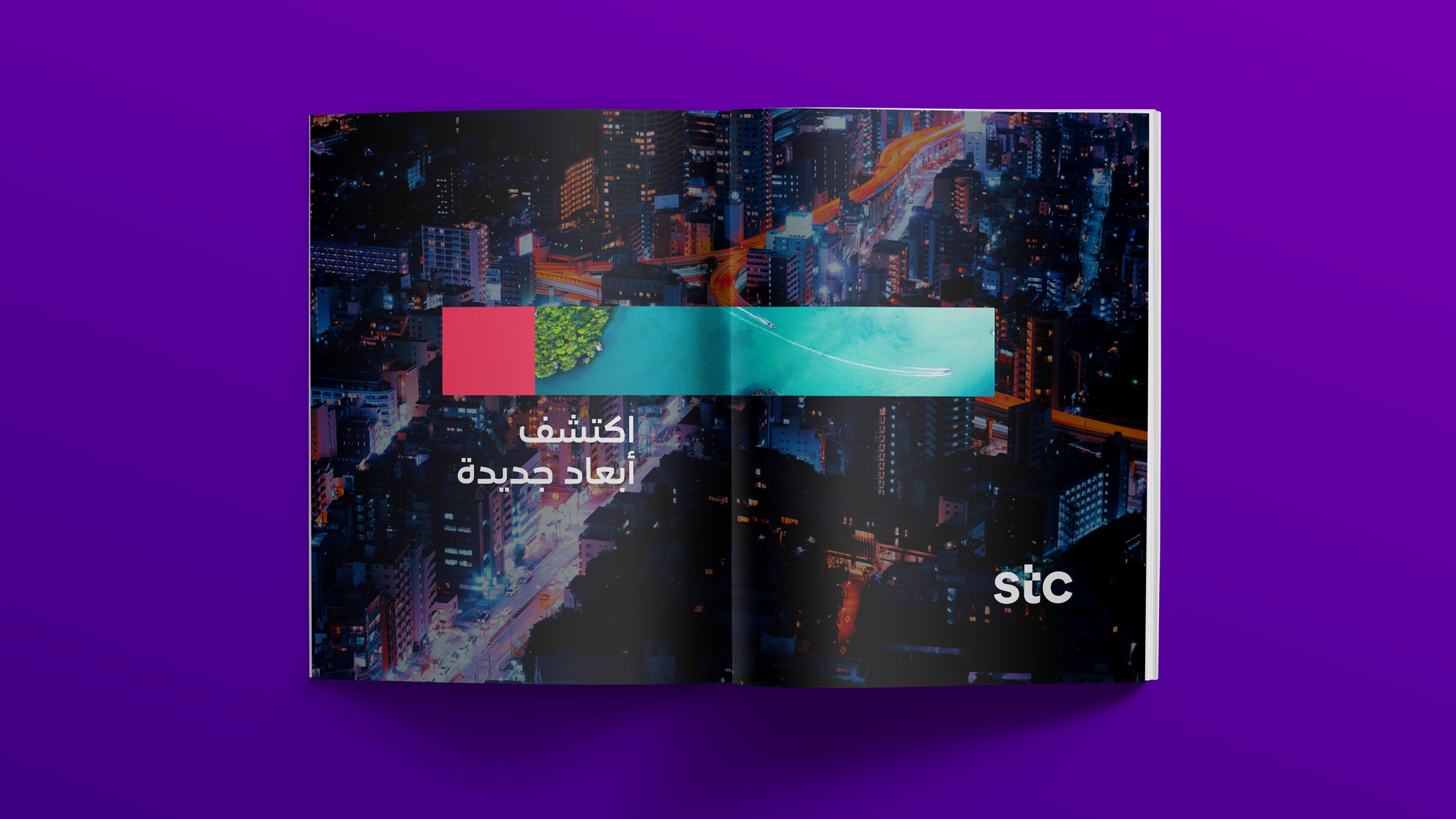
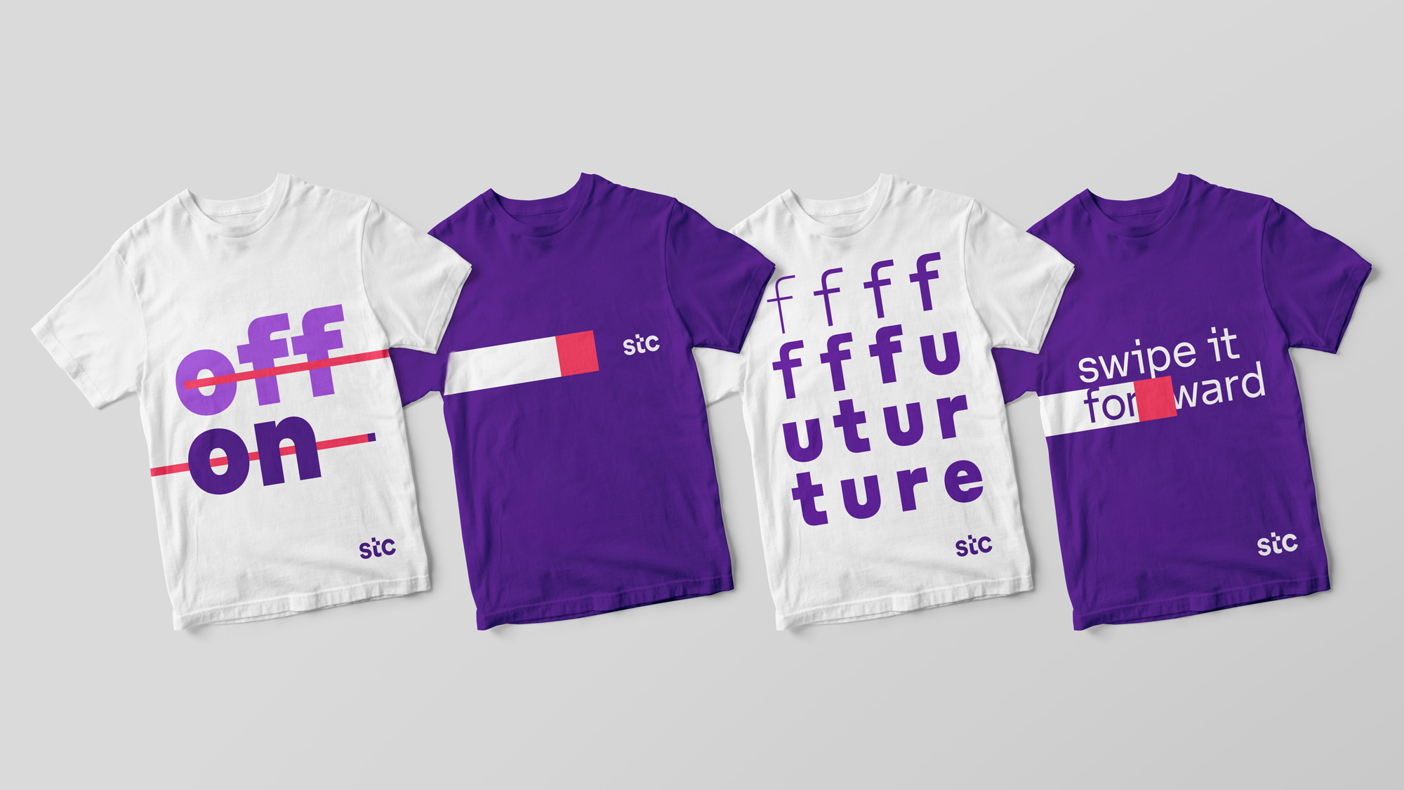
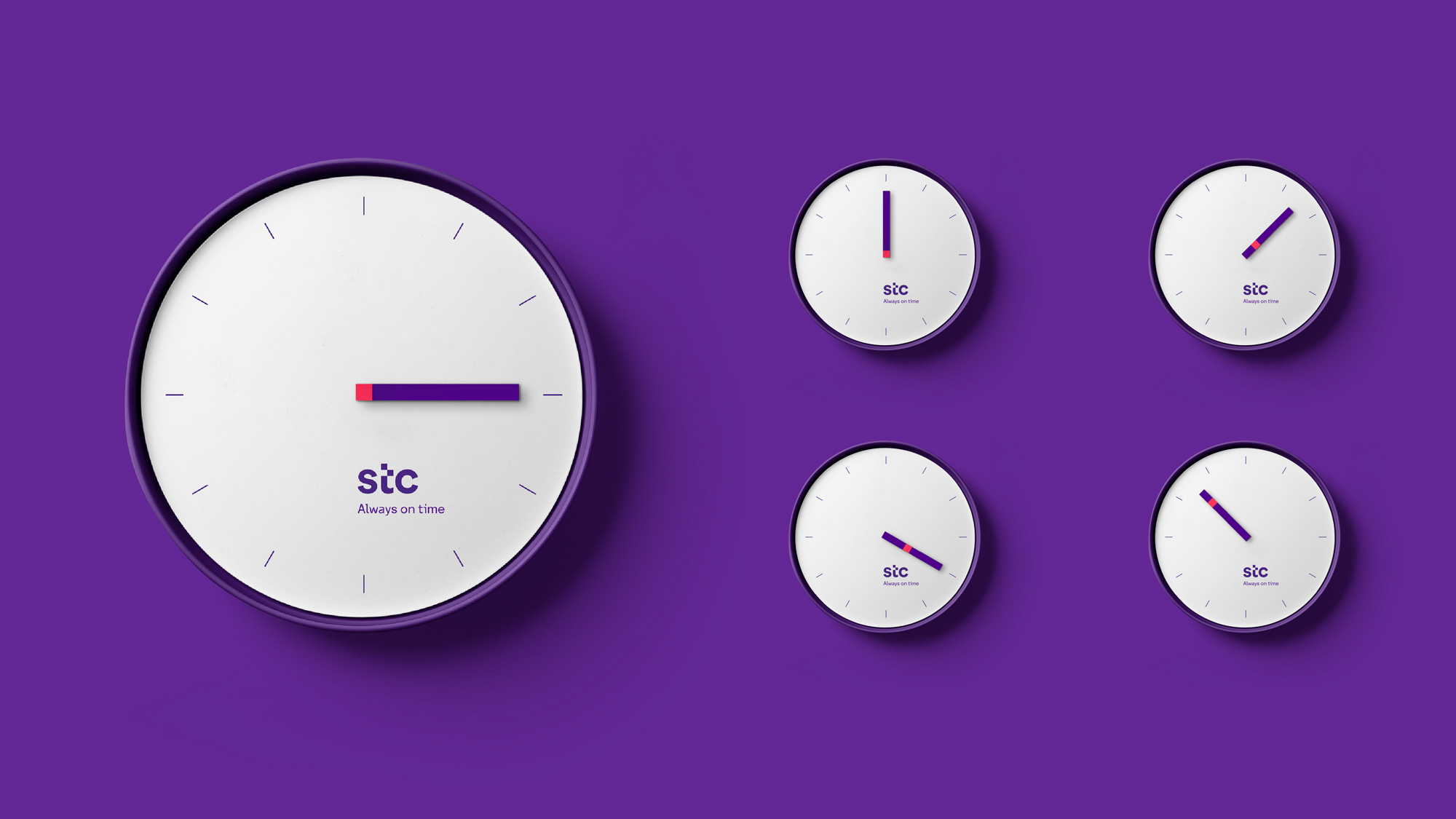
The new stc speaks about the future and seamless progress. But how can you imagine an idea of the future without repeating stereotypes? It was necessary to find a way to express the future in a simple, human and innovative way, creating a new metaphor that emanates from the brand strategy. The answer was in a digital and human movement that transforms, discovers, activates, opens, facilitates and is omnipresent when people interact with screens: the “slider”. The power to go forward and change is - and always has been - at our fingertips.
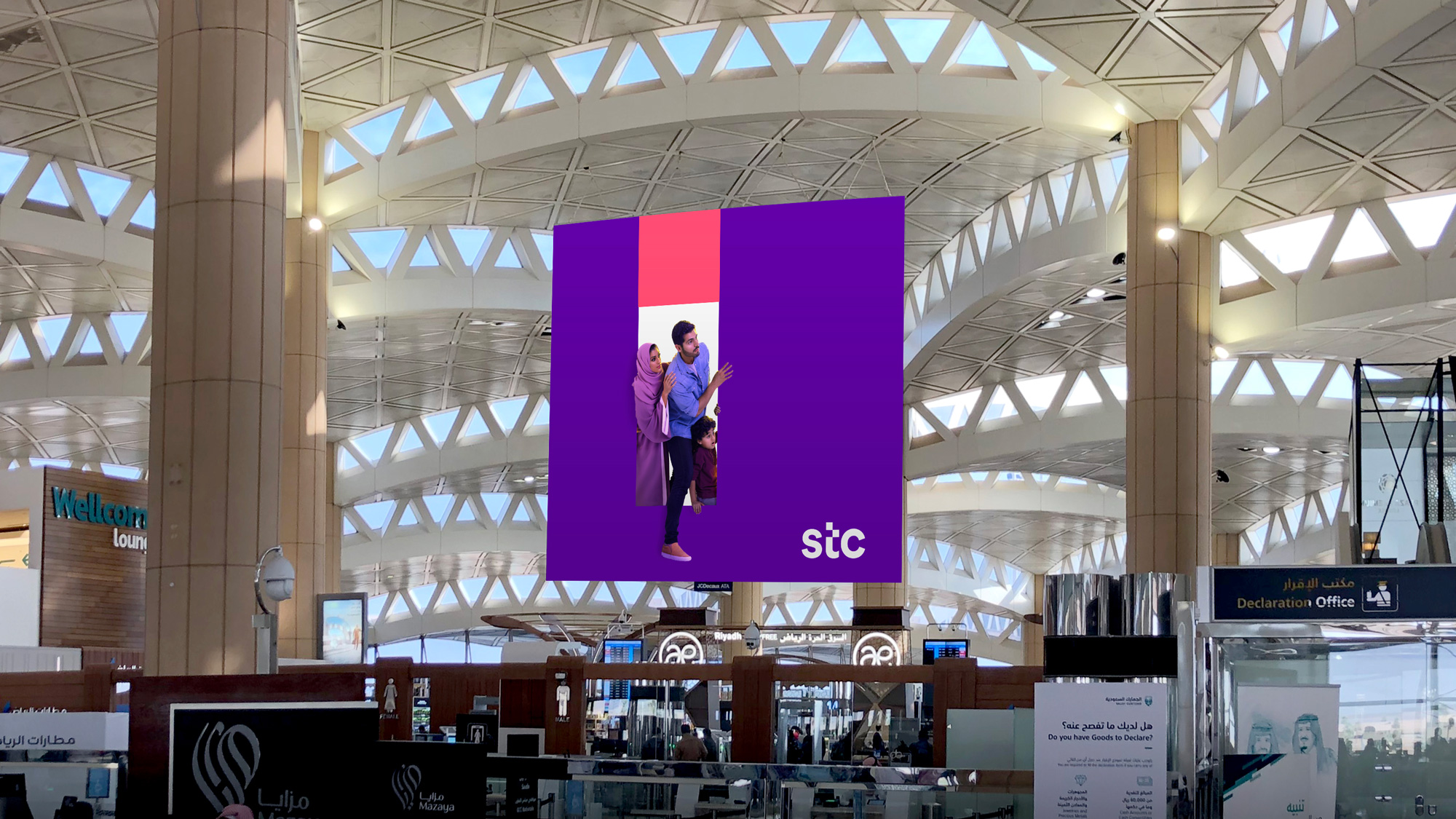
This “slider” or “forward gesture” serves stc to express three superpowers: link (taking you from one positive point to an even better one), reveal (a window to new possibilities) and transform (an agent that changes the environment).
It’s dynamic because it invites the user to act. It’s interactive because it’s user centric and doesn’t work without people. It’s creative because it’s a tool that allows people to do things they couldn’t do before and shows them what’s yet to come.
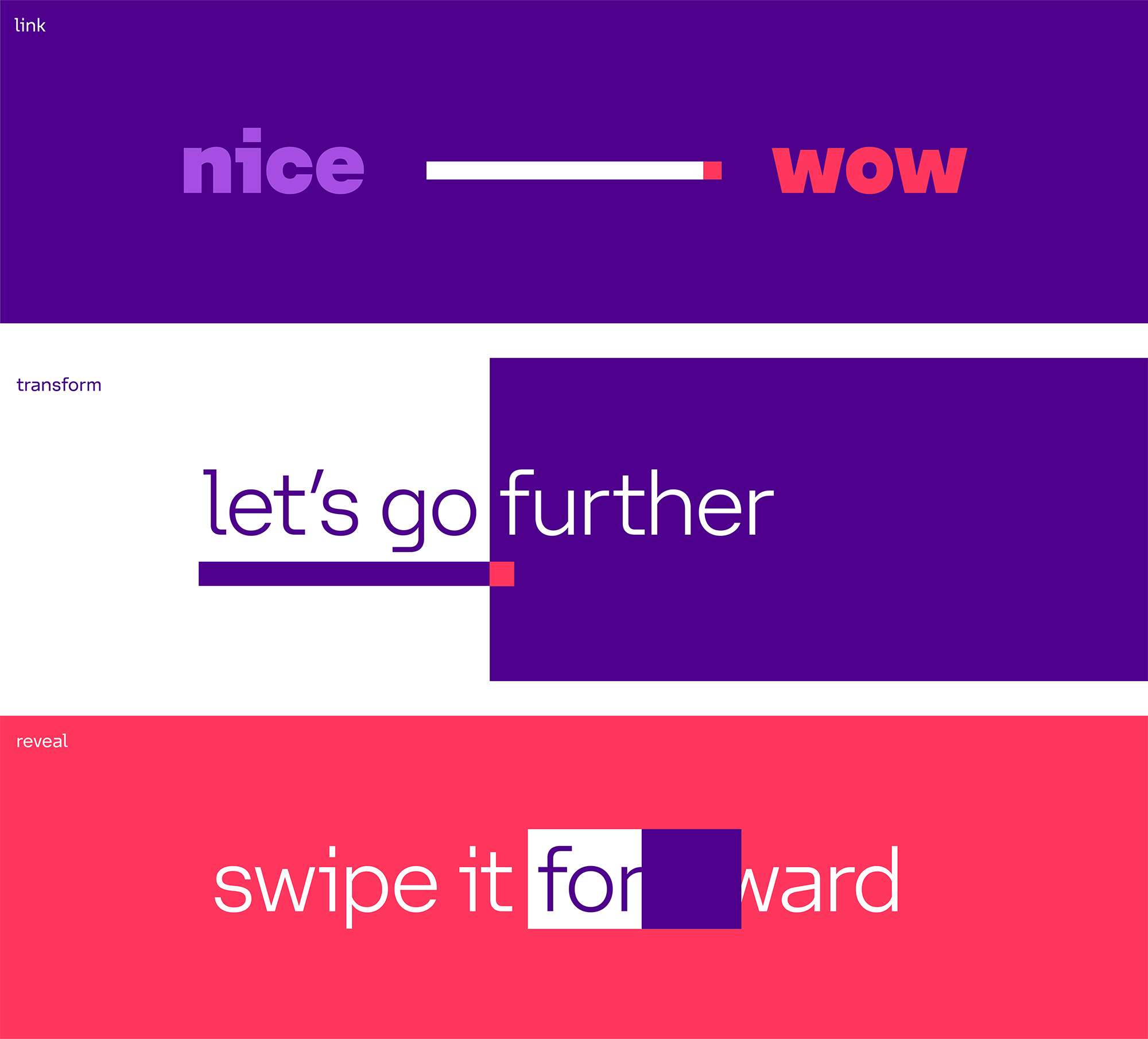
I would normally talk about the logo before anything else but, in this case, establishing the concept behind the logo is important and because all of the stuff above informs the identity. The idea of “forward”-ness is nothing new in corporate identity, in fact it’s one of the most well-trodden ideas, like, ever, so what begins as a bit of an eyeball of “Please, God, not another forward identity” turns into a rather smart and relatively surprising way of interpreting it. The veritable pixel graphic device that also runs the risk of being trite is able to infuse the identity with a great range of behaviors that, although subtle, are able to nicely convey the notions of linking, transforming, and revealing in an engaging manner. I’m not saying anything here is revolutionary but it’s clear and effective and particularly impressive at this scale of a company, where they could easily be way more literal instead of a little ambiguous and open to interpretation.
The “slider” - as a continuous energy towards the future - works as the essence of the new stc visual identity. This energy is encapsulated in the new logo - specifically, the “slider” resource intervenes in a simple and iconic way on the “t”. The logo no longer has a symbol and it doesn’t need one. The name becomes stc’s new symbol, moving from capital letters to small letters to convey more closeness and to use a younger and more digital expression. In addition, the descriptor that previously formed part of the logo has been eliminated so it transcends the meaning of its initials.
While the old identity was all over the place and mostly in rather cheesy, techie aesthetics, the logo was pretty interesting. Hard to use but unique for sure. The new logo is a very simple and straightforward wordmark in a nice sans serif with the displaced “t” as the only visual flair. Before you pile on, yes, this is the logo that the internet claimed copied the cts logo but let’s not even go there because, as far as logos go, neither of them is the most original, so similarities in execution are to be expected. I understand I just praised and dissed the logo in the same sentence but I think that’s to be expected from a simple logo like this: it’s not the most exciting but it gets the job done and as part of the rest of the identity it’s a solid piece of the puzzle. And there are a lot of pieces…
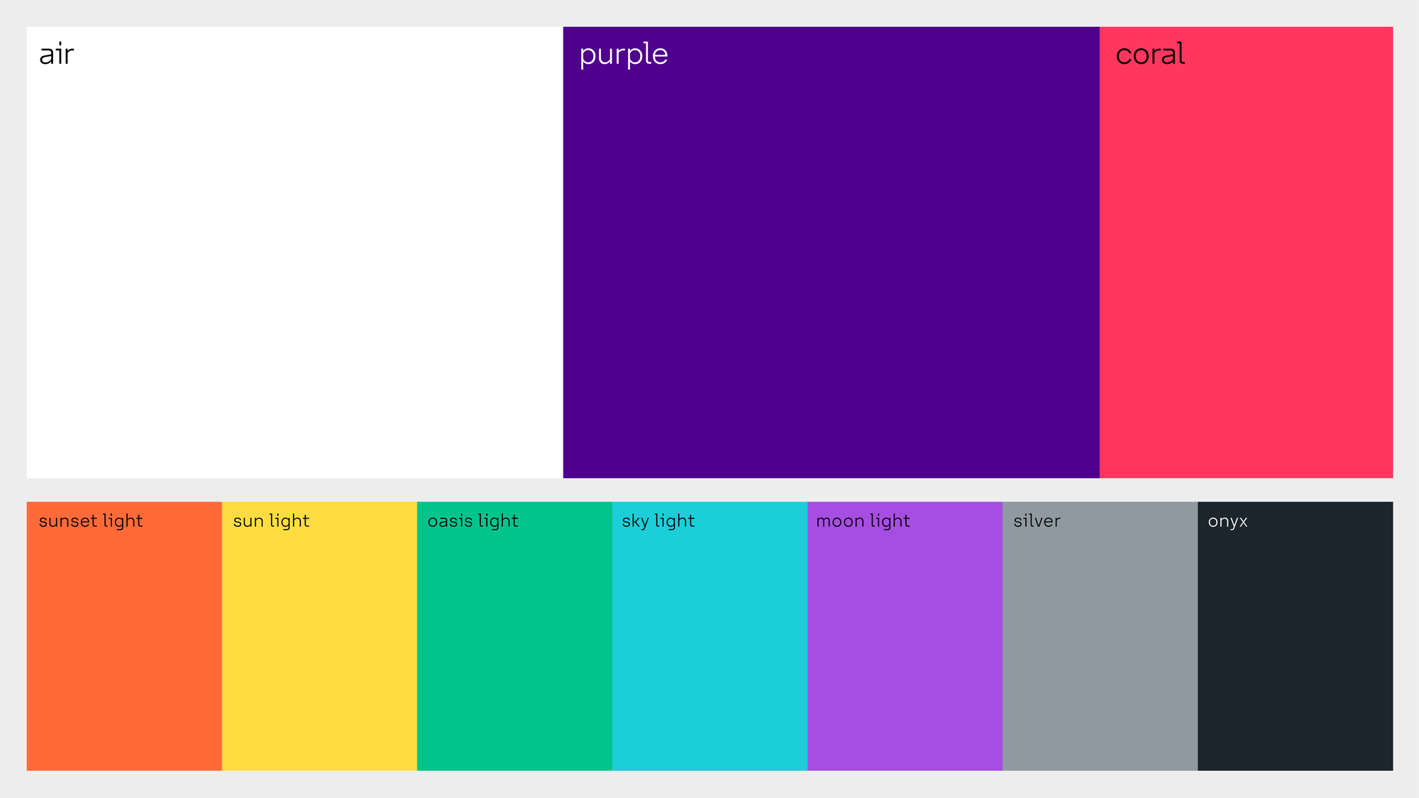
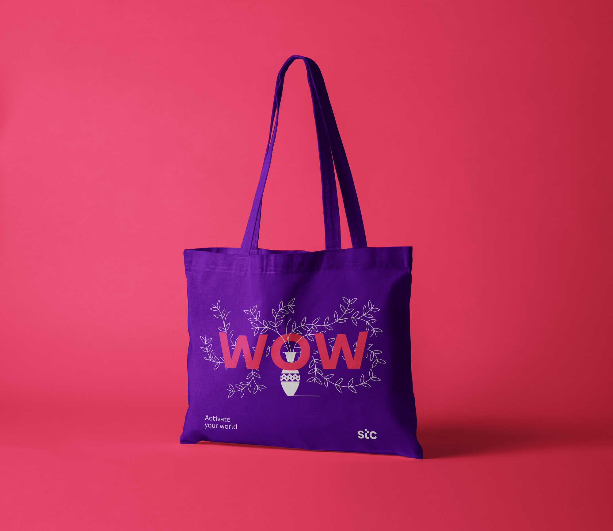
The new visual identity rests upon three main colors: a new, more vibrant and digital purple (the color that stc maintains, the color that people already identify with the brand and a color that communicates creativity, inspiration and imagination), “Air” white (representing clarity, light and simplicity) and coral (a highlight color that gives a more youthful touch to stc and transmits collaboration and energy).
Likewise, the font stc Forward has been developed, an ad hoc typography that encompasses the Latin and Arabic families and incorporates the history of the “slider” in its hyperextended horizontal strokes.
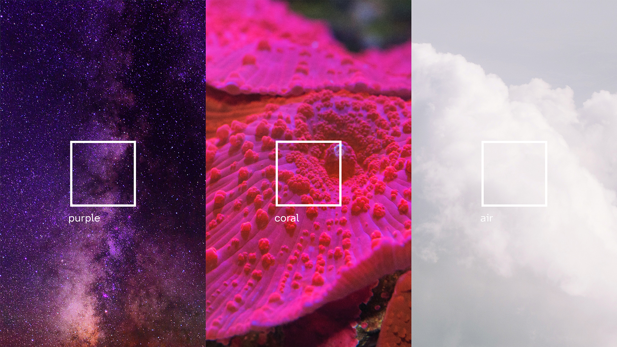
The color palette is bright and techie in an every-product-in-Silicon-Valley way which may have grown tiresome to most of us but I assume-that/wonder-if it’s a range of colors that can create a big impact in Saudi Arabia, despite most of us being so used to seeing this combination of purple and coral.
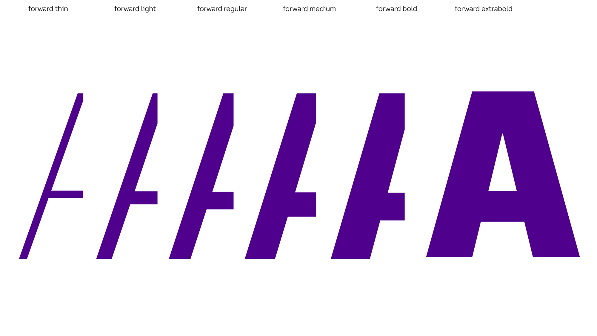
The custom type family is really nice — the extended top of the “a” is a great differentiator and a smart way to build in the slider’s horizontal gesture into the type.
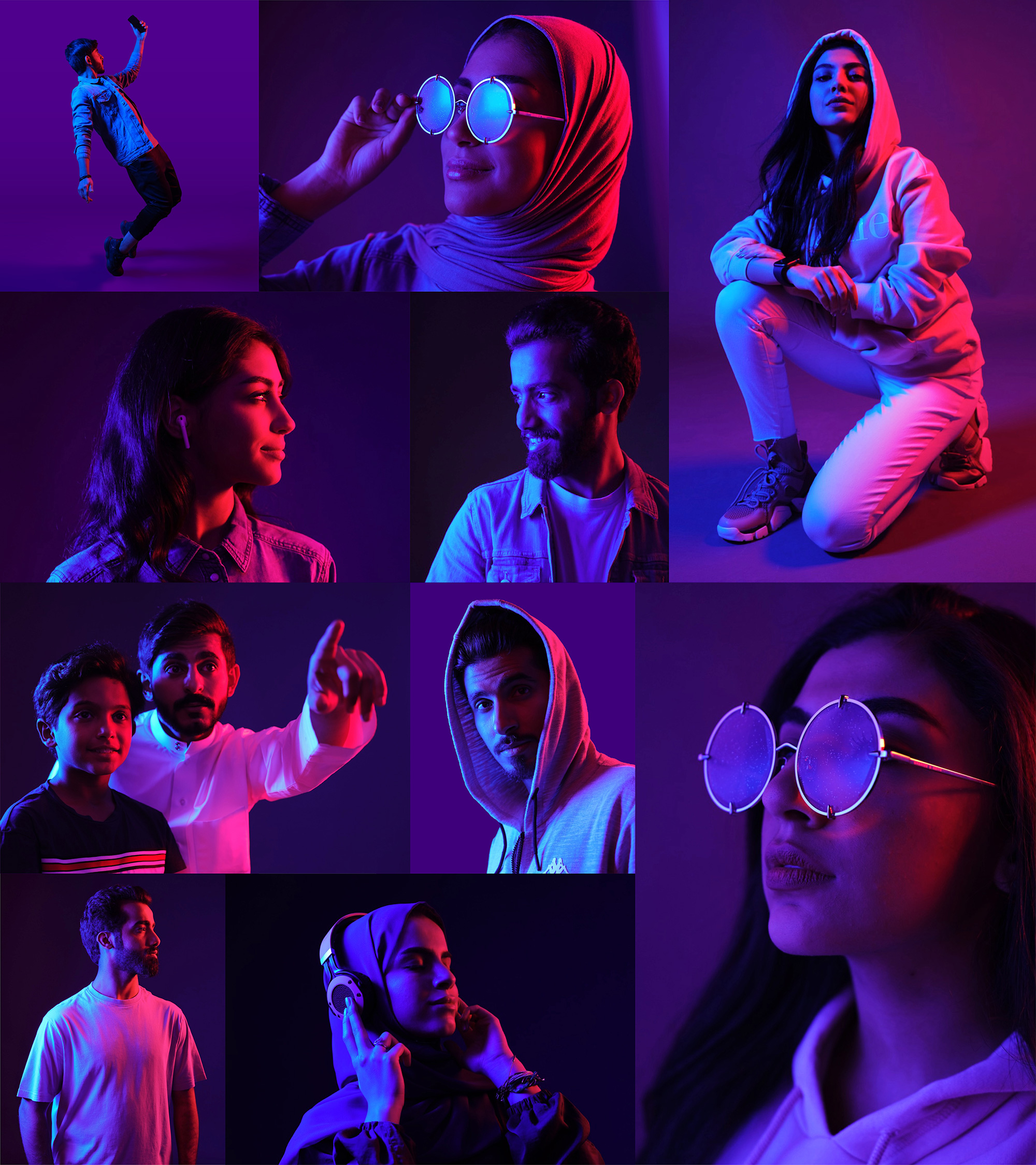
Yet another great element. Nicely art directed, well executed, and very satisfyingly on brand.
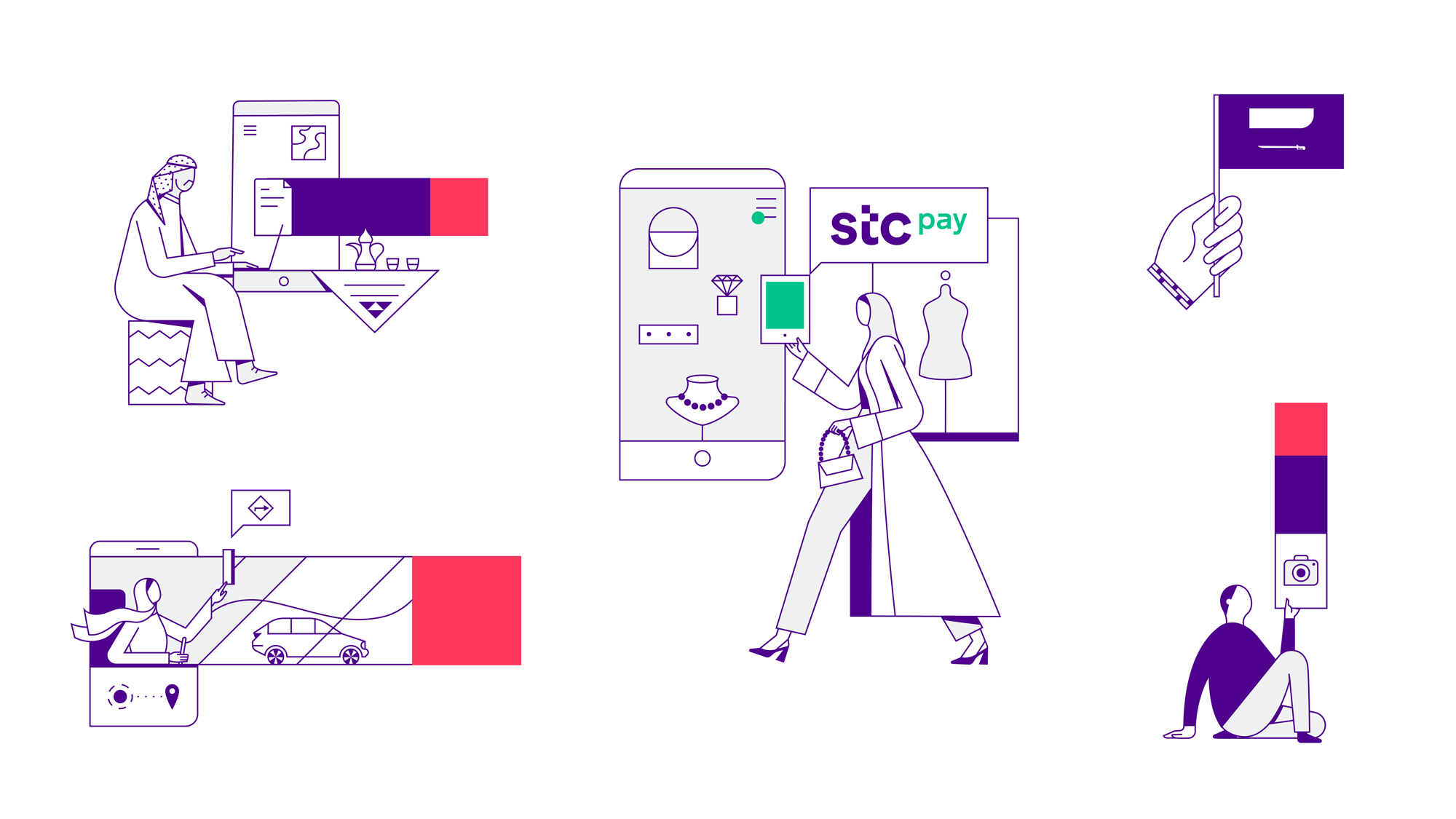
Not everything could be a win, right? The attack of the faceless line-art people continues in this identity. Again, like the color palette, this might be a runaway hit over there and, to their credit, both the illustrations and motion approach have some nice moments.
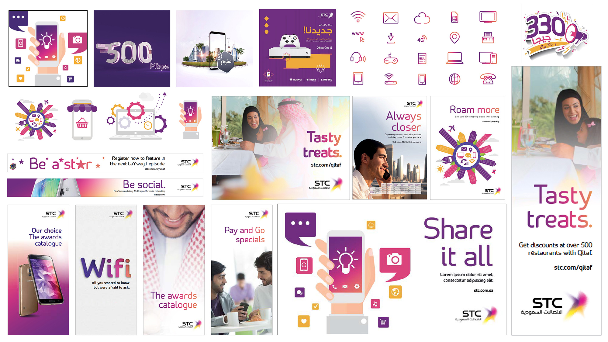
This is less a rebrand and more a rebirth. It is the unleashing of something powerful. New services beyond telecom (entertainment, fintech, insurance, apps and more) and new markets beyond the origin country. A new name, visual and verbal expression, personality and attitude that finally match what is being transformed - from a local telco to a regional digital powerhouse.
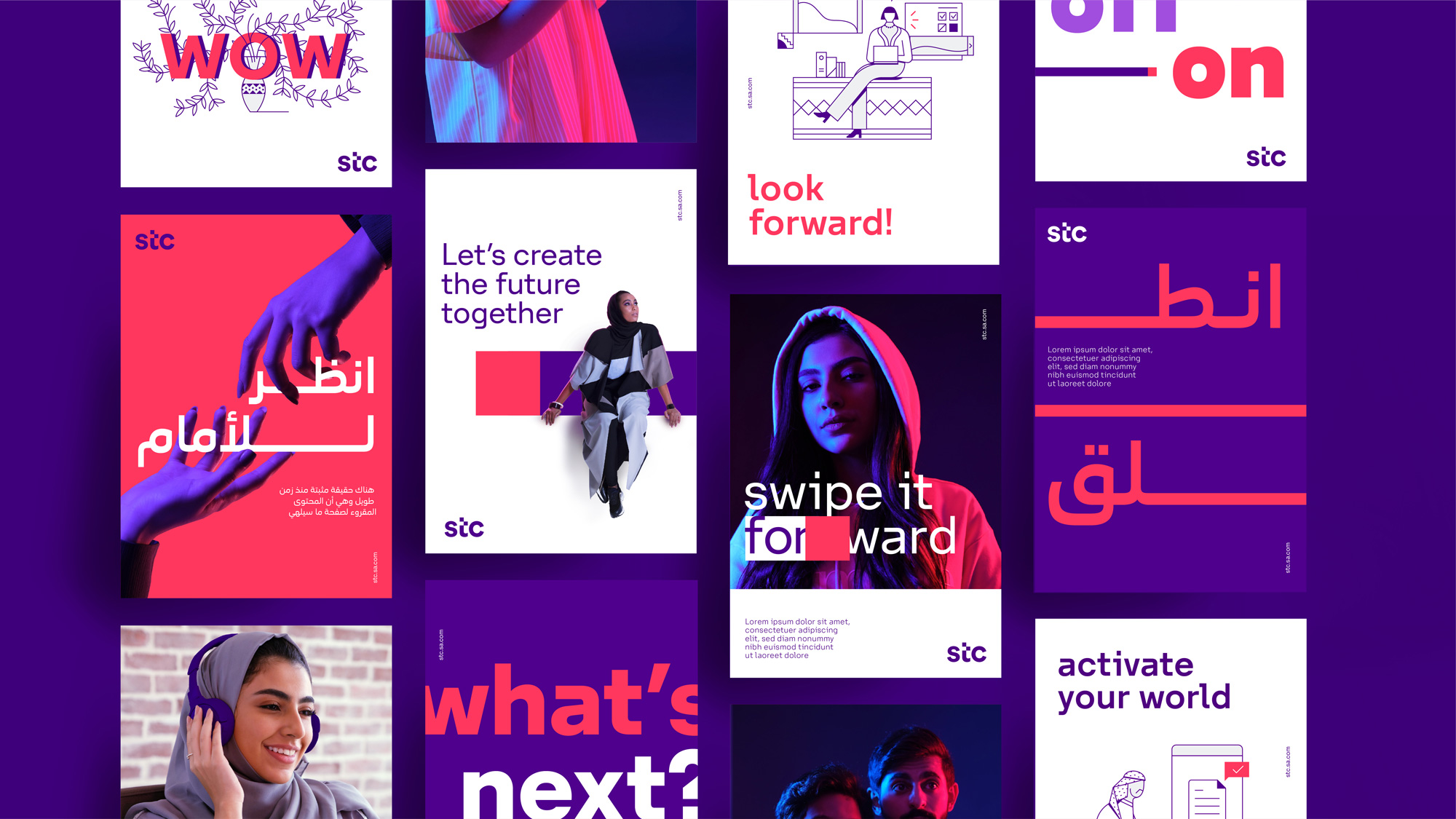
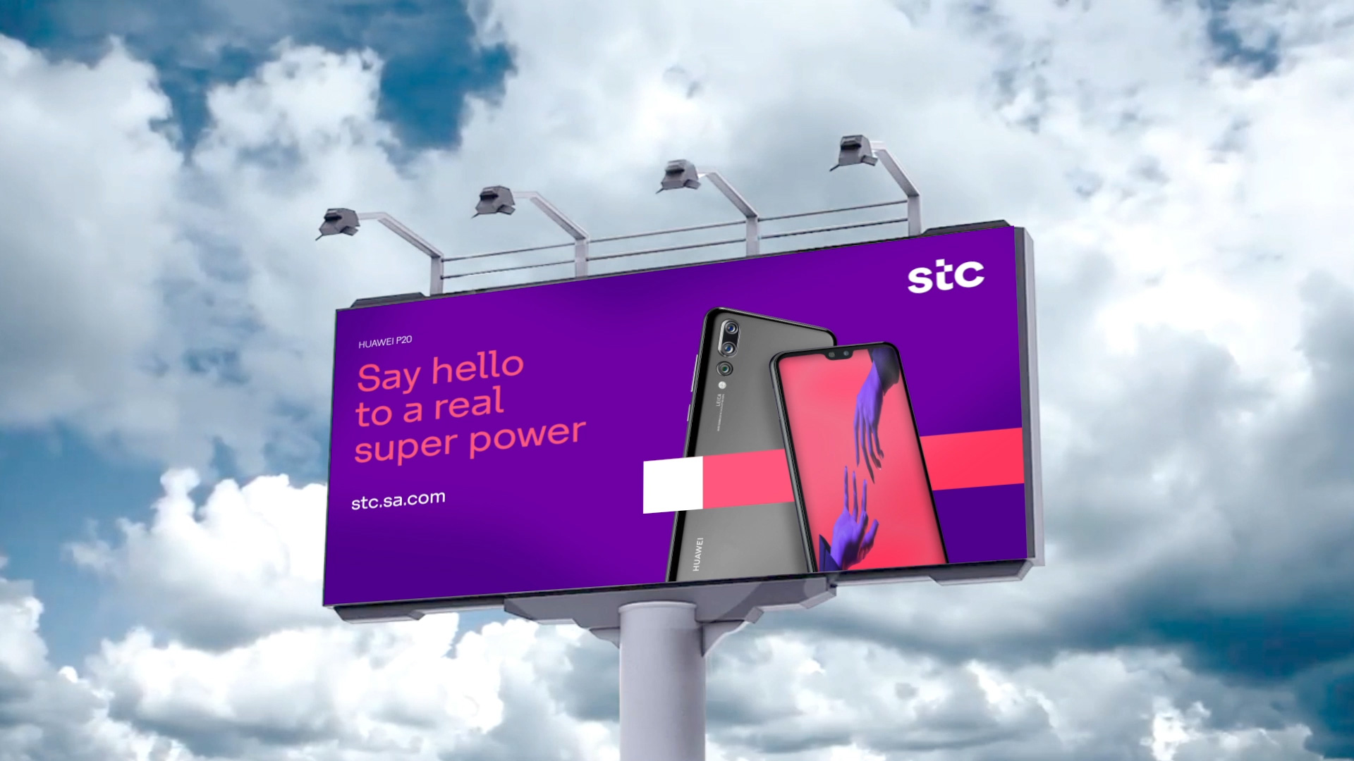
The applications are solid. Nothing super crazy good but what I really like is the wide variety of approaches and uses of the elements that all feel cohesive and as part of the broad visual language of stc.
Overall, this feels right… it may tread on many recurring trends but it works very well to infuse stc with an instant sense of contemporary-ness that wasn’t there before while also providing a couple of small design surprises along the way.
 each year since publication began in 2006

 Новости Союза дизайнеров
Все о дизайне в Санкт-Петербурге.
Новости Союза дизайнеров
Все о дизайне в Санкт-Петербурге.