Обзор лучших ресурсов по разработке бренда, разработке упаковки
contact us | ok@ohmycode.ru
contact us | ok@ohmycode.ru
Established in 2008, Thumbtack is an online platform that connects professionals across a wide range of services — from carpenters to plumbers to tutors — with people needing stuff done. Users create a job they need completed and professionals on the site can bid on it. I’ve used Thumbtack a number of times and found one of our favorite contractors through there and one of the best roof guys ever. It’s easy, it’s quick, and the ability to comparison-shop is very helpful. This week, Thumbtack introduced a new identity designed in-house in collaboration with Portland, OR-based Instrument.
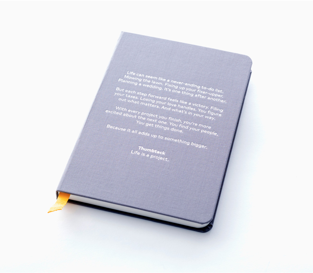
Meet the Thumbtack thumbtack.
Finally, our logo is an actual tack. Not a pushpin.
The old logo was the kind of logo that makes me wary of a new service or product I have not tried before. The first time I used Thumbtack I literally had doubts about whether to use it or not simply because the logo didn’t exude trust; it gave the whole site an amateurish feeling that was a bit unfortunate given how effective the site is. The cheesy script font, the orange color, and the fact that the thumbtack was a pushpin added up to a less than stellar logo. The new logo is one of my favorite of the year so far with the best possible thumbtack depiction that doubles as a “T”. It may seem like an obvious solution but it’s done perfectly right, with a deep, hard shadow that makes the tiny thumbtack look more monumental and bigger than life. It works great as a “T” in the wordmark, perfectly balanced in weight with the rest of the letters (which are perfectly kerned) and it works even better as a standalone icon used in white over blue, which better showcases the shadow effect.

The icons and illustrations are par for the course for a web-based service: colorful, playful, and faceless. They are all perfectly appropriate but also fairly indistinguishable from others.
Our business is other businesses, so our brand can’t be so dominant that they can’t shine. We leave plenty of wiggle room with abundant white space, a beautiful blue as our primary color, and a secondary palette that frees us up to do more.
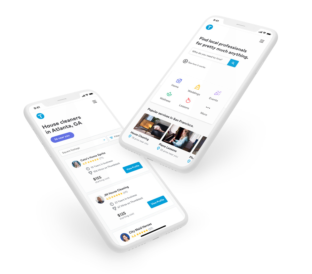
Not much in terms of applications other than the mobile app and website, which, dare I say it, maybe the latter makes far too generous use of white space… It’s almost like the site is missing a full-screen video in the background and more stuff. But can’t complain much because the alternative of a packed site isn’t that ideal. Both site and app, though, are crisp and clean.
Overall, this is a great evolution that gives the service a proper, grown-up logo and an identity that is pared down and provides the professionals listed on their site with a neutral backdrop to present their services.
Thanks to Cheshire Isaacs for the tip.

 Новости Союза дизайнеров
Все о дизайне в Санкт-Петербурге.
Новости Союза дизайнеров
Все о дизайне в Санкт-Петербурге.