Обзор лучших ресурсов по разработке бренда, разработке упаковки
contact us | ok@ohmycode.ru
contact us | ok@ohmycode.ru
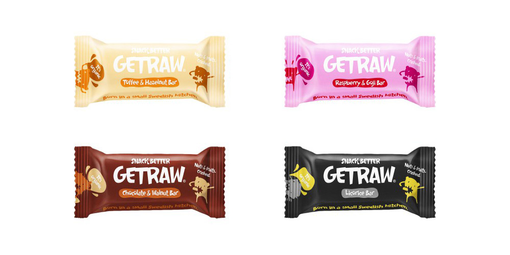
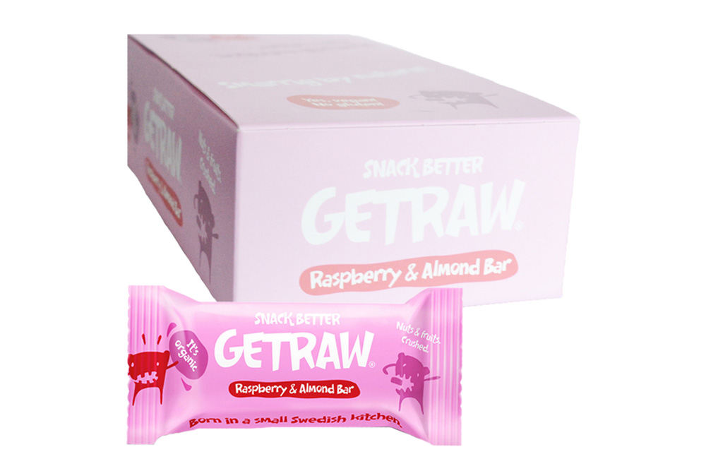
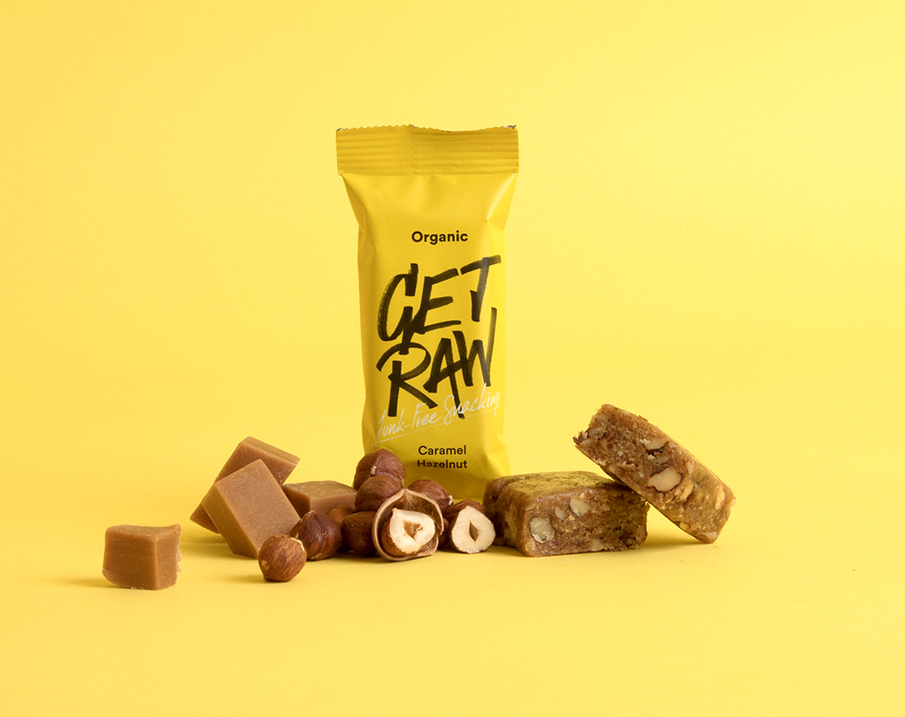
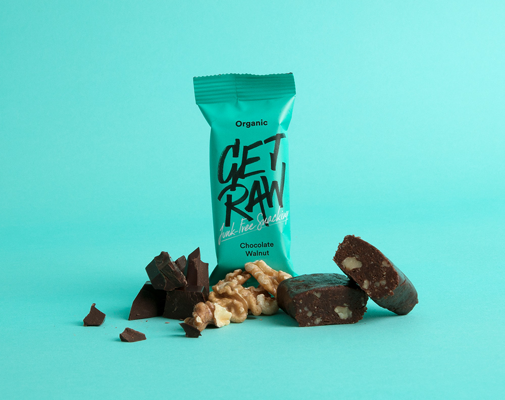
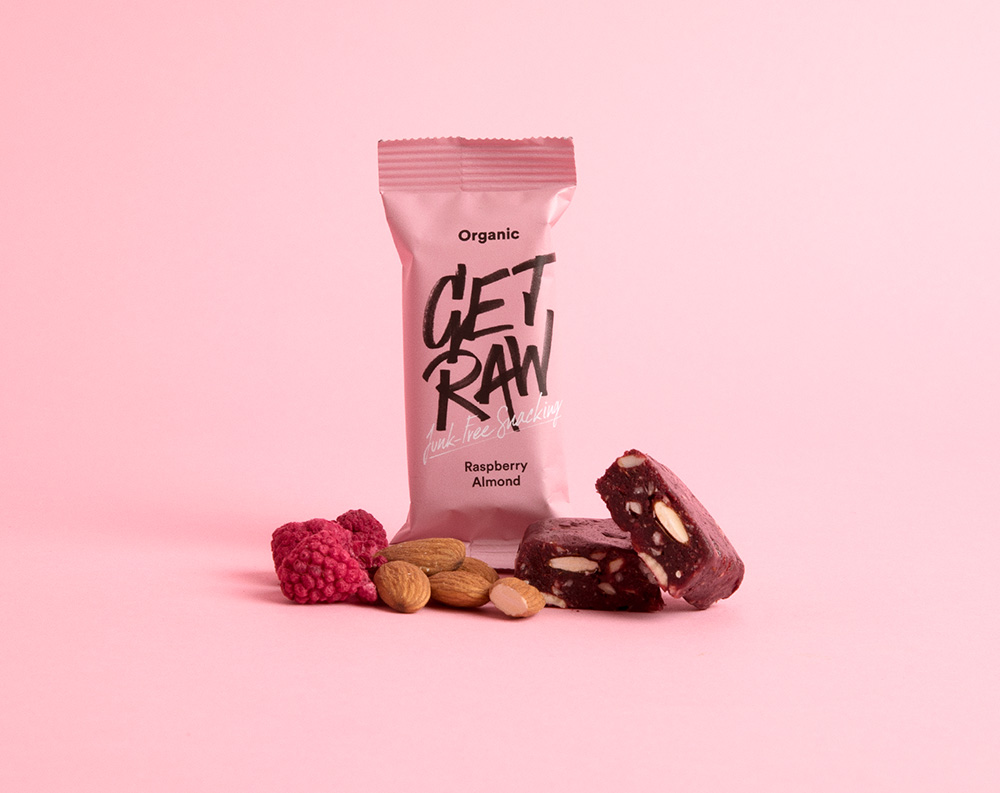
Established in 2013, Get Raw is a brand of health bars in Sweden that are organic, vegan, gluten-free, and without refined sugar. Started as a mother and daughter venture, Get Raw is now available through more than 250 retailers. Late last year, the company introduced a new logo and packaging designed by Stockholm, Sweden-based Snask.
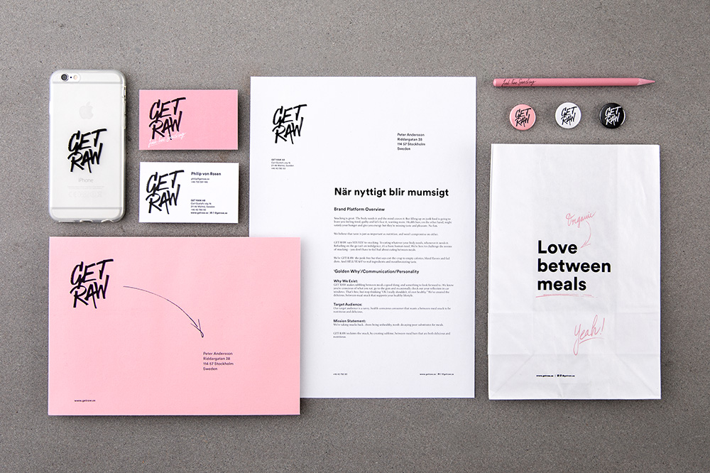
We created a concept around junk-free snacking and the love between meals. Refueling on the go isn’t an indulgence but a basic human need. And so we created a concept around not feeling bad about eating between meals. Real ingredients and mouthwatering taste. Simply put say yes to snacking!
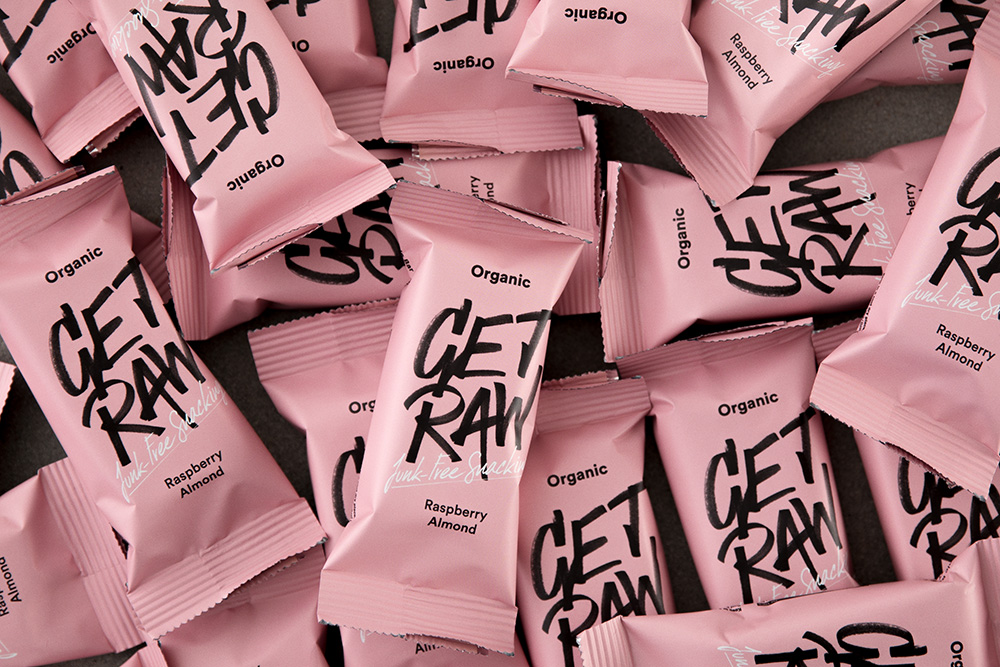
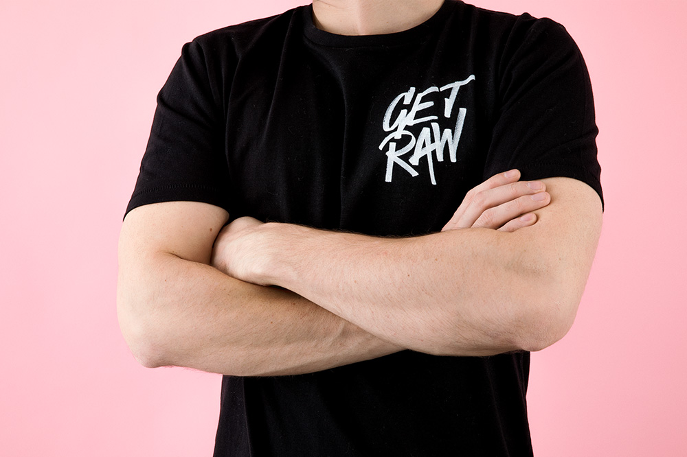
The old logo got the point across that the product was unconventional with the wacky typography but when paired with the monster illustrations perhaps it started to skew towards looking like a kid treat instead of an adult snack. The new logo communicates rawness in a more straightforward way, with an energetic, hand-drawn, marker gesture that results in a slightly punk but still very much reigned in aesthetic that hits a nice balance. The penmanship (or markership) of the logo is pretty nice with each letter having some cool traits of their own and working together as a slick lettering unit. The only small part I would have fixed is the last long stroke of the “W” that got a little wobbly but I also appreciate they didn’t perfect it all too much to keep that… raw feeling.
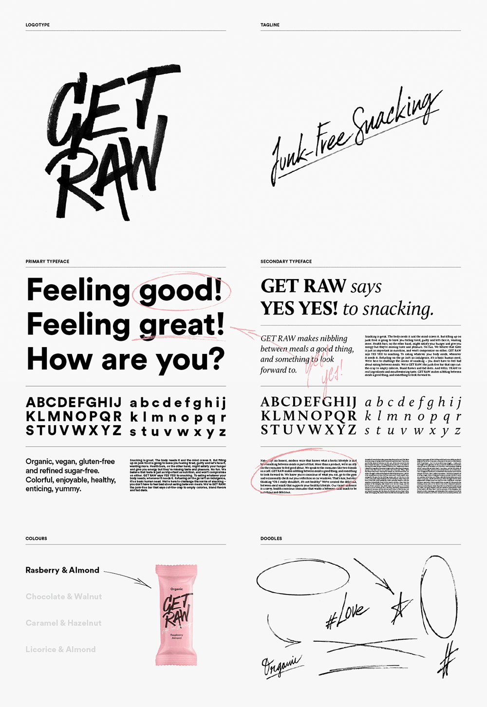
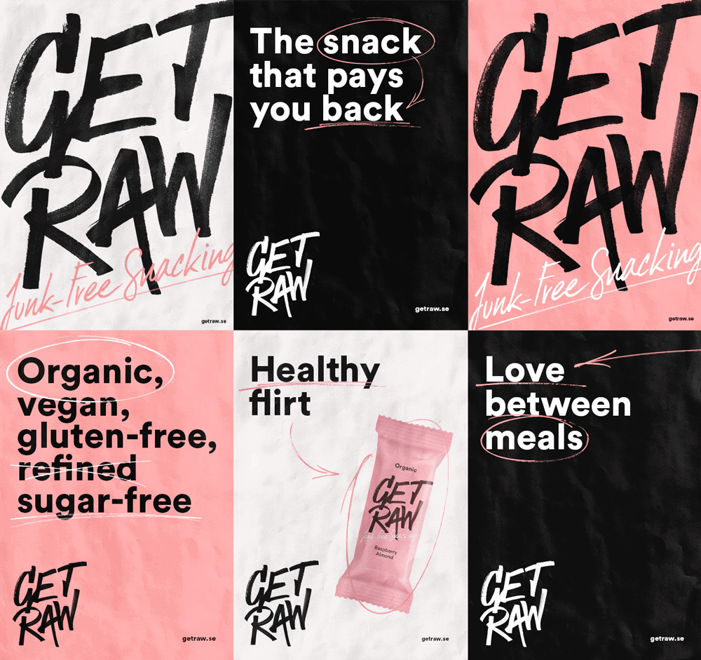
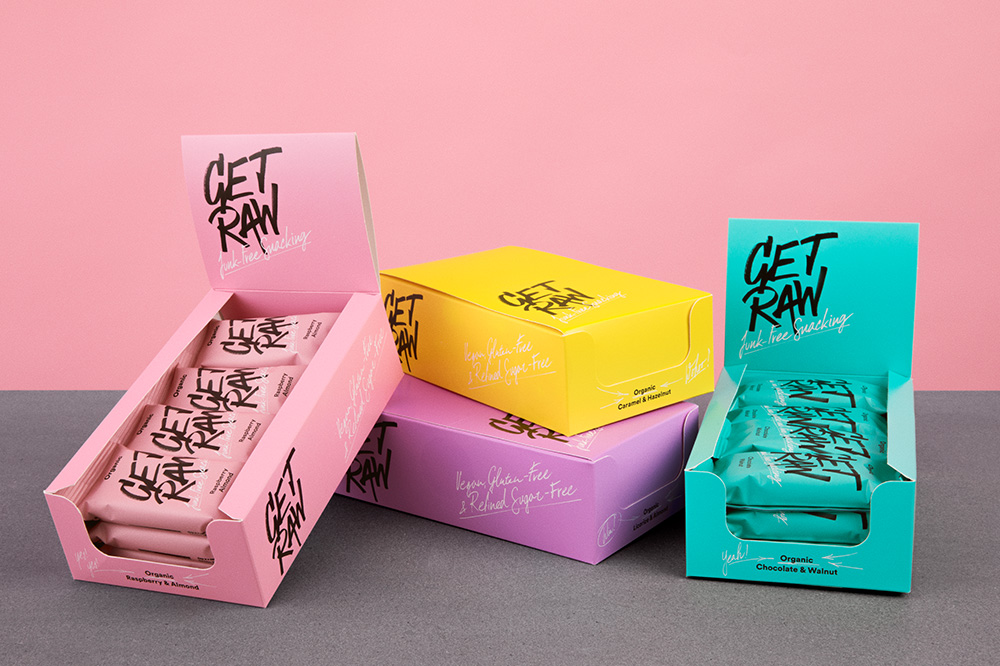
The scribble elements are okay and they pair well with the sans serif. Nothing groundbreaking here but a good integration of all the elements.
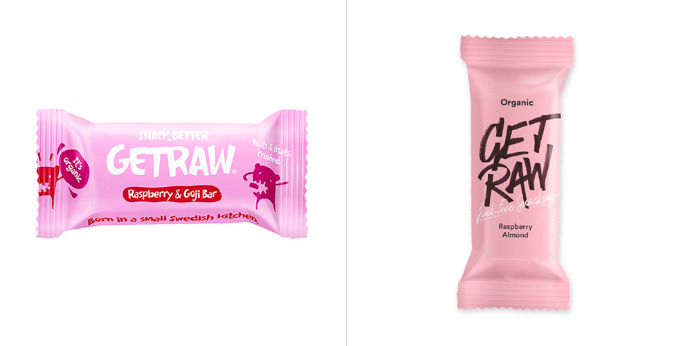
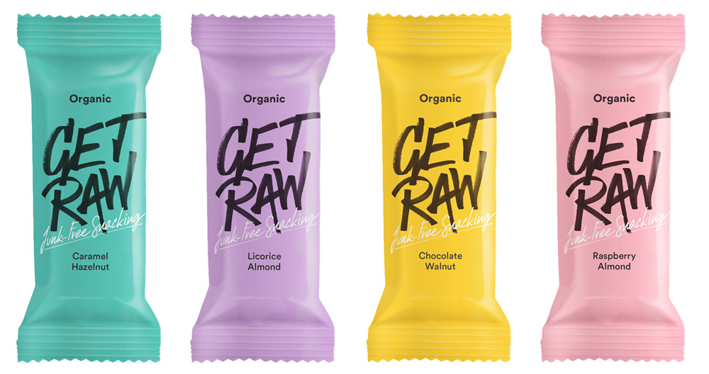
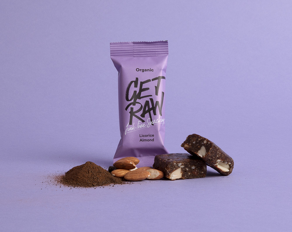
As with the logo, the old bar packaging was fine and fun but maybe too fun, missing the grown-up audience that would appreciate the raw ingredients. The new packaging looks like something more people would be more comfortable whipping out at the gym or the office, like “Look at me, I’m healthy and cool!” The logo looks great big across the small packet with the thin tagline subtly standing out in the new subdued color palette that looks extra good in the matte finish of the wrappers.
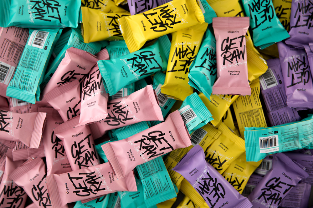
Overall, this is a fun redesign that maintains a rebellious attitude while also making it look more confident and better positioned for a more grown-up audience.

 Новости Союза дизайнеров
Все о дизайне в Санкт-Петербурге.
Новости Союза дизайнеров
Все о дизайне в Санкт-Петербурге.