Обзор лучших ресурсов по разработке бренда, разработке упаковки
contact us | ok@ohmycode.ru
contact us | ok@ohmycode.ru
Established in 2009, Qbic is a small chain of low-cost, boutique, urban hotels. It currently operates two hotels, one in London and one in Amsterdam, and will be opening two more, one in Brussels and one in Manchester. With a green and sustainable mindset, Qbic has developed its own custom room furniture that integrates a giant bed frame (including a bed and nooks and crannies for stuff) with a bathroom and all the necessary electrical wirings, allowing them to install a room in pretty much any space. An eye for quirky furniture and decor, makes these hotels a lot more attractive than your average budget hotel and a lot more memorable than your average large chain hotel. Recently, Qbic introduced a new identity designed by London, UK-based Ragged Edge.
Ragged Edge helped create a strategic platform that could inform every part of the Qbic experience, internally and externally. “We wanted to take Qbic’s desire to do good, and amplify it into something bigger and more emotional” says Max Ottignon, Co-founder, Ragged Edge. “This led us to ‘Welcome Character’, a brand idea that’s as distinct in the category as it is relevant to guests who want to be treated as individuals, not room numbers.”
The old logo looked fully like it belonged to any of the generic budget hotels that are a dime a dozen in Europe and provided no indication that this one was any different. Visually it was more or less (less, actually) fine and inoffensive. The new logo, with its relatively flamboyant “Q” is far more unique, interesting, and reflective of the personality of the hotels. I really like the big, bold, curly tail of the “Q”, especially how it fills the counter space of the round letter to balance out the negative space (otherwise it would look like a giant hole) and the rounded-corners of A2-TYPE’s Boing work well to soften the logo.
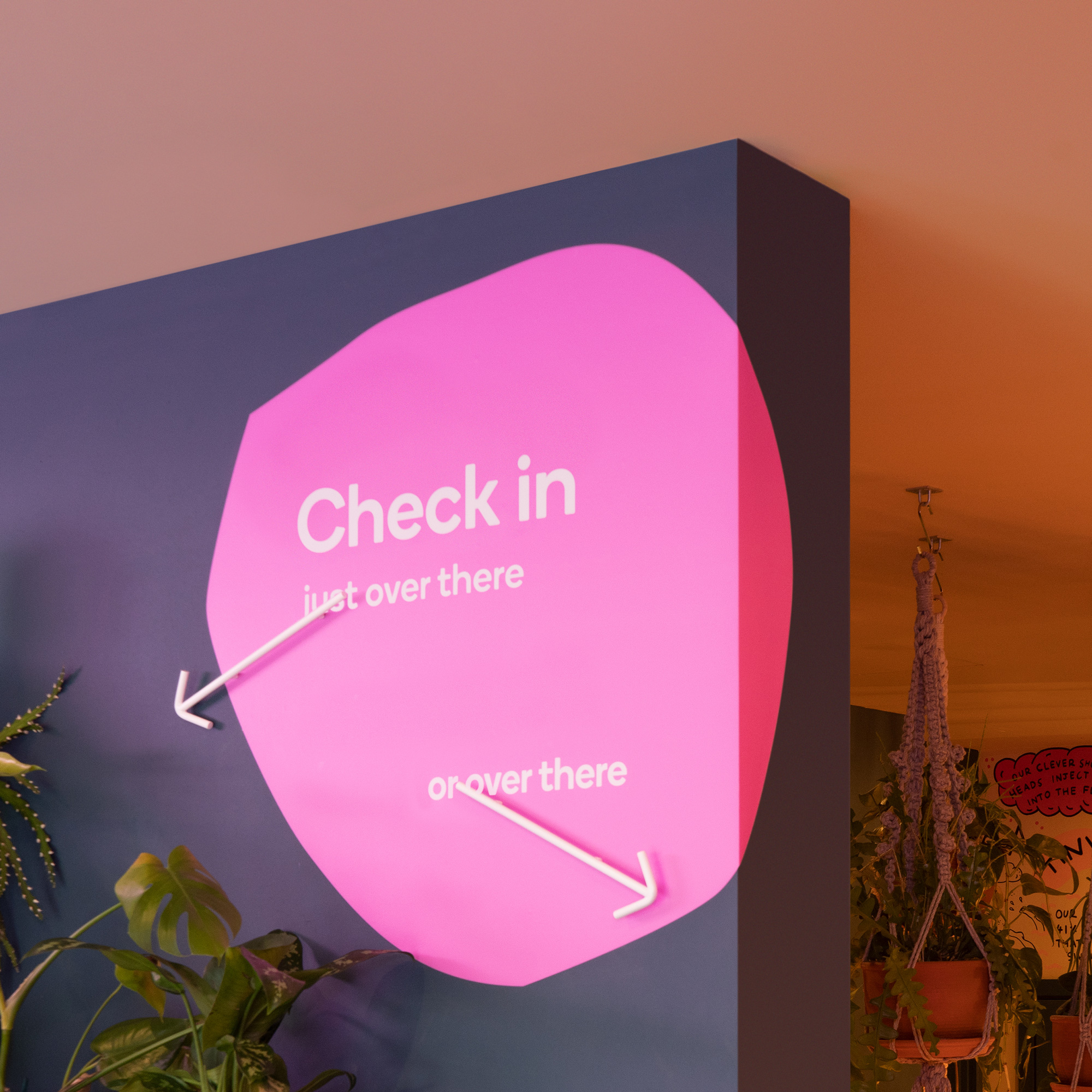
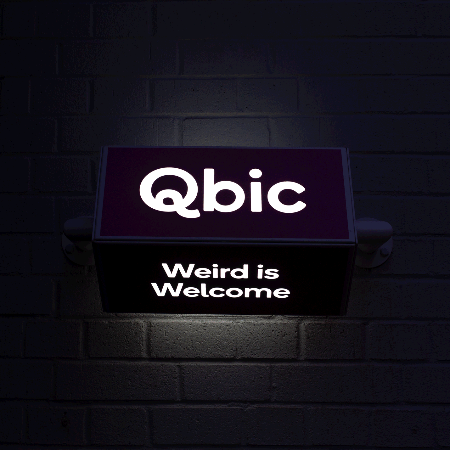
The new visual identity is inspired by the hotel’s physical layout, and the coming together of different people and ideas. And the tone of voice celebrates guests’ quirks and eccentricities: weird is welcome.
I don’t quite buy the rationalization for the blob patterns as coming from the layout of the hotel but they make for good eye candy and help further the quirky personality of the hotel while providing an endless range of configurations and applications for any application.
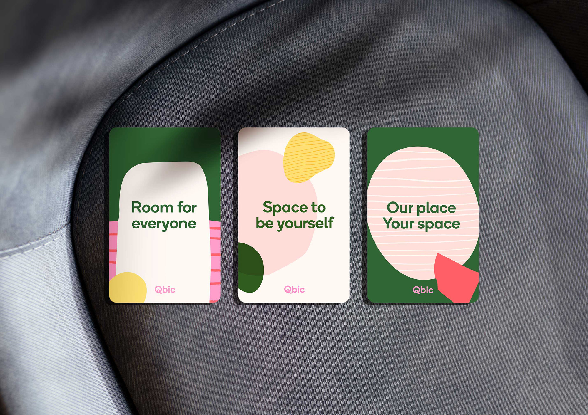
The identity relies heavily on the patterns which look good and engaging now but I feel like they have a quick expiration date of one to two years. And perhaps that’s not a terrible thing; being a small hotel that runs through applications quickly — thinking of those key cards in particular — it would be eas(ier) to introduce a new identity around the new logo. The color palette is nice and deserves a mention for not being the typical purple-red-blue color palette of the late-2010s.
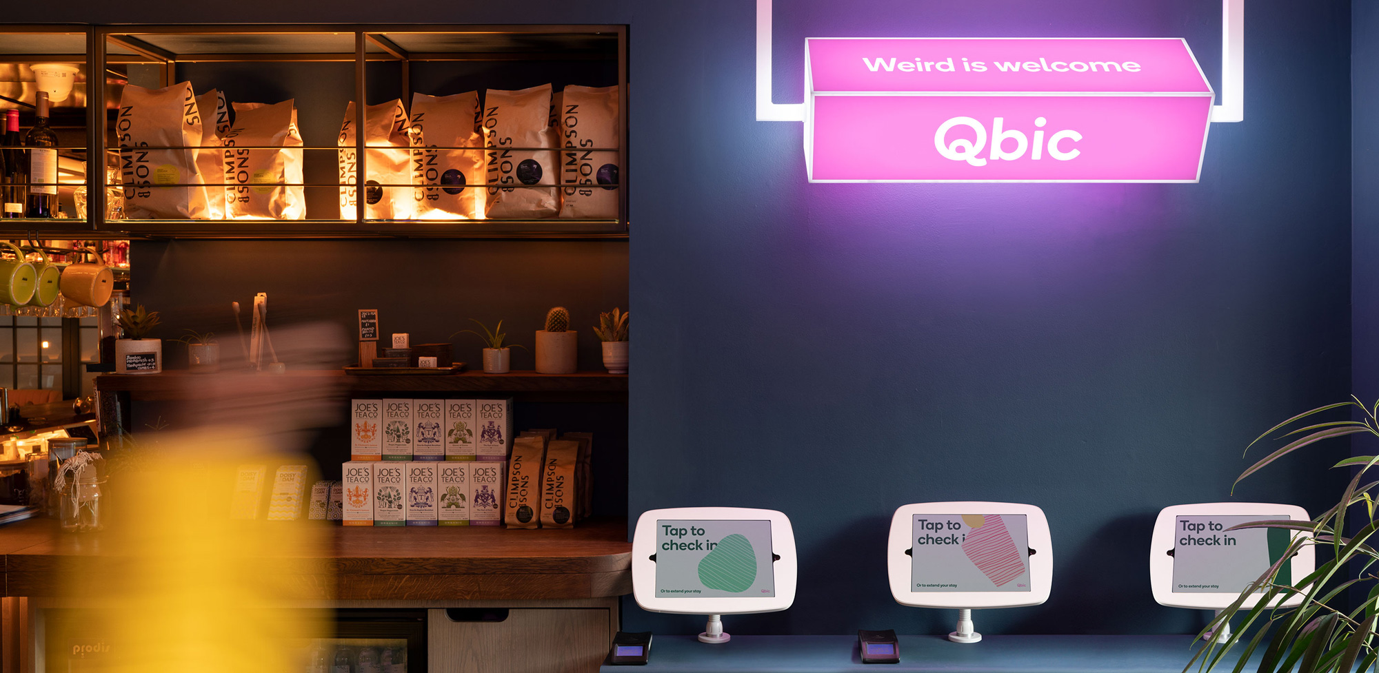
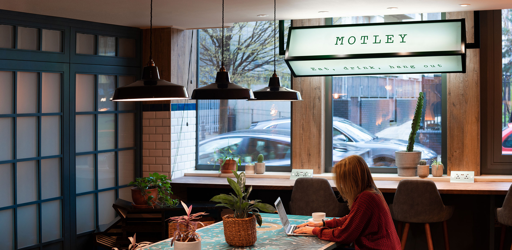
While Qbic’s rooms are for overnight guests, the shared space is for everyone. So Ragged Edge and Qbic created a sub-brand with its own distinct character: Motley is a place for locals and guests to come together to eat, drink, work or play.
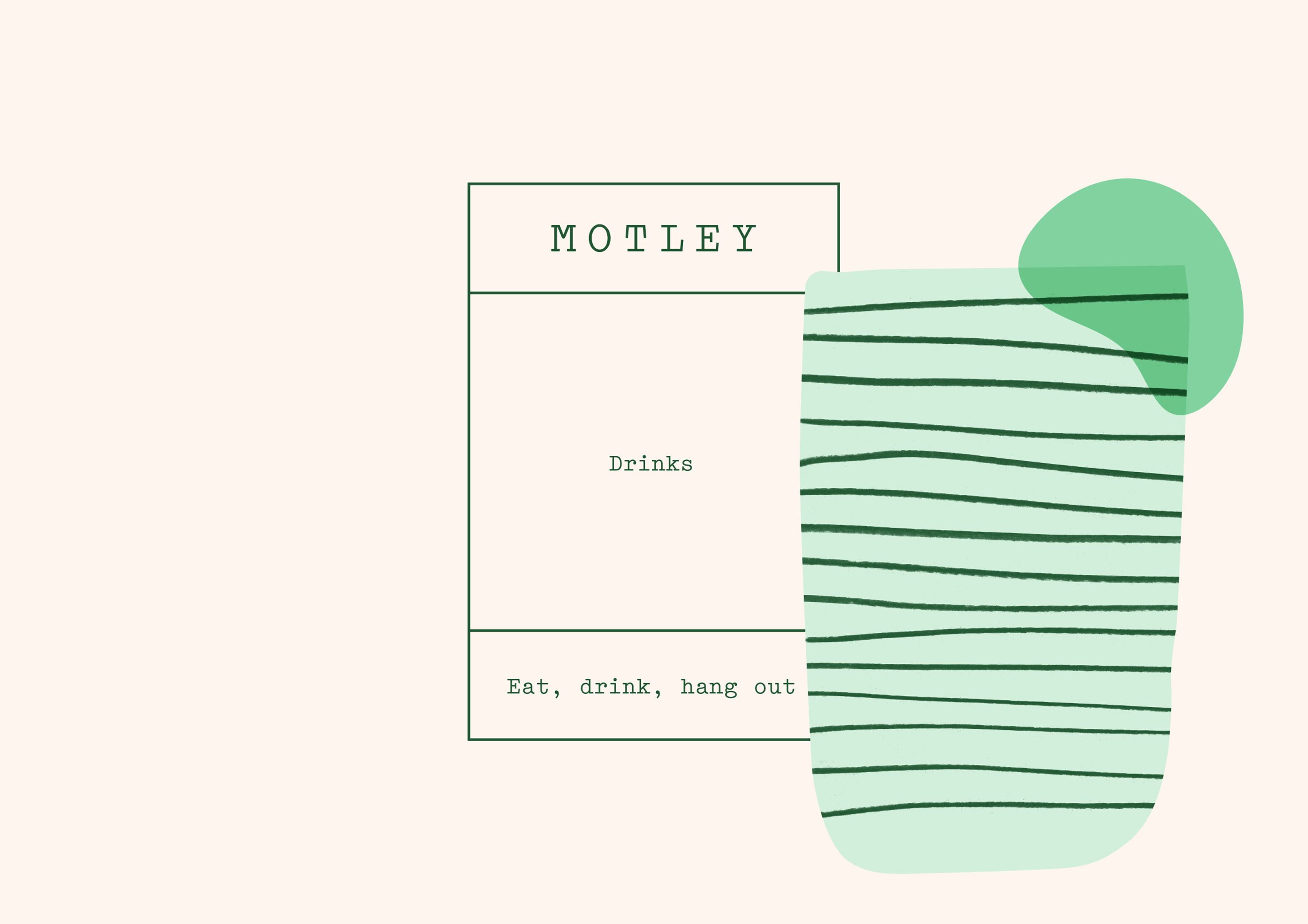
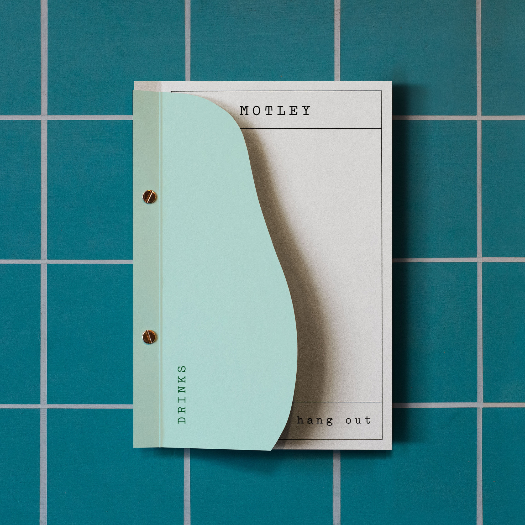
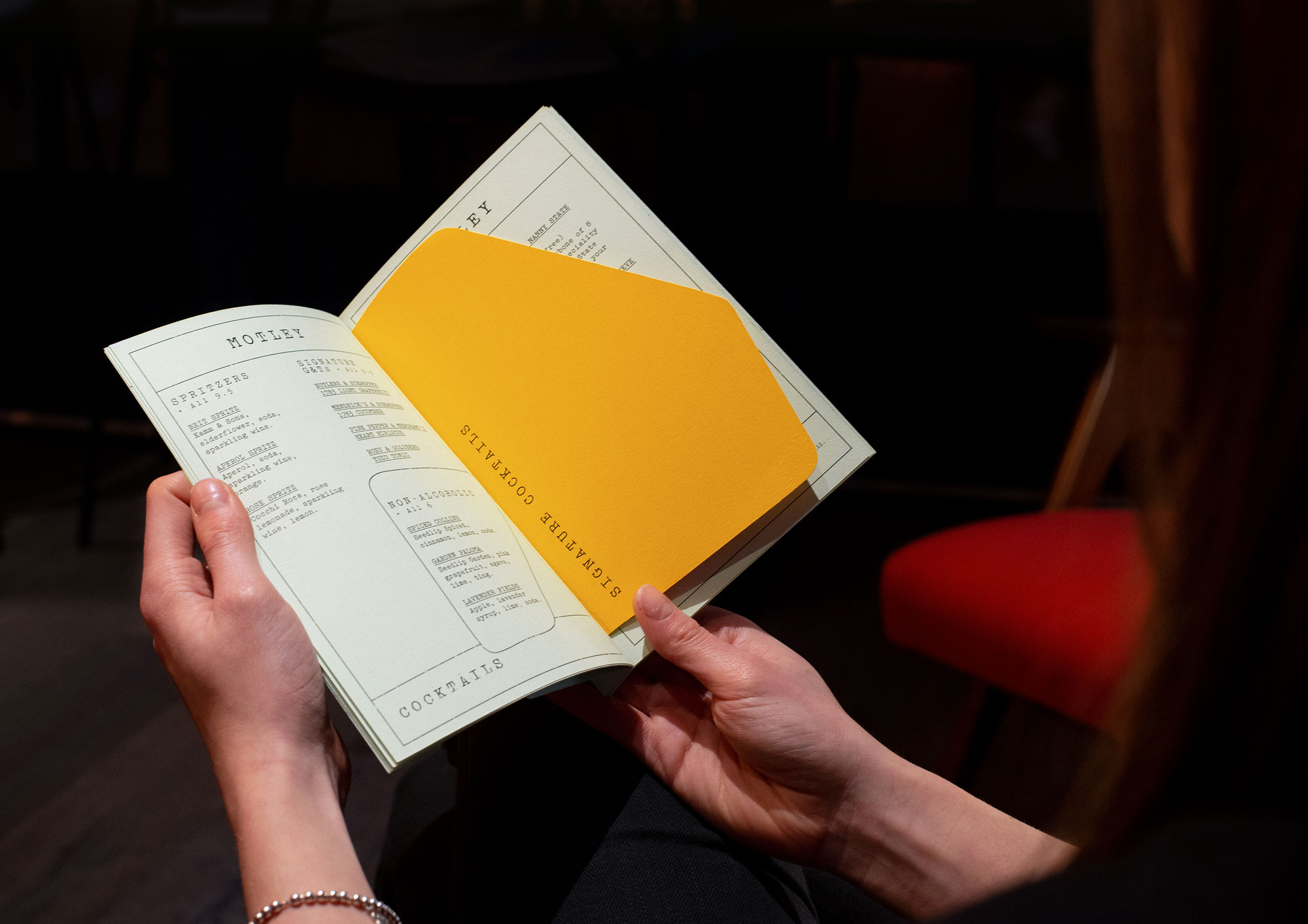
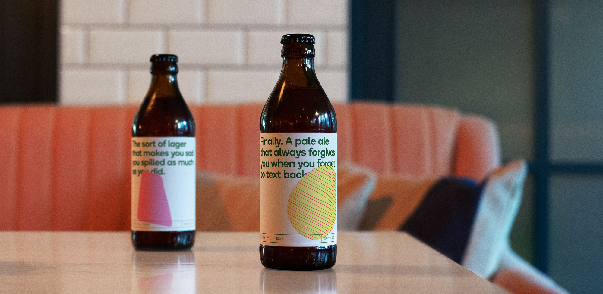
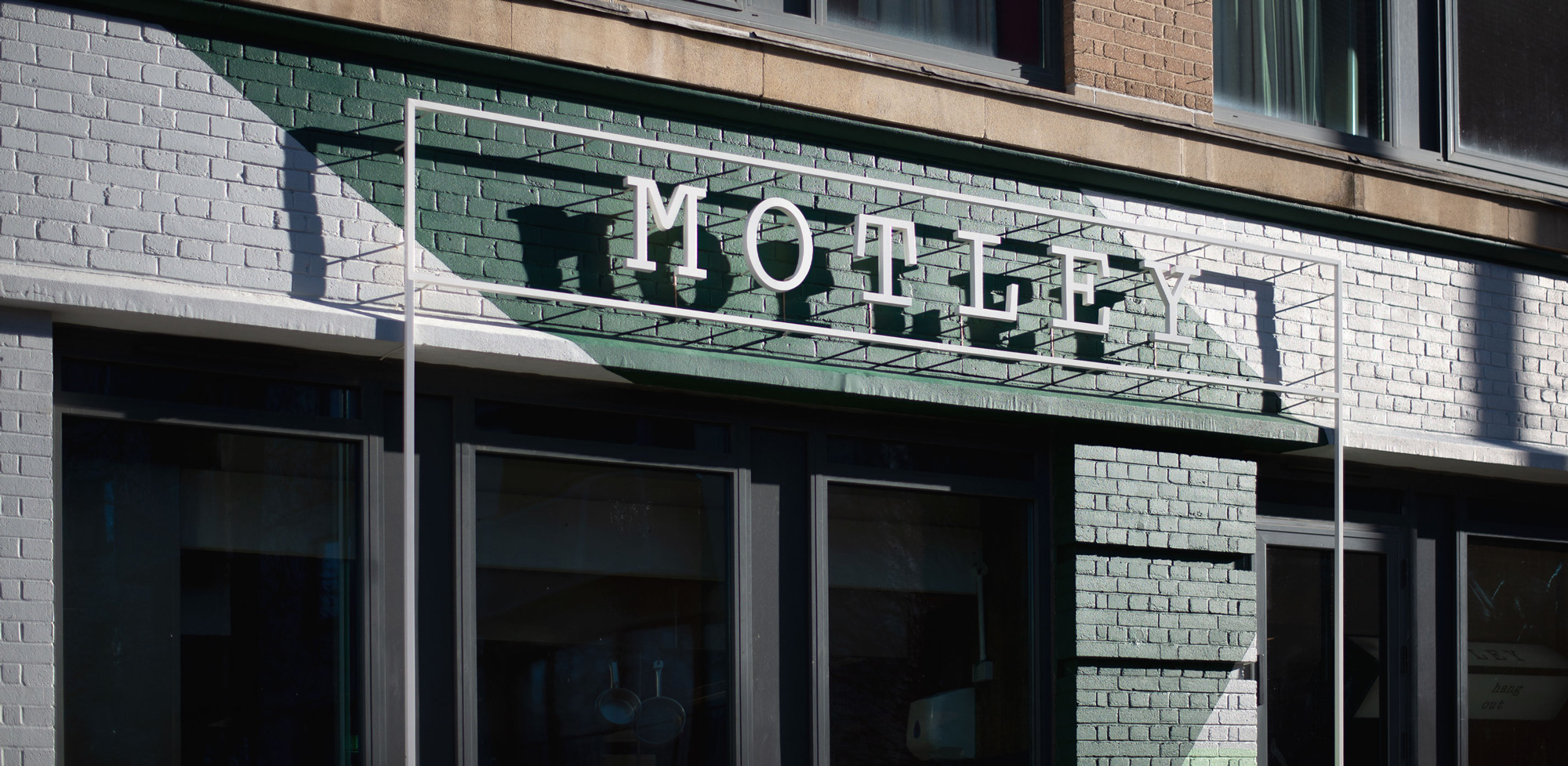
As a bonus to this project, there are the materials for the restaurant, Motley, which would make a decent Friday Likes project on its own. The thin typewriter font for the logo is hipstery and fun while the blob patterns take on more figurative expressions and the funky rotating physical sign from the check-in area makes another appearance. The exterior signage with the thin stroke of the logo translated into a physical thing looks great.
Overall, this is a good-looking update that is a better representation of the hotel experience and makes for a nice system that conveys that Qbic hotels are a place where you can get a good night’s sleep and some decent avo toast.

 Новости Союза дизайнеров
Все о дизайне в Санкт-Петербурге.
Новости Союза дизайнеров
Все о дизайне в Санкт-Петербурге.