Обзор лучших ресурсов по разработке бренда, разработке упаковки
contact us | ok@ohmycode.ru
contact us | ok@ohmycode.ru
Built in 1944, Seattle-Tacoma International Airport — colloquially known as Sea-Tac — is among the top ten busiest airports in the U.S. and serves as the primary commercial airport for the Seattle metropolitan area in the state of Washington. Operated by the Port of Seattle, 30 airlines connect to 91 non-stop domestic and 27 international destinations at the airport. It served 51.8 million passengers and 453,549 metric tons of air cargo in 2019. A current project, expected to be completed in 2021, is a new international arrivals facility, being constructed across the runway from the main terminal and will feature the longest aerial walkway over an active taxiway of any airport. Earlier this year, Sea-Tac introduced a new logo, which we covered in the Spotted section, and now we have a look at the full identity, designed by Seattle-based Turnstyle.
Like the region itself, the airport has undergone massive growth in the past decade. But along with historic growth had come a bit of a brand identity crisis. While the name of the airport remains Seattle-Tacoma International Airport, it had been variously identified as the “Port of Seattle” operationally, as “Sea-Tac” locally, as “SEA” nationally, and sometimes as a more generic “Seattle” internationally.
The objective was to clarify the airport’s identity and to facilitate a strong and consistent brand experience—to inspire travelers, to promote the beauty of the Pacific Northwest, to reflect the region’s civic pride as an international gateway and to provide a unifying customer service vision of excellence for employees. Success would mean distinguishing the airport as a celebrated destination and, ultimately, influencing travel choices for customers and the commensurate investments by airlines in the region.
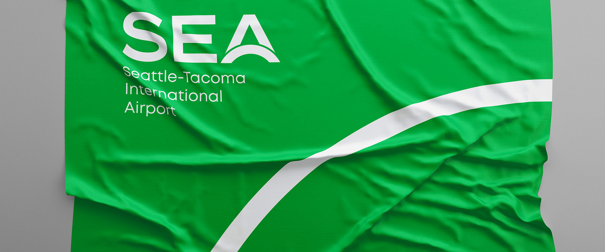
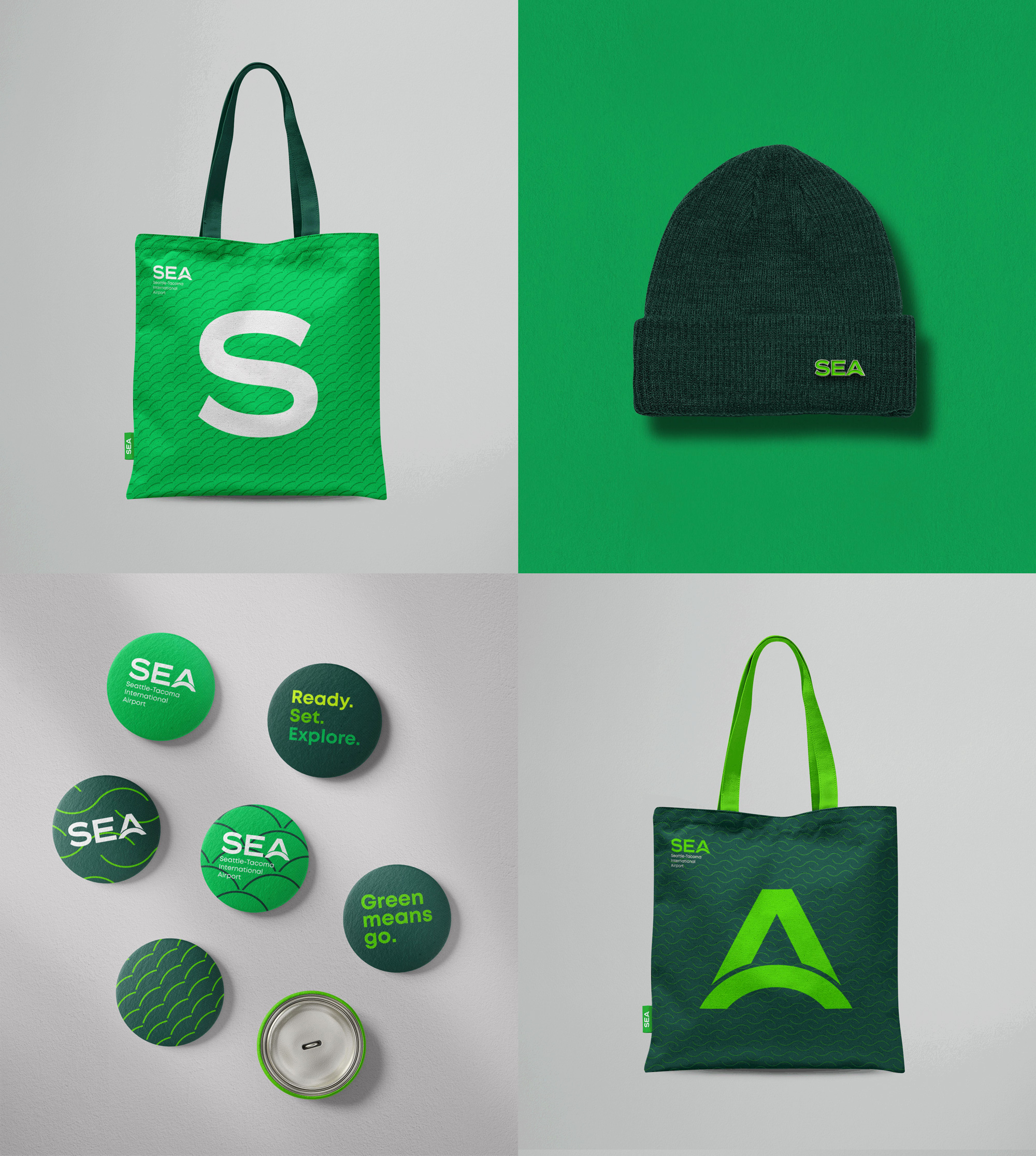
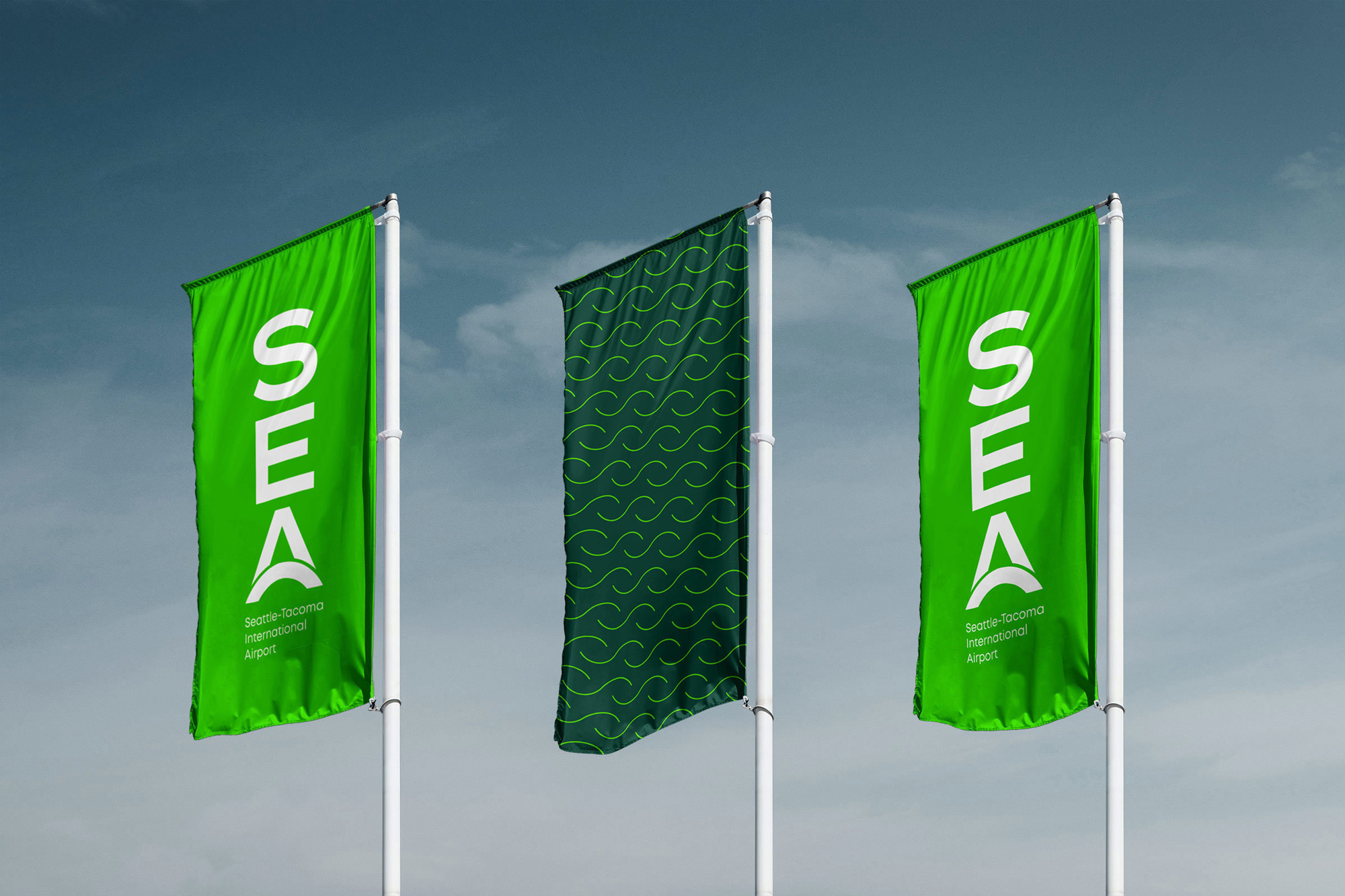
Travelers recognize three-letter airport codes on luggage tags and when booking online reservations. We embraced this industry standard by making S-E-A the simplified moniker for the brand. The stylized curving crossbar of the A, inspired by airline route maps, represents the arc of travel—a journey from here to there (or there to here).
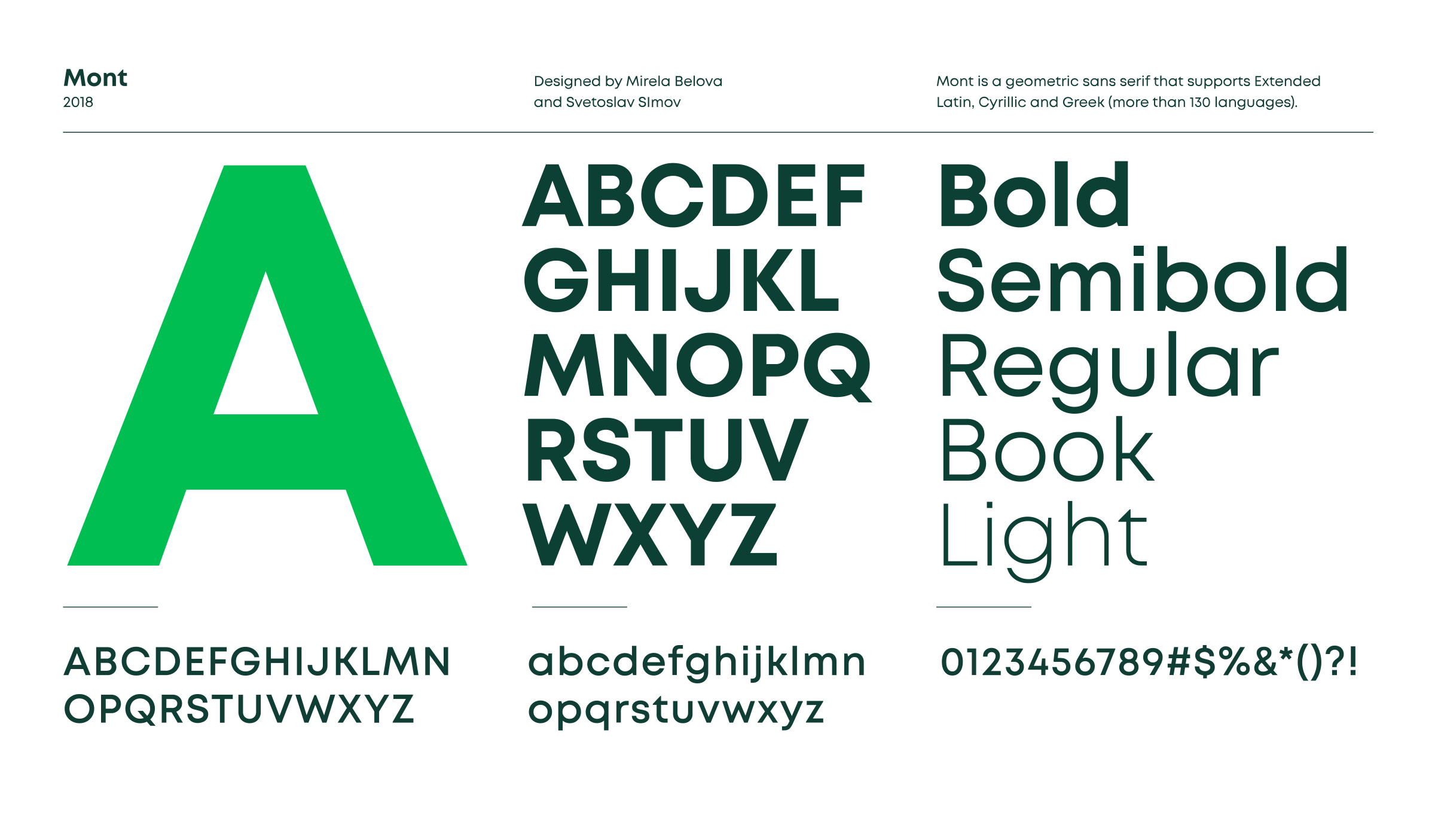
The old logo was more or less, possibly less, fine as a logo but in terms of representing the airport it wasn’t right as all the focus was on “Port of Seattle” not “Seattle-Tacoma International Airport”… it’s as if the logo at the top of the page here on Brand New had a huge “UnderConsideration” wordmark with “Brand New” all small and secondary — not right, right? The new logo takes the three-letter airport code, SEA, to build a new recognizable visual shorthand for the airport, rendered in a rather nice extended sans serif with an “A” that features an arc as its crossbar. Visually, I’m not super crazy about how the arc is integrated through the thin white stroke but I don’t dislike it either and I do like how the curves of the “S” and the arc match. Conceptually, per the explanation one image above… I can, pun intended, get on board with it. The wordmark, typeset in Mont is mostly fine — there is something about the single-storey “a”s that seems off, maybe looking too playful somehow? — and I like how they shifted the left alignment to match the angle of the “A”, which gives some extra room to the longer “Seattle-Tacoma” line.
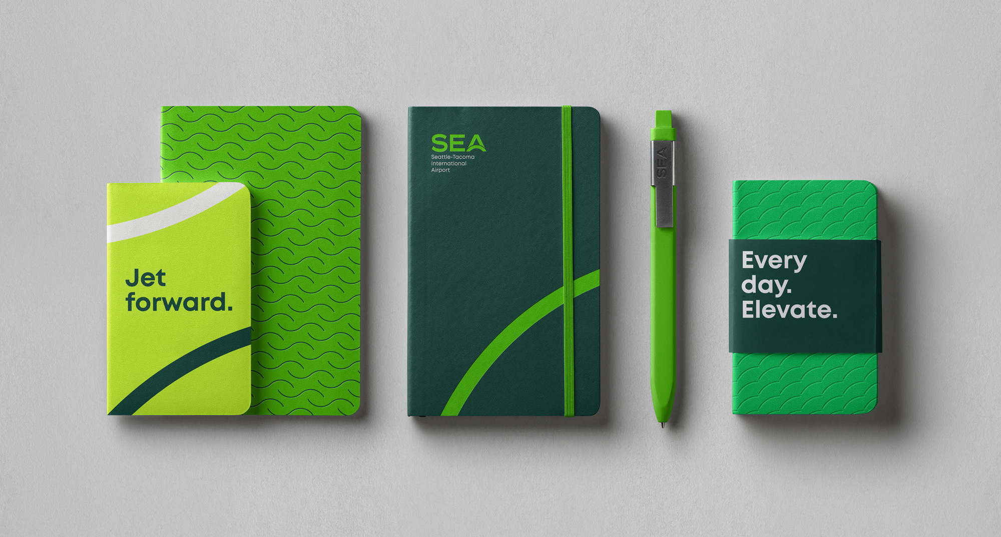
The brand mantra: We endeavored to raise the airport’s sights above and beyond aviation infrastructure. To position the brand to cater to the well-being of the traveler. To elevate the customer experience and set a higher standard for customer service. To be empathetic, efficient and proactive.

I’ve never been a fan of taglines that jam together words with periods: Lazy. It. Feels. I always get the sense that client and designer (or copywriter or strategist) had words they liked but could never figure out how to put them together into a short, coherent sentence. This is a perfect example where, yeah, the airport operates every day and I guess airplanes elevate and the goal for the airport is to elevate that experience every day but give me a beginning, middle, and end — not just two beginnings, or middles, or ends — and perhaps throw in a comma for good measure. I digress…
Seattle and surrounding areas are filled with lush vegetation year-round due to prevalent rain and the proliferation of evergreen trees. This naturally influenced the color palette of the visual identity system.


I have always enjoyed combinations of greens and these are all nice and bright, so I’m sold on that palette.

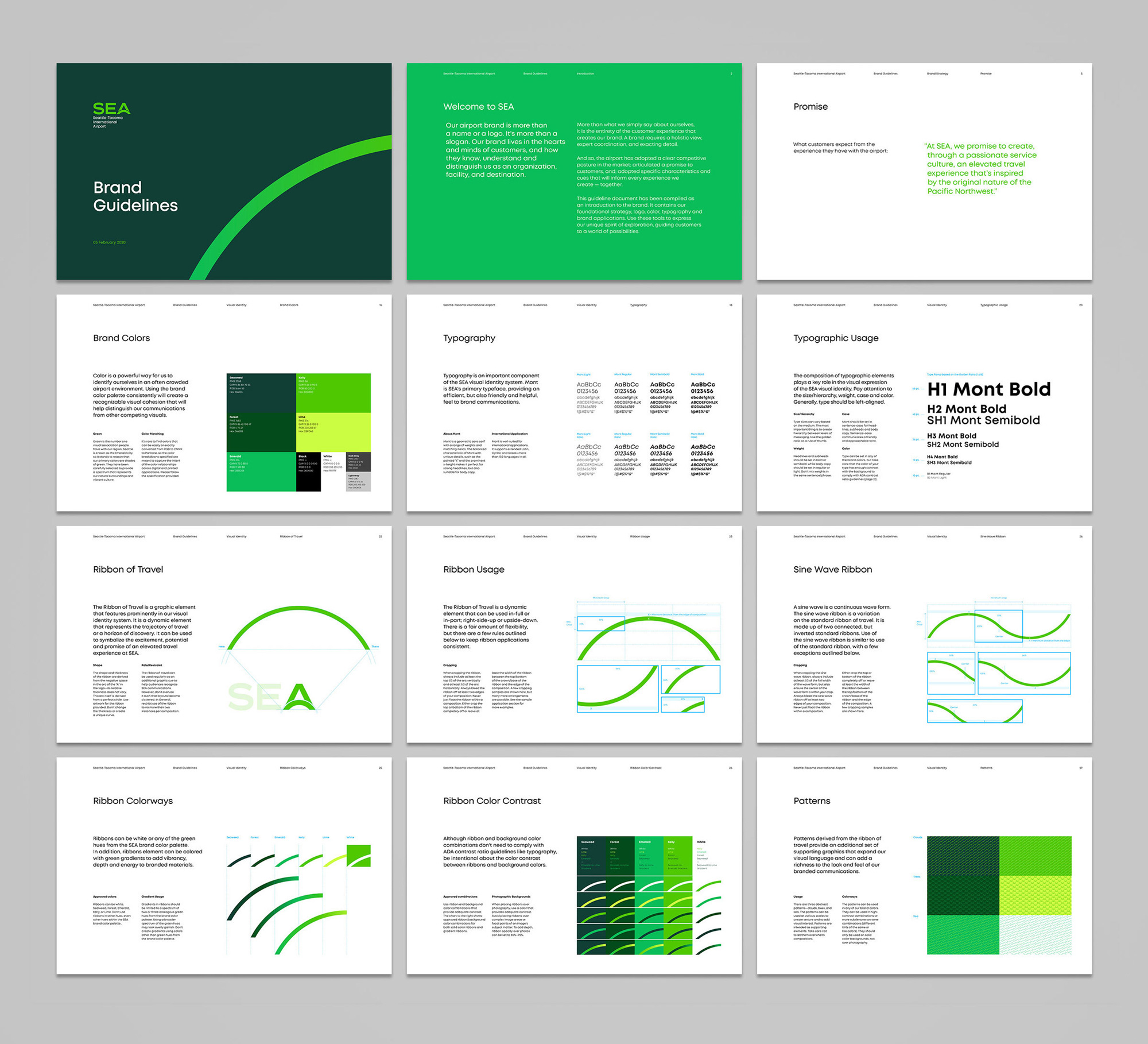
SEA will soon boast the longest aerial walkway over an active taxiway on the planet. It will connect the new International Arrivals Facility to the Main Terminal, offering stunning views and symbolizing SEA’s position as a leading international gateway. A graphic arc or “ribbon of travel,” inspired by the bridge (and derived from the crossbar of the A in the logo) is used to symbolize the excitement, potential and promise of an elevated travel experience at SEA.
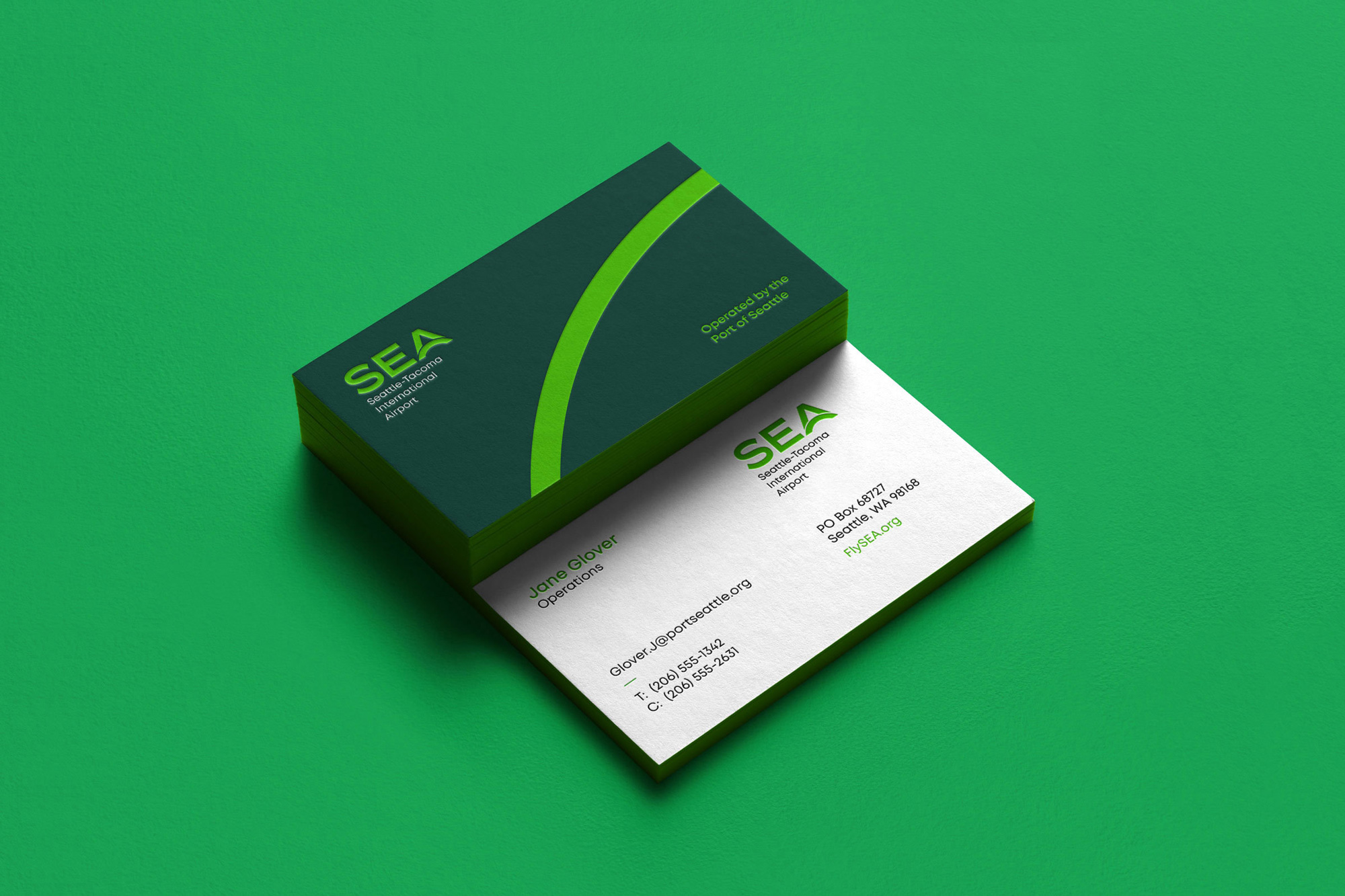
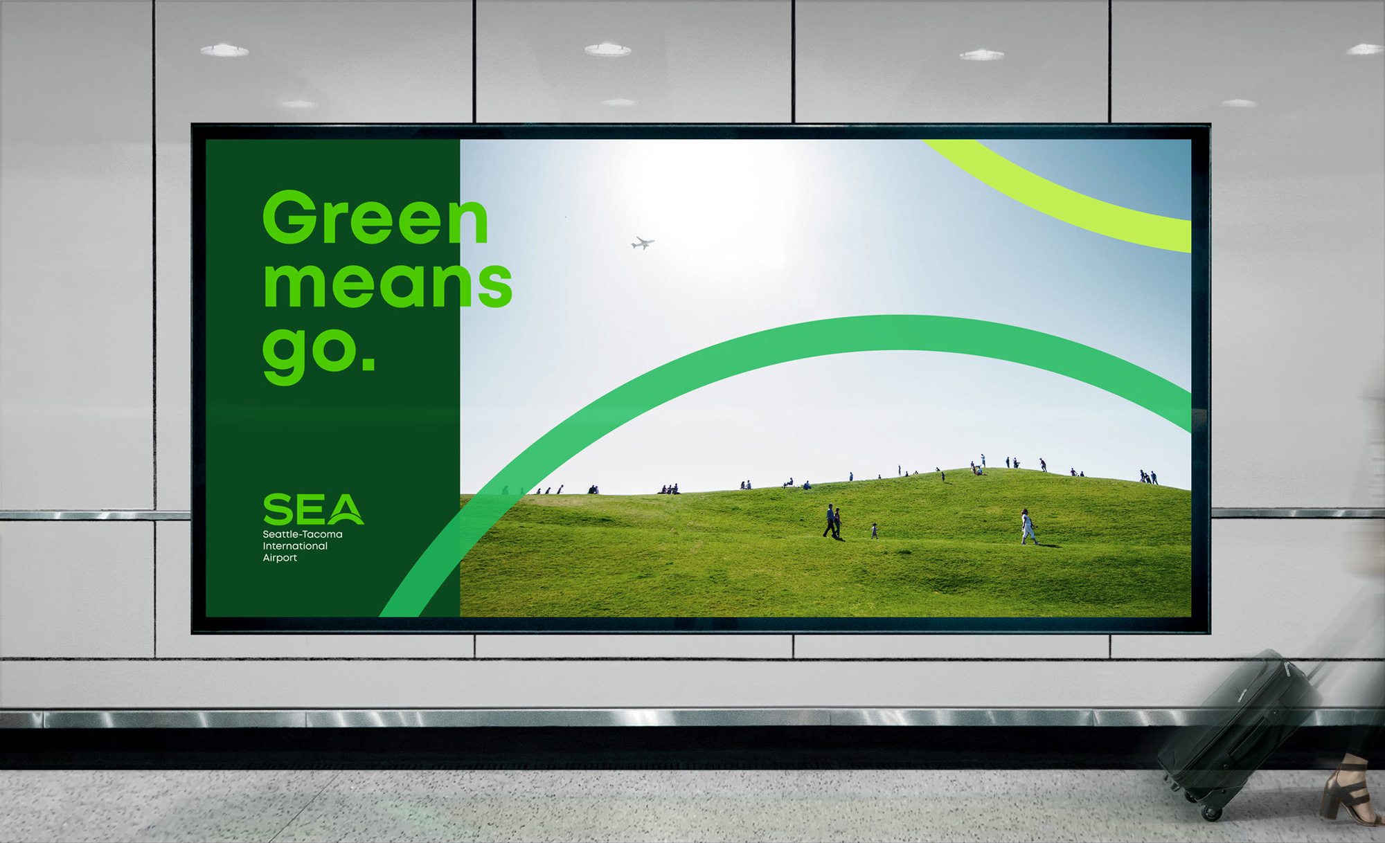
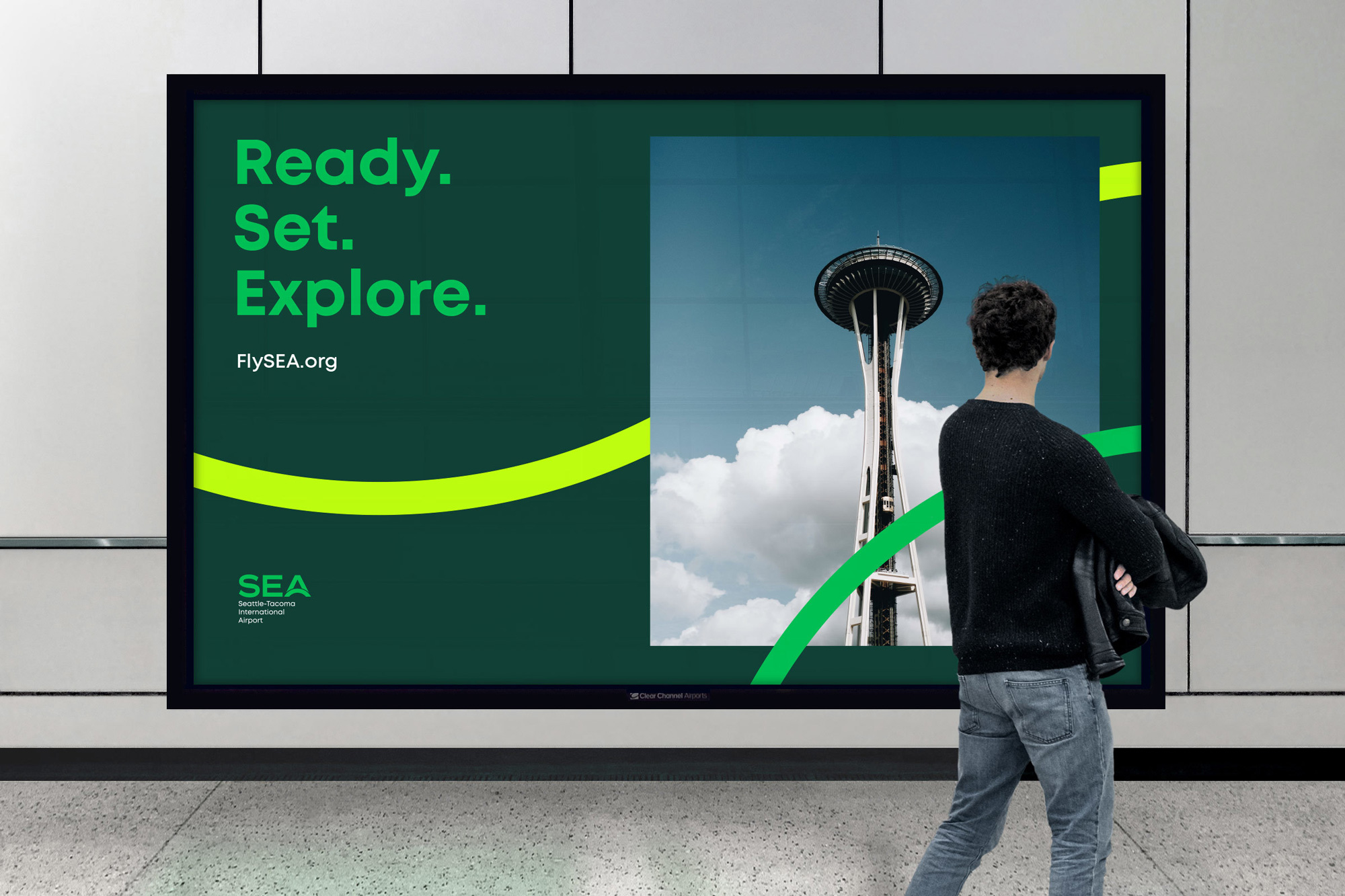
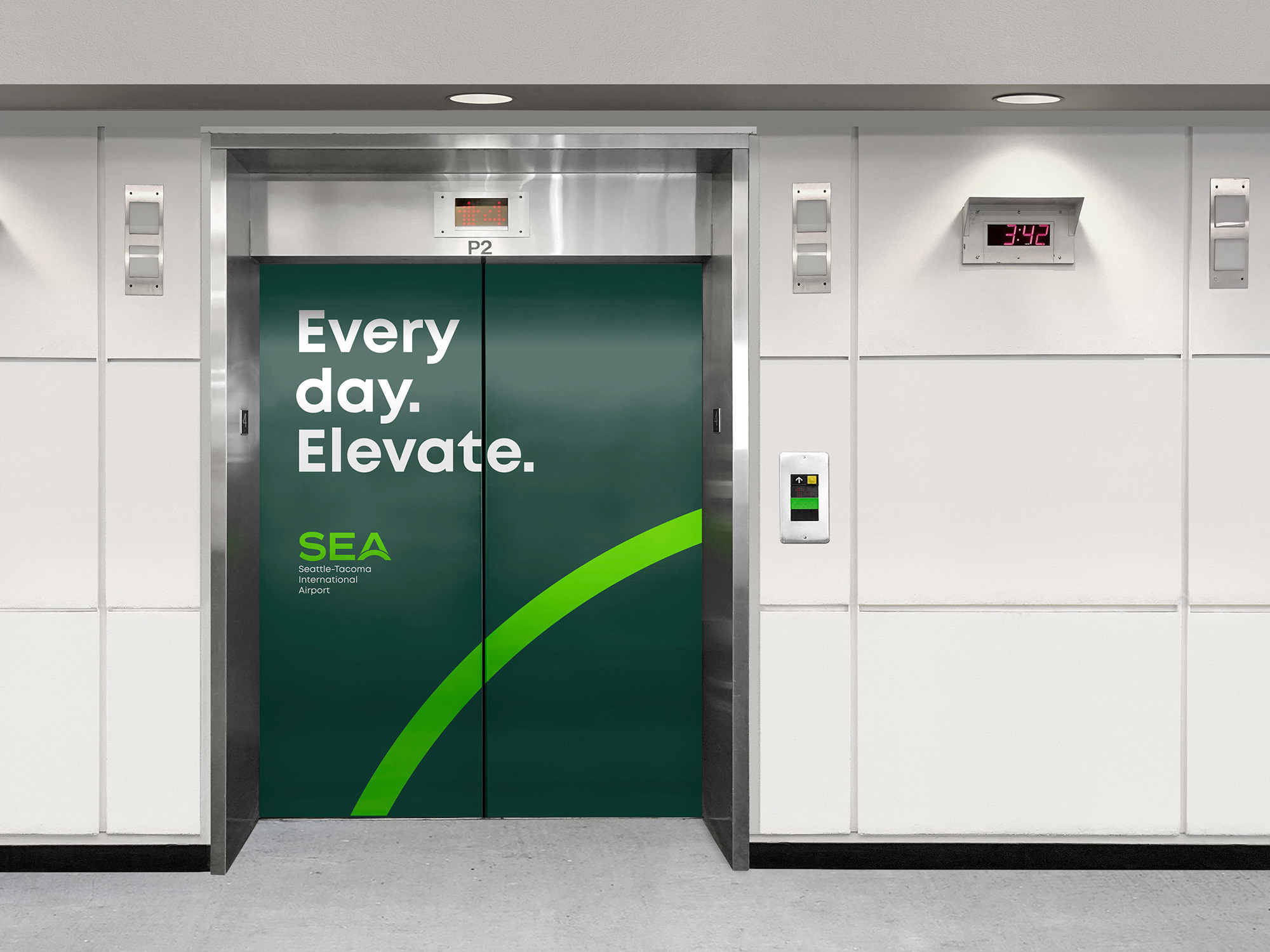
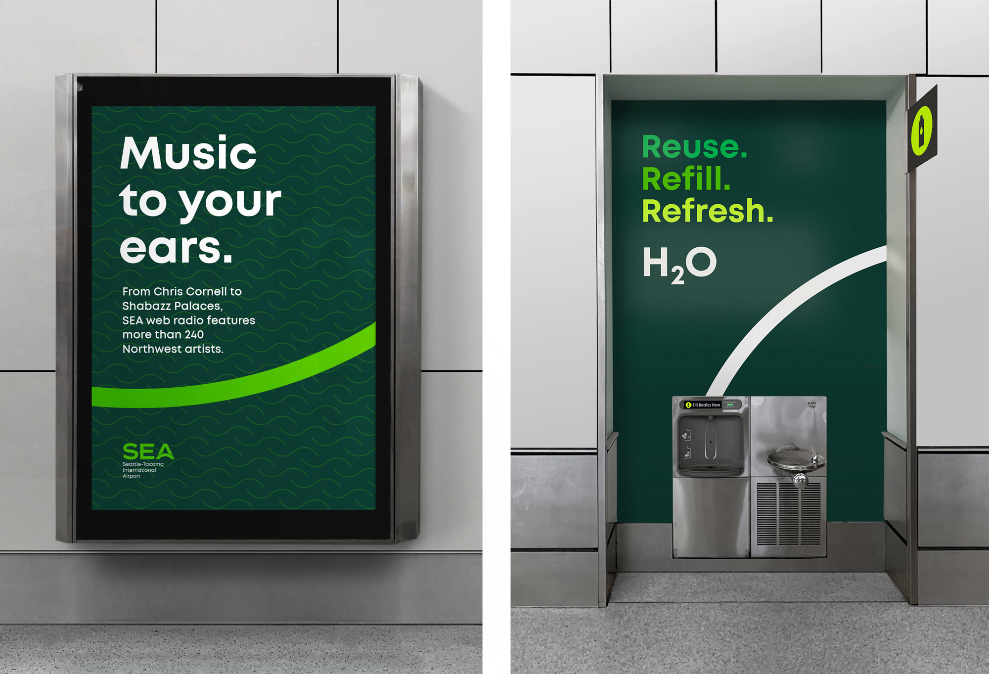
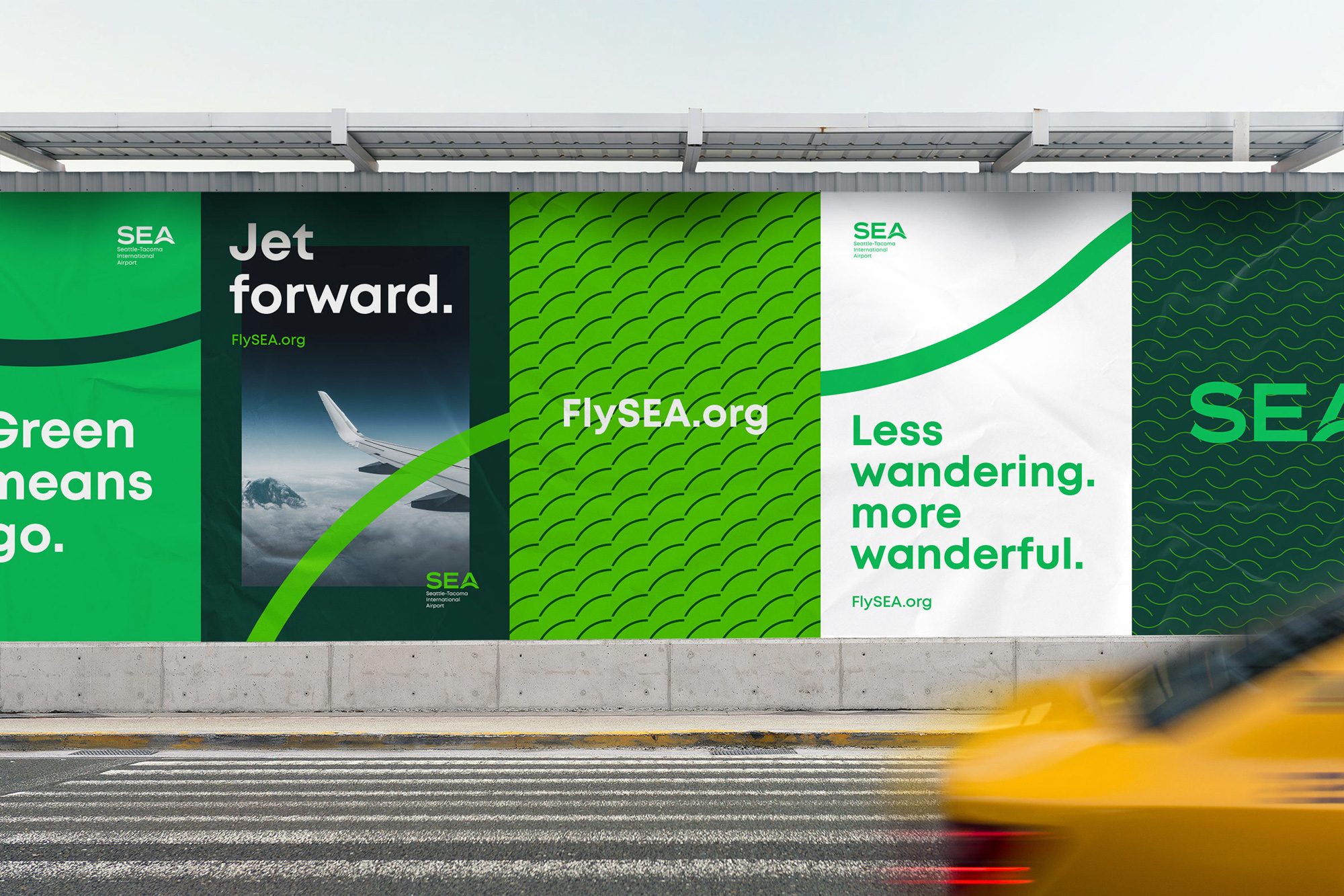
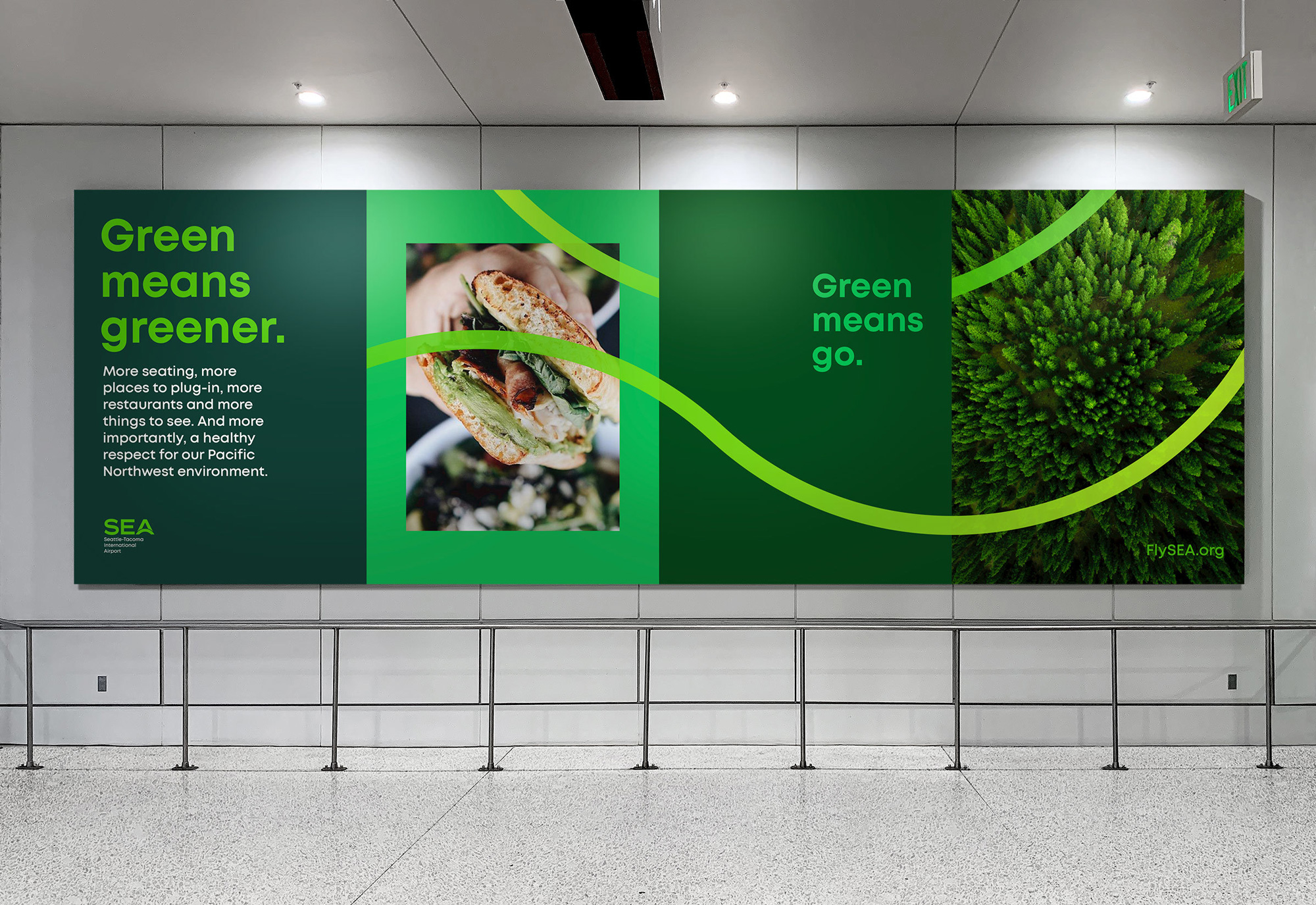
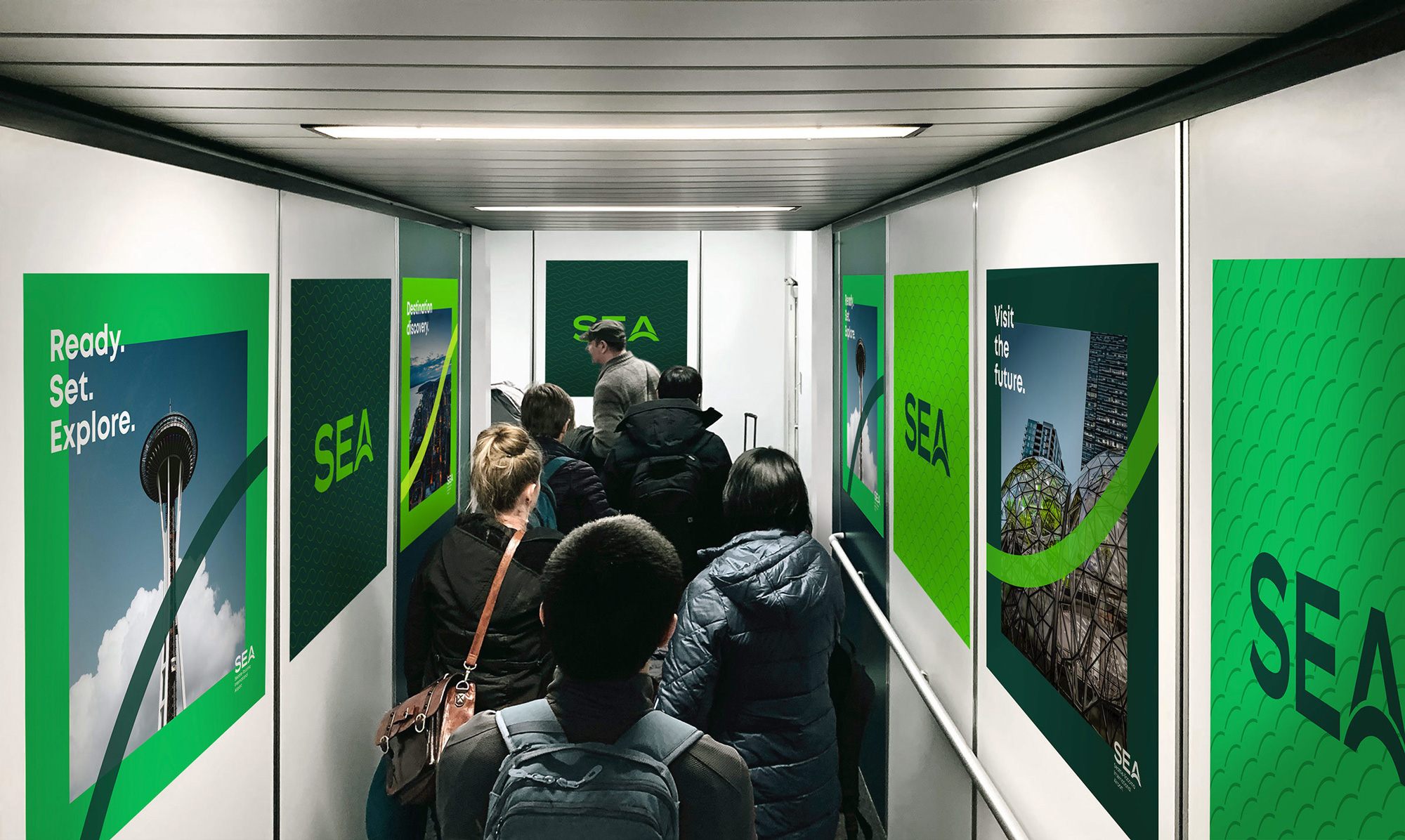
In application, the core idea is that the arc of the “A” or the “bridge” anchors every layout by showing up in the lower-right quadrant of most layouts. Sometimes it flips, sometimes it’s accompanied by another arc. Photos are cropped inside rectangles with heavy margins and the type is big, bold, and bright. In principle, this is all fine but the execution somehow feels like it’s missing cohesiveness, as if all the elements are working on their own rather than together. Nothing here is bad or ugly — maybe the patterns, a little, as they feel way different from the rest of the elements — it’s, in fact, all good, but I feel like this could somehow be really great and it’s not quite there yet, which is usually a challenge when creating mock-ups of things-that-could-one-day-exist so it will be interesting to see how this develops in the future.
Overall, as airports keep trying to elevate — hey! I’m on brand and I didn’t do that on purpose — their own presence so that airlines don’t overshadow them and to reinforce positive experiences and expectations for passengers, this identity for Sea-Tac is above and beyond what most airports have and, despite some of my personal grievances, is a solid identity with an easily recognizable logo to help passengers discern between airline touchpoints and airport touchpoints.
Thanks to Carlos Montalvan for the tip.
 each year since publication began in 2006

 Новости Союза дизайнеров
Все о дизайне в Санкт-Петербурге.
Новости Союза дизайнеров
Все о дизайне в Санкт-Петербурге.