Обзор лучших ресурсов по разработке бренда, разработке упаковки
contact us | ok@ohmycode.ru
contact us | ok@ohmycode.ru
(Est. 1945) “The Borregos Monterrey (in English: Rams) is the name of all the sports teams that represent the Monterrey Institute of Technology and Higher Education (ITESM) in various sports, such as: basketball, volleyball, American football and football for both men’s and women’s teams. The Tec de Monterrey teams are best known for college football across Mexico. The two most successful Borregos football teams are those from the Monterrey and State of Mexico campuses. These two teams have won the majority of the college league championships since the early 1990s.” (Wikipedia)
Chermayeff & Geismar & Haviv (New York, NY)
Chermayeff & Geismar & Haviv project page
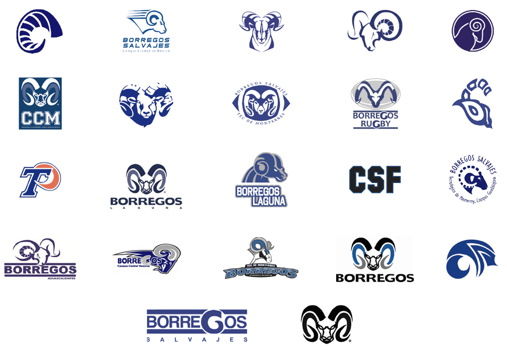
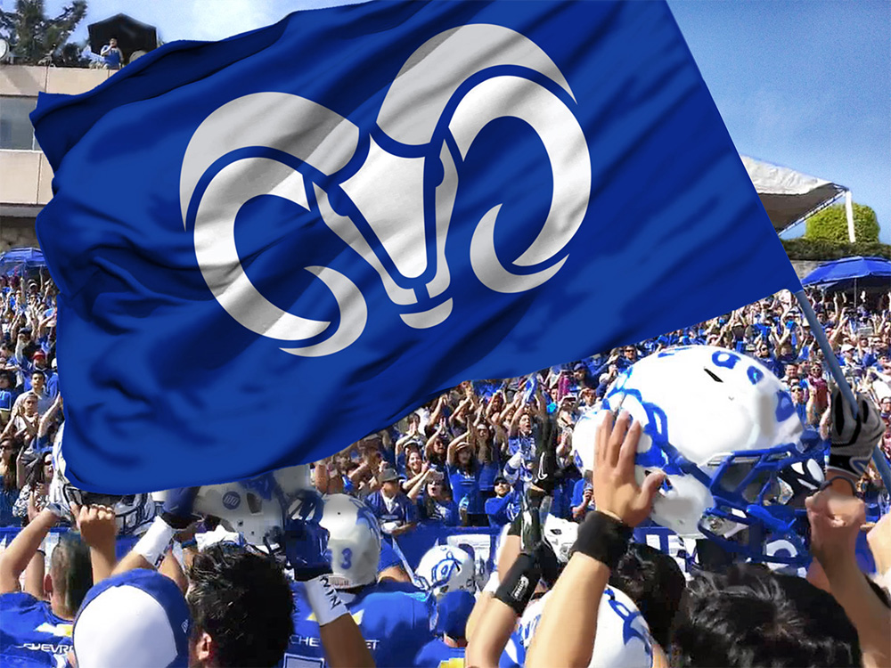
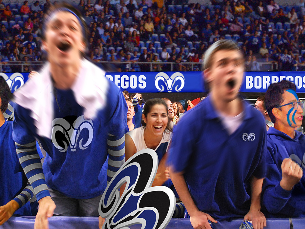
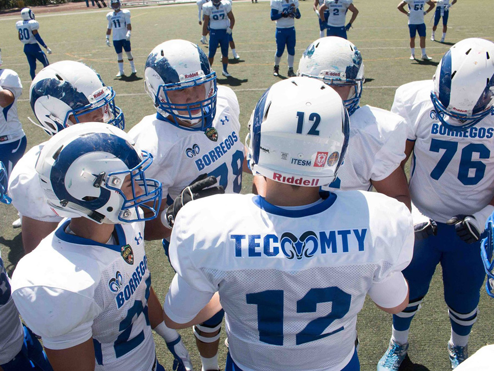
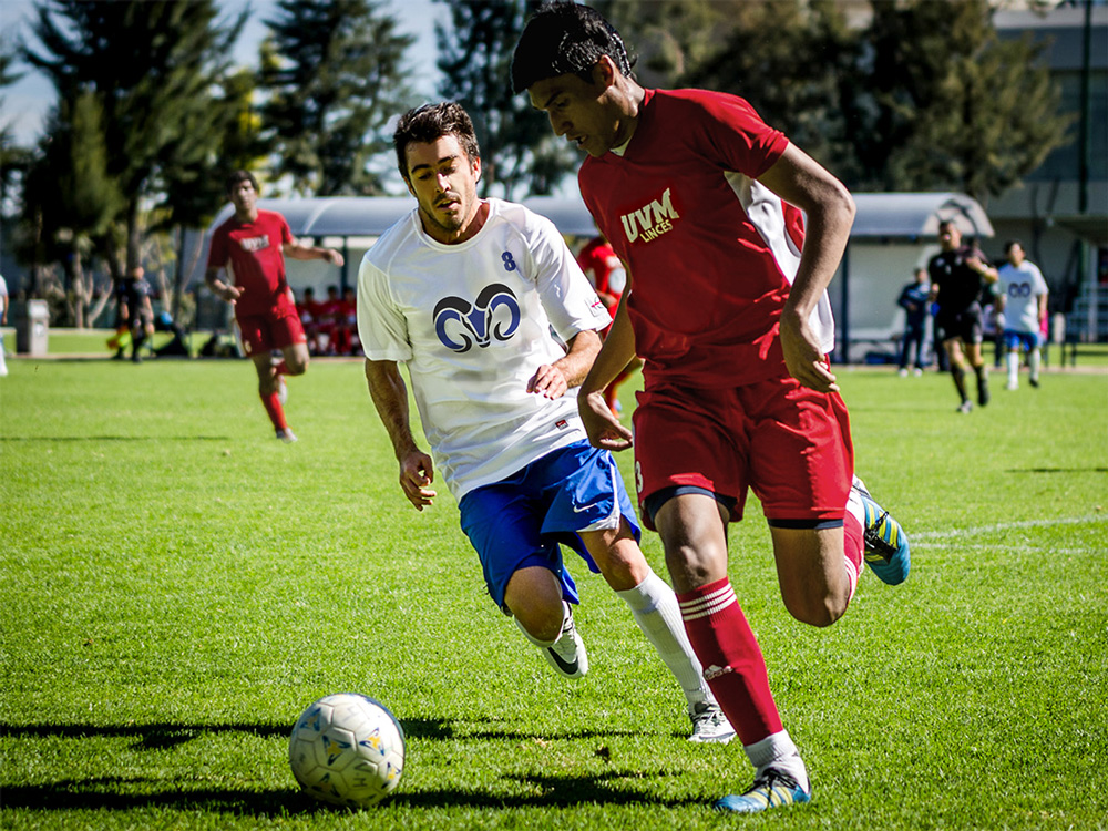
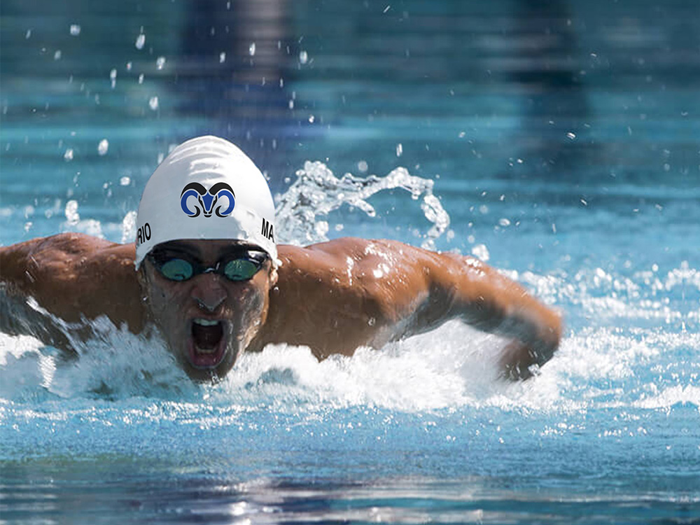
The new Borregos ram’s head logo replaces all existing designs. Building on elements familiar to student athletes, the new design is cleanly rendered and functions effectively with the new Borregos wordmark. A three-letter abbreviation for each campus combines with the new logo to create a complete and customized system for differentiating the various teams. With new uniforms, helmets, signage, and promotional materials for every sport and campus, the cohesive new identity will enhance the visibility and prestige of the university’s presence across the nation and beyond.
The Tec de Monterrey football team is the closest there is in Mexico — across all sports and all colleges — to something like Nebraska or Notre Dame in terms of legacy and wins but even then, neither it nor the rest of the athletic teams of one of the best universities in Mexico have the brand awareness or merchandise power of its U.S. counterparts. (Check out this NYTimes story on the team if you are into in-depth sports stories.) In the opening image I placed two of the most recently recurring logos but as the first image below shows, they are only two of many in current rotation and they all share the dubious claim of sucking in equal measure. The new ram icon is an evolution of a previously seen version that is now expertly executed with minimal elements that communicate the expected aggressiveness of a college sports team logo. The icon works best on dark backgrounds where the eyes are dark, making it more "natural". It looks great small and large and now stands a chance to compete with one of the best Mexican sports logos, that of the Pumas of UNAM. The accompanying typography leaves some ambition to be desired for, as it's a very basic "varsity" typeface without much interest and in its main use, with TEC MTY (Tec Monterrey), the angles of the "C" stand out weirdly. The "BORREGOS" wordmark is better. Overall, though, it's all about that ram and it's pretty bad-ass.


 Новости Союза дизайнеров
Все о дизайне в Санкт-Петербурге.
Новости Союза дизайнеров
Все о дизайне в Санкт-Петербурге.