Обзор лучших ресурсов по разработке бренда, разработке упаковки
contact us | ok@ohmycode.ru
contact us | ok@ohmycode.ru
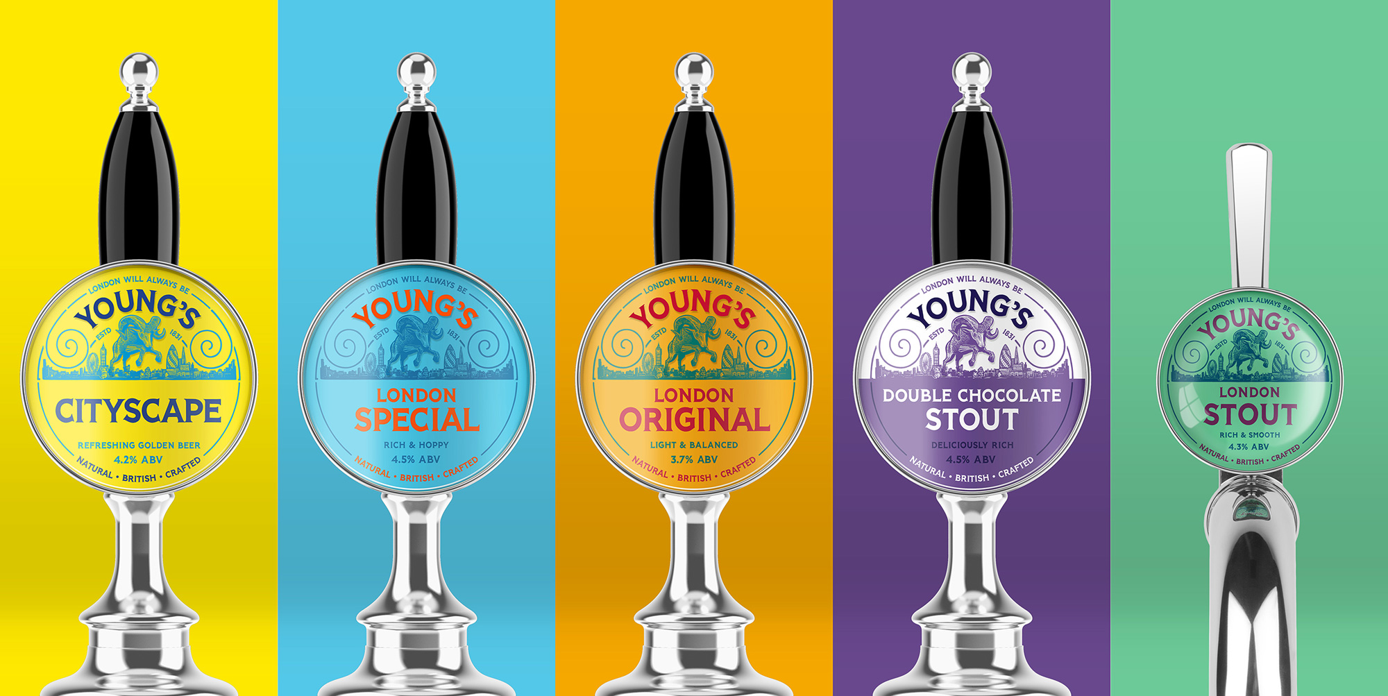
Established in 1831, Young’s is one of the UK’s oldest beer brands, operating its brewery from the same location — where a pub and brewery had been in existence since 1550, apparently — in London until 2006. The brewery was family-run until 2006 as well, with the great-great-grandson of co-founder Charles Allen Young being the last chairman. In 2006, Young’s merged with Charles Wells Brewery to form Wells & Young’s Brewery and moved its brewing operations to Bedford. For a long time, Young’s brewery also operated Young’s pubs, a chain with nearly 220 locations but in 2011 the two businesses separated, which was also the time when Wells bought Young’s 40% ownership of the company. The Young’s brand, still around after all the ownership changes, offers six beers: London Original, a pale ale; London Special, an amber ale; Cityscape, a golden cask ale; Head On, an IPA; a stout; and a chocolate stout. Recently, Wells & Young’s Brewery introduced a new identity for Young’s designed by Cornwall, UK-based Kingdom & Sparrow.
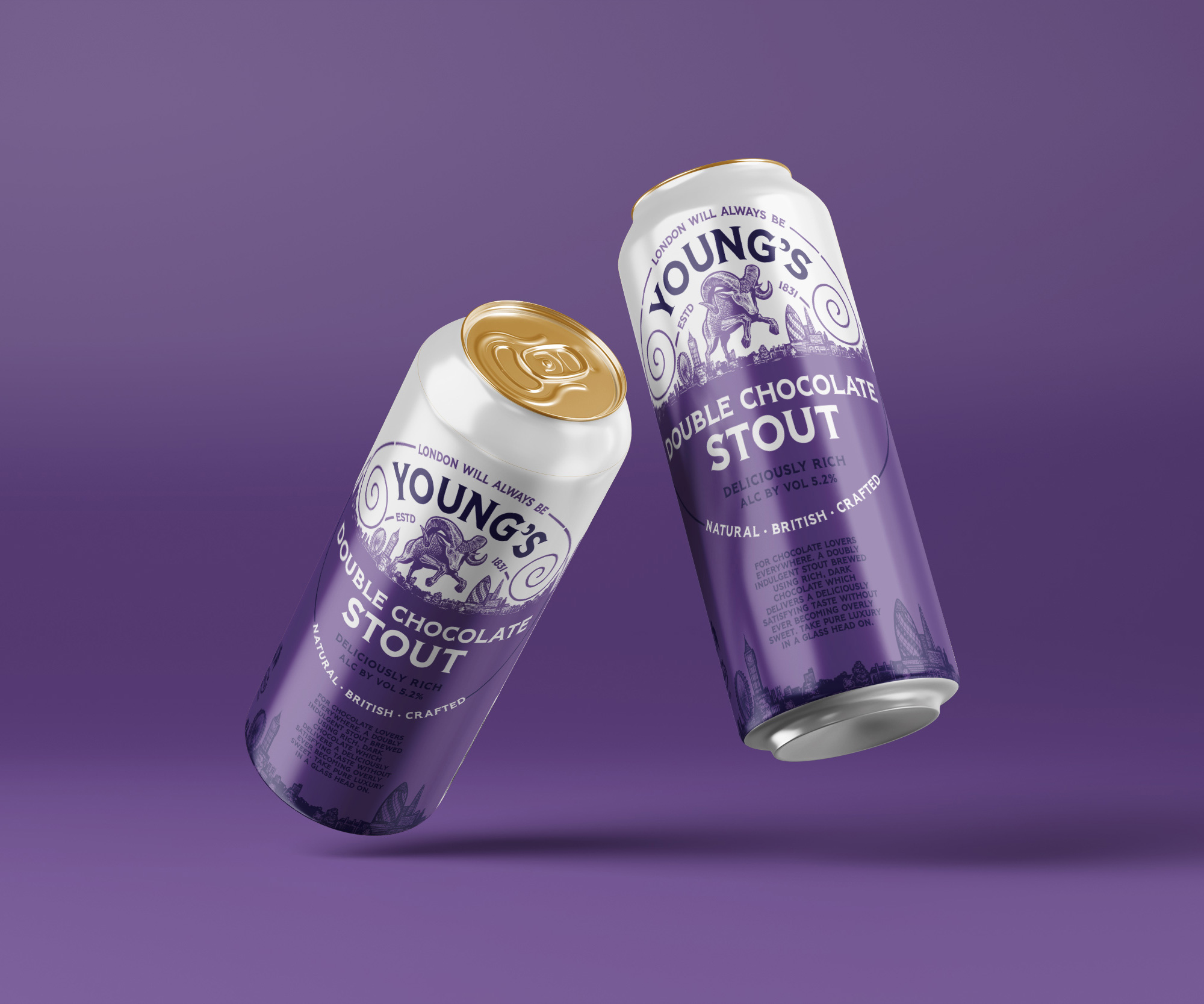
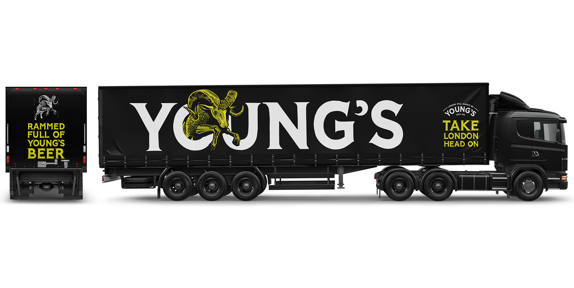
With the core brand message of ‘Take London Head On’, we took Young’s on a bold journey. We created a series of confident and engaging brand assets to help eliminate younger consumer’s perceptions of cask ale and stand up to competitors on the bar and shelf, including a bright colour palette and a handcrafted, bespoke typeface with heritage London cues. Most notably, we’ve injected some attitude into Young’s iconic ram emblem. Previously depicted as static and shy, the new hand-drawn ram leaps confidently over the London skyline.
The old logo was more or less okay… it had a decent base before all the gold casting was put on it. The ram was fine, looking like a gold statue, and the type was decent — except for the “s” that almost looks like they forgot to include it in the first draft — but the gradients in the framing device and stroke made it look cheap. To its credit, it did look like an established brand but apparently that was the problem for the brewery, that it looked too established and old. The new logo is certainly energetic and unexpected, especially considering today’s beer trends that are all about minimalism.
An ornate ram illustration leads the charge in a pose that is definitely in your face with some big-ass horns coming straight at you. I like the roughness of the textures and how well they work in white when the stroke of the ram isn’t so defined and heavy-handed as in the black-on-white version. The custom typography is pretty cool, in a kind of taller, rougher Copperplate style. Big ups to the apostrophe being a ram horn. The “OU” kerning pair on the curve could have been better resolved and the overall letter-spacing in the rest of the words could be looser but, overall, the flared serif looks good, exuding a kind of vintage vibe with some contemporary flair.

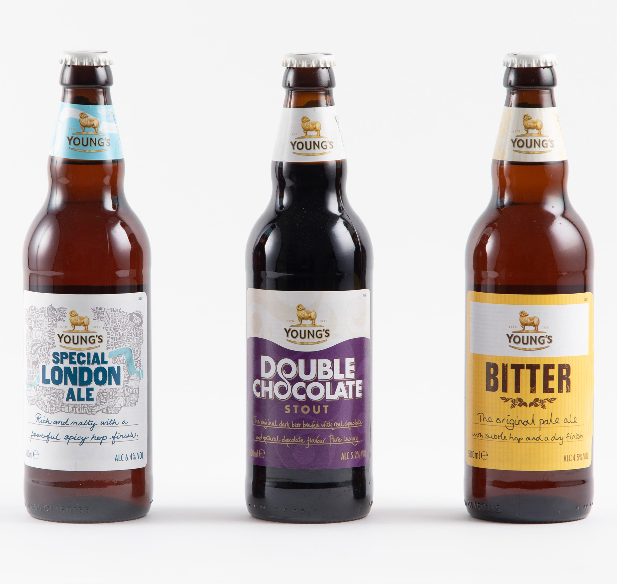
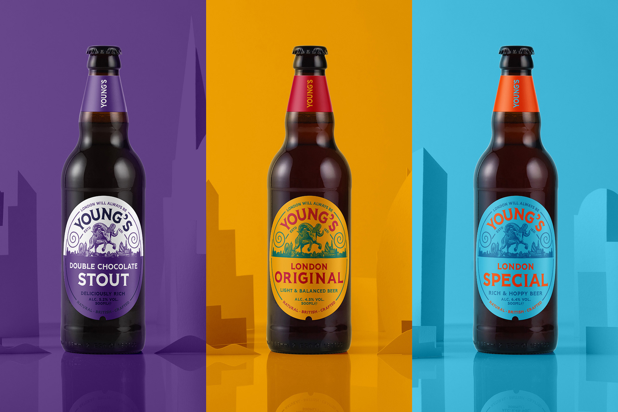
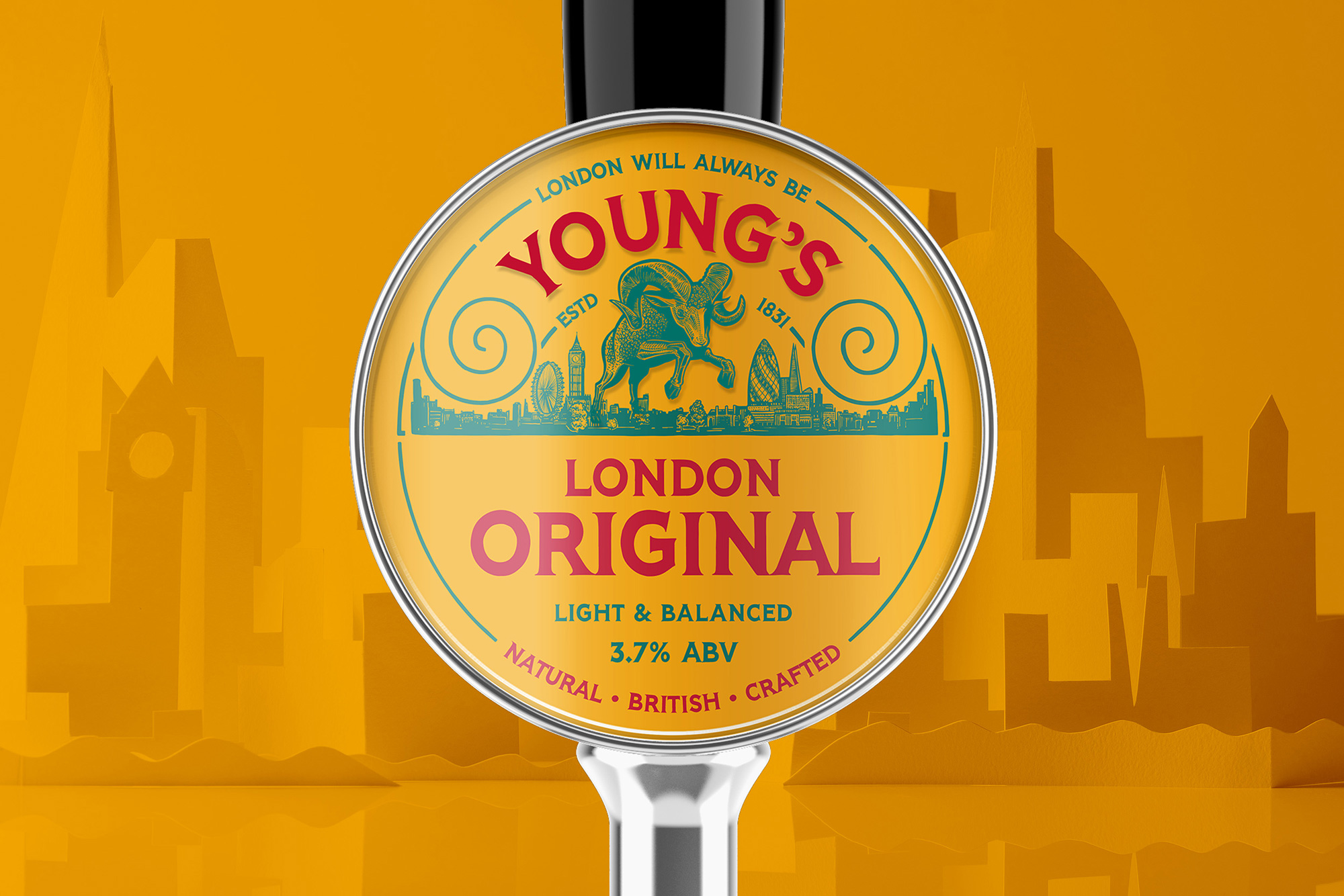
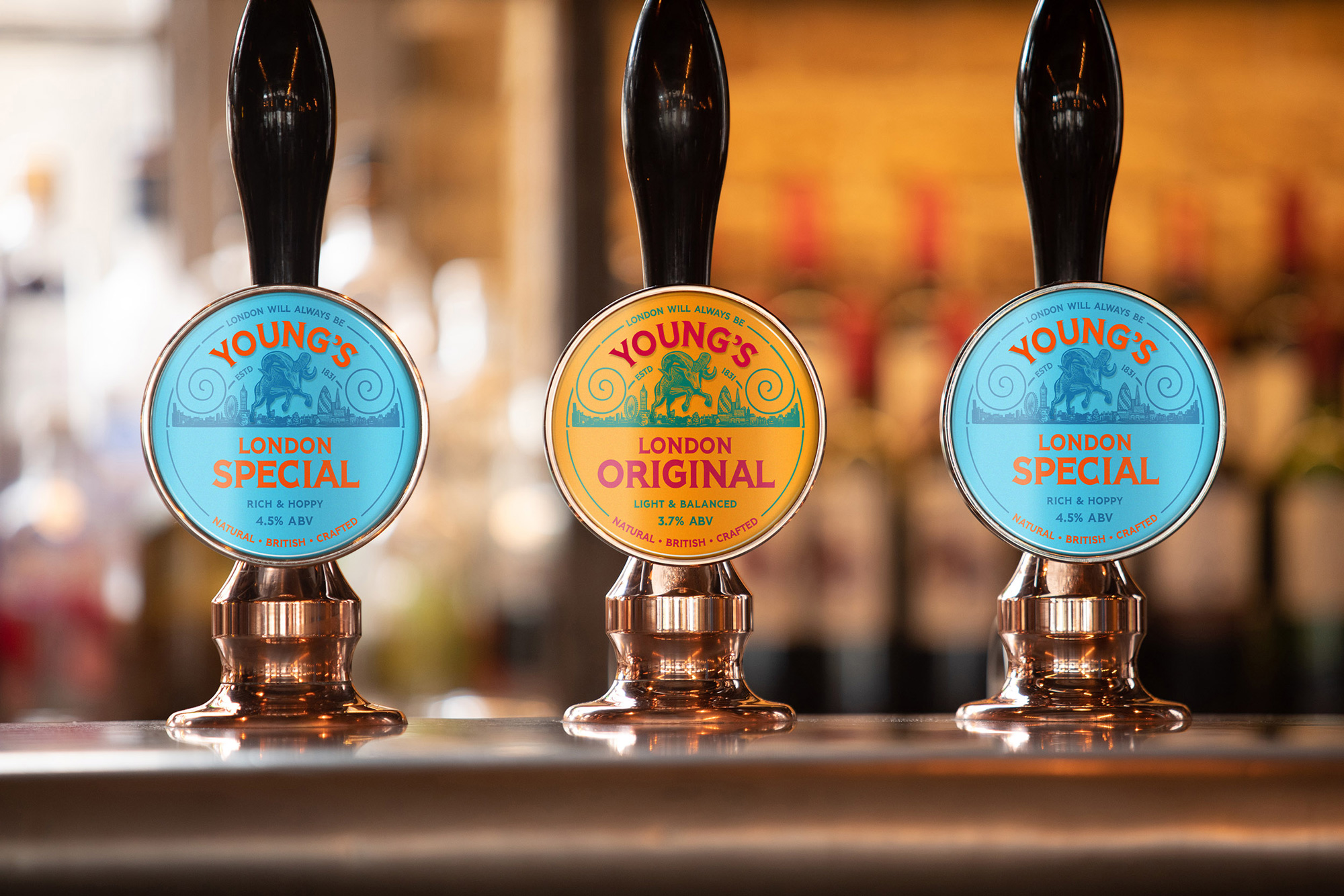
The old bottles weren’t terrible but definitely had consistency issues and maybe too many ideas going on at the same time between the different treatments of each beer style, the handwritten descriptions, and the backgrounds. The logo on the neck was nice though. The new bottles are all consistent with color changes differentiating between the beers. The ram has been paired with a skyline of London and while it’s a little cheesy, it creates a strong horizontal line that works very well in the oval label to split it between branding on the top and information on the bottom. The colors on their primary beer, London Original, are quite nice — London Special… yikes.
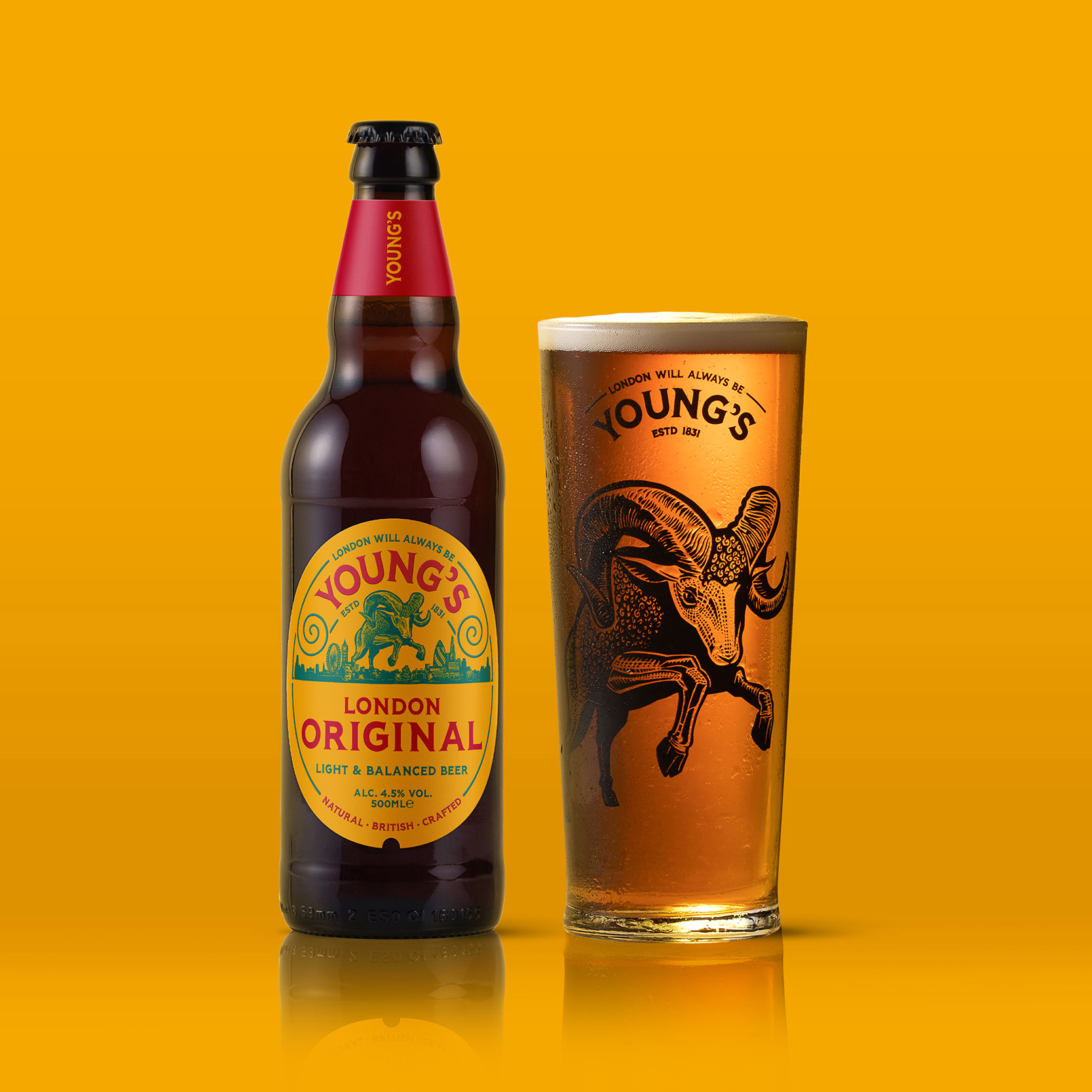
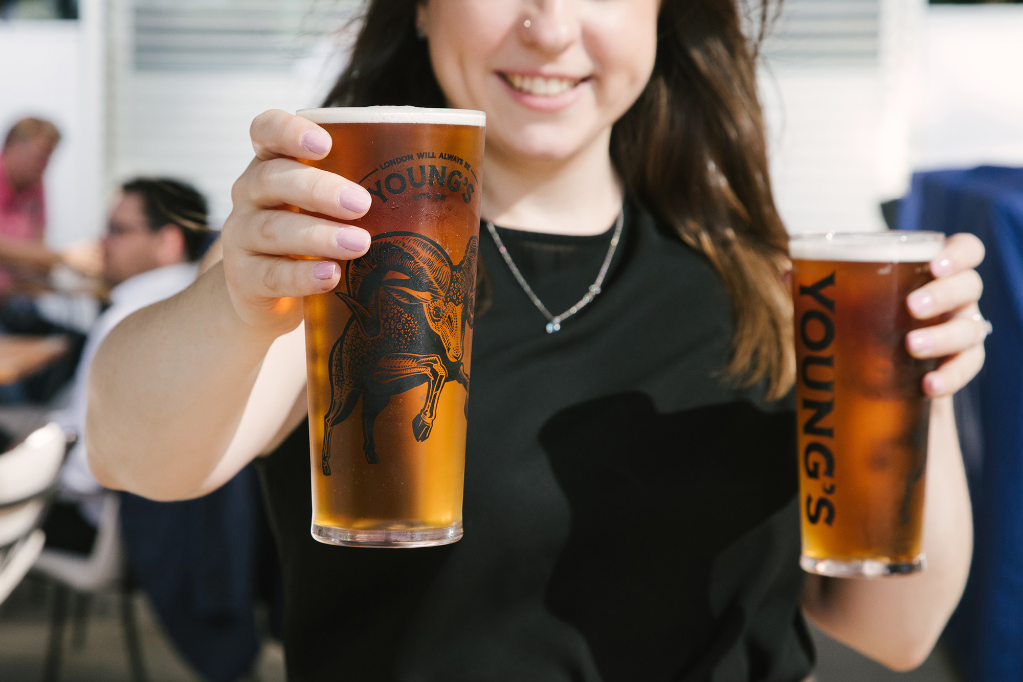
The highlight of the project, for me, are the new pint glasses. They look so bad-ass, with the ram illustration huge on one side and the straight wordmark on the other. There is something very cool about the design being in black (as opposed to white or gold, which are also common).
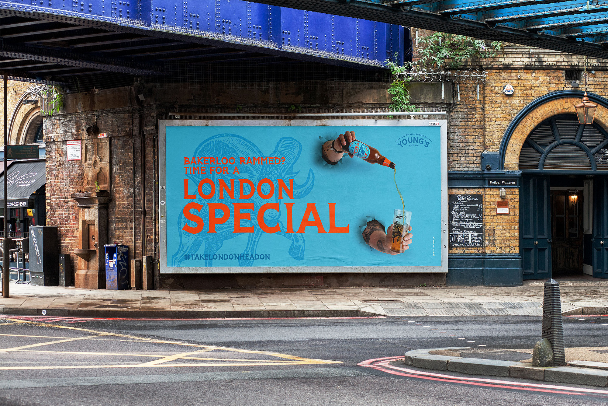
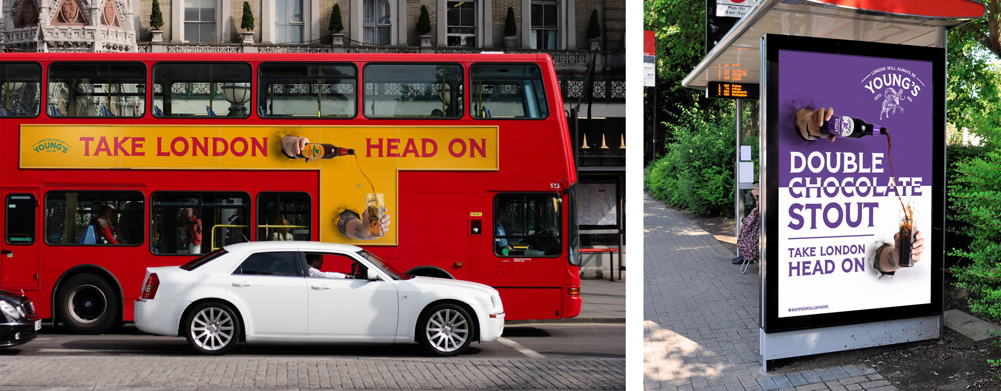
The ads are kind of funny, although I don’t know if they are meant to be taken as funny… but the hands punching trough the background like a ram is, like the logo, unexpected and, oddly, funny. Overall, given the direction many beers and breweries have gone in recently, I am really liking this more expressive approach that I do think manages to change the perception of Young’s to something more engaging, energetic, and worth a second look.
 each year since publication began in 2006

 Новости Союза дизайнеров
Все о дизайне в Санкт-Петербурге.
Новости Союза дизайнеров
Все о дизайне в Санкт-Петербурге.