Обзор лучших ресурсов по разработке бренда, разработке упаковки
contact us | ok@ohmycode.ru
contact us | ok@ohmycode.ru
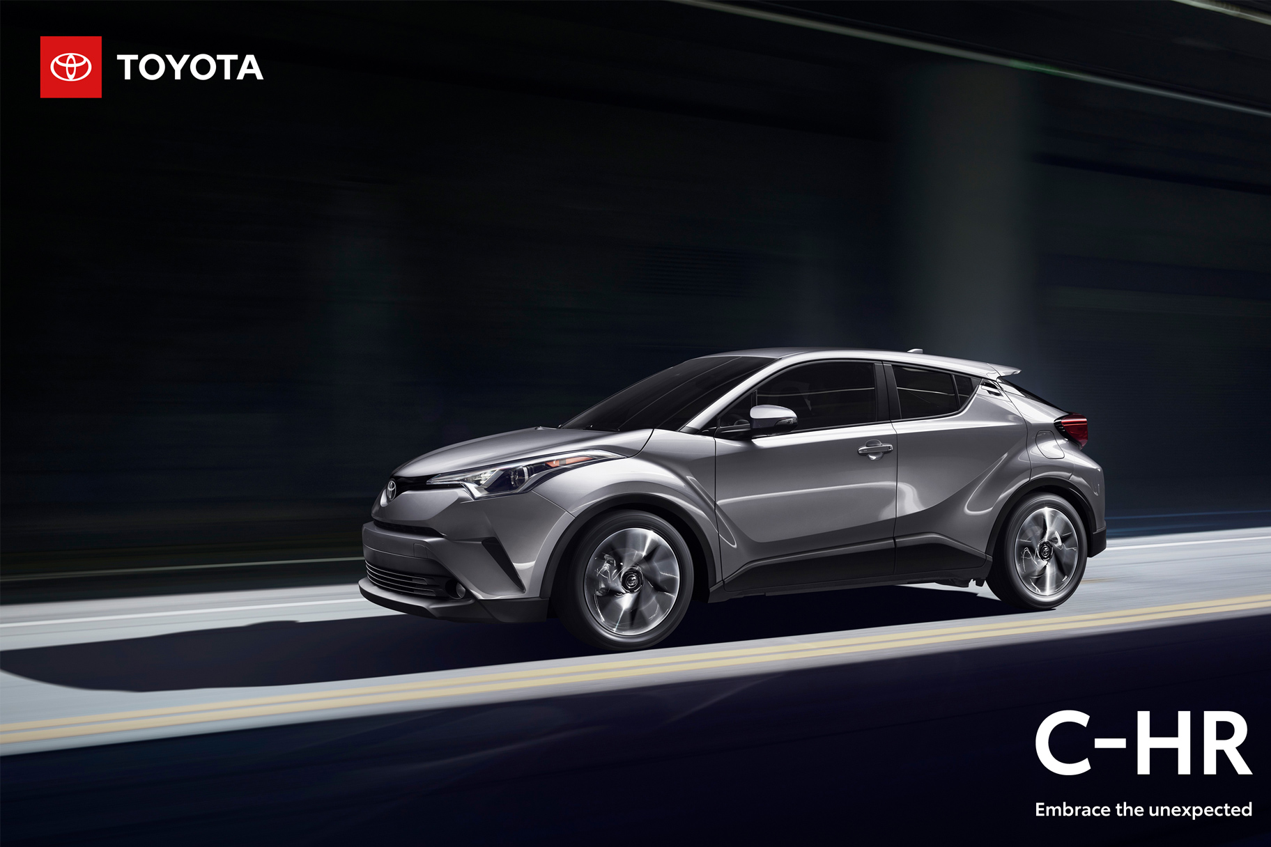
Established in 1937, Toyota is a Japanese multinational automotive manufacturer headquartered in Toyota City, Aichi, Japan. One of the leading auto manufacturers by volume of cars produced and revenue, Toyota is present pretty much all over the world (except for Australia) and employs more than 369,000 people. Its Prius, introduced in 1997, has made Toyota the world’s market leader in sales of hybrid electric vehicles. In the United States, Toyota is based in Plano, TX, and manages 16 car brands including many popular cars like the 4Runner, Camry, RAV4, and the Tacoma and Tundra pickup trucks. Earlier this year, Toyota introduced a refreshed identity. No design credit given.
A comprehensive online brand guidelines microsite can be found here. All images and quotes in this post are taken from there, where there is plenty more to see and read.
The Toyota brand represents our tenets of quality, reliability and durability. It also stands as a symbol to inspire people around the world to go to the places and do the things they’ve always dreamed of.
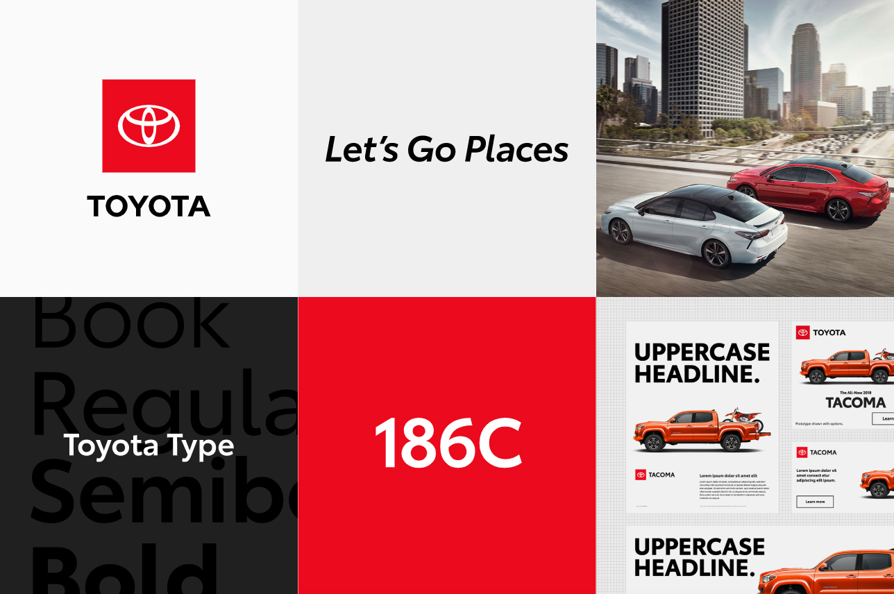
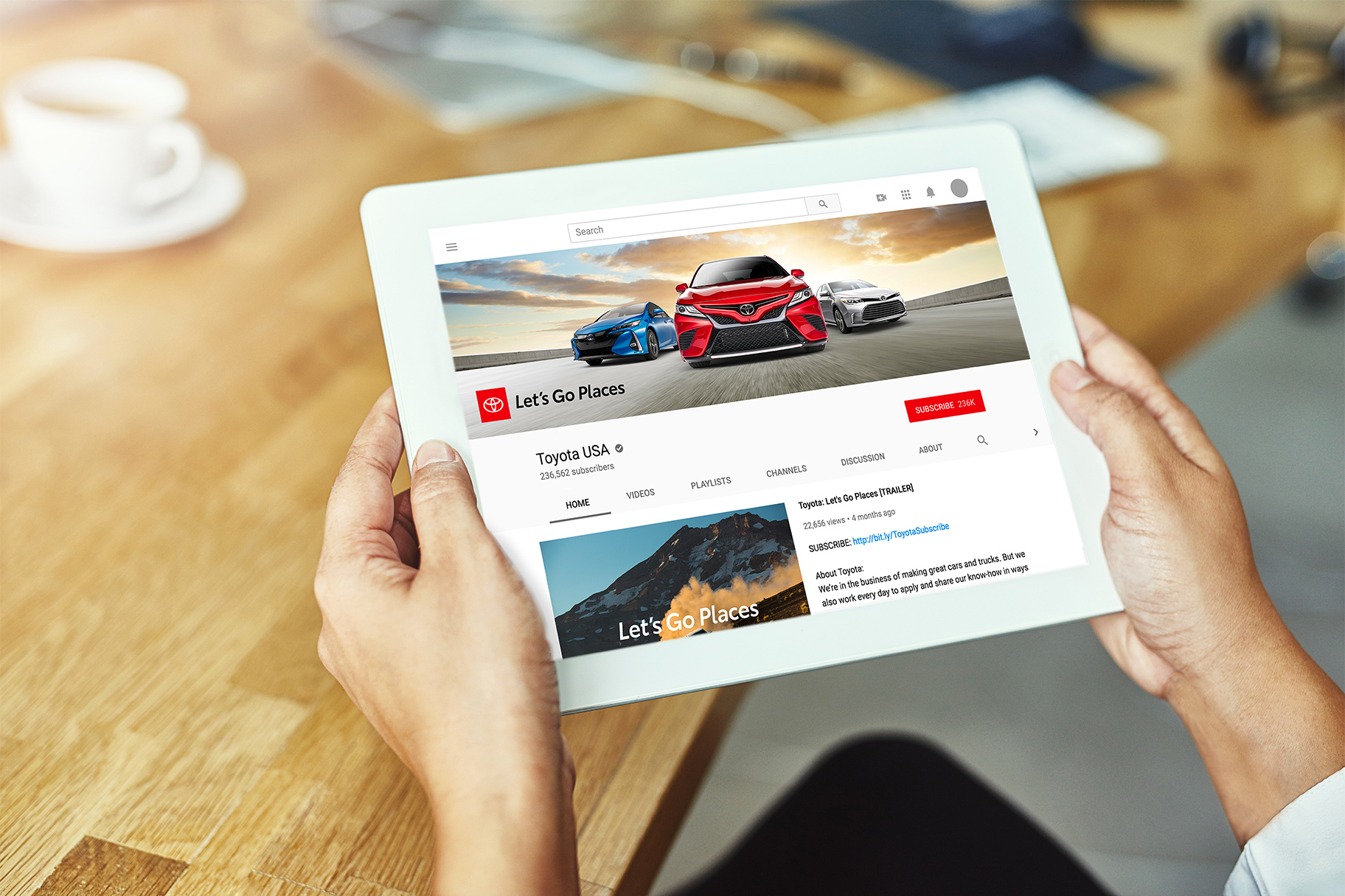
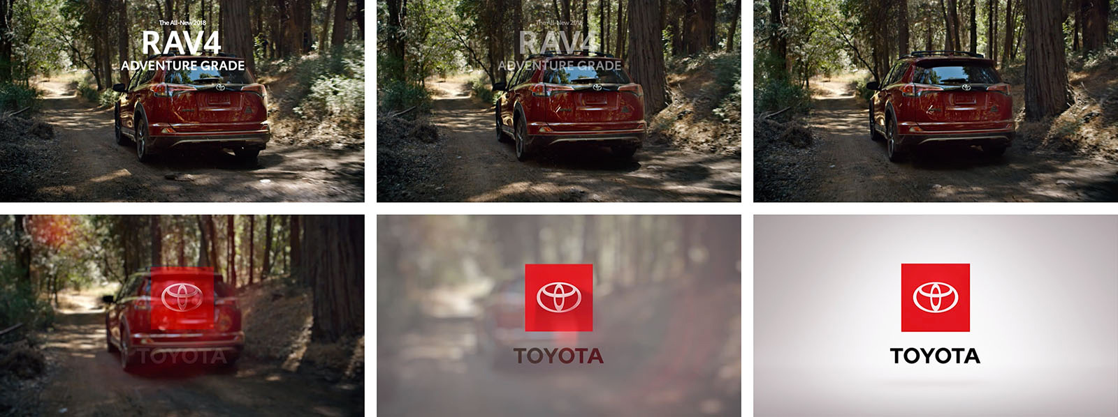
The staging platform is how we refer to the Toyota emblem when shown in the red surround. The staging platform allows the emblem to be anchored and impactful.
Any time a car manufacture logo loses its chrome skin is a good thing — the idea that the logo must look like the actual metal badge on a car’s grill has rarely been flattering for them. Toyota’s evolution is particularly flattering as the old logo was clunky and didn’t have the greatest finish. Once you remove the 3D effects the icon, to be honest, isn’t that great but it looks infinitely better and now at least has a chance to be more interesting beyond another chrome thing. Placing the icon inside a red square gives it a little more presence and weight and pairing it with the black wordmark creates a logo with more impact. Even the 1-color versions look pretty convincing and make the icon stand out quite nicely. Its flexibility to accommodate the tagline or the individual car brands works quite well. Before this redesign I had never given the Toyota logo a second thought but this new approach gives it a somewhat elevated presence that I never associated with Toyota.
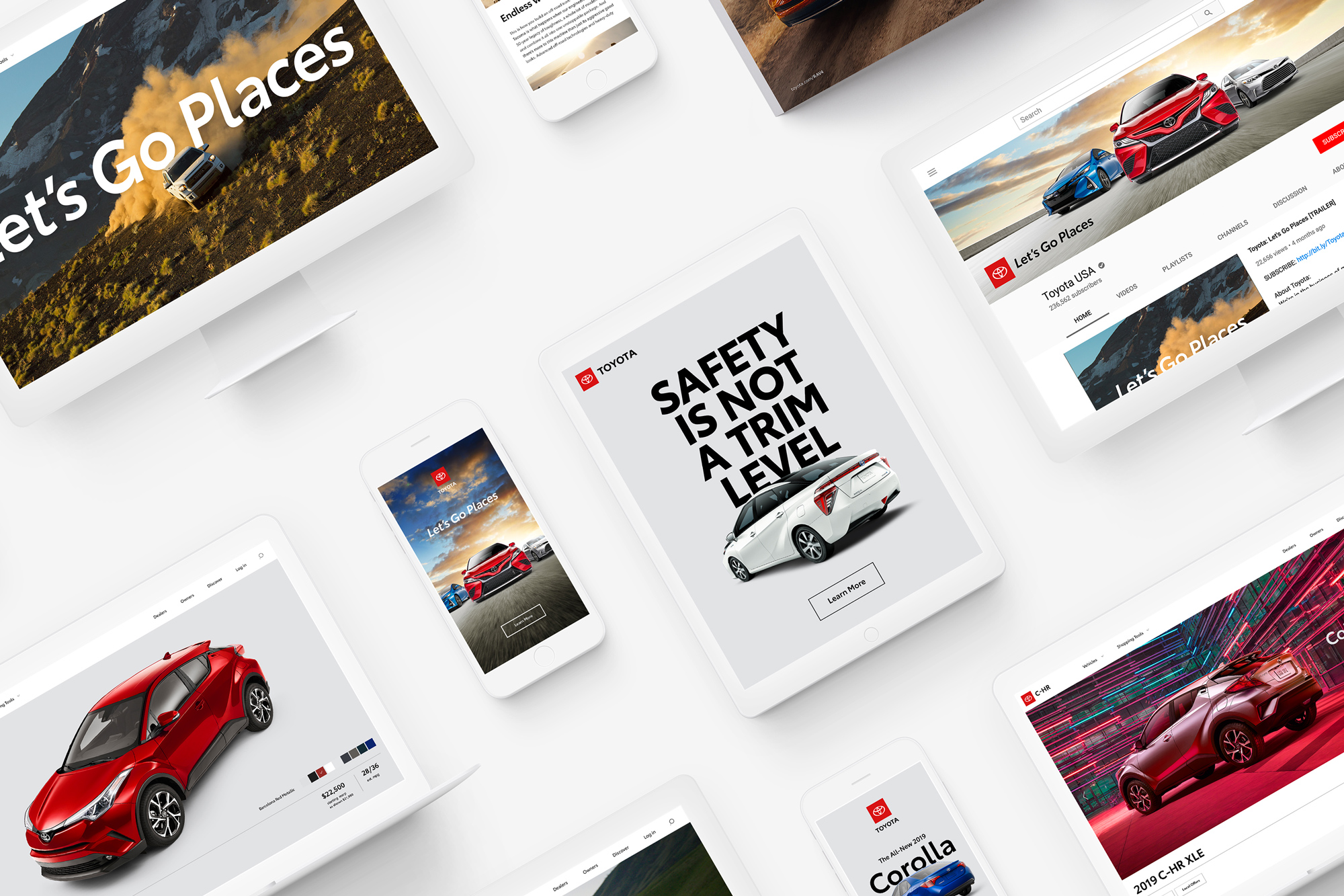
The Toyota Visual Identity System currently comprises six core elements that help unify and communicate our brands with consistency and clarity. They include our logos, the Let’s Go Places tagline, the Toyota typography, photography styles, color palette and design layouts. Together they help convey the Toyota visual brand identity.
Typography provides a strong, unifying element and can help convey a consistent brand voice across various marketing communications. Our font is approachable, human and highly technical, and it has been conscientiously engineered. Utilizing our own typeface will help provide increased visibility and recognition across all touch points for both the brand and vehicles.
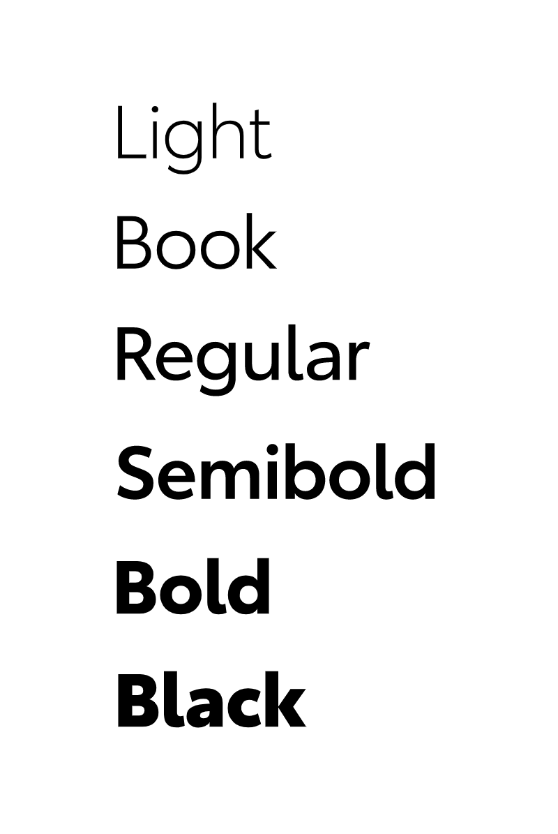
There is more to the typeface explained in a video on this page (which I couldn’t embed or download, sorry) and while, yes, a lot of the stuff in that video makes sense, the result is a solid fine — it’s as if Gotham and FF Din had a baby with Gotham’s genes leading the way. Which is not a bad thing in any way and it has a solid look but it’s also not anything we haven’t seen in one form or another before.
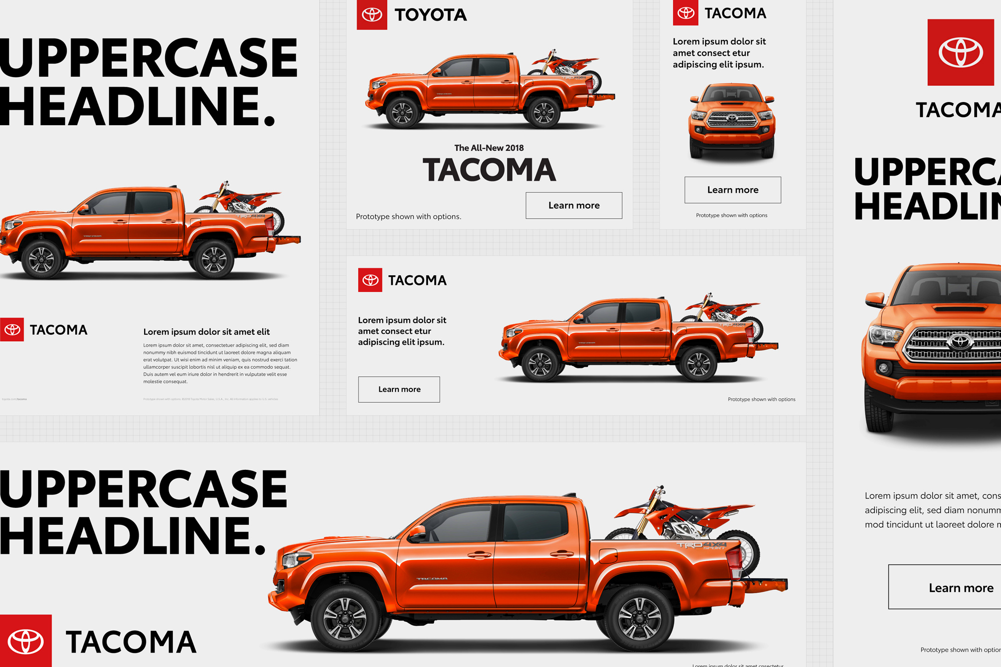
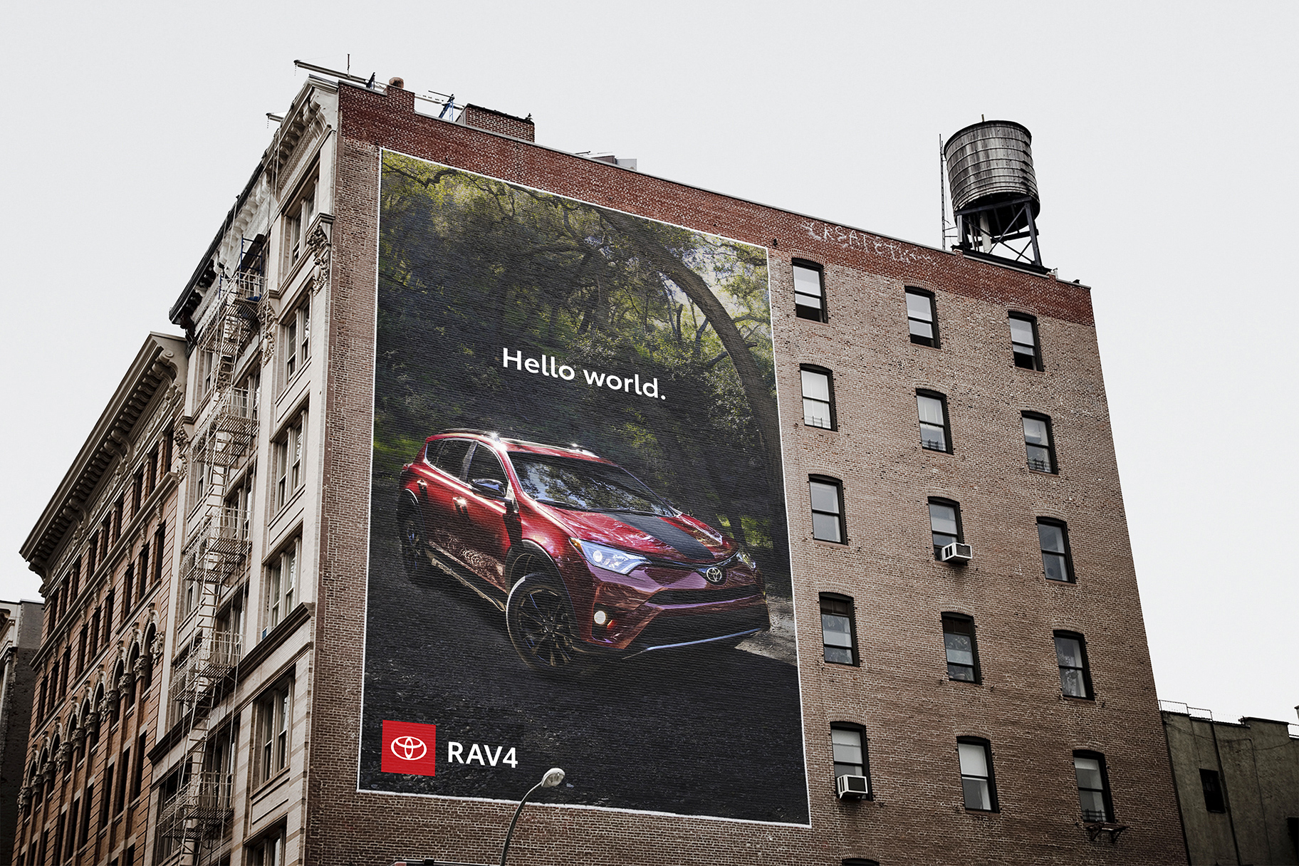
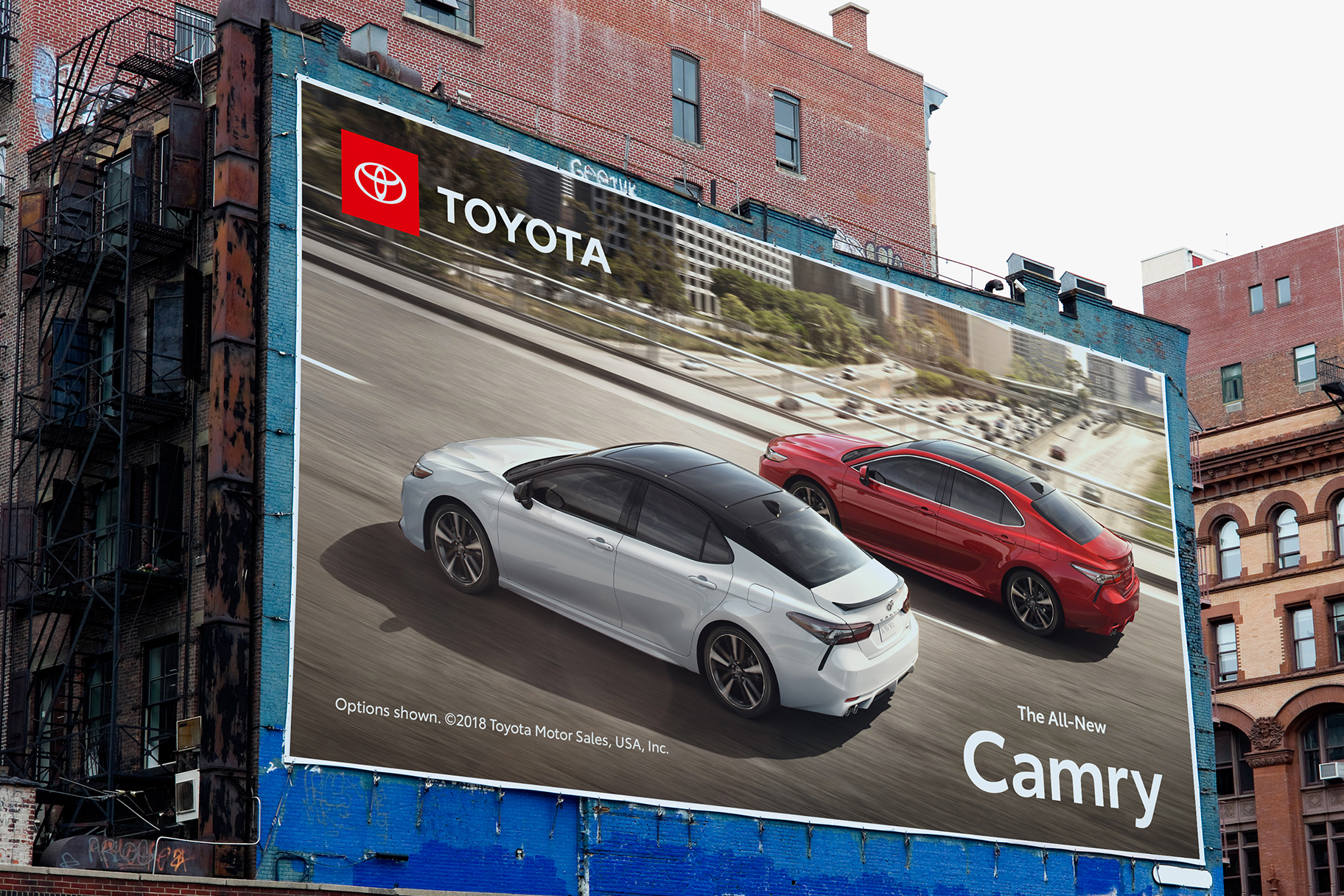
The layouts are what got my attention the most. There is a strong confidence and directness to these that works very well for Toyota: rugged, direct, and unfussy. The logo in the red square works great as an anchor to all the variations.


The one thing I really don’t like is the italic tagline — it stands out strangely among the otherwise utilitarian look of the type family. I find the “G” too big and distracting as well. And, personally, whenever I think of Toyota, in my mind I’m still going “You asked for it, you got it… Toyota” thanks to Billy Crystal.
Overall, this isn’t a major logo redesign but it’s a huge improvement that, along with the well thought-out identity, gives Toyota a design dimension it didn’t have before.
Thanks to Andy Kimbrell for the tip.

 Новости Союза дизайнеров
Все о дизайне в Санкт-Петербурге.
Новости Союза дизайнеров
Все о дизайне в Санкт-Петербурге.