Обзор лучших ресурсов по разработке бренда, разработке упаковки
contact us | ok@ohmycode.ru
contact us | ok@ohmycode.ru
First held in France in 1954, the Rugby League World Cup is contested by teams from the 19 countries that are members of the Rugby League International Federation. Celebrated every four years since 2013 (and at irregular intervals before then), Rugby League World Cup is considered to be the foremost competition in the “league” variant of the sport and the Australian national rugby league team, the Kangaroos, has dominated the competition with 11 titles, including the most recent in 2017. The 2021 edition will be held in England and, for the first time, it will carry out the men’s, women’s, and wheelchair competitions (played since 2010 and 2008 respectively) at the same time and on the same stage. The identity for the 2021 Rugby League World Cup has been designed by Belfast, Ireland-based Mammoth.
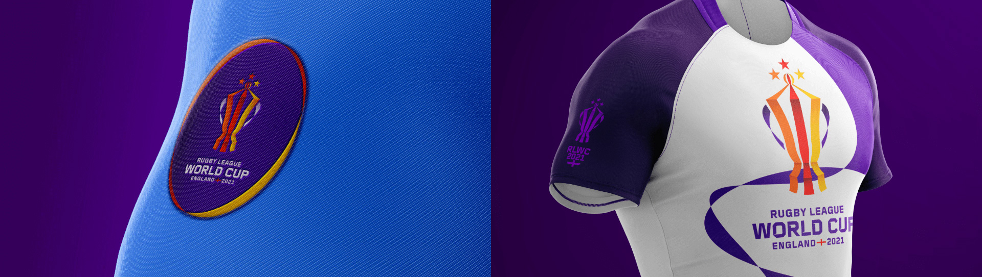
The trophy has been the traditional symbol of the Rugby League World Cup for many years - it’s the global pinnacle of Rugby League, coveted by each and every nation. The identity has been created using the trophy’s ribbons to embody the three tournaments (men, women and wheelchair with red, orange, and yellow) and to symbolise our close connection to fans, nations, communities, teams and players.
The ribbon symbolises the connection to the world cup and to the world. It’s our visual metaphor to represent the brand, creating an identity that flexes out into a brand system that unites cities, countries and fans. The continuous ribbon creates the perfect link between teams, hosts, nations and events. It bends, travels and creates shapes building a unique visual language that not only identifies the RLWC—but differentiates it.
I am assuming the before logo was an interim one between the time it was announced that the event would be held in England and the time they introduced the after version, which is very welcome because the old logo looked like a rejected comp from a horror movie poster with its splatter typography and matching-but-not-really trophy depiction. The new logo is both a more festive and more aggressive interpretation in its two contrasting elements: a ribbon-based trophy icon and a spiky-notched wordmark. Both are good within their genres but I’m not sure they belong together. The trophy has some nice volume to it with the ribbons following the shape of the actual trophy with subtle shadows on each crease. I’m not sure why the white ribbons for the handles don’t have a shadow as those pieces feel flat. The little nub at the top is a hard element to resolve with the ribbon effect as it starts to look like a beach ball but I think they solved it as well as possible. The wordmark is fine if you are into the spiky type treatment which, at least in this case, is the lesser offensive style with the spikes going inward. It’s fortunate that in the words “WORLD CUP” they were able to alternate whether the spike was on the top or bottom, which creates some added rhythm in the wordmark. I kind of like the secondary type used in the smaller bits of text in the wordmark better and wouldn’t have minded that being used big as well but I can understand the impetus behind the spikes. The Saint George’s Cross detail in the bottom line is quite nice.
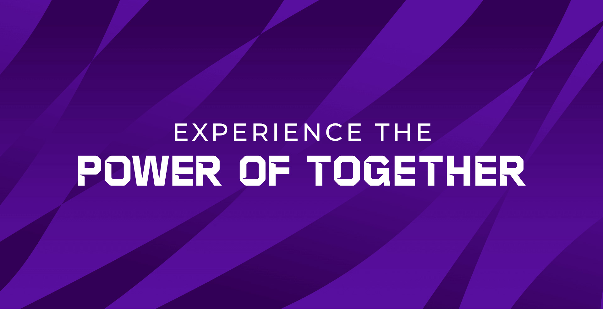
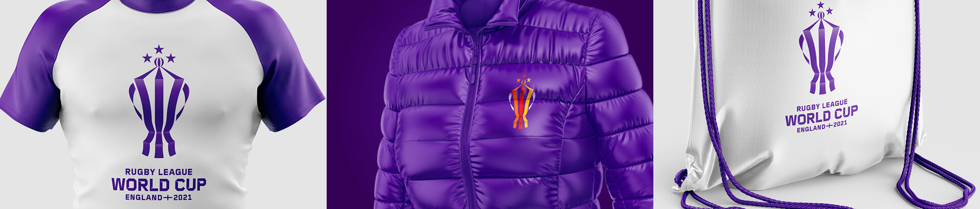
Short-Hand Identity - Small size, big impact. There will be times where the main identity will be unsuitable due to format/legibility so we have created our short-hand version. The short-hand identity is bold and impactful, communicating the key message while remaining compact and versatile.
The shorthand version is useful given how detailed and large the full logo is and, at first glance, it looks fine but there are some questionable decisions. The “RLWC” part is okay but the “2021” is not quite okay. The spikes in the “02” look like eyelashes and the two “2”s are different, which I understand maybe why they wanted to do that but the result is strange, especially when you look at the bottom of the first “2” where a spike is forced on it creating a weird bump that at first I thought it was an SVG rendering issue but, nope, it’s very much on purpose. The Saint George’s Cross feels too heavy and its spherized effect is strange and oddly resolved. I know they were trying to make it look like a trophy but the distortion is not quite right and clashes with the straightness of the type above it.
For the custom typeface, once more letters mix and match, the upper and lower positioning of the notches creates odd rhythms throughout. Perhaps this needed an OpenType feature that would shift the notches to create more of that nice up-down-up-down variance from the wordmark.
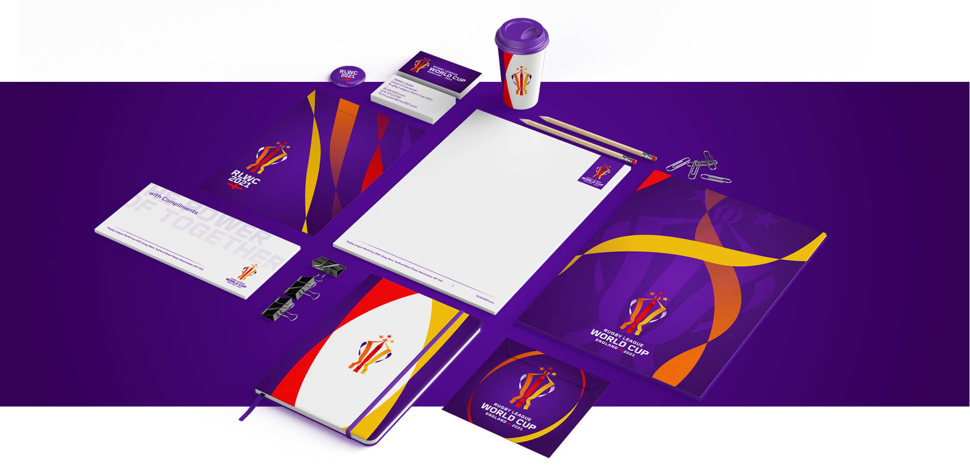
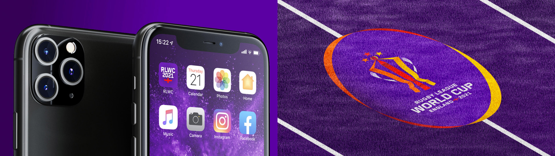
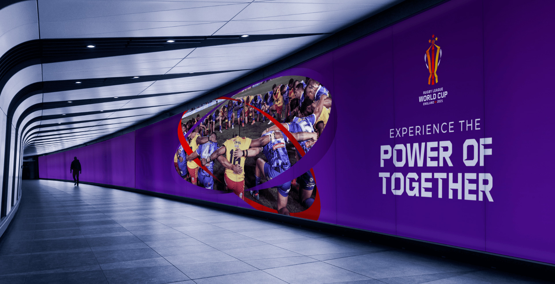
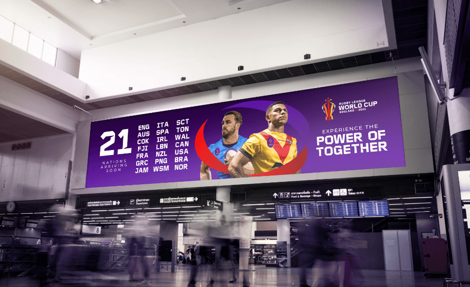
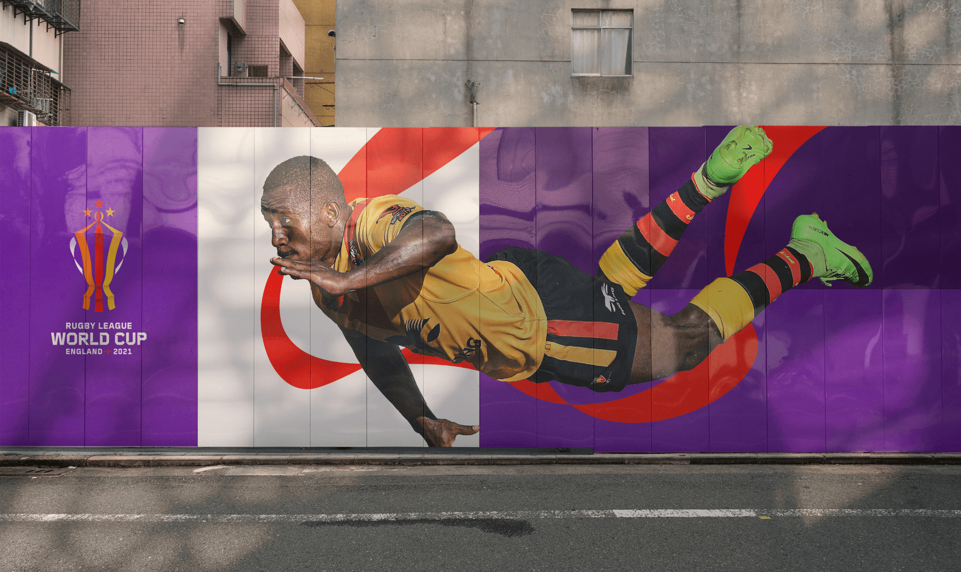
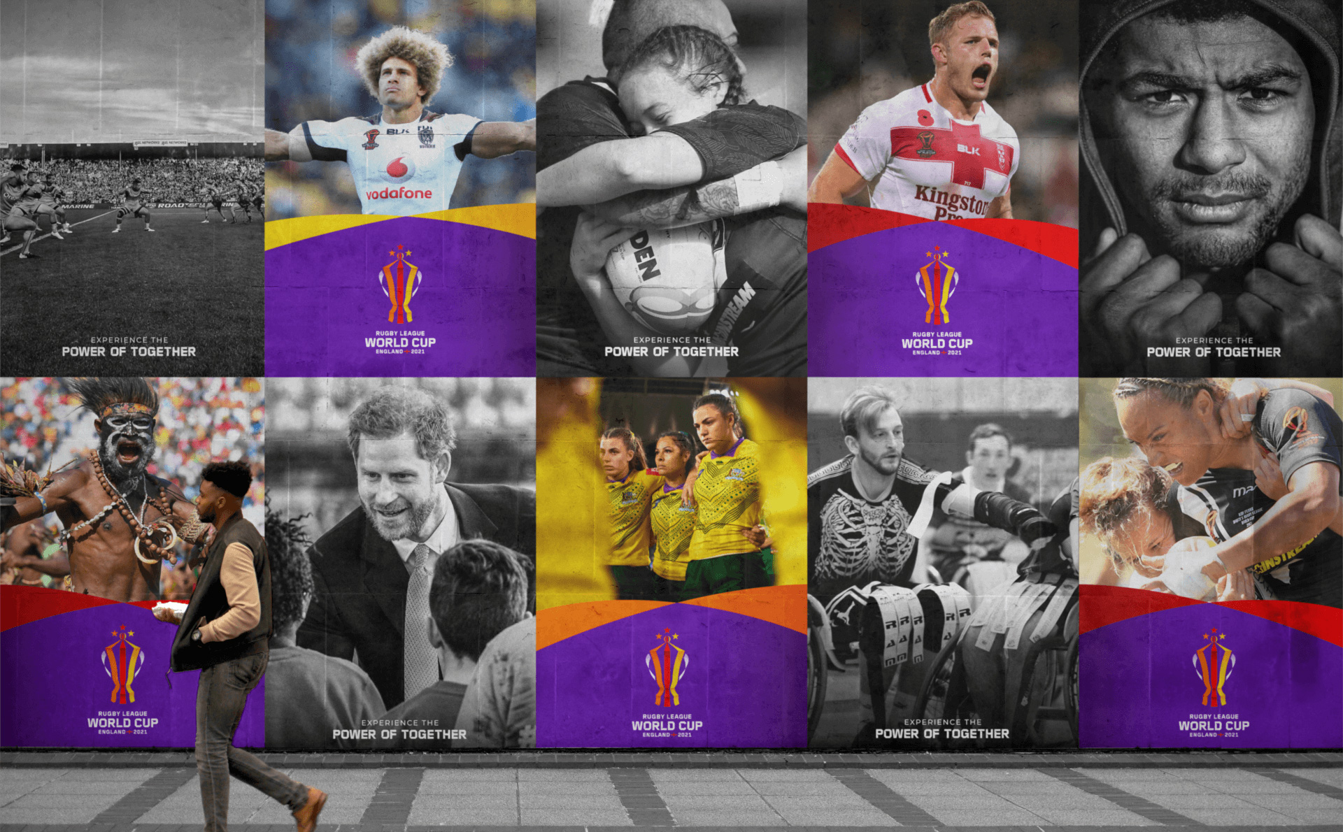
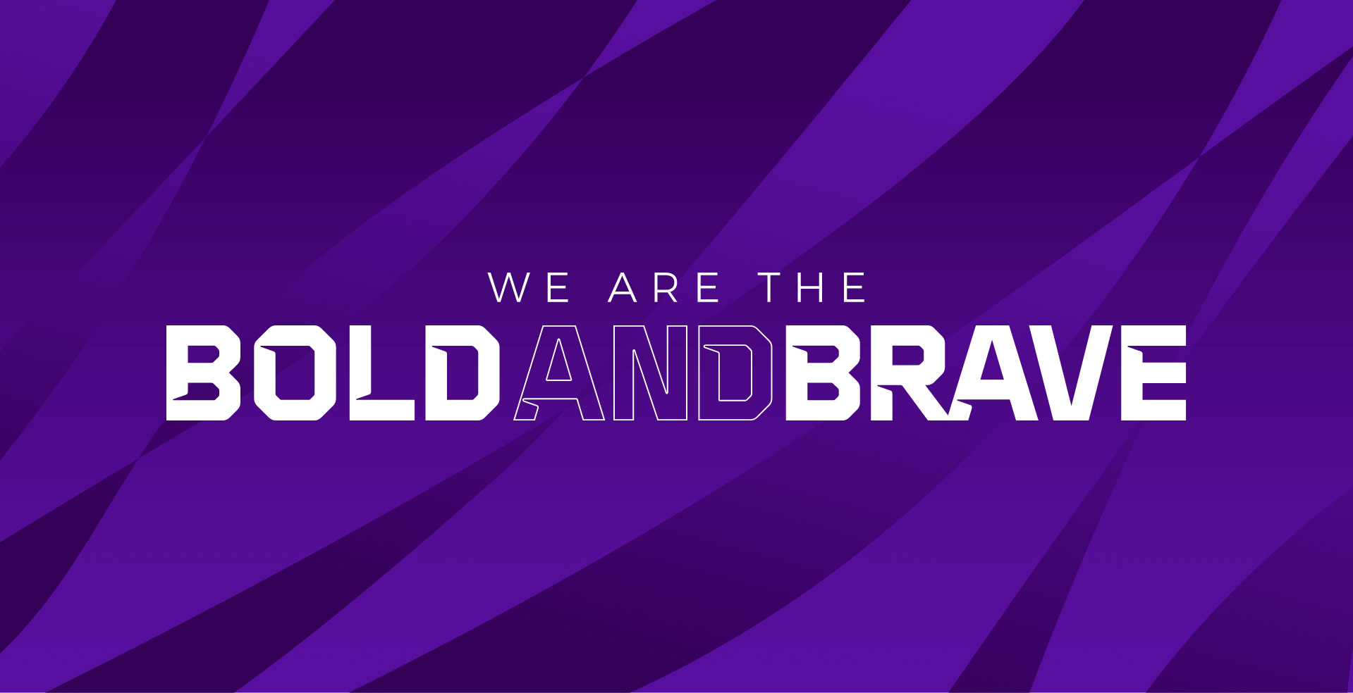
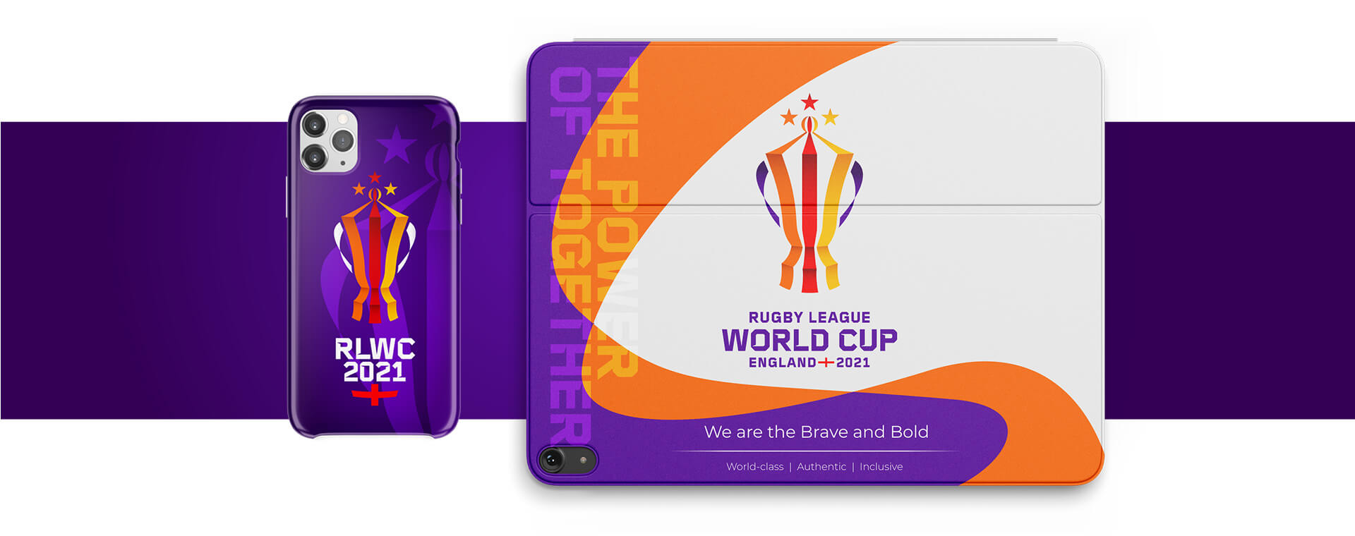
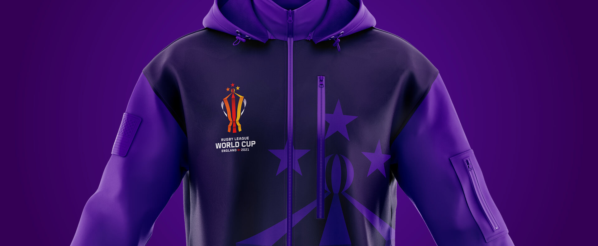
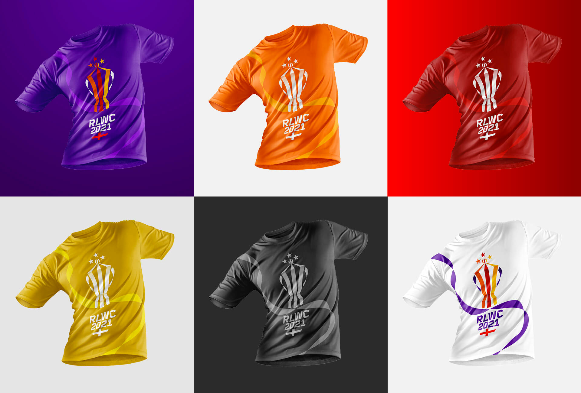
In application, there are a lot of ribbons and swooshes in different configurations and uses. I’m not a huge fan of any of it but it’s not bad or wrong by any means. Things feel lively and bold, in part thanks to the effective color palette, and the variety of approaches will probably help the organizers create the myriad applications needed as the event approaches.
Overall, I have a number of reservations about this but they are mostly personal and this all works fairly well, feeling like a celebratory and momentous event through all the effusive ribbons while also reminding the audience that it’s a hard-hitting sport through the bold, spiky typography, which sums this up for me as mixed feelings.
 each year since publication began in 2006

 Новости Союза дизайнеров
Все о дизайне в Санкт-Петербурге.
Новости Союза дизайнеров
Все о дизайне в Санкт-Петербурге.