contact us | ok@ohmycode.ru
contact us | ok@ohmycode.ru
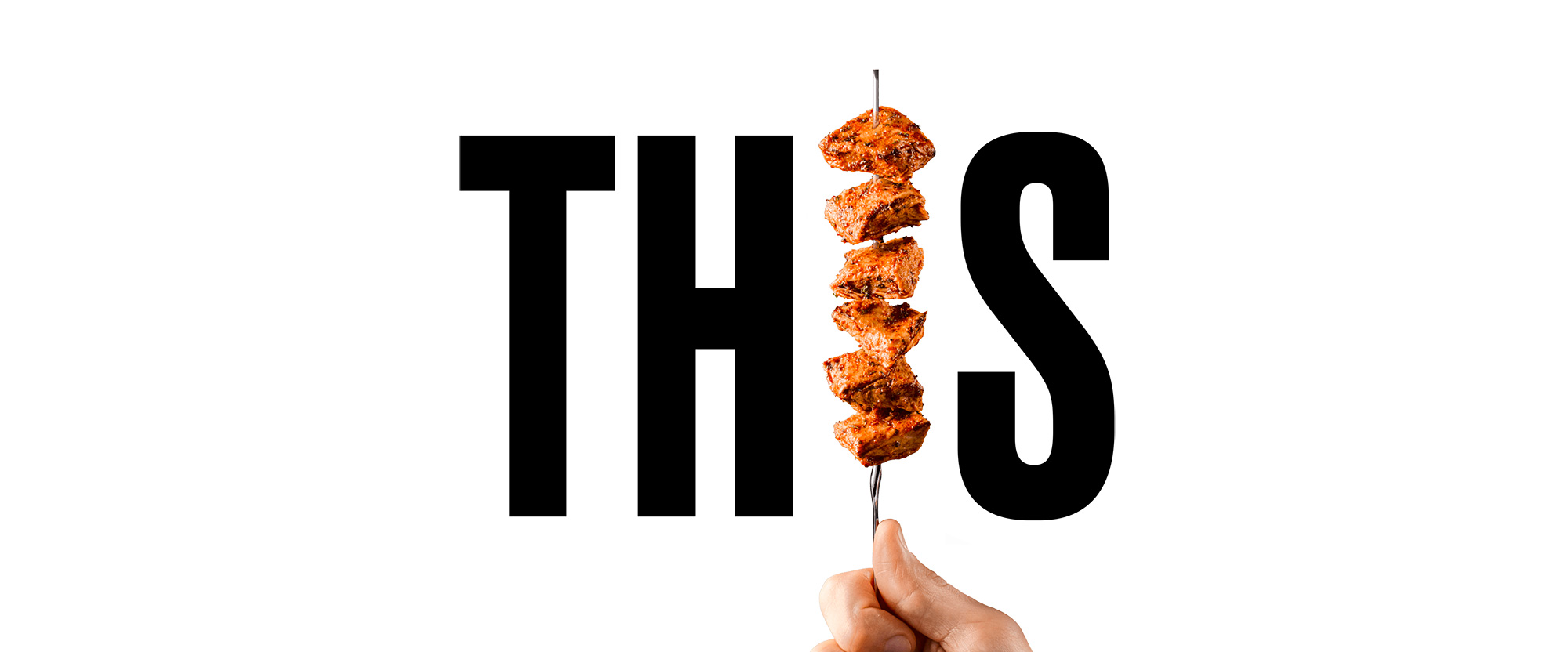
Established in London, UK, in 2019, THIS is a new brand of plant-based, meat-alternative products. Started by a couple of friends, self-described as meat-lovers, THIS isn’t about guilt-tripping people into not eating animal-based products but about offering a quality product with the taste and texture of meat without the environmental impact. Using soy bean protein, water, and pea protein, the company will offer THIS isn’t Chicken and THIS isn’t Bacon in ready-to-cook and ready-to-eat variations to restaurants and retailers. The identity and packaging for THIS have been designed by London-based Johnson Banks.
Our branding challenge was to help create and launch a disruptive, challenger brand into a market mainly aimed at vegetarians, dominated by major brands such as Quorn.
Much of our initial work was taken up with a search for the right name. After a few false starts, THIS was chosen. It’s short, it’s different, and most importantly, it allows us to immediately talk about their product line - THIS isn’t chicken, THIS isn’t bacon, etc.
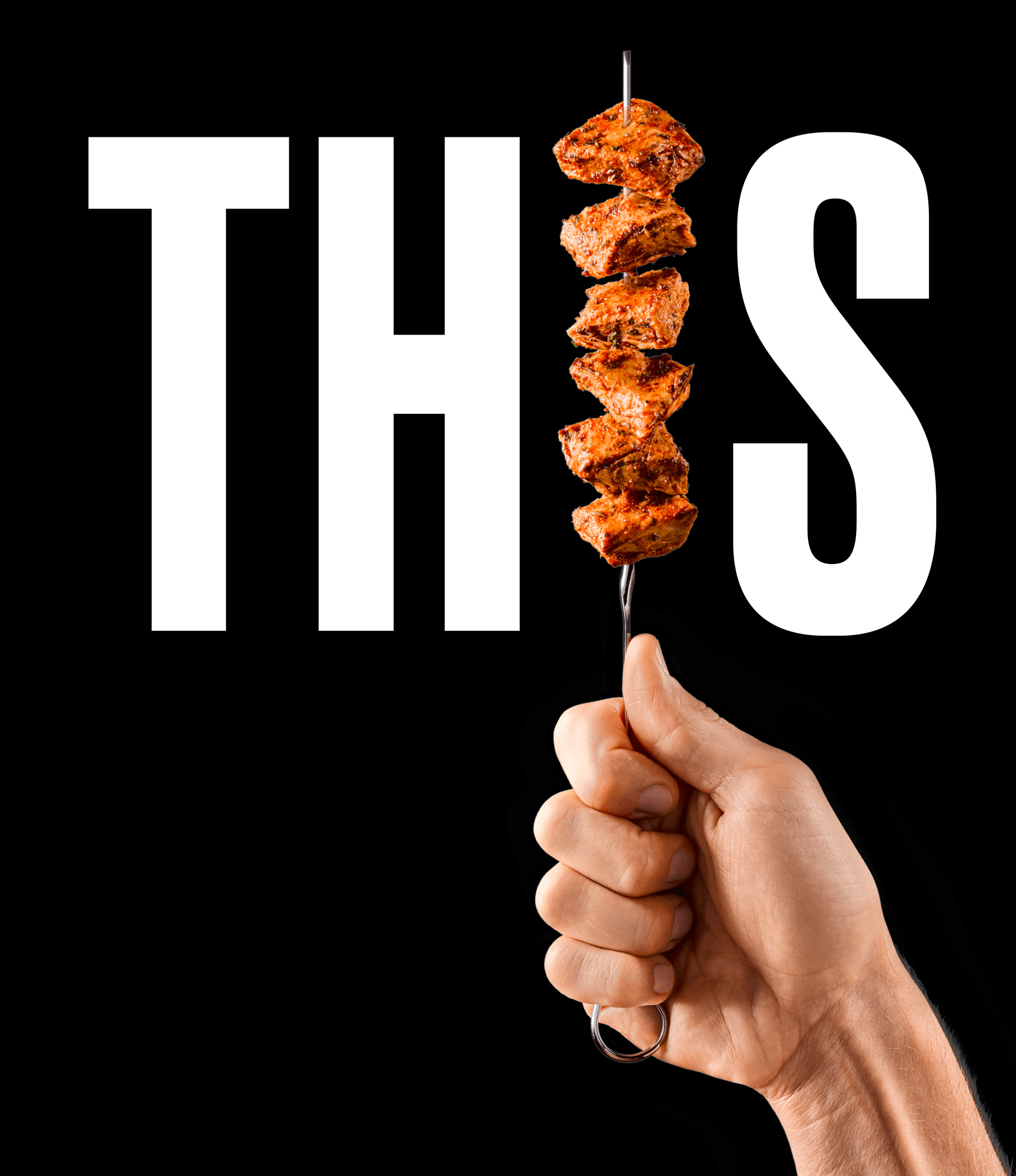
The branding approach we created centres around a monochrome palette and strong and consistent use of the brand name. Forks, skewers, knives - you name it - are topped with the product and replace the ‘I’ in each product logo, of which there are eight in total.
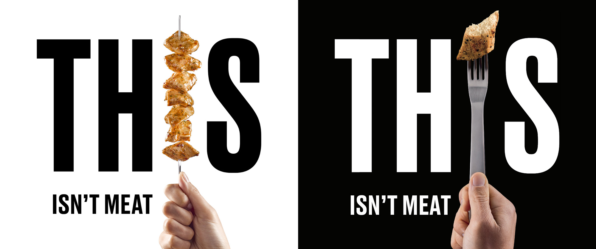
The first thing I’ll mention is how surprised I am that the name “This” was available for commercial use. The business’ official name is “Plant Meat Limited” which would sell zero of its product but it’s pretty impressive that they can trade under such a broad brand name. It seems like the kind of thing many companies think of doing, then worry it would not be feasible legally, and so no one has done it. And the way the name is used really pays off with great verbal branding with sentences like “THIS changes everything” and using negatives, um, positively like “THIS isn’t Chicken” — it has a light rebellious attitude but with just the right amount of self-deprecation.
The new logo, typeset in uppercase Druk, is as deadpan as its name and replaces the “I” with different utensils showcasing the product as proudly as Simba was held on Pride Rock. On paper, it’s a goofy idea but it works remarkably well to instantly tell you what this product is and what it isn’t. It helps that — if you are a fan of chicken (as I am) — the pieces of non-meat look pretty darn tasty and provide the only burst of color in an otherwise black and white identity.
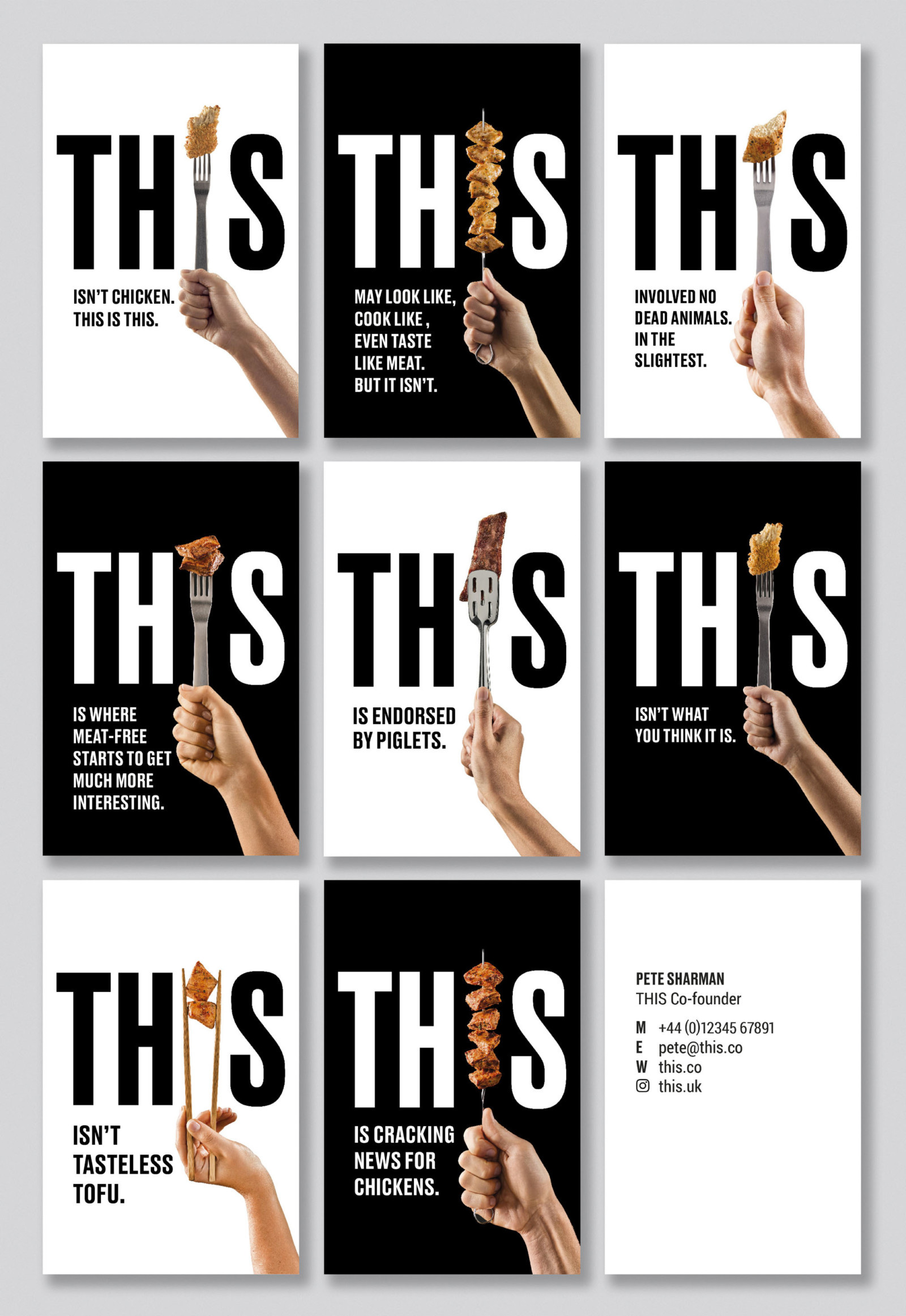
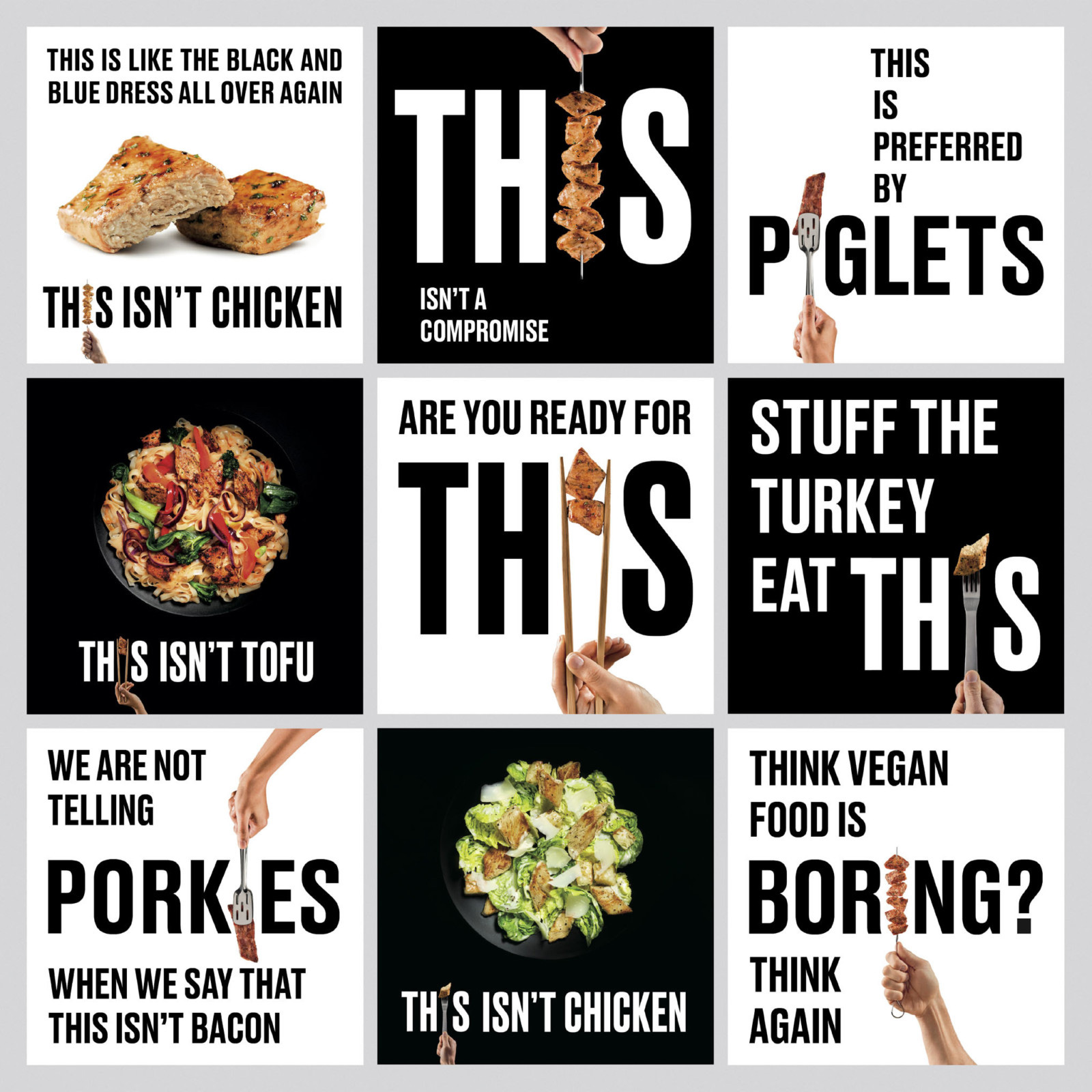
The minimal set of elements — Druk, “THIS”, and product photography — have the ability to tell a lot of stories about the product and make every impression count. The social media posts can get a little chaotic but are still enjoyable.
The product packaging is an innovative new design - a cardboard tray which uses around 90% less plastic. We alternated the monochrome palette to differentiate between the ready-to-eat products (black) and ready-to-cook (white). Many of our packaging design discussions concentrated on quite how to get the brand name as huge as possible to give the products maximum ‘shelf stand-out’.
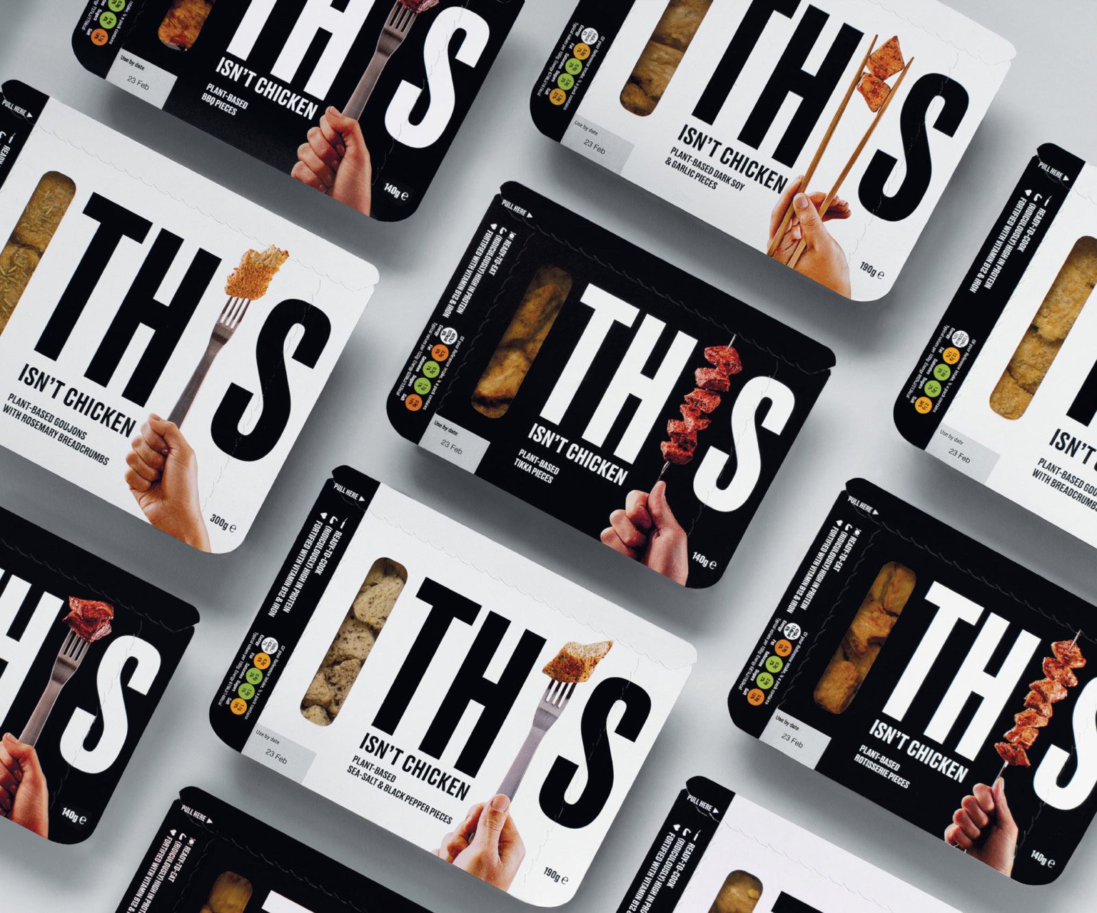
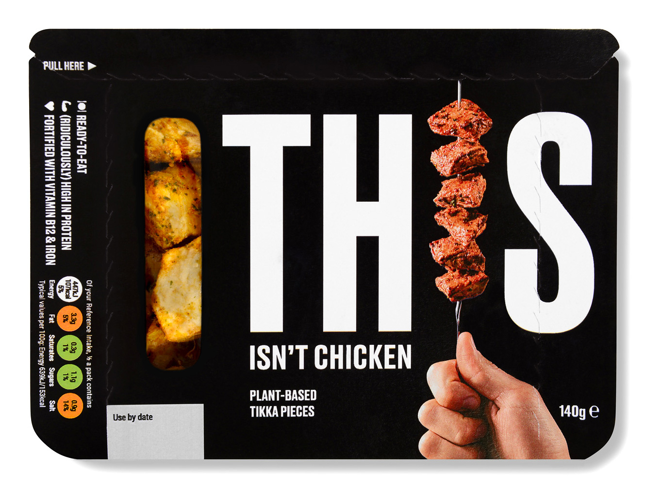
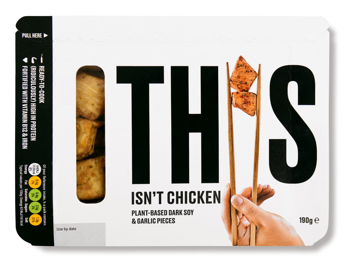
The best part about the packaging are the side views, with the big, bold proclamation of “THIS ISN’T CHICKEN” on the shelves — for those actively looking for non-meat products, it’s an instant draw and for others it might incite enough curiosity to pick up the product for further inspection. On the top, the name is as big as it gets and, being in a condensed font, it’s pretty darn big. Seeing the transparent strip where you can get a peek at the product I do have to wonder if that should have replaced the “I” in the name only in the packaging — but I do get why it doesn’t. Also, props for showing the packaging with warts and all (use-by date, tear-out markings, dietary badges, etc.).
Overall, this has a very unexpected approach for a new consumer product and instead of blending in the category — not just of non-meat products but of consumer products in general — it boldly stands out in design and tone of voice.

 Новости Союза дизайнеров
Все о дизайне в Санкт-Петербурге.