Обзор лучших ресурсов по разработке бренда, разработке упаковки
contact us | ok@ohmycode.ru
contact us | ok@ohmycode.ru
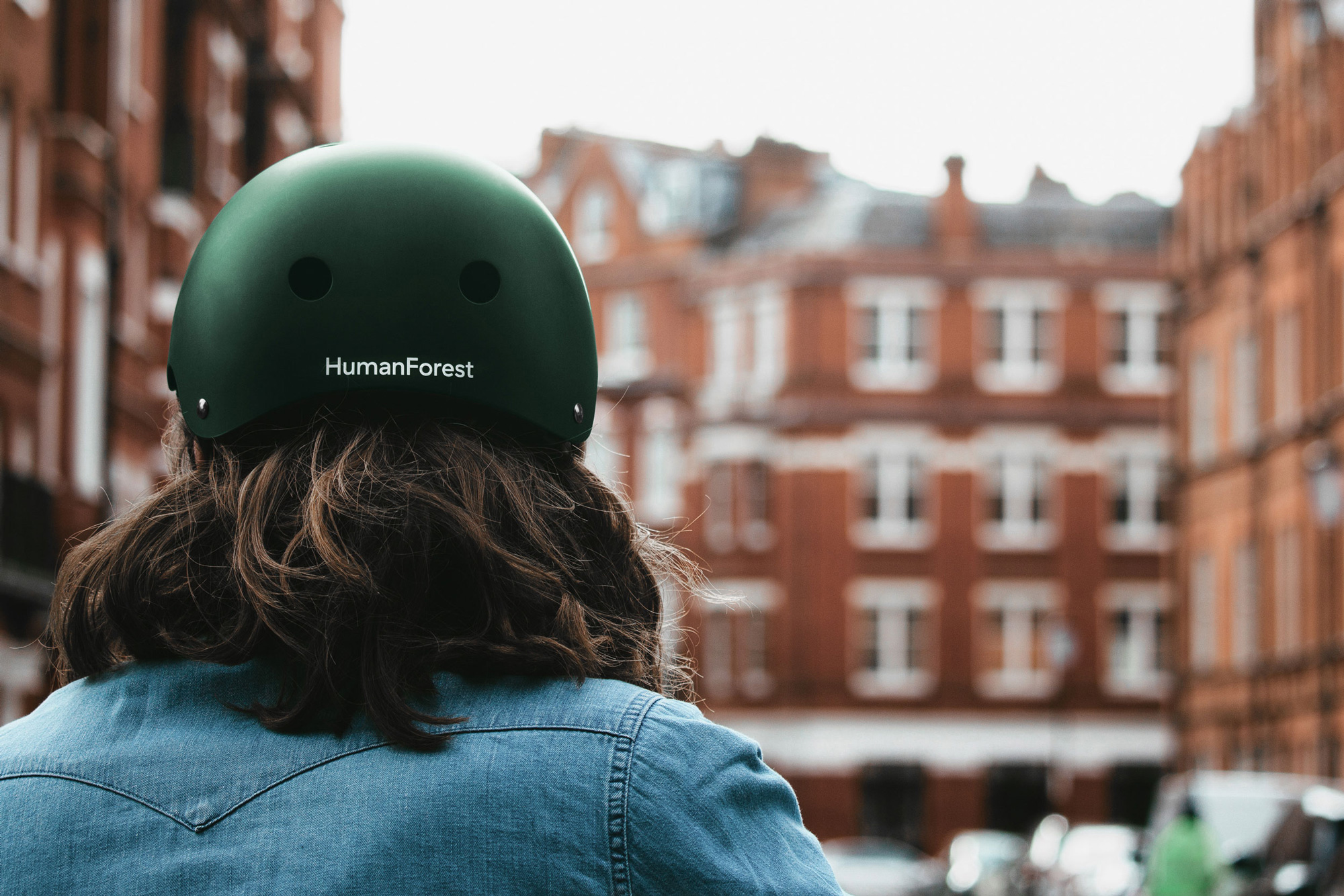
Launched in 2020, HumanForest is London, UK’s first free, shared, electric bike scheme. Starting with a trial of 200 e-bikes — that, for the initial trial period, must be picked up in and brought back to London’s Islington district — and with 1,000 additional e-bikes expected to roll out across the rest of the city, riders can use the e-bike for 20 minutes at no cost and can then either park it or keeping riding for £0.12p per minute. HumanForest’s e-bikes are zero-emission, powered by renewable energy, and require no docking stations — swappable battery packs are charged remotely and replaced as needed by the HumanForest team, whose service vehicles are also electric and zero-emission. The company’s name alludes to trees’ ability to remove CO2 from the atmosphere so if humans opted to ride their e-bike they would emit zero greenhouse gases, ergo reducing the amount of CO2 in the air, double-ergo, becoming a human forest. The identity for HumanForest has been designed by Auckland, New Zealand-based South.
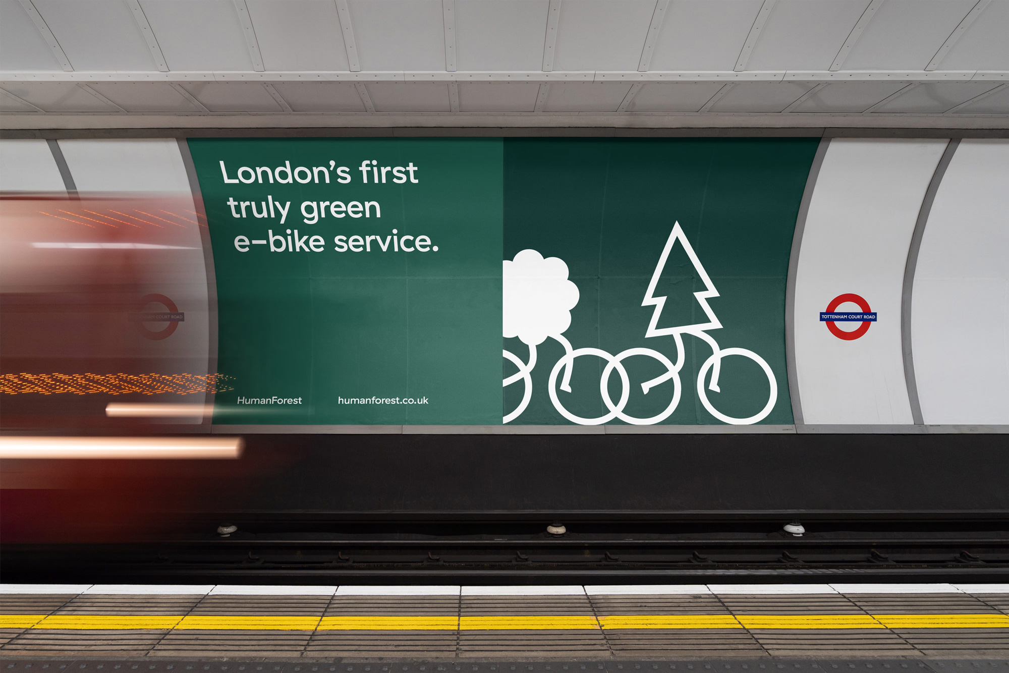
A collection of whimsical animated characters personify the brand concept and create a sense of community and collective effort. Key design considerations around colour and messaging represented an opportunity to capture classic British culture and ensure the brand complements the environment - a definitive aesthetic point of difference to competing brands. The primary green (inspired by historic British racing hues) gives the bikes an understated and fashionable look. A supporting palette of organic tones look to add a natural feel across digital and physical outputs. The logotype and core messaging is set in Haptik, offering a charming set of letterforms to communicate the light-hearted copy.
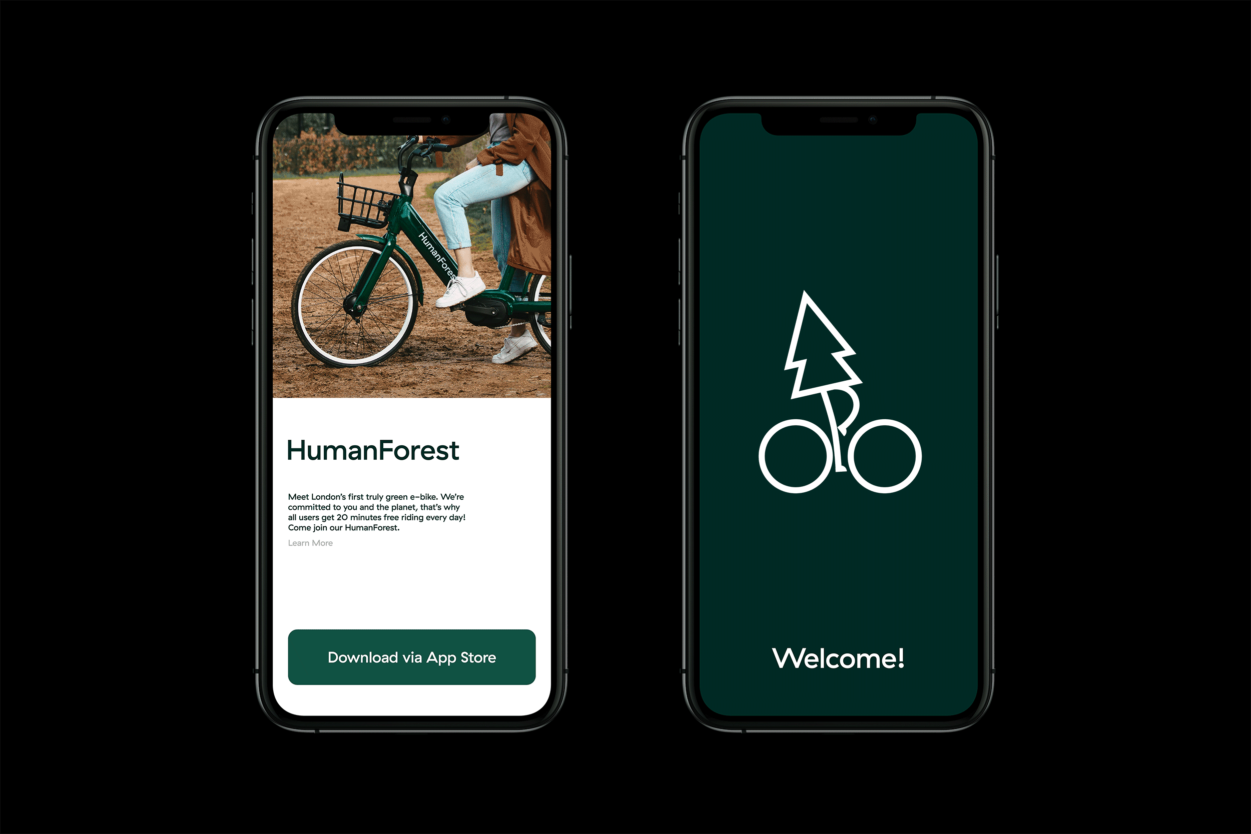
As far as the official logo goes, there isn’t much to it — it’s unapologetically GT Haptik out of the box, typeset, and done. Even on their website, the logo is live text (as opposed to an SVG or PNG file). While not exciting in the least, it perhaps speaks to the e-bikes’ energy frugality, making it look like a no-frills, functional, industrious mode of transportation and, luckily, it has some sidekicks to brighten up the mood.
The “Treenions” are a set of seven ambiguously-shaped trees and shrubs with human legs — literally, a human forest. As minimal as they are, they are full of personality, especially in motion but even static. Their deadpan presence and walking swagger full of confidence and determination is absolutely delightful and I love how they each have different cadences — the tall boi, with the slow, long strides is my favorite. The relative silliness of the trees works particularly well when offset by the rich dark green color that permeates the brand in a regal-like hue that could easily come across as stuffy or snobby but that’s impossible when you have trees with legs as your primary brand element.
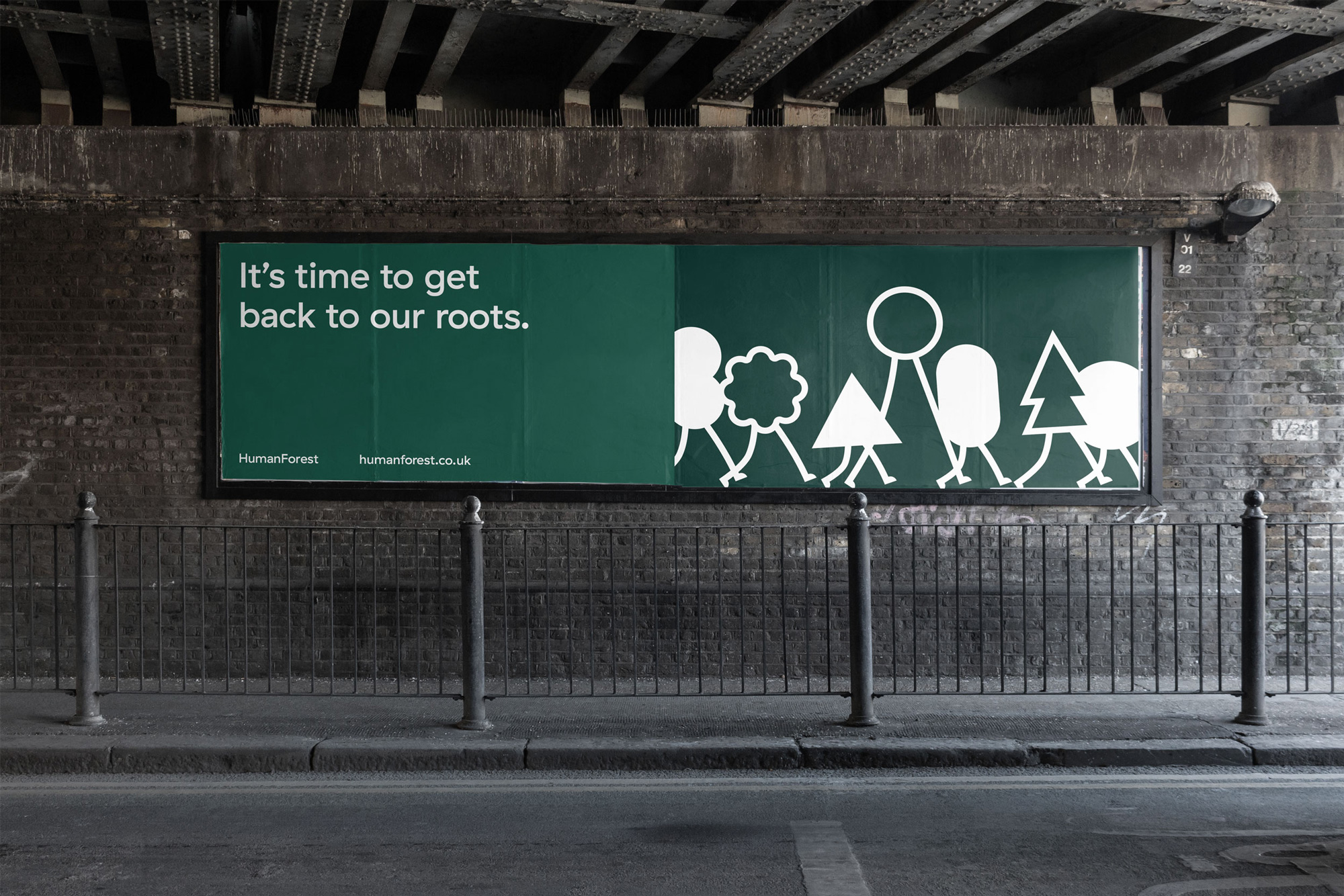
The applications are very straightforward… perhaps a little too straightforward but the treenions do all the heavy lifting needed and become the center of attention of the messaging and carry forward the company’s attitude and core message of getting moving, together, without CO2 emmissions.
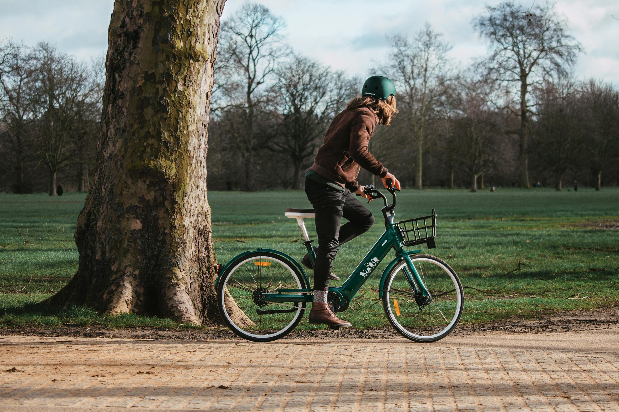
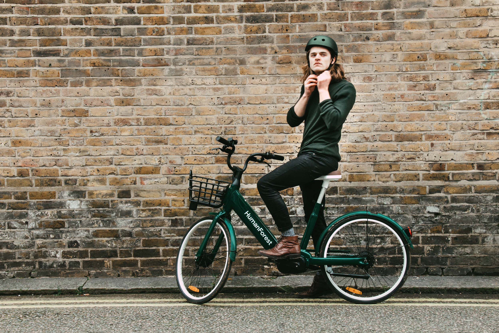
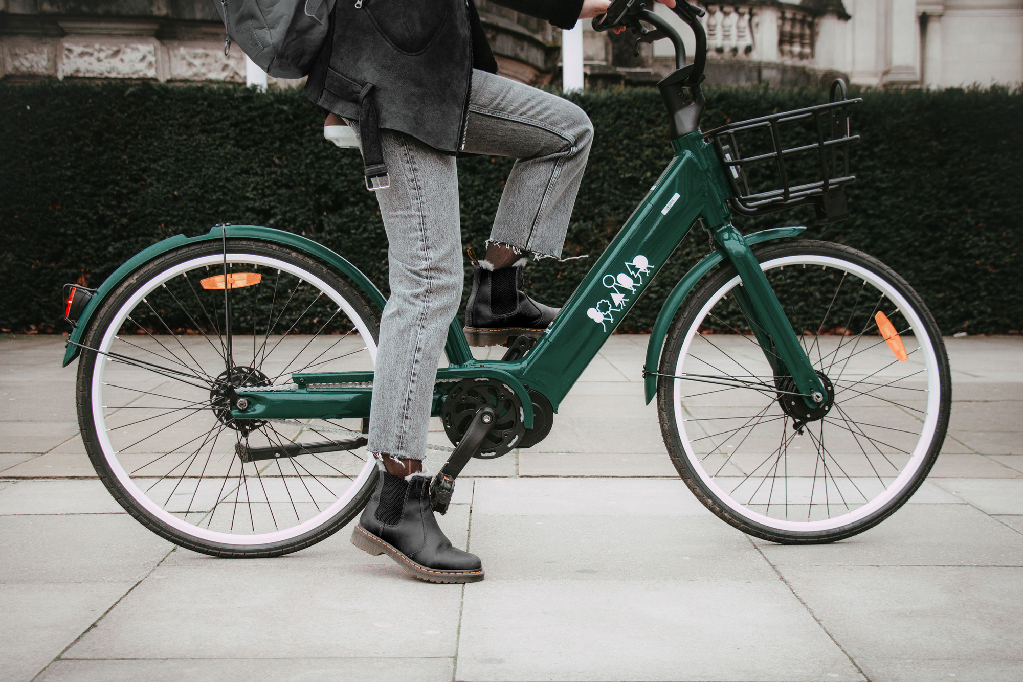
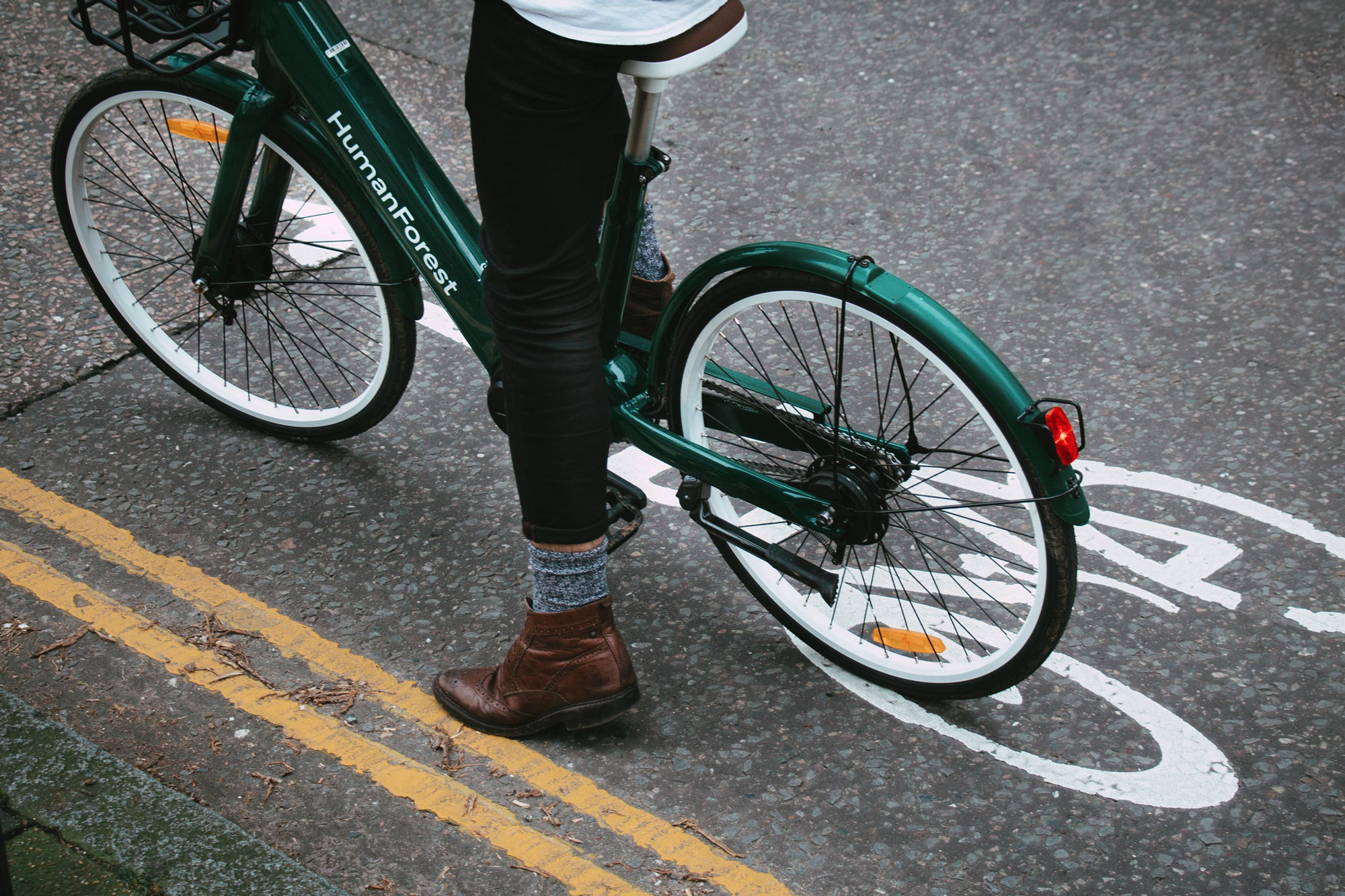
The e-bike itself is quite nice too in that slick dark green color that, admittedly, may make it hard to spot the bikes in an urban setting and after some wear and tear the green might take on an off-putting dusty, muddy, scratchy patina but, for now, a nice alternative to the bright colors of shared public transportation.
Overall, this has a great personality to it and very efficiently positions HumanForest as not just an eco-friendly transportation option but a people-friendly company trying to make a difference.
 each year since publication began in 2006

 Новости Союза дизайнеров
Все о дизайне в Санкт-Петербурге.
Новости Союза дизайнеров
Все о дизайне в Санкт-Петербурге.