contact us | ok@ohmycode.ru
contact us | ok@ohmycode.ru
Established in 1870 in Amsterdam, Amstel is a Dutch brewery that first brewed a Bavaria-style lager, starting its exporting business early on in the 1880s and has now, 150 years later, expanded to 110 markets worldwide. Its portfolio of beers has grown from its flagship golden Amstel Beer to include Amstel Lager, Amstel Premium Pilsener, Amstel Light, Amstel Bright, and Amstel Radler. In 1968, Heineken International bought Amstel, closed its Amsterdam brewing facility, and production was relocated to the main Heineken plant, currently producing more than 12.5 million hectolitres per year, which is, like, a lot. This year, Amstel is rolling out a global identity and packaging designed by London, UK-based Elmwood.
Amsterdam-founded Amstel has been one of the world’s most recognised names in beer for almost 150 years. Its 115 markets required different expressions of the brand to align with local needs. The result was a lack of global coherence in visual identity that devalued Amstel’s brand iconicity. The challenge became how to create globally iconic assets that could carry through all of Amstel’s expressions while remaining flexible enough to meet the needs of local marketers.
Amstel brought on Elmwood London to design around this challenge. The consultancy worked with the Amstel team to create the “I am Iconic” platform: a global strategic framework with multiple iconic assets available for local markets to choose from in creating their own expressions of the Amstel identity.
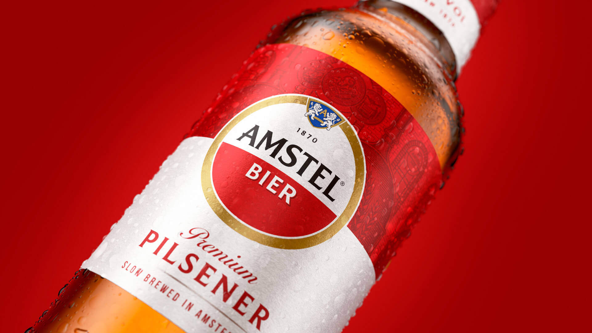
Elmwood London started by diving into Amstel’s story-rich archives to get to the heart of what had historically made the brand distinct. The consultancy focused on Amstel’s iconic logo that features a circle with a red-and-white split and dialed up the shape and color iconicity both on and off pack.
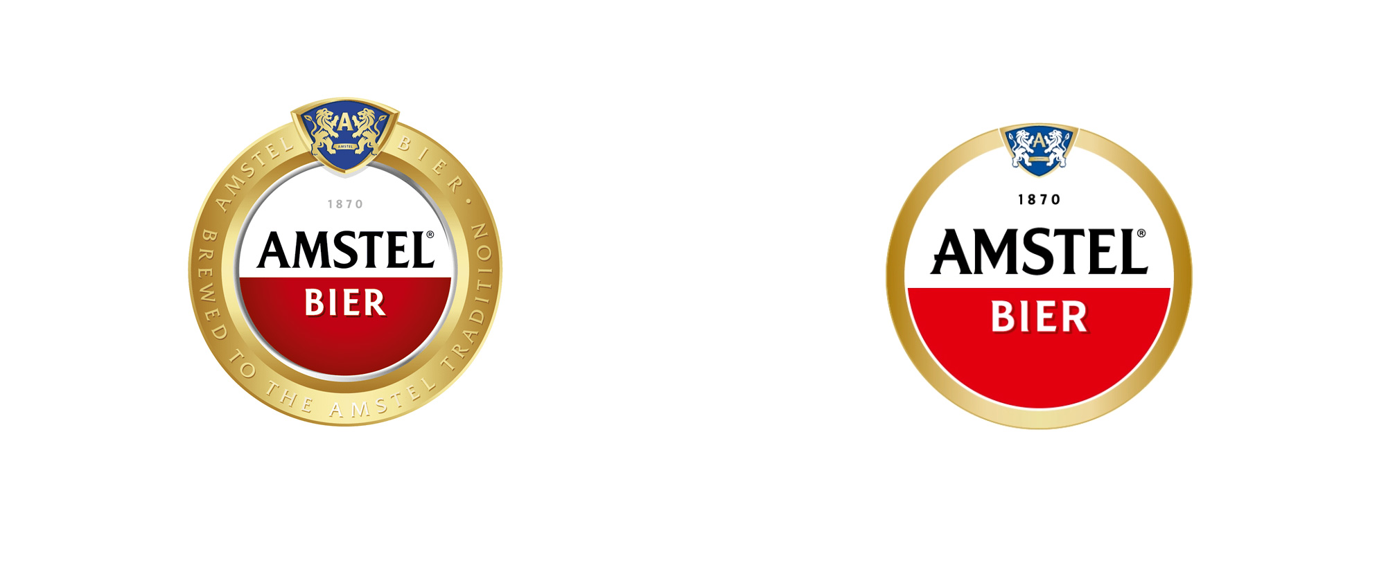
I had never paid much attention to the Amstel logo, in part because I am not a fan of their beer, but I definitely associate the white and red circle with it and the new logo amplifies that element quite effectively by simplifying the design. Removing the legend from the golden ring makes a huge difference simply by allowing the name to be much bigger and the ring less overpowering. The “AMSTEL” wordmark has been finessed and given more character and uniqueness, especially in the “A”. Squaring off the “M” solved the spacing issue that existed before between the “A” and the “M” but now the “M” may feel too wide. Still, in general, I would pick the new wordmark over the old. The integration of the coat of arms into the ring is also a nice improvement to create a more concise unit but perhaps it runs a little small. Overall, the new logo does feel better suited for carrying more responsibility across markets.
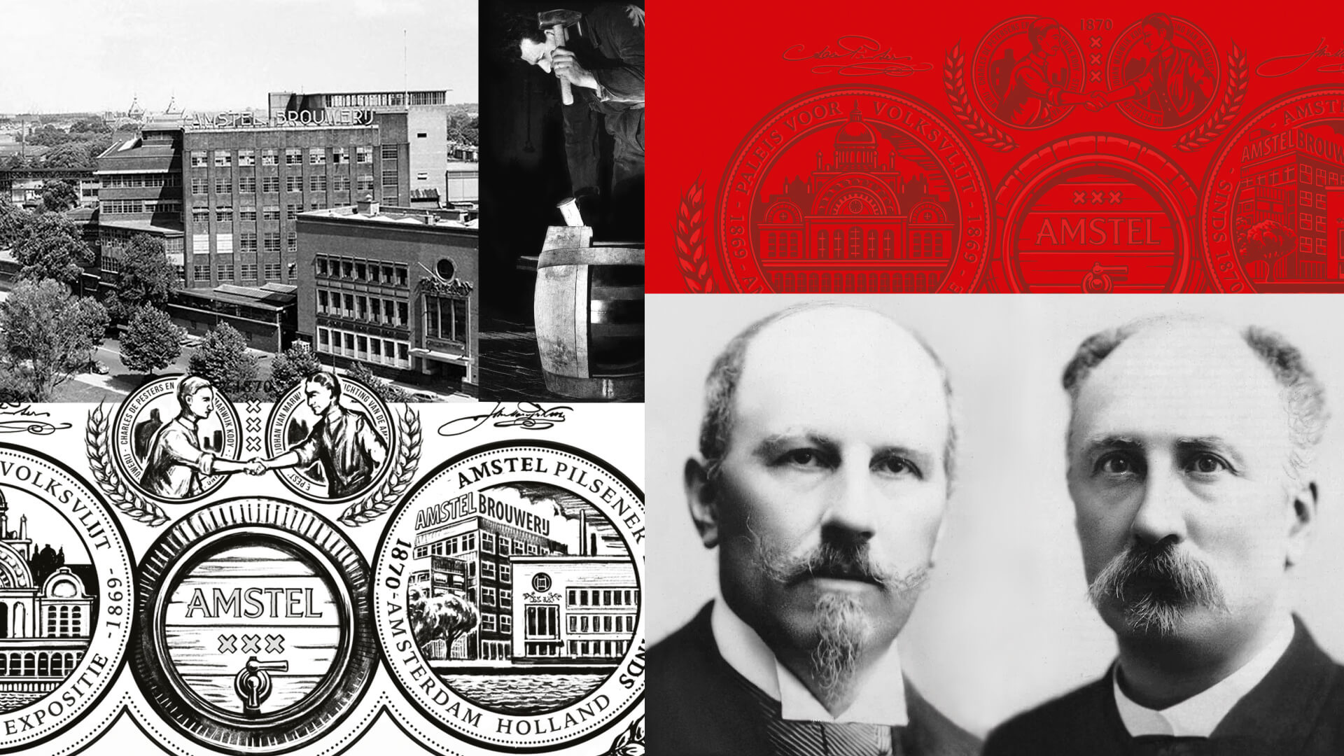
With the new iconic logos in place, Elmwood London then built on Amstel’s position as the world’s local beer by bringing to life three credential stories: “Born from better beer,” “Born in Amsterdam” and “Born from friendship.” The consultancy crafted a series of illustrations that champion the brewing process, the Amstel River with its iconic bridge, and the founders’ signatures to symbolise these respective stories. The result is a new visual identity system that empowers Amstel’s marketers to select their own stories based on their specific local needs.

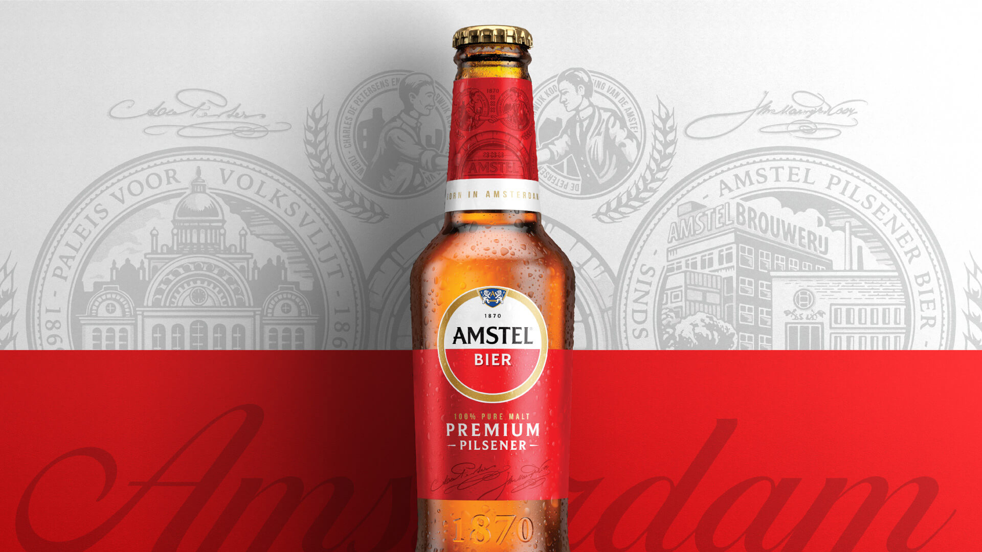
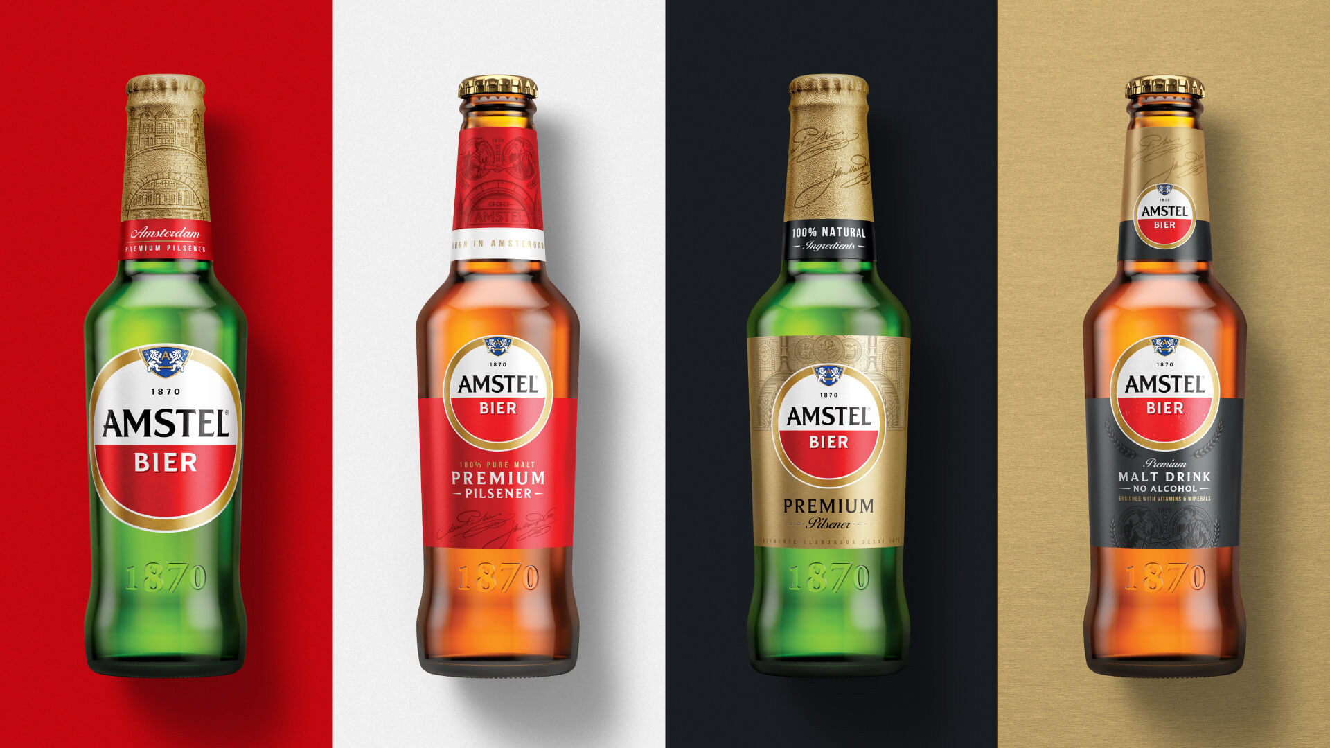
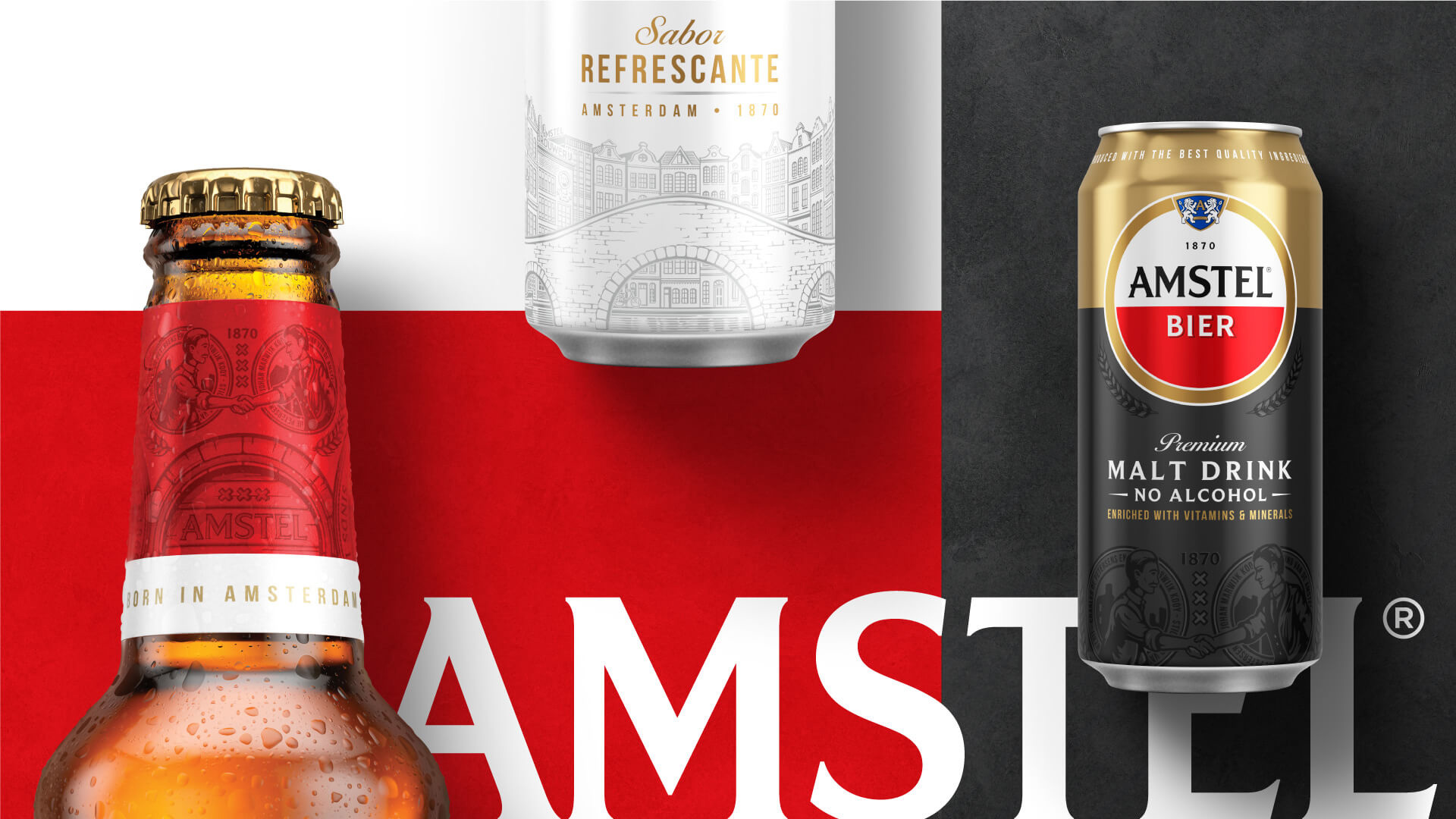
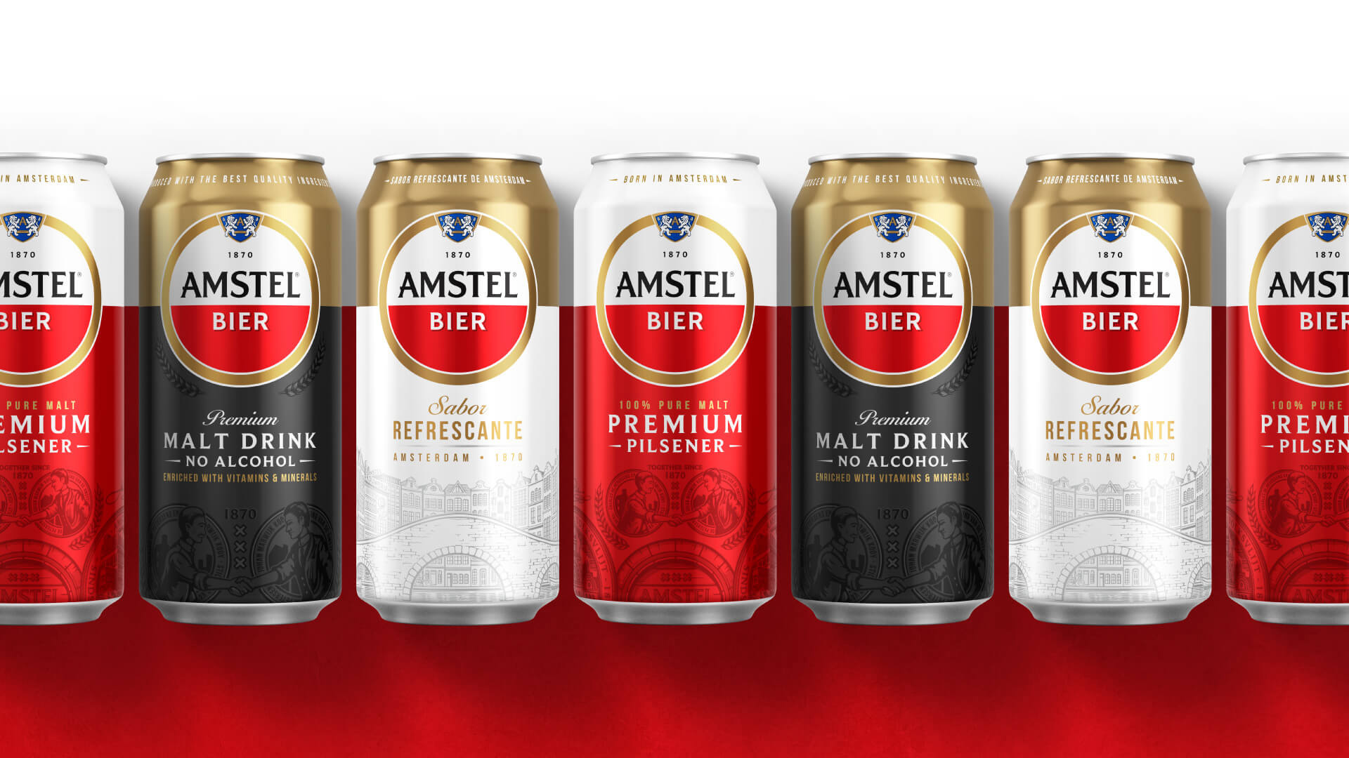
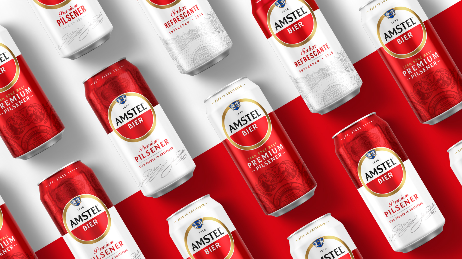
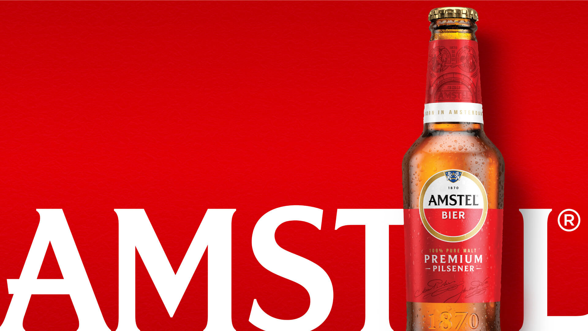
It’s hard to do a before/after comparison of the packaging because look at this mess, it’s all over the place and it’s hard to tell what design is from 1 year ago and what is from 10 years ago, so any effort to unify them is most welcome. What’s really great about the new packaging is that instead of a single, static design for all 110 markets, each market can customize its look from a consistent set of design assets that even if they yield bottles that look different from each other, they are still speaking the same visual language, which happens to be pretty nice through a set of detailed, single-color illustrations that are applied tone-on-tone, as well as some good typographic lock-ups that look very beer-y. It’s hard not to and perhaps even a little unfair to compare this to Jones Knowles Ritchie’s work for Budweiser but I think the comparison is a positive one in the sense that both designs are all about elevating the craft of their identity assets.
The one thing that I still wonder about is how this new design system applies, if at all, to the varieties of Amstel Light or Amstel Bright or any other Amstel Something variety from around the world? Maybe time will tell.
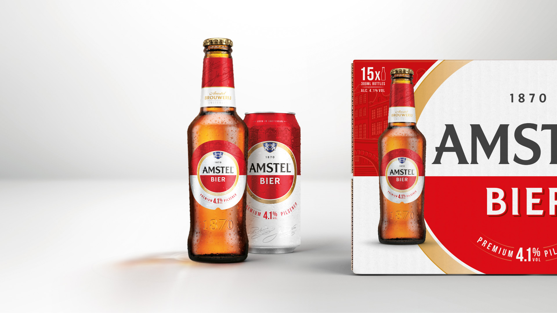
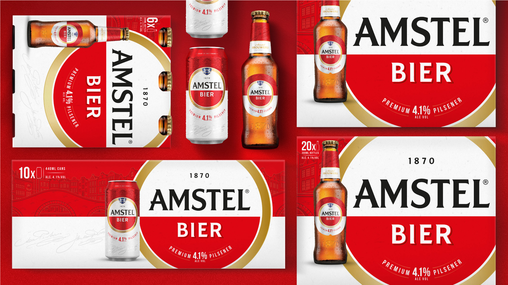
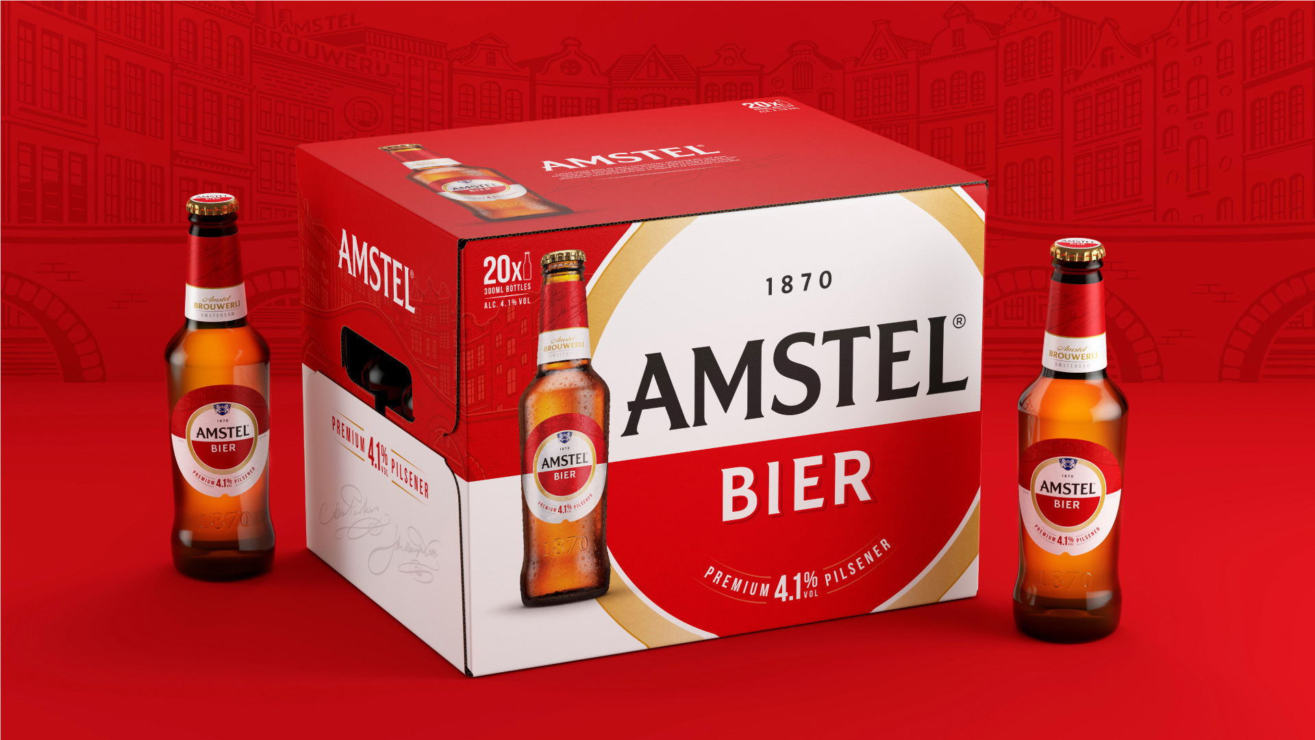
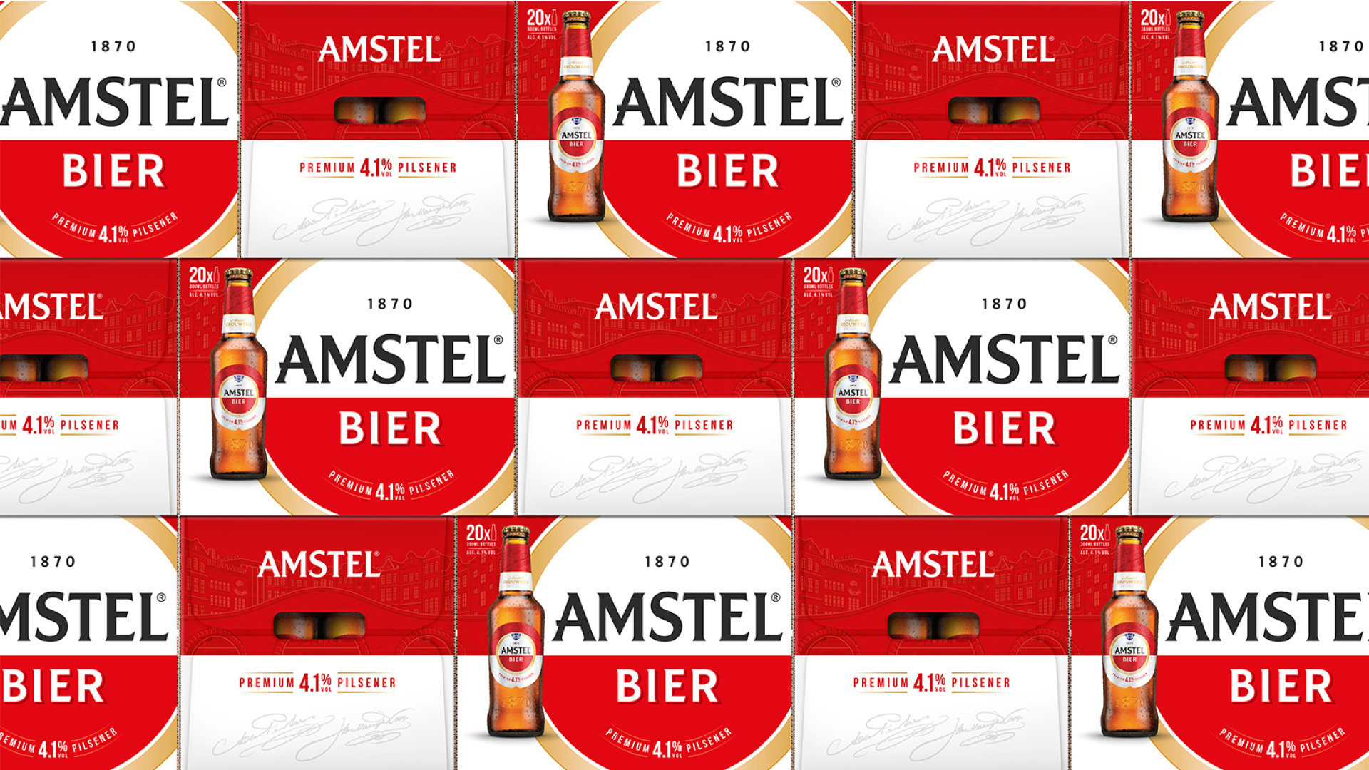
The UK market execution created by Elmwood — other markets will probably be designed by other agencies or, given the generator, by Heineken’s design team — shows how nice the selected elements come together across a variety of applications: they chose the canal illustration and founder signatures and then extended those across bottles, cans, and cases. Looks almost easy! Overall, what’s really effective about the new design is that it still feels like a large, mainstream beer brand but with just the right amount of sophistication to elevate its presence and not so much to make it look stuffy or artisanal, which it’s not.

 Новости Союза дизайнеров
Все о дизайне в Санкт-Петербурге.