Обзор лучших ресурсов по разработке бренда, разработке упаковки
contact us | ok@ohmycode.ru
contact us | ok@ohmycode.ru
Opening this September (2019), The Prince Akatoki in London is the first 5-star luxury hotel of many planned by the partnership between Prince Hotels Group, which manages nearly 30 hotels in Japan, and StayWell, one of the largest hotel management groups in Asia Pacific. The Akatoki hotels — the second one will be in Guangzhou, Southern China — will bring Prince Hotels’ sensibilities and style of luxury to the rest of the world, fusing Japanese aesthetics and hospitality with the culture of each location, “aimed at high-end travelers looking to escape the chaotic pace of modern life, guests will discover a sanctuary within”. The new identity has been designed by the Sydney, Australia, office of Interbrand, who also conceived the name.
Starting with a strategy that spoke to a unique brand proposition—to exemplify Japan’s unique sophistication and hospitality to the world—we were tasked with developing a name, visual identity, and design system that reflects our modern take on Japanese tradition.
I usually put brand introduction videos at the end but this one is worth watching at the beginning as it sets the mood perfectly with its earthy narration and super sweet motion design.
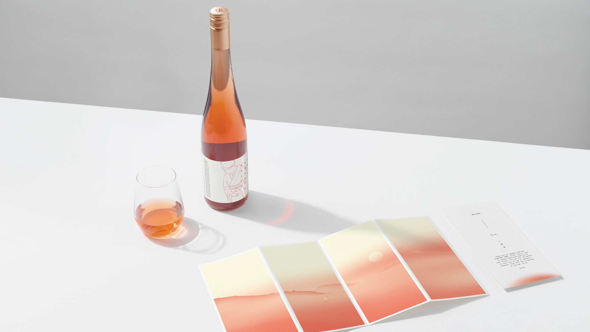
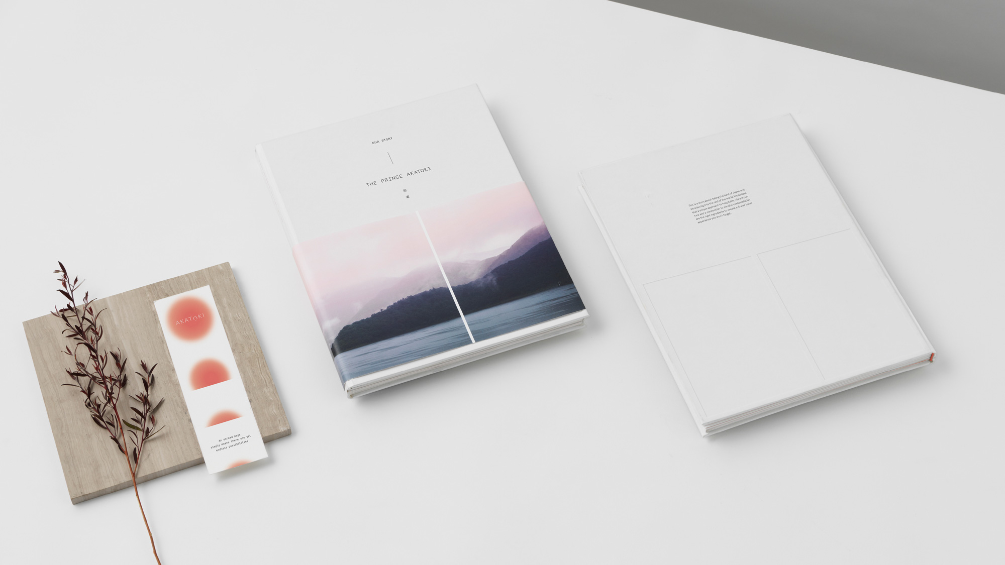
The name Akatoki comes from an ancient Japanese word for dawn. It captures the optimism and positivity for the day ahead. As the sun comes up each morning, guests at The Prince Akatoki will wake up relaxed, rejuvenated, and ready for the possibilities of the day ahead.
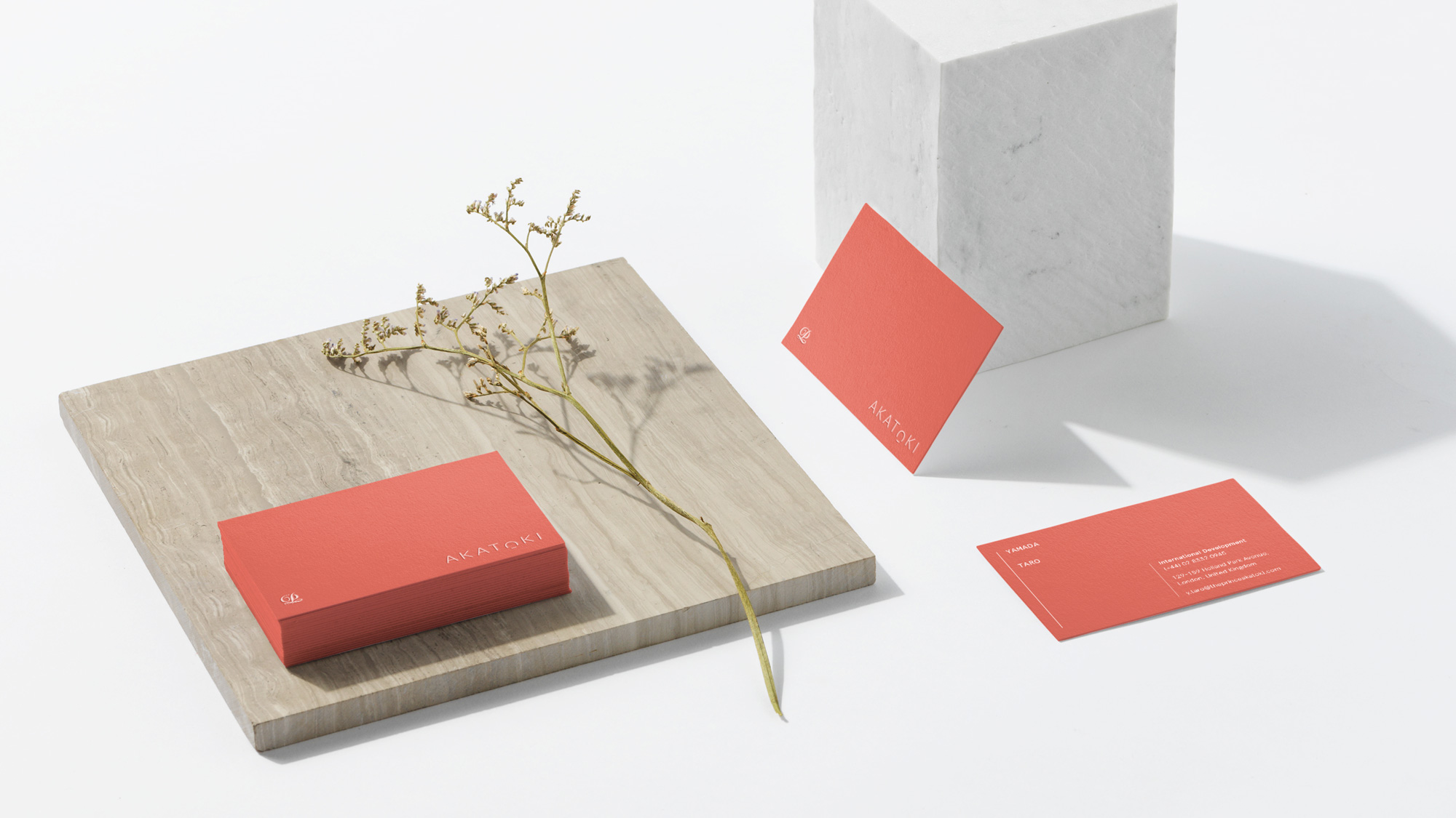
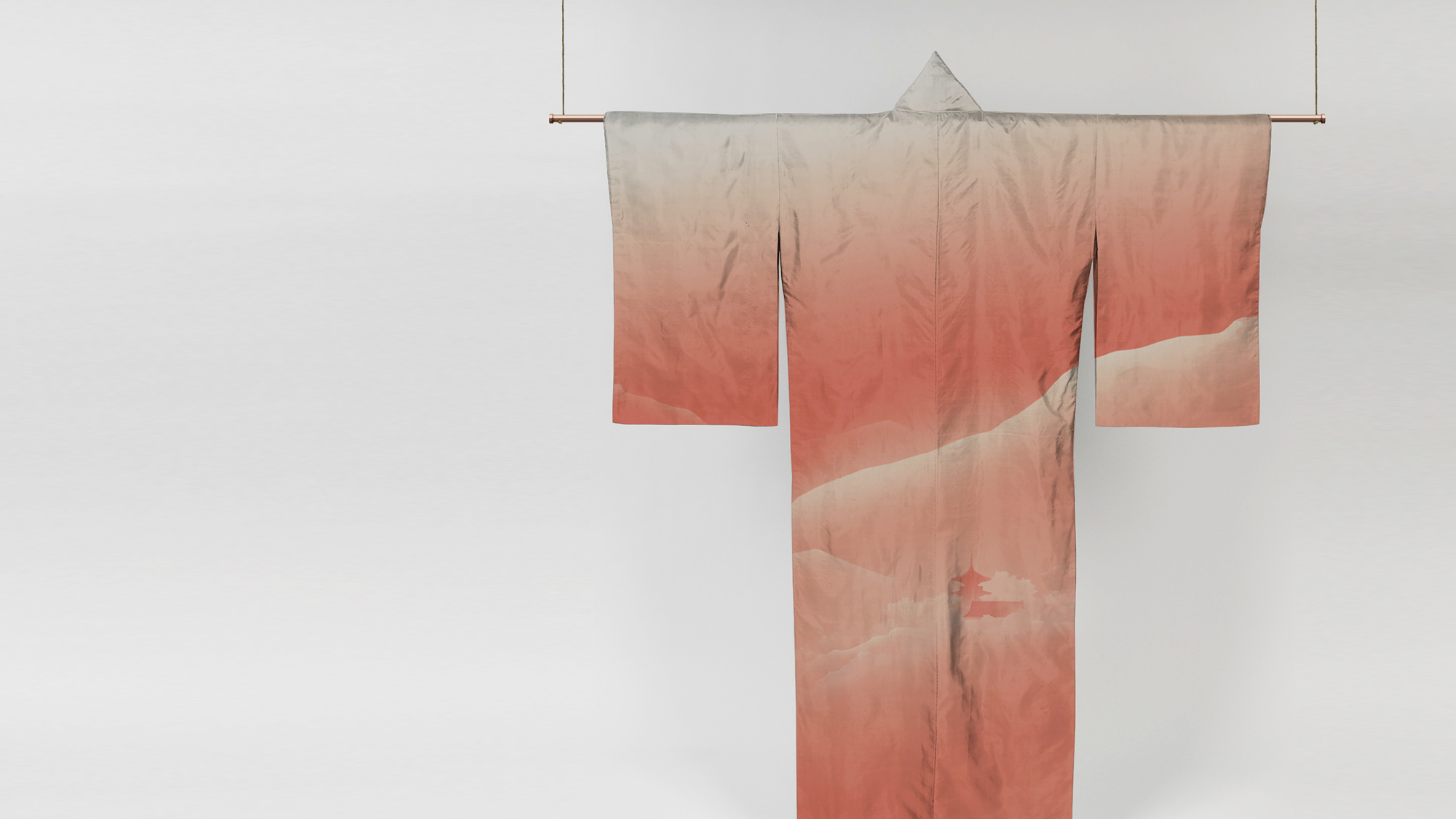
We call this feeling Poetry at Dawn. It is the idea that drives every detail in the brand experience; from the logo, an identity inspired by the colours of sunrise, to a guest experience that emphasises the best ways to start your day.
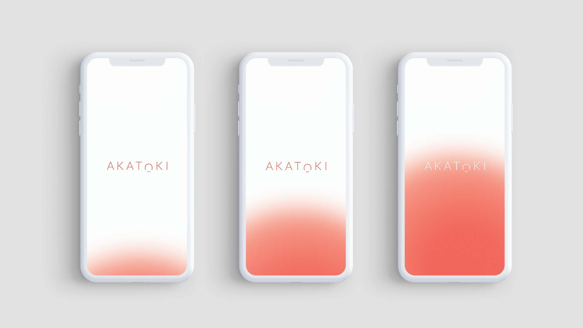
The script “P” comes from the Prince Hotels logo, which had to be included in the lock-up and even though it’s treated as nicely and effectively as possible it is indeed the one element that looks out of place with the rest of the project, which is all kinds of delicate, subtle, and beautiful, starting with the “AKATOKI” wordmark that converts the “O” into a rising sun. No, it is not an original idea, but it is so perfectly executed, it hurts. The implied reflection of the sun as if it were setting in water is simply a crop of the “O” itself and I’m biting my knuckle in jealousy. Not sure if most everyone will share my feelings, but I love it. The stacked version of the logo works best as it looks more contemporary and integrates the “P” a lot better.
The sunrise graphic is stunning as well… it’s just the right amount of feathering, in the right tone, providing the right amount of contrast to the thin wordmark.
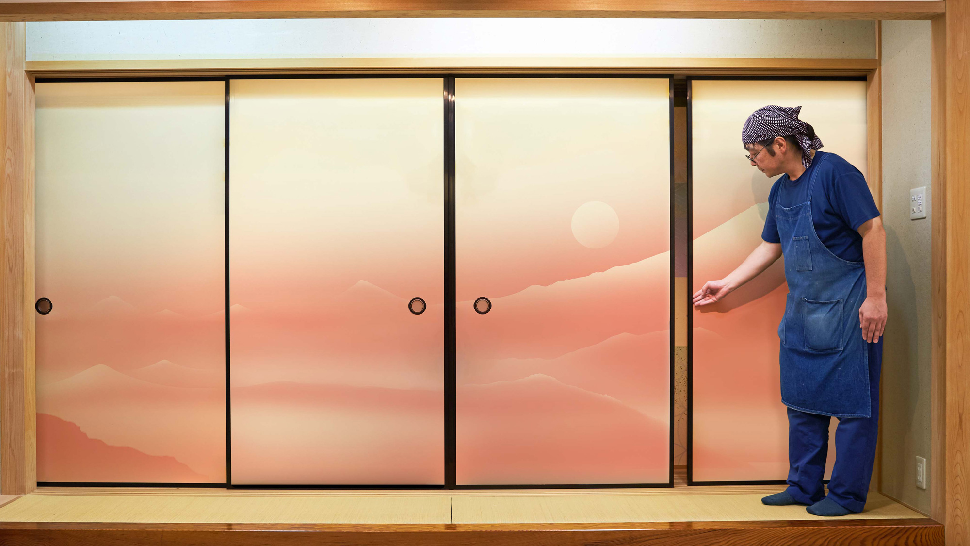
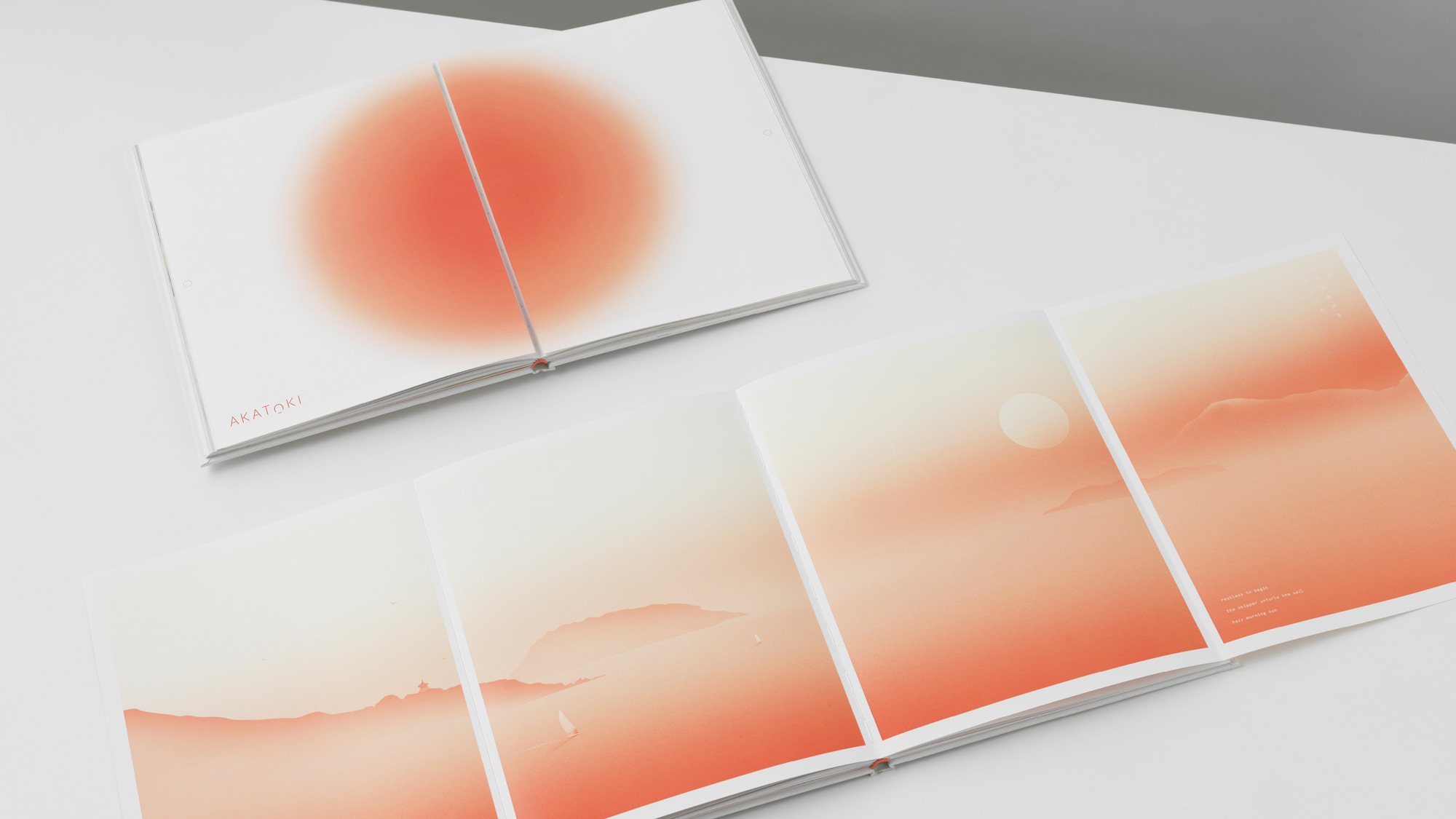
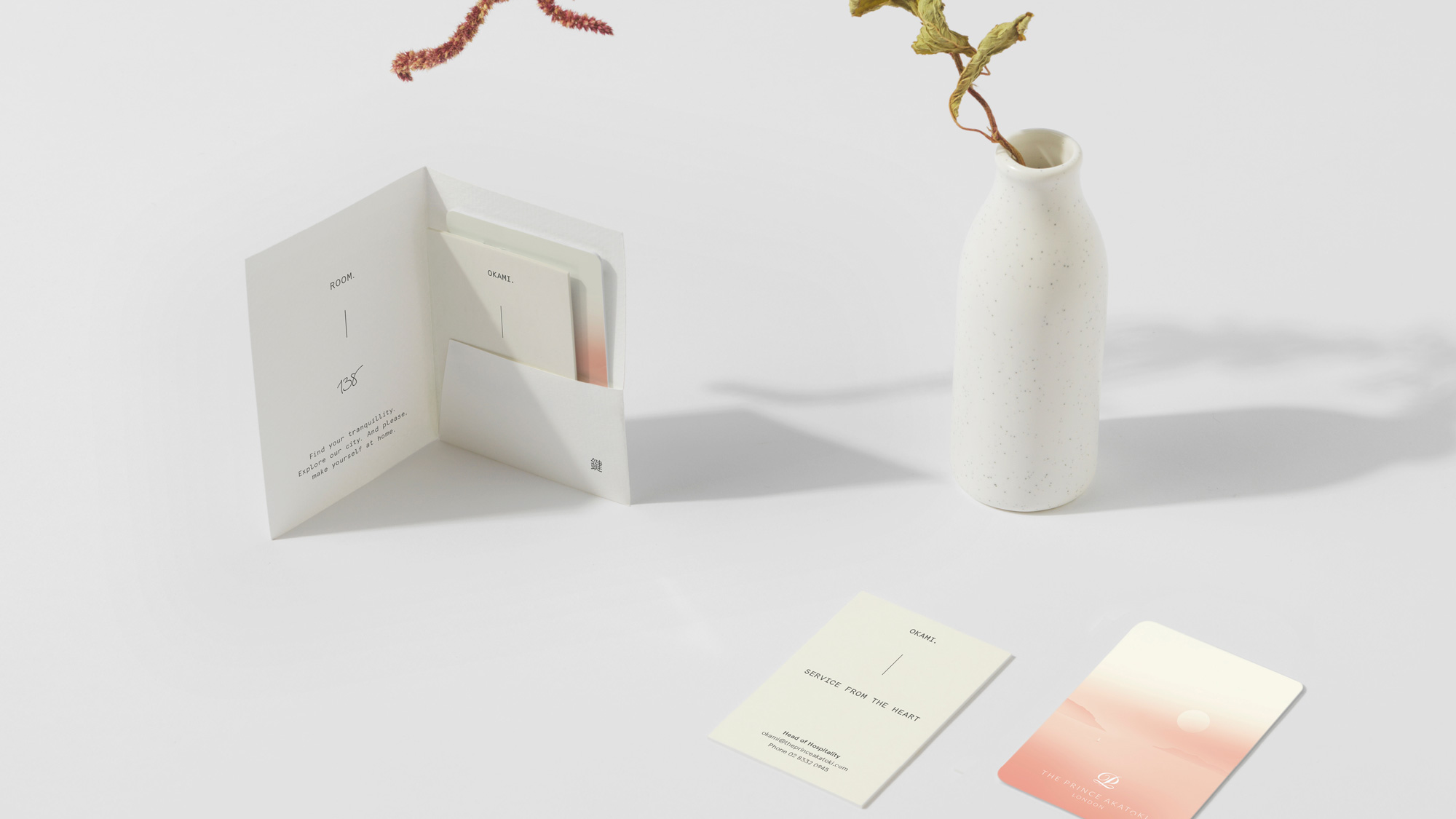
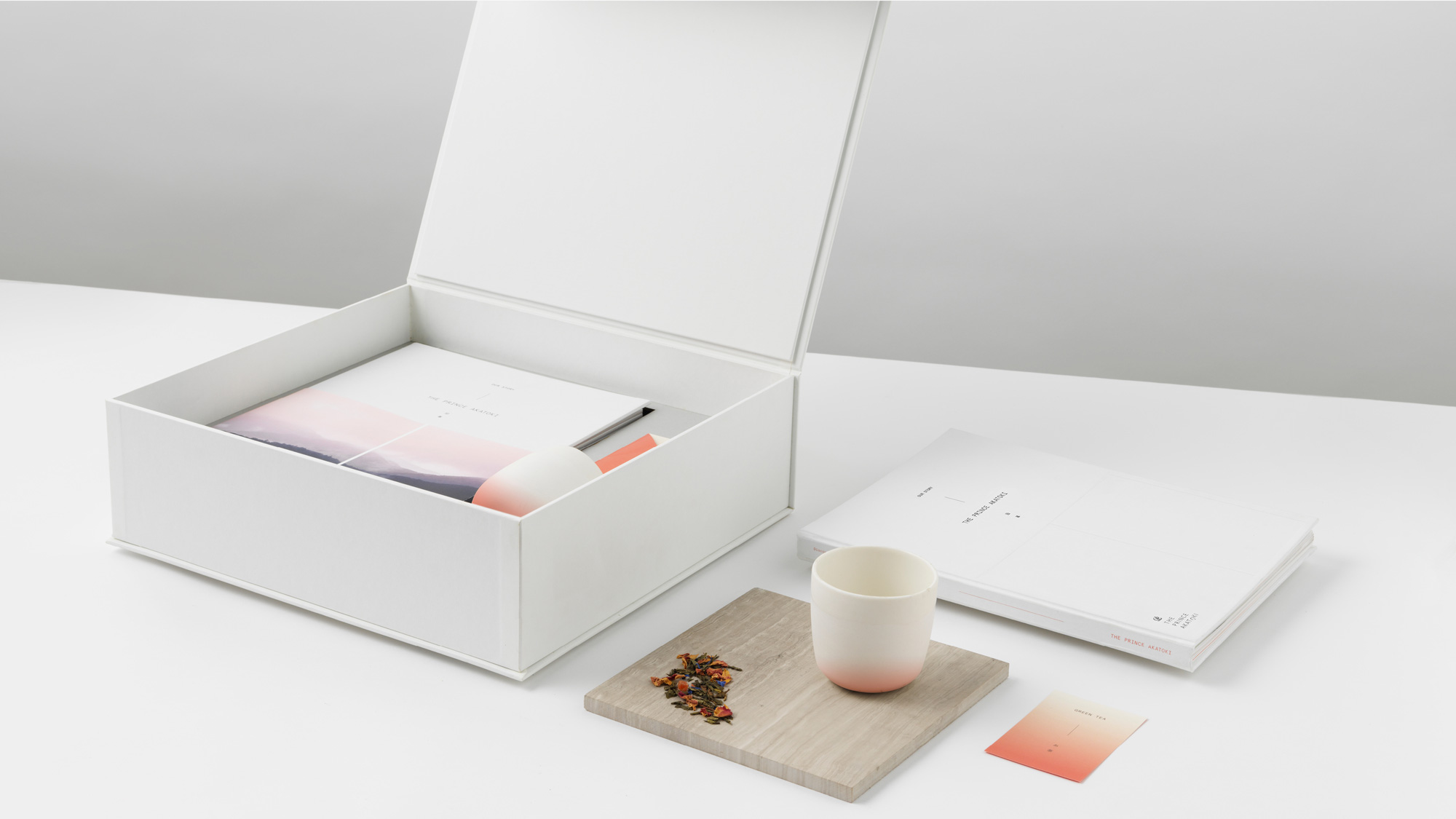
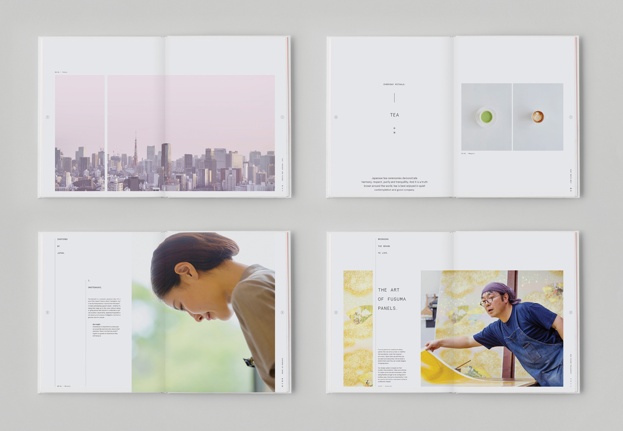
The Prince Akatoki design system is a modern interpretation of traditional Japanese fusuma panels. These sliding doors can open or close to redefine the purpose of a room, or they can create intriguing patterns and layers. It is an endlessly flexible system that creates structure for text, acts as a container for imagery, comes alive in motion, and physically divides spaces throughout the hotel.
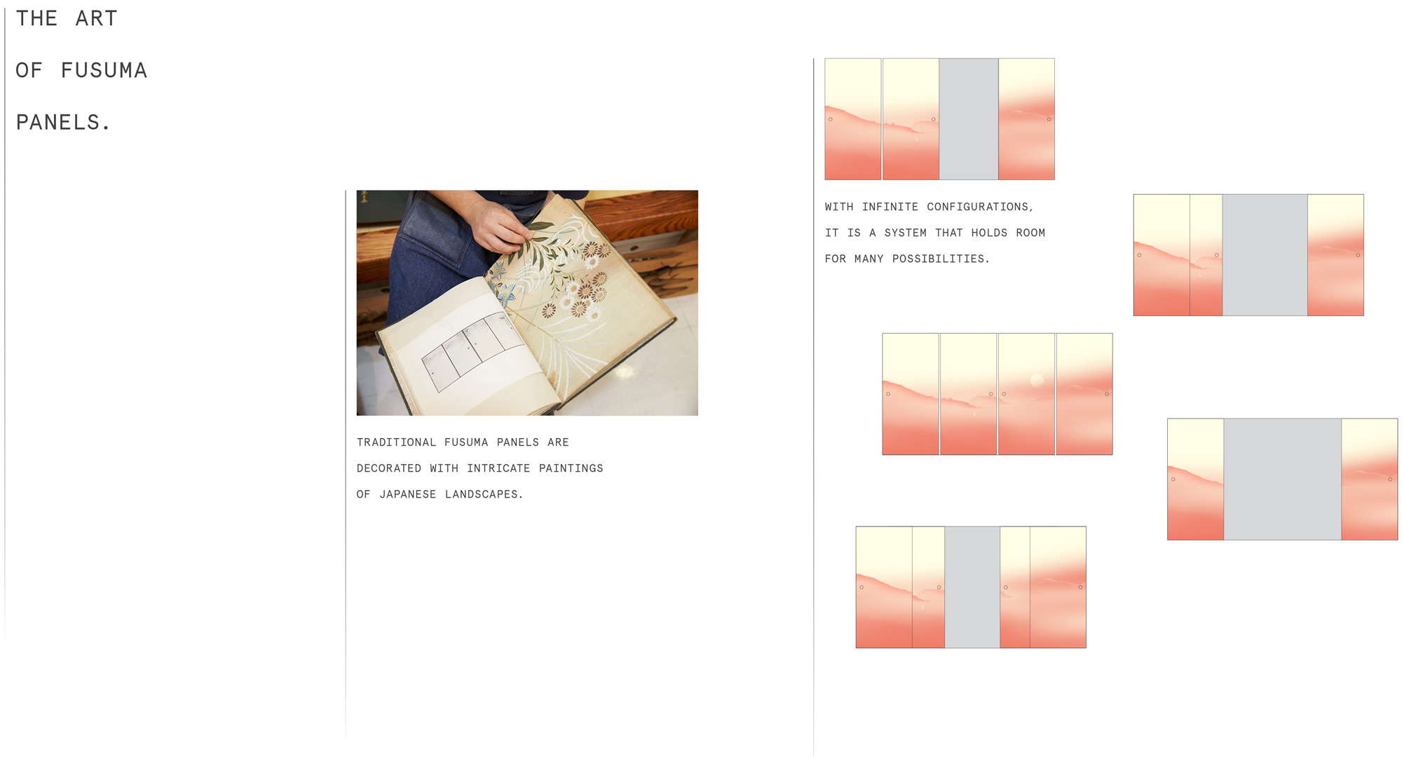
The pink on cream illustrations by Matt Murphy are simply amazing and, for the first time in a long time on Brand New, we are seeing a very different style of illustration that breaks the mold from the happy faceless people in flat colors and line art. These are just so effusive and calming and mysterious. Pairing the illustrations with the opening/closing treatment of Fusuma panels makes them even more delightful with the stacking effect that creates beautiful crops of the illustrations.

Would totally stay here… if I could afford it.
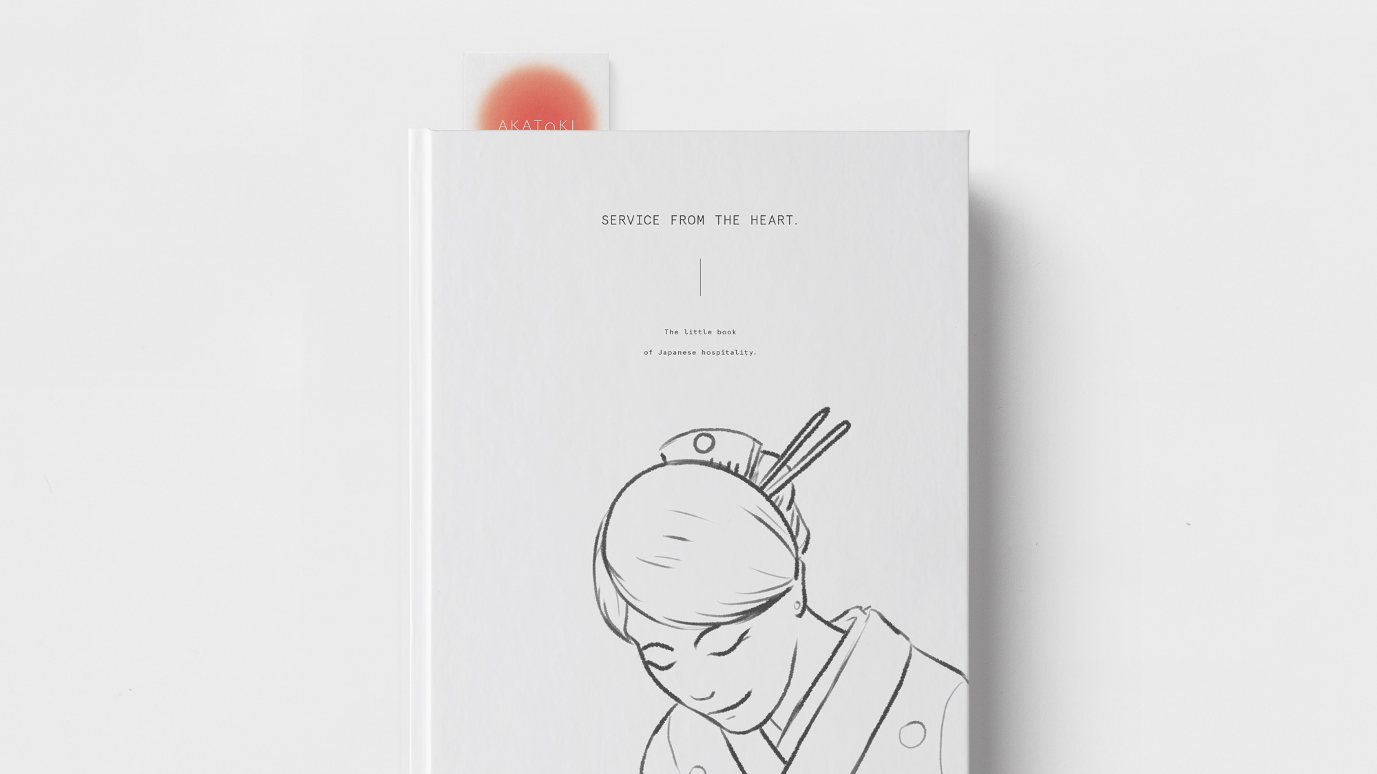
The secondary illustration of the geisha is also great and its line work pairs perfectly with the thin typography and Japanese writing. Also… the motion on the latter? Swoon.
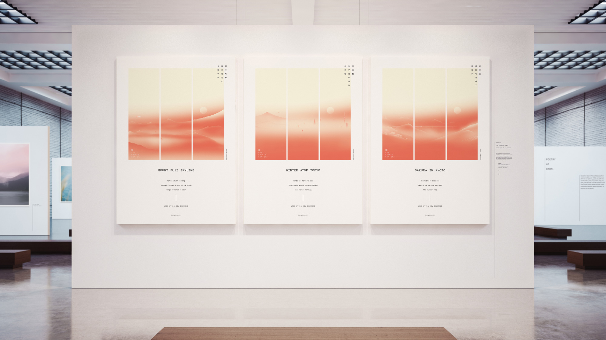
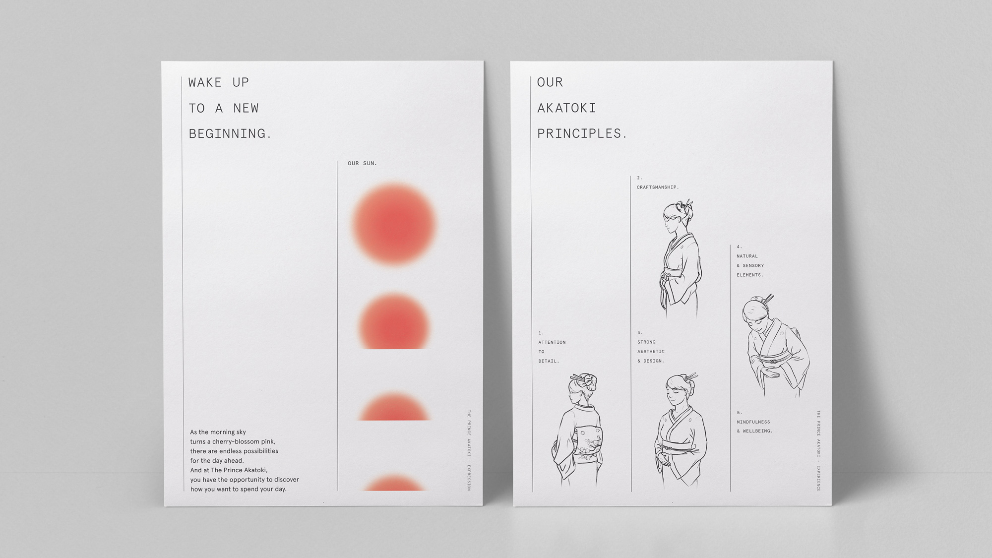
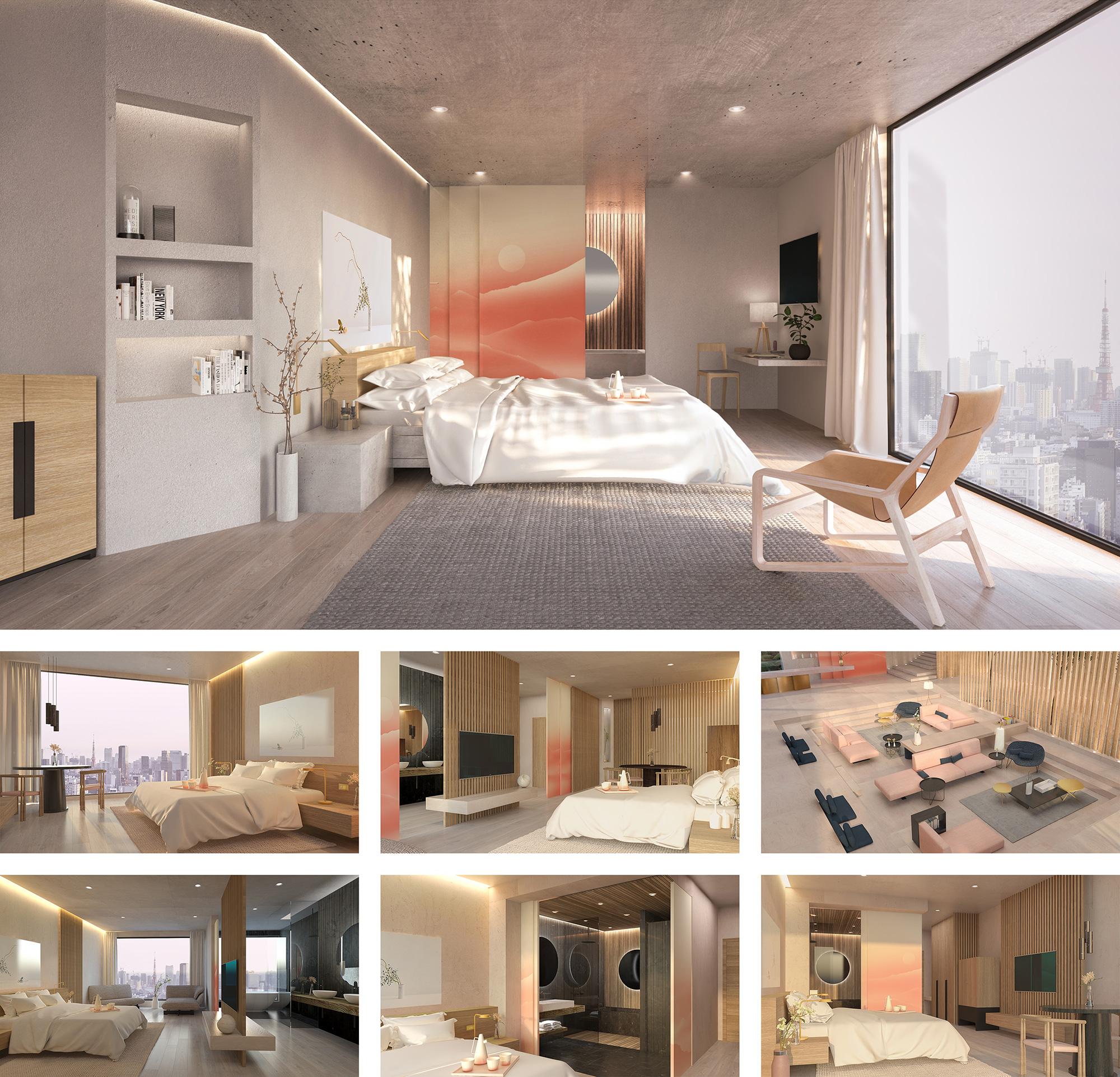
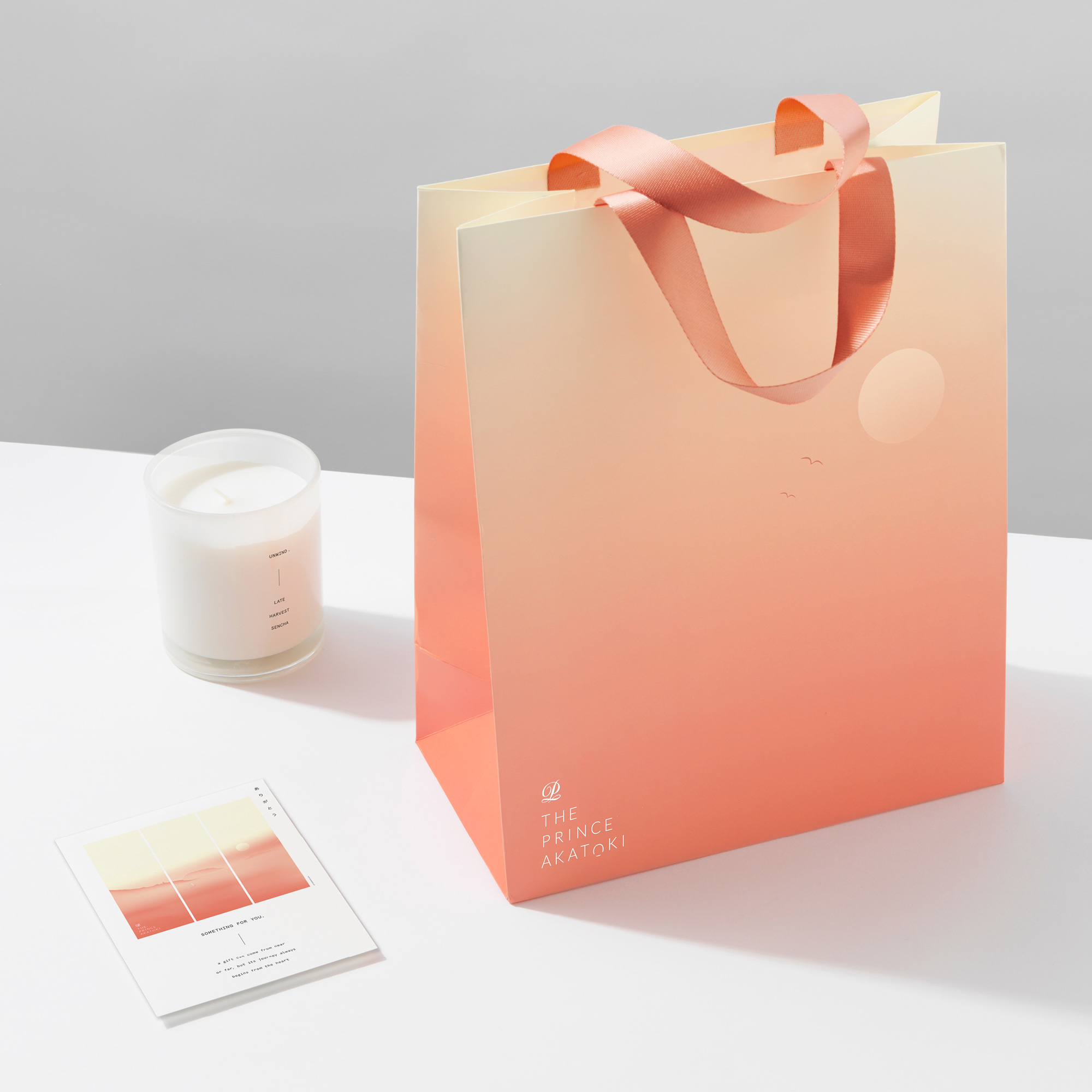
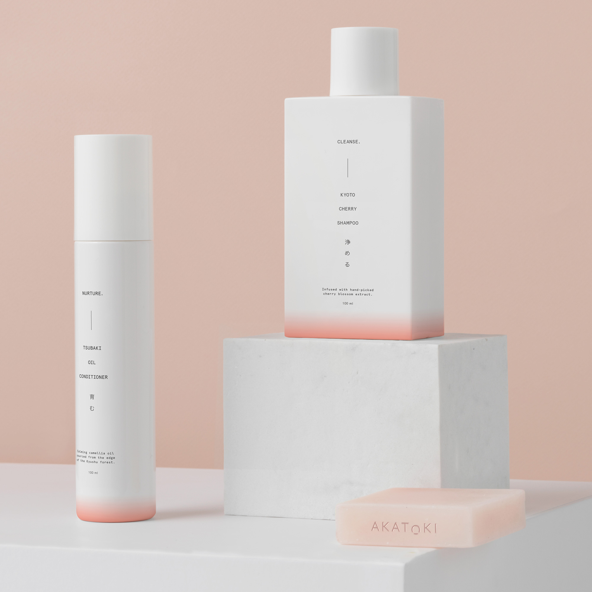
The applications make great use of the elements, integrating the rising sun, the illustrations, the thin lines, and the subtle typography in wonderful ways using white space generously and strikingly.
I do realize I am being overly positive about this project but it’s so well done and so different — without going for the super weird, Brutalist trend — from what we’ve been seeing for the past couple of years that I just feel excited about it. Outside of the context of Brand New, which is where it matters, this identity screams luxury and peacefulness while promising a unique experience different from large luxury hotel chains.
 each year since publication began in 2006

 Новости Союза дизайнеров
Все о дизайне в Санкт-Петербурге.
Новости Союза дизайнеров
Все о дизайне в Санкт-Петербурге.