Обзор лучших ресурсов по разработке бренда, разработке упаковки
contact us | ok@ohmycode.ru
contact us | ok@ohmycode.ru
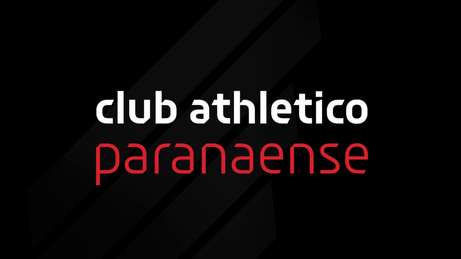
Founded in 1924, Club Athletico Paranaense is a Brazilian football team from Curitiba in Paraná that currently plays in Campeonato Brasileiro Série A, the country’s top league. Nicknamed Furacão (“Hurricane” in English), it is not the winningest team in Brazil and has only won one league championship in 2001 but it did win 2018’s Copa Sudamericana, the second-most prestigious club competition in South American football. In December, the team introduced a new identity designed by São Paulo, Brazil-based Oz.
The new brand carries not only the history of the club, but all its differentials and aspirations for the future, resulting in a unique brand, unlike anything in Brazilian football currently.
We are looking for a design whose simplicity allows it to be reproduced from memory by any fan, unlike most traditional shields. This minimalism and graphic synthesis - eliminating unnecessary visual adornments - is a striking feature of international contemporary design.
The old logo was like many other soccer logos where the monogram could have been any other letter combination and the stripes any other color combination and it wouldn’t make a difference. Also that “C” was almost inexistent being so closely placed to the “A”. The new logo takes a more contemporary approach and breaks away from baroque lettering and circular badges to introduce a relatively more minimalist visual device that starts off in the shape of a shield but then breaks away by extending the lines upwards for a rare asymmetric design. It looks more like a wing than a hurricane but, in the end, it does communicate some kind of extreme motion. I don’t love it but I don’t hate it either… it’s fine. The “CAP” lettering could have been great if they had not added the extra little strokes, which only create visual noise and have no relation to anything else anywhere. The team’s name underneath is mostly fine. All three elements together, though, I’m not sure they are the most convincingly cohesive.
I do dig this animation. Very hurricane-ish.
The sub-brands get oddly corporate and I do get that there is a business side to soccer teams so I’m not entirely knocking it but the custom font looks like a corporate tech company in this context.
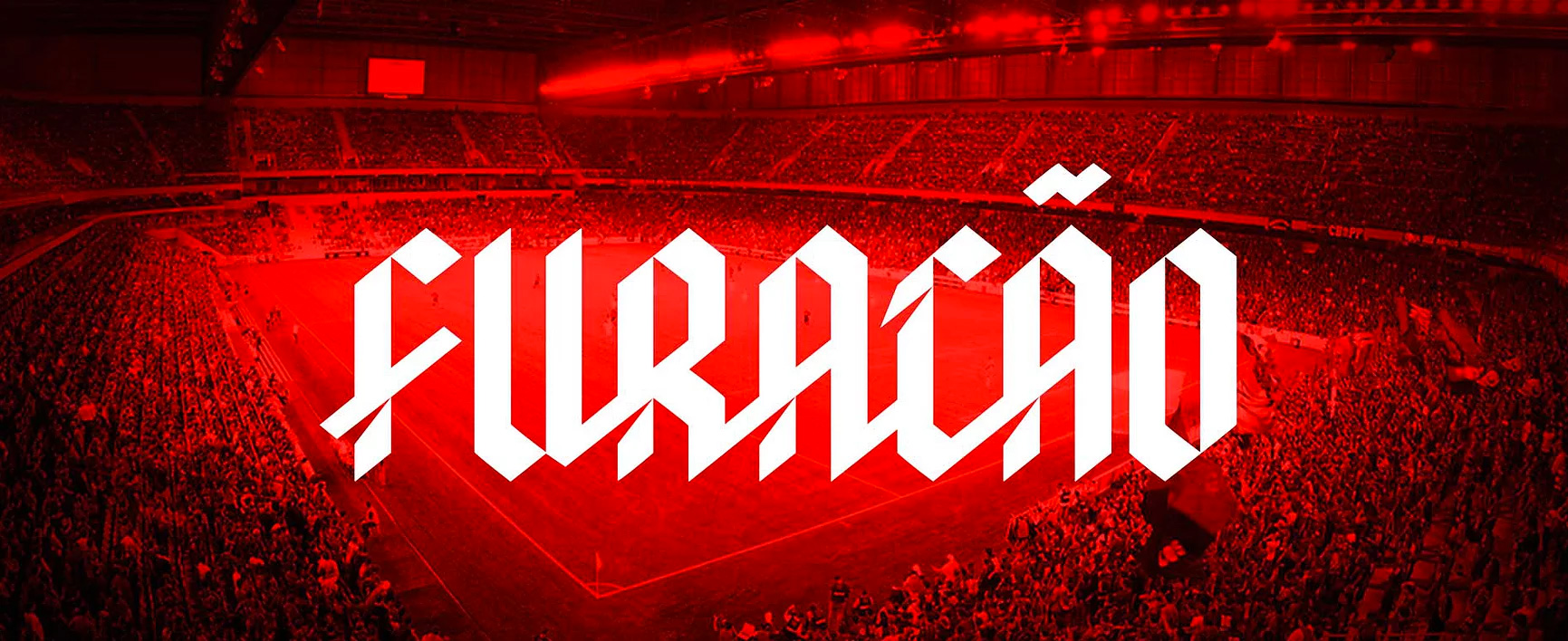
In partnership with Fabio Haag Type, we have developed an exclusive typography for the hurricane. A proprietary typography is a powerful tool in building a solid identity, since all communications will be done in a personalized way.
In the case of Athletico Paranaense the importance is even greater. The main expression of identity of a football club is undoubtedly its uniform. The number on the back of the players therefore has a relevant role in the image. In this way it becomes a great differential the numbers have a unique design, different from those of all the opponents with which you will face in the field.
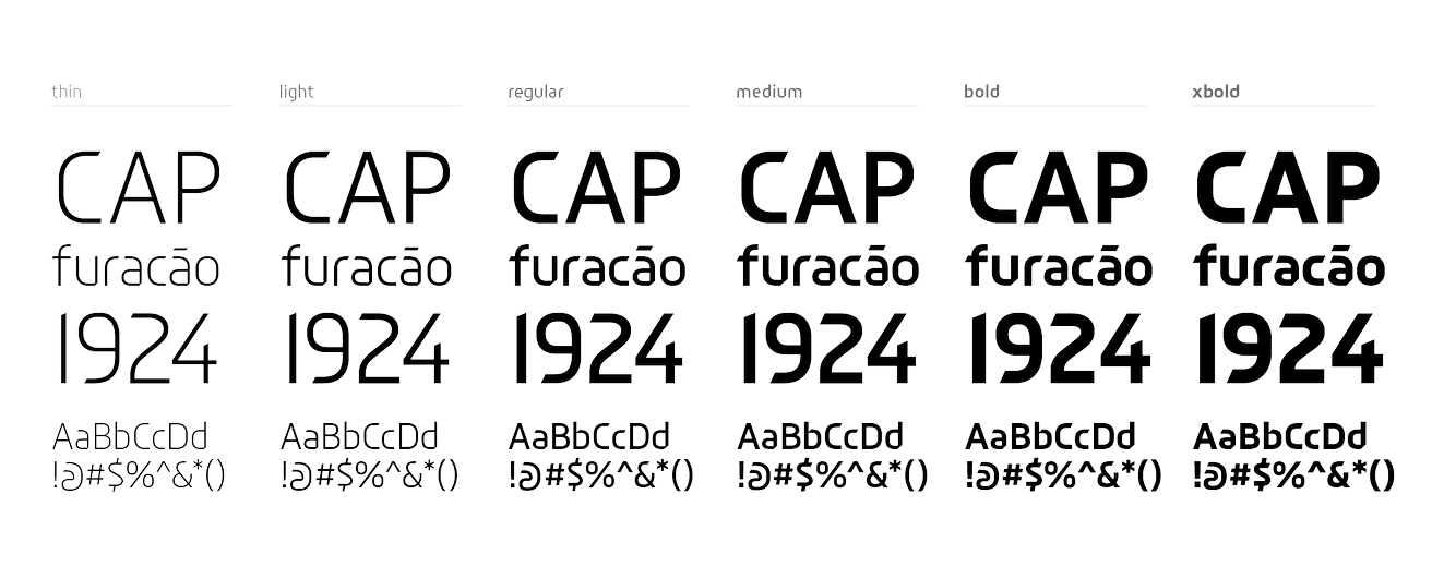
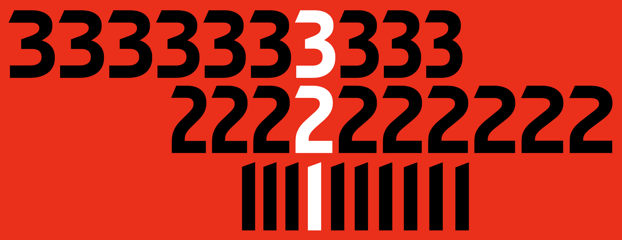
There are things I like about the custom font family (like the “a”) and things I really dislike (like the “r”). In general though, it’s a little awkward, and I keep thinking it’s more for a corporation than a soccer team. The numbers are kind of cool. I wish they had instead turned the blackletter of “CAP” and “furacão” into a full font.
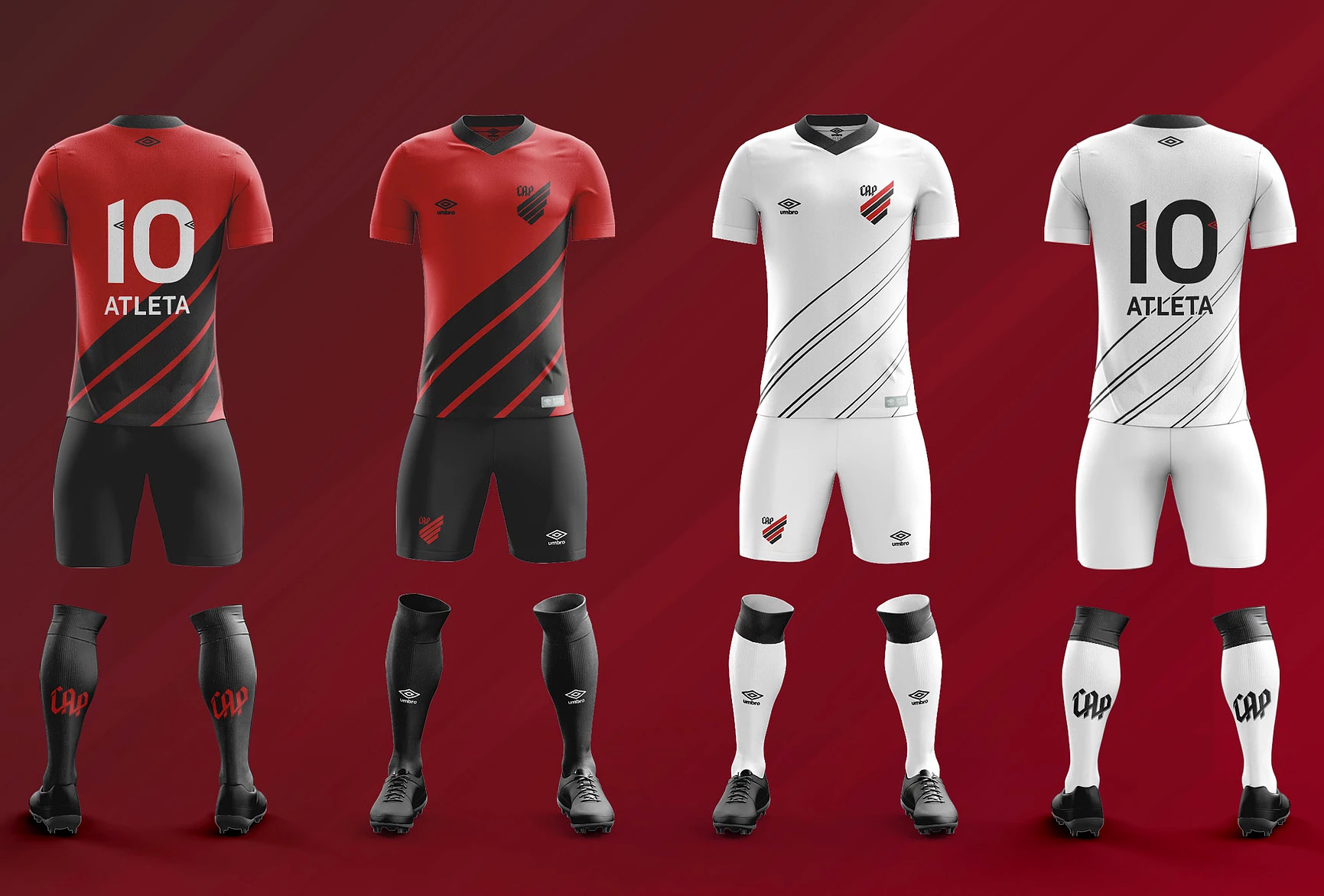
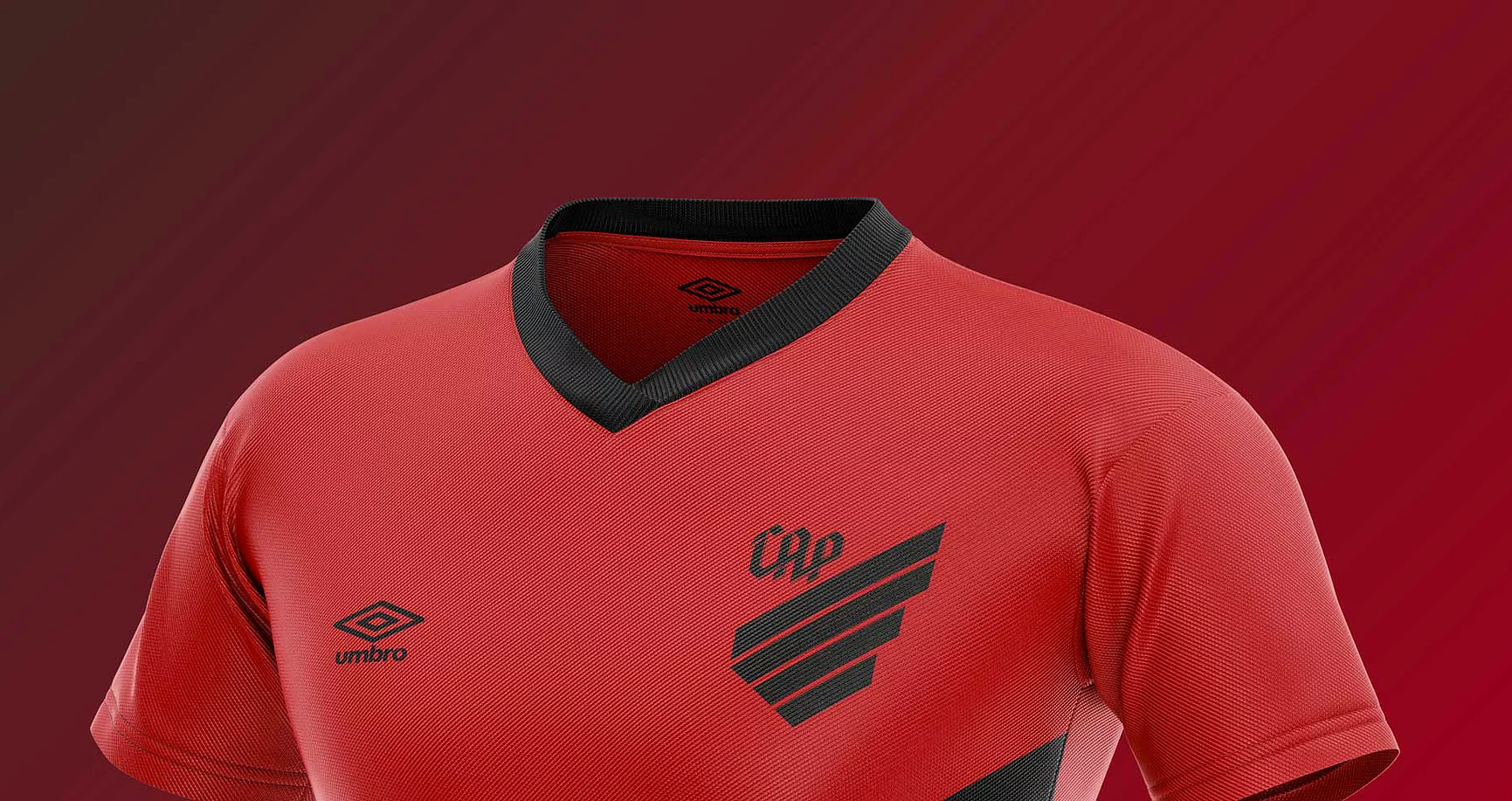
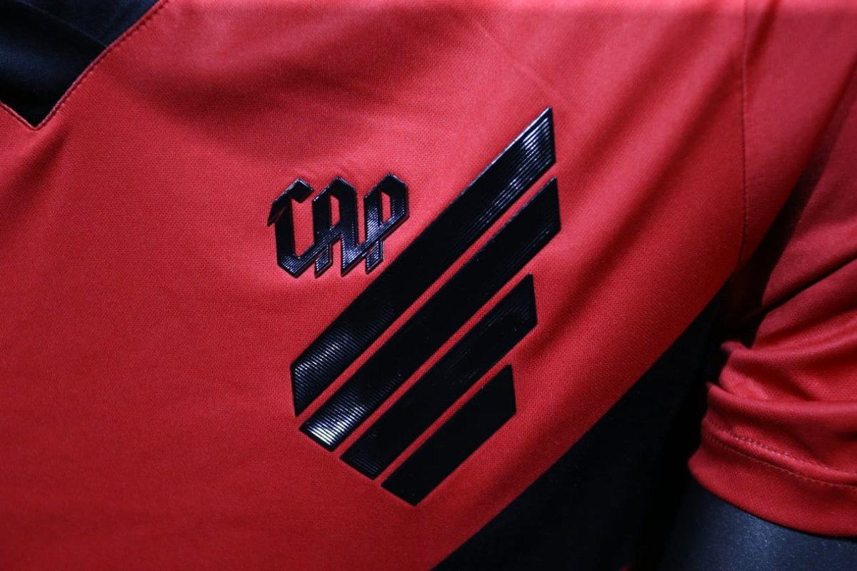
The uniforms look fine. The logo works nicely in the corner and the big stripes are a good extension of the shield. Kind of amazing they insisted on the thin stroke when applying it in real life to the uniform — the image directly above looks like the plastic material on the lettering got burnt.
I will typically appreciate any soccer team that breaks away from the classic and traditional approach and this one almost did it in a convincing way but some of the smaller decisions held it from being a runaway hit like Juventus. Overall, it’s fine and now different enough but could use a more personality — pro tip: more of that blackletter.
Thanks to Guilherme Schmitt for the tip.

 Новости Союза дизайнеров
Все о дизайне в Санкт-Петербурге.
Новости Союза дизайнеров
Все о дизайне в Санкт-Петербурге.